Mastering Proximity in Design for Better Book Covers
Learn how the principle of proximity in design transforms your book cover. Group elements to improve hierarchy, boost readability, and increase sales in 2026.
Posted by
Related reading
Photos for Book Covers: A Complete Guide for Authors
Learn how to choose effective photos for book covers. This guide covers composition, sourcing, licensing, and technical specs for KDP-ready designs.
Create the Perfect Book Review Form: A Guide for Authors
Learn to design a book review form that delivers actionable feedback. This guide covers question design, distribution tactics, and using reviews for marketing.
Effective Backgrounds for Covers: KDP Guide 2026
Choose effective backgrounds for covers to grab attention on Amazon KDP. Our 2026 guide covers types, genre matching, composition, & technical specs.
Ready to design your cover?
Use our AI book cover generator to create tailored book cover concepts in minutes.


You're probably looking at a draft cover that has all the expected parts. A title. Your name. Maybe a subtitle, tagline, or strong image. Nothing is technically missing, yet the cover still feels crowded, awkward, or strangely homemade.
That feeling usually isn't about taste. It's often about proximity in design.
Proximity is one of those quiet design principles that readers notice without knowing they're noticing it. On a book cover, it tells the eye what belongs together, what matters most, and where to look first. When spacing is handled well, the cover feels clear and intentional. When it isn't, even good typography and solid imagery can look disorganized.
Why Your Book Cover Feels Cluttered and Unprofessional
A common indie author problem looks like this: you pick a strong stock image, choose a readable font, place the title at the top, add your name at the bottom, and maybe tuck in a subtitle somewhere in the middle. Every element works on its own. Together, the cover still feels off.
The usual reaction is to blame the font or the image. However, the underlying issue is often the space between things.
If the title sits too far from the subtitle, they stop reading as one unit. If your author name is nearly as close to the title as the subtitle is, the eye has to guess what belongs together. If every element gets the same amount of spacing, the design becomes flat. Nothing feels grouped, so everything competes.
That's why professional covers often look calmer even when they contain the same number of elements. The designer hasn't necessarily removed information. They've organized relationships.
A good way to think about it is this: clutter doesn't always mean “too much stuff.” It often means unclear structure. The same problem shows up in presentations, reports, and sales materials. If you want a non-book example of how layout choices help readers process information faster, this piece on transforming complex sales data into clarity shows the same principle at work in a different format.
A cover looks professional when the reader can tell, at a glance, what the main message is and which details support it.
For KDP authors, that matters even more because your cover usually appears first as a small thumbnail. At that size, readers won't study your design. They'll scan it. If the spacing doesn't create order instantly, the cover can feel noisy before anyone reads a word.
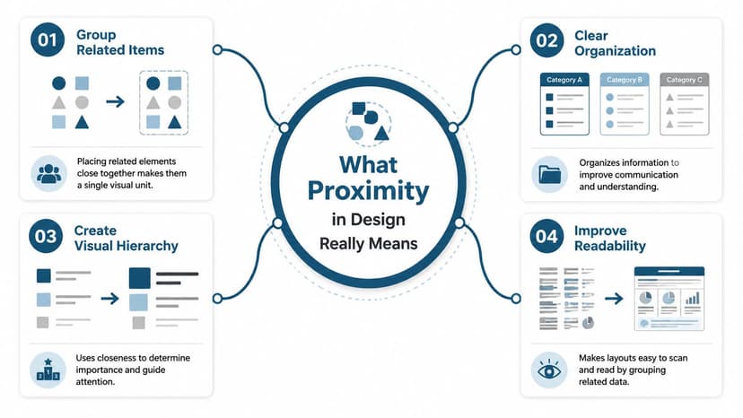
What Proximity in Design Really Means
Proximity in design means placing related things close together and unrelated things farther apart. That's the whole principle. Simple idea, major effect.
It comes from Gestalt psychology, developed in the first half of the 20th century. The core rule is straightforward: elements that are near each other are perceived as related, and elements with more distance between them are perceived as separate. Nielsen Norman Group notes that proximity can even overpower other visual cues such as color or shape because the brain relies heavily on spatial relationships when it groups information (Nielsen Norman Group on Gestalt proximity).
Think about a party. If three people are standing close together and another two are across the room, you assume there are two separate conversations. Nobody needs to announce it. Distance tells you.
The same thing happens on a cover.
A quick everyday analogy
A grocery list is easier to scan when similar items are grouped:
- Produce together so apples, lettuce, and onions feel like one category
- Dairy together so milk, yogurt, and cheese don't float around the page
- Cleaning supplies apart because they belong to a different task
If the list is random, you can still read it, but you'll work harder. That's what poor proximity does on a book cover. It forces the viewer to sort the layout manually.
What authors often confuse
Many people assume proximity is just another word for white space. They're related, but they're not the same thing.
White space is the open area around elements. Proximity is how you use that space to define relationships. If you want a deeper explanation of how empty space supports layout decisions, this guide to white space in design is a useful companion.
Another confusion is thinking “close together” always means cramped. It doesn't. Good proximity uses contrast in spacing. Related items should feel closer to each other than they feel to surrounding elements.
Practical rule: The space inside a group should be smaller than the space outside that group.
That's why a title and subtitle might sit fairly close, while the entire title block sits farther away from the author name or badge.
If you design print materials as well, you'll see the same logic in flyers and brochures. The layout advice from The Print Warehouse Ltd is useful because leaflet design depends on the same basic skill: helping readers understand what belongs together before they start reading line by line.
How Proximity Creates Hierarchy and Readability
A book cover doesn't just need to look attractive. It needs to tell the eye where to go first, second, and third. Proximity helps create that order.
When related elements are grouped tightly, they read as one message. When major groups are separated clearly, the viewer understands the hierarchy. On a cover, that usually means the reader can immediately distinguish the title block, supporting text, and author credit.

Why hierarchy starts with spacing
Authors often think hierarchy comes mostly from font size. Size matters, but spacing tells the eye how to interpret the size.
For example, a subtitle can be smaller than the title but still feel strongly connected if it sits close beneath it. If that same subtitle is pushed too far away, it may look like a separate message. The reader then has to pause and decode the layout.
That pause is expensive on Amazon, where covers are competing in a fast-moving grid of thumbnails.
According to Gapsy Studio, proper visual grouping through proximity principles can boost user comprehension by nearly 30%, and the spacing in a design communicates relationships within a fraction of a second, before a user reads a single word (Gapsy Studio on the proximity design principle).
What this looks like on a KDP thumbnail
At thumbnail size, readers don't inspect details. They look for signals:
- What's the title
- What kind of book is this
- What information supports the main message
- What can be ignored for now
If your title, subtitle, and tagline are all evenly spaced, the cover may feel like one flat block. If your title and subtitle are grouped while the tagline sits apart as a secondary element, the eye can sort the information quickly.
That's one reason proximity works so well with visual hierarchy in graphic design. Hierarchy isn't only about making one thing large. It's about making the relationships obvious.
If the viewer has to figure out what goes with what, the layout is already doing too much work.
A useful mental test
Blur your eyes or zoom out until the text is barely readable. You should still see a few clear clusters rather than one scattered arrangement.
If everything looks equally spaced, the cover will probably feel equally important everywhere. That's rarely what you want. Most covers need one dominant group, one secondary group, and perhaps one minor supporting detail.
Applying Proximity on Your Book Cover With Examples
Theory becomes useful when you can spot it on your own draft. The fastest way is to compare a weak layout against a stronger one and ask one question: what changed in the spacing?

Example one thriller cover
Before:
You have a thriller title at the top, a tagline floating near the middle, and your name at the bottom. The title is bold, but the tagline sits so far away that it feels unrelated. A reader may not connect the two lines as part of the same promise.
After:
Move the tagline closer to the title so they form one compact block. Keep the author name clearly separated below. Now the eye reads the title first, absorbs the supporting line second, and then moves on.
What changed?
- The title and tagline became one unit
- The author name gained a cleaner secondary position
- The cover stopped feeling like three unrelated text fragments
This works especially well when the tagline sharpens genre expectations. A psychological thriller might pair a short title with a sharper supporting line. If those two parts drift apart, the concept weakens.
Example two nonfiction cover
Before:
A nonfiction cover includes the title, subtitle, author name, and a short credibility line such as “A practical guide for founders.” Everything is centered, but each line has roughly the same amount of space above and below it. The result feels polite but muddy.
After:
Treat the title and subtitle as the main block. Place the credibility line closer to the subtitle if it supports the promise, or farther away if it functions more like an endorsement-style detail. Keep the author name in its own quieter zone.
That creates a stronger reading order:
- Main subject
- What the book helps with
- Who wrote it
Example three series fiction
Series covers often break proximity by over-separating the series name from the title. If “Book One of the Black Harbor Files” sits too far from the main title, readers may miss the series connection entirely.
A better approach is to nest the series marker near the title block while still giving the main title visual dominance. The series note should feel attached, not competitive.
Related text should sit close enough to feel intentional, not so close that it feels jammed.
A simple application method
If you're adjusting your own cover, work in passes:
- First pass: Group the title with anything that directly explains it, such as a subtitle or tagline.
- Second pass: Separate that group from the author name.
- Third pass: Check whether any badge, series note, or testimonial is drifting too close to the wrong group.
Proximity also supports unity in graphic design. When spacing relationships are consistent, the whole cover feels like one coherent object instead of a pile of parts.
Common Proximity Mistakes and Simple Rules to Follow
Most proximity problems fall into a few predictable patterns. If you can recognize them, you can fix a cover quickly without redesigning everything.
The most common errors
| Common Mistake | The Problem | The Fix |
|---|---|---|
| Elements that should connect are too far apart | The reader doesn't know they belong together | Move related text into a tighter group |
| Unrelated elements sit too close together | The cover creates false relationships | Increase space between separate content blocks |
| Every gap is the same | Nothing feels primary or secondary | Use smaller internal gaps and larger external gaps |
| A small detail crowds the title | The main message loses authority | Give the title block more breathing room |
| Empty space gets trapped in awkward pockets | The cover feels accidental rather than structured | Reposition groups so open space looks deliberate |
Rules that solve most covers
-
Group by meaning, not by symmetry Authors often center everything and space it evenly because it feels tidy. But equal spacing can hide significant relationships. Group things according to what they mean.
-
Protect the title block
Your title usually needs the strongest, clearest grouping on the cover. Don't let badges, series labels, or decorative flourishes drift so close that they weaken it. -
Make separation obvious
If two groups serve different jobs, create a noticeable gap. Tiny differences often aren't enough. The eye needs a clear signal.
A clean cover usually comes from stronger grouping, not from adding more decoration.
A quick diagnostic pass
Print the cover or view it small on your phone and ask:
- Does the subtitle clearly belong to the title
- Does the author name feel separate enough
- Are any two unrelated items accidentally forming a pair
- Does the open space look intentional
If one answer is “maybe,” the spacing probably needs work.
Your Proximity Checklist for a KDP-Ready Cover
Before you export your final file, run through a short review. This catches most spacing problems while there's still time to fix them.
Yes or no checks
- Is the title the clearest visual group on the cover?
- Is the subtitle or tagline closer to the title than to any other element?
- Is the author name separated enough to read as a distinct secondary item?
- Do series notes, badges, or endorsements avoid crowding the title block?
- When viewed as a thumbnail, do you see clear clusters rather than scattered text?
- Does the empty space around your main groups feel deliberate rather than random?
A practical way to test options
Create two or three layout variations and compare them side by side instead of tweaking one file forever. You can do that in standard design software, or you can use an AI cover workflow to generate alternate arrangements quickly and judge the spacing, not just the artwork. For example, BeYourCover's free tool can help you create and compare different cover concepts, which makes proximity decisions easier to evaluate visually.
One useful habit is to duplicate your design and change only spacing. Don't swap fonts, colors, and imagery at the same time. If too many variables move at once, you won't know whether the improvement came from better proximity or from something else.
Good proximity makes your cover easier to understand before it makes it prettier.
For indie authors on Amazon KDP, that's the actual standard. Your cover doesn't need to impress a designer first. It needs to communicate fast, clearly, and confidently to a browsing reader.
If your cover feels crowded, don't start by replacing the image. Start by checking the relationships between the elements you already have. A few spacing changes can turn a confusing draft into a cover that reads like it was made on purpose.
Ready to Create Your Own Book Cover?
Turn your story into a visual masterpiece. Fill in the details below to start generating professional covers instantly.