10 Essential Tips for Designing a Book Cover
Explore our top 10 tips for designing book covers. Learn typography, color psychology, and composition to create a professional cover for your indie book.
Posted by
Related reading
Photos for Book Covers: A Complete Guide for Authors
Learn how to choose effective photos for book covers. This guide covers composition, sourcing, licensing, and technical specs for KDP-ready designs.
Create the Perfect Book Review Form: A Guide for Authors
Learn to design a book review form that delivers actionable feedback. This guide covers question design, distribution tactics, and using reviews for marketing.
Effective Backgrounds for Covers: KDP Guide 2026
Choose effective backgrounds for covers to grab attention on Amazon KDP. Our 2026 guide covers types, genre matching, composition, & technical specs.
Ready to design your cover?
Use our AI book cover generator to create tailored book cover concepts in minutes.


Designing a Cover That Sells Starts Here
You can write a strong book, commission a careful edit, and format the interior beautifully, then still lose readers at the first glance. That's the reality indie authors face on Amazon KDP and other digital storefronts. Potential readers typically do not meet your story first. They meet a tiny cover thumbnail beside a row of competing titles.
That's why practical tips for designing a book cover matter so much. Good cover design isn't decoration. It's packaging, positioning, and communication. It tells the reader what kind of experience they're about to buy, whether the book feels professionally made, and whether it belongs in the genre they already love.
The good news is that strong covers usually come from clear decisions, not mystery. If you understand color, hierarchy, composition, and how covers behave at small sizes, you can make better choices whether you're hiring a designer, working from a template, or testing directions with an AI workflow.
This guide keeps things grounded in what helps. You'll see where classic design theory still holds up, where digital marketplaces change the rules, and how to refine a cover without getting stuck in endless revisions. You'll also see where simple tools, including a contrast checker and an AI cover generator, can help you test choices before you publish.
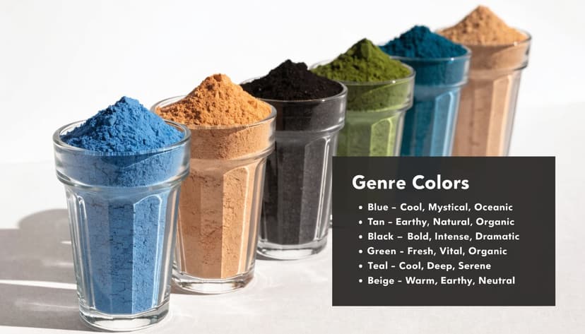
1. Leverage Color Psychology for Genre Recognition
A reader scrolling Amazon makes a judgment before the title is fully legible. Color usually makes that judgment happen.
A cover with deep blacks and sharp red accents signals danger fast. Warm pinks, creams, and soft golds suggest intimacy or emotional uplift. Muted neutrals can suggest literary fiction, historical fiction, or memoir, depending on the type and imagery around them. Classic color theory still matters here, but indie authors have to apply it in a digital storefront where a cover gets sorted in a split second beside dozens of close competitors.
Match the shelf before you try to break from it
Readers use color as a shortcut. If your cozy mystery is dressed like a military thriller, you create hesitation right where you need recognition. That hesitation costs clicks.
Study the top covers in your exact subgenre, not the broad category. Epic fantasy, dark fantasy, and cozy fantasy often use different temperature, saturation, and contrast levels. The same goes for dark romance versus sweet romance. Adobe's overview of color psychology in design is a useful starting point, but the practical test is whether your palette fits the books your reader already buys.
Practical rule: Choose the genre signal first. Add originality after the cover reads correctly.
A few choices usually improve results:
- Pick one dominant mood: Decide whether the cover should feel tense, tender, eerie, hopeful, or elegant. Build the palette around that single emotional target.
- Limit the palette: One main color, one support color, and one accent is often enough. Too many competing hues weaken recognition.
- Control contrast carefully: Strong contrast helps a cover stand out, but extreme contrast can make it feel harsh or cheap if the genre calls for subtlety.
- Test readability early: Run text and background combinations through a color contrast checker before you commit to the final direction.
- Compare at thumbnail size: A palette that feels rich at full size can turn muddy or flat when reduced for search results.
Originality still matters. It just works better after the cover clearly belongs on the right shelf. The best indie covers balance both. They follow enough genre convention to be recognized instantly, then use color choices with enough control to look current instead of interchangeable.
2. Master Typography Hierarchy and Readability
Typography is where many otherwise strong covers fail. The art may be solid. The concept may fit the book. But if the title is hard to read, the cover stops doing its job.
Your title usually needs to carry the most visual weight. Then comes the author name. Then any subtitle, series line, or tagline. When all text elements compete equally, nothing wins.
Make the title do the heavy lifting
A minimalist thriller can get away with one bold sans serif title. A literary novel may suit an elegant serif with generous spacing. A romance might pair expressive script with a stable secondary font. The trick isn't picking a “beautiful” font. It's building a hierarchy that survives reduction.
One of the most useful habits in any design process is to start simple and inspect the basics before adding complexity. That mirrors a core analytics principle. Researchers are advised to always start with descriptive statistics before building more complex models. Cover design benefits from the same discipline. Get the title, scale, spacing, and contrast right before you chase effects.
Here's what usually works better than authors expect:
- Use fewer fonts: Two is often enough. Three is usually the limit.
- Create clear size separation: The title should look intentionally more important than the author name.
- Adjust spacing manually: Default tracking and kerning often look clumsy on a cover.
Lead with legibility. Decorative flourishes come later.
Use a color contrast checker if your text sits over color or imagery. It's one of the easiest ways to catch a title treatment that looks stylish but reads poorly.
3. Design for Thumbnail and Multiple Format Sizes
Many covers are designed too large and judged too close. That's backwards for a digital-first market. Your cover has to work first as a thumbnail, then as a full-size image, then in print.
If it fails small, it fails where most discovery happens.
Shrink early, not at the end
A common mistake is building a detailed composition that looks rich on a large canvas but collapses when reduced. Thin lines vanish. Fine textures blur. Small type turns to mush. Background scenes become noise.
The safer approach is to design with the smallest important use case in mind. Build a cover that reads instantly in a storefront grid. Then add nuance that rewards a larger view.
A cover doesn't need to show everything. It needs to communicate enough, fast.
I also recommend testing beyond the book page itself. Drop the cover into mock retailer views, social posts, and ad placements. A title treatment that works on the book page may become weak in a mobile ad.
Useful checks:
- Reduce it repeatedly: View it at a small size throughout the process, not just before export.
- Keep essentials central: Title, author, and the primary image need to survive crops and scaling.
- Avoid fragile detail: Intricate ornaments and tiny symbolic objects often disappear.
If you want a good parallel outside publishing, thumbnail design for video faces the same problem. This guide to designing winning thumbnails with AI is useful because it reinforces the same reality. Small-format competition rewards clarity, strong shapes, and instant visual priority.
4. Create Strong Visual Focal Points
A cover needs one thing the eye lands on first. Sometimes that's the title. Sometimes it's a face, a symbolic object, or a sharp contrast area. Without that anchor, the design feels scattered.
The focal point is what gives the cover its first sentence. It tells the reader where to look and what matters.
Give the eye somewhere to land
I often see covers where every element has been treated as important. A textured background, multiple objects, decorative typography, atmospheric overlays, a subtitle, a badge, and a series label all compete at once. The result isn't richness. It's indecision.
Strong focal points come from contrast. That can mean bright against dark, large against small, sharp against soft, or simple against textured. Position matters too. Covers often feel more intentional when the main element sits slightly off-center rather than dead middle, especially in genres that benefit from a more contemporary look.
For a deeper explanation of how readers scan a design, visual hierarchy in graphic design is worth reviewing before you refine your layout.
A quick self-test helps:
- Blur the cover: If the main emphasis disappears, your focal point isn't strong enough.
- Look for one winner: Decide what should be seen first, second, and third.
- Protect that area: Give your focal point breathing room so nearby elements don't weaken it.
A thriller might use one red object against a dark field. A fantasy cover might center attention on a glowing artifact. A literary novel might let the title itself be the focal point. Different methods, same requirement. The reader should know where to look instantly.
5. Apply Genre-Specific Design Conventions
Readers don't browse books in a vacuum. They compare your cover to every similar title they've seen before. That's why genre conventions matter. They create familiarity fast.
Ignoring those conventions rarely makes a book look bold. More often, it makes the book look miscategorized or amateur.
Learn the rules before you bend them
A cozy mystery often benefits from warmth, charm, and a lighter illustrative approach. A science fiction novel might need cooler tones, cleaner type, and a sense of scale or futurism. Dark fantasy tends to embrace dramatic contrast and ornate or weighty typography. Romance can shift from playful to sensual to historical, and each subgenre signals differently.
What matters most is subgenre accuracy. “Fantasy” is too broad. “Paranormal romance” and “epic fantasy” ask for different cues. “Domestic thriller” and “military thriller” do too.
One practical way to think about this comes from product design. In software, a small portion of features often drives most usage, and many features are rarely used, according to Pendo's feature adoption analysis. Covers have a similar dynamic. A few high-signal elements usually do most of the work. Genre-appropriate typography, palette, imagery style, and composition matter more than a pile of extra embellishments.
Don't try to be unique in ten ways. Be unmistakable in the few ways readers actually notice.
A smart approach is to adopt the conventions readers need, then shift one element:
- Keep the familiar frame: Use the expected genre language in palette or typography.
- Change one note: Introduce a more unusual composition, object, or color accent.
- Avoid dated shortcuts: Some conventions persist because they work. Others linger because people copy old covers.
Good genre design doesn't feel generic. It feels legible to the market.
6. Balance Simplicity with Distinctiveness
The covers that look effortless usually involved a lot of restraint. Simplicity is powerful because it removes friction. But simplicity can also become bland if you remove the wrong things.
The better question isn't “How do I make this minimal?” It's “What deserves to stay?”
Edit until the message sharpens
I've seen many indie covers improve the moment one background texture, one font treatment, or one extra image layer gets removed. Each extra element has to justify its place. If it doesn't strengthen clarity, mood, or memorability, it's clutter.
Practical tips for designing often become less about adding and more about editing. White space helps. Limited color palettes help. Cleaner typography helps. But none of those choices matter if the core concept is weak. Distinctiveness still needs a memorable hook.
A useful exercise is to ask what the book's strongest visual promise is. Is it menace, tenderness, wonder, secrecy, grief, rebellion? Build around that one promise, not every subplot or character detail.
Try this filter:
- Remove one thing at a time: If the cover gets clearer, keep it out.
- Choose one complex element: Let one part be rich, then keep the rest disciplined.
- Use empty space actively: Space isn't wasted. It creates emphasis.
Minimal doesn't mean plain. A single object, a striking title treatment, or a disciplined palette can carry a cover very well if the choices feel intentional.
7. Implement Strategic Use of Imagery and Photography
The image on a cover should feel inevitable, not merely available. That's the standard. Readers may not say it that way, but they sense it immediately.
Generic stock imagery often fails because it looks borrowed rather than specific. It fills the space without deepening the book's identity.
Choose images that carry story, not just subject matter
A thriller doesn't become compelling because there's a woman running through fog. A romance doesn't become persuasive because there's an attractive couple on the front. The image has to express the right tone, level of intensity, and market position.
If you use stock, the best results often come from transforming it. Crop unexpectedly. Combine multiple assets. Shift the color grade. Use texture or lighting to create a distinct atmosphere. If you rely on a stock image exactly as it was sold, there's a higher risk your cover will resemble other books.
There's also a specific problem many authors run into. Rich, detailed imagery can look great until the title goes on top of it. Guidance around layered text on complex backgrounds is still thin, and designers often default to flatter compositions because they're easier to manage. That gap matters for genres like fantasy, romance, and thriller, where atmospheric backgrounds can be part of the appeal.
Rich imagery only works if the text still reads cleanly at every viewing size.
A few rules keep image-heavy covers under control:
- Judge the image behind live text: Don't approve the art first and hope the typography will fit later.
- Check licensing carefully: Commercial rights matter for KDP and print sales.
- Prefer strong shapes over tiny detail: The broad silhouette usually matters more than subtle textures.
Good imagery should support the cover's job, not create obstacles for the title.
8. Understand and Implement the Rule of Thirds
The rule of thirds is simple, and that's why it remains useful. Divide the cover into a three-by-three grid. Put key elements on the lines or at their intersections. The layout often feels more dynamic immediately.
This doesn't mean every cover should avoid centered composition. It means centered should be a choice, not a default.
Use the grid to avoid static layouts
A lot of covers feel amateur because everything is stacked mechanically in the middle. Centered text, centered image, centered balance. That can work for certain literary or classic treatments, but it often drains energy from the design.
Place a character slightly to one side. Drop the horizon higher or lower instead of splitting the cover in half. Let the title sit where it counterbalances the image rather than floating above or below it.
There's also a useful link to a broader design challenge. Existing design guidance often under-serves asymmetry, even though asymmetrical compositions can feel modern and deliberate when handled well. That gap matters for covers because the rectangular format, spine constraints, and thumbnail behavior all make balance more demanding.
Try this in practice:
- Move the main subject off-center: A small shift can make the cover feel much more intentional.
- Avoid a middle horizon line: It often creates a stiff, divided composition.
- Balance weight, not symmetry: A large dark shape on one side can be balanced by bright type on the other.
The rule of thirds isn't magic. It's just one of the quickest ways to make a cover feel considered instead of placed.
9. Ensure Accessibility and Inclusive Design
A reader finds your cover in a crowded Amazon category on a phone in sunlight. If the title fades into the background, the color contrast collapses, or the character image relies on a stereotype, the design has already lost ground before the sample is opened.
Accessibility starts as a reader issue. It quickly becomes a sales issue.
Digital-first storefronts are unforgiving. Covers are seen small, fast, and under poor viewing conditions. The same decisions that help readers with low vision or color-vision differences also help every shopper scan, recognize, and trust your cover more easily. Good accessibility usually improves clarity, and clarity improves performance.
Readability has to survive real viewing conditions
Test the cover where indie books live. Shrink it to thumbnail size. View it on a bright screen. Switch it to grayscale. If the hierarchy falls apart, the design is too dependent on ideal conditions.
Background art often causes the problem. A dramatic texture or photo can look strong at full size but interfere with the title once the cover is reduced. In those cases, the fix is rarely complicated. Darken the image behind the text, simplify the value range, increase type weight, or reduce decorative effects that blur letterforms.
For practical color guidance, see accessible color palettes for book covers.
A quick review catches most failures:
- Check contrast: Title and author name should separate clearly from the background at first glance.
- Test in grayscale: If hierarchy disappears without color, the cover is relying too heavily on hue.
- Avoid very thin fonts: Fine strokes break apart on retailer thumbnails and lower-quality screens.
- Watch text over busy images: Contrast is not just about color. Pattern and texture matter too.
Inclusive design also covers representation. Character styling, skin tone rendering, cultural symbols, age cues, disability markers, and gender presentation all shape reader expectations. Use references carefully. Avoid shorthand that turns a group into a visual trope. If a cover signals identity, it should do so with intention and respect, not with stock assumptions pulled from a genre feed.
Classic design theory meets indie publishing reality. Clear hierarchy, controlled contrast, and thoughtful imagery are not abstract ideals. They help a cover work across storefront thumbnails, ebook previews, print files, and a broader range of readers.
10. Master Iterative Design and Refinement Process
Strong covers rarely appear fully formed on the first attempt. They get better through comparison, adjustment, and selective testing. The key is to iterate with criteria, not just feelings.
That means changing one major variable at a time and judging the result against the same standards each round.
Start broad, then narrow
I prefer beginning with distinct directions rather than five nearly identical versions. One might be type-led. One might center an object. One might rely on atmosphere and silhouette. You learn more from contrast than from tiny cosmetic changes.
This mirrors a practical onboarding lesson from product design. Guided onboarding can increase product adoption by 15 to 25 percent, especially when users are led through the key steps that create value early. Cover design benefits from the same kind of structure. A defined sequence helps. Establish the concept, test the thumbnail, refine typography, then polish print details. Don't jump randomly between them.
If you want to test directions quickly, a free AI book cover tool can help you generate and compare early concepts before you commit to a final design path.
Useful refinement habits:
- Set evaluation criteria first: Readability, genre fit, distinctiveness, focal clarity, and print readiness are good starting points.
- Change one major thing at a time: If you alter palette, typography, and imagery together, you won't know what improved the result.
- Kill weak directions early: Not every concept deserves rescue.
A better cover usually comes from clearer decisions, not from more versions.
Iteration works when it stays purposeful. The goal isn't endless variation. It's a cover that communicates fast, fits the market, and still feels like your book.
10-Point Design Tips Comparison
A good cover decision has to survive contact with the actual storefront. A layout that feels impressive at full size can fall apart on a phone screen, and a genre-perfect concept can still miss if the title hierarchy is weak. That is why the best design choices sit at the intersection of classic principles and digital-first testing.
Use this table as a working comparison, not a scorecard. It helps indie authors weigh effort, cost, and likely payoff before spending time refining the wrong thing.
| Approach | 🔄 Implementation Complexity | ⚡ Resource Requirements | ⭐ Expected Outcomes | 📊 Ideal Use Cases | 💡 Key Advantage / Tip |
|---|---|---|---|---|---|
| Use Color Psychology for Genre Recognition | Medium, requires research and cultural checks | Low, palette tools, testing | ⭐⭐⭐⭐, faster genre recognition, stronger discoverability | Genre-driven retail categories (KDP thumbnails, browse pages) | Research common palettes in your category and test them at thumbnail size |
| Master Typography Hierarchy and Readability | Medium to High, typographic skill and testing needed | Low to Medium, fonts, contrast tools | ⭐⭐⭐⭐⭐, clear titles, better click-through potential, stronger credibility | Text-dominant covers, any thumbnail-critical context | Prioritize title legibility and keep size relationships clear, often in the 2 to 4 to 1 range |
| Design for Thumbnail and Multiple Format Sizes | High, responsive layouts across formats | Medium, templates, device testing time | ⭐⭐⭐⭐⭐, consistent branding and readability across platforms | Digital-first authors, ads, social marketing assets | Design small first at about 200×300px, then adapt with format templates |
| Create Strong Visual Focal Points | Medium, composition and visual weight decisions | Low to Medium, imagery or typographic treatment | ⭐⭐⭐⭐, stronger attention and better recall | Thrillers, fantasy, covers needing instant impact | Use contrast and placement to guide the eye, and confirm the focal point still reads small |
| Apply Genre-Specific Design Conventions | Medium, research and market alignment | Low, mood boards, genre references | ⭐⭐⭐⭐, clearer genre signals and better retail fit | New authors targeting specific genre audiences | Follow the expected signals, then change one controlled element to stand apart |
| Balance Simplicity with Distinctiveness | Medium, restraint and concept clarity required | Low, fewer assets, stronger concept work | ⭐⭐⭐⭐, cleaner presentation and better cross-size performance | Literary fiction, minimalist branding, bold indie titles | Remove anything that does not support the concept, and use space deliberately |
| Implement Strategic Use of Imagery and Photography | Medium to High, sourcing, licensing, composition | High, premium stock or commissioned shoots | ⭐⭐⭐⭐, improves perceived quality and makes the cover more distinctive | Romance, portrait-driven genres, curated visual brands | Pay for strong licensed imagery when the image carries the concept, and avoid generic stock |
| Understand and Implement the Rule of Thirds | Low, simple guideline to apply | Low, grid overlay in design tools | ⭐⭐⭐, more dynamic and balanced compositions | Most genres seeking visual sophistication | Place key elements near intersections, then break the grid only when the result is stronger |
| Ensure Accessibility and Inclusive Design | Medium, testing and inclusive sourcing | Low to Medium, contrast checkers, grayscale checks | ⭐⭐⭐⭐, wider usability and stronger professional standards | All covers, especially diverse or regulated markets | Check contrast, test in grayscale, and avoid type treatments that disappear for low-vision readers |
| Master Iterative Design and Refinement Process | Medium, structured workflow and evaluation | Medium, feedback rounds, version control, comparison testing | ⭐⭐⭐⭐⭐, better final decisions and fewer wasted revisions | Indie authors, iterative publishing workflows | Start with 3 to 5 distinct directions and change one major variable at a time |
The trade-off is simple. Some methods are cheap and fast but only help if the underlying concept is already sound. Others take more time or money, especially custom imagery and multi-format adaptation, but they pay off when a cover has to sell in crowded digital storefronts and still hold up in print.
For indie authors, the highest-return combination is usually readable typography, clear genre signaling, thumbnail-first composition, and a disciplined revision process. Those four choices do more practical work than decorative extras.
Your Next Steps to a Professional Cover
An effective book cover comes from disciplined choices. That's the thread running through all these tips for designing. Color should signal genre quickly. Typography should read instantly. Composition should guide the eye. Imagery should add meaning, not clutter. And every decision should hold up at thumbnail size, because that's where many readers will first encounter the book.
For indie authors, that matters more than ever. You're often publishing into a marketplace where the cover has to do several jobs at once. It has to compete in search results, look credible beside traditionally published books, stay readable on mobile, and still make sense when adapted for paperback, hardcover, and marketing assets. If the design only works in one context, it isn't finished yet.
The practical advantage is that cover design doesn't have to rely on instinct alone. You can test readability. You can compare layouts side by side. You can shrink the image and judge its performance objectively. You can review your category and see what visual conventions readers already recognize. That moves the process from guesswork to decision-making.
If you're hiring a designer, use these principles as a briefing tool. Ask direct questions about hierarchy, thumbnail performance, genre fit, and text legibility over imagery. If you're designing the cover yourself, use the same points as a review checklist before you upload anything to KDP.
It also helps to separate concept testing from final polishing. Early in the process, speed matters. That's where templates, mockups, or AI-assisted workflows can be useful. A tool like BeYourCover is one option for generating and refining initial cover directions from a title, genre, and summary, then adjusting typography, layout, and visual style as you narrow the concept. That kind of workflow won't replace judgment, but it can make iteration faster.
When you get to launch planning, remember that your cover also needs to travel well beyond the retailer page. You may use it in ads, announcement graphics, author posts, and press materials. If you're preparing supporting launch assets, this book press release example is a practical reference for how your cover may appear in broader promotional materials.
A professional cover doesn't need to be flashy. It needs to be clear, credible, and right for the reader you want to reach. If you apply that standard consistently, you'll make better design decisions at every stage.
Ready to Create Your Own Book Cover?
Turn your story into a visual masterpiece. Fill in the details below to start generating professional covers instantly.