What Is White Space in Design and Why It Matters for Your Book Cover
Learn what is white space in design and how to use it to create a professional book cover that boosts readability, focus, and sales on Amazon KDP.
Posted by
Related reading
Photos for Book Covers: A Complete Guide for Authors
Learn how to choose effective photos for book covers. This guide covers composition, sourcing, licensing, and technical specs for KDP-ready designs.
Create the Perfect Book Review Form: A Guide for Authors
Learn to design a book review form that delivers actionable feedback. This guide covers question design, distribution tactics, and using reviews for marketing.
Effective Backgrounds for Covers: KDP Guide 2026
Choose effective backgrounds for covers to grab attention on Amazon KDP. Our 2026 guide covers types, genre matching, composition, & technical specs.
Ready to design your cover?
Use our AI book cover generator to create tailored book cover concepts in minutes.


You hear designers talk about "white space" all the time, but what is it, really? Simply put, white space—often called negative space—is the unmarked area in a design. It's the breathing room around your text and images.
For indie authors preparing to publish on Amazon KDP, this isn't wasted space. It’s one of the most powerful tools in your arsenal for guiding a reader's eye, signaling professionalism, and ultimately, making a sale on a crowded digital bookshelf.
Why White Space Is Your Secret Weapon on Amazon
Picture a potential reader scrolling through hundreds of tiny book cover thumbnails on their phone. A cover packed to the edges with text and graphics becomes an illegible blur. It gets skipped over without a second thought.
Now, imagine a cover that uses space thoughtfully. The title pops. The central image is crystal clear. The genre and quality are communicated instantly. That’s the power of white space in action. This intentional use of "emptiness" actively works to make your cover perform better. To learn more about how design choices impact visibility, check out these tips on Amazon product listing optimization.
The Power of Clarity
The number one job of white space is to create focus and improve legibility. Research shows that generous white space can boost reading comprehension by as much as 20%. That's a massive advantage when a reader needs to grasp your title and author name in a split second.
A clean, well-spaced design—the kind you see in the strongest simple book cover designs—builds immediate trust and tells the reader you’re a professional. It subtly communicates that the story inside is just as thoughtfully crafted as the cover itself.
Think of white space as the silent partner in your design. It does the heavy lifting, turning a simple cover into a focused, compelling invitation that stops a casual browser dead in their tracks and turns them into a buyer.
From First Glance to Final Sale
A cover that breathes is a cover that sells. By creating a clear visual path, you guide the reader’s eye exactly where you want it to go—from your hooky title to your evocative imagery. Whether you’re designing from scratch or testing concepts with an AI tool, prioritizing white space is one of the smartest moves you can make. It’s not just an aesthetic choice; it’s a business decision that directly impacts your visibility and sales.
This table breaks down the tangible benefits of using white space and how each one translates into better performance for indie authors.
| Benefit | Impact on Your Sales |
|---|---|
| Increased Readability | Your title and author name are legible even as tiny thumbnails, leading to more clicks. |
| Professionalism & Trust | A clean, uncluttered design signals a high-quality book, reducing reader hesitation. |
| Improved Focus | It directs the eye to the most important elements (like the title or a compelling image). |
| Enhanced Genre Signaling | The mood created by white space helps instantly classify your book, attracting the right readers. |
| Better Brand Recall | A distinctive, clean design makes your author brand more memorable for future purchases. |
As you can see, what looks like "empty" space is actually packed with strategic value, working hard to convert casual browsers into loyal readers.
Understanding Macro and Micro White Space
To effectively use white space, you must understand that it works on two different levels: macro and micro. Nailing this distinction elevates your cover from looking accidental to intentional and professional.
Think of macro white space as the big-picture architecture of your cover. It’s the large, obvious gaps between your main elements—the space that separates your title from your central image, and the space between that image and your author name. This is the “breathing room” that gives your entire design a clean, organized feel.
Without enough macro space, a cover feels chaotic and claustrophobic. By using these larger empty areas with purpose, you cut through the visual noise and pull the reader’s eye exactly where you want it to go first.
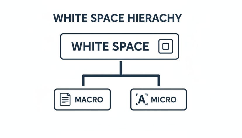
The Details that Matter
Micro white space is about the finer, more subtle spacing that holds the design together at a granular level. These are the tiny, often subconscious details that make a massive difference in how readable and professional your cover looks.
Micro white space includes:
- Kerning: The space between individual letters. Good kerning ensures letters in a word aren’t awkwardly squashed together or drifting apart.
- Tracking: The overall spacing across a whole word or line of text. This affects the text's density and gives it a specific stylistic feel.
- Leading (Line Spacing): The vertical gap between lines of text. Squeeze them too tight, and it’s a nightmare to read. Spread them too far, and the lines feel disconnected.
These tiny tweaks are what separate a decent design from a truly great one. While macro space lays the foundation, micro space is the final coat of polish that signals quality to a potential reader.
Here’s a good way to think about it: A house. Macro white space is how you arrange the rooms—the kitchen here, the living room there. Micro white space is how you arrange the furniture inside each room. You need both to create a space that’s balanced, functional, and feels good to be in.
Ultimately, both types work together to create a smooth experience for the person browsing for their next read. As you design your cover, perhaps by testing ideas with an AI tool, keep an eye on both the big picture (macro) and the small details (micro). Being deliberate about spacing on both levels will give your cover a huge leg up on the crowded Amazon marketplace.
Creating a Clear Visual Hierarchy
This is the single most important job white space has on your book cover: creating a visual hierarchy. Think of it as an invisible tour guide for the reader's eyes, telling them exactly where to look first, second, and third. You control this path by strategically placing empty space around your cover elements.
Want your title to be the star of the show? Surround it with a generous amount of breathing room. The more important the element, the more space it gets. This control lets you guide a potential reader from your killer title to an intriguing image, and finally, to your author name.
This hierarchy is what turns a casual glance into genuine interest. In design, this isn't "wasted space"—it’s the silent hero that brings order to your cover. It's especially crucial for nonfiction, where clarity is king. This idea is backed by Gestalt psychology; the law of proximity states that we see objects close to each other as a group. White space is how you create those groups, making a cover instantly understandable—a massive advantage when someone's scrolling online.
Directing the Reader’s Gaze
Imagine your cover is a map. If it's cluttered with no clear roads (white space), a visitor will get lost and frustrated. A busy design forces the brain to work too hard, and most people will just keep scrolling. By using space with intention, you create an effortless journey that makes your cover's message crystal clear. This concept of using space for clarity isn't just limited to covers; you can see similar principles in data visualization best practices.
A strong visual hierarchy doesn't just make a cover look "good"; it makes it functional. It’s the difference between a cover that gets ignored and one that begs to be clicked.
The Trio of Importance
For the vast majority of book covers, the hierarchy follows a simple, time-tested pattern. By carefully managing the space around these three core elements, you can ensure your cover communicates its message in a heartbeat.
- Primary Element (The Hook): Your Title. This should almost always get the most white space. It has to be the first thing a reader sees and understands, even as a tiny thumbnail on a store page.
- Secondary Element (The Emotion): Your Main Image or Graphic. This is what pulls the reader in emotionally. It needs to be clear and powerful but shouldn't fight with the title for the top spot.
- Tertiary Element (The Credit): Your Author Name. While obviously important, your name is usually the last thing a new reader processes. It needs its own space to be perfectly legible, but it shouldn't overpower the title.
This structure works because it mirrors how people naturally scan for information. Of course, striking the right balance here is deeply connected to your font and layout choices. To see how these pieces all fit together, check out our complete guide on typography for book covers.
Common White Space Mistakes to Avoid
Knowing what white space is and why it matters is half the battle. Now comes the hard part: avoiding the traps that even well-intentioned authors fall into. A few simple mistakes can instantly undermine your cover's impact, making it look amateurish.

The biggest pitfall is the urge to "fill the canvas." Many authors think more is more, cramming every spare inch with taglines, blurbs, and busy images. The impulse makes sense—you're proud of your story and want to convey everything at once! But it almost always backfires, creating visual noise that overwhelms a potential reader.
Instead of drawing people in, a cluttered cover makes their eyes glaze over. There’s no clear focal point, and your brilliant title gets lost in the chaos.
Trapped Space and Wobbly Margins
Another common mistake is creating trapped negative space. This happens when you get awkward, unintentional gaps between elements. These little pockets of space don't guide the eye; they distract it, pulling attention away from your title and main image. The whole thing starts to feel accidental and disjointed.
Just as bad are inconsistent margins. When the space between your text and the edge of the cover is all over the place, it throws the entire design off-kilter. It’s a dead giveaway of an amateur design, creating a subtle feeling of imbalance that can make a reader question the quality of the book inside.
The secret to avoiding these mistakes is intentionality. Every bit of space on your cover, empty or not, needs to have a job. Ask yourself: is this space guiding the reader or just getting in the way?
A Checklist for Common Pitfalls
Run through this simple checklist to keep your design looking sharp and professional. It's especially useful when refining concepts from an AI generator, helping you select the strongest layouts.
- Is There a Clear Focal Point? At a glance, where does your eye land? If it isn't immediately on the title or main image, you likely have too much clutter.
- Are Your Margins Consistent? Look at the space on the top, bottom, left, and right. A steady frame gives the design a feeling of stability and polish.
- Does the Space Flow Naturally? The empty space should create a smooth path between elements, not awkward dead ends. A good layout guides the reader from the title to the image to your author name without them even thinking about it.
- Is There Enough Breathing Room? Every important element deserves its own space. Your author name shouldn't be jammed up against the title. Generous spacing signals importance and makes everything easier to read.
By consciously protecting that empty space, you give your most important elements the room they need to shine. Keeping these common mistakes in mind will ensure your cover looks polished, professional, and ready to grab a reader's attention.
Practical Tips for Using White Space on Your Cover
Knowing the theory is one thing, but putting it into practice is where your cover will either sink or swim. The good news is that making white space work for you doesn’t require a design degree. A few simple gut checks can tell you if you’re using negative space to its full potential.
The real secret is to think like a reader scrolling through Amazon. They aren't seeing your cover full-screen—they're seeing a tiny thumbnail surrounded by dozens of others. This is the moment of truth for your white space.
Perform the Thumbnail Test
This is, without a doubt, the most important test you can run. Shrink your cover down to the size of a postage stamp on your computer screen.
- Does your title pop? If it gets muddy or blends into the background, it’s a sure sign you need more macro white space around it.
- Is the main image clear? The breathing room around your central graphic is what makes it instantly recognizable, telegraphing genre and mood in a split second.
- Can you read your name? Your author name needs enough space—both micro and macro—to be legible, even when it's tiny.
If your cover fails this test, readers will scroll right past it without a second thought. Generous spacing is what makes your most important elements powerful and effective at a small scale.
Create a Stable Frame with Margins
Nothing signals an amateur design faster than elements crammed right up against the edges of a cover. Consistent, balanced margins are a hallmark of professional design. The space between your text, your graphics, and the four edges of the cover needs to feel intentional.
When margins are uneven or too tight, the whole design feels unstable and rushed, which can subconsciously erode a reader’s trust in the quality of your book.
Ask yourself: Does the space around my key elements feel generous and purposeful, or tight and accidental? The goal is to create a sense of calm and focus, allowing your cover's message to be received instantly.
Guide the Reader’s Eye
Effective design isn't random; it’s about control. You can use white space to create a natural path for the reader's eyes to follow. For most Western audiences, this path is a "Z-pattern"—starting at the top-left (usually the title), scanning across, then dropping down to the bottom-left before settling on the bottom-right (often the author name).
By clearing out the clutter and arranging your elements in a clean field of negative space, you guide the reader along this path without them even realizing it. It just feels right. For a deeper look at layouts and other critical components, check out our comprehensive guide of book cover design tips.
When testing different layouts, perhaps with an AI tool, you'll find that the best options already respect these principles of visual hierarchy. From there, you can fine-tune the spacing to perfectly match your vision.
White Space Is Your Most Powerful Design Tool
Ultimately, white space isn’t an absence of design—it is the design. It's the active ingredient that brings clarity, sophistication, and focus to your book cover. By learning to embrace that negative space, you empower your title to be read, your imagery to be felt, and your professionalism to be seen.
This simple shift in perspective is what allows indie authors to create covers that genuinely compete in a crowded market.
So, as you work on your next cover, maybe while testing ideas with an AI tool, challenge yourself to look beyond the text and images. Pay close attention to that crucial, unmarked space in between.
That space isn’t empty—it’s full of potential. It’s where you’ll find the clarity and impact that drives clicks and, ultimately, drives sales.
Common Questions About Using White Space
Getting the hang of white space can feel a bit like learning a new language. Here are answers to a few common questions from authors trying to find the perfect balance on their own covers.
How Much Is Too Much White Space on a Book Cover?
There’s no magic number—it comes down to your genre. A literary novel or a sharp business book might use 40-50% negative space to create a feeling of elegance and focus, the hallmark of the best minimalist book cover examples. On the flip side, an epic fantasy cover bursting with action will use much less to convey a world teeming with detail.
The real test is function. Does your cover feel intentional and clean, or just empty? If your key elements feel like they’re floating away from each other, you’ve probably gone too far. The thumbnail test is your best friend: shrink the cover down to the size it would be on an Amazon search page. If the title and main image are still crystal clear, you've likely found the sweet spot.
Does "White Space" Have to Be White?
Not at all. This is a common misconception. Think of “white space” as a designer’s term for breathing room. It’s any unmarked area on your cover, no matter the color.
It could be a solid black background, a soft, moody gradient, or even the blurred part of a photograph. The goal is simply to give the viewer’s eye a quiet place to rest, which makes the important stuff—like your title and author name—pop. That’s why you’ll see so many powerful romance covers that lean on white space that use deep, rich colors as their "white space" to create a dramatic mood.
Can an AI Tool Help Me Get This Right?
Absolutely. A well-designed AI tool can provide a fantastic starting point. An AI cover generator trained on professional designs already understands the core principles of spacing and hierarchy for different genres. It will often produce concepts with a solid compositional foundation.
From there, you can act as the art director, fine-tuning the micro-spacing yourself. Nudging text up a few pixels or adjusting the distance between elements is how you take a good design and make it great, ensuring your cover has the professional polish it needs to compete.
Ready to Create Your Own Book Cover?
Turn your story into a visual masterpiece. Fill in the details below to start generating professional covers instantly.