How to Use Unity in Graphic Design for Better Book Covers
Learn how unity in graphic design transforms book covers. Discover practical principles to create cohesive, genre-perfect designs that attract readers.
Posted by
Related reading
Photos for Book Covers: A Complete Guide for Authors
Learn how to choose effective photos for book covers. This guide covers composition, sourcing, licensing, and technical specs for KDP-ready designs.
Create the Perfect Book Review Form: A Guide for Authors
Learn to design a book review form that delivers actionable feedback. This guide covers question design, distribution tactics, and using reviews for marketing.
Effective Backgrounds for Covers: KDP Guide 2026
Choose effective backgrounds for covers to grab attention on Amazon KDP. Our 2026 guide covers types, genre matching, composition, & technical specs.
Ready to design your cover?
Use our AI book cover generator to create tailored book cover concepts in minutes.


Think of your book cover as an orchestra. You have different instruments—the fonts, the images, the color palette. Unity in graphic design is the conductor that brings them all together, ensuring every element plays in harmony to create one powerful, cohesive message.
Why Unity Matters on a Crowded Digital Bookshelf
For an indie author, understanding unity isn't just an artistic skill; it's a critical sales tool. On a fast-scrolling marketplace like Amazon KDP, your cover has less than three seconds to make a connection. A unified design does that instantly, sending a single, clear message about your book's genre and tone. It’s what makes your ideal reader stop and say, "This looks like my kind of book."

This is what separates a cover that looks polished, professional, and current—the hallmark of the best modern book cover examples—from one that just feels… off. When a cover is disjointed, with elements that clash or fight for attention, a potential reader will scroll right past. They'll assume, perhaps unconsciously, that the writing inside is just as amateurish. A cohesive design, on the other hand, builds instant trust and piques their curiosity.
The Connection Between Cohesion and Clicks
The effect of a unified design isn't just theoretical. The global graphic design market data shows how much thoughtful design shapes consumer behavior. In the competitive world of KDP, a cover that communicates clearly is essential for getting noticed.
A unified cover nails several crucial jobs for your book:
- Communicates Genre Instantly: Consistent visual language, like the dark, moody tones you see on most thriller book covers, immediately tells a reader what they're getting into.
- Builds Professional Credibility: A design where everything just works signals a high-quality product. It encourages readers to take a chance on an author they’ve never heard of.
- Creates an Emotional Connection: By aligning color, imagery, and typography, your cover evokes a specific feeling—whether it's suspense, romance, or high-flying adventure—that hooks the exact readers you're looking for.
Ultimately, unity in graphic design ensures that every piece of your cover works together to answer a reader’s most important question: “Is this book for me?”
When all the elements are pulling in the same direction, the answer becomes a clear and confident "yes." This cohesion doesn't just help with that first click; it strengthens your author brand, making your work memorable and helping you build a loyal readership over time. Think of it as your first and most effective marketing pitch.
The Core Principles for Achieving Visual Unity
So, how do you actually create unity in a design? It isn't a mystical formula. It comes down to a handful of core principles that, when used together, create that seamless harmony you’re looking for. Think of them as the fundamental tools in your design toolkit.
When these elements are combined with intention, the whole design just clicks. It feels complete, professional, and speaks directly to your ideal reader without any confusion.

This kind of thoughtful design is becoming more important than ever as reader expectations climb. For indie authors, applying these principles of unity can directly translate into better visibility and a more professional appearance on digital bookshelves.
Let's break down the key principles you'll use to build that unity.
Proximity and Grouping
The principle of proximity is simple: things that are close together feel like they belong together. On a book cover, this means your title and subtitle should be grouped tightly, while your author name gets its own space. It creates an instant visual logic that readers understand in a fraction of a second.
When elements are scattered all over the place, the brain has to work overtime to figure out what’s going on. That confusion is the enemy of a good cover. Grouping brings order from chaos.
Repetition and Consistency
Repetition is the steady rhythm that ties your entire design together. It’s about using the same elements over and over—a specific font, a color, or even a shape—to create a sense of belonging among all the different parts. It’s what makes a design feel like a cohesive whole rather than a random collection of items.
For authors writing a series, repetition is an absolute must. Using the same typography and layout for your name and series title across every book builds a brand that readers can spot from a mile away. Even on a single book, repeating a key color from the main image in your title text forges a powerful, unified connection. You can go deeper on this in our guide on the principle of design repetition.
Alignment and Order
Alignment is the invisible scaffolding that gives your cover structure and professionalism. It’s the grid that all your text and images stick to. Whether you choose to center-align, left-align, or right-align your elements, the key is consistency. A consistent alignment scheme stops a cover from looking sloppy and accidental.
A cover with strong alignment feels stable and well-organized, signaling to the reader that the content inside is just as thoughtfully constructed. It’s a subtle cue that builds immense trust.
Contrast and Focus
Here’s the interesting part: while unity is about harmony, contrast is what makes it exciting. Contrast is all about making certain elements stand out, whether you do it with size, color, or style. A big, bold title against a soft, muted background is a classic example of using contrast to grab the reader’s eye and point it right where you want it.
Without any contrast, a design can feel flat, boring, and forgettable. But when you use it with purpose, it creates a clear visual hierarchy, directs the reader's attention, and adds a dynamic punch that makes your cover pop on a crowded digital shelf. While these principles are critical for book covers, they're universal in visual communication. For another perspective, this article on website design for startups shows how these same ideas create cohesion in a different medium.
To tie this all together, here’s a quick-reference table breaking down how each principle applies directly to your book cover.
Key Principles of Unity for Book Covers
| Principle | What It Means | Book Cover Application |
|---|---|---|
| Proximity | Grouping related items together to create a visual relationship. | Place the title and subtitle close to each other, separate from the author's name. |
| Repetition | Using the same or similar elements throughout the design. | Use the same font family for all text, or repeat a specific color from the artwork in the title. |
| Alignment | Arranging elements along a common line or margin. | Align all text to a single axis (left, center, or right) for a clean, professional look. |
| Contrast | Making certain elements stand out to create focus and hierarchy. | Make the title much larger or bolder than the author's name to establish what's most important. |
Think of these principles not as rigid rules, but as reliable tools. By consciously applying proximity, repetition, alignment, and contrast, you can move from a design that simply looks okay to one that feels complete, intentional, and incredibly effective.
How Unity Connects Your Cover to Genre Expectations
Think of unity as the visual handshake between your book and its ideal reader. It’s the fastest, most effective way to signal, “Hey, this story is exactly what you’re looking for.” Every genre has a distinct visual language that fans instantly recognize—often without even thinking about it—while scrolling through Amazon.
A disjointed cover sends confusing, mixed signals. But a unified one? That’s a powerful magnet. When your font, imagery, and colors all work together to reinforce the same genre message, your cover becomes instantly recognizable to fans scanning dozens of tiny thumbnails. This isn't about being derivative; it's about speaking the language your audience already understands.
Decoding Genre With Unified Visuals
Take a look at the clear, unspoken rules of different genres. A thriller cover almost always uses high-contrast visuals, dark and cool color palettes, and sharp, bold typography to build a sense of danger and suspense. Every single element works in unison to scream “page-turner.”
Now, pivot to a contemporary romance cover. You'll likely see bright, warm colors, soft-focus photography, and a light, elegant script font. The unity here comes from creating a feeling of warmth, connection, and optimism. A potential reader can peg the genre in a split second because every design choice lines up perfectly with their expectations.
A unified design doesn’t just show readers what your book looks like—it tells them what it feels like. This emotional connection is what stops the scroll and earns the click.
The Critical Role of Color and Typography
Color is hands-down one of the most powerful tools for establishing genre unity. The specific hues you choose can immediately set the tone and align your cover with what readers are looking for. Dark blues and grays suggest mystery, while vibrant pinks and oranges point toward lighthearted fiction. For a deeper dive, understanding some key concepts from popular books on color psychology can give you a massive edge.
Typography works the exact same way. The font you'd pick for a sweeping historical fiction novel is going to be worlds apart from one for a gritty sci-fi epic. A unified design ensures your title's font style complements the cover image rather than fighting with it.
- Thriller: Sharp, sans-serif fonts, often with a distressed or textured effect.
- Romance: Elegant script fonts or clean, modern serifs.
- Fantasy: Ornate, stylized fonts that suggest magic and adventure.
- Sci-Fi: Geometric, futuristic fonts with clean lines.
By harmonizing these elements, you're not just making a pretty picture. You are building a cohesive, genre-specific package that tells Amazon shoppers exactly what kind of story they are about to get. That kind of clarity is absolutely essential for turning browsers into buyers.
A Practical Checklist for a Unified Book Cover
Let's move from theory to a cover that actually sells. Creating a unified design isn't a mystical art—it’s a clear, repeatable process. Think of the steps below as your pre-flight checklist before you hit "publish" on KDP. It’s about making intentional choices that all point in the same direction.
Each step naturally flows into the next, building a cascade of smart, cohesive decisions. If you want to get really organized, using a visual identity guide template is a fantastic way to document your choices and keep everything consistent.
The 5-Step Unity Checklist
Work through these five steps in order. Doing so will cut out the guesswork and focus your creative energy where it truly counts: grabbing a reader's attention.
-
Define Your Core Message. Before you even think about opening a design tool, you need answers to three questions. What’s the genre? What’s the primary tone (e.g., suspenseful, romantic, adventurous)? What’s the single most important theme? Everything else you do will flow from these answers.
-
Pick a Harmonious Color Palette. You really only need three core colors to set the mood. Choose one to be dominant, a second for support, and a third as an accent. That’s it. And make sure these colors feel right for your genre. Dark, moody blues for a thriller; warm, soft pastels for a romance. You get the idea.
The flowchart below shows how this works in practice, aligning visual signals with specific genres.
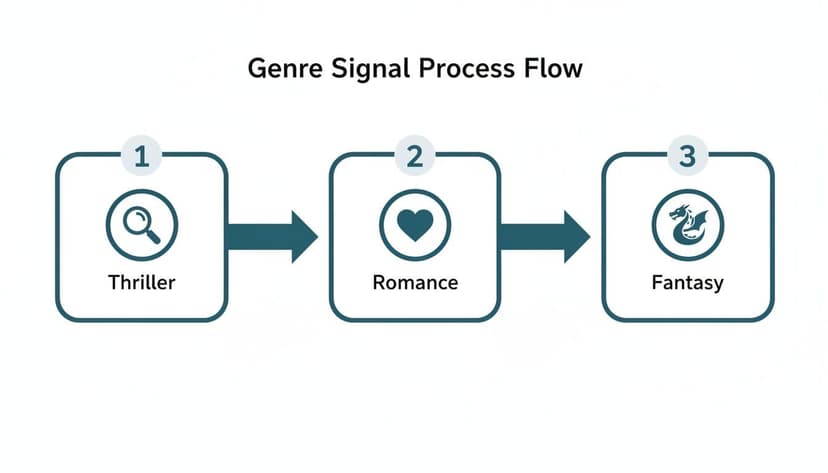
You can see how distinct visual cues for genres like thriller, romance, and fantasy create instant recognition. That’s unity at work.
-
Establish a Typographic Hierarchy. Your fonts need to have a job to do, and that job is to communicate importance. The title must be the loudest thing on the cover, visually speaking. The author's name comes next. If you're just starting out, our guide on the best fonts for book covers is packed with tips to make your text readable and on-brand for your genre.
-
Choose Congruent Imagery. Whatever main image or graphic you use, it has to match the mood you've already established with your colors and theme. A gritty, high-contrast photo has no business on a lighthearted rom-com cover. Every single visual element needs to tell the exact same story.
-
Organize with Alignment and Proximity. This is the secret sauce that separates amateur covers from professional ones. Use an invisible grid to align all your text. Group related items, like the title and subtitle, close together. It’s a simple trick that brings instant order and polish to your design.
How Technology Can Help
Modern tools make achieving unity much easier. For instance, creating and testing covers with an AI tool allows an indie author to quickly explore different unified concepts. You can generate multiple variations for a single project, which makes finding the perfect look much faster. This kind of rapid iteration is key to achieving genre-specific cohesion. You can test a dozen color palettes or font pairings in minutes, all while the core principles of good design hold everything together. This gives you a significant advantage in finding the one cover that truly connects with readers.
Common Mistakes That Wreck Cover Unity
Achieving that perfect sense of unity on a book cover can be tricky, and it’s surprisingly easy to get wrong. Even with the best intentions, a few common missteps can turn a promising cover into a confusing mess that sends readers scrolling.
Knowing what these pitfalls are is the first step to dodging them completely.

These errors usually happen when you try to do too much at once. The result is a design where every single element is screaming for attention, creating a chaotic and unprofessional vibe that kills your book's credibility before anyone even reads the blurb.
Pitfall #1: The Ransom Note Effect (Too Many Fonts)
One of the most frequent and jarring mistakes is piling on too many different fonts. When your title, author name, and tagline are all in wildly different styles, the cover starts looking like a ransom note cobbled together from magazine clippings. It’s an instant deal-breaker for professional cohesion.
This creates a ton of visual noise, making it impossible for a reader’s eye to find a place to rest. Instead of a clear path, you’ve got a typographic battle where nothing wins.
How to Fix It:
- Limit your choices. Stick to a maximum of two font families. A classic approach is one for the title and a second for the author name and other text. It's a safe and effective rule.
- Use variations. You can create plenty of contrast by using different weights (bold, regular, light) or styles (italic) from the same font family. This gives you variety without sacrificing unity.
Pitfall #2: Clashing Colors and Visual Overload
Another common problem is a color palette that feels random or just plain hurts to look at. Throwing a bunch of bright, competing colors onto a cover is visually exhausting for a potential reader. The same goes for colors that don't match your genre’s tone—like neon green on a historical romance cover. It creates instant confusion.
A disorganized color scheme sends a mixed message. It fails to establish a clear mood, leaving the reader unsure of what kind of emotional experience your book offers.
This mistake often happens when an author wants every element to "pop." But when everything shouts, nothing is heard. It’s especially damaging on thumbnail-sized images, where all those clashing colors just dissolve into an unreadable blur.
Pitfall #3: Imagery That Contradicts the Tone
Your cover image is your story’s visual ambassador. If it doesn't match the book's mood, unity is impossible from the start. A lighthearted, cartoonish illustration on a gritty thriller cover is a classic example of this disconnect. It promises one experience while the story delivers another—a surefire way to disappoint readers.
This mismatch can be subtle, too. Maybe the model’s expression feels too modern for your historical fiction, or the stock photo has a corporate vibe that just doesn't fit your epic fantasy. For instance, you wouldn't use a bright, cheerful setting for a dark fantasy book cover example exploring grim themes.
The image must feel like it was born from the world of your story, reinforcing the very atmosphere you've worked so hard to create.
So, you've designed a cover you love. It looks great on your big screen, but how do you really know if it’s working? Before you commit, it’s time to step away from your personal taste and put it through two brutally honest tests.
The Squint and Thumbnail Tests
First up is the squint test. Tape your cover to a wall a few feet away, or just hold it at arm's length. Now, squint until the whole thing blurs.
What do you see? If the most important parts—usually your title and the main focal point of the art—still pop, you're on the right track. If everything just melts into a murky, indistinct blob, it means your visual hierarchy and contrast aren't strong enough.
Next, and this one is non-negotiable, is the thumbnail test. Shrink your cover down to the tiny size it will be on an Amazon or Goodreads search page. Seriously, make it about an inch tall.
Can you still read the title? Does the core concept of the image still come across? If the answer is no, it will be completely invisible to a reader scrolling past dozens of other books. It simply won't get the click.
A cover that passes these tests proves its unity in graphic design is more than just a pretty picture. It's a functional sales tool that works where it matters most—in a crowded online marketplace.
A great way to approach this is to generate several variations of your cover. You can even use an AI tool for this to get different concepts quickly. Then, run each one through these tests to see which performs best. This lets you move from "I think this looks good" to "I have data showing this one works."
Frequently Asked Questions About Cover Unity
Here are a few common questions I hear from indie authors trying to nail unity in graphic design for their book covers.
Can a book cover be too simple?
No, but it can be unclear. Simplicity is often your best friend. A minimalist design—one built from proven minimalist cover design ideas like powerful typography, one clear focal point, and a tight color palette—can be incredibly striking and stick in a reader's mind far longer than a busy one.
The real question isn't about complexity, but about clarity. Does that simple, unified design tell the right story about your book's genre and tone? A stark, clean cover might scream "must-read" for literary fiction, but that same approach could feel completely out of place for an epic fantasy novel. It’s all about matching the design’s energy to the story’s soul.
How do I keep my book series looking cohesive?
When it comes to a series, unity isn't just a nice-to-have; it's the glue that holds your author brand together. The key here is the principle of repetition.
You’re essentially creating a visual brand identity for the series by using the same core elements on every cover. Here's a checklist:
- Consistent Typography: Lock in the same font and placement for your author name and series title. Don't change it.
- A Familiar Layout: Stick to the same underlying grid or structure for each cover. The reader's eye should know exactly where to look.
- Cohesive Color Grading: Even if the colors change, apply a similar filter, saturation, or overall color treatment to tie them all together.
The main image will obviously change to reflect what’s happening in each book, but those repeating elements act as an instant signal. Readers see it and think, "Oh, it's a new book in that series I love!" It’s a powerful trigger for impulse buys.
Can I use an AI tool and still create a unique cover?
Yes. Modern AI cover creation tools aren't just spitting out generic templates; they're designed to create unified concepts based on proven genre conventions and your unique creative direction. The value is in how you use the tool.
Think of it as a creative partner. You can generate a dozen distinct ideas in minutes, then refine your prompts to get closer to your vision. Swap out an image, play with the typography, or adjust the mood. This process lets you combine the AI's ability to create cohesive layouts with the soul of your story, giving you a cover that’s both professionally unified and genuinely yours.
Ready to Create Your Own Book Cover?
Turn your story into a visual masterpiece. Fill in the details below to start generating professional covers instantly.