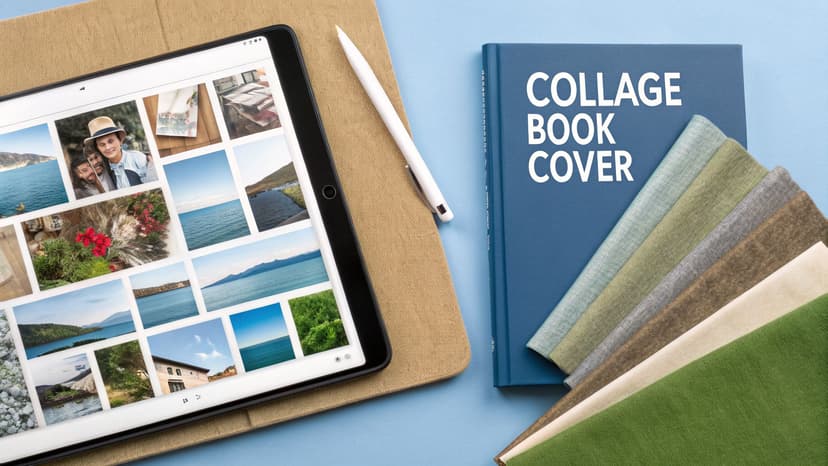
A Guide to Digital Collage Art for Book Covers
Learn to create stunning book covers with digital collage art. Our guide covers tools, techniques, and AI-assisted workflows for indie authors.
Posted by
Related reading
Photos for Book Covers: A Complete Guide for Authors
Learn how to choose effective photos for book covers. This guide covers composition, sourcing, licensing, and technical specs for KDP-ready designs.
Create the Perfect Book Review Form: A Guide for Authors
Learn to design a book review form that delivers actionable feedback. This guide covers question design, distribution tactics, and using reviews for marketing.
Effective Backgrounds for Covers: KDP Guide 2026
Choose effective backgrounds for covers to grab attention on Amazon KDP. Our 2026 guide covers types, genre matching, composition, & technical specs.
Ready to design your cover?
Use our AI book cover generator to create tailored book cover concepts in minutes.


Think of your book cover as a visual recipe. You're not just using a single ingredient; you're blending photos, textures, and typography to create a richer story. That’s the core strength of digital collage art—it’s a powerful technique that lets indie authors design a unique, evocative image that communicates a book's essence at a glance.
What Is Digital Collage Art for Book Covers
At its heart, digital collage is the art of combining multiple images and other visual elements within a software program to create one cohesive artwork. For an indie author publishing on KDP, this is a secret weapon for creating a cover that stands out in the endless scroll of an Amazon product page. It allows you to move past a single, generic stock photo and build a visual narrative, layer by layer.
This method is about more than aesthetics; it's a storytelling tool. By carefully blending different visual elements, you gain precise control over the mood, genre, and themes your cover communicates. This is essential for authors whose stories sit between genres or have complex emotional arcs that are difficult to capture with a single image.
To understand how a digital collage cover works, it helps to break it down into its core components. Each piece serves a specific purpose in conveying your book's story.
Here's a breakdown of the key elements you'll be working with:
Core Elements of Digital Collage Book Covers
| Element Type | Description | Purpose for an Author |
|---|---|---|
| Base Image | The foundational photo or texture that sets the scene. This could be a landscape, a portrait, or an abstract background. | Establishes the primary mood, setting, and color palette. It’s the canvas for your story. |
| Focal Point | The main subject or symbol layered on top. This is often a character, an object, or a key symbolic image. | Draws the reader’s eye and immediately communicates the central theme or conflict of the book. |
| Textural Overlays | Subtle layers like film grain, scratches, paper textures, or grunge effects. | Adds depth, atmosphere, and a tactile feel. A distressed texture can signal a historical or gritty story. |
| Symbolic Elements | Smaller images or icons that add narrative context, like a raven for a gothic tale or a broken clock for a time-travel story. | Provides layers of meaning and rewards readers who look closely, hinting at subplots or key motifs. |
| Typography | The font, size, and placement of your title and author name. | Not just text, but a design element. The style reinforces genre—serifs for literary fiction, bold sans-serifs for thrillers. |
Each element is a deliberate choice. When you combine them effectively, you're not just designing a cover; you're building a visual promise to your reader about the experience waiting inside.
From Analog Craft to Digital Powerhouse
While collage began as a physical art form, the digital age turned it into a creative powerhouse for creators. When programs like Adobe Photoshop arrived, the stage was set for a massive surge in digital creativity. Today, a significant percentage of self-publishers depend on digital tools for their cover design to control costs and creative vision. You can learn more about this journey in this brief history of collage.
The biggest advantage of digital collage is its flexibility. Unlike working with paint or glue, you can endlessly experiment with layouts, colors, and textures without permanent commitment. This "non-destructive" workflow is perfect for authors who need to try out different ideas before settling on a final design.
Why It Matters for Indie Authors
For authors selling on platforms like Amazon KDP, the cover is your single most important marketing tool. Digital collage offers a path to creating a bespoke visual identity that feels custom and intentional, not like something pulled from a stock photo library.
It allows you to weave key symbols, character likenesses, and specific setting details into one unified design. For instance, a cover for a thriller book might merge a shadowy figure with a stark cityscape and a distressed texture to build immediate suspense.
This approach often pulls inspiration from various visual media, and the final results can even look like collectible pop culture art prints. Ultimately, creating a great collage cover comes down to making smart choices about:
- Source Imagery: Picking the right photos, illustrations, and textures that align with your story.
- Composition: Arranging all the pieces to guide the viewer's eye to your title and the most important visuals.
- Typography: Choosing fonts that feel like a natural part of the artwork, not just text placed on top.
You can also use AI tools to generate initial collage concepts or test variations, which can then be refined. This blend of automated assistance and hands-on control helps authors produce professional-quality covers that are a true reflection of their vision.
Essential Tools for Your Digital Collage Cover
 To bring your digital collage art concept to life, you need to choose the right tool. The software you select involves a trade-off between creative control, cost, and the time you’re willing to spend learning. As an author, your goal is to find the sweet spot that works for your timeline and budget.
There are three main paths you can take. Understanding the pros and cons of each is key to making a decision that won't lead to frustration during the design process.
Professional Design Software
This category is dominated by heavyweights like Adobe Photoshop. These programs offer absolute, pixel-perfect control. For creating the kind of seamless, professional-grade collage that sells books, features like advanced masking, blending modes, and color correction are non-negotiable.
However, that power comes with a price. The learning curve can be steep, and monthly subscription fees may be a challenge for some self-published authors. This route is best if you already have design experience or are prepared to invest significant time in learning a new skill.
User-Friendly Web Editors
Platforms like Canva or Fotor have made design more accessible with drag-and-drop interfaces and large libraries of templates and stock elements. You can assemble a decent-looking cover quickly, with minimal technical expertise.
The main drawback here is creative limitation. While they are easy to use, you may hit a wall when trying to create something truly unique. These editors often lack the sophisticated layering and blending options that define high-quality digital collage art, which can sometimes result in a more generic look.
AI-Powered Cover Generators
A newer class of tools uses artificial intelligence to bridge the gap between professional software and simple editors. These platforms can generate numerous genre-aware cover concepts from a book's summary or a descriptive prompt.
You can then use built-in editors to tweak the concepts—adjusting text, swapping elements, and fine-tuning colors—without needing to master complex software. This is a practical way to get a strong, professional starting point that saves time while still allowing for final creative input.
The Bottom Line: Your tool choice defines your workflow. Professional software offers total freedom but demands skill and budget. Web editors are fast and simple but creatively limiting. AI tools provide a hybrid approach, automating difficult steps so you can focus on refining the final design.
Collage has transformed since its early 20th-century roots. Digital methods, pioneered by software like Photoshop, have made it a dominant force in visual arts. This shift puts powerful tools directly into the hands of indie authors. For more on this, check out the rich history of collage and its evolution.
Ultimately, the best software is the one that helps you create the cover you want with the least friction. If you're ready to compare specific options, take a look at our detailed guide on the best book cover design software. No matter what you choose, the goal is always the same: make a cover that grabs a reader and doesn't let go.
How to Build a Powerful Collage Composition
A stunning digital collage art cover isn’t just a collection of images. It’s an exercise in visual storytelling. A strong composition is what grabs a reader's attention, guides their gaze, and makes an emotional promise—all in a matter of seconds.
Understanding a few core design principles is the secret to turning a random assortment of images into a cohesive, compelling book cover.
Think of composition as the invisible architecture holding your design together. It’s the difference between a cover that feels intentional and professional, and one that looks chaotic. For authors, knowing these basics helps you make smarter choices, whether you’re building a cover yourself or guiding an AI tool to a better result.
Establish a Clear Visual Hierarchy
Visual hierarchy is about controlling the order in which a person processes visual information. On a book cover, you have three main elements competing for attention: the main image, the title, and your name. A strong hierarchy ensures the reader sees them in the intended order.
You can set priorities using a few simple techniques:
- Scale: Larger elements are perceived as more important. Make your focal point image or your title noticeably larger than everything else.
- Color and Contrast: A bright pop of color against a muted background is an instant eye-magnet. For example, a character in a red coat on a grayscale city street immediately becomes the focal point.
- Placement: Elements placed in the center or at the top of the cover tend to feel more important due to how we are trained to read.
A common pitfall is making everything important, which results in nothing standing out. If your title, author name, and multiple images are all competing for attention, readers may feel overwhelmed and simply scroll past.
Create a Deliberate Focal Point
Every effective cover has a single spot that acts as the visual entry point for the entire design. This is where your story begins. In a digital collage, the focal point isn't always a single image; it's often a clever blend of elements that create one powerful "hero" area.
For example, your focal point could be a character’s face merged with a symbolic object, all framed by a specific texture from your book cover background. This fusion tells a much richer story than any single image could.
To strengthen your focal point, you can use leading lines. These are subtle visual cues—like a road, a shadow, or a character’s gaze—that guide the reader's eye from that main focal point to your title.
Developing a powerful collage composition often involves sparking new ideas; exploring various proven techniques for creativity can significantly enhance your artistic output.
Balance the Composition for Harmony
Balance gives your design a sense of stability and structure. An unbalanced cover can feel jarring or unstable. There are two main types of balance to consider in your digital collage:
- Symmetrical Balance: This occurs when elements are mirrored on either side of a central axis. It creates a feeling of formality, stability, and order. This approach works well for non-fiction, historical fiction, or epic fantasy covers where you want to project a sense of gravitas.
- Asymmetrical Balance: This is where you balance a large element on one side with several smaller elements on the other. It feels more dynamic and modern, creating a sense of energy and movement. Most fiction covers use asymmetrical balance to build tension and visual interest.
As you assemble your collage, step back periodically and ask: does the cover feel visually "heavy" on one side? If so, try adding or resizing a smaller element on the opposite side to restore equilibrium.
By intentionally applying these principles of hierarchy, focus, and balance, you can ensure your digital collage art doesn't just look good—it works hard to sell your book.
Alright, theory is one thing, but putting it into practice is where the real work begins. Let's walk through the process of building a digital collage cover.
Think of this not as a chaotic process of cutting and pasting, but as a clear, methodical pipeline. We're going to break it down into four distinct stages. Following these steps helps turn a collection of images into a cohesive, professional book cover that grabs a reader's attention and communicates your story's essence.
Stage 1: Sourcing Your Visual Assets
Every great collage starts with quality ingredients. Before opening Photoshop or another editor, you need to gather a library of images, textures, and fonts that match your book's genre, mood, and key story elements.
Here’s a checklist for asset gathering:
- Primary Images: Find one or two high-resolution photos or illustrations that will form the core of your cover. This could be a character portrait, a key setting, or a symbolic object.
- Secondary Elements: These are smaller pieces that add layers of meaning. For a science fiction book cover, you might gather images of star charts, rusty metal textures, or abstract light flares.
- Textural Overlays: Look for textures that create a feeling. Think film grain, crinkled paper, dust, scratches, or subtle watercolor washes. These add atmosphere and grit.
- Typography: Select two or three font options. You'll want one for the title and another for your author name and tagline. Ensure they fit genre conventions and the overall vibe of your collage.
Stage 2: Layering and Blending
Now for the assembly. With your assets collected, it's time to put the puzzle together. The goal is to make all your different elements look like they belong in the same world by eliminating hard edges and creating smooth, believable transitions.
In a program like Photoshop, this is achieved with layer masks and soft brushes, which allow you to "paint away" parts of an image to let the layer underneath show through. This is how you seamlessly blend a character into a new background or merge a modern city with a fantasy sky. Adjusting the opacity of your layers is another key technique for integrating elements.
This is where you apply composition theory. The simple flowchart below illustrates the core thought process.
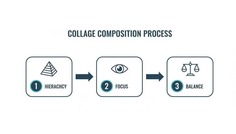
It boils down to establishing a clear visual hierarchy, defining a single focal point, and keeping the whole design balanced. Nailing these three will lead to a strong composition.
Stage 3: Integrating Title and Text
Typography isn’t an afterthought; it's a core part of the digital collage art itself. Your title needs to feel like it’s part of the scene, not just floating on top of it.
Try placing your title so it interacts with your main subject. For example, you could tuck part of a letter behind a character's shoulder to create an immediate sense of depth. A practical tip: use the color picker tool to sample a hue directly from your artwork and apply it to your text. This instantly makes the title feel grounded in the image.
Stage 4: Final Color and Polish
This final step unifies the entire design. Your goal is to give all the separate pieces a consistent color treatment, making them look as if they were captured with the same camera on the same day.
This is often done with a final "color grading" layer. By applying a single color filter, a gradient map, or a photo filter over your entire design, you can pull all the different colors into a single, professional palette.
This is also where you might add a final, subtle texture over the whole image—like a fine grain—to give it that last bit of polish and cohesion.
If this manual workflow seems daunting, you have other options. Modern AI tools can dramatically speed up the initial stages, helping you find and combine elements in seconds.
The table below compares the traditional, hands-on method with an AI-assisted approach.
Manual vs. AI-Assisted Collage Workflow
| Workflow Stage | Manual Approach (e.g., Photoshop) | AI-Assisted Approach (e.g., BeYourCover) |
|---|---|---|
| Asset Sourcing | Manually searching stock photo sites, which can take hours to find the right elements. | Describe the needed elements in a prompt; the AI sources and combines them in seconds. |
| Layering & Blending | Requires technical skill with layer masks, blending modes, and soft brushes. Very time-consuming. | AI handles the initial blending automatically based on your prompt, creating a seamless base image. |
| Composition | You manually arrange all elements, which demands a strong eye for design principles. | The AI generates compositions based on analyzing millions of successful book covers. |
| Time Investment | 3-8 hours for a professional-quality collage, depending on complexity and skill level. | 5-15 minutes for initial concept generation, plus time for manual refinement. |
| Skill Requirement | High. Requires proficiency in design software and a deep understanding of composition. | Low to Medium. Primarily requires a clear vision and effective prompting skills. |
AI doesn't replace the artist, but it can act as an incredibly fast and capable assistant. Using a tool like BeYourCover lets you bypass the tedious sourcing and blending, so you can jump straight to refining the typography and final polish.
Exporting Your Cover for KDP and Beyond
You’ve finished your digital collage, and it looks great. But the final step—exporting your file—is critical. Incorrect settings can turn a beautiful cover into a blurry, pixelated mess on a retail page.
Getting the export settings right ensures all your creative work looks professional, whether it's an ebook on a Kindle or a paperback in a reader's hands.
Ebook Export Settings
For digital storefronts like Amazon KDP, the priority is screen-readiness. You need a file that looks sharp on everything from a high-resolution iPad to a basic e-ink reader, without being so large that it slows down the store page.
- File Format: Stick with JPEG (or JPG). It offers the best balance between image quality and file size for web use.
- Color Profile: Always use RGB (Red, Green, Blue). This is the native color space for screens. Exporting in a print profile like CMYK will make your colors appear dull online.
- Resolution: To keep your cover sharp on modern high-resolution devices, aim for 300 DPI, even for your ebook.
Key Takeaway: Treat your ebook cover as a digital-first product. The goal is a high-quality, RGB JPEG that looks great and loads fast on any screen. This is the safest bet for all major ebook platforms.
Print Cover Export Settings
When preparing a cover for a print-on-demand paperback, the technical requirements are much higher. A printing press is a precise machine that will reveal any mistakes. Here, you're not just creating a front cover—you're creating a full "wraparound" file that includes the front, back, and spine.
Calculating the exact spine width and total dimensions is a crucial step. For a deep dive into getting those numbers perfect, make sure you read our detailed guide on Amazon book cover dimensions. Getting this right is non-negotiable.
Once your canvas is sized correctly, here’s your print-ready checklist:
- File Format: Export as a Print-Ready PDF. This format locks in all your fonts, images, and layout details, ensuring nothing shifts or gets substituted during the printing process.
- Color Profile: Use CMYK (Cyan, Magenta, Yellow, Key/Black). This is the four-color model that commercial printers use. If you send an RGB file, the printer will convert it, and the resulting color shift can be unpredictable.
- Resolution: A minimum of 300 DPI is mandatory for print. Anything less will result in a blurry and unprofessional look.
- Bleed and Margins: You must add a "bleed" area—usually 0.125 inches—around the edges of your entire design. This is extra image area that gets trimmed off, preventing white slivers at the edge of the finished book. Equally important, keep all text and logos well inside the safe margins so they don't get accidentally cut.
While creating digital collage art concepts can be a rewarding creative process, the final export can be tedious. When you’re ready, a platform like BeYourCover can take the guesswork out of it by automatically generating perfectly formatted, KDP-ready files for both your print and ebook editions.
Common Questions About Digital Collage Covers
For an indie author, the prospect of designing a cover can be intimidating, especially with a creative technique like digital collage art. Here are answers to some of the most common questions.
Is Digital Collage Legal for Book Covers?
Yes, but only if you have a commercial license for every single asset you use.
This means every photo, texture, illustration, and font must be cleared for commercial projects. Using a random image from a web search is a fast way to receive a cease-and-desist letter. To protect yourself, source your assets from trusted stock sites or use platforms that include commercially licensed elements in their library. Always read the license agreement—some have restrictions against use on print-on-demand products or require artist credit.
Do I Need to Be an Artist to Make a Collage Cover?
Not anymore. While creating a professional collage cover once required deep knowledge of a tool like Adobe Photoshop and a strong grasp of art theory, that is no longer the case.
Today, the most important skill is a clear vision. If you understand your book's genre, themes, and the desired mood, you can direct AI tools to generate powerful concepts for you. The process shifts from creating from scratch to curating and refining. This is especially useful for genres like fantasy book covers, where blending multiple complex elements is common.
Remember, your job as the author isn’t to be the artist; it's to be the art director. A clear vision and good direction are your most powerful tools.
How Do I Make Sure My Collage Doesn't Look Messy?
This is a common concern with collage, but it's avoidable by following a few simple design rules. A "messy" cover is almost always a cover that lacks a clear visual hierarchy.
To keep your design looking intentional and professional, run through this checklist:
- Have One Hero: Your cover needs a single focal point. Decide what the most important element is and let everything else play a supporting role. If everything is competing for attention, nothing will stand out.
- Unify Your Colors: A limited color palette is your best friend. It instantly pulls disparate elements together. You can apply a color grading layer at the end to create a cohesive mood.
- Embrace Negative Space: Don't be afraid of empty areas on your cover. Negative space (or "white space") gives the important elements room to breathe and helps direct the reader’s eye where you want it to go.
By focusing on a strong hierarchy and a unified palette, your digital collage will look polished, not chaotic.
Ready to Create Your Own Book Cover?
Turn your story into a visual masterpiece. Fill in the details below to start generating professional covers instantly.