The 8.5 x 11 Size Guide for Authors and KDP Publishing
Master the 8.5 x 11 size for your book. Our guide covers pixel dimensions, KDP print specs for bleed and margins, and when to use this popular trim size.
Posted by
Related reading
Photos for Book Covers: A Complete Guide for Authors
Learn how to choose effective photos for book covers. This guide covers composition, sourcing, licensing, and technical specs for KDP-ready designs.
Create the Perfect Book Review Form: A Guide for Authors
Learn to design a book review form that delivers actionable feedback. This guide covers question design, distribution tactics, and using reviews for marketing.
Effective Backgrounds for Covers: KDP Guide 2026
Choose effective backgrounds for covers to grab attention on Amazon KDP. Our 2026 guide covers types, genre matching, composition, & technical specs.
Ready to design your cover?
Use our AI book cover generator to create tailored book cover concepts in minutes.


You've written the manuscript. You're inside KDP, staring at trim sizes, and 8.5 x 11 looks familiar enough to feel safe. It's standard printer paper, so it must be straightforward. Then the questions start. Is it too big for a book? What pixel size do you need? Why does KDP care about bleed? And why do some books look polished in this format while others look like office handouts?
That confusion is normal.
The 8.5 x 11 size is one of the most common page formats in North America, but it's also one of the most misunderstood in self-publishing. Authors often treat it like a default instead of a decision. That's where problems begin. A trim size doesn't just affect file setup. It changes how your book feels in the reader's hands, how much room you have for worksheets or diagrams, and whether the format matches what buyers expect from the category.
This size is also called US Letter or ANSI A. It measures 8.5 x 11 inches, or 215.9 x 279.4 mm, and it's slightly different from A4, which is the paper standard used in much of the world (PaperSizesWiki). That difference seems small on screen, but it matters once you're preparing print files or moving between design systems.
There's a reason this format has stayed so dominant. The U.S. Bureau of Standards officially adopted 8.5 x 11 inches in 1921, after a much older paper-making tradition shaped the dimensions, and the size proved practical for typewriters because it supported a comfortable line length for reading (Mental Floss on why paper is 8.5 x 11).
For authors, the useful question isn't “What is 8.5 x 11?” It's “When does this size help my book, and when does it hurt it?” That's the decision that makes the technical setup easier and the finished book stronger.
Introduction
The first mistake many authors make with the 8.5 x 11 size is assuming “common” means “right for everything.” It doesn't. In publishing, familiar paper and suitable trim size are not the same thing.
A workbook, planner, teacher resource, coloring book, or training manual often benefits from a larger page. Readers need room to write, scan charts, or follow instructions without cramped layouts. A standard novel usually doesn't. The exact same dimensions can look spacious and professional in one category, then awkward and amateur in another.
That's why this format deserves more than a quick spec sheet. It sits at the intersection of print production and reader expectation.
Practical rule: Choose trim size based on how the reader uses the page, not on what feels easiest to set up in Word or Canva.
The physical measurements matter, but so do the consequences of that size. Larger pages influence margin planning, typography, cover composition, shipping feel, and how your interior pages handle worksheets or visual material. Once you understand the logic, the technical terms stop feeling abstract.
A good way to think about it is this. Trim size is part of the reading experience. It's not a clerical setting. It's a design decision.
What authors usually need to know first
Most new self-publishers need clarity on four things:
- Whether 8.5 x 11 fits the book type. This is the strategic decision.
- How to translate inches into pixels. This affects cover setup and image quality.
- What bleed, trim, and safe area mean. This affects KDP approval.
- How to build the file correctly in real tools. This affects your workflow.
Once those are in place, the process becomes much less mysterious.
Decoding the Standard 8.5 x 11 Paper Size
An author often picks 8.5 x 11 because it feels familiar. That instinct is understandable. It is the standard North American Letter page, measured at 8.5 x 11 inches, or 215.9 x 279.4 mm.
In book design, though, familiarity is only part of the story. One must consider whether that familiar page helps the reader use the book the way you intend. For a workbook, training guide, teacher resource, or technical manual, the larger page usually gives you useful working room. For a text-heavy book meant to be read straight through, the same size can feel oversized and slightly corporate.
Why the size matters beyond the measurement
Letter size is common in offices, schools, and home printers across the US and Canada. That makes it practical for books readers may print from a PDF, annotate by hand, or recognize immediately as a workbook-style format.
That same practicality creates a design trade-off. A page this large needs stronger layout discipline. If the text block runs too wide, reading becomes tiring. If margins are too thin, the book feels cheap and unfinished. If headings, worksheets, and callouts are handled well, the page feels generous and easy to use.
I usually tell authors to judge this size by function, not by habit. If the reader needs to write, compare, fill in, label, or reference diagrams, 8.5 x 11 often earns its keep.
Letter versus A4
A common production mistake happens before the book is even designed. The file gets started in A4 instead of Letter.
A4 is slightly narrower and taller than 8.5 x 11. On screen, that difference can look minor. In production, it is enough to shift line breaks, move page counts, throw off template alignment, and create export problems if your software or freelancer uses international defaults.
For authors, the practical consequences are straightforward:
- Templates built for A4 can produce awkward margins on a Letter trim size.
- Interior pages may reflow, which changes page turns and worksheet spacing.
- Printer-ready files need a final size check before upload, especially in Canva, Word, or Adobe InDesign.
If you are still comparing trim options, a KDP cover calculator for 8.5 x 11 books helps you see how the physical format affects the full cover layout, spine allowance, and bleed area before you commit.
Paper choice matters too. Size sets the footprint, but stock changes the feel in the reader's hands. If you are comparing options for manuals or workbooks, it helps to understand what GSM means for paper, because a large page on thin stock feels very different from the same page on a heavier sheet.
Letter size feels familiar to readers. For authors, that is useful only when the format supports the job the book needs to do.
Translating Inches to Pixels for Digital Design
An 8.5 x 11 page can look perfectly fine on screen and still print soft. That gap usually comes down to pixel density.
For book production, inches define the physical page. Pixels define how much detail is available inside that page. If the canvas is too small for print, photos lose edge detail, thin rules look rough, and covers pick up that fuzzy, home-printed look authors are usually trying to avoid.
Resolution works a lot like fabric weave. Two shirts can be the same size, but the tighter weave looks cleaner up close and holds detail better. Print files behave the same way.
The pixel sizes that matter
For an 8.5 x 11 inch document, pixel dimensions change with resolution:
| Resolution (PPI/DPI) | Pixel Dimensions (Width x Height) | Common Use Case |
|---|---|---|
| 72 | 612 x 792 | Screen previews and web graphics |
| 150 | 1275 x 1650 | Draft proofs and low-detail internal prints |
| 300 | 2550 x 3300 | Print-ready interiors and covers |
For a book file, 300 is the working target. An 8.5 x 11 page at that resolution needs 2550 x 3300 pixels before you place text and images. If you start with a smaller file and scale it up later, the software can enlarge the page size, but it cannot create missing detail.
That trade-off matters most for the kinds of books that often use 8.5 x 11 on KDP: workbooks, manuals, planners, and heavily formatted nonfiction. Those formats depend on crisp lines, readable labels, and diagrams that stay clear after printing. A novel can hide a lot. A worksheet cannot.
Why authors run into trouble here
The usual mistake is designing for screen first, then trying to repurpose the file for print. Canva exports, screenshots, web images, and copied charts often look acceptable at 100 percent zoom. On paper, the weaknesses show up fast.
Low-resolution files usually fail in predictable ways:
- Small text softens, especially in charts, callouts, and form labels.
- Line art loses precision, which is a problem for tables, checklists, and instructional diagrams.
- Photos and textured backgrounds break down, especially if they were pulled from websites or social platforms.
I see this most often on workbook covers and interior instruction pages. Authors choose 8.5 x 11 because they want room for writing or step-by-step visuals, which is usually the right decision. But the larger page also makes weak source files more obvious, because readers have more space to inspect.
If you need to verify dimensions before exporting a full wraparound file, use this KDP cover calculator for 8.5 x 11 books. It helps confirm the page setup before you build a cover around the wrong canvas.
PPI, DPI, and the practical rule
Publishing tools often blur PPI and DPI together. Technically, they are not identical. In everyday book production, the practical rule is simple: build your file at print resolution from the start.
That means using print-sized images, not website graphics stretched to fill a page. It also means checking placed images individually. A document can be set to 300, while one photo inside it is still too small to print well.
Starting with a web-sized image is like enlarging a small photocopy. The page gets bigger. The detail does not.
For 8.5 x 11 books, that is the primary decision point. If your project depends on worksheets, diagrams, forms, or instructional layouts, this trim size gives you useful space only if the file quality supports it.
Mastering Print Specs Bleed Margin and Trim
Most KDP cover rejections aren't about creativity. They're about geometry.
The 8.5 x 11 size sounds simple until you prepare a print file, because the final book size and the file size are not the same thing. Printers need extra image area outside the cut line. They also need some tolerance for physical trimming. If your design doesn't account for that, edges can show white slivers or important text can get clipped.
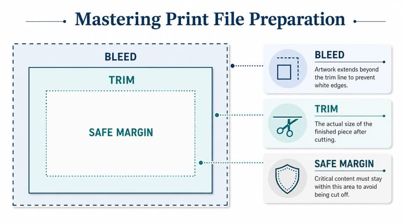
Think of it like a framed photograph
Imagine you're placing a photo inside a frame.
The trim line is the visible edge of the frame. The bleed is extra photo area extending beyond that edge, so the frame never reveals a white gap if alignment shifts slightly. The safe margin is the area where faces, text, or anything important should stay, so nothing critical gets hidden by the frame.
That's how print files work.
The three zones that matter
For KDP paperbacks, the platform requires 0.125-inch bleed on each outer edge when your design runs to the edge of the page. For an 8.5 x 11 cover, that means a total file size of 8.75 x 11.25 inches. KDP also says critical text and images should stay 0.25 inches inside the final trim line (KDP cover specs for bleed and margins).
Here's the practical breakdown:
-
Bleed
This is the extra background area that extends beyond the final cut. If your cover has color, texture, or imagery touching the edge, bleed is mandatory. -
Trim
This is the intended finished size after printing and cutting. It's the target, not a guarantee to the hairline. -
Safe margin
This is your protection zone. Keep titles, subtitles, logos, and other critical elements inside it.
What goes wrong when authors ignore this
The most common failures are predictable:
-
Background stops at the trim line
The printed book can show thin white edges because the blade doesn't hit exactly where the digital preview suggests. -
Text sits too close to the edge
The book may technically print, but the cover feels tense and vulnerable. On a bad cut, letters can look crowded or partially clipped. -
Borders create visible misalignment
Thin borders near the outer edge are especially risky because even slight trimming variation makes them look uneven.
Production note: The closer a critical element sits to the edge, the more you're asking a mechanical process to behave like a laser.
If you want to see how these production rules apply to actual physical products, this guide to printable book covers gives helpful context on how files become finished covers.
A working checklist before export
Use this before you upload:
- Check bleed first. If any artwork touches the edge, extend it past trim.
- Pull text inward. Don't let titles, author names, or callouts drift into the danger zone.
- Avoid hairline borders. They magnify small cutting shifts.
- Zoom in on edges. The corners often reveal setup errors faster than the center.
- Export for print, not screen. Build the final file with print settings from the start.
These rules can feel fussy until you've seen a book come back with an awkward crop. After that, they feel generous.
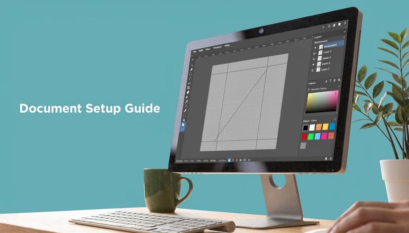
How to Set Up Your 8.5 x 11 Document Correctly
A clean setup saves editing time later. It also prevents the common habit of “fixing” print problems by nudging random elements right before upload.
If you're designing an interior page, an ad insert, or a front cover concept for the 8.5 x 11 size, the goal is simple. Start with the correct canvas, correct resolution, and visible guides before you place anything important.
In Canva
Canva works well for quick layouts if you set the document correctly at the beginning.
Use this workflow:
- Create a custom size in inches, not pixels, if you want to think in print dimensions first.
- Choose the final page size or bleed size intentionally depending on whether you're designing a simple page or an edge-to-edge print file.
- Turn on rulers and guides so you can mark trim and safe areas visually.
- Use high-resolution uploads for photos, textures, and logos.
- Export as PDF Print when you're preparing for press.
Canva's weakness isn't creativity. It's precision under pressure. If you're handling a full wrap, spine calculations, and press-ready output, you need to check every dimension twice.
In Photoshop or InDesign
Adobe tools give you more control.
In Photoshop, start a new document at the correct physical size and resolution. Add guides for trim and safe margin immediately. If you're building a raster-heavy cover, this is often the easiest environment for compositing.
In InDesign, use a document setup with bleed built in from the start. It's usually the better choice for text-heavy layouts, workbook pages, or projects with multiple recurring elements. InDesign also makes it easier to keep alignment disciplined across a series.
For authors who want a broader print-prep mindset, this article on preparing artwork for poster printing is useful because poster and book-cover workflows share the same underlying habits: build for physical output, respect bleed, and don't trust the screen alone.
Where AI tools fit
Modern AI cover tools can help at the concept stage or speed up iteration when you're testing title treatment, composition, and genre cues. They're most useful when they remove repetitive setup friction rather than replace judgment.
If you're using one, the smart approach is to treat it like a fast sketch partner. Generate concepts, compare hierarchy, then confirm the final output meets your trim and print requirements before upload.
Good production starts before design. The file should know what it's becoming.
That applies whether you're working manually in Adobe, laying out pages in Canva, or testing cover concepts with an AI tool.
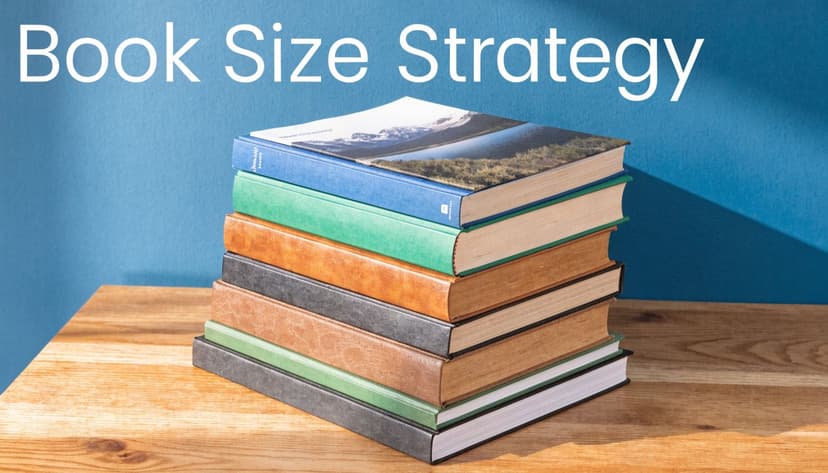
When to Choose the 8.5 x 11 Trim Size for Your Book
This is the primary decision point. The 8.5 x 11 size is not “better” or “worse” than smaller trims. It's just more appropriate for some books than others.
The fastest way to choose well is to ask one question: Does the page need room to function, or just room to read?
Where this format works well
According to SelfPublishing.com's guide to KDP book sizes, the 8.5 x 11 inch size is dominant in low-content books and workbooks on KDP. That tracks with real production logic. These books ask the page to do something.
Strong use cases include:
- Workbooks with writing space, prompts, or exercises
- Journals and planners that need open areas and clear structure
- Manuals and training guides with screenshots, diagrams, or step-by-step instruction
- Educational resources where spacing improves usability
- Coloring and activity books where cramped pages would hurt the experience
If you're developing a guided journal or prompted notebook, this PledgeBox guide to choosing journals is a useful companion read because it focuses on what makes a journal format feel usable, not just printable.
Where it usually works against you
The same SelfPublishing.com source warns that for standard fiction, choosing 8.5 x 11 can be a strategic mistake because readers typically expect formats like 5 x 8 or 6 x 9. That expectation matters.
A novel in oversized trim can create the wrong signal before the reader opens it. It may feel like a script, workbook, draft manuscript, or vanity project rather than a polished trade book.
That doesn't mean fiction can never use it. It means the format has to earn its place. Most of the time, it doesn't.
A simple decision filter
Choose 8.5 x 11 if your book benefits from one or more of these:
- The reader writes on the page
- The page contains forms, tables, or exercises
- You need large diagrams or visual clarity
- The category already uses larger formats
Avoid it if your main goal is immersive reading in a conventional trade format.
If you're comparing sizes more broadly, this guide to Amazon KDP book sizes helps place 8.5 x 11 in context against the trims readers expect in other categories.
A trim size should support the book's job. If the format calls attention to itself for the wrong reason, it's the wrong format.
Conclusion
The 8.5 x 11 size is not a default choice. It is a functional choice.
It works best when the page has a job beyond being read straight through. Workbooks, manuals, training guides, planners, and other write-in formats benefit from the extra space because the reader needs room to act on the content, not just consume it. That is why you should choose this trim size on KDP. Familiarity helps, but usability is what makes it successful.
The same logic applies on the production side. Pixel dimensions, bleed, trim, and safe margins are print controls. They are the practical settings that determine whether your book prints cleanly, keeps important content out of the cut line, and avoids the common upload problems that catch new authors late in the process. I tell authors to treat these specs like measurements before cutting wood. A small mistake at setup turns into a visible problem in the finished piece.
For a new author, the decision is simpler than it first appears. Choose 8.5 x 11 when your content needs space, structure, and clarity on the page. Skip it when your book depends on compact, immersive reading and standard trade-book expectations.
Make the trim size support the book's job, and the technical setup becomes much easier to get right.
Ready to Create Your Own Book Cover?
Turn your story into a visual masterpiece. Fill in the details below to start generating professional covers instantly.