The Cobalt Blue Color Code: A Guide for Book Cover Design
Discover the exact cobalt blue color code (Hex, RGB, CMYK) and learn how to use it for book covers that stand out on Amazon KDP and beyond.
Posted by
Related reading
Master Dark Teal Hex Code for Stunning Covers
Find the official dark teal hex code (#014D4E) for book covers. Learn color psychology, palettes, and KDP print tips to perfect your design.
Your Guide to the Burgundy Color Code for Book Covers
Discover how to use the burgundy color code for your book cover. Get HEX, RGB, and CMYK values to create a cover that sells on Amazon KDP.
Mastering Balancing Elements in Photography for Striking Book Covers
Learn balancing elements photography to create compelling, professional book covers. Get practical tips for indie authors to attract readers on KDP.
Ready to design your cover?
Use our AI book cover generator to create tailored book cover concepts in minutes.


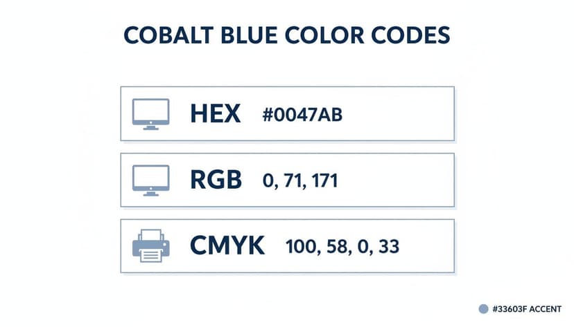
When designing your book cover, the cobalt blue color code you need to know is Hex #0047AB. This is the digital standard for that rich, powerful blue on screens. For indie authors, getting this code and its print equivalent right is a crucial step to ensure your cover looks as professional on a bookstore shelf as it does in an online listing.
Quick Guide to Cobalt Blue Color Codes
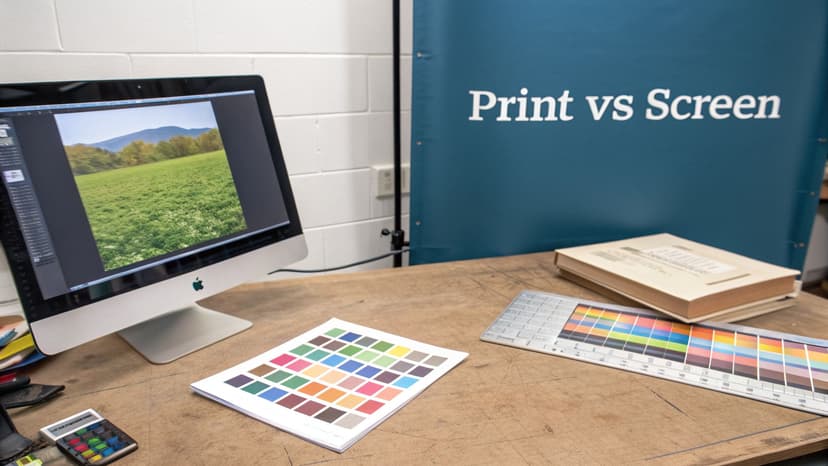
As an author, brand consistency is essential. A reader who sees your ebook cover online should instantly recognize the paperback version. This is only possible if the colors match across formats. Understanding the difference between digital (RGB) and print (CMYK) color systems is critical. They are two different languages for describing color, and confusing them can lead to washed-out, disappointing print results.
This quick reference table lays out the essential codes you'll need for your design process.
Cobalt Blue Color Code Reference Table
Here is a quick-lookup table showing the primary cobalt blue color code in different color models for web, digital, and print applications.
| Color System | Code | Primary Use |
|---|---|---|
| HEX | #0047AB | Web design, CSS, HTML |
| RGB | 0, 71, 171 | Digital displays, ebooks, online ads |
| CMYK | 100, 58, 0, 33 | Print projects, KDP paperbacks, marketing materials |
Bookmark this table. It's your cheat sheet for maintaining a consistent and professional look across every format your book will appear on.
The infographic below visualizes these same values, showing how one color concept translates into different numerical codes depending on its final destination—a screen or a printing press.
Nailing these codes is one of those small details that separates an amateur-looking cover from a professional one. It’s a simple but vital step for any author managing their own cover design.
Digital vs. Print Color Systems
Let's break down the practical application. For anything that will be viewed on a screen—your ebook, website banners, social media graphics—you’ll use RGB (0, 71, 171), which corresponds directly to the hexadecimal code #0047AB. This additive system mixes Red, Green, and Blue light to create colors.
However, when you're preparing your cover for a KDP paperback or any other print job, you must switch to CMYK (100, 58, 0, 33). This subtractive system uses physical inks—Cyan, Magenta, Yellow, and Key (Black)—and is the standard for professional printing. Using RGB values for a print file will cause an automated color shift, often making your vibrant blues look dull and muddy.
Think about the intense, moody blue on a best-selling thriller book cover. That impact is achieved by using the correct color space for the right medium. While an AI tool can help you brainstorm cover ideas, always double-check that your final, downloadable files are set to the correct color profile (RGB for digital, CMYK for print).
Understanding the Psychology of Cobalt Blue
Color isn't just decoration on a book cover—it's a psychological trigger that helps manage reader expectations. When you choose a color, you're signaling your genre and tone. Cobalt blue, with its striking intensity, sends a clear signal of authority, intelligence, and depth, making it an incredibly effective tool for certain genres.
The pigment has a rich, storied past, famously used in Chinese porcelain as far back as the 8th century. Though the element cobalt wasn't officially identified until 1735, its use in art stretches back to the Bronze Age. This long history as a prized and expensive color gives it an inherent sense of quality and trustworthiness.
Communicating Trust and Depth
Thanks to its deep, unwavering hue, cobalt blue is strongly associated with competence and reliability. This makes it a fantastic choice for non-fiction authors who need to establish immediate credibility. A cover built around cobalt blue silently promises the reader that the content inside is serious and well-researched.
For fiction, it serves a different purpose. In genres like thrillers or science fiction, the color summons a feeling of mystery and immensity. It can evoke the crushing depths of the ocean or the endless expanse of a night sky, pulling your reader into a world of suspense. The right shade of blue can be foundational to your book's atmosphere, which is why digging into what the color blue means for branding and creative work is time well spent.
Practical Application for Authors
Understanding this psychological shortcut is key to matching your cover with your ideal reader's expectations. Your goal is for fans of your genre to see your book and feel an instant sense of familiarity.
Here’s a checklist for how to apply it:
- For Thrillers and Mysteries: Use cobalt blue to build a tense, atmospheric backdrop that signals secrets and high stakes. Pair it with crisp white or a sharp yellow for the title to create a can't-miss contrast.
- For Non-Fiction & Business: Use a solid, dominant cobalt field to project authority and expertise. This works well for books on finance, technology, or leadership.
- For Sci-Fi: Let cobalt do the heavy lifting to hint at futuristic tech, alien worlds, or the sheer vastness of space.
You can dive deeper into how specific shades connect with readers and signal genre by exploring the cobalt blue color meaning in more detail. A practical next step is to generate a few mockups to see the impact for yourself before you commit to a final design.
Designing Your Book Cover with Cobalt Blue
Once you understand the theory behind cobalt blue’s power, it's time to apply it. How you use this color can make or break its impact, turning a generic design into one that connects with the right audience. The first decision is whether cobalt blue is the star of the show or a supporting actor.

That one choice ties directly into your book's genre and the promise you're making to the reader. A cover drenched in cobalt sends a very different signal than one that uses it for a tiny, strategic detail.
Strategic Design Approaches
For authors, especially those trying to align with genre conventions, the cobalt blue color code is an incredibly versatile tool. A smart approach ensures your cover sets the right tone before a reader even processes the title.
Here are a few proven ways to use it:
- Dominant Background: A solid field of cobalt blue is a fantastic way to build atmosphere. This is a go-to move for thriller book covers, where the deep, intense blue instantly suggests mystery, nighttime, or a high-stakes plot unfolding in the shadows.
- High-Contrast Typography: When your title needs to be legible from across the room (or a crowded Amazon page), you can't beat crisp white or a vibrant yellow text on a cobalt field. The contrast is powerful. This is a classic choice for non-fiction books that need to project clarity and authority.
- Accent Color: Don't underestimate a small, potent dose of color. Using cobalt for just one element—the glint in a character’s eye, a piece of clothing, or a crucial icon—is a professional technique. It draws the eye exactly where you want it and adds a layer of sophistication without overpowering the entire design.
Decision Point: Experiment by mocking up a version with a dominant background and comparing it to one with a subtle accent. You'll see right away which one strengthens your cover's message and which one muddies it.
This is where a modern AI cover creation tool can be useful. You can generate a handful of different concepts in minutes, letting you see how cobalt blue performs in various roles. It’s a fast way to make an informed design choice before you commit.
Building Genre-Specific Color Palettes
A great cover is rarely about just one color; it’s about the entire palette working together. The right combination can instantly telegraph your genre and hook your ideal reader. Cobalt blue is a fantastic anchor, but its real magic is unlocked when you pair it with the right supporting shades.
It’s wise to approach this like a designer. Applying some basic principles for creating a color palette for your design system will help you ensure every color choice is deliberate and effective.
To give you a head start, here are several ready-to-use color palettes built around cobalt blue. Each one is tailored for a popular book genre and includes the Hex codes, so you can plug them directly into your design software.
Cobalt Blue Color Palettes for Popular Genres
This table offers some genre-specific combinations featuring cobalt blue. Use them as a starting point to create a mood that feels instantly recognizable to fans of that category.
| Genre | Palette Name | Color 1 (Hex) | Color 2 (Hex) | Color 3 (Hex) |
|---|---|---|---|---|
| Sci-Fi | Cybernetic Void | #0047AB | #C0C0C0 | #00FFFF |
| Thriller | Corporate Shadow | #0047AB | #FFFFFF | #36454F |
| Non-Fiction | Academic Authority | #0047AB | #704214 | #F1E9D2 |
These palettes are designed to be high-impact and genre-appropriate right out of the box, giving you a professional foundation for your cover design.
Futuristic Sci-Fi Palette
To create a mood that signals advanced technology and deep space, pair cobalt blue with metallics and an electric pop. This trio immediately brings to mind high-tech cityscapes, interstellar travel, and the thrill of discovery. It’s a perfect fit for any story about future societies or galactic exploration.
- Primary: Cobalt Blue (#0047AB)
- Accent 1: Metallic Silver (#C0C0C0)
- Accent 2: Electric Cyan (#00FFFF)
Corporate Thriller Palette
For a thriller set in the world of cutthroat business or espionage, your palette needs to be clean, sharp, and serious. This combination feels professional and buttoned-up, but with a palpable tension simmering just beneath the surface. It projects an air of cold, calculated precision that is essential for the thriller book covers genre.
- Primary: Cobalt Blue (#0047AB)
- Accent 1: Crisp White (#FFFFFF)
- Accent 2: Deep Charcoal (#36454F)
A successful color palette does more than just look good—it tells a story. The contrast between cobalt and charcoal suggests secrets and conflict, while the crisp white implies a clean corporate facade.
Historical Non-Fiction Palette
To signal authority and historical significance, pair cobalt blue with colors that feel grounded and timeless. Sepia and parchment tones instantly add a sense of age and importance, giving your cover an academic yet highly readable feel. This is a classic choice for biographies, history texts, and any book that needs to establish intellectual credibility at a glance.
- Primary: Cobalt Blue (#0047AB)
- Accent 1: Sepia Brown (#704214)
- Accent 2: Parchment (#F1E9D2)
You can use an AI tool to test these palettes quickly. Generating several mockups with these different schemes will show you firsthand how a few color swaps can change the entire vibe of your cover, helping you nail the final decision.
Navigating Cobalt Blue for KDP Print Production
One of the most common frustrations for self-publishers is approving a gorgeous ebook cover only to receive a paperback version that looks dull and muddy. This is especially true for intense colors like cobalt blue. The culprit is the fundamental difference between how screens display color and how printers create it.
Your monitor uses an RGB (Red, Green, Blue) color model, creating color with light. It can produce brilliant, luminous blues that simply don’t exist in the world of ink.
Print-on-demand services like Amazon KDP use the CMYK (Cyan, Magenta, Yellow, Black) system, which mixes physical inks. Many bright RGB blues, including pure cobalt at #0047AB, are considered "out of gamut" for CMYK. This means the printing press cannot mix inks to match that exact shade. Instead, the software substitutes the closest possible color, which often ends up looking darker, less saturated, or even purplish.
Common KDP Color Pitfalls to Avoid
To ensure your paperback cover looks as you intended, you must design for print from day one. Avoiding these common mistakes can save you significant time and money on reprints.
- Designing in RGB for Print: This is the most critical error. Never create your print cover file in the RGB color space. Your design software should be set to CMYK from the start.
- Skipping the Proof Copy: A digital proof on your screen is useless for judging print color accuracy. Always order a physical proof copy from KDP to see exactly how your cobalt blue will look on paper.
- Trusting Your Screen: Your monitor's brightness, calibration, and age drastically change how you perceive color. What you see is only an approximation of the final printed product.
The best practice is to design with a CMYK-safe cobalt blue from the start. It may look slightly less vibrant on your monitor, but it will print with far more accuracy and consistency. To learn more about preparing your cover for physical copies, check out our complete guide to creating printable book covers.
Ensuring Readability with Color Contrast
That stunning cobalt blue background is wasted if no one can read your title. Getting the contrast right between your text and background isn't just a design detail—it's a critical part of making your cover accessible and marketable. A cover that’s hard to read is a cover that gets scrolled past, especially on a crowded Amazon page.
The Web Content Accessibility Guidelines (WCAG) are the industry standard for legibility. While developed for websites, their rules are invaluable for book cover design. The guidelines use a contrast ratio to measure readability; for primary text, you want to hit a minimum ratio of 4.5:1. This ensures most people, including those with common visual impairments, can read your title without difficulty.
High-Contrast Pairings for Cobalt Blue
Achieving strong contrast with a deep, rich color like cobalt blue is straightforward. You simply need to pair it with a color from the opposite end of the brightness scale.
Here are your best options:
- White (#FFFFFF): This is the classic, can’t-go-wrong choice. White text on a cobalt background provides maximum contrast, making your title and author name pop with absolute clarity.
- Bright Yellow (#FFFF00): For a more energetic, high-contrast look, a punchy, pure yellow is an excellent choice. It's a fantastic option for thrillers or high-energy non-fiction.
- Light Gray (#E0E0E0): For secondary text like a subtitle or series name, a light gray is a smart move. It provides enough contrast to be readable but is subtle enough that it won’t compete with your main title for attention.
Pro Tip: Before you finalize your design, always use a free online contrast checker to plug in the hex codes for your text and background. It's a two-second step that confirms your cover will work for the widest possible audience.
For authors who want to optimize their cover's effectiveness, learning more about accessible color palettes can provide a competitive edge. This practice makes your book not just visually appealing, but also inclusive and commercially stronger.
Got Questions About Cobalt Blue?
Working with a bold color like cobalt blue often brings up common questions for authors preparing to publish. Here are quick answers to the most frequent problems to help you get your cover design right the first time.
Why does my cobalt blue look different when printed from KDP?
This is the most common and frustrating issue authors face with color. The problem lies in the fundamental difference between screen colors (RGB) and print inks (CMYK).
Your monitor creates color by mixing Red, Green, and Blue light, which produces a very wide range of vibrant shades—what designers call a wide gamut. Print, on the other hand, uses Cyan, Magenta, Yellow, and Black ink. This CMYK ink-based system has a much smaller color gamut.
Bright, electric blues like digital cobalt are "out of gamut" for CMYK printing. When a service like KDP receives your RGB file, its system automatically converts the color to the nearest printable ink mixture. The result is often a cobalt that looks dull, flat, or even shifts toward a muddy purple. To avoid this, always design your print cover in a CMYK color profile from the start and use the specific code CMYK (100, 58, 0, 33) for a predictable, rich blue.
What is the best color for text on a cobalt blue background?
For crystal-clear readability, your best bet is always white (#FFFFFF). It’s the safest and most powerful choice, creating a high-contrast look that easily passes Web Content Accessibility Guidelines (WCAG). This ensures your title is sharp and legible, even as a tiny thumbnail on an Amazon search page.
For secondary text like a subtitle, a light gray or a very pale, muted yellow can work well, but you must run it through a contrast checker tool to ensure it's readable. Avoid dark colors like black or deep gray, as they have almost no contrast against cobalt blue and will be nearly illegible. This type of high contrast is critical for creating an effective thriller book cover.
Can I use the cobalt blue hex code for my print book cover?
No, you should never send a file using a hex code to a print service. Hex codes like #0047AB are strictly for screen-based design; they are a shorthand for RGB color values used in websites and digital applications.
If you upload a book cover file that uses hex codes to KDP, their system will automatically convert it to CMYK, and you'll have no control over the final color.
Key Takeaway: For professional, consistent print results, provide your designer with the correct CMYK values for cobalt blue: 100, 58, 0, 33. This is the only way to ensure the blue you approve on your final proof is the same blue your readers get on the finished paperback.
Ready to Create Your Own Book Cover?
Turn your story into a visual masterpiece. Fill in the details below to start generating professional covers instantly.