A Guide to Creating Printable Book Covers for KDP
Learn how to design professional printable book covers for Amazon KDP. This guide covers sizing, bleed, resolution, and export settings for a perfect print.
Posted by
Related reading
Photos for Book Covers: A Complete Guide for Authors
Learn how to choose effective photos for book covers. This guide covers composition, sourcing, licensing, and technical specs for KDP-ready designs.
Create the Perfect Book Review Form: A Guide for Authors
Learn to design a book review form that delivers actionable feedback. This guide covers question design, distribution tactics, and using reviews for marketing.
Effective Backgrounds for Covers: KDP Guide 2026
Choose effective backgrounds for covers to grab attention on Amazon KDP. Our 2026 guide covers types, genre matching, composition, & technical specs.
Ready to design your cover?
Use our AI book cover generator to create tailored book cover concepts in minutes.


A printable book cover is fundamentally different from its ebook counterpart. It's not just a higher-resolution image; it's a single, wraparound file engineered for physical production. This complete package contains the front, back, and spine, all in one seamless design that must be technically precise.
Unlike a simple JPEG for your ebook, this file requires a specific setup. If you get the dimensions, bleed, or resolution wrong, you'll face printing errors that can delay your launch and result in a book that looks unprofessional. Mastering these technical requirements is the key to producing a book that looks polished and ready for sale on platforms like Amazon KDP.
For the exact wraparound measurements of your trim size, page count, and paper type, open the KDP Cover Size Calculator before you export your file.
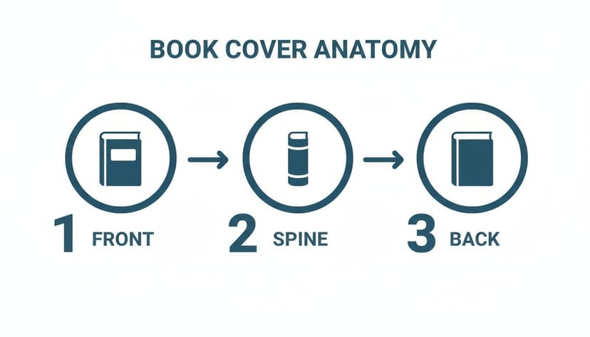
The Anatomy of a Print-Ready Cover
For many indie authors, moving from a digital ebook to a physical print book is a major milestone. However, it's also where many encounter their first significant technical hurdle. An ebook cover is a straightforward, front-facing image. A print cover is a foldable piece of art that must wrap around your book's pages with perfect precision.
This single file is composed of three distinct parts working in concert:
- The Front Cover: This is your book's first impression and what grabs a reader's attention. It houses your title, author name, and primary artwork.
- The Back Cover: This is your sales pitch. It must include space for your book blurb, an author bio, and the barcode/ISBN.
- The Spine: This connects the front and back covers. It displays your title and author name, making your book identifiable on a bookshelf. The spine's width is variable; it depends entirely on your final page count and the paper type you choose.
Getting the Technical Details Right
To create a file that Amazon KDP or any other print-on-demand service will accept, you must adhere to their technical specifications. These aren't suggestions; they are non-negotiable rules for professional printing.
Getting this right is crucial. With the global book market projected to reach USD 157.88 billion by 2031, a high-quality, technically perfect cover is essential to compete effectively. Mordor Intelligence offers more insights on the global book market for those interested in market trends.
One of the most common pitfalls for new authors is designing the front, back, and spine as three separate files. A printable cover must be one continuous canvas, with every element measured and aligned to create a single, flawless file ready for printing.
Before diving deeper, let's clarify the key terminology. You will encounter these terms in KDP's templates and printer specifications.
Print Cover Terminology at a Glance
This table breaks down the essential terms you need to know. Use it as a quick reference when navigating the technical side of cover design.
| Term | What It Means for Your Cover | Common KDP Requirement |
|---|---|---|
| Trim Size | The final, physical dimensions of your book after it’s cut (e.g., 6" x 9"). | Must match a standard KDP size (e.g., 5" x 8", 6" x 9"). |
| Bleed | An extra 0.125" border of your background image or color that extends past the trim line on all outer edges. | 0.125" on the top, bottom, and outside edges of the cover. |
| Safe Zone | The inner area where all important text and key design elements must be placed to avoid being accidentally cut off during trimming. | Typically 0.125" inside the trim lines. No critical text should go beyond this. |
| Spine Width | The thickness of your book's spine, calculated based on page count and paper type (cream or white). | Must be calculated precisely using KDP's formula or cover calculator. |
| Resolution | The clarity of your image, measured in Dots Per Inch (DPI). Low resolution looks blurry and pixelated when printed. | 300 DPI is the industry standard for crisp, professional printing. |
| Color Profile | The color space your file is saved in. Print uses CMYK (Cyan, Magenta, Yellow, Black), not RGB (Red, Green, Blue), which is for screens. | CMYK is required for accurate color reproduction in print. |
Understanding these terms from the beginning will save you significant time and prevent frustrating file rejections.
Trim, Bleed, and Margins: Your Cover's Blueprint
Of all the technical specifications, these three are the most critical for avoiding printing issues. The easiest way to visualize them is as a set of nested boundaries on your design canvas.
-
Trim Size: This is the final dimension. It’s the exact size of your book after the printer’s guillotine cuts it. If you're creating a 6" x 9" book, this is the line where the cut happens.
-
Bleed: Since industrial printing machines can have minor variations, bleed is necessary. It’s an extra 0.125 inches of your background design that extends beyond the trim line. This ensures that if the cut is slightly off, you won't have an unprofessional white sliver along the edge of your cover. The printer cuts through the bleed area for a clean, edge-to-edge finish.
-
Safe Zone (or Margin): This is your safety net. It's an inner boundary, usually another 0.125 inches inside the trim line. You must keep all important text (title, author name, back blurb) and crucial images within this zone to prevent them from being trimmed off.
Mastering these concepts is the first practical step toward creating a cover that looks as good in a reader's hands as it does on your screen. For more guidance on the creative aspects, our article on what makes a good book cover can help you combine strong design with these technical rules.
How to Nail Your Spine and Canvas Dimensions
The spine is the single element that causes the most issues for authors creating a print cover. Its width is entirely dependent on your final page count and the paper type used by your publisher, like Amazon KDP. Guessing this number is the quickest path to having your cover file rejected.
If the spine width is wrong, your spine text will awkwardly wrap onto the front or back cover, signaling an amateur production. When it's correct, your book looks sharp and professional on any bookshelf. It's a small detail that makes a significant difference.
This diagram illustrates how the front, back, and spine combine into one seamless file. This is the blueprint for your entire print-ready cover.
This single wraparound file is what you are building. Let's ensure the calculations are correct from the start.
The Spine Width Formula
Fortunately, you don't have to guess. KDP provides precise formulas based on paper stock thickness.
Here are the formulas to use:
- For white paper: Page count x 0.002252" (or 0.0572 mm)
- For cream paper: Page count x 0.0025" (or 0.0635 mm)
Let's apply this. Imagine you've written a 300-page thriller and chosen cream paper.
Your calculation would be: 300 pages x 0.0025" = 0.75 inches
That 0.75-inch measurement is the exact spine width for your cover. If you were publishing a 200-page non-fiction book on white paper, your calculation would be 200 x 0.002252" = 0.45 inches.
Pro Tip: It is critical to use your final, fully-formatted page count. If a last-minute edit adds or removes pages, your spine width will change, and you must adjust the entire cover file accordingly.
Building Your Full Canvas
With the spine width determined, you can calculate the total dimensions for your complete wraparound cover. This canvas includes the front, back, spine, and the required bleed on all four outer edges.
The formula for the total canvas width is:
(Bleed + Back Cover Width + Spine Width + Front Cover Width + Bleed)
Using our 300-page, 6" x 9" thriller example:
- Bleed: 0.125"
- Back Cover Width: 6"
- Spine Width: 0.75"
- Front Cover Width: 6"
Plugging in the numbers:
Total Canvas Width = (0.125" + 6" + 0.75" + 6" + 0.125") = 13.0 inches
And for the height:
Total Canvas Height = (Bleed + Trim Height + Bleed) Total Canvas Height = (0.125" + 9" + 0.125") = 9.25 inches
Your final, print-ready canvas dimensions are 13.0" x 9.25". Setting up your design software with this exact size from the start is non-negotiable for a successful print run.
Using KDP's Tools for Peace of Mind
While understanding the math is beneficial, you don't have to do it manually. KDP offers a valuable Cover Calculator & Template Generator that is highly recommended.
Simply enter your trim size, page count, and paper color, and it will generate a downloadable PNG and PDF template with clear markings for the spine, bleed areas, and safe zones. This tool acts as a foolproof guide. You can layer it in your design software (like Photoshop or Affinity Photo) to ensure your spine text is perfectly centered and your back cover blurb is clear of the barcode area. Whether you’re designing from scratch or adapting a design, such as one from our gallery of print-ready romance cover layouts, using the official KDP template eliminates guesswork.
Nail Your Resolution and Color Profile for a Perfect Print Cover
Have you ever seen a book cover that looked vibrant on screen but appeared blurry, dark, or disappointing in print? This common issue usually stems from two culprits: resolution and color profile.
Getting these technical specs right is the difference between a book that looks professionally published and one that signals an amateur effort. It's not just a matter of pride; it's about making sales. For indie authors, a poor-quality cover can severely impact a book's performance. Mastering these two settings costs nothing but can put your book miles ahead of the competition.
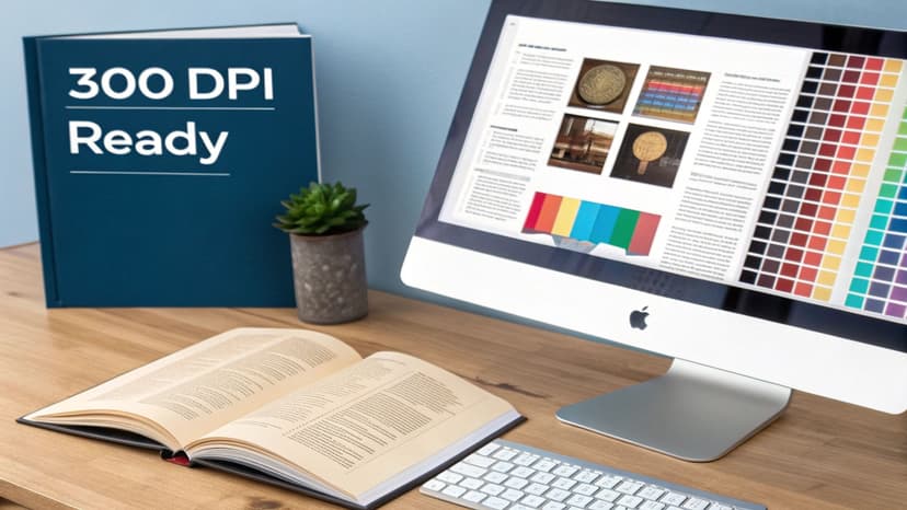
The Only Number That Matters: 300 DPI
When it comes to printing a book cover, there is one golden rule: 300 DPI (Dots Per Inch). This is the non-negotiable industry standard because it ensures every letter is crisp and every image is sharp, with no pixelation.
An image saved at 72 DPI, which is standard for websites, will look terrible in print. It will be fuzzy, blocky, and unprofessional. Print-on-demand services like Amazon KDP will reject files that don't meet the 300 DPI minimum, saving you from a disappointing final product.
The best practice is to set your design canvas to 300 DPI from the very beginning in your design software. Attempting to "upscale" a low-resolution image later does not work and will produce poor results. Start with the correct resolution to ensure a quality finish.
The Great Divide: RGB vs. CMYK
The second technical trap for authors is color management. Your computer monitor and a physical printer speak two different color languages.
- RGB (Red, Green, Blue) is for screens. It's an additive color model, mixing light to create vibrant colors. This is why screens can produce brilliant hues that seem to glow.
- CMYK (Cyan, Magenta, Yellow, Key/Black) is for ink. It's a subtractive model where inks are layered on paper to absorb light, creating colors.
A classic mistake is designing a cover with an electric blue title in RGB, only to have it print as a dull, flat navy. This happens because that specific vibrant blue cannot be replicated with CMYK inks; it does not exist in the physical world of print.
To avoid this, you must export your final print-ready file in the CMYK color profile. A better approach is to switch your design document to CMYK before you finalize your colors. This provides a more accurate preview of how the colors will appear when printed, preventing unwelcome surprises. The principles are the same whether you're designing a book or aiming for flawless A1 poster printing—the output medium dictates the color profile.
Want to Skip the Technical Headaches?
Most authors prefer writing to managing DPI and color modes. Modern tools can help streamline this process.
If you are creating printable book covers using a tool, these technical settings are often handled automatically. Platforms designed for cover creation are typically built to generate high-resolution, CMYK-ready files from the outset. This allows you to focus on creative decisions—like finding inspiration from high-contrast thriller covers—knowing the final file will meet KDP’s strict technical requirements.
Designing Typography and Imagery for a Physical Book
A physical book cover has a tangible presence that is very different from a digital thumbnail. What looks great on a backlit screen can appear flat or become unreadable on a printed page. Your typography and imagery must be selected with the physical medium in mind to ensure your book looks sharp, professional, and impactful.
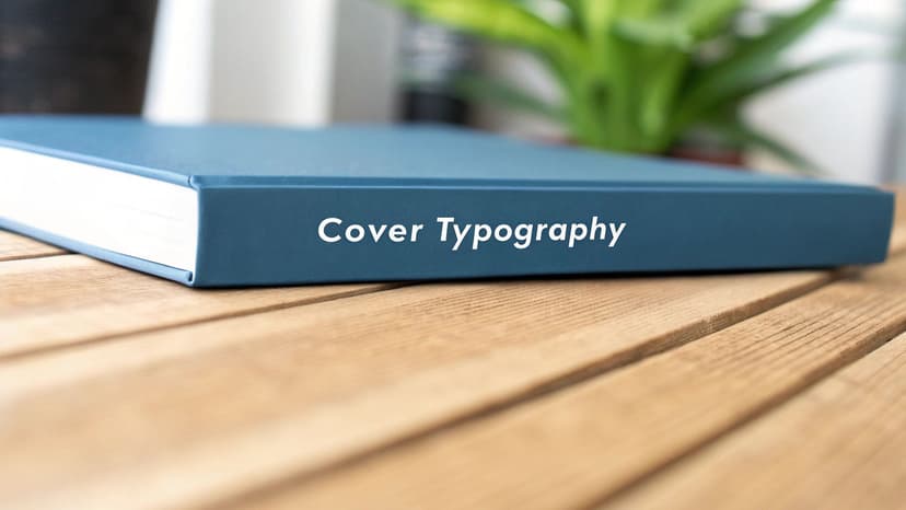
Typography is where this difference is most apparent. Your title font needs to be crisp and legible from a distance. The text on the spine must be readable when the book is shelved. The blurb on the back must be comfortable for someone to hold and read.
Choosing Fonts That Print Well
Not all fonts are suitable for printing. Ultra-thin, delicate scripts or heavily distressed fonts might look elegant on a high-resolution monitor but can appear broken or disappear entirely when printed with ink on paper.
When selecting fonts for your printable book covers, clarity is the primary goal. Here are some decision criteria:
- Weight and Contrast: Choose fonts with substance. A bold, clean sans-serif for a thriller or a sturdy, classic serif for historical fiction will hold up better in print than a wispy, lightweight alternative.
- Size Matters: On a standard 6"x9" book, the title font should be the dominant element. For the spine, you need a font that remains readable even when scaled down to fit a narrow 0.5-inch spine.
- Back Cover Readability: Keep the font size for your blurb between 9pt and 12pt. Anything smaller is difficult to read, while anything larger can look unprofessional.
For a deeper dive, our guide on typography for book covers offers practical advice on pairing fonts and matching them to your genre.
Imagery and Contrast for Print
Similar to fonts, your cover image must be optimized for the physical world. The most important factor is contrast. An image that looks subtly moody on a backlit screen can become a dark, indistinguishable blob when printed.
A common pitfall is choosing an image with low contrast between the foreground and background. On paper, subtle nuances are lost, and the design can look muddy. Always aim for images with clear subjects and strong visual separation.
Before finalizing your image, print a test copy on a standard home printer. While it won't perfectly match a professional press, it's a quick and inexpensive way to assess how your colors and contrast will translate from screen to paper.
Assembling a Compelling Back Cover
The back cover is your final sales pitch and should be designed with purpose. It is a structured marketing tool that guides the reader's eye.
A professional back cover typically includes three key elements:
- The Blurb: This is your hook. Place it at the top and keep it a compelling, concise summary of your story. Use short paragraphs to make it inviting.
- Author Bio & Photo (Optional): A brief, one-or-two-sentence bio adds a personal touch and builds credibility. A small, professional headshot can help create a connection with readers.
- The Barcode Area: This is non-negotiable. KDP will automatically place a barcode in the lower-right corner of your back cover, and you must leave a clean space for it. The standard is a white or very light-colored box of at least 2" wide by 1.2" high. Do not allow any text or design elements to enter this zone, as it will make the barcode unscannable.
By considering how your fonts, images, and layout will appear on a physical object, you ensure your book looks as professional in a reader's hands as it does online.
Final Preflight Checklist for Your KDP Cover
You’ve designed a cover you're proud of. Before you upload it to KDP, a careful preflight check can save you days of frustrating rejections and delays. Think of this as your final quality control step to catch small mistakes that could derail your launch.
A Final Visual Inspection
Open your final, flattened cover file and view it at 100% zoom. Don't just glance at it—scrutinize every detail.
Start with the overall layout. Do the dimensions match your calculations for trim size, spine, and bleed? Is the bleed properly extended beyond the trim lines on all outer edges?
Next, zoom in on the safe zones.
- Front Cover: Is your title or author name too close to the top, bottom, or right edge?
- Back Cover: Is every word of your blurb and bio safely inside the margins? Have you left a clean, empty space for the KDP barcode?
- Spine: Is the spine text perfectly centered? Even a slight misalignment will be obvious on the printed book.
This is your last chance to spot critical elements at risk of being trimmed off during printing.
One of the most common reasons KDP rejects a cover is for "live elements outside the safe zone." This is their technical term for text or key art placed too close to the edge. A five-minute check can prevent a five-day delay.
Proofread Every Single Word (Again)
You have likely proofread your manuscript multiple times, but the cover is often overlooked. It is easy for a typo to hide in plain sight on a design you’ve been looking at for hours.
Read every word out loud: the title, subtitle, author name, spine text, and the entire back cover blurb. Saying the words aloud slows your brain down and helps you catch errors your eyes might otherwise miss. A typo on the cover is an instant credibility killer. The importance of flawless file preparation is a common theme in all professional printing, including specialized areas like coloring book printing services.
Locking in the Right Export Settings for KDP
After your visual and text checks are complete, the final step is exporting the file correctly. KDP has strict file specifications, and using the wrong settings is a guaranteed rejection.
Export a single, flattened, high-resolution PDF with these exact settings:
- File Format: Export as a PDF. It is the industry standard for print and required by KDP.
- PDF Standard: Choose PDF/X-1a:2001. This preset is the gold standard for commercial printing, as it flattens your design and embeds fonts, ensuring nothing shifts during processing.
- Color Profile: Ensure the output color profile is set to CMYK to convert your on-screen RGB colors to the proper format for printing.
- Resolution: Double-check that your export resolution is 300 DPI. Anything less will result in a pixelated, unprofessional appearance.
Using these settings ensures you upload a professional-grade file that will pass KDP’s automated checks for printable book covers. Once you have the perfect file, you can visualize how it will look in the real world. Our guide on using a book cover mockup generator can show you how to create compelling promotional images.
Your Final KDP Cover Preflight Checklist
Before exporting, run through this quick checklist. It is designed to catch the most common errors that lead to rejections from Amazon KDP.
| Check Item | Verification Step | Why It's Important |
|---|---|---|
| Correct Dimensions | Verify the document width and height match your trim size + bleed + spine width calculations. | KDP will instantly reject a file with incorrect dimensions. |
| Bleed is Set | Confirm your background image or color extends 0.125 inches beyond the trim lines on all outer edges. | Prevents unsightly white slivers at the edge of your cover if the trim is slightly off. |
| Safe Zones Respected | Check that all text and critical imagery are inside the inner margin guides. | Avoids having your title, author name, or blurb accidentally trimmed off. |
| Barcode Area Clear | Ensure the bottom right corner of the back cover is completely empty. | KDP requires this blank space to print its unique barcode. |
| 300 DPI Resolution | Open the file properties or export settings to confirm the resolution is 300 DPI. | Guarantees a sharp, professional print quality without pixelation or blurriness. |
| CMYK Color Mode | Confirm the document's color mode (or export profile) is set to CMYK. | Ensures the printed colors match your on-screen design as closely as possible. |
| Final Proofread | Read every single word on the front, back, and spine out loud. | Catches embarrassing typos that can undermine your book's credibility. |
This final check takes only a few minutes but provides the confidence that your cover file is technically perfect and ready for a smooth upload.
Common Questions About Printable Book Covers
Navigating the specifics of print-ready covers can feel overwhelming. Once you understand the basics of bleed, spine math, and color profiles, other questions often arise. Here are answers to some of the most common queries from authors preparing their files for KDP.
What Is the Difference Between Bleed and Margin?
It is easy to confuse these two terms, as they both often involve the 0.125-inch measurement. The simplest way to differentiate them is to think of them as the outer and inner safety boundaries of your design.
Bleed is the part of your design that extends beyond the trim line. It is intended to be cut off. Think of it as an insurance policy against slight misalignments in the printing and cutting process. By extending your background into the bleed area, you prevent a white sliver from appearing along the edge of your finished book.
The margin, or safe zone, is the area inside the trim line where all your important content must reside. Your book title, author name, and back blurb must be kept safely within this zone. Anything placed between the safe zone and the trim line is at risk of being cut off.
Can I Use the Same File for My Ebook and Print Book?
No, you cannot. This is a fundamental point that trips up many first-time authors. Ebook and print covers are designed for completely different purposes and have entirely separate technical requirements.
- An ebook cover is only the front cover. It is a simple JPEG file optimized to look good as a small thumbnail on a retail website.
- A printable book cover is a single, wraparound PDF file that includes the front, back, and a precisely calculated spine. It must be 300 DPI, use a CMYK color profile, and include bleed.
Attempting to upload your ebook JPEG for your print version on KDP will result in an immediate rejection. The files are not interchangeable.
What Happens If My Spine Calculation Is Wrong?
An incorrect spine width is one of the most frequent reasons KDP rejects cover files. While the consequences are cosmetic, they can make your book look amateurish.
If your spine is too narrow, the text will appear cramped and may spill onto the front or back cover. If it is too wide, the design will look off-center, with awkward gaps that disrupt the wraparound effect. The best practice is to always use your final page count and KDP's own calculator to determine the correct width.
An improperly sized spine is an immediate giveaway of a self-published book that missed a final quality check. Double-checking this one measurement significantly impacts the perceived quality of your book.
Does KDP Add the Barcode for Me?
Yes, it does. If you do not provide your own ISBN and barcode, KDP will automatically generate one and place it on your back cover. However, you must leave a designated space for it.
This means ensuring the lower-right portion of your back cover is clear. It needs to be a white or very light-colored box, completely free of text or other design elements, so that scanners can read the barcode. A common mistake is placing text or design elements in this area, which can cause printing errors.
To see how professional designers handle this space, observe the back covers in our collection of fantasy back-cover layouts. You'll notice they all respect that barcode zone.
Relevant Free Tools
Keep going with the right generator
These tools match the topic of this article and give readers a direct next step.
Ready to Create Your Own Book Cover?
Turn your story into a visual masterpiece. Fill in the details below to start generating professional covers instantly.