How to Use Accessible Color Palettes for High-Impact Book Covers
Learn how to use accessible color palettes to design inclusive, high-converting book covers. Practical tips for indie authors to meet WCAG standards.
Posted by
Related reading
Master Dark Teal Hex Code for Stunning Covers
Find the official dark teal hex code (#014D4E) for book covers. Learn color psychology, palettes, and KDP print tips to perfect your design.
Your Guide to the Burgundy Color Code for Book Covers
Discover how to use the burgundy color code for your book cover. Get HEX, RGB, and CMYK values to create a cover that sells on Amazon KDP.
The Cobalt Blue Color Code: A Guide for Book Cover Design
Discover the exact cobalt blue color code (Hex, RGB, CMYK) and learn how to use it for book covers that stand out on Amazon KDP and beyond.
Ready to design your cover?
Use our AI book cover generator to create tailored book cover concepts in minutes.


When we talk about an "accessible color palette," we're really just talking about smart design. The goal is to make sure your book cover is legible and visually clear to absolutely everyone, including people with color vision deficiencies.
This isn't about using boring or dull colors. It’s about creating high-contrast combinations that make your title, author name, and key design elements pop. For indie authors trying to stand out on crowded digital shelves like Amazon KDP, this is one of the simplest ways to improve your book's discoverability.
Why Accessible Colors Boost Your Book Sales

Let's be practical—"color accessibility" sounds like a technical headache, something you'd rather leave to web developers. But for an author, it's a secret weapon for selling more books. Choosing accessible colors isn't just about ticking a box; it’s about connecting with more readers and creating a cover that's impossible to scroll past.
Picture your new thriller cover. In your mind, that deep red title against a dark, stormy background looks incredibly moody and professional. The problem? For millions of potential readers, it just looks like a muddy, unreadable smudge. When they’re scrolling through dozens of thumbnails on Amazon, your cover simply vanishes.
From Blurry Thumbnail to Bestseller
High-contrast, accessible designs have a direct and measurable impact on how your book performs. A reader's journey from browsing to buying starts with a single click, and that click is almost always a reaction to your cover's clarity.
Here’s a simple checklist of how that decision translates into your KDP royalties:
- Better Discoverability: A cover with strong contrast between the title and background stays legible even as a tiny thumbnail. This means your book grabs attention faster in search results and those crucial "also bought" carousels.
- Higher Click-Through Rates: When a reader can instantly read your title and get a feel for the genre, they're far more likely to click and learn more. A confusing cover creates friction, and friction makes people keep scrolling.
- Wider Audience Reach: Roughly 1 in 12 men and 1 in 200 women have some form of color vision deficiency. If you ignore accessibility, you're unintentionally making your book invisible to a significant chunk of the market.
An accessible cover is, by definition, a more marketable cover. It guarantees that every single potential reader gets the same clear, compelling first impression of your work, regardless of their visual ability.
Connecting Design Choices to Your Bottom Line
Ultimately, every decision you make about your cover should serve one purpose: selling more books. Thinking about accessibility frames your color choices in a practical, business-first way. It shifts the question from, "Does this look pretty?" to, "Does this work?"
Modern tools, including those that use AI to generate covers, offer a fantastic starting point for genre-appropriate designs. But once you understand the principles of accessible color, you're empowered to take those concepts and refine them into a final product that isn't just beautiful, but is also fine-tuned for maximum commercial impact.
If you want to dig deeper into what makes a cover effective, these book cover design tips are a great next step. This is the 'why' behind the 'how'—it's all about linking smart, inclusive design to tangible results for your author career.
Getting the Basics of Color Accessibility Right
You don't need to be a designer to understand color accessibility. It comes down to a few key ideas that ensure your cover is clear and readable for everyone, no matter how they see color. Nailing these fundamentals is the first step toward making smarter design choices that sell more books.
The gold standard for this is the Web Content Accessibility Guidelines (WCAG). While built for websites, the principles are a perfect fit for book covers, especially when you think about how they appear as tiny thumbnails on Amazon.
WCAG uses a simple rating system, but for indie authors, only two levels really matter:
- Level AA (Minimum): This is your target. It’s the accepted standard for most digital content and ensures your cover will be legible to the vast majority of readers, including those with common types of color blindness. Aiming for AA is a practical, achievable goal.
- Level AAA (Enhanced): This requires extremely high contrast, which is great but can sometimes restrict creative color choices. It's not something most authors need to stress about for a book cover.
What's a Contrast Ratio, Anyway?
The core of these ratings is the contrast ratio. It’s just a number that tells you the difference in brightness between two colors—say, your title text and the background behind it. You'll see it written as a ratio, like 4.5:1.
The higher that first number, the better the contrast. Black text on a white background, for example, has a massive contrast ratio of 21:1, making it easy to read—the same high-contrast pairing behind so many striking minimalist cover contrast examples. Light gray text on a white background has a poor one. WCAG gives us clear targets to hit.
Key Takeaway: For your title and author name (standard-sized text), you need a minimum contrast ratio of 4.5:1. If you only remember one thing from this section, make it this. It will single-handedly make your cover dramatically more effective.
Why This Matters: The Impact of Color Vision Deficiency
It’s easy to assume everyone sees your meticulously chosen color palette the same way you do. But around 300 million people worldwide have some form of color vision deficiency (CVD). That includes about 8% of men and 0.5% of women. If your cover isn’t accessible, you're potentially losing a huge part of your audience before they even read the blurb.
Here’s how common types of CVD can change the vibe of your genre-specific cover:
- Protanopia (Red-Blind): People with protanopia see reds as dark, muted, and almost brownish. That blood-red horror title you placed on a black background? It might just disappear.
- Deuteranopia (Green-Blind): This makes greens look dull and washed out. If your epic fantasy cover relies on a rich, magical forest of greens and browns, it could look like a muddy, confusing mess.
- Tritanopia (Blue-Blind): Blues appear greener and yellows can look pinkish. This can completely throw off the cool, futuristic mood of a sci-fi cover that uses a classic blue-and-yellow palette.
To help you hit the right targets, here’s a quick reference table.
WCAG Contrast Ratio Cheat Sheet for Book Covers
This table breaks down the minimum contrast ratios you should aim for on your cover's most important elements. Sticking to these WCAG AA standards is the easiest way to ensure your cover is legible and effective.
| Element Type | WCAG Level AA (Minimum) | WCAG Level AAA (Enhanced) | Practical Example on a Cover |
|---|---|---|---|
| Normal Text (e.g., Title, Author Name) | 4.5:1 | 7:1 | A bright yellow title on a dark blue background. |
| Large Text (e.g., a huge one-word title) | 3:1 | 4.5:1 | A very large, bold subtitle that's a central design element. |
| Important Graphics (e.g., icons, logos) | 3:1 | 4.5:1 | The outline of a key symbol, like a sword or a heart. |
| UI Elements (e.g., "Buy Now" button on a promo image) | 3:1 | 4.5:1 | The border of a "Look Inside" graphic you've added. |
Meeting the Level AA column is a solid goal. It ensures readability without overly restricting your creative palette.
Getting a handle on these principles is the first step. If you want to dig deeper, looking into established web accessibility best practices provides a great overview that applies just as well to book covers. And since color is so tied to emotion, understanding the psychology behind it is a huge advantage. We've put together a guide on the best books on color psychology that can really level up your design instincts.
Ultimately, building an accessible color palette isn’t about limiting creativity—it's about designing smarter.
A Practical Workflow for Building Your Accessible Palette
The theory is useful, but let's focus on the practical application. Building an accessible color palette that sells books and feels right for your genre is where the real work happens. This isn't about abstract rules; it's a practical workflow to take you from a single base color to a complete, compliant palette for your next cover.
The process boils down to making smart, intentional choices, using free tools, and double-checking your work. The goal is simple: make sure every reader has a great visual experience.
This visual guide breaks down the core process into three stages. First, understand the guidelines. Then, check your contrast. Finally, simulate how different people will see your cover.
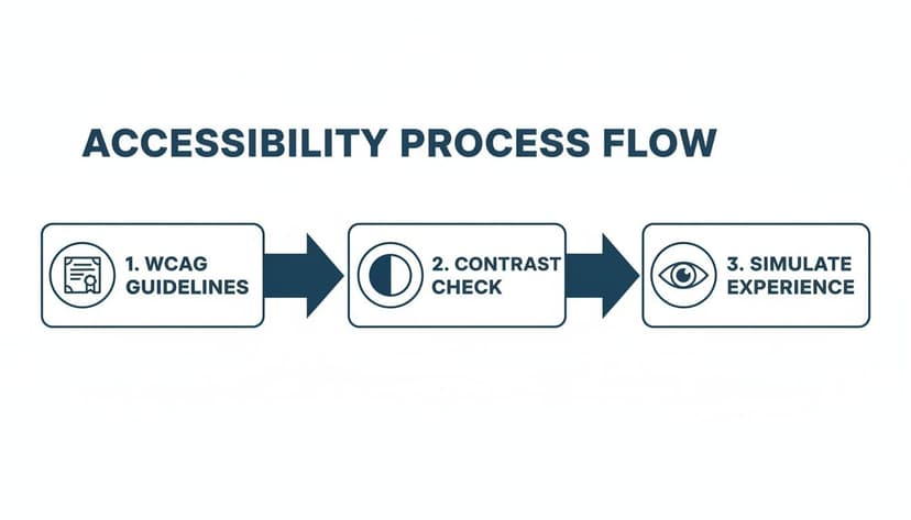
Stick to these steps, and you’ll end up with colors that are not just beautiful, but also technically sound and inclusive for every reader.
Step 1: Start With a Strong, Genre-Appropriate Base
First, pick one powerful base color that immediately signals your genre. This is not the time to get experimental. Your best bet is to head over to the Amazon bestseller lists and see what's already working.
Writing epic fantasy? You might notice a lot of deep navy blues or rich forest greens. That color becomes your anchor—the primary hue you'll build everything else around.
Once you’ve found a color you like on a bestselling cover, you need its hex code. A browser extension like ColorZilla is perfect for this. Just use the eyedropper tool to grab the exact six-digit code (like #1A2B3C). That precise code is what you'll plug into accessibility tools.
With that base color locked in, you can start building out the rest of your palette with confidence, knowing you're starting from a place of proven market appeal.
Step 2: Use Free Tools to Build and Test
You do not need expensive software for this. Incredible free tools online do all the heavy lifting. A personal favorite is Adobe Color—it has built-in accessibility features that are easy for authors to use.
Just plug your base hex code into the color wheel and head to the "Accessibility Tools" section. This is where you can check the contrast ratio between different colors. The tool will instantly flag any combinations that don't meet WCAG AA standards, letting you tweak them in real-time until they pass. All the guesswork is gone.
Here’s a quick way to use it:
- Pick a Harmony Rule: Start with something simple like "Complementary" or "Triad." This will generate initial accent colors based on your anchor color.
- Adjust and Check: Drag the color sliders to fine-tune the shades. You'll see the contrast checker update instantly, telling you which pairs are safe for text and backgrounds.
- Find Your Neutrals: Don't forget to find light and dark neutrals (like grays or off-whites) that work with your main colors. These are essential for body text or subtle background elements.
Step 3: Refine Your Palette with Purpose
Once you have a handful of compliant colors, the last step is to give each one a job. A good palette isn't a random collection of colors; it's a system designed to create a clear visual hierarchy.
- Primary Color: This is your base, the color that will dominate the cover's design.
- Accent Color: Use a high-contrast color here for the title or a key design element you want to pop.
- Text Color: This needs to be a dark or light neutral with a killer contrast ratio (at least 4.5:1) against both your primary and accent colors.
- Secondary Accent (Optional): Use another color for less critical info, like subtitles or the author name.
Structuring your palette this way ensures the most important information—your title and author name—is always the most readable. Even if you are creating or testing covers with an AI tool, you can use this workflow to audit and fix the colors it suggests. This puts you back in control while guaranteeing the final design works for everyone.
Once you’ve nailed down your accessible palette, document it. Adding it to a comprehensive brand style guide is a professional move that helps maintain consistency across your website, social media, and ads, making your author brand stronger.
Essential Tools to Test Your Book Cover's Accessibility
You don't have to guess whether your cover is accessible—you can test it. You don't need a design degree or pricey software. A handful of free, easy-to-use tools can empower any author to check their work, whether they're designing the cover themselves or giving feedback to a freelancer.
Using these tools pulls you out of guesswork and into data. This step is crucial for making sure your cover pops as a crisp, legible thumbnail on crowded retail sites like Amazon, where first impressions are everything.
Quick Contrast Checkers
The fastest way to validate your color choices is with a dedicated contrast checker. These are perfect for on-the-fly checks of specific color pairs—like your title text against a moody background image.
It’s simple: you enter the hex codes for your foreground and background colors, and the tool instantly provides the contrast ratio. More importantly, it will tell you if you pass the critical WCAG AA and AAA standards for both normal and large text.
My go-to options are:
- WebAIM Contrast Checker: This is the industry standard. It's a no-fuss, browser-based tool that gets the job done fast.
- Adobe Color's Contrast Tools: This is built into their color palette generator, which makes it fantastic for checking an entire color scheme at once.
Poor color contrast isn't just a minor design mistake; it's the single biggest reason people can't access digital content. For authors who get this right, it's a huge opportunity. A low-contrast cover thumbnail simply vanishes for millions of readers with color blindness or vision impairments.
Browser Extensions for Real-Time Analysis
For a more seamless workflow, browser extensions are a game-changer. They let you check contrast and even simulate different types of color blindness directly on a webpage or an image you've uploaded. This is perfect for reviewing a cover proof from your designer or an image you're testing.
Pro Tip: Use an extension to see how your cover looks on a live Amazon search results page. This gives you the real-world context you need, showing how your cover's legibility holds up right next to the competition.
Two of the best extensions for this are WAVE and Colorblindly. WAVE is a powerhouse for a full accessibility audit, while Colorblindly is hyper-focused on simulating the eight types of color vision deficiency. It lets you see your cover through your readers' eyes.
All-in-One Design and Testing Platforms
Some platforms roll palette creation and robust testing features into one package, giving you a complete end-to-end solution. These are brilliant for authors who want a more guided experience when building an accessible color scheme from scratch.
A great example is Coolors, which lets you generate palettes and then immediately view them through various color blindness simulations. This proactive approach helps you spot problems early in the design phase, saving time on revisions. These platforms slot in perfectly alongside the other book cover design tools you might be using for typography and layout.
By adding these tools to your process, you stop hoping your cover is accessible and start knowing it is. This final check provides confidence that your cover is ready to capture the attention of every potential reader.
Common Mistakes to Avoid in Accessible Cover Design

Knowing the rules of accessible color is half the battle. Putting them into practice without falling into common design traps is the other half. Even authors with the best intentions can make simple mistakes that hurt their cover's readability and sales potential.
Here are the most common pitfalls indie authors face:
- Relying on Color Alone: A splash of red might feel like a clear signal for horror, but without enough contrast, it looks like a muddy blob to many readers. Genre cues should come from a mix of imagery, typography, and a color scheme that passes the contrast test.
- Prioritizing Style Over Substance: Delicate, whisper-thin script fonts can look gorgeous in a full-size preview but vanish completely against a complex background, especially when shrunk down to a tiny thumbnail on a phone.
- Forgetting Genre Conventions: A neon green and hot pink cover might be perfectly legible—you'll find plenty of bold children's book cover color examples in that vein—but it would be a disaster for a historical fiction novel. The goal is to find accessible palettes within the established visual language of your genre.
The Pitfall of Low-Contrast Text
This is the number one offender. It's tempting to go for a subtle, moody effect by placing dark gray text over a slightly less dark background. But that artistic choice makes your title virtually invisible to a huge chunk of your potential audience.
- What Not to Do: Placing a deep purple author name on a black background. The contrast ratio is almost certainly well below the required 4.5:1, meaning it fails WCAG AA standards.
- What to Do Instead: Use a contrast checker before you finalize anything. A quick swap to a light gray or an off-white for the text could be all you need to fix the issue while keeping the mood.
The Problem of Vibrating Colors
Ever seen two colors next to each other that seem to shimmer or hurt your eyes? That’s color vibration. It happens when highly saturated, complementary colors—like a fire-engine red and an electric blue—are placed side-by-side. The effect is jarring and can cause real eye strain, making people want to look away.
This is a case where a design might technically pass a contrast check, but the user experience is still poor.
Your cover's job is to draw the reader in, not physically repel them. If looking at your design feels like a workout for your eyes, you need to rethink the color combination.
Forgetting to Check Against Genre Norms
As you focus on making your cover accessible, don’t lose sight of what readers in your genre expect. A perfectly compliant color palette is useless if it signals the wrong genre.
Think about romance, for instance. We all know certain color schemes signal specific tropes. An enemies-to-lovers story often uses dark, high-contrast palettes. Instead of ditching that trend, just adapt it. Make sure your dark title has a powerful contrast against that moody background, and you’ll have a cover that’s both on-brand and readable. A good starting point can be found by reviewing a gallery of romance book cover designs to understand the visual language.
You can use an AI tool to generate cover concepts based on your tropes. Then, bring those ideas into your design process and use accessibility tools to fine-tune the colors. The result is a cover that’s both trendy and legible.
Answering Your Top Questions About Accessible Color Palettes
Let's dive into some of the questions I hear most often from indie authors trying to wrap their heads around accessible design. These are the persistent myths and practical concerns that come up time and again.
Does My Print Book Cover Really Need to Be Accessible?
Absolutely. While the official WCAG guidelines were built for the web, the core principles—high contrast and clear typography—are universal design truths.
Think about the journey your physical book takes. It has to be legible under the harsh fluorescent glare of a bookstore, in the dappled sunlight of a park, and by the dim lamp on a reader's nightstand. Good contrast isn’t just for readers with visual impairments; it helps everyone. It’s what makes your title and author name pop from across a room, grabbing that crucial first glance on a crowded shelf.
In short, accessibility in print is just good, effective design. It’s about making sure your cover does its job in every possible real-world scenario.
Will Using Accessible Colors Make My Cover Boring and Dull?
This is the biggest myth out there. Accessibility is not about slapping black text on a white background and calling it a day. It’s about making smart, inclusive choices that actually make your design stronger.
You can create stunning, genre-perfect, and emotionally powerful covers using an endless variety of accessible color palettes. The trick is to stop thinking of it as a limitation.
Accessibility is a creative challenge, not a creative restriction. The goal is to find the most powerful color combinations that also happen to be legible for everyone.
You'd be surprised how many bestselling covers already follow these best practices. Good design is often accessible by default. We're even seeing this trend in the corporate world. For instance, Microsoft just rolled out five new accessible themes for its Power BI software, including one called "Orchid."
Imagine that: a soft, neutral orchid palette for a compelling romance book that looks incredible and passes every contrast check. You can read more about how they developed these new color themes and borrow some ideas for your own genre.
Can't I Just Let an AI Tool Handle the Accessibility Stuff?
Using an AI tool is a fantastic way to generate initial concepts. These platforms are trained on massive datasets of successful covers, so the designs they generate often have a solid foundation with good contrast and clear layouts. They can save you hours of guesswork.
But I always recommend a final, human check. Treat the AI-generated design as a high-quality draft. From there, it only takes a few minutes to run it through one of the free contrast checkers or color blindness simulators we talked about earlier.
This quick final step gives you complete creative confidence and ensures your cover is truly ready for every single potential reader before you hit publish. It’s a tiny bit of effort for a huge payoff.
What's More Important: A Cool Font or an Accessible One?
An accessible font. Every single time. No contest.
Here's the hard truth: a visually stunning title that no one can read will sell exactly zero books. If a reader has to squint to figure out your title on a tiny Amazon thumbnail, they’re not going to click. They’re just going to scroll on by.
The best covers find that perfect sweet spot—a font that is both stylistically right for the genre and ridiculously easy to read. Your typography has to pull double duty, communicating the book's tone while being effortlessly legible. If you have to choose, always prioritize clarity. Your sales will thank you for it.
Ready to Create Your Own Book Cover?
Turn your story into a visual masterpiece. Fill in the details below to start generating professional covers instantly.