Cobalt Blue Color Meaning for Your Book Cover Design
Unlock the cobalt blue color meaning to create a book cover that sells. Learn how its psychology, history, and genre fit can captivate readers on KDP.
Posted by
Related reading
Master Dark Teal Hex Code for Stunning Covers
Find the official dark teal hex code (#014D4E) for book covers. Learn color psychology, palettes, and KDP print tips to perfect your design.
Your Guide to the Burgundy Color Code for Book Covers
Discover how to use the burgundy color code for your book cover. Get HEX, RGB, and CMYK values to create a cover that sells on Amazon KDP.
The Cobalt Blue Color Code: A Guide for Book Cover Design
Discover the exact cobalt blue color code (Hex, RGB, CMYK) and learn how to use it for book covers that stand out on Amazon KDP and beyond.
Ready to design your cover?
Use our AI book cover generator to create tailored book cover concepts in minutes.


When you see cobalt blue on a book cover, what does it signal to a potential reader? It’s not just another shade of blue. For an author publishing on a crowded digital shelf like Amazon KDP, understanding the cobalt blue color meaning—trust, intelligence, authority, and depth—is a strategic tool for capturing reader attention and setting clear genre expectations.
The Power of Cobalt Blue for Your Book Cover

As a deep, saturated, and confident blue, it immediately cues a story with substance and intellectual weight. It’s a world away from the light, airy feel of sky blue or the electric buzz of cyan.
Unlike those brighter, more playful blues, cobalt carries a certain gravity. For an indie author, this is an incredibly valuable tool. It helps set reader expectations before they even click on your book, promising a narrative that’s compelling, thoughtful, or packed with expertise.
Cobalt blue acts as a visual shorthand for quality and seriousness. It’s a color that doesn’t shout but speaks with quiet confidence, drawing readers in with the promise of a well-crafted story.
This psychological punch is exactly why you see it used so deliberately in certain genres. A thriller wrapped in cobalt suggests deep secrets and high stakes, while a business book uses it to project instant credibility. In literary fiction, it can hint at profound emotional journeys or philosophical questions. For practical examples, you can review designs on our page dedicated to thriller book covers.
Decision Checklist: Is Cobalt Blue Right for Your Book?
To help you decide if cobalt is the right choice for your cover, use this checklist to see if its core attributes align with your story's themes and genre.
| Attribute | Psychological Meaning | Best Suited Genres |
|---|---|---|
| Authority | Signals expertise, confidence, and control. | Business, Non-Fiction, Thrillers |
| Intelligence | Conveys logic, knowledge, and thoughtfulness. | Science Fiction, Literary Fiction, Historical |
| Depth | Evokes seriousness, mystery, and introspection. | Psychological Thrillers, Sci-Fi, Memoirs |
| Trust | Builds a sense of reliability and stability. | Self-Help, How-To Guides, Biographies |
Getting a handle on the cobalt blue color meaning lets you design with intent, moving beyond just picking a color you like. When you choose it deliberately, you’re aligning your cover with what readers in that genre are subconsciously looking for, which is the secret to making a powerful first impression.
The Psychology Behind Cobalt Blue in Cover Design

We've talked about what cobalt blue signals, but let's get into the why. Why does this specific color have such a hold on a reader’s subconscious? The psychological power of cobalt blue comes from the deep-seated associations we all have with the color blue, just dialed up to eleven by cobalt's intensity.
When a potential reader glances at a cobalt blue cover, their brain immediately registers it as a sign of stability and seriousness. This isn't just a designer’s opinion; it’s a well-documented psychological shortcut. Deep blues feel non-threatening and calming, giving a reader the mental green light to engage with complex or even intense themes.
Cobalt blue triggers feelings of confidence, seriousness, and calm introspection. This isn't just about aesthetics; it's about managing reader expectations from the very first glance.
This is precisely why the color is such a workhorse across different genres. For a sci-fi novel, cobalt evokes the vast, intelligent void of space. For a literary fiction title, it hints at an emotionally deep story that demands serious thought.
The Science of Trust and Authority
The pull of cobalt blue isn't just theoretical—it’s backed by solid consumer research. In the world of color psychology, deep blues are the undisputed champions of trust, making them a secret weapon for hooking readers. In fact, studies show blue hues can boost perceived trustworthiness by as much as 34% in branding.
What’s more, 57% of consumers connect deep blues with professionalism and security. These are critical triggers for genres like thrillers, business books, and memoirs where credibility is everything. Using cobalt taps into a pre-existing mental framework that tells readers your book is reliable and expertly crafted.
This psychological foundation is a massive part of effective cover design. You can take a deeper dive into these ideas in our guide on the broader principles of color psychology for branding and see how to apply them to your own author platform.
Fine-Tuning the Psychological Tone
Of course, not all cobalt blues are created equal. Subtle shifts in the shade can completely change your cover’s psychological message. A darker, more muted cobalt can feel somber and mysterious, a perfect match for a psychological thriller. A brighter, more saturated version can convey confidence and innovation, making it ideal for a groundbreaking business book.
Playing with these nuances is key to nailing your story’s specific emotional tone. Creating mockups with an AI tool can be a practical way to test these subtle shifts. You can generate multiple versions to see firsthand how a minor change in shade impacts the cover’s mood and market appeal before you commit.
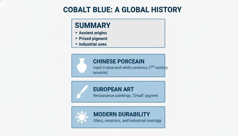
A History of Prestige and Power
When you choose cobalt blue for your cover, you're not just picking a shade; you're tapping into a powerful legacy of prestige, global trade, and artistic revolution. Choosing it means you're borrowing centuries of perceived value, giving your book a layer of timeless quality before a single page is turned.
Its journey to becoming a symbol of luxury began over a millennium ago, forming the backbone of one of the world's most revered art forms: Chinese blue and white porcelain. As early as the 9th century, artisans were sourcing precious cobalt ores from as far away as Persia. The scale of this trade was staggering; by the 14th century, they were importing around 1,000 kilograms of the raw material every year just to keep up with demand. You can dig deeper into the history of this pigment on Wikipedia.
This wasn't just pretty pottery. Each piece was a status symbol, representing imperial power, immense wealth, and a level of craftsmanship the world had never seen. The deep, vibrant blue commanded respect, a fusion of global reach and artistic genius that still captivates collectors today.
A Revolution in European Art
Cobalt blue's story didn't end in the East. Fast forward to the early 19th century, when European chemists finally synthesized the pigment. Suddenly, artists had a stable, brilliant blue that was far more affordable than the ridiculously expensive ultramarine, which had to be ground from lapis lazuli gemstones.
This breakthrough completely changed the game. It unleashed a wave of creativity, especially for the Impressionists and Post-Impressionists. Painters like Vincent van Gogh grabbed onto cobalt blue for its raw emotional power. He famously used it to paint the swirling, electric sky in "The Starry Night," where the color’s incredible depth communicates both cosmic awe and deep, personal turmoil.
"Cobalt [blue] is a divine colour and there is nothing so beautiful for putting atmosphere around things." - Vincent van Gogh
For these painters, cobalt blue wasn't just another color on the palette. It was a tool for expressing feelings that couldn't be put into words and for capturing the fleeting, magical qualities of light. Its arrival signaled a major shift—color was now about emotion, not just realism.
The Modern Promise of Durability
Beyond all the history and artistry, cobalt blue offers a surprisingly practical benefit for today's authors: durability. One of the main reasons artists loved the pigment was its incredible lightfastness—a technical term meaning it stubbornly resists fading when exposed to light.
This is a huge deal if you’re publishing print-on-demand books through services like Amazon KDP. A cover printed with stable cobalt blue inks will hold its vibrant color far longer than one made with cheaper, less stable pigments. Your physical books will look just as crisp and professional years from now as they did on day one.
This built-in longevity reinforces the color's psychological meaning of trust and lasting value. It’s a subtle promise to the reader, and for authors working on something like a historical fiction book cover, that sense of endurance can be the perfect finishing touch.
Technical Codes for a Perfect Cobalt Blue Cover
Getting your colors right is one of those non-negotiable rules of professional cover design. That brilliant, electric cobalt blue you see on your screen can all too easily turn into a dull, muddy disappointment in print if you’re not careful. To nail the powerful psychology of cobalt blue, you need to speak the language of color codes.
These values ensure your color stays consistent, from the ebook version on a Kindle to the paperback in a reader's hands.
Codes for Your Digital Cover
When you're designing for screens—like your ebook cover, website banners, or social media graphics—you’ll be working in an additive color space. This just means the screen is mixing Red, Green, and Blue light to create the final color. Your go-to codes here are:
- Hex Code:
#0047AB(The universal code for web browsers and CSS) - RGB:
R: 0, G: 71, B: 171(Used in design software like Photoshop)
Think of these as the precise recipe your computer needs to create that perfect, deep cobalt every single time.
From Screen to Print: The Right Codes for Paper
Print is a whole different ballgame. Instead of adding light, printers subtract it by layering inks on paper. This is why you need a different set of codes, known as CMYK.
To make sure your physical book cover matches your digital one, you’ll use CMYK: C: 100%, M: 58%, Y: 0%, K: 33%. Handing these exact numbers to your designer or printer is the single best way to prevent nasty color surprises.
Now, for authors who are serious about branding, there's another level of precision: the Pantone Matching System (PMS). For anyone building an author brand, understanding Pantone Colours is a must. It guarantees that the cobalt blue on your book cover is the exact same shade as the blue on your business cards, bookmarks, and other marketing materials.
While there isn't a single Pantone that's a perfect one-to-one match, a fantastic option is Pantone 19-4052 Classic Blue. It carries that same authoritative, confident feeling that makes cobalt so compelling.
Cobalt Blue Color Codes for Digital and Print
Use these values to ensure your cobalt blue is consistent across your ebook cover, print cover, and promotional materials.
| Color System | Value | Primary Use Case |
|---|---|---|
| Hex | #0047AB |
Web design, ebooks, online ads |
| RGB | 0, 71, 171 |
Digital images (Photoshop, etc.) |
| CMYK | 100, 58, 0, 33 |
Print books, business cards, flyers |
| Pantone | 19-4052 Classic Blue |
Professional brand color matching |
Having these codes on hand makes the entire design process smoother and ensures your final product looks polished and intentional.
When you choose cobalt, you're tapping into a color with some serious history. It’s been a mark of luxury in Chinese porcelain, a staple for visionary artists in Europe, and a modern symbol of strength and durability.
What’s the takeaway for your book cover? Using this color instantly gives your design a sense of value and permanence. Exploring a full shades of blue color palette can help you discover complementary hues that build on this rich legacy, creating a cover that feels both timeless and completely modern.
How to Match Cobalt Blue to Your Book Genre
Choosing a cover color isn't just about what looks good—it's your single fastest way to signal your book's genre to a browsing reader. The cobalt blue color meaning comes packed with authority, intelligence, and depth, but making it work for you means knowing how to aim it at your specific genre.
Get it right, and you instantly manage reader expectations, aligning your cover with the visual language of its category on Amazon KDP. A smart color strategy isn't just about aesthetics; it's about creating a cover that sells. Let's break down how this powerhouse color plays out across three major genres.
Thrillers and Mysteries
For thrillers, cobalt blue is an absolute titan. Its deep, serious tone is an immediate shortcut to mystery, nighttime secrets, and the authoritative presence of law enforcement or shadowy government agencies. It promises a story that is complex, high-stakes, and smart.
A solid cobalt background practically radiates suspense and gravity. It’s the perfect canvas for a bold, high-contrast title that needs to pop.
- Complementary Color Pairing: Hit it with a sharp, vibrant yellow or orange. That high-contrast punch creates a sense of immediate danger and urgency—perfect for an action-heavy thriller.
- Typography: A crisp, bold white sans-serif font is your best bet. It guarantees your title is legible and commanding, even when it’s just a tiny thumbnail on a screen.
This combo screams modern and fast-paced. For a psychological thriller, you might swap the orange for a muted silver or gray to create a colder, more clinical atmosphere.
Science Fiction
In the world of science fiction, cobalt blue speaks of advanced tech, the silent expanse of deep space, and the cool logic of futuristic societies. It can be the quiet void between stars, the glow from a spaceship's command console, or the uniform of a powerful interstellar fleet. The color's deep ties to intelligence make it a natural fit for hard sci-fi exploring complex technical or philosophical ideas, and it anchors countless sci-fi cover design ideas.
For science fiction covers, cobalt blue acts as a visual signifier for intellect and the unknown. It draws readers in with the promise of a vast, imaginative world grounded in smart, forward-thinking concepts.
To give your sci-fi cover that cutting-edge feel, pair cobalt with colors that amplify its futuristic vibe.
- Complementary Color Pairing: A clean, metallic silver or a brilliant cyan delivers a sleek, high-tech look. These pairings are fantastic for stories about artificial intelligence, cybernetics, or deep space exploration.
- Typography: Geometric or minimalist fonts work exceptionally well here, reinforcing the themes of structured design and advanced order. To lean into a more ethereal or otherworldly feel, you can learn more about how blue and purple tones work together in our article exploring if purple and blue match.
Non-Fiction and Business
When it comes to non-fiction—especially in business, self-help, or finance—the core cobalt blue color meaning of trust and credibility is gold. It projects authority and expertise, telling potential readers that the information inside is reliable, well-researched, and worth their time.
Unlike fiction, which sells a story, non-fiction sells a solution or a body of knowledge. Cobalt blue establishes that dependable expertise in a single glance. A great strategy is to use an AI tool to generate slight variations of your cover, testing different shades to find the one that conveys confidence without feeling too cold or corporate. This lets you precisely tune your cover's message for your target audience.
Common Mistakes to Avoid When Using Cobalt Blue
Cobalt blue is a powerhouse color, but it’s also incredibly easy to get wrong. A single misstep can undermine your cover's impact, telling readers the wrong story before they even read the blurb. Knowing the most common traps is the first step to making sure your design connects with the right audience.
Checklist of Pitfalls to Avoid:
- Poor Text Contrast: Using black, dark gray, or other low-contrast text colors. This makes your title unreadable, especially as a small thumbnail on Amazon, killing its visibility.
- Overuse and Flatness: Drenching the entire cover in a single, flat shade of cobalt. This looks amateur and lacks the visual depth needed to attract a reader's eye. A professional design uses the color as a key element, not a suffocating blanket.
- Genre Mismatch: Applying cobalt blue to genres that require a light, fun, or energetic tone (like rom-coms or cozy mysteries). This sends a confusing signal and actively pushes away your target readers.
Your title needs to be the undeniable hero of the cover. A reader’s eye should snap to it instantly. For online sales, good contrast isn't just a suggestion; it's a requirement.
How to Avoid Tonal Confusion
The most critical error is a genre mismatch. Cobalt blue’s serious, authoritative vibe makes it a terrible fit for genres that run on light, fun energy. Slap it on a sweet contemporary romance or a quirky comedy, and you're sending a confusing signal, promising a tone the story can’t possibly deliver.
This kind of tonal confusion actively pushes away your ideal readers. They'll take one look, assume your book is something it isn't, and scroll right past. For example, while cobalt is perfect for a high-stakes thriller book cover, it would feel jarring and out of place on a lighthearted rom-com.
When you're working on your own cover, don't be afraid to experiment. You can use an AI tool to mock up your concept with different background colors. You’ll see right away whether cobalt is actually serving your story or if another color would do a much better job of hitting your genre’s specific notes.
Frequently Asked Questions About Using Cobalt Blue
Working with a color as bold as cobalt blue is bound to raise a few questions. Let's get straight to the practical, no-fluff answers you need to get your cover design right.
Is Cobalt Blue a Good Color for a Fantasy Book Cover?
Yes, cobalt blue can be a fantastic choice for fantasy, but it works best for specific subgenres like epic or high fantasy. Its deep, rich tone instantly brings to mind ancient magic, royal lineage, and a sense of powerful destiny.
Pair it with shimmering gold or silver text, and you’ve got a cover that signals importance—perfect for a sprawling tale of kingdoms and fate. For urban fantasy, it can create a sleek, mysterious vibe. Just be careful with lighter, whimsical fantasy; a serious color like cobalt might set the wrong tone.
You can see how other powerful colors work on our page dedicated to thriller book covers.
What Colors Pair Best with Cobalt Blue for Text?
When your cover is sitting on a crowded Amazon page, readability is everything. High-contrast colors are your best bet for making your title pop.
- Crisp White or Light Silver: These are the go-to professional choices. They look clean, sharp, and are incredibly easy to read against a deep cobalt background.
- Bright Yellow or Warm Gold: If you want a more dramatic or energetic feel, these colors create an unmissable focal point that pulls the reader’s eye directly to your title.
Warning: Never use black or dark gray text on a cobalt blue background. It’s a critical mistake that kills contrast, making your title unreadable as a thumbnail and costing you clicks and sales.
How Can I Keep My Cobalt Blue Consistent?
Getting your color to look the same online and in print is a classic headache for authors. The key is to manage your color codes from the start. First, always use the right code for the format: RGB for ebooks and CMYK for print.
Second, when you're getting your file ready for a printer like KDP, make sure your design software is set to a CMYK color profile before you export. This stops the printer's software from making its own weird color conversion.
Finally, and this is non-negotiable, always order a physical proof copy. Nothing beats holding the actual book in your hands to know for sure that your cobalt blue is exactly what you envisioned.
Ready to Create Your Own Book Cover?
Turn your story into a visual masterpiece. Fill in the details below to start generating professional covers instantly.