Your Guide to the Burgundy Color Code for Book Covers
Discover how to use the burgundy color code for your book cover. Get HEX, RGB, and CMYK values to create a cover that sells on Amazon KDP.
Posted by
Related reading
Master Dark Teal Hex Code for Stunning Covers
Find the official dark teal hex code (#014D4E) for book covers. Learn color psychology, palettes, and KDP print tips to perfect your design.
The Cobalt Blue Color Code: A Guide for Book Cover Design
Discover the exact cobalt blue color code (Hex, RGB, CMYK) and learn how to use it for book covers that stand out on Amazon KDP and beyond.
Mastering Balancing Elements in Photography for Striking Book Covers
Learn balancing elements photography to create compelling, professional book covers. Get practical tips for indie authors to attract readers on KDP.
Ready to design your cover?
Use our AI book cover generator to create tailored book cover concepts in minutes.


The classic burgundy color code, most often seen as #800020, is a critical tool for ensuring your book cover looks consistently professional everywhere. Think of it as a universal translator for color, guaranteeing the deep, rich burgundy you chose on your screen is the same one your reader holds in their hands.
Decoding the Burgundy Color Code for Authors
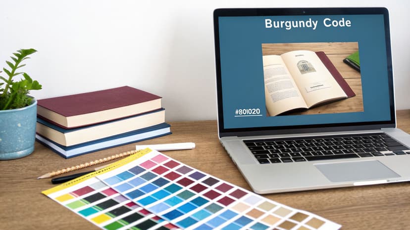
For an author, a color code isn't just a jumble of letters and numbers—it's your tool for precision. When you see a cover with a perfect shade, it’s not just "burgundy"; it's a specific value like #800020 that any design system can replicate without error. This code is what guarantees the color you approved in the design phase is the one that shows up on Amazon KDP.
This precision is vital for both digital and print books. Why? Because an ebook on a Kindle uses a different color system (RGB for screens) than a paperback printed through a service like KDP (CMYK for ink). Knowing the correct codes for each format prevents your moody, atmospheric burgundy from printing as a flat, disappointing red.
Burgundy Color Code Conversion Table
Here’s a quick reference guide for the most common burgundy color codes across different systems. These are what you'll use for everything from digital design to print production.
| Color System | Code | Primary Use |
|---|---|---|
| HEX | #800020 |
Web and digital design (ebooks, websites, ads). |
| RGB | (128, 0, 32) |
Screen-based media (monitors, TVs, mobile devices). |
| CMYK | (0, 100, 75, 50) |
Professional printing (paperbacks, hardcovers). |
| HSL | (345, 100%, 25%) |
Fine-tuning in digital design software. |
| Pantone | 202 C |
Brand consistency for offset printing. |
Having this table handy means you can confidently provide your color specs to a designer or plug them into a cover creation tool and know the result will be accurate.
Why This Matters for Your Book Cover
Burgundy isn't just a color; it’s an entire mood. It borrows the raw passion from red, the grounded stability from brown, and a touch of luxury from purple. This unique blend makes it a powerhouse choice for authors.
It’s especially potent in genres that demand emotional weight, like the gripping suspense you find on thriller book covers or the simmering desire in a historical romance. In fact, this rich hue is shaping up to be a major design trend for 2026, hitting a sweet spot that feels bold, reassuring, and elegant all at once. It’s the perfect color for a cover that needs to feel both timeless and current.
Knowing the specific burgundy color code empowers you. It lets you communicate your vision clearly to a designer or confidently use a tool to get the exact color you imagined. It takes the guesswork out of design and puts you in control of your book's visual identity.
By mastering these codes, you’re not just picking a color. You’re ensuring your book’s first impression is professional, compelling, and perfectly aligned with the story inside.
The Psychology of Burgundy in Cover Design
Why does a burgundy cover feel so powerful? The secret is in its color psychology. Burgundy isn’t just a simple dark red; it’s a complex shade that sends strong, subconscious signals to your readers, shaping how they feel about your book before they even read a single word.
Think of it as a sophisticated blend of its parent colors. It has all the passion and energy of red, but it's tempered with the stability of brown and a subtle touch of purple's royal luxury. This unique recipe creates an immediate feeling of depth, ambition, and serious emotion.
It's this rich, layered meaning that makes burgundy a near-perfect choice for specific genres. The color instantly communicates the exact mood that readers of dark romance, historical fiction, epic fantasy, and intricate thrillers are looking for.
When you understand how to wield this color, you gain a massive advantage on a crowded digital bookshelf like Amazon. You're signaling your book's core themes at a glance.
Connecting Color to Genre
For a book cover, burgundy is a powerful non-verbal cue. Its psychological triggers align perfectly with what readers in several key genres have come to expect:
- Dark Romance & Passion: Those red undertones are all about desire and intense, high-stakes emotion. It’s the perfect backdrop for stories with complicated, all-consuming relationships.
- Historical Fiction & Epic Fantasy: The hints of brown and purple bring a sense of history, royalty, and weight. It makes a cover feel substantial and important, hinting at a world with deep lore or sprawling events.
- Thrillers & Mysteries: The deep, shadowy quality creates an immediate atmosphere of suspense and sophistication. It tells the reader this isn't a cheap scare—it's an intricate puzzle waiting to be solved.
By strategically using a specific burgundy shade, you're tapping into these pre-existing associations, making your cover far more effective at grabbing your target audience. You can even use a cover creation tool to test different shades and see which one best captures your story's unique emotional core. For a deeper dive, check out our guide on the fundamentals of color psychology for branding.
The Science of Capturing Attention
The power of burgundy isn't just a feeling; it's backed by data. Its psychological profile is turning heads in digital advertising and branding. Eye-tracking studies have shown that related deep, purplish hues can generate 34% longer fixation times from viewers.
That’s a significant advantage for an author, as it can lead to deeper cognitive engagement with your promotional visuals. You can learn more about the research behind color psychology in advertising.
For indie authors publishing on KDP, this means choosing a burgundy cover isn't just an aesthetic whim—it’s a calculated marketing move designed to stop the scroll and boost your click-through rates.
Building a Winning Burgundy Color Palette
Burgundy rarely stands alone. On a book cover, it’s the supporting colors that make it truly effective—turning a good design into one that looks professionally tuned for your specific genre. This is where we move past abstract color theory and into practical, ready-to-use color combinations and hex codes you can apply immediately.
The colors you pick for your covers aren't just decorative; they're a core piece of your author brand. Knowing how to create a strong brand identity helps you make these choices with purpose, ensuring your books look cohesive and instantly recognizable.
Genre-Specific Burgundy Color Palettes
A great cover uses color as a shortcut to managing reader expectations. The right palette is a silent promise, telling your ideal reader exactly what kind of story they're about to get.
To make this easier, here are some genre-specific palettes to get you started.
| Genre | Primary Color | Accent Color 1 | Accent Color 2 | Mood |
|---|---|---|---|---|
| Fantasy | Burgundy #800020 |
Gold #FFD700 |
Charcoal #36454F |
Epic, Magical, Royal |
| Thriller | Burgundy #6D2932 |
Cool Gray #A9A9A9 |
Deep Navy #000080 |
Tense, Modern, Sophisticated |
| Romance | Burgundy #900020 |
Cream #FFFDD0 |
Soft Pink #F8C8DC |
Warm, Intimate, Elegant |
These combinations are designed to evoke a specific feeling at a glance. You can copy these hex codes directly into a design tool to get a head start.
For authors writing across different genres, it's a good idea to see how other foundational colors work. For instance, our deep dive into the shades of blue color palette offers similar genre-specific combos for a completely different emotional spectrum.
The Psychology Behind Burgundy Pairings
Why do these combinations work so well? It all comes down to the psychology you're trying to trigger. This map breaks down the core feelings that burgundy taps into.
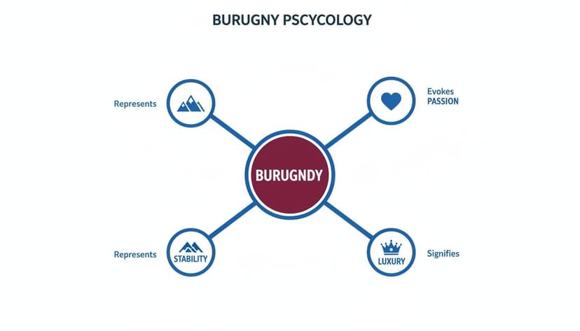
As you can see, burgundy sits at the intersection of passion, stability, and luxury. This is exactly what makes it so versatile.
Your choice of accent colors allows you to lean into one of these psychological pillars. Pairing burgundy with gold, for example, dials up the luxury. Pairing it with a grounded neutral like gray or charcoal enhances its feeling of stability and seriousness. When generating cover concepts, try testing these different pairings to see which one best captures the heart of your story.
Looking ahead, color forecasts for 2026 point to a specific variant, Magenta Purple (#990066), as a major commercial player for KDP authors. It's even projected to replace black in over 30% of autumn palettes thanks to its refined and versatile feel. Burgundy's sophisticated vibe makes it a bold but reliable choice for grabbing attention and driving sales, as noted in recent 2026 color trend reports.
Key Takeaway: Building a great palette isn't about picking pretty colors. It's about combining them to tell a story, guide a reader's emotions, and perfectly match genre expectations before they've even read the first page.
Can Readers Actually See Your Title? Making It Pop on Burgundy

Let's be blunt: a gorgeous burgundy background is useless if no one can read your title. Your cover has to work as a tiny thumbnail on an Amazon search page, and if the title is a muddy, unreadable mess, you've lost the sale.
This is where text contrast is crucial. Simply put, contrast is the difference in brightness between your text and the background. With a deep, luxurious color like burgundy, you need a text color that’s significantly lighter to leap off the page (or screen). A dark title on a dark background is one of the most common—and fatal—design mistakes.
The Golden Rule: Your #1 goal is instant legibility, even at a tiny size. A crisp white or a warm, light cream text against a standard burgundy (#800020) is a classic pairing for a reason—it just works. Steer clear of using dark grays, deep blues, or other shadowy colors for your title text.
Demystifying Contrast Ratios
So, how do you know if your text is "light enough"? Thankfully, you don't have to guess. Designers use a system from the Web Content Accessibility Guidelines (WCAG) that assigns a number—the contrast ratio—to measure readability.
Think of it as a score. A higher number means the text is easier to read. While these rules were made for websites, the principle is absolutely vital for book covers that need to grab attention in a split second. A little knowledge about WCAG compliance levels can give you a huge advantage.
You don’t need to be a design expert to use this. There are many free "contrast checker" tools online where you just plug in your colors and get an instant score.
Your 4-Step Pre-Flight Check
Before you commit to your cover, run this simple check. It takes less than a minute and can save you from a major design headache.
- Grab Your Hex Codes: Find the exact hex codes for your burgundy background and the text color you've chosen.
- Find a Contrast Checker: Google "contrast checker" and open any of the free tools that pop up. Paste your two hex codes into the designated fields.
- Aim for the Magic Number: For big, bold text like a book title, you want a contrast ratio of at least 4.5:1. This is the professional standard for clear, accessible design.
- Tweak and Test: Is your score too low? No problem. Try a slightly lighter or brighter version of your text color. You’ll be surprised how a small adjustment can dramatically improve your ratio.
Following this quick process ensures your cover isn't just beautiful—it's an effective sales tool. To dive deeper into this subject, check out our guide on building accessible color palettes for more pro tips.
Common Mistakes to Avoid with Burgundy
Burgundy is a powerful color, but it's also surprisingly easy to get wrong. A few common mistakes can drain the life out of this gorgeous shade, turning a potentially stunning cover into something amateurish. Avoiding these pitfalls is key to a professional-looking design.
Pitfall #1: The "Muddy" Cover
This is what happens when you pile dark on dark. Think of a burgundy background paired with deep browns, charcoal grays, or dark navy accents. Without any light to create separation, the colors bleed into a flat, indistinct blob—especially when shrunk down to a tiny thumbnail on an Amazon page.
Pitfall #2: Ignoring Title Contrast
This next one is a deal-breaker. You can have the most beautiful burgundy background in the world, but if your title is a dark color, it's going to vanish. Your title and author name must be readable in a split second.
A title that can't be read is a sale that can't be made. Always prioritize legibility over a subtle aesthetic.
There's a reason crisp white, cream, or a light metallic gold on burgundy are such timeless, high-contrast pairings. They simply work.
Pitfall #3: Overusing the Color
Burgundy is a strong flavor; a little goes a long way. Drenching your entire cover in one solid shade, with no breathing room or contrasting elements, feels overwhelming and heavy. Instead of looking luxurious, this approach often ends up looking dated and flat. Think of it as a dominant background, broken up with your main character, key objects, or bold typography. You can quickly generate a few variations with an AI tool like BeYourCover to see which balance feels right.
Pitfall #4: Forgetting Genre Expectations
Finally, ignoring your genre's visual language is a surefire way to confuse readers. A deep, sensual burgundy might be perfect for a dark romance book cover, signaling passion and secrets. But that same shade could feel completely wrong for a lighthearted contemporary rom-com.
Decision Checklist:
- Does this specific burgundy color code match the mood of my story?
- Is this color common on my genre's bestseller list, or will it stick out for the wrong reasons?
Getting the answers right ensures your cover is speaking the correct language to the very people you want to reach.
How to Use Burgundy Color Codes on Your Cover

All this color theory is great, but let's get down to what really matters: getting that perfect shade of burgundy onto your actual book cover. This is where a burgundy color code stops being a random string of characters and becomes your most powerful tool for precision.
Using a specific code is the difference between close enough and exactly right. It ensures the vision you have in your head is what ends up on the screen, with no room for misinterpretation.
Most professional design software and cover creation tools have an editor where you can plug in these codes. Instead of dragging a color picker around and just hoping you land on the right hue, you get to dictate the exact shade. This gives you total command over your cover’s background, text, and every other element.
Once an initial concept is generated, you can often navigate to an editor and paste your chosen hex code—like #800020—to ensure perfect color consistency across all your branding. This simple step bridges the gap between knowing what you want and actually getting it.
A Practical Walkthrough
Let’s make this concrete. Say you’re designing a cover and want that deep, classic burgundy for the background. The process is refreshingly simple.
Here’s the typical workflow you'll follow:
- Generate Your Initial Concept: Start by entering your story details to get a few design directions from the AI.
- Access the Editor: Once you have a concept you like, open it in the editor to start fine-tuning.
- Select the Element: Click on the background, a line of text, or any other part of the design you want to color.
- Input the Hex Code: A color panel will pop up, showing the current color's hex code. Just delete it and paste in your preferred burgundy color code.
The change happens instantly. This method takes all the guesswork out of the equation, guaranteeing the shade of burgundy is the one you chose, not a random approximation.
Testing and Iteration
The real power of using codes is how quickly you can test different options. You can generate a cover for your romance book cover, for example, then quickly create several variations side-by-side, each with a slightly different shade of burgundy.
Is the classic #800020 the perfect fit, or does a slightly brighter #900020 do a better job of capturing your story’s passionate tone? By just copying and pasting, you can compare them visually and make a decision based on what actually looks best.
This rapid iteration is crucial. It helps you land on a final cover that’s not just beautiful, but perfectly tuned to your genre and story, making your book pop on digital shelves like Amazon.
Frequently Asked Questions About Burgundy Covers
Even after you've settled on a color, a few questions often pop up. Let's tackle some of the most common ones authors ask when working with burgundy for their book covers.
What Is the Difference Between Burgundy, Maroon, and Crimson?
It's easy to lump these three together, but they all send different signals to a reader. Getting it right comes down to understanding their subtle undertones and what mood you're trying to set.
-
Burgundy (#800020): This is your deep, sophisticated red. The key is its distinct purple tint, which gives it that classic feeling of luxury and depth.
-
Maroon (#800000): This one leans more into brownish-red territory. It’s warmer and more earthy than burgundy, making it feel grounded, stable, and a bit more traditional.
-
Crimson (#DC143C): The energetic one of the bunch. Crimson is a much brighter, more vibrant red with a hint of blue. It’s all about passion and energy, not subtlety.
Think about the story's core emotion. Burgundy whispers sophistication, maroon suggests stability, and crimson shouts passion.
Is Burgundy a Good Color for Non-Fiction?
Absolutely. While it’s a star in fiction, burgundy's psychological pull makes it a fantastic choice for non-fiction covers, too. It’s strongly associated with authority, substance, and tradition.
This makes it a perfect fit for serious subjects like history, academic writing, business strategy, or philosophy. The color acts as a subconscious cue, telling the reader that the information inside is well-researched, credible, and important. We see this effect used in genres like thrillers where burgundy helps signal a story with real weight and sophistication, as you can see in these thriller book covers.
How Do I Make My Printed Book Match My Ebook?
This is a classic headache for authors using print-on-demand services like KDP. The culprit is the difference between how screens and printers handle color. Your screen uses RGB (mixing Red, Green, and Blue light), while a printer uses CMYK (mixing Cyan, Magenta, Yellow, and Black ink).
What looks rich and dark on your monitor can sometimes turn out flat or surprisingly bright on paper.
Practical Tip: Design your ebook cover using the RGB hex code #800020. But before you export the file for print, you must convert your design to the CMYK color space. Nearly every professional design tool has a simple function for this. This one step is the key to ensuring the rich, deep burgundy you chose doesn't become a disappointing red on your printed book.
Ready to Create Your Own Book Cover?
Turn your story into a visual masterpiece. Fill in the details below to start generating professional covers instantly.