Effective Backgrounds for Covers: KDP Guide 2026
Choose effective backgrounds for covers to grab attention on Amazon KDP. Our 2026 guide covers types, genre matching, composition, & technical specs.
Posted by
 Pablo Yáñez
Related reading
Photos for Book Covers: A Complete Guide for Authors
Learn how to choose effective photos for book covers. This guide covers composition, sourcing, licensing, and technical specs for KDP-ready designs.
Create the Perfect Book Review Form: A Guide for Authors
Learn to design a book review form that delivers actionable feedback. This guide covers question design, distribution tactics, and using reviews for marketing.
KDP Self Publishing: A Complete 2026 Author's Guide
Ready to self-publish your book? This complete KDP self publishing guide walks you through manuscript prep, cover design, marketing, and more for 2026.
Ready to design your cover?
Use our AI book cover generator to create tailored book cover concepts in minutes.

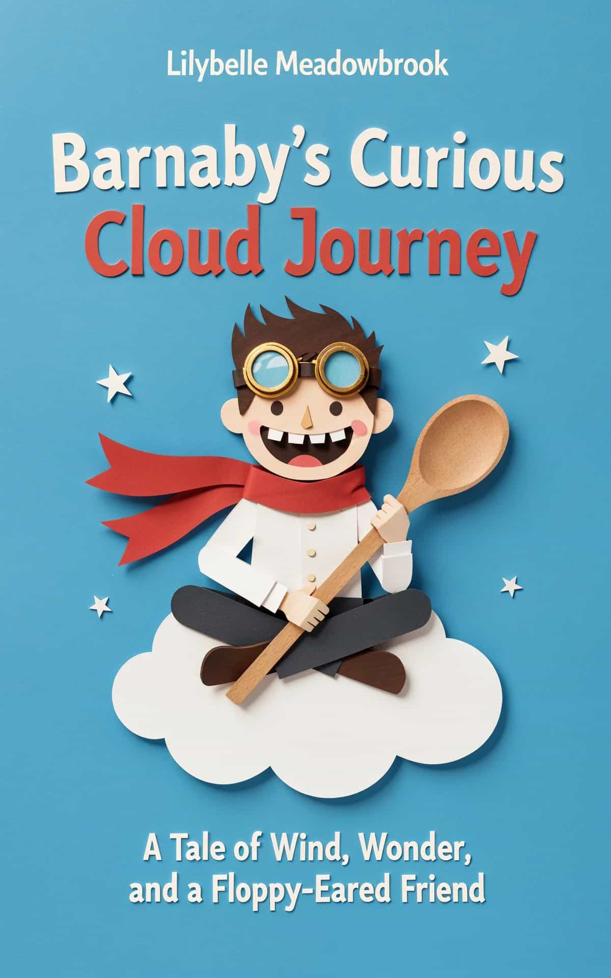
You're probably looking at a blank canvas, a folder full of stock images, or a half-finished AI-generated concept and thinking the same thing most authors think at this stage: “What should the background be?”
That question sounds cosmetic, but it isn't. On Amazon KDP and other storefronts, readers don't inspect your cover in a calm, full-screen environment. They scan tiny rectangles, make fast genre judgments, and decide whether your book looks relevant, professional, and worth a click. The background does a lot of that work before anyone reads a single word of your title.
Authors often choose backgrounds for covers by asking what looks dramatic, expensive, or artistic. The better question is simpler: what helps the cover communicate instantly? A good background sets the emotional temperature, frames the typography, and tells the reader what shelf your book belongs on. A bad one creates friction. It muddies the title, confuses genre, or makes the whole cover feel generic.
Why Your Cover Background Is a Sales Tool
A common mistake is treating the background like wallpaper. It isn't wallpaper. It's the field your entire sales message sits on.
When an author sends me cover drafts that “almost work,” the problem usually isn't the font. It's that the background is saying the wrong thing. A misty forest says something very different from a clean geometric grid. A distressed concrete texture pushes the reader toward tension or grit. A soft-focus sky can suggest reflection, healing, or romance depending on the color and crop.
Readers judge genre before they read title details
On a storefront grid, people don't start by decoding nuance. They look for familiar signals. The background is one of the fastest signals on the page because it occupies the most visual area.
That's why the same title treatment can feel commercial on one background and amateur on another. If the backdrop creates the right expectation, the reader's brain does less work. That matters online, where hesitation kills clicks.
The same principle shows up outside publishing. If you've ever studied what makes a good YouTube thumbnail, you've seen the same problem in another format: small images have to communicate fast, and every background choice either supports that goal or gets in the way.
Practical rule: If the background needs a long explanation, it's probably not doing its job.
Pretty is not the same as effective
Authors often fall in love with a beautiful image that would work well as wall art, a website hero image, or a mood board. But covers sell books, not aesthetics in isolation.
A good background for a cover does three jobs at once:
- Signals genre: It tells the right reader, “this is for you.”
- Supports hierarchy: It gives the title, subtitle, and author name room to breathe.
- Creates contrast: It helps the cover survive thumbnail size without becoming noise.
That's why background choice is strategic. The strongest option is usually not the loudest image in your shortlist. It's the one that makes the rest of the cover easier to understand at a glance.
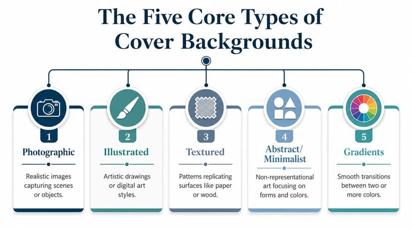
The Five Core Types of Cover Backgrounds
Most backgrounds for covers fall into five practical categories. Once you know what each category is good at, choosing gets much easier.
Photographic backgrounds
A photographic background is a snapshot of the book's world. It gives you realism fast.
This works well when setting matters. A road disappearing into fog, a city skyline, a couple on a beach, a remote cabin, a business desk scene. These backgrounds help readers place the book immediately. They're especially useful when you want atmosphere without explaining it.
The risk is over-detail. A photo with too many focal points competes with typography. Another risk is sameness. If the image looks like stock photography readers have seen across dozens of covers, the book can lose distinction.
Interesting side note: visual motifs like forests and fields don't feel common by accident. Real natural environments condition what people find familiar. Eurostat reported that in the EU's 2018 land-cover survey, woodland accounted for 41.1% and cropland for 24.2% of land cover, which helps explain why those visual themes feel so grounded and recurrent in design language (Eurostat land cover statistics).
Illustrated backgrounds
An illustrated background is a designed interpretation, not a literal capture. It can be painterly, graphic, whimsical, dark, ornate, or flat.
This category gives you more control over tone than photography usually does. It also helps books stand apart in crowded digital shelves because the style itself becomes part of the hook. Fantasy, middle grade, cozy fiction, graphic-forward romance, and select literary fiction often benefit from this approach.
Illustration works best when the style matches the promise of the book. A mismatch is costly. A playful illustrated background on a bleak psychological thriller sends the wrong signal even if the art is excellent.
Textured backgrounds
Textured backgrounds are surfaces with mood. Think paper grain, brushed paint, smoke, grunge, linen, marble, concrete, or aged parchment.
They're useful when you want atmosphere without a literal scene. Texture can make a cover feel tactile and intentional, and it often solves the practical problem of giving typography a calmer field. Thrillers, historical books, memoir, literary fiction, and some nonfiction all use texture well, and gritty horror book cover examples lean on it hardest of all.
A textured background often succeeds because it adds tone without adding story clutter.
The trap is using texture as filler. If it's there only because the cover felt empty, it usually looks that way.
Abstract and minimalist backgrounds
Abstract and minimalist backgrounds are concepts made visual. They use shapes, lines, grids, symbols, negative space, or restrained forms rather than scenery.
They're often the smartest choice when the book sells an idea rather than a place. Business, self-help, leadership, technology, and thought-driven nonfiction often benefit from this kind of backdrop. The design can feel modern, credible, and focused.
A verified design observation matters here: high-contrast technology-style backgrounds work best when they use a sparse grid or node-link structure with strong negative space, because dense backgrounds reduce title and subtitle legibility. Stock libraries even separate general technology imagery from cover-page technology backgrounds, which reflects how different layout needs affect production choices (technology cover background guidance).
Gradient backgrounds
Gradients are emotion controlled through color transition. They're simple, flexible, and underrated.
A gradient can create depth, softness, heat, tension, or calm without introducing extra objects. It can support type-led covers particularly well, and it gives designers room to shape focus zones behind the title. For ebooks, this can be extremely effective because the simplicity survives downscaling.
Use gradients when you want the cover to feel clean and deliberate. Avoid them when the genre requires literal worldbuilding or a stronger narrative cue.
Matching Your Background to the Right Genre
The right background doesn't just look appropriate. It aligns with what readers already expect from the category they shop in.
Here's a working guide.
Background type and genre suitability
| Background Type | Best For Genres | Communicates |
|---|---|---|
| Photographic | Thriller, romance, memoir, commercial fiction | Place, mood, realism, immediacy |
| Illustrated | Fantasy, cozy fiction, middle grade, select romance | Voice, character, stylization, uniqueness |
| Textured | Historical fiction, literary fiction, memoir, suspense | Atmosphere, seriousness, tactile mood |
| Abstract/Minimalist | Business, self-help, technology, nonfiction | Clarity, authority, concepts, modernity |
| Gradients | Contemporary fiction, wellness, type-led nonfiction, some sci-fi | Emotional tone, simplicity, clean focus |
Why thrillers and suspense often need restraint
Thrillers usually benefit from backgrounds with tension built into them. That can mean gritty texture, dark photography, fog, shadow, or stark environmental contrast. The point isn't to show everything. It's to create unease.
When authors choose a thriller background that's too polished or decorative, the cover loses urgency. You want friction, not prettiness. A distressed backdrop or ominous photographic crop tends to do that more effectively than a busy action scene.
Why romance depends on emotional clarity
Romance readers want to know what kind of emotional experience they're getting. The right romance book cover backgrounds often carry that signal before the title typography confirms it.
Soft-focus photography, warm gradients, painterly illustration, or clean intimate settings usually communicate emotional access. Harsh texture or cold abstraction can work for darker romantic subgenres, but only if the rest of the package supports that choice.
Color matters too. If you're weighing how background hue affects warmth, trust, or tension, this guide on color psychology for branding is useful because the same principles influence book-cover response.
Why nonfiction often performs better with less scenery
For business and educational titles, a literal scene often weakens the message unless the topic is location-specific. Readers in these categories are usually buying clarity, expertise, or transformation. A conceptual background communicates that more efficiently.
That's one reason minimalist grids and infographic-style textures have become a visual shorthand for authority in nonfiction and business. The wider normalization of public datasets through institutions like the UN statistical system and UNCTAD helped make data visualization feel mainstream and credible, which influenced design language far beyond reports and dashboards (UNCTAD statistics and institutional context).
Use literal scenery when the setting sells the book. Use conceptual backgrounds when the idea sells the book.
When to bend genre convention
You don't always need to follow the category leader. But if you break convention, do it on purpose.
A memoir can use abstraction if the emotional theme matters more than the life chronology. A fantasy novel can lean on texture and symbol instead of a full illustrated background—some of the most atmospheric fantasy covers do exactly that when mystery is part of the appeal. The key is that the cover must still make sense to the right reader within seconds.
If the background makes your book look like it belongs in the wrong category, originality won't save it.
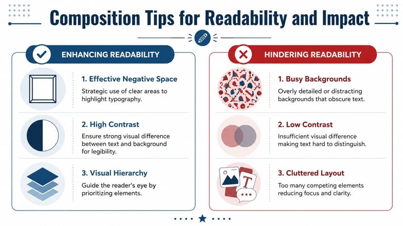
Composition Tips for Readability and Impact
A strong background can still fail if the composition fights the text. Most underperforming covers don't have a sourcing problem. They have a placement problem.
Build a quiet zone for the title
The title needs a calm area. Designers often call this negative space, but in practical terms it just means giving words somewhere to sit without interference.
If your background has detail everywhere, the eye keeps wandering. That makes the title feel less important even when it's large enough. Skies, walls, water, blurred foliage, empty gradients, soft shadows, and cropped textures often provide useful quiet zones.
A verified principle worth keeping in mind: a major challenge in cover design is readability across mobile storefronts, and a visually complex background can hurt performance if it competes with the title at thumbnail size. The goal is a background that supports typography subtly, not one that overpowers it (thumbnail readability guidance).
Control contrast before you touch the font
Authors often try to solve readability with heavier fonts, outlines, glow effects, or drop shadows. Those are rescue tools, not first choices.
Start with the background itself. If the title area sits over medium-value detail, almost any text treatment will struggle. Shift the crop. Darken or lighten the image selectively. Blur part of it. Lower texture intensity behind key text. Once the field is right, the typography usually becomes much easier to solve.
Don't ask the font to fix a background problem.
Use composition that guides the eye
Good cover composition creates a reading path. The eye should land somewhere meaningful, then move naturally to the title, subtitle, and author name.
Useful tactics include:
- Top-third breathing room: Many covers work better when the upper area is less busy and the lower area carries more image weight.
- Directional cues: Roads, beams of light, silhouettes, and architectural lines can point toward text.
- One dominant focal area: If the background already has multiple points of equal emphasis, the cover will feel indecisive.
Check the cover at small size
A cover can look excellent at full resolution and collapse as a thumbnail. That's normal. Marketplace performance depends on small-size communication.
Do these checks before you finalize:
- Zoom out aggressively: View the cover small enough that you can't read body details. Does the title still hold?
- Test on mobile: A phone view is often more honest than a desktop mockup.
- Squint test: If the cover turns into visual mush, simplify the background.
- Grayscale check: If the hierarchy disappears without color, the contrast structure needs work.
If you're experimenting with palettes, a free color tool can help you choose cleaner combinations before you commit. Something like Adobe Color is useful for testing contrast relationships and mood quickly.
Technical Specs and Sourcing Your Background
A background can be strategically right and still fail in production if the file quality or usage rights are wrong. Such circumstances often expose flaws in many DIY covers.

Choose assets built for production
Professional cover workflows rely on high-resolution vector or high-res raster backgrounds because the same design often has to work as an ebook thumbnail, a paperback front, and a full-wrap print file. Major stock libraries explicitly separate vectors, illustrations, and high-res graphics for this reason, which tells you that scalability and print readiness are baseline requirements, not extras (high-resolution background asset guidance).
That matters because a background that looks fine in a small digital preview may break apart in print. Soft edges, compression artifacts, and muddy gradients become obvious once the file is pushed into a larger format.
What to check before you buy or export
Use this checklist before you approve a cover background:
- Resolution quality: Make sure the source file stays sharp in both small digital use and larger print applications.
- Licensing terms: Confirm you're allowed to use the asset on a commercial book cover, not just in personal projects.
- Editable flexibility: If you may need to blur, recolor, extend, or crop the image, choose a file that can tolerate those changes.
- Series consistency: If this is book one of several, ask whether the same style can be repeated without feeling copied.
- Print behavior: Gradients, dark textures, and subtle shadow detail need checking because they can reproduce differently in print than on screen.
Cropping rules matter more than people think
A background isn't just an image. It's an image inside a layout system. That's why safe zones matter. Social media designers deal with this constantly, and the principle transfers well to book covers: don't place essential elements where automated cropping or trim can compromise them.
If you want a simple parallel example of how layout-safe areas affect final presentation, these Facebook cover photo safe zone tips are useful because they show how composition decisions have to account for platform constraints.
Source carefully and document everything
When authors pull images from random search results, they create two problems. First, they risk legal trouble. Second, they often end up with files that are too compressed or poorly suited for commercial output.
If you're comparing options, it also helps to review how different visuals behave on covers specifically, not just as standalone pictures. A practical starting point is this guide to book cover photos, especially if you're trying to decide between scene-based photography and more neutral support imagery.
Modern Workflows for Creating Backgrounds
The old workflow was straightforward. Search stock libraries, license an image, adjust it, place type, and hope it doesn't look like five other books in your category.
That still works. But it isn't the only option now.

Start with direction, not software
The strongest modern workflow starts with a clear brief. Before opening Midjourney, Adobe Firefly, Canva, Photoshop, or a stock site, define these points:
- Genre signal: What must the background communicate instantly?
- Emotional tone: Uneasy, tender, authoritative, epic, intimate, reflective?
- Text placement needs: Where does the title need space?
- Series potential: Can the approach evolve across multiple books?
- Originality threshold: Does this feel distinct enough from category clichés?
That last point matters more than ever. AI tools allow rapid iteration, but the challenge is choosing backgrounds that still feel original and genre-appropriate, and that can adapt across a series without becoming generic branding wallpaper (AI background workflow guidance).
Use AI for variation, then edit like a designer
AI is useful when you treat it as a concept engine, not an autopilot. The practical advantage isn't that it “makes a cover for you.” It's that you can explore multiple visual directions quickly.
Prompts work better when they include compositional intent, not just subject matter. For example:
- Thriller: “Misty rural road at dusk, cinematic, low saturation, empty upper third for title, subtle texture, suspense mood”
- Business: “Minimal dark navy grid with sparse glowing nodes, strong negative space, clean center composition, premium nonfiction”
- Romance: “Soft golden coastal background, shallow depth of field, warm pastel haze, uncluttered center space for elegant title”
- Fantasy: “Painterly moonlit forest with distant castle silhouette, atmospheric depth, clear title zone in sky, rich but not busy”
The important part is what happens next. You still need to judge whether the result reads correctly at small size, whether it looks overfamiliar, and whether the text can sit on it cleanly.
A generated background is a draft asset, not a finished cover decision.
Blend stock, AI, and layout testing
In practice, many strong covers now come from hybrid workflows. You might start from a stock photo, use Photoshop to simplify it, generate alternate moods with AI, then test several title placements before choosing the final version.
If you want to experiment with that process in a cover-specific environment, AI tools for graphic designers give a useful overview of the current situation. One cover-focused option is BeYourCover, which generates book cover concepts from a title, genre, and short summary and lets you test typography, layout, and variations against the chosen background. That kind of workflow is helpful because it closes the gap between “nice image” and “usable cover.”
A primary advantage of modern tools is speed of comparison. You can test atmospheric photography against a gradient. You can compare an illustrated backdrop with a conceptual one. You can see quickly whether a more original direction improves clarity or just makes the cover stranger.
Making Your Final Background Decision
Choose the background that works hardest, not the one that shouts loudest. The right option tells the reader what kind of book this is, sets the mood fast, and gives your typography room to win at thumbnail size.
If you're torn between two backgrounds for covers, pick the one that makes the title clearer and the genre more obvious. Readers don't reward background complexity. They reward covers that feel immediately right.
If you want to test background directions before committing, try a cover mockup workflow or a free tool for title and layout experiments so you can compare clarity, contrast, and genre fit before publishing.
Ready to Create Your Own Book Cover?
Turn your story into a visual masterpiece. Fill in the details below to start generating professional covers instantly.
