Photos for Book Covers: A Complete Guide for Authors
Learn how to choose effective photos for book covers. This guide covers composition, sourcing, licensing, and technical specs for KDP-ready designs.
Posted by
Related reading
The Bright Pink Color Code for KDP Book Covers
Find the right bright pink color code for your book cover. This guide covers hex, RGB, and CMYK values, plus KDP print settings and design tips for authors.
Hiring a Book Cover Illustrator: A Practical Guide for 2026
Learn how to find, hire, and manage a professional book cover illustrator. Our step-by-step guide helps indie authors navigate briefs, pricing, and rights.
Create the Perfect Book Review Form: A Guide for Authors
Learn to design a book review form that delivers actionable feedback. This guide covers question design, distribution tactics, and using reviews for marketing.
Ready to design your cover?
Use our AI book cover generator to create tailored book cover concepts in minutes.


You've finished the manuscript. Now you need a cover that works in two places at once: as a full-size print object and as a tiny retail thumbnail on Amazon.
That's why choosing photos for book covers isn't just a style decision. It's a filtering decision. You're not asking, “Is this image beautiful?” You're asking, “Can this image carry my title, signal my genre, survive cropping, and still look professional when printed?”
Most cover mistakes happen before the design stage. Authors pick a photo that feels emotionally right, then discover it's too busy for text, too horizontal for a vertical cover, too weak in resolution, or too generic to stand out in a crowded category. The image wasn't bad. It was wrong for the job.
A good decision framework solves that. It helps you choose the right source, the right file, and the right composition for your budget, skill level, and publishing path.
Your Book Cover Starts with a Single Image
You choose a photo that feels right. Then the title has nowhere to sit, the paperback crop cuts into the subject, and the ebook thumbnail turns into a blur. By the time those problems show up, you have already spent time and money on the wrong file.
For indie authors, this single visual decision carries more weight than it seems to at first. One image often has to support several formats, different trim sizes, and very different viewing conditions. If the foundation is weak, the rest of the cover has to compensate, and that usually shows.
Why the photo choice is strategic
The base image does more than set the mood. It controls how much flexibility you have later with type, cropping, color treatment, and format changes. A strong photo gives the designer room to solve problems. A weak one creates problems that design cannot fully hide.
Print also exposes flaws fast. Soft focus, compression artifacts, awkward framing, and thin file quality may pass on a screen, then fall apart on a physical cover. Good source images hold detail through resizing and leave enough usable space around the subject. That breathing room matters if you need to adapt the same concept for hardcover, paperback, and ebook.
Composition matters here as much as resolution. Authors who understand how to balance visual elements in photography usually make better first picks because they stop judging the image only by taste. They start judging it by workload. Can this file carry text cleanly? Can it survive a tighter crop? Can it still read at thumbnail size?
If the answer is no, every later step gets more expensive.
- Typography gets constrained when the photo has no quiet area for the title.
- Cropping gets dangerous when the subject is pressed against the edge.
- Format changes get messy when the image only works in one proportion.
- Print reveals weak files that looked acceptable on a laptop.
Practical rule: Treat the image as the structural layer of the cover, rather than as decoration added at the end.
What authors often get wrong
The usual mistake is choosing for personal meaning before checking market fit. A family photo, travel snapshot, or atmospheric stock image may matter to the author, but the cover still has a job to do. It has to signal genre, leave room for type, and hold together across formats.
I advise authors to make the decision in this order: market signal, composition, file quality, then personal preference. That sequence prevents expensive attachment to an image that cannot do the work.
A good photo for a book cover is rarely the one with the strongest emotional pull in isolation. It is the one that gives you the best path to a finished cover that looks credible in your category.
The Anatomy of an Effective Cover Photo
A useful cover photo acts like a stage set. It establishes place, mood, and tension, but it still leaves room for the actors to perform. On a book cover, those actors are the title, subtitle, and author name.
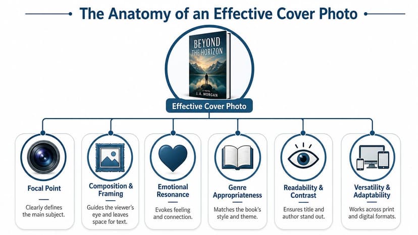
Start with copy space
For book-cover photography, the image has to be composed with text placement in mind. Practitioners advise leaving plain or low-detail areas for the title and author name, and shooting multiple variations that preserve copy space in different parts of the frame, as noted by Digital Photography School's cover-photo guidance.
That one principle rules out a surprising number of otherwise attractive images. If the entire frame is full of sharp texture, busy foliage, patterned clothing, city detail, or strong contrast changes, your typography will fight for survival.
Use this test before you shortlist any image:
- Squint at the photo: If you can't identify one calm area, type will struggle.
- Mentally place the title: Try top, center, and bottom. At least one should feel natural.
- Check for interruption: Hair, branches, buildings, and hard edges often cut through text zones.
- Look for flexibility: You want room to shift the crop without destroying the composition.
If you want a deeper visual breakdown of how subjects, balance, and empty space work together, this guide on balancing elements in photography is a useful companion.
Choose a clear focal point
A cover photo needs one dominant subject or visual idea. Not three. Not a collection of interesting details. One.
That could be a face, a house, a road, a symbolic object, a silhouette, or a dramatic natural feature. The key is immediate readability. The reader should grasp the visual hierarchy fast, especially at thumbnail size.
Photos that usually fail here include:
- Crowded scenes with many equally important elements
- Wide environmental shots where nothing anchors attention
- Literal narrative moments that feel too specific or melodramatic
- Generic symbolic stock with no emotional tension
A strong cover image doesn't explain the whole book. It creates a controlled first impression.
Match mood to market
Lighting and color carry genre signals. A warm, airy floral image and a cold, high-contrast alleyway don't promise the same reading experience. The floral belongs to the soft palettes of romance cover photography ideas; the alleyway to the tension of thriller photo cover examples. Readers may not describe those signals in design terms, but they do react to them.
That doesn't mean you should copy another cover. It means your photo should belong in the same visual conversation as books competing for the same reader.
A practical genre check:
| Cover element | What to ask |
|---|---|
| Lighting | Does it feel soft, harsh, dramatic, nostalgic, eerie, polished? |
| Color | Does the palette fit the tone your reader expects? |
| Subject matter | Does the image suggest the right world, stakes, or emotional register? |
| Simplicity | Will the core idea survive once the cover is reduced to thumbnail size? |
Beautiful photography can still fail commercially if it sends the wrong signal.
Sourcing Your Cover Photo Options and Tradeoffs
Once you know what the photo must do, the next question is where to get it. At this stage, many authors lose time. They jump between stock sites, old personal photos, AI tools, and custom-shoot ideas without a decision framework.
The cleaner approach is to choose a sourcing method based on four variables: budget, uniqueness, time, and skill.
Cover Photo Sourcing Options
| Method | Cost | Uniqueness | Time Investment | Skill Required |
|---|---|---|---|---|
| Stock photo | Low to moderate | Low to moderate | Low | Low to moderate |
| Commissioned photographer | High | High | High | Low for the author, higher coordination needs |
| DIY photography | Low to moderate | Moderate to high | High | High |
| AI image generation | Low to moderate | Moderate to high | Moderate | Moderate |
Stock works when speed matters
Stock is often the fastest route to a usable image, especially if your concept is simple and your category has recognizable visual cues. But stock comes with a real tradeoff. Industry guidance warns that widely used images can appear on multiple covers, so authors should check whether an image is already associated with other books and edit it into something more distinctive, as discussed in this guide to stock imagery in book cover design.
Stock is a good fit if:
- You need efficiency: You can audition many concepts quickly.
- Your budget is tight: Licensing one image is usually cheaper than producing a shoot.
- You're hiring a designer: A designer can crop, composite, grade, and typographically transform a familiar image.
Stock is a weak fit if your genre is saturated with the same visual shorthand.
Commissioned and DIY photos give control
A custom shoot gives you the best chance of getting exact framing, wardrobe, props, lighting, and copy space. That matters if your concept depends on a very specific character, setting, or brand look. The cost isn't just money, though. It also includes planning, communication, and the risk of getting an image that's technically fine but still not right for cover use.
DIY photography sits in a similar category. It can work well if you already understand composition and editing, and if your concept doesn't require expensive staging. It often fails when authors assume that “personal” automatically means “professional.”
AI can help test concepts before you commit
AI image generation is useful when you need visual exploration. It can help you test mood, subject direction, and composition before you buy stock or plan a shoot. If you're comparing tools, this roundup of AI image tools for stock-style visuals gives a practical starting point.
For authors who want to experiment with cover concepts directly, AI tools for graphic designers are also worth reviewing. One option in that workflow is BeYourCover, which can generate cover concepts from a title, genre, and summary so you can test whether a photo-driven direction is viable before committing to final design.
The best sourcing method isn't the most creative one. It's the one that gets you a cover-ready image with the least avoidable risk.
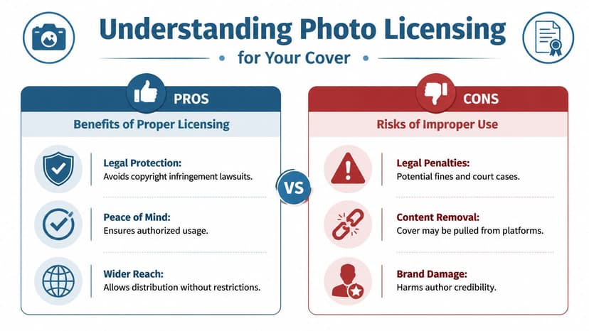
Understanding Photo Licensing for Your Cover
Licensing isn't the glamorous part of cover design, but it's the part that can cause real damage if you ignore it. A strong image with weak rights is still a bad asset.
Read licenses like a publisher, not a casual user
When you license a photo for a book cover, you're not just putting an image on a blog post. You're using it on a commercial product sold across platforms and formats. That means you need to verify whether the license allows commercial cover use, print distribution, modification, and any other planned usage tied to the book.
A useful mental model is traffic lights:
- Green light: Commercial use is clearly allowed, and the terms fit your project.
- Yellow light: Commercial use may be allowed, but there are restrictions on print, modifications, or redistribution.
- Red light: The source is unclear, unattributed, scraped, or inconsistent. Don't use it.
If you're checking uncertain files, reverse searches and forensic tools can help. This guide on how to verify image sources and detect AI is useful when you need to investigate an image before it reaches production.
Why commercial context matters
Photographers who produce cover-ready images often work with market-specific licensing realities in mind. In one microstock report, only about 60 of 815 accepted images included people, reflecting how specialized book-cover demand can be, especially where licensing and cover usability intersect, as described in this microstock report on book cover photography.
That matters because the rights attached to an image are part of its usefulness. A striking image can still be the wrong choice if the usage terms are vague, limited, or unsupported.
Keep records like you might need them later
If you license an image, save the confirmation, invoice, file details, and the exact license terms that applied at the time of purchase. Don't rely on memory or assume you can retrieve the original listing later.
Keep a simple file with:
- Source details: Where you got the image
- License proof: Receipt, order confirmation, or download record
- Usage notes: What the license allowed when you acquired it
- Edited versions: Final production files tied to that original asset
If you can't prove you had the right to use the image, treat that as a production problem before publication, not after.
Technical Specifications for Print and Ebooks
Creative fit isn't enough. A photo can match the genre perfectly and still fail in production if the file is too small, cropped too tightly, or prepared in the wrong format.
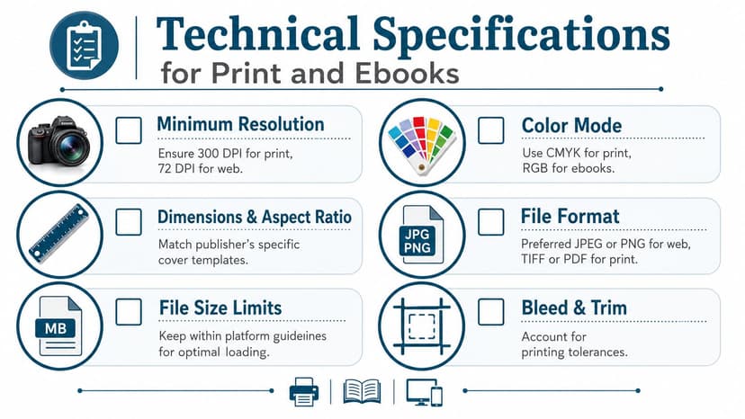
Resolution and orientation come first
One industry guide notes that 300 DPI is the print gold standard, and also warns that because 90% of photos are horizontally-oriented, a usable cover image often requires deliberate framing or enough resolution to survive conversion into a vertical layout, as explained in Clear Sight Books' photo resolution and layout guidance.
That single orientation problem catches a lot of authors. A strong horizontal image may look impressive on screen, then fall apart when cropped for a portrait cover. Heads get cut off. The subject drifts off-center. The usable text area disappears.
If you want a plain-English refresher on how image dimensions and clarity interact, this essential photo resolution guide is a practical reference.
Use a production checklist
Before approving any image for cover design, check the basics:
- Portrait suitability: Can the image work vertically without harming the subject?
- Cropping margin: Is there enough extra frame around the focal point?
- Detail retention: Will textures, edges, and faces still look clean in print?
- Template fit: Does it match the trim and wrap requirements you're designing for?
For KDP work, trim size changes the exact layout needs, so it helps to check a dedicated guide to Amazon book cover dimensions before final export.
File prep mistakes that create expensive problems
Some technical errors don't show up until late:
| Mistake | What happens |
|---|---|
| Starting with a web image | The cover may look soft or pixelated in print |
| Cropping too aggressively | You lose flexibility for alternate formats |
| Ignoring trim and bleed | Important content can sit too close to the edge |
| Approving only on a large screen | Thumbnail legibility gets missed |
The safest workflow is to begin with the largest, cleanest file you can legally use, then test it at both full print size and reduced retail size before you lock the design.
Integrating Your Photo into a Polished Cover
You have a promising image, a title, and a rough mockup. Then the trouble starts. The title sits on top of the busiest part of the photo, the author name feels dropped in at the last minute, and the cover that looked decent at full size turns muddy the moment it shrinks.
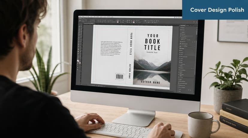
A photo becomes a cover only after it can support hierarchy, typography, and format requirements at the same time. That is the real decision point. Authors often spend too long asking whether they like an image and not enough time asking whether it leaves enough room for the cover to work.
Let the photo support the type
Strong covers start with a clear pecking order. The reader should know where to look first, second, and third. In most cases, that means title first, image second, author name third, unless genre expectations suggest a different order.
The photo has to cooperate with that structure. Busy textures, high-contrast edges, and faces placed in the center often make type placement harder and more expensive to solve. A quieter image can look less exciting in isolation, yet produce a stronger final cover because it gives the title space to read cleanly.
Use a few practical checks before committing to a layout:
- Place the title in the area with the cleanest contrast
- Keep text off eyes, mouths, and other facial focal points
- Make one text element clearly dominant
- Use asymmetry on purpose instead of centering by habit
- Choose photos with some negative space if your title is long
This is also where the earlier technical choices pay off. A larger, cleaner source file gives you more freedom to crop, darken, blur, or extend parts of the image so the typography feels built in instead of pasted on.
Run the thumbnail test early
Retailers sell books small first. Your full-size cover matters for print, but your thumbnail often gets the first click.
Shrink the draft fast and judge it hard:
- Reduce the cover until it matches online store size
- View it on a phone, not just a desktop monitor
- Check genre signal first
- Check title readability next
- Check whether the focal point still holds attention
While every background detail does not need to survive at thumbnail size, the cover must still communicate one clear idea and keep the title readable. If either fails, change the crop, simplify the background, or pick a different image.
Iterate before you commit
Covers improve through comparison. I usually learn more from seeing three workable versions side by side than from staring at one draft and trying to guess whether it is good enough.
Test different crops. Try a darker grade, a softer background, or a tighter zoom on the subject. Shift the title higher, lower, larger, and smaller. These are not cosmetic tweaks. They answer a practical question: does this particular photo give you enough flexibility to become a marketable cover for your genre?
If you want to test visual directions before paying for final production, use a free tool for generating and comparing cover concepts. That kind of rapid iteration helps when you are deciding between a literal photo, a mood-driven image, or a more stylized AI-assisted concept.
The strongest result usually comes from a workable image that leaves room for design decisions. Photo, type, and format need to pull in the same direction. That is how a raw image turns into a cover that can compete.
Ready to Create Your Own Book Cover?
Turn your story into a visual masterpiece. Fill in the details below to start generating professional covers instantly.