How to Design Cute Book Covers That Connect with Readers
Discover 8 essential styles for cute book covers. Learn design secrets for pastels, illustrations, and patterns to attract readers on Amazon KDP.
Posted by
Related reading
Photos for Book Covers: A Complete Guide for Authors
Learn how to choose effective photos for book covers. This guide covers composition, sourcing, licensing, and technical specs for KDP-ready designs.
Create the Perfect Book Review Form: A Guide for Authors
Learn to design a book review form that delivers actionable feedback. This guide covers question design, distribution tactics, and using reviews for marketing.
Effective Backgrounds for Covers: KDP Guide 2026
Choose effective backgrounds for covers to grab attention on Amazon KDP. Our 2026 guide covers types, genre matching, composition, & technical specs.
Ready to design your cover?
Use our AI book cover generator to create tailored book cover concepts in minutes.


In a crowded digital marketplace, a book cover's first job is to stop the scroll. Cute book covers accomplish this with remarkable efficiency, acting as powerful visual shorthand that communicates genre, tone, and emotional promise in a single glance. For indie authors publishing on platforms like Amazon KDP, mastering this aesthetic is not about decoration; it's a strategic tool for connecting with a target audience. Cuteness, when executed with precision, signals safety, charm, and delight, making your book an inviting destination for readers seeking a specific emotional experience.
This article moves beyond a simple gallery of designs. We will deconstruct the specific elements that make these covers work, from the psychology of pastel color palettes to the strategic use of whimsical character illustrations. You will learn not just what makes a cover cute, but why those choices are effective for genres like cozy mystery, lighthearted romance, and children's literature. We'll provide a practical breakdown of each style, offering actionable tips you can apply directly, whether you're briefing a designer or experimenting with cover creation tools yourself. The goal is to equip you with the knowledge to create a cover that doesn't just look good, but sells.
1. How to Use Pastel Palettes and Soft Typography
One of the most effective strategies for creating cute book covers is the deliberate use of pastel color palettes paired with soft, rounded typography. This design choice immediately signals a gentle, approachable, and often whimsical tone. Muted hues like blush pink, mint green, lavender, and soft cream create a low-contrast, visually soothing experience that draws the eye without overwhelming it. This aesthetic is particularly potent for genres like cozy fiction, contemporary romance, and children's books, where the cover needs to promise a comforting and enjoyable read.

This style has gained significant traction within the Instagram and BookTok communities, where its photogenic quality helps books stand out in social media feeds. The covers for many popular contemporary authors master this approach, combining pastels with friendly fonts to create an instantly recognizable brand.
Key Decision Criteria
- Color Psychology: Pastels are associated with calmness, sweetness, and lightheartedness. They lower the visual "volume," making a book feel like a gentle escape rather than an intense, demanding story.
- Typography's Role: The typography is just as crucial as the color. Soft, rounded, or flowing script fonts reinforce the cover's friendly message. Sharp, blocky, or aggressive fonts would create a jarring contradiction.
- Target Audience: This aesthetic strongly connects with millennial and Gen Z readers, who have shown a clear preference for minimalist and pastel-heavy designs in various consumer products, including books.
Common Pitfalls and How to Avoid Them
To apply this style effectively, be aware of these common mistakes:
- Becoming Washed Out: Prevent your design from looking bland by pairing your primary pastels with a single, slightly deeper accent color for the title or key design elements.
- Losing Legibility: Pastel covers can lose their definition when viewed as small thumbnails on retail sites like Amazon. Use a preview tool to ensure your title remains legible and the colors are distinct at 50px.
- Ignoring Print Shifts: Colors often appear less vibrant in print than on screen. When preparing your files for a physical copy, consider increasing the saturation of your pastels by 10–15% to compensate.
- Starting Too Complex: When testing ideas with an AI tool, start with a simple prompt like, "cozy bookshop with a cat, soft pastel color palette, rounded sans-serif font." You can then iterate on the color scheme or typography.
2. Using Illustrated Characters and Whimsical Mascots
Featuring an illustrated character or a whimsical mascot on your book cover is a powerful way to forge an immediate emotional connection with potential readers. These designs use stylized characters, from charming animals to relatable human figures, to create an anchor for the story's personality. This approach is highly effective for genres where character is central, such as children's books, cozy mysteries, and YA contemporary, as the illustration instantly sets the tone and builds memorability.
This style has found a strong foothold on platforms like Instagram and Webtoon, where a distinct character can make a book instantly recognizable in a busy feed. Many successful authors have built entire series around iconic illustrated protagonists, proving how a strong character design can become a brand in itself. The inherent charm of these cute book covers encourages social sharing, which drives organic discovery.
Key Decision Criteria
- Emotional Connection: A character's expression or pose communicates mood and genre cues far more directly than abstract imagery. A smiling, quirky character suggests a lighthearted read, while a pensive one hints at introspection.
- Memorability and Branding: Characters are more memorable than generic cover art. For a series, a consistent character illustration creates a powerful visual brand that readers can easily spot, encouraging them to collect the entire set.
- Target Audience: Illustrated protagonists appeal directly to readers of YA, children's fiction, and cozy genres. For book covers that lean into a distinctly adorable charm, exploring the Kawaii aesthetic can provide a rich source of inspiration for character design and overall visual appeal.
Common Pitfalls and How to Avoid Them
To make this style work for your book, avoid these common errors:
- Mismatching Expression and Tone: Ensure your character’s expression perfectly aligns with your book's tone. A mismatch between a cheerful illustration and a somber story can confuse and disappoint readers.
- Losing Detail: Detailed illustrations can become muddled at thumbnail size. Preview your cover on a small screen to confirm the character remains clear and recognizable.
- Inconsistent Branding: For a series, develop a simple style guide for your character. Note key colors, features, and proportions to maintain consistency. You can find more practical advice in our guide to book cover illustration.
- Vague Initial Concepts: When ideating, use an AI tool with specific prompts like, "whimsical illustration of a teenage girl with glasses, surrounded by books, bright and cheerful." This allows you to quickly explore different character styles before committing.
3. How to Apply Minimalist Line Art and Negative Space
One of the most refined approaches to creating cute book covers is through minimalist line art and a generous use of negative space. This design strategy communicates sophistication and approachability by focusing on simple, clean line drawings or geometric shapes against an uncluttered background. By prioritizing restraint, the cover conveys personality and theme without overwhelming the viewer. This style is exceptionally effective for literary fiction, contemporary romance, wellness, and self-help books, where it signals a thoughtful, modern, and authentic reading experience.

The influence of this aesthetic is visible in the iconic covers for authors like Sally Rooney and poets like Rupi Kaur. Design-forward publishers have widely adopted this clean look, resulting in a cover that feels both artistic and accessible, promising a story with depth and clarity.
Key Decision Criteria
- Negative Space as a Narrative Tool: The empty space on the cover is not just a void; it’s an active design element. It draws focus to the central illustration and typography, creating a sense of calm and allowing the reader’s imagination to fill in the gaps.
- Symbolic Illustration: The line art itself is often symbolic rather than literal. A single, continuous line forming a face or object can represent complex themes like connection or identity, making the cover intellectually engaging.
- Font as a Counterpoint: Typography is critical. A distinctive serif or a unique sans-serif font provides a necessary counterpoint to the simplicity of the illustration, adding personality and ensuring the title is a strong focal point.
Common Pitfalls and How to Avoid Them
To successfully implement this minimalist style, focus on these techniques:
- Overly Complex Palette: Stick to one or two colors at most for your line art and text. Ensure they provide sufficient contrast against your background to remain readable and impactful.
- Poor Visibility: Minimalist designs must hold up at small sizes. Test your cover to ensure the line weight is thick enough to remain visible at a 1-inch thumbnail width, as fine lines can disappear on retail sites.
- Imprecise Placement: The power of minimalism comes from precision. Use layout grid tools to position your illustration and text with mathematical accuracy, ensuring the composition feels intentional and balanced.
- Unclear Prompts: When experimenting with an AI tool, use direct prompts like, "minimalist book cover, single continuous line drawing of a flower, on a solid cream background, elegant serif font." You can then iterate on the line weight and font style.
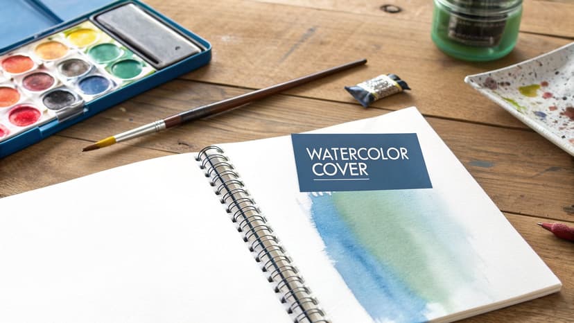
4. Why Use Watercolor and Textured Paint Effects
A watercolor or hand-painted aesthetic gives a cover a warm, artistic, and distinctly personal feel, which is essential for cute book covers aimed at readers seeking authenticity. This design approach uses soft pigmentation, organic brushstrokes, and bleeding color effects to create a cover that feels unique and crafted with care. The textured quality is particularly powerful for memoirs, literary fiction, and creative nonfiction, where this "handmade" signal suggests genuine artistic intent over corporate polish.
This style resonates strongly in the BookTok community, where its visual softness and artistic flair make it highly shareable. The covers for books like Cheryl Strayed’s memoirs or certain editions of Elizabeth Gilbert's Eat, Pray, Love often use this method to convey introspection and creativity.
Key Decision Criteria
- Emotional Connection: The imperfections and soft edges of watercolor create a sense of vulnerability and sincerity. This makes the book feel more like a personal story and less like a mass-produced product.
- Artistic Credibility: A hand-painted look immediately signals that the book values art and creativity. This is a crucial cue for genres like memoir book covers, where the author's unique voice is the main attraction.
- Visual Softness: The gentle blending of colors is inherently calming and non-aggressive. It’s an ideal choice for stories that promise emotional depth, reflection, or a comforting journey.
Common Pitfalls and How to Avoid Them
To use this style for your own cover, be mindful of these issues:
- Lacking Structure: A pure watercolor background can feel formless. Combine it with clean, structured typography or simple geometric borders to provide balance and guide the reader's eye.
- Poor Legibility: Textured backgrounds can sometimes compete with the title. Ensure your typography has sufficient contrast. Consider adding a subtle drop shadow or outline to your text to make it pop.
- Ignoring Print Variations: Watercolor effects, especially subtle color gradients, can look very different in print than on a backlit screen. Always order a proof copy to verify color accuracy before a full print run.
- Overwhelming Text: An AI tool can be a great starting point. Use a prompt like, "watercolor illustration of a quiet garden, soft color bleeds, minimalist sans-serif title." You can then adjust the opacity if the background overwhelms the text.
5. How to Create Pattern-Based and Decorative Designs
Another powerful strategy for crafting cute book covers involves the use of repeating patterns and rich decorative elements. Designs featuring florals, geometric repeats, celestial motifs, or cultural patterns create a sense of visual depth and tactile appeal. This approach can fill the entire cover or act as an ornamental frame, signaling emotional intensity and imaginative world-building to the reader. It is highly effective for genres like fantasy, paranormal fiction, and romance, where a visually abundant cover promises an equally rich story.
This style has been popularized by fantasy authors and romance artist collectives, who understand that patterns create excellent visual continuity for a series. Margaret Rogerson's fantasy covers, with their celestial patterns, and the special repeat editions of Sarah J. Maas's A Court of Thorns and Roses are prime examples of how patterns build a recognizable brand identity.
Key Decision Criteria
- Visual Richness: Patterns add a layer of complexity and sophistication, making a cover feel substantial and thoughtfully designed. They invite the eye to linger and explore the details.
- Genre Signaling: A floral pattern might signal a romance, while intricate celestial or gothic patterns are a clear indicator of a fantasy book cover. This visual shorthand helps a book find its target audience quickly.
- Series Cohesion: Using a consistent pattern style, but altering the color scheme or primary motif for each book in a series, is an effective way to tie them together on a digital or physical bookshelf.
Common Pitfalls and How to Avoid Them
To apply this style successfully, avoid these mistakes:
- Visual Chaos: Establish a clear visual order. Let one dominant pattern be the star, with one or two smaller, complementary patterns acting in a supporting role.
- Poor Legibility: Ensure your typography has enough contrast to stand out against the busy background. A solid-colored bar or a subtle drop shadow behind the title can prevent it from being obscured.
- Thumbnail Noise: Dense patterns can become visual noise when scaled down on retail sites. Check your design at a small size to ensure the core elements remain distinct and appealing.
- Unfocused Generation: When developing ideas with an AI tool, use a prompt like, "fantasy romance book cover, art nouveau floral pattern in gold foil, dark teal background." This gives the tool a clear direction for creating a detailed, pattern-based design.
6. Why Use Soft Focus and Bokeh Photography
Using photo-based backgrounds with soft focus and bokeh effects is a powerful method for creating cute book covers that are both emotionally resonant and visually refined. This technique combines authentic photography with a gentle blur, causing background details to dissolve into soft, glowing orbs of light. The result is a dreamy, intimate aesthetic that puts the emotional core of the story front and center without sacrificing a professional look.
This approach is particularly effective for contemporary romance, women's fiction, and memoirs, where the cover must convey authenticity and relatability. Authors whose covers have successfully adopted this style, like many of Colleen Hoover's post-BookTok designs, use it to create a sense of closeness and emotional depth. The soft focus draws the reader in, promising a story with heart.
Key Decision Criteria
- Emotional Intimacy: The soft focus mimics how the human eye perceives depth, naturally drawing attention to the sharpest point, which is typically the subject or title. This creates an immediate feeling of closeness and focus on the story's emotional core.
- Visual Sophistication: Unlike flat illustrations, a photographic base with bokeh adds texture, depth, and a sense of realism. It signals a modern, high-quality production value that appeals to readers accustomed to the polished aesthetics popular on social media.
- Genre Signaling: For genres like contemporary romance or women's fiction, a soft-focus cover acts as a clear visual cue. It promises a story that is relatable, heartfelt, and centered on character relationships and personal journeys.
Common Pitfalls and How to Avoid Them
To use this style for your own cute book covers, avoid these issues:
- Unbalanced Blur: Ensure your main subject remains recognizable. Apply a blur effect to the background but keep the focal point relatively sharp. A background blur of 30–50% is a good starting point.
- Cold Color Grading: Apply a warm color grade with slightly increased saturation and a warmer white balance to your photograph. This makes the cover feel more inviting and approachable.
- Poor Text Readability: Layer your title and author name over a semi-transparent shape or add a subtle drop shadow to make them stand out against the detailed bokeh background.
- Loss of Effect at Small Sizes: The delicate orbs of a bokeh effect can disappear when the cover is viewed as a small thumbnail online. Check your design at 50px to ensure the effect still adds texture and doesn't just look noisy.
7. How to Use a Retro Aesthetic with Modern Typography
Combining vintage visual styles with crisp, modern typography creates a fascinating bridge between nostalgia and contemporary relevance. This design approach creates cute book covers by blending elements from past decades, like 70s color schemes or 80s illustration styles, with clean sans-serif fonts. The result is a cover that feels both familiar and fresh, appealing to readers who appreciate a touch of irony or cozy charm.
This style is particularly effective for genres like cozy mystery, paranormal romance, and some forms of science fiction, where a vintage feel can signal either comfort or a specific thematic setting. The contrast between old and new design elements captures attention and communicates a unique, confident tone. The redesigns of Tana French's Dublin Murder Squad series are a prime example, using a retro aesthetic to create a strong, cohesive brand identity.
Key Decision Criteria
- Nostalgia as a Hook: Retro elements tap into positive associations with the past, creating an immediate sense of comfort and familiarity. This can make a book feel like a dependable, enjoyable read from the moment a reader sees the cover.
- Modern Typography for Clarity: Using a modern font prevents the design from looking genuinely dated or difficult to read. The clean lines of contemporary typography anchor the vintage elements, ensuring the title and author name are clear and accessible, especially in digital storefronts.
- Genre Signaling: A 70s-inspired palette can signal a cozy mystery, while retro-futurism is a classic fit for science fiction book covers. This targeted use of vintage aesthetics helps attract the right audience by aligning with established genre conventions.
Common Pitfalls and How to Avoid Them
To apply this style effectively, be mindful of these common mistakes:
- Mixing Eras: Choose a specific decade (70s, 80s, 90s) and stick to its visual language. Mixing elements from too many different eras can create a confusing, unfocused design.
- Lacking Visual Balance: Pair your retro illustration or pattern with one distinctly modern element, such as a bold, sans-serif title font. This contrast is the key to making the style work.
- Overusing Textures: Apply a light vintage texture, like paper grain or subtle print wear, but keep its opacity low (20–30% maximum). The goal is to add depth, not to obscure the design.
- Low Contrast: Retro color palettes can sometimes have low contrast. Always check how your cover appears at thumbnail size to ensure the title remains legible on platforms like Amazon KDP. You can test concepts by generating a cover with an AI tool and then using previewers to check its resolution performance.
8. Why Use Collage-Based and Mixed Media Designs
A collage-based approach combines illustrations, photos, text fragments, and patterns to build a visually rich and artistic book cover. This technique creates a playful and personalized feel that immediately signals indie confidence and creativity. The resulting designs reward close inspection, feeling less like a commercial product and more like a curated piece of art. This makes them highly effective for genres where personality is key, such as memoir, cozy mysteries, and certain types of young adult fiction.
This scrapbook-like style builds a direct connection with readers looking for authentic, character-driven stories. The covers for Cheryl Strayed's memoirs and many indie paranormal romance books showcase this method perfectly, using layered elements to tell a story before the first page is even turned. It's a fantastic way to create cute book covers that also feel intellectually and artistically engaging.
Key Decision Criteria
- Visual Storytelling: Collage allows you to layer symbols and images that hint at the plot, themes, or a character’s personality. Each element adds a piece to the narrative puzzle.
- Artistic Credibility: The handmade, mixed-media feel suggests an author with a strong artistic vision. It moves away from slick corporate design and toward something more personal and bespoke.
- Target Audience: This style resonates with readers who appreciate creative expression and are often drawn to indie or non-traditional stories. It signals that the book itself might be just as inventive as its cover.
Common Pitfalls and How to Avoid Them
To effectively implement a collage style, be mindful of these issues:
- No Focal Point: Amid the visual complexity, one element must anchor the viewer's eye. This could be the title, a central illustration, or a photograph. Arrange other elements around it to create a guided flow.
- Chaotic Color Palette: A cohesive look is crucial. Stick to a limited palette of four to five primary colors to tie the disparate elements together and prevent the design from becoming chaotic.
- Flat Composition: Overlap elements intentionally to create depth and visual interest. Use shadows and transparency to make the layers feel distinct yet connected.
- Manual Assembly Challenges: You can generate individual collage assets using an AI tool. Use prompts like "vintage photograph of a key" or "watercolor splash in teal" and then manually assemble them, or use features to remove text and reposition elements for the perfect composition.
How to Choose the Right "Cute" Design Style
| Design Style | Why Choose It? | Common Pitfalls to Avoid | Best For Genres Like... |
|---|---|---|---|
| Pastel Palettes | Signals gentleness, comfort, and modern appeal. Photogenic for social media. | Washed-out colors, poor thumbnail legibility, print color shifts. | Cozy Fiction, Contemporary Romance, Children's Books |
| Illustrated Characters | Creates an immediate emotional connection and strong series branding. Highly memorable. | Mismatched tone, loss of detail at small sizes, inconsistent character art. | YA Contemporary, Cozy Mystery, Children's, Paranormal Romance |
| Minimalist Line Art | Conveys sophistication, clarity, and thoughtfulness. Feels artistic and modern. | Invisible lines at thumbnail size, poor contrast, imprecise layout. | Literary Fiction, Poetry, Self-Help, Contemporary Romance |
| Watercolor Effects | Feels authentic, personal, and artistic. Signals vulnerability and sincerity. | Lack of structure, poor text legibility, unexpected print results. | Memoir, Literary Fiction, Women's Fiction, Creative Nonfiction |
| Pattern-Based Designs | Creates visual richness and strong series cohesion. Excellent for genre signaling. | Visual clutter, poor typography contrast, noisy thumbnails. | Fantasy, Paranormal Romance, Historical Fiction |
| Soft Focus Photography | Achieves emotional intimacy and a professional, modern look. Highly relatable. | Over-blurring, poor text readability, cold color grading. | Contemporary Romance, Women's Fiction, Memoir |
| Retro Aesthetics | Taps into nostalgia for a familiar, charming feel. Unique and attention-grabbing. | Clashing eras, poor legibility from low contrast, looking dated instead of retro. | Cozy Mystery, Retro Sci-Fi, Paranormal Romance |
| Collage & Mixed Media | Signals indie creativity and artistic depth. Tells a story through layered visuals. | No clear focal point, chaotic composition, illegible typography. | Memoir, YA Fiction, Experimental Fiction, Paranormal Romance |
Turning Cute Concepts into Reader-Grabbing Covers
Throughout this exploration of cute book covers, a central theme emerges: strategic intent. An effective cover, no matter how charming or whimsical, is never an accident. It is a carefully constructed visual pitch, designed to attract a specific reader by making a clear promise about the story's emotional core. The approaches we've analyzed, from minimalist line art to vibrant character illustrations, all demonstrate this principle. They connect with their target audience by making deliberate choices in color, composition, and typography.
The true power of these designs lies in their ability to communicate complex feelings almost instantly. A soft pastel palette signals comfort, while a quirky illustrated mascot can promise humor. As an author, your primary task is to decode the emotional DNA of your book and translate it into a visual language that resonates with your ideal readers.
From Strategy to a Finished Cover
Understanding the why behind a successful cover is the first step. The next is applying that knowledge. Here is a checklist to guide your design process:
- Match Aesthetic to Emotion: Does the chosen aesthetic, whether it's retro collage or modern watercolor, truly reflect the feeling and tone of your manuscript? A mismatch can lead to disappointed readers and negative reviews.
- Ensure Typography Reinforces Tone: The font you choose does more than just state the title; it sets the tone. Soft, rounded sans-serifs suggest accessibility, while elegant scripts can imply romance. Ensure your typography supports the overall design.
- The Thumbnail Test is Non-Negotiable: Your cover will most often be seen as a small thumbnail on a crowded digital storefront. A design that looks beautiful full-screen but becomes an incomprehensible blur when shrunk is a failed design. Simplicity, high contrast, and a clear focal point are your best friends.
Your Next Steps in Cover Design
Moving from concept to a final, market-ready asset requires experimentation. This is where you can see the power of iterating on your ideas. You can try out different approaches, perhaps testing a character-focused design against a more minimalist, pattern-based concept. Creating variations has become much more direct; using an AI tool can help you quickly generate and compare different stylistic directions without the initial cost of hiring a designer. This allows you to test which "cute" approach actually performs best for your book.
Ultimately, mastering the art of creating cute book covers is about more than just aesthetics; it is a vital business skill for any indie author. A strong cover drives clicks, conversions, and sales. It is your single most important marketing tool. By combining the strategic insights from these approaches with a willingness to test and refine your work, you can create a cover that not only looks delightful but also works tirelessly to put your story into the hands of eager readers. For more genre-specific breakdowns, our detailed analysis of romance book covers offers further guidance.
Ready to Create Your Own Book Cover?
Turn your story into a visual masterpiece. Fill in the details below to start generating professional covers instantly.