A Practical Guide to Cover Design Templates for Indie Authors
Discover how to use cover design templates to create a professional book cover. Learn to find, customize, and export KDP-ready covers that drive sales.
Posted by
Related reading
Photos for Book Covers: A Complete Guide for Authors
Learn how to choose effective photos for book covers. This guide covers composition, sourcing, licensing, and technical specs for KDP-ready designs.
Create the Perfect Book Review Form: A Guide for Authors
Learn to design a book review form that delivers actionable feedback. This guide covers question design, distribution tactics, and using reviews for marketing.
Effective Backgrounds for Covers: KDP Guide 2026
Choose effective backgrounds for covers to grab attention on Amazon KDP. Our 2026 guide covers types, genre matching, composition, & technical specs.
Ready to design your cover?
Use our AI book cover generator to create tailored book cover concepts in minutes.


For many indie authors, getting a book cover designed feels like a major, expensive obstacle. This is where cover design templates offer a strategic advantage, providing a fast, affordable path to a professional-looking cover without the high cost of a custom designer.
And forget the myth that "template" means "generic." Modern templates are powerful starting points, giving you a high-quality foundation to create something unique and genre-specific. They are a tool for informed decision-making, not a creative shortcut.
Why Smart Authors Use Cover Design Templates
For many self-published authors, the cover is the single biggest hurdle before launch. It's a tough skill to master, needing a blend of artistic talent, marketing savvy, and technical know-how. Hiring a professional is the traditional route, but it often involves a significant financial investment and long timelines that can derail a publishing schedule.
That's the exact problem templates solve. They are a strategic tool, providing a pre-built framework that already adheres to core design principles. Instead of staring at a blank canvas, you begin with a professional layout, effective font pairing, and a solid color scheme—all ready for you to customize.
The Cost and Time Advantage
The most obvious benefits are time and money. The U.S. book publishing market is projected to hit $49.1 billion by 2026, so standing out is non-negotiable, but it can be expensive. Hiring a designer for a custom cover now averages around $920 and can take weeks, if not months.
Historically, authors might pay $500–$2,000 for a single cover, and 60% reported that design delays disrupted their launch plans. You can dig into more of the market data over at IBISWorld.
This is a huge reason why so many authors are shifting their workflow.
Traditional Design vs. Template-Based Workflow
Let's break down the practical differences between hiring a traditional designer and using a modern, template-based approach. The table below provides a clear comparison to help you decide which path is right for your project.
| Factor | Traditional Design | Cover Design Templates |
|---|---|---|
| Cost | $500 – $2,000+ | $0 – $99 |
| Timeline | 2 – 8 weeks | Minutes to hours |
| Flexibility | Limited revisions | Unlimited iterations |
| Control | Designer-led | Author-led |
As you can see, the trade-offs are significant. While a top-tier designer can produce incredible work, the template workflow offers a level of speed and affordability that's essential for most authors managing a budget.
This process flow diagram highlights the difference in timelines.
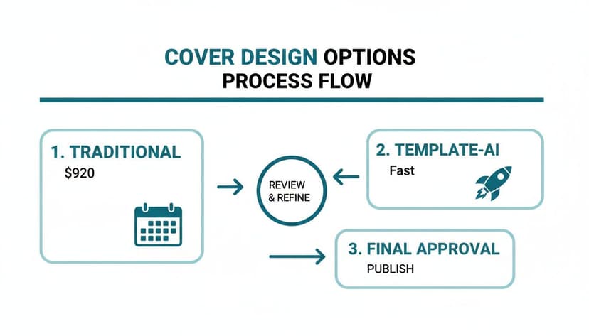
The key takeaway is the massive reduction in turnaround time. You can move from concept to a market-ready cover in a fraction of the time.
Creative Control and Iteration
Beyond the savings, templates put you in the driver's seat. You’re not just a client awaiting a proof; you are the creator. This hands-on control is ideal for rapid testing and refinement.
Want to see how the title looks in a different position? You can do it. Curious if a warmer color palette better captures your book's tone? You can try it in seconds. This is especially useful for authors writing a series, like a set of connected romance book covers, where templates provide a solid framework for visual consistency.
Using a template isn't about cutting corners. It's a strategic decision to allocate your resources—time and money—where they'll have the biggest impact, all while maintaining full control over your book's crucial first impression.
Some tools can also assist in this process. For instance, generating several distinct template concepts based on your genre and synopsis can help you compare professional layouts before you even start customizing.
Ultimately, a well-chosen and thoughtfully customized template will always outperform a poorly executed custom design. Our guide on how to create a book cover online walks you through how this modern workflow comes together.
How to Find the Right Template for Your Genre
Your book cover is your most important marketing asset. Long before anyone reads your first sentence, they judge your book by its cover. Selecting the right template isn't just about finding something that looks nice; it’s about making an instant promise to the reader about the experience they're about to have.
A potential buyer should know in a single glance whether they’re getting a gritty urban fantasy or a sweeping historical romance. That split-second recognition is built on visual cues your genre's readers have been trained to expect. A template is your shortcut to getting those signals right.

Deconstructing Your Genre's Visual Language
Before you start browsing templates, do your research. Go to the Amazon bestseller list for your exact sub-genre and analyze what you see. Don't just admire the art—start breaking it down like a detective.
Ask yourself these three questions for every cover you see:
- Typography: What kind of fonts are they using? Are they sharp, modern sans-serifs or classic, elegant serifs? Look at how the author's name is styled versus the title. There's a formula there.
- Color Palette: What are the dominant colors? Thrillers often lean into high-contrast palettes—black, white, and a splash of red. Rom-coms? They tend to use bright pastels and vibrant, cheerful tones.
- Layout and Imagery: Is the cover focused on a character? An object? A symbolic scene? Pay attention to where the title and author's name are placed. Composition is everything.
This isn't about copying other authors. It's about learning the visual language your readers already understand. To get a wider view of what's working across different genres, it's always a good idea to study a variety of book cover inspiration to spot both current trends and timeless designs.
Selecting a Template With Customization in Mind
Once you’ve got a handle on your genre's conventions, you can start hunting for a template that gives you a solid head start. You're looking for a layout that mirrors the bestsellers you studied, but with enough room to make it your own. If you want to see what common structures look like, exploring a wide selection of templates can be a huge help.
Find a template that nails the basics: a balanced composition, a clear visual hierarchy (the important stuff pops), and a font pairing that feels professional right out of the box.
A great template isn't the finished product; it's a launchpad. It handles 80% of the difficult design work, like layout and font choice, freeing you to focus on the 20% that makes the cover uniquely representative of your story.
This is how you work smart. You're not starting from a blank page; you’re building on a professional framework designed from the ground up to catch a reader's eye.
Using AI to Generate Genre-Specific Concepts
Here’s where things get really efficient. Instead of scrolling through hundreds of generic templates, a good AI tool can help you generate concepts based on your book. By inputting your genre, a quick summary, and key themes, you can get multiple, distinct cover concepts.
The tool can provide options that are already aligned with your genre. You might get one that's character-focused, another that's more symbolic, and a third that's pure typography.
This gives you a set of professional starting points to choose from. From there, you just pick the one that best captures the soul of your story and start tweaking. This combination of AI-powered brainstorming and your own creative touch is an incredibly powerful workflow for the modern author.
Making the Template Your Own with Fonts and Color
You’ve got a template. Great. But right now, it’s just a professional starting point. The real magic happens when you infuse it with your book’s unique DNA, and the two most powerful tools you have for that are typography and color.
These elements do the heavy lifting. They set the mood, grab a reader's attention, and—most importantly—make your cover legible as a tiny thumbnail on an Amazon search page. Think of the template as the skeleton; your font and color choices are what give it a soul. They’re the first signals that tell a reader if they’re about to dive into a chilling thriller, a sweeping historical epic, or a fun, flirty romance.
Choosing Fonts That Scream Your Genre
Your fonts aren't just there to spell out your title. They are a core piece of the artwork, and they need to signal your genre from a mile away.
- Thrillers & Sci-Fi: These genres almost always demand bold, sharp, sans-serif fonts. Think clean lines, tight spacing, and high impact. You want to create a feeling of modern urgency or cold, technological precision.
- Historical Fiction & Fantasy: Readers expect elegant serif fonts. These classic, timeless letterforms suggest a story rooted in another era or a world with its own deep history. For a more detailed look, our guide on the best fonts for book covers breaks down specific recommendations by genre.
- Romance: This is where things get really diverse. A sweet contemporary romance might use a friendly, handwritten script. A steamy paranormal romance, on the other hand, might call for something more stylized and edgy.
The trick is to pair your fonts like a pro. A common and effective strategy is to use a bold, decorative font for the title and a simple, clean font for your author name. This creates a clear visual hierarchy, telling the reader’s eye where to look first. Stick to a maximum of two, maybe three, fonts on the entire cover. Any more, and it starts to look cluttered and amateurish.
The Psychology of Color on Book Covers
Color is pure emotion. The palette you choose will trigger instant feelings and associations in a potential reader’s mind, so you absolutely have to get it right. Your goal is to pick colors that not only match your story’s tone but also meet the expectations of your target audience.
For instance, bright, saturated colors often signal a fun, high-energy read—perfect for comedy or lighthearted contemporary fiction. In stark contrast, muted, desaturated tones can create a sense of seriousness, nostalgia, or dread, which works beautifully for literary fiction or a somber historical drama. And you can’t go wrong with a dark, high-contrast palette (like black, white, and a splash of red or yellow) for thrillers and horror. It creates immediate tension.
Your color palette is a non-verbal promise to the reader. It sets the stage for the emotional journey ahead. If you get the colors wrong, you risk attracting the wrong readers or, even worse, confusing the ones who would have loved your book.
In today's digital-first market, the technical role of your choices is more critical than ever. Your cover has to work both as a full-size image and as a tiny thumbnail where 90% of Amazon sales begin. Industry analysis shows that as cover design evolves, typography is becoming the hero. Designers have found that high-contrast elements can improve click-through rates on ads by 25-40%—a massive advantage in a crowded market. You can read more about these developing trends in this analysis on 2026 design trends.
A Quick Sanity Check for Your Design
Once you’ve tweaked the fonts and colors, it's time to step back and be your own harshest critic. This little checklist helps you catch common mistakes before you go live.
- The Thumbnail Test: This is non-negotiable. Zoom out until your cover is the size of a postage stamp. Can you still read the title? Does the core image still pop? If not, it fails.
- Contrast Check: Does your title stand out clearly from the background? Text gets swallowed up easily, especially dark text on a busy background. If it's hard to read, it needs more contrast.
- The "Does It Fit In?" Test: Pull up the top 10 bestsellers in your specific subgenre on Amazon. Put your cover next to them. Does it look like it belongs on the same virtual shelf? Or does it stick out for all the wrong reasons?
- The Gut Check: Look at your cover quickly. What's the first feeling you get? Does that feeling match the mood of your book?
This is also a perfect time to experiment. Using an AI tool, you can generate several variations with different font pairings or color schemes in minutes. Seeing them all side-by-side makes it much easier to spot the clear winner.
Finalizing Layout and Imagery
With your typography and colors locked in, it's time to tackle the overall structure and main visual. A good template provides a fantastic head start with a professionally balanced layout, but your unique title and author name still need to become the stars of the show.
This is also the moment you’ll trade that placeholder art for an image that actually tells your story. The goal is to make your chosen visual—whether it's custom art, a stock photo, or an AI-generated scene—feel like it was part of the design from the very beginning.
Adjusting the Layout for Better Flow
Great templates are built on solid design principles, but a super long title or a short author name can throw things off balance. Your job is to make small adjustments to preserve a clear path for the reader's eye. This is about mastering visual hierarchy—telling the reader’s eyes exactly where to look.
Think of it like a three-step journey for the reader's gaze:
- The Title: This has to be the most powerful text element. Got a short, punchy title? You might need to bump up the font size to give it more presence. Long title? Focus on smart line breaks so it’s balanced and easy to scan.
- The Image: Your cover art should hook them immediately, creating intrigue that naturally leads their eye right back to the title.
- The Author Name: Your name needs to be clear and legible, but it shouldn't fight the title for attention. It acts as an anchor, usually at the top or bottom of the cover.
Don't be afraid to nudge things around. Sometimes, shifting the entire title block up or down by just a few pixels makes a world of difference. It can completely change the cover's energy and professional feel.
The best layouts are invisible. They guide your focus so effortlessly that you don't notice the structure—you just feel the impact of a clean, cohesive design.
Swapping Placeholder Art with Your Imagery
The image is the heart of your cover. That placeholder is just a stand-in; replacing it is what will make your book truly yours. You have a few solid options for sourcing your main visual.
- Stock Photography: Sites like Pexels, Unsplash, or paid services like Adobe Stock have millions of high-quality images. The trick is to find photos with "negative space"—clean areas where your text can live without feeling cluttered.
- Custom Artwork: If you write fantasy or sci-fi, you might have a commissioned illustration of a character or a world. A great template acts as the perfect frame, making sure the typography adds to your art instead of competing with it.
- AI-Generated Visuals: This is where it gets really interesting. You can use an AI tool to generate an endless supply of unique images based on your story's themes, characters, and mood. This gives you a one-of-a-kind visual without the hefty price tag of a commissioned artist.
No matter where you get your image, make sure it’s high-resolution—at least 300 DPI. A blurry or pixelated image screams amateur and can lose you a sale before a reader even gets to your blurb.
Using Modern Tools for Seamless Image Swaps
Ever find the perfect stock photo, but there's a watermark or some text right where your title needs to go? Years ago, fixing that meant firing up Photoshop and spending hours with the clone stamp tool. Not anymore.
Modern tools have completely changed the game. For instance, many platforms now have AI-powered features like "generative fill" or "remove text." These tools can digitally erase unwanted objects or text from an image, leaving you with a clean canvas. It's an incredibly powerful way to adapt a great photo that’s almost perfect, letting you make huge changes without any technical design skills.
Exporting a Flawless Cover for KDP and Beyond
You’ve tweaked the colors, perfected the fonts, and your cover is finally looking incredible. But don’t celebrate just yet. The final export is where many self-published authors stumble, turning a beautiful design into a blurry, rejected mess.
A single wrong setting can lead to frustrating upload errors on Amazon KDP, washed-out colors on e-readers, or a pixelated print book that screams “amateur.” Let’s cut through the technical jargon and make sure your cover looks just as professional in hand as it does on your screen.
Ebook vs. Print: Getting the Technical Details Right
You’ll need to prepare two completely different files: one for digital screens (ebooks) and one for physical printing. Each has its own strict set of rules.
When someone buys your ebook, they’re looking at it on a glowing screen. Your export settings need to reflect that.
- Format: JPEG (or JPG). This is the universal standard. It keeps file sizes manageable for quick downloads while preserving quality.
- Color Profile: RGB (Red, Green, Blue). All digital screens—from phones to Kindles—use the RGB color space. Exporting in RGB ensures your cover’s colors look vibrant and accurate.
- Resolution: 72 DPI (Dots Per Inch) is the classic web standard, but honestly, it’s a bit dated. I always recommend exporting at 150 DPI or even 300 DPI to ensure your cover looks sharp on modern high-resolution displays.
Print books are a different beast entirely. The requirements are rigid, and there's no room for error.
- Format: Print-Ready PDF. This is non-negotiable. A PDF locks in all your fonts, images, and layout details, so nothing shifts or breaks when it goes to the printer.
- Color Profile: CMYK (Cyan, Magenta, Yellow, Key/Black). This is the four-color ink process used in professional printing. If you upload an RGB file for print, the colors will shift during conversion, often looking dull or muddy.
- Resolution: 300 DPI is the absolute minimum. Anything less will result in a blurry, pixelated cover that instantly marks a book as low-quality.
My rule of thumb: Always create two final, separate files—an RGB JPEG for the ebook and a CMYK PDF for print. Mixing these up is the #1 reason for disappointing results.
KDP Paperback Specifics: Spine and Bleed
Exporting a paperback cover for KDP involves more than just the front. You’re creating a full-wrap cover that includes the front, back, and that all-important spine.
First things first, you need the exact dimensions. KDP offers a free cover calculator and template generator for this. You’ll plug in your trim size, final page count, and paper type, and it spits out a custom template. The spine width is determined by your page count, so make sure that number is final before you start designing.
Pay close attention to the bleed. This is an extra 0.125-inch margin on the three outer edges of your cover. You must extend your background color or image all the way to the edge of this bleed area.
Why? During manufacturing, a massive machine trims the covers. If the cut is off by even a fraction of a millimeter and your background stops at the trim line, you’ll end up with an ugly white sliver along the edge of your book. Extending your design into the bleed gives the printer that small margin of error.
Your Pre-Export Final Checklist
Ready to hit that export button? Hold on. Run through this quick sanity check to catch any last-minute mistakes. It’s a five-minute job that can save you hours of re-uploading and frustration.
- High-Res Images? Did you swap out all the low-quality placeholders? Zoom in and make sure every photo or graphic is crisp. For print, they must be 300 DPI.
- Text in the Safe Zone? Is all your text (title, author name, back cover blurb) comfortably inside the “safe area” of the template? Anything too close to the edge risks getting sliced off.
- Proofread. Again. It sounds obvious, but a typo on the cover is a massive red flag to potential readers. Read every single word one last time. Have a friend read it, too.
- Spine Check. If your book has over 100 pages, you probably have spine text. Is it perfectly centered? Is it legible?
- Final Export Settings. One last check: Are you exporting a CMYK PDF for your print version? And an RGB JPEG for your ebook? Double-check those color profiles and resolutions before you click save.
Common Questions About Using Cover Templates
Even with the clear benefits, it's natural to have questions about using cover design templates. Authors often worry about originality, series branding, and whether a template will negatively impact their book's credibility.
Let's address these common concerns head-on.
"Will my cover look like someone else's?"
This is a valid concern, but the short answer is: not if you customize it properly. A good template isn't the final product; it's the professional framework you build upon.
Think of it like a recipe. Two chefs can start with the same instructions, but their final dishes will be unique based on their choice of ingredients, technique, and presentation.
Your cover works the same way. Once you swap the stock image for your own, choose fonts that match your genre, and adjust the color scheme to fit your story's mood, that cover is 100% yours. The template simply ensures you start with a balanced, professional layout.
"Can I use templates for a book series?"
Yes, and you absolutely should. In fact, using a template is one of the smartest ways to build a strong, recognizable series brand. Readers need visual cues to know books are connected, and consistency is what encourages them to buy the whole series.
Here is a practical checklist for series branding with templates:
- Establish a Master Design: The cover for book one becomes your series blueprint. This design locks in the core layout, the typography for your author name, and the placement of the series title.
- Maintain the Foundation: For every other book, keep the core structure the same. The author name font, title placement, and overall composition should not change.
- Vary the Specifics: For each new book, swap out the main artwork or photo and adjust the color palette. This creates the "same but different" feeling that defines successful series branding.
This approach gives you a professional, cohesive look that can be difficult and expensive to achieve with one-off custom designs.
"Will using a template hurt my book's credibility?"
No. In fact, the opposite is often true. A sharp, well-made cover that started as a template is infinitely more credible than a sloppy, amateurish custom design.
Readers don't know you used a template, and they don't care. They only see whether a cover looks professional or looks like it was made in five minutes. A cover with clashing fonts, a cluttered layout, or blurry images is an instant turn-off. Templates are designed to help you avoid those exact mistakes.
The real threat to your book’s credibility isn't using a template—it's publishing a cover that signals "amateur." A high-quality template is your best defense against common design blunders.
The industry is already shifting. Recent data shows that an estimated 65% of indie authors now use some kind of hybrid or AI-assisted tool in their design workflow, a huge leap from just 25% in 2023. Why? Because thumbnail-driven marketplaces like Amazon are brutal—a bad cover can slash your conversions by over 50%.
As a recent Spine Magazine trend analysis points out, purely AI-generated covers often miss the mark, but template-based systems that blend professional design with author customization are becoming the new standard. A good template provides a professional foundation while you retain full creative control. It's the best of both worlds.
Ready to Create Your Own Book Cover?
Turn your story into a visual masterpiece. Fill in the details below to start generating professional covers instantly.