How to Make a Moodboard: Stunning Book Covers
Learn how to make a moodboard for your book's stunning cover. Step-by-step guide for authors: gather visuals & brief AI or designers effectively.
Posted by
Related reading
Photos for Book Covers: A Complete Guide for Authors
Learn how to choose effective photos for book covers. This guide covers composition, sourcing, licensing, and technical specs for KDP-ready designs.
Create the Perfect Book Review Form: A Guide for Authors
Learn to design a book review form that delivers actionable feedback. This guide covers question design, distribution tactics, and using reviews for marketing.
Effective Backgrounds for Covers: KDP Guide 2026
Choose effective backgrounds for covers to grab attention on Amazon KDP. Our 2026 guide covers types, genre matching, composition, & technical specs.
Ready to design your cover?
Use our AI book cover generator to create tailored book cover concepts in minutes.


You've finished the manuscript. You know the book has a strong hook, a clear audience, and a place in the market. Then you sit down to think about the cover and everything goes fuzzy.
That's normal.
Most indie authors don't struggle because they lack taste. They struggle because they're trying to jump from story to cover in one leap. A moodboard fixes that. It gives you a working visual direction before you hire a designer, test concepts, or try an AI tool.
If you're learning how to make a moodboard for a book cover, think of it less as a collage and more as a decision tool. A good one helps you choose what belongs on the cover, what absolutely doesn't, and how to explain your vision without vague phrases like “make it more atmospheric.”
Why a Moodboard Is Your Most Important Pre-Design Tool
A blank cover brief creates bad decisions fast. Authors often start by searching for “beautiful covers,” saving anything they like, and hoping a pattern appears. That usually produces a board full of mixed signals: one image says literary fiction, another says dark fantasy, another feels like prestige TV key art.
A moodboard works when it becomes a filter. It translates the emotional core of your book into visual evidence. That matters on Amazon KDP, where readers make split-second judgments from a thumbnail and expect the cover to signal genre, tone, and professionalism immediately.
The strongest boards do two jobs at once. They help you clarify your own thinking, and they help someone else execute it. That “someone else” might be a freelance designer, a publishing teammate, or an AI system that needs structured prompt language.
What a moodboard actually solves
A practical moodboard helps you answer questions that are hard to solve with words alone:
- Genre fit: Does this book need menace, intimacy, wonder, grit, or polish?
- Audience alignment: Will the cover attract the reader you want, or the wrong reader?
- Visual boundaries: Are you drawn to an image because it fits your market, or because it's personally appealing?
- Creative consistency: Do your references point toward one direction or five?
Practical rule: If your board can't tell a stranger what shelf your book belongs on, it isn't ready to guide a cover.
This is the same reason planning matters in adjacent creative work. If you've ever looked at essential video planning steps, the logic is familiar. Visual planning reduces guesswork before production starts. Book covers need that same discipline.
Why authors skip this step and regret it
Skipping moodboarding doesn't save time. It usually shifts uncertainty downstream into revisions, second-guessing, and expensive restarts.
Common signs you needed a board earlier:
| Situation | What it usually means |
|---|---|
| You keep changing your genre description | Your visual direction isn't anchored |
| You say “I'll know it when I see it” | Your criteria aren't defined |
| You like many covers that don't resemble each other | You're collecting taste, not strategy |
| Your designer sends concepts that feel “off” | The brief lacked visual specificity |
A moodboard won't design the cover for you. It will make the right cover far easier to reach.
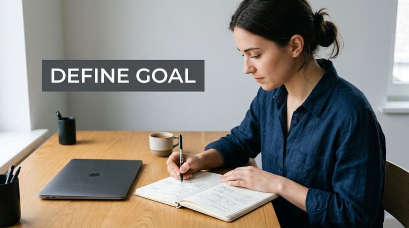
Define Your Cover's Goal Before Gathering Images
Most weak moodboards fail before the first image is saved. The mistake is simple: opening Pinterest too early.
You need a cover goal before you need inspiration. Otherwise every appealing image feels relevant, and your board turns into a scrapbook of disconnected moods.
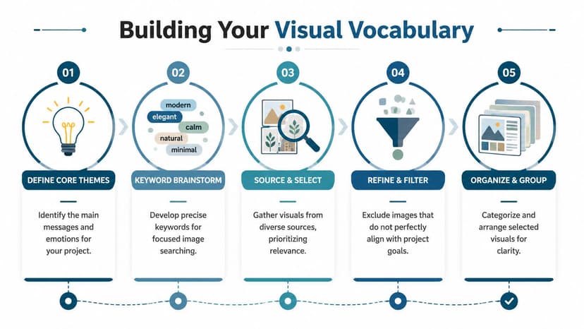
A structured process helps here. A structured 5-step digital moodboarding process, starting with defining the creative goal and genre benchmarks, yields 78% client approval on the first design iteration, according to aggregated data from case studies involving over 500 projects in this moodboarding workflow reference.
Start with the job your cover must do
Your cover is not a summary of the whole book. It's a sales-facing signal. Decide what it must communicate in a thumbnail view.
Ask:
-
What genre should a reader identify immediately?
“Fantasy” isn't enough. Is it romantic fantasy, grimdark, mythic, cozy, epic? -
What emotional response should come first?
Tension, longing, danger, comfort, melancholy, awe. -
What promise are you making?
Fast-paced plot, emotional intimacy, high-concept worldbuilding, prestige nonfiction authority. -
What must not appear on the cover?
This matters as much as what should appear. A single off-market cue can pull your book toward the wrong audience.
Use a simple brief before you search
Write five short lines before gathering references:
- Genre: The clearest market category
- Reader expectation: What this audience expects to feel
- Tone: A few adjectives that belong together
- Thumbnail message: What should read instantly at small size
- Avoid list: Visual clichés or misleading signals
That brief keeps your board from drifting.
Don't collect images because they're pretty. Collect them because they prove a specific choice.
Benchmark against real covers, but don't copy them
Study current books in your niche and look for recurring signals. You're not trying to mimic one cover. You're learning the visual language readers already trust.
Look at:
- Composition patterns: Central object, character silhouette, symbolic icon, expansive view
- Color habits: Muted versus saturated, warm versus cold, bright versus restrained
- Type treatment: Elegant serif, thriller sans serif, script accents, distressed lettering
When authors skip this step, they often ask for a cover that reflects the story perfectly but sells the book poorly. Those aren't the same objective. Marketable covers balance both.
Curate a Focused Visual Vocabulary
The best moodboards aren't large. They're precise.
Once your cover goal is clear, start gathering references as if you're building a shared language. Each image should contribute one clear “word” to that language: fog, brass, restraint, candlelight, urban decay, velvet, symmetry, danger, tenderness.
Design experts recommend aiming for 10 to 15 high-impact images for a moodboard. Adding too many visuals can dilute the core message and make the specific look and feel get lost in the noise, according to Figma's moodboard guide.
Gather broadly, then cut hard
At the start, collect more than you need. Pull from book covers, film stills, editorial photography, typography references, texture shots, and location imagery. Then trim aggressively.
Good source categories include:
- Book covers in your market for packaging cues
- Movie or TV stills for lighting and atmosphere
- Fashion editorials for posture, styling, and attitude
- Architecture and interiors for setting mood
- Fine art and texture photography for palette and surface feel
The key is not literalism. A thriller board might include wet pavement, sodium street lighting, brushed metal, and cramped hallways without including a single gun or running figure.
Decide what each image is doing
A useful board has role clarity. Every image should earn its place.
Try grouping references by function:
| Image type | What it contributes |
|---|---|
| Hero image | The central mood or strongest genre cue |
| Supporting atmosphere | Lighting, weather, emotional tone |
| Texture references | Paper grain, fabric, stone, smoke, metallic detail |
| Character cues | Archetype, silhouette, posture, styling |
| Layout references | Negative space, hierarchy, title placement |
If two images communicate the same thing, keep the stronger one.
A crowded board doesn't look more thoughtful. It looks undecided.
Build vocabulary, not noise
Many authors make a mistake here. They search by plot detail instead of by visual function. A fantasy novel about a queen, a betrayal, and a ruined city can produce an unusable board if every saved image is “queen,” “castle,” or “dragon.”
Search with better terms:
- “gilded decay”
- “cathedral shadows”
- “storm-lit skyline”
- “ornate serif title”
- “velvet texture”
- “cold moonlit portrait”
For extra direction, reviewing book cover inspiration for market patterns can help you separate trend signals from random aesthetic preference.
By the time you finish, your board should feel narrow in the best way. It should exclude more than it includes.
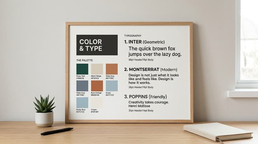
Establish a Cohesive Palette and Typography
Images set the mood, but color and type tell people how polished and market-aware your cover will feel. If your board has strong imagery but inconsistent palette choices or conflicting font styles, it won't translate cleanly into a finished cover.
Pull a palette from the board, not from preference
Authors often choose colors they personally like instead of colors that support the book's market position. Your board should solve that. Look across your selected images and identify recurring tones.
A practical approach is to define:
- One dominant color that carries the mood
- One secondary color that supports it
- One accent color for emphasis
- Two neutrals for balance, contrast, or background use
If you want help extracting these from a reference image, a simple palette generator can speed things up. BeYourCover offers a free color palette tool for visual direction as a useful starting point for identifying combinations that feel intentional rather than accidental.
Match the palette to the reading experience
Think in emotional terms first, then in technical ones.
For example:
- Warm, desaturated tones often feel intimate, historical, or romantic.
- Cool dark palettes can feel forensic, suspenseful, or epic.
- High-contrast bright palettes may suggest commercial energy, satire, or younger crossover appeal.
- Soft neutrals and restrained accents can support memoir, literary, or premium nonfiction positioning.
If you need help training your eye, browsing visual environments like gifPaper's aesthetic Mac ideas can be surprisingly useful for noticing how color, mood, and minimal composition work together across curated digital imagery.
Choose typography that belongs in the same world
Typography on a moodboard should do more than “look nice.” It should indicate the kind of cover system your book needs.
Use this distinction:
| Type role | Best use |
|---|---|
| Display font | Title treatment, strongest personality |
| Supporting font | Author name, subtitle, series line, tagline |
A few practical rules help:
- Don't pair two loud fonts. If your title font is decorative, keep the supporting font calm.
- Check genre fit. A refined serif can signal prestige or romance. A hard-edged sans serif can signal thriller or contemporary nonfiction.
- Test legibility at small size. What looks elegant full-screen can disappear on a retail page.
- Avoid novelty fonts. They date quickly and often weaken trust.
The type should sound like the same book your images are describing.
A good moodboard doesn't need final fonts selected. It needs typographic direction strong enough that a designer, or your own cover tool, can move forward without guessing.
Compose and Annotate Your Board for Clarity
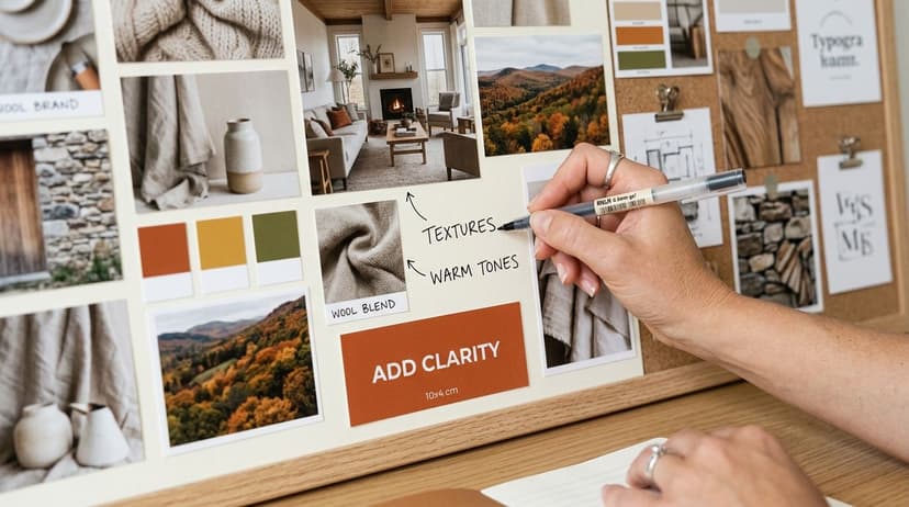
A moodboard becomes useful when another person can read it correctly. That depends on composition and annotation.
Without those, a board is just a cluster of references. The person reviewing it has to infer your intent, and that's where projects go sideways.
In creative industries, moodboards fail in an estimated 41% of cases due to poor collaboration and miscommunication. However, systematized digital workflows with clear annotations can achieve 85% alignment success, according to Milanote's guide to better moodboards.
Arrange it so the eye knows where to look
A chaotic board creates interpretive problems. If everything has equal size and weight, nothing feels primary.
Use a simple hierarchy:
- Put your strongest reference near the center or upper area.
- Group similar images together. Keep textures with textures, type with type, covers with covers.
- Leave breathing room between categories.
- Make your “must-keep” direction larger than your “optional” references.
This doesn't need advanced design software. Canva, Milanote, Figma, PowerPoint, and even Google Slides can all work if the structure is clean.
Annotate the why, not the whole image
This is the step authors skip most often.
Don't label an image with what it shows. Label it with what you want carried forward. A forest image might not mean “add this forest.” It might mean “keep the mist, muted contrast, and isolated feeling.”
Useful annotation examples:
- Keep this lighting direction, not the exact model
- Good title spacing for long fantasy names
- Use this texture quality, avoid the distressed effect
- Like the restraint here, especially the negative space
- Strong mood, but too literary for this audience
“Love the atmosphere, not the literal object” is often the note that saves a board from being copied too closely.
Add enough detail for action
Your board should answer practical questions before anyone asks them.
Include short notes on:
- What matters most
- What should not be copied directly
- Which elements are optional
- How the board should feel at thumbnail size
- What market signals must remain visible
A silent board invites projection. An annotated board gives direction.
If you're working with a designer, this reduces avoidable revision loops. If you're using an AI tool, annotations help you convert the board into cleaner prompts instead of vague aesthetic requests.
Translate Your Moodboard for AI and Designers
A finished moodboard is not the end of the job. It's the handoff document.
That's where many authors stall. A 2025 survey found that while 68% of indie authors use mood boards, 42% struggle to translate them into professional designs, citing “prompt engineering” for AI tools as a primary hurdle, according to this indie author moodboard survey summary.
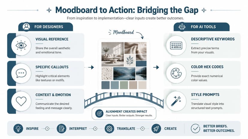
Turn visual references into usable language
Start by breaking your board into categories:
- subject
- setting
- lighting
- palette
- texture
- typography
- composition
- emotional tone
Then write one line for each.
For example, a board for a dark academic fantasy might become:
| Board element | Translation |
|---|---|
| Subject | solitary female scholar, poised not action-heavy |
| Setting | gothic library, candlelit stone, old-world architecture |
| Lighting | low light, warm highlights, deep shadow contrast |
| Palette | oxblood, black, parchment, tarnished gold |
| Texture | vellum, dust, smoke, aged metal |
| Tone | secretive, intelligent, dangerous |
That gives you the bones of both a designer brief and an AI prompt.
Build a prompt from decisions, not adjectives alone
Weak prompt: “Make it moody and cinematic.”
Stronger prompt: “Dark academic fantasy book cover, solitary female scholar in candlelit gothic library, parchment and oxblood palette, tarnished gold accents, atmospheric smoke, elegant serif title space, premium commercial fiction feel.”
That structure works better because it names what the system should prioritize.
If you also create promotional assets after the cover is set, learning how teams create polished visuals for social media can help you keep the same visual logic across launch graphics and ads.
Give human designers the same clarity
A designer brief doesn't need to be long. It needs to be specific.
Include:
- Book title and author name
- Genre and subgenre
- One-sentence market positioning
- Your moodboard
- Three essential elements
- Three things to avoid
- Notes on thumbnail performance
- Comparable covers only as directional references
If you want to test concepts before committing, it's reasonable to generate early drafts with an AI workflow and compare directions. Tools discussed in AI tools for graphic designers can help with early iteration, especially when you already have a disciplined board and a clear prompt structure.
A moodboard becomes powerful when it leads to decisions. If it can guide both a machine and a designer without confusion, you've built it correctly.
A strong moodboard saves time because it removes ambiguity before design starts. It helps you spot mixed signals early, communicate your market clearly, and move from vague taste to usable direction.
If you want to put that process into practice, you can test concepts with BeYourCover's free tool for AI book cover creation, using your moodboard notes as the basis for prompts or design variations. That works best when the board is tight, annotated, and built around the reader you want to reach.
Ready to Create Your Own Book Cover?
Turn your story into a visual masterpiece. Fill in the details below to start generating professional covers instantly.