The 7 Best Professional Fonts for Book Covers
Discover the best professional fonts for book covers. Our guide breaks down 7 top choices for authors, covering licensing, cost, and genre suitability.
Posted by
Related reading
Photos for Book Covers: A Complete Guide for Authors
Learn how to choose effective photos for book covers. This guide covers composition, sourcing, licensing, and technical specs for KDP-ready designs.
Create the Perfect Book Review Form: A Guide for Authors
Learn to design a book review form that delivers actionable feedback. This guide covers question design, distribution tactics, and using reviews for marketing.
Effective Backgrounds for Covers: KDP Guide 2026
Choose effective backgrounds for covers to grab attention on Amazon KDP. Our 2026 guide covers types, genre matching, composition, & technical specs.
Ready to design your cover?
Use our AI book cover generator to create tailored book cover concepts in minutes.


You're probably in one of two situations right now. You have a strong title and a decent cover concept, but the typography still feels amateur. Or you're staring at thousands of font options and realizing that “looks nice” isn't enough when your cover has to work on Amazon, in ads, and in print.
That's why choosing among the best professional fonts is less about taste and more about fit. A cover font signals genre, tone, and credibility before a reader processes a single word. Typography also matters beyond aesthetics. The global font and typeface market was valued at $965.4 million in 2021 and is projected to reach $1,332.99 million by 2031, reflecting sustained investment in typography across industries, according to TonerBuzz's font statistics roundup. For authors, that's a reminder that type is part of the product, not decoration.
Most major brands already behave that way. The same roundup notes that about 70% of Fortune 500 companies use sans-serif fonts in their logos, which helps explain why clean sans faces so often read as current and credible in commercial publishing too.
If you also create promo graphics, the same thinking applies to branded typography for social media posts. On book covers, though, licensing, thumbnail legibility, and genre fit matter more. These seven fonts are strong professional options because they solve real publishing problems, not because they're trendy.
1. Gotham
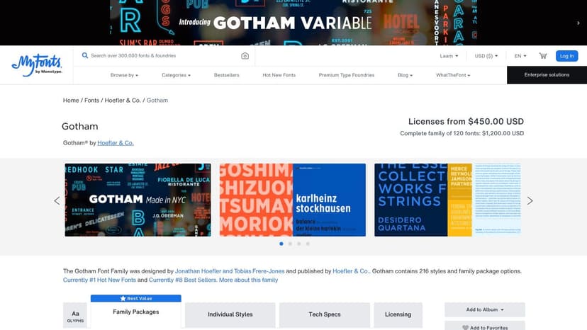
Gotham on MyFonts is one of the safest choices when you need a cover to look contemporary, confident, and clean. It has the kind of neutrality that helps a title feel established without looking sterile. For nonfiction, business, self-help, political titles, and upscale thrillers, Gotham is hard to misuse.
Its biggest practical advantage is range. You can move from a broad, confident title to a narrow spine treatment without switching visual voice. That matters more than most authors expect, especially once subtitle length, trim size, and back-cover constraints start fighting each other.
Where Gotham earns its keep
Gotham works best when the layout needs control. Long titles, multi-line subtitles, endorsement copy, and series branding all benefit from its large family and condensed options. If you're building a repeatable look across several books, that flexibility saves time.
Practical rule: Gotham is a better system font than a one-off statement font. Use it when consistency matters more than novelty.
It also has a variable version, which is useful if your workflow includes digital assets beyond the cover itself. For an author brand spanning cover, landing page, and ad creative, one adjustable font file can simplify production.
A drawback is distinctiveness. Gotham is popular because it works, but popularity cuts both ways. In crowded nonfiction categories, it can look familiar enough that you'll need stronger color, composition, or image direction to stand apart.
Licensing is the other trade-off. Desktop use for a print cover is one thing. Webfont, app, and broader commercial use can be a separate conversation, so check the license before assuming one purchase covers everything. If you're still comparing sans options for publishing use, this guide to fonts for book covers helps narrow the field.
2. Proxima Nova
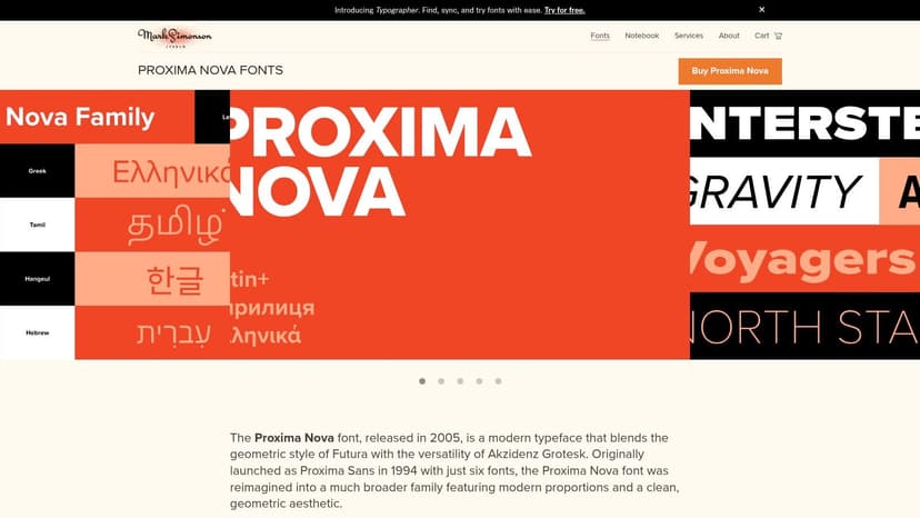
Some fonts feel polished but slightly distant. Proxima Nova doesn't. Proxima Nova from Mark Simonson Studio has a friendlier, more conversational tone than Gotham while still reading as professional. That makes it especially useful for commercial fiction, practical nonfiction, and author brands that need warmth without looking casual.
It's one of the easiest fonts to pair. Put it next to a literary serif, a modern serif, or a restrained script, and it usually behaves. That's valuable when your cover needs a title face and a support face that don't compete.
Why designers keep coming back to it
The family is broad, the metrics are dependable, and the OpenType features are useful. Small caps, alternate figures, ligatures, and alternate characters aren't decorative extras. They help when you're refining subtitle rhythm, handling numerals, or trying to make a crowded back cover feel intentional.
Its language support is also unusually strong, which matters for multilingual publishing or internationally marketed titles. If your metadata, author name, or edition details need broader script support, Proxima Nova is easier to trust than many display-first sans serifs.
Proxima Nova rarely steals the show. It makes the rest of the cover easier to solve.
The downside is familiarity. If you're launching a brand-new series and want typography to carry a lot of identity on its own, Proxima Nova may be too agreeable. It excels as a dependable professional font, not as a dramatic signature.
Still, there's a reason it shows up in so many production workflows. If you need a cover that feels current and readable without fuss, it's a strong pick. This is especially true if you're applying broader book cover design tips around hierarchy, spacing, and subtitle control.
3. Avenir Next World
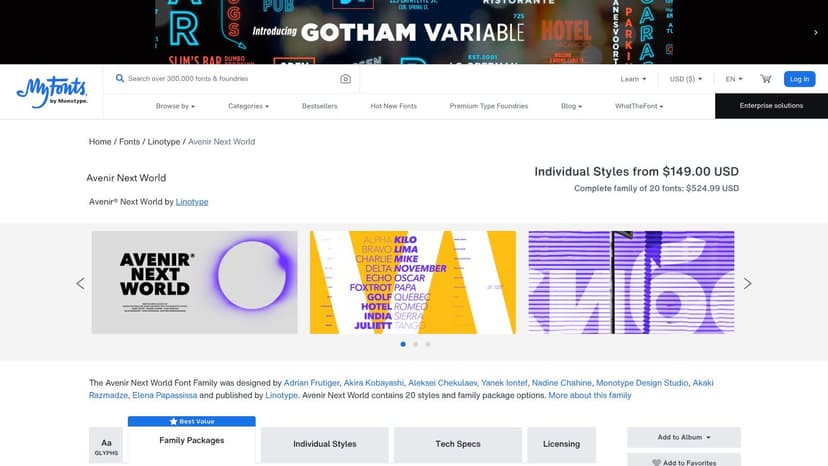
Avenir Next World on MyFonts solves a problem many authors don't notice until late in production. A lot of clean sans serifs look fine in English, then fall apart when you need consistent typography across multiple languages or scripts. Avenir Next World is built for that wider publishing reality.
It supports more than 150 languages and scripts, which makes it a practical choice for translated editions, bilingual covers, academic publishing, and presses with international catalogs. If your front cover, spine, and marketing assets need one unified typographic voice, this family is unusually reliable for that job.
Best use cases
I'd put Avenir Next World near the top of the list for:
- Multilingual editions: It keeps the same overall tone across scripts instead of making one language look “designed” and another look substituted.
- Institutional publishing: University presses, business books, and global nonfiction benefit from its polished restraint.
- Long-term series branding: It feels stable enough to support multiple titles without locking you into a trend.
Avenir Next World also handles size changes well. It stays composed in display use, but it doesn't get fragile when you reduce it for subtitles or supporting cover text.
Its main drawback is cost. This is a premium family, and that matters if you're an indie author buying type one project at a time. If you only need a simple English-language title treatment, there are less expensive ways to get a similar clean, modern effect.
Still, if your publishing needs cross borders, this is one of the best professional fonts because it removes a whole class of production problems before they start.
4. Minion 3
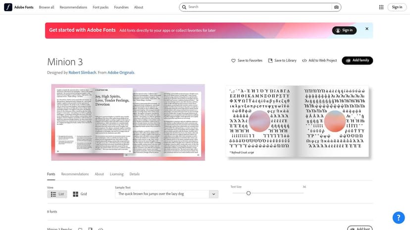
Not every cover should shout. Minion 3 on Adobe Fonts is for projects that need authority, literary weight, or editorial credibility. It's a workhorse serif, but that undersells it. Minion 3 gives you the kind of structure that makes a serious book feel serious.
This is also the easiest place to explain optical sizes in plain English. Minion 3 includes different versions tuned for different size ranges, such as Display, Subhead, Text, and Caption. That means the font isn't just scaled up or down mechanically. The letterforms are adjusted so they perform better at the size you use.
Why optical sizes matter on book projects
Large title text and small back-cover copy don't need the same drawing. A font optimized for display can look too delicate in smaller copy. A text cut can look dull and clunky when enlarged. Optical sizes solve that.
For authors handling both cover and interior materials, Minion 3 can bring order to the entire package. It's especially strong for back-cover copy, endorsements, flap text, and any project where the cover needs a literary or scholarly tone.
Watch for this: Adobe Fonts covers many common desktop and hosted web uses, but it doesn't automatically mean every embedding scenario is covered. App use and self-hosting can require separate rights.
Another practical benefit is cost efficiency if you already subscribe to Creative Cloud. In that case, Minion 3 may be available without buying a separate desktop license just for the cover. If your project also involves interior typography decisions, this article on book design and layout is the right companion read.
Minion 3 isn't the font for every genre. It's rarely the best answer for high-energy commercial romance or aggressive thriller packaging. But for literary fiction, history, memoir, essays, and serious nonfiction, it's one of the most useful professional serifs you can choose.
5. Publico
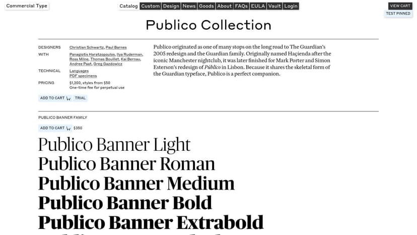
Publico from Commercial Type has a sharper editorial personality than Minion 3. If Minion feels bookish and classical, Publico feels published. It carries some newspaper and magazine energy, which can make a cover look current, intelligent, and slightly more forceful.
That edge is useful. Many serious covers fail because they confuse “literary” with “quiet.” Publico gives you sophistication without softness. It can carry opinionated nonfiction, cultural criticism, narrative journalism, and literary fiction that needs more bite.
What Publico does better than most serifs
The family structure is smart. Text, Headline, Banner, Condensed, and Mono variants let you build hierarchy without patching together unrelated fonts. That's a strong advantage if you want the front cover, spine, and back cover to feel like one designed system.
Its italics are another reason designers like it. On covers, italics often become muddy or decorative. Publico's italics hold shape and purpose, which helps with pull quotes, subtitles, or author credentials that need emphasis without fussiness.
Use it when you want:
- Editorial authority: It feels informed and established.
- Sharper contrast: More attitude than a traditional old-style serif.
- A coordinated family: Good for full-wrap cover systems and marketing extensions.
The trade-off is price creep. One cut may be manageable, but multiple subfamilies can raise the total quickly. That makes Publico better suited to authors or presses who know they'll use it across several assets, not just one front cover.
6. GT Super
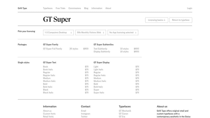
If you want a serif that feels premium on sight, GT Super from Grilli Type is a strong candidate. It has contrast and elegance, but it doesn't collapse into fashion-magazine fragility. On the right cover, GT Super makes even a simple layout feel deliberate.
Often, authors overcorrect. They pick a high-contrast serif because it looks expensive, then discover it breaks down at small sizes or in cramped production areas. GT Super avoids some of that because it's built as a system with Text and Display subfamilies.
Good fit and bad fit
GT Super is excellent for literary fiction, upscale romance, memoir, historical fiction, and essays. It also works for genre books that want a prestige cue without becoming old-fashioned. A moody novel with restrained imagery can gain a lot from it.
On a thumbnail, elegance only helps if the letters still separate cleanly. Thin strokes that look refined at full size can disappear fast on mobile.
That caution matters because thumbnail legibility remains an underexplored area in cover typography. Existing guidance often says to “make it bigger,” but there's little concrete comparison data on how fonts behave at small marketplace sizes, as noted in this discussion of the thumbnail-readability gap in self-published book fonts. With GT Super, test early. Don't assume a beautiful desktop mockup will survive reduction.
Licensing here is fairly straightforward, which I appreciate. Trial options and perpetual licensing are easier for indie authors to understand than sprawling enterprise-style terms. The main limitation is language breadth. If you need broad script support, Avenir Next World or Proxima Nova may be safer.
7. The Freight Collection
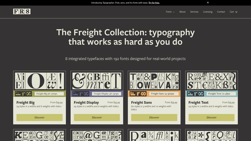
The Freight Collection is less a single font than a publishing toolkit. When authors ask for “one font family that can do everything,” this is the kind of answer they usually mean. Freight gives you serif, sans, optical sizing, and a wide style range inside one coordinated system.
That matters most on bigger publishing programs. A single stand-alone title can survive on a simpler typographic choice. A series, imprint, or author brand benefits from a family that can carry a large title on one book, tiny supporting copy on another, and consistent ads, web graphics, and interiors without feeling patched together.
Why Freight is so useful in publishing
The collection spans eight coordinated families, including Big, Display, Text, Micro, Sans, Neo, and Round. That breadth means you can preserve one typographic voice while adjusting for real production needs. Tiny copy doesn't have to use the same cut as a giant title, and that's exactly the point.
The practical upside is scale. You can start with one or two styles, then expand later if the project grows. That makes Freight one of the best professional fonts for authors planning a series identity rather than a single launch.
A few cautions are worth stating plainly:
- Choice overload: Without a style guide, too many options can slow decisions.
- License nuance: Availability through Adobe Fonts may cover some use cases, but not every use case.
- Discipline required: Freight rewards consistency. Randomly mixing subfamilies defeats the benefit of the system.
If you want one family that can move from refined literary packaging to dense production details without changing tone, Freight is unusually capable.
Best Professional Fonts: 7-Font Comparison
| Font | Implementation complexity 🔄 | Resource requirements ⚡ | Expected outcomes ⭐📊 | Ideal use cases 💡 | Key advantages ⭐ |
|---|---|---|---|---|---|
| Gotham (Hoefler & Co./Monotype) | Moderate, large family + variable option; requires system choices | High, premium licensing for web; variable reduces asset count | Strong headline/display performance; versatile brand tone | Covers, headlines, ads, responsive designs | Recognizable, deep style range; variable weight/width control |
| Proxima Nova (Mark Simonson Studio) | Low, predictable metrics and straightforward deployment | Moderate, paid license but clear direct pricing | Very readable across print & digital; stable production results | Web/UI, product design, covers/interiors pairing | Wide style range; broad language support; predictable behavior |
| Avenir Next World (Linotype/Monotype) | Moderate–High, multi‑script setup for global projects | High, premium price for extensive script support | Consistent global typographic voice; legible at many sizes | Multilingual covers/interiors and international publishing | Extensive script coverage; cohesive voice across scripts |
| Minion 3 (Adobe Originals / Adobe Fonts) | Moderate, optical sizes require selecting appropriate cut | Low–Moderate, included with Creative Cloud; separate licenses for self‑hosting | Excellent long‑form readability; classic editorial tone | Book interiors, blurbs, back covers, editorial text | Multiple optical sizes; included hosted licensing via Adobe Fonts |
| Publico (Commercial Type) | Moderate, multiple subfamilies optimized by use | Moderate–High, buying many subfamilies increases cost | Crisp display and strong editorial credibility | Magazine/newspaper style covers, blurbs, quotes | Purpose‑built subfamilies; distinctive newspaper/magazine feel |
| GT Super (Grilli Type) | Low–Moderate, two subfamilies with tuned optical sizes | Moderate, one‑time perpetual licensing; limited scripts | Elegant, premium contrast that reads well at display sizes | Literary and genre covers, premium thumbnails | High‑contrast refined aesthetic; buyer‑friendly licensing |
| The Freight Collection (The Type Founders / Darden Studio) | High, huge superfamily (192 fonts); requires governance | High, many styles to license; competitive per‑style pricing | Unified voice from micro captions to large display; very versatile | Series branding, dense editorial pages, full publishing systems | Extremely versatile superfamily; optical sizes for all use cases |
From Font Choice to Final Cover
The best professional fonts aren't the ones designers praise most. They're the ones that fit your book's market position, hold up at small sizes, and come with licensing you understand. A font can be beautiful and still be wrong for your cover if it clashes with genre expectations, fails on a spine, or creates rights issues when you start using it in ads and marketing materials.
Licensing deserves more attention than authors usually give it. A desktop license may cover the print cover file you send to your designer or upload workflow, but that doesn't always mean the same font is cleared for web embedding, app use, editable templates, or broader commercial distribution. Read the license before you commit to a family, especially if you plan to use the same typography across website headers, promo graphics, audiobook art, and social assets.
Readability matters too, and not just in theory. Font type can affect reading comprehension by up to 10%, and strategic font choices can reduce printing costs by up to 77%, according to Linearity's font statistics overview. For print-focused authors, that's a practical reminder that typography decisions can affect both reader experience and production economics. The same source also recommends limiting a design to two or three complementary font families and notes that fonts with larger x-heights, such as Open Sans, Noto Sans, and Lato, can improve readability at smaller sizes.
The smartest next step is to test, not guess. Try title treatments at full size, then shrink them to marketplace thumbnail scale. Compare serif and sans options side by side. If you want a low-risk way to experiment, start with a free book cover tool to mock up hierarchy and spacing before buying a premium license.
If you're exploring complete cover directions, using an AI tool can help you test typography in context rather than in isolation. BeYourCover is one option if you want to generate concepts, then adjust fonts, text placement, color, and layout before committing to a final direction. That won't replace judgment, but it can make the evaluation process much faster.
A professional cover usually isn't built from a dramatic font choice alone. It comes from a font that fits the story, survives the technical realities, and keeps the reader's attention exactly where it belongs.
Ready to Create Your Own Book Cover?
Turn your story into a visual masterpiece. Fill in the details below to start generating professional covers instantly.