Mastering the Emerald Green Hex for Unforgettable Book Covers
Discover how to use the emerald green hex code to create a book cover that captivates readers. Learn color psychology, palette creation, and KDP optimization.
Posted by
Related reading
Master Dark Teal Hex Code for Stunning Covers
Find the official dark teal hex code (#014D4E) for book covers. Learn color psychology, palettes, and KDP print tips to perfect your design.
Your Guide to the Burgundy Color Code for Book Covers
Discover how to use the burgundy color code for your book cover. Get HEX, RGB, and CMYK values to create a cover that sells on Amazon KDP.
The Cobalt Blue Color Code: A Guide for Book Cover Design
Discover the exact cobalt blue color code (Hex, RGB, CMYK) and learn how to use it for book covers that stand out on Amazon KDP and beyond.
Ready to design your cover?
Use our AI book cover generator to create tailored book cover concepts in minutes.


When designers refer to emerald green, there's one specific code they often turn to. The canonical emerald green hex code is #50C878. This is the digital shorthand for a deep green that feels both luxurious and natural—an incredibly powerful tool for authors aiming to set a specific mood with their book cover.
Decoding the Emerald Green Hex Code
You don't need to be a professional designer to make smart choices for your cover, but understanding a few key numbers will prevent a lot of frustration. Think of a hex code as a universal language for color on screens. It's a simple command that tells any monitor, tablet, or phone exactly which shade of green to display.
However, your book isn't just an ebook; it's also a physical copy. This is where things can get tricky, and where understanding the difference between RGB and CMYK becomes a critical skill for any author.

From Screen to Print
The reason this matters is simple: colors created with light (RGB) almost always look brighter and more vibrant than colors created with ink (CMYK).
Have you ever ordered a proof copy from a service like KDP, only to find the gorgeous, glowing cover on your screen turned into a disappointingly dull green in print? That's the RGB-to-CMYK shift in action. Knowing both sets of codes helps you anticipate this change and ensure your cover looks just as stunning in person as it does online.
To make it easy, here's a quick cheat sheet for the classic emerald green, #50C878.
Emerald Green Color Code Conversions (#50C878)
This table gives you the essential codes for both digital displays and physical printing, so you have the right values on hand no matter where your cover appears.
| Color Model | Code |
|---|---|
| Hex | #50C878 |
| RGB | 80, 200, 120 |
| CMYK | 60, 0, 40, 22 |
| HSL | 140°, 47%, 55% |
Keep these numbers handy when you're working in a design tool or communicating with a cover designer. They are the foundation for a consistent and professional look.
Having these codes is the first step toward making smart design choices for your book. It’s also worth exploring how nearby shades can shift the mood, like the ones we cover in our guide to the blue-green color code, which can introduce a more tranquil or aquatic feel.
The Hidden Meaning of Emerald Green in Book Covers
Color is one of the most potent tools in your author toolkit. It’s a silent storyteller, working its magic on a crowded digital shelf. An emerald green hex code isn't just a technical instruction; it's a trigger for a deep psychological response in potential readers. This single choice can broadcast your book's genre, tone, and promise before a single word of the title is even read.
Our brains are hardwired to notice green. It sits right in the middle of the visible light spectrum, making it one of the easiest colors for our eyes to process. This isn't just a random biological quirk—it’s an evolutionary trait that connects green to feelings of safety, nature, and tranquility. It’s a primal signal that all is well.
But the specific shade of emerald is where things get interesting. It carries a powerful dual meaning that makes it incredibly versatile for book cover design, capable of signaling both natural wonder and sophisticated ambition.
The Duality of Emerald Green
Emerald green is a color of fascinating contradictions, which is exactly why it can adapt to so many different genres.
- Opulence and Ambition: For centuries, emerald gemstones have been shorthand for wealth, status, and power. This deep cultural association makes the color a fantastic choice for epic fantasy, historical fiction about royalty, or even non-fiction books on finance and success. An emerald cover subconsciously tells a reader: this story contains high stakes, luxury, and ambition.
- Nature and Vitality: At the same time, the color is fundamentally tied to lush forests and vibrant life. This makes it an obvious fit for eco-fiction, fantasy novels set in enchanted woods, or wellness guides. It instantly communicates growth, harmony, and the richness of the natural world.
- Mystery and Foreboding: Dial down the brightness, and emerald green takes on a much more unsettling quality. For thrillers or dark fantasy, a deep, muted emerald creates a potent sense of unease and mystery, hinting at secrets lurking just out of sight.
To get a better handle on how these cues work on a reader's subconscious, you can explore the principles of color psychology for branding, which apply directly to attracting your ideal audience.
The nuance lies in saturation and context. A bright, crisp emerald feels energetic and aspirational. A dark, desaturated emerald feels moody and dangerous. Your control over this single element directs the reader's entire emotional expectation.
Understanding this is crucial before you start designing. For example, when you’re experimenting with concepts, perhaps using an AI cover creation tool, specifying "dark, moody emerald green" will produce dramatically different results than just asking for "emerald green." One is perfect for a thriller, the other for high fantasy.
Mastering this language gives you direct creative control. It’s about making a deliberate choice to tell the right story at a glance and attract the exact reader your book was written for.
How to Build a Compelling Color Palette Around Emerald Green
A great color palette doesn't just look pretty; it tells a story. When you make emerald green the protagonist of your cover design, the supporting colors you choose are what set the genre and tone. This isn't about pulling random shades from a color wheel—it's about building a sophisticated, genre-specific palette that makes your emerald cover pop.
Think of it this way: pairing colors is a deliberate act of communication. The right combo can instantly signal luxury, danger, or tranquility to a reader scrolling through Amazon. Your goal is to create a visual shortcut that shouts, "This book is for you!"
This is where understanding emerald's core psychology comes in. It’s not just a color; it’s a concept.
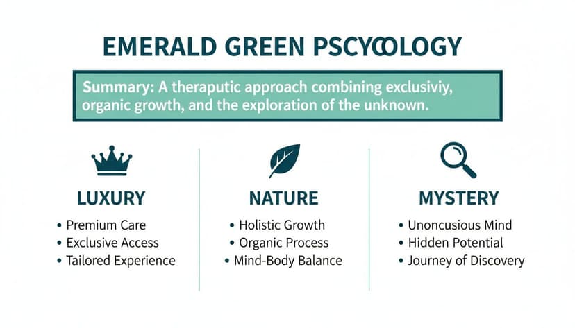
These three pillars—Luxury, Nature, and Mystery—are your foundation. They give you a proven framework for building palettes that connect with your book's specific themes and, most importantly, your target readers.
Palettes to Attract Your Ideal Reader
To make this immediately practical, here are four genre-specific palettes built around emerald green. Each one is engineered to grab a particular audience and forge an instant emotional connection. Use these hex codes as a launchpad for your design, whether you're working in a design program or testing concepts with a tool like BeYourCover.
1. Epic Fantasy & Luxury: Emerald and Gold
This is the quintessential pairing for stories dripping with royalty, ancient magic, and high ambition. The deep, lush green provides a regal base, while a splash of gold adds an immediate sense of prestige and value.
- Emerald Green:
#50C878 - Metallic Gold:
#D4AF37 - Rich Black:
#121212 - Soft Ivory:
#FFFFF0
When Pantone named emerald its 2013 Color of the Year, it triggered a 250% surge in its use across digital media. In graphic design, a staggering 62% of luxury packaging now incorporates emerald-gold combinations, which has been shown to lift perceived value by 30% in consumer studies. That’s a powerful strategy you can use to signal an opulent, high-stakes fantasy. You can discover more insights about emerald green's impact and see how it continues to dominate design trends.
2. Thriller & Modern Fiction: Emerald and Charcoal
For a moodier, more contemporary vibe, ditch the bright gold and bring in dark, cool neutrals. This palette creates a sharp sense of suspense and urban sophistication, making it perfect for psychological thrillers, dark academia, or tense modern dramas.
This combination works because the charcoal mutes emerald's natural vibrancy, shifting the mood from lively to mysterious. The high contrast also ensures text remains sharp and legible, even as a tiny thumbnail on a crowded storefront.
3. Elegant Non-Fiction & Memoir: Emerald and Cream
If your goal is to communicate wisdom, personal growth, and approachable authority, pair emerald with warm off-whites and creams. The combination feels organic, clean, and trustworthy—ideal for self-help, wellness guides, or beautifully crafted memoirs. It’s a fantastic look for non-fiction and even translates well to a thoughtful fantasy book cover.
4. Magical Realism & Romance: Emerald and Deep Plum
Want to evoke a feeling of deep enchantment and simmering romance? Combine emerald green with a rich, velvety plum or magenta. This analogous pairing feels harmonious yet wonderfully unexpected, suggesting a world that is both grounded in reality and touched by a hint of magic. It’s a fantastic choice for romantasy cover design examples and other stories that blur the line between the everyday and the extraordinary.
How to Make Your Cover Stand Out as a KDP Thumbnail

Here's a hard truth: your book cover has two jobs. It has to look fantastic at full size, sure. But first, it has to grab a reader’s eye as a tiny thumbnail on a crowded Amazon page. This is where so many otherwise brilliant designs fall completely flat.
An intricate cover might look incredible on your desktop, but when it’s shrunk down to the size of a postage stamp, it can turn into a muddy, illegible blob. For indie authors, thumbnail impact is everything. Your cover’s first impression happens in a split-second glance, fighting for attention against a dozen others.
This is precisely where a bold emerald green hex code becomes your secret weapon. The sheer saturation of a classic emerald like #50C878 gives it an immediate visual punch. Unlike muted colors that wash out and blur, its vibrancy cuts through the noise, making sure your cover gets noticed.
The Thumbnail Legibility Test: A Non-Negotiable Checklist
The single most important goal for a KDP thumbnail is instant readability. A potential buyer has to be able to read your title and get a feel for the genre in less than a second. Pairing emerald green with high-contrast typography isn't just a good idea—it's a requirement for success.
1. Prioritize High-Contrast Typography:
- Crisp White (#FFFFFF): This is the gold standard for a reason. White text on a deep emerald background creates clean, sharp contrast that makes your title pop.
- Metallic Fonts (Gold or Silver): A simulated metallic font, like a bright gold #FFD700, does double duty. It stands out beautifully against the green while adding a feeling of luxury.
2. Conduct the Grayscale Test:
- Before you finalize any design, convert your cover to grayscale. This strips away color and reveals pure value contrast. If your title and main elements are still perfectly clear, your design is strong.
3. Always Test at Thumbnail Size:
- As you mockup concepts, make the "thumbnail test" a reflex. Generate a version, then immediately shrink it down to the size it would be on a phone screen. Is the title still readable? Does the color pop, or does it fade?
A beautiful cover that fails the thumbnail test is a missed sale. By leaning into a strong emerald green hex code and insisting on high-contrast fonts, you’re giving your book its best shot at standing out where it counts most. You can read more about the strategic use of emerald green to understand how its inherent qualities make it a natural fit for grabbing attention.
How to Design Accessible Covers with Emerald Green
An effective cover needs to do more than just look good—it needs to work for everyone. Ensuring your cover is accessible to readers with visual impairments is a crucial step that can expand your audience. It all comes down to making smart choices about color and contrast so your title is legible to as many people as possible.
This is where the Web Content Accessibility Guidelines (WCAG) are a useful resource. Though designed for websites, these standards are a godsend for book cover thumbnails, which are essentially tiny graphics that need to be understood at a glance.
Understanding Contrast Ratios
The heart of accessible design is the contrast ratio. It’s a measurement of the brightness difference between two colors—for example, your title text and your background. A high ratio makes text easy to read, while a low one can make it disappear for people with color blindness or low vision.
WCAG gives us clear targets to aim for:
- AA Level: A contrast ratio of at least 4.5:1 for normal text.
- AAA Level: A much stricter ratio of at least 7:1 for normal text.
For a book cover, hitting the AA standard is a fantastic goal.
The great news is that a true emerald green like #50C878 gives you a brilliant starting point. Its rich, deep value naturally stands out against lighter colors.
For instance, putting crisp white text (#FFFFFF) on top of that classic emerald (#50C878) gives you a contrast ratio of 3.17:1. That’s perfectly fine for a big, chunky title (which is considered "large text"), but it technically falls short of the 4.5:1 needed for smaller text like a subtitle or author name. To hit that mark, you'd need a slightly darker shade of emerald.
Making Smart Design Choices
This doesn't mean you have to ditch your favorite emerald hex code. It just means you need to be strategic. If your heart is set on #50C878, make sure your title and author name are bold and large enough to be considered "large text," which only requires a 3:1 ratio. You're already in the clear.
On the flip side, using a light gray font on that same emerald background would almost certainly fail a contrast check, making your cover illegible to a slice of your potential readers. To dive deeper into creating designs that work for everyone, check out our guide to accessible color palettes for more practical tips.
Before you finalize any cover, always run your color pairings through a free online contrast checker. It's a two-second step that guarantees your beautiful design is also an effective and inclusive one.
Your Quick-Start Guide to Using Emerald Green
Let's move from theory to practice. Whether you're using professional design software or an AI tool, these are the practical steps to get emerald green onto your cover today.
First, you need the right color code. For that iconic, classic emerald, use the hex code #50C878. Just copy and paste that value straight into your design program’s color picker to ensure you’re starting with the correct shade.
Implementation Checklist for Authors
With the right code locked in, it's time to make a few key decisions. This isn't just about splashing color around; it's about making strategic choices that serve your book's genre and audience.
-
Define Its Role: Is emerald green the background or an accent? A full emerald background makes a bold statement, perfect for fantasy or high-concept nonfiction. Used as an accent, it can bring a touch of class to your typography or small graphic elements without dominating the design.
-
Add Depth with Texture: A flat color can sometimes feel one-dimensional. Try overlaying textures like marble, dark foliage, or even a subtle distressed paper effect. This simple technique can add significant visual interest and thematic depth, hinting at everything from ancient magic to modern luxury.
-
Pass the Thumbnail Test: This is the most critical step. Before you finalize your design, shrink it down to thumbnail size. This is how 99% of readers will first see it on Amazon. If your emerald details still pop and the title is crystal clear, you have an effective design.
A great way to test these ideas is by using an AI generator to explore concepts. You can use prompts like "fantasy book cover with an emerald green marble texture and elegant gold serif font" to quickly iterate and find a powerful combination that will make your cover impossible to ignore.
Frequently Asked Questions
Working with a color as rich as emerald green often brings up a few practical questions. Let's tackle some of the most common ones so you can move forward with confidence.
What Is the Best Font Color with an Emerald Green Background?
For maximum impact, your best options are a clean, crisp white (#FFFFFF) or a classic metallic gold (#FFD700).
White delivers unbeatable contrast, which is essential for accessibility and ensures your title is legible even as a tiny thumbnail on Amazon. Gold adds an immediate sense of luxury and magic, making it a perfect fit for a standout fantasy book cover.
Can I Use a Different Shade of Emerald Green?
Absolutely. The “official” emerald green hex code, #50C878, is just a starting point. Great design is about making intentional choices that serve your story.
- Lighter, airier shades can feel more modern and fresh, suitable for wellness guides, contemporary fiction, or lighthearted romance.
- Darker, more desaturated emeralds create a powerful, moody atmosphere, ideal for thrillers, historical fiction, or dark fantasy.
The most important thing is that your chosen shade matches the book's emotional tone and still provides enough contrast for your text to be easily readable.
How Do I Match My Screen Color to the Printed Book?
This is a common headache for authors. What you see on your glowing monitor (RGB) will almost never perfectly match what comes off a printing press (CMYK).
The best way to mitigate this is to provide your printer with a file using CMYK values. For the canonical emerald, that’s C:60 M:0 Y:40 K:22.
If you're using a tool like BeYourCover, make sure you download the high-resolution, print-ready file, as it’s already optimized for KDP's process. However, the most critical step is to always order a physical proof copy. It's the only way to see exactly how your colors will look in print before you publish.
Ready to Create Your Own Book Cover?
Turn your story into a visual masterpiece. Fill in the details below to start generating professional covers instantly.