Mastering the Blue Green Color Code for Your Book Cover
Discover how to use the blue green color code for your book cover. Learn color psychology and design tips to create covers that captivate readers on KDP.
Posted by
Related reading
Master Dark Teal Hex Code for Stunning Covers
Find the official dark teal hex code (#014D4E) for book covers. Learn color psychology, palettes, and KDP print tips to perfect your design.
Your Guide to the Burgundy Color Code for Book Covers
Discover how to use the burgundy color code for your book cover. Get HEX, RGB, and CMYK values to create a cover that sells on Amazon KDP.
The Cobalt Blue Color Code: A Guide for Book Cover Design
Discover the exact cobalt blue color code (Hex, RGB, CMYK) and learn how to use it for book covers that stand out on Amazon KDP and beyond.
Ready to design your cover?
Use our AI book cover generator to create tailored book cover concepts in minutes.


Ever picked up a book and felt instantly drawn to its cover? If it was a shade of blue-green, there's a good reason. But how do you ensure the stunning teal on your screen looks just as good in print on Amazon KDP? The answer lies in the blue green color code.
Think of a color code as a specific recipe. Just like a baker needs precise measurements to get the same cake every time, a designer needs a color code to create a consistent shade of blue-green, whether it's a deep teal or a bright turquoise. Without one, the color you love on your laptop could look totally different on someone else's phone—or worse, on the printed copy of your book. This guide will walk you through how to use these codes effectively for your author career.
What Is the Blue Green Color Code?
A color code is a set of instructions that tells a device or a printer exactly which shade to show. For authors, understanding these codes is the first step toward a cover that looks intentional and professional.
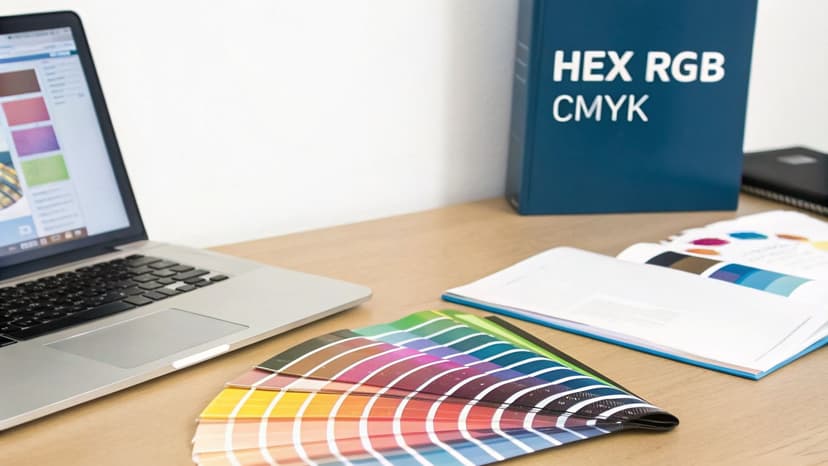
As you prepare your book for platforms like Amazon KDP, you’ll encounter three main types of color codes:
- Hex (Hexadecimal): This is a six-character code starting with a pound sign, like #40E0D0 for Turquoise. Hex is the universal language for color on the web, in ebooks, and in most design tools. If you're experimenting with an AI tool to generate cover mockups, you'll likely be using Hex codes.
- RGB (Red, Green, Blue): This model is for anything that emits light—computer monitors, tablets, and smartphones. It mixes red, green, and blue light (each with a value from 0 to 255) to create every color you see on screen. Your ebook cover file will use RGB.
- CMYK (Cyan, Magenta, Yellow, Key/Black): This one is all about ink. CMYK is the standard for physical printing, so it’s essential for your paperback or hardcover. Getting this right prevents your beautiful blue-greens from looking muddy or washed-out on paper.
Common Blue Green Hex Codes for Book Covers
To help you get started, here is a quick-reference table of effective blue-green hex codes. I've included the psychological feeling each color tends to evoke and the genres where it shines. For example, picking the right shade for a non-fiction book cover can instantly signal credibility and expertise.
A specific blue green color code ensures brand consistency. When a reader sees your cover on Amazon, your website, and social media, the color should be identical every time. This consistency builds recognition and signals professionalism.
| Color Name | Hex Code | Psychological Meaning | Best For Genres |
|---|---|---|---|
| Teal | #008080 |
Clarity, Sophistication, Trust | Business, Self-Help, Thriller |
| Turquoise | #40E0D0 |
Healing, Calm, Creativity | Wellness, YA Fantasy, Memoir |
| Aquamarine | #7FFFD4 |
Refreshing, Youthful, Dreamy | Romance, Fantasy, New Adult |
| Steel Blue | #4682B4 |
Authority, Stability, Logic | Sci-Fi, Non-Fiction, Tech |
| Cadet Blue | #5F9EA0 |
Serene, Dependable, Muted | Historical Fiction, Literary Fiction |
These codes are the key to unlocking a specific mood for your story. A thoughtful color choice is one of the fastest ways to tell a potential reader what kind of journey they're about to embark on.
The Psychology of Blue Green Hues on Book Covers

Color isn’t just decoration; it’s a silent conversation with your reader. Using a blue green color code sends a complex, persuasive message long before anyone reads your synopsis. We're tapping into the core emotions that drive someone to click "buy now."
Blue-green shades are a fascinating mix, borrowing from two powerful colors. Blue communicates trust, stability, and authority. Green signals growth, tranquility, and new beginnings. Blend them together, and you get a versatile powerhouse of a color that speaks to readers across a huge range of genres.
Why This Combination Is Effective for Authors
For indie authors on a crowded digital shelf like Amazon KDP, your cover is a tiny thumbnail fighting for attention. This psychological shortcut is your secret weapon. A deep, authoritative teal on a business book instantly projects credibility. A vibrant, fresh turquoise on a wellness guide promises healing and renewal without saying a word.
This unique combination works so well because it strikes a balance between professionalism and approachability. It’s no wonder a blue-green palette is a go-to choice for everything from high-stakes thrillers to practical self-help guides. It gives readers an emotional shorthand that says, "This book is trustworthy, and it offers growth."
In a survey of nearly 900 readers, 78% said they would be likely to buy a book with a blue cover. This strong preference for blue is exactly why a blue-green color code is so effective. It grounds your cover in a universally trusted color while letting the green add a layer of nuance and energy.
How to Make Strategic Color Choices
Once you understand this psychology, you can make smarter design decisions. Instead of just picking a color you like, you can choose one that aligns with your target readers' expectations. For example, a muted, steely blue-green might appeal to readers of hard sci-fi — the kind of restrained palette seen in many sci-fi cover color examples — while a softer aquamarine is a perfect fit for a lighthearted contemporary romance.
These subtle choices directly impact how your book is perceived. You can test different shades by creating quick mockups with an AI tool to see which one best captures your story’s mood. To learn more about how color influences your audience, check out our guide on color psychology for branding. When you’re deliberate with your color code, you turn your cover into a powerful marketing tool.
How to Match Blue-Green Shades to Your Genre
Picking the right blue-green for your cover isn't about what you like best—it's a strategic move to signal your book's genre and mood to the right readers. A specific blue green color code acts as a visual shortcut, telling a reader what to expect before they even read your title.
For instance, a deep, muted teal practically whispers sophistication and seriousness, a natural fit for business books or dense non-fiction. On the other hand, a vibrant, energetic turquoise screams YA fantasy adventure or a fresh wellness guide, promising creativity and renewal.
Decision Checklist for Choosing Your Perfect Hue
To land on the right shade, you must consider your story, your audience, and your competition. A thoughtful color choice ensures your cover sends the right message in a split second on a crowded digital shelf like Amazon.
Run your blue-green options through this quick checklist:
- Your Book's Core Theme: What is the central idea? If your story is about healing and self-discovery, a lighter, calmer shade like aquamarine makes sense. A corporate thriller, however, needs something darker and more authoritative, like a steel blue.
- Your Target Audience's Expectations: Who are you writing for? Research the bestseller lists for your specific niche. This reveals what successful authors are already using to attract the readers you want.
- The Competitive Landscape: How will your cover stand out in its category? If everyone is using dark blue, a brighter turquoise could pop. But be careful—if your genre has strong color conventions, straying too far might confuse potential buyers.
Color psychology studies consistently show that green, often mixed with blue in teal or turquoise, symbolizes growth, nature, and tranquility. This makes blue-green a powerhouse for genres like health, wellness, and fantasy. You can find more data on how color influences readers over at Spine Book Printing.
Matching Shades to Popular Genres
Once you apply this framework, you can zero in on a shade that works. A light and airy shade is a fantastic choice for contemporary romance or a breezy beach read. You can dive deeper with our guide on the uses of the aqua blue color for more on that. For a non-fiction book that needs to project authority, a darker teal or cadet blue offers a sense of stability and trust.
A great way to test your ideas is to use an AI tool to generate a few quick cover mockups. This lets you see how different blue-green hex codes look with your title and imagery, helping you confidently pick a color that not only looks great but also works hard to sell your book.
How to Apply Blue Green in Your Cover Design
You understand the genres and the psychology behind blue-green. Now it's time to put that blue-green color code to work on your actual book cover. This is where you move from ideas to execution, making the key decisions that will shape your reader's first impression.
The biggest choice you'll make is how blue-green will function in your design. Will it be the main event—a dominant, immersive background? Or will it be a strategic, eye-catching accent? The role you give it sets the entire mood.
Dominant Background vs. Striking Accent
This isn't just a design choice; it's a storytelling one.
- As a Background: Using blue-green as your main color is a powerful way to establish an atmosphere. Think of a sprawling, deep teal ocean for a fantasy epic or a clean, trustworthy cyan for a business guide. This approach works when the color is the emotion you're trying to sell—serenity, mystery, or growth.
- As an Accent: When you need a specific element to pop, blue-green is your secret weapon. A flash of vibrant turquoise for the title on a gritty, black-and-white thriller cover feels electric and modern. It’s all about creating a focal point and telling the reader’s eye exactly where to look first.
Whether you go big or small, the goal is always a balanced, professional-looking cover.
Industry analyses show that blue-green hues, like versatile teal (#008080), are design powerhouses, dominating up to 35-40% of non-fiction and business covers because they blend blue's trustworthiness with green's vitality. You can explore more about the hidden psychology of color to see how these trends influence buyer decisions.
How to Create Contrast and Readability
A gorgeous cover is useless if no one can read the title. This is especially true for the tiny thumbnails on sites like Amazon KDP. High contrast isn't just a good idea; it's essential.
Pairing your blue-green shade with a high-contrast color is non-negotiable. Crisp white text against a dark teal background is a classic for a reason—it’s foolproof and guarantees legibility.
If you're aiming for something more elegant, try pairing a muted cadet blue with a metallic gold or silver font. For a more energetic vibe, a warm, complementary color like orange or coral can create a stunning pop against a cool turquoise. This is a perfect combo for a book that promises creativity or adventure.
A simple way to test these pairings is by using an AI tool to generate quick mockups. You can feed it prompts like "serene blue-green sci-fi book cover with bold white typography" to see how different palettes play together. It’s a great way to experiment and find the perfect match for your book.
Common Readability Pitfalls and How to Avoid Them
What good is a stunning cover if no one can read the title? It’s a classic pitfall for authors. You craft a beautiful, moody blue-green background, only to realize too late that your text vanishes into it. This is a huge problem on tiny Amazon thumbnails where your cover has seconds to make an impression.
The key to avoiding this is high contrast.
The Web Content Accessibility Guidelines (WCAG) use a contrast ratio to measure this. For book covers, aim for a ratio of at least 4.5:1. It’s a solid benchmark that ensures your title is clear and legible for as many readers as possible.
A common mistake is pairing a dark or mid-tone font with an equally dark blue-green background. A navy blue title on a deep teal base, for example, will turn into an unreadable blob. The goal is to make your title pop, not melt into the background.
Choosing High-Contrast Pairings
The simplest rule of thumb is to pair light with dark. You want to avoid placing colors of similar brightness next to each other, as they will compete for attention and reduce readability.
This summary visual breaks down how to think about the different color roles on your cover—your background, your main accent (like the title), and any other pairings.
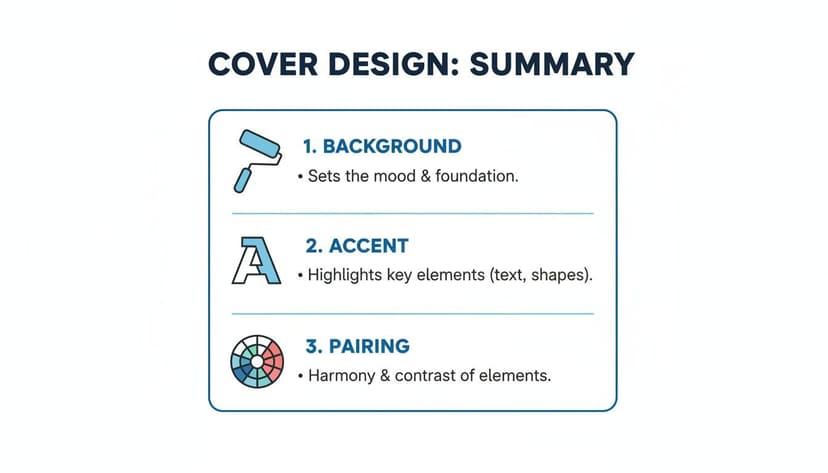
This reinforces that your background, text, and complementary colors must work together as a team.
To give you a practical sense of what works, here’s a quick reference table. These pairings are designed to help your title grab attention, even as a tiny thumbnail image.
Blue Green Contrast Guide for Typography
| Background Color | Good Text Color (High Contrast) | Poor Text Color (Low Contrast) |
|---|---|---|
| Light Teal (#B2DFDB) | Deep Navy (#001F3F) or Black | Pale Yellow or Light Gray |
| Deep Teal (#008080) | Crisp White or Cream (#FFFDD0) | Forest Green or Dark Purple |
| Seafoam Green (#98FF98) | Charcoal Gray (#36454F) or Black | Mint Green or Sky Blue |
| Dark Cyan (#008B8B) | Bright White or Silver | Dark Blue or Maroon |
Choosing a pairing from the "Good" column ensures your title is sharp and clear. For a deeper dive, our guide on creating accessible color palettes is a fantastic resource.
High-contrast is not optional—it’s a commercial necessity. A reader scrolling through dozens of books on Amazon makes a split-second decision based on your cover's thumbnail. If they can't read the title, they will scroll right past.
Remember, you don't have to guess. You can use an AI generator to quickly test different text colors against your chosen blue-green background. It's the fastest way to see what really works before you commit to a final design.
How to Export Your Cover for KDP and Print
You’ve nailed the perfect blue-green hues and built a design with striking contrast. But there’s one last crucial step: ensuring those colors look just as good in print and on-screen as they do in your design software.
Getting the export settings right is a make-or-break moment. A wrong move here can lead to disappointing printing mistakes, turning your vibrant cover into a muddy mess.
The core issue is the difference between how screens create color versus how printers do. This is the difference between two color models: RGB and CMYK.
- RGB (Red, Green, Blue): This is the language of light, used by monitors, phones, and Kindles. All of your ebook covers and online marketing images should be in the RGB color space.
- CMYK (Cyan, Magenta, Yellow, Key/Black): This is the language of ink. Printers use this model, so your paperback or hardcover file for KDP Print must be in CMYK.
How to Handle the RGB to CMYK Shift
What happens when your brilliant on-screen teal hits the printing press? Sometimes, it looks duller. This is a known phenomenon called a color shift.
It happens because the range of colors CMYK ink can reproduce (its "gamut") is smaller than what a bright RGB screen can show. Some super-luminous blue-greens simply don’t have a perfect match in ink.
A direct conversion from an RGB file to CMYK can cause a color shift. The best practice is to convert your file to the CMYK color profile before you finalize the print version. This gives you a much more accurate preview of how the final printed color will look.
To sidestep any surprises, stick to this checklist when prepping your files for KDP:
- Create Two Master Files: This is non-negotiable. Keep one file for your ebook (saved in RGB) and a separate one for your print cover (saved in CMYK). This prevents mix-ups.
- Use the Right Profile: When exporting your print cover, select a CMYK color profile in your design tool's settings. KDP usually works well with profiles like GRACol2006 or SWOP 2006. Some tools allow you to concept in RGB and then export the final with the correct print-ready CMYK settings.
- Check KDP’s Specs: KDP’s guidelines can change, so always check their latest requirements for resolution (almost always 300 DPI for print), file type (PDF for print), and color profile. Following their rules is the surest way to ensure your blue green color code translates from screen to paper beautifully.
Frequently Asked Questions
When you're designing a book cover, a few common questions always pop up, especially when working with a specific color family like blue-green. Let's tackle some of the most frequent ones from indie authors.
Can I Use the Same Blue-Green Color Code for Print and Ebooks?
Yes, but with a critical catch: you have to export two different files.
For ebooks, your cover file needs to be in the RGB color space. This is built for screens, so the vibrant colors you see on your monitor will show up as you intend on a Kindle, iPad, or phone.
For print-on-demand services like KDP, however, you must export a separate file in CMYK. This color model is for ink on paper, and it ensures the printed cover won't come out looking muddy or completely different from your design.
What Is the Best Blue-Green Shade for a Fantasy Novel?
For fantasy, you want colors that suggest magic and otherworldliness. Lean into the more vibrant end of the spectrum. Shades like turquoise (#40E0D0) and aquamarine (#7FFFD4) work wonders.
These colors immediately signal things like healing potions, enchanted forests, and mystical waters, which perfectly aligns with what fantasy readers are looking for. You can see this in action on many bestselling fantasy book covers.
How Do I Ensure My Cover Image Is High Enough Quality for Print?
This one is non-negotiable. For a professional-looking print book, your cover image must be 300 DPI (dots per inch). Anything less will look pixelated, blurry, and amateurish.
Simply resizing a low-resolution image won't fix the problem; it just stretches the existing pixels. If your source image isn't high-resolution, you will need to prepare it correctly. Getting this right is so vital that there are entire tutorials on it—this guide to upscaling images for print to 300 DPI is a great place to start.
Key Takeaway: Always design your print cover at 300 DPI from the very beginning. Trying to fix a low-resolution file later is a headache and rarely produces a clean, professional result.
What If My Chosen Blue-Green Color Looks Dull in Print?
This is the classic RGB-to-CMYK "color shift." It's a very common problem. The glowing, luminous blue-greens that look amazing on a backlit screen often can't be replicated perfectly with physical ink.
The best way to avoid this disappointing surprise is to use the CMYK preview mode in your design software. This feature simulates what the colors will look like when printed, giving you a much more realistic preview. It lets you spot a dull-looking teal and adjust it to a more vibrant, print-friendly shade before you finalize everything.
Ready to Create Your Own Book Cover?
Turn your story into a visual masterpiece. Fill in the details below to start generating professional covers instantly.