Master Dark Teal Hex Code for Stunning Covers
Find the official dark teal hex code (#014D4E) for book covers. Learn color psychology, palettes, and KDP print tips to perfect your design.
Posted by
Related reading
Your Guide to the Burgundy Color Code for Book Covers
Discover how to use the burgundy color code for your book cover. Get HEX, RGB, and CMYK values to create a cover that sells on Amazon KDP.
The Cobalt Blue Color Code: A Guide for Book Cover Design
Discover the exact cobalt blue color code (Hex, RGB, CMYK) and learn how to use it for book covers that stand out on Amazon KDP and beyond.
Mastering Balancing Elements in Photography for Striking Book Covers
Learn balancing elements photography to create compelling, professional book covers. Get practical tips for indie authors to attract readers on KDP.
Ready to design your cover?
Use our AI book cover generator to create tailored book cover concepts in minutes.


Dark teal's most widely used hex code is #014D4E, with RGB values (1, 77, 78). If you're choosing a moody, professional cover color for Amazon KDP, this is the dark teal hex code most authors should start with.
If you're staring at your draft cover and thinking, “Why do some books look instantly credible while mine still feels a little off?”, color is often the missing piece. Not because one shade magically sells a book on its own, but because readers make fast judgments from tiny thumbnails, and a color like dark teal can signal tone before they read a single word of your title.
For authors, that matters. A thriller needs tension. A sci-fi novel needs depth. Literary fiction often benefits from restraint and confidence. Dark teal sits in a useful middle ground. It feels cooler and more cerebral than bright blue, but less predictable than black or gray.
The Definitive Dark Teal Hex Code for Authors
You open your cover draft at thumbnail size on Amazon, and something feels off. The layout is fine. The title is readable. But the cover still lacks the quiet authority readers expect from a professionally designed book. Often, the problem is not the font or image. It is the color choice.
For most author and publishing uses, the dark teal hex code to start with is #014D4E. It gives you a controlled, low-noise blue-green that reads as intentional on screen and gives your designer, or your future self, a clear reference point. ArtyClick identifies this shade as dark teal with RGB (1, 77, 78) in its dark teal color reference.
That matters because covers sell with first impressions. Readers do not study your palette. They react to it in a second. A strong dark teal can signal intelligence, tension, depth, and restraint before they read one word of your title or subtitle.
Why this shade works on books
Dark teal sits between familiar choices. It is more thoughtful than standard navy, less harsh than black, and less generic than many mid-tone blues. In book design terms, it works like a well-fitted jacket. It does not beg for attention, but it tells the reader the book was made with care.
That is useful for authors because color is part of genre signaling. A thriller cover needs pressure and uncertainty. Literary fiction often benefits from control and understatement. Science fiction needs atmosphere without turning cartoonish. #014D4E can support all three, depending on the image, type, and contrast choices around it.
If you browse category pages and then discover the best Canadian fiction books, you can see this principle in action. Strong covers use color to frame reader expectations fast. The palette tells you whether a book feels commercial, introspective, suspenseful, or upscale long before the sample pages do.
Practical rule: Pick dark teal to support the promise your cover makes to the reader.
One code, several nearby variants
Authors get confused here, and for good reason. “Dark teal” is a family name, not a single paint chip used by every design tool and color library. Two shades can both be called dark teal and still create very different reactions on a storefront.
That is why #014D4E is a useful starting point, not a law. It gives you a dependable center point. From there, you can shift slightly bluer for a colder, more technical feel, or slightly greener for a mood that feels more organic or coastal. If you want to compare neighboring shades before you commit, this guide to the blue green color code helps show where dark teal sits in the wider blue-green range.
Use this filter before you lock the color into your cover file:
- Choose #014D4E if you want a classic dark teal that feels credible in multiple fiction categories.
- Adjust toward blue if your book needs a cooler, sharper, more cerebral tone.
- Adjust toward green if your concept needs more warmth, nature, or emotional softness.
- Test the shade in context with your title, author name, and imagery. A hex code never sells the book by itself. The full cover does.
Translating Dark Teal for Screen and Print
You approve your cover on screen. The dark teal looks polished, intelligent, and expensive. Then the paperback proof arrives, and the same background looks heavier, duller, or slightly muddy. That shift is one of the most common color problems authors face, and it can weaken a strong sales cover if you do not plan for it early.
Dark teal changes character because screens and paper build color in different ways. Screens use light. Print uses ink. For authors, that difference matters because a color that attracts clicks in an Amazon thumbnail still has to hold up on a physical book people can touch, photograph, and review.
The screen version
For digital use, #014D4E converts to RGB (1, 77, 78). That is the version your ebook cover, retailer thumbnail, and social graphics will display. On a backlit screen, dark teal usually feels sharper and cleaner because light passes through the color instead of sitting on top of paper.
That is why a dark teal cover can look so persuasive in a thumbnail. It carries mood without turning black, and it often gives white or pale type a crisp edge. If you are designing a book cover that sells, that balance matters. Readers need to read the title fast, but they also need to feel the genre promise in a split second.
The print version
Print asks the color to do a different job. Instead of glowing, it has to absorb into stock, coating, and ink coverage. Dark teal usually prints with a heavy cyan and black mix, which is why the paperback version can lose subtle detail in shadows or textures.
Here is the practical translation:
| Color format | Dark teal value |
|---|---|
| Hex | #014D4E |
| RGB | (1, 77, 78) |
| CMYK | Approx. 99% cyan, 1% magenta, 0% yellow, 69% black |
Treat that CMYK line as a guide, not a guarantee. KDP printing, paper stock, coating, and even how dark your background image runs can shift the final result.
Your monitor glows. Paper absorbs. The same dark teal can look luminous on Kindle and dense in print.
What this means for KDP
Authors can save money and avoid the usual proofing surprise by using this approach. A dark teal background often works well on KDP, but only if you prepare the file for print instead of trusting the screen preview.
Check these points before upload:
- Soft proof your cover to preview how dark teal may shift once converted for print.
- Protect shadow detail in photos or textured backgrounds so dark areas do not merge into one flat block.
- Create separation around the title with contrast, size, spacing, or a light texture behind the type.
- Order a proof copy before approving the paperback, especially if dark teal covers a large portion of the front.
- Compare matte and glossy expectations in your design thinking. Matte often makes dark teal feel more restrained, while gloss can make it appear a little deeper.
A good cover can lose sales when the print version looks murky, cheap, or hard to read. The color choice was not the mistake. The translation was.
Using Dark Teal in Genre-Specific Cover Design
A reader scrolling Amazon makes a decision in seconds. Before they read your subtitle or sample pages, your cover has already signaled mood, genre, and price-point expectations. Dark teal can help that first impression, but only when it matches the promise of the book.

Designers use dark teal because it sits in a useful middle ground. It carries some of blue's trust and distance, some of green's intelligence and unease, and a darker value that adds seriousness. On a cover, that mix can read as controlled, tense, thoughtful, or mysterious.
Where dark teal usually fits best
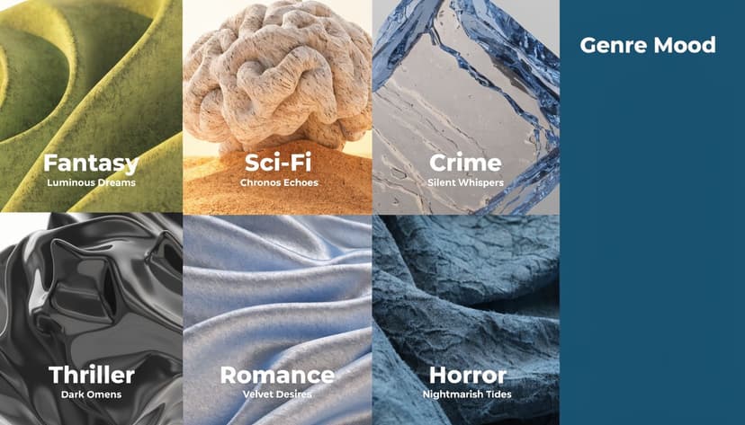
In thrillers, dark teal often signals secrecy, surveillance, cold water, night scenes, institutional power, or psychological strain. It pairs naturally with clean sans serif type, shadowed photography, and restrained accent colors. If your story involves hidden motives, procedural tension, or danger beneath the surface, dark teal can support that sales message well.
In science fiction, dark teal suggests technology, scale, and atmosphere. It helps a book feel intelligent and immersive rather than loud. Authors who want a more serious sci-fi look often choose it over brighter blues because it feels less like action-adventure and more like systems, distance, and consequence.
For literary fiction, historical fiction, and memoir, dark teal can add emotional restraint. It works like a low musical note in a score. It does not demand attention with brightness, but it can make the whole composition feel more mature and intentional.
Where authors often misread it
Dark teal rarely communicates warmth, playfulness, or flirtation on its own. That makes it a weaker lead color for rom-coms, cozy fiction, upbeat self-help, or cheerful commercial nonfiction. In those categories, it can make the book feel heavier than the reading experience is, which hurts the match between cover promise and reader expectation.
That does not mean you must avoid it completely. It often works better as a supporting color, such as a spine color, a small background panel, or a secondary shade in an illustration. If you want help pairing it with more reader-friendly tones, this guide to accessible color palettes for book covers is a useful next step.
Here's a practical genre check:
- Strong fit for thrillers, suspense, sci-fi, and moody literary fiction
- Conditional fit for historical fiction, memoir, and serious nonfiction
- Riskier fit for comedy-forward, breezy, or highly romantic positioning
A good cover tells the right reader, “This book is for you.”
If you want a broader look at the commercial side of visual positioning, BarkerBooks has a useful article on designing a book cover that sells. Read it alongside your category research if you are deciding whether your cover should feel more market-familiar or more distinctive.
The key design question
The key question isn't whether dark teal is attractive. It is whether dark teal helps your book make the right promise at a glance.
That is how professional cover designers choose color. Not by personal preference alone, but by whether the color helps the right reader stop, click, and feel confident that the book belongs to them.
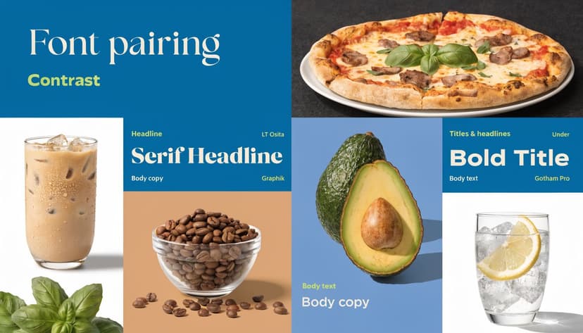
Ensuring Readability with Typography and Contrast
A dark teal background can look elegant and still fail as a cover. The usual reason is simple. The title disappears at thumbnail size.
What readable really means
Readable doesn't mean “I can make it out if I zoom in.” It means a shopper scrolling Amazon on a phone can instantly distinguish the title, author name, and major focal shape.
Dark teal gives you a strong foundation because it's dark enough to support light typography. But that doesn't mean every light color will work equally well. Cream may feel softer than pure white. Pale gold may look elegant in full size but disappear in a small listing image.
A thumbnail-first checklist
Use this checklist before you approve a cover:
- Test at small size. Shrink the cover until it's roughly thumbnail scale and see whether the title still reads.
- Choose one dominant text color. Too many competing text treatments weaken hierarchy.
- Check weight, not just color. A thin serif in pale gold can vanish even if the contrast looks acceptable on a large screen.
- Use spacing deliberately. Tight tracking on a dark background often hurts clarity.
- Review accessibility. If contrast is weak, many readers will feel friction before they know why.
For a practical primer on better pairings, this article on accessible color palettes is a useful place to compare combinations before you commit.
Text colors that usually work
These combinations are often effective with dark teal:
| Text choice | Typical effect |
|---|---|
| White | Crisp, modern, high clarity |
| Soft cream | Warmer, more literary |
| Muted gold | Elegant, but needs testing |
| Light gray | Understated, often best for subtitles |
What usually fails is low-contrast subtlety. Mid-tone blue on dark teal. Dull gray on textured teal. Ornate metallic effects that look impressive in a mockup and weak in a store grid.
Checklist test: If your title only works at full size, it doesn't work yet.
A good habit is to export one version for detail review and one stripped-down test image for thumbnail review. If the stripped-down image feels cleaner and stronger, your typography probably needs simplification.
Building a Professional Dark Teal Color Palette
A cover rarely succeeds because of one isolated color. It succeeds because the full palette feels intentional. Dark teal does its best work when you give it supporting colors that clarify the genre signal rather than muddy it.
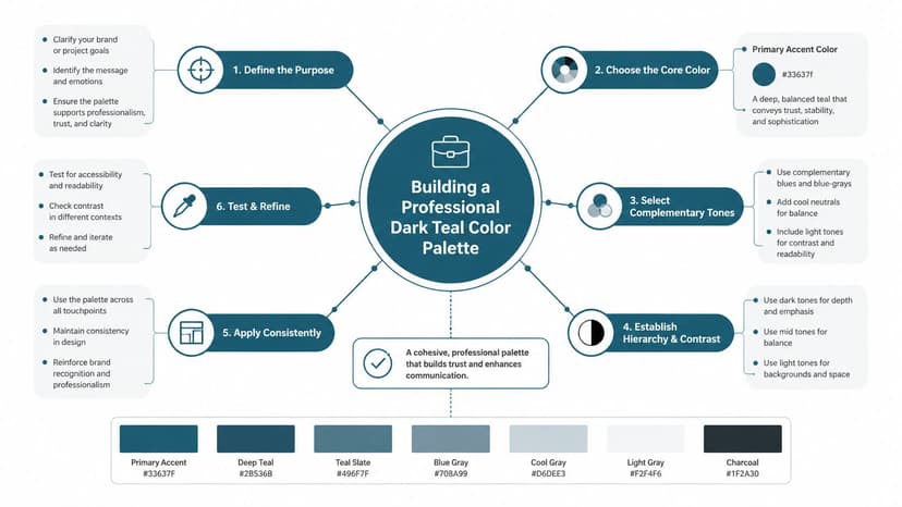
Three practical palette directions
Start with #014D4E as the anchor, then build around mood.
Analogous palette
This stays close to dark teal on the color wheel and creates a smooth, atmospheric look.
Try pairing dark teal with nearby blue-green and cooler blue tones. This works well for sci-fi, literary fiction, and serious nonfiction because the palette feels cohesive and restrained.
If you're comparing neighboring jewel tones, this guide to the emerald green hex helps clarify where green-heavy choices start to shift the tone away from teal.
Complementary palette
This uses a warm opposite accent to wake up the cover.
A burnt orange, muted copper, or dusty coral accent can make dark teal feel sharper and more commercial. This is useful when the cover needs tension or a focal point, especially in thrillers.
Neutral-led palette
Sometimes the best companion colors aren't dramatic at all. Off-white, charcoal, stone, and soft metallic accents can keep dark teal elegant and premium-looking.
That's often the right move when your image or typography already carries a lot of detail.
How to choose without overcomplicating it
Use this decision list when you're stuck:
- If your book is plot-driven and commercial, give dark teal one warm accent.
- If your book is atmospheric and serious, keep the palette narrow and cool.
- If your typography is ornate, simplify the supporting colors.
- If your image is busy, let neutrals do more of the work.
Testing palette variations fast
Mockups help in this situation. You don't need to rebuild the whole cover every time. You can test one version with cream type, one with copper accents, and one with pale gray hierarchy and compare the result side by side.
For teams working across editions or product lines, this article on creating consistent product variations with AI is useful because the recoloring logic is similar. In publishing, the same principle applies when you want one strong concept and need to test multiple palette directions without changing the entire layout.
If you're experimenting with concepts, an AI cover tool can help you preview dark teal palettes on actual compositions before you settle on a final direction. Used well, that's not a replacement for judgment. It's a faster way to compare options.
Keep one element constant while you test color. If you change layout, image, and palette at the same time, you won't know what improved the cover.
Common Mistakes to Avoid with Dark Teal
The biggest mistake authors make with dark teal is assuming a strong color will carry the cover by itself. It won't. Dark teal can look refined, but it can also look flat, murky, or genre-confusing if you handle it casually.
The print trap
One technical issue deserves real attention. For KDP print, dark teal can turn muddy because its CMYK conversion uses nearly 100% cyan and 69% black, and that screen-to-print shift can compress the color unless you manage profiles carefully and soft proof before export, as explained in Media.io's dark teal color breakdown.
That's why a cover can feel rich on your laptop and heavy in a paperback proof.
The design trap
The second problem is overuse. If the background, title effects, shadows, image tint, and decorative elements all sit in the same dark teal family, the cover loses contrast and drama.
Watch for these mistakes:
- Too much tonal sameness. Everything blends together.
- Weak accent choices. The wrong warm accent can make the book look like a different genre.
- Over-textured backgrounds. Grain, smoke, fog, and distressed overlays can swallow type fast.
- Ignoring thumbnail behavior. A moody cover isn't successful if readers can't read it.
A pro-level filter
Ask yourself three questions before final export:
- Does the color support the genre promise?
- Does the title read at thumbnail size?
- Does the print version still hold detail in proof?
If the answer to any one of those is no, the dark teal isn't helping yet. It's just decorating.
If you want to test dark teal on your own concept before hiring out revisions, try BeYourCover's free tool for generating and refining book cover concepts. It's a practical way to compare palettes, typography, and genre positioning on real cover layouts without committing too early.
Ready to Create Your Own Book Cover?
Turn your story into a visual masterpiece. Fill in the details below to start generating professional covers instantly.