Creating Anime Characters for Book Covers
Learn the full workflow for creating anime characters for book covers. Covers concept, design, color, posing, and using AI tools for KDP-ready art.
Posted by
Related reading
Photos for Book Covers: A Complete Guide for Authors
Learn how to choose effective photos for book covers. This guide covers composition, sourcing, licensing, and technical specs for KDP-ready designs.
Create the Perfect Book Review Form: A Guide for Authors
Learn to design a book review form that delivers actionable feedback. This guide covers question design, distribution tactics, and using reviews for marketing.
Effective Backgrounds for Covers: KDP Guide 2026
Choose effective backgrounds for covers to grab attention on Amazon KDP. Our 2026 guide covers types, genre matching, composition, & technical specs.
Ready to design your cover?
Use our AI book cover generator to create tailored book cover concepts in minutes.


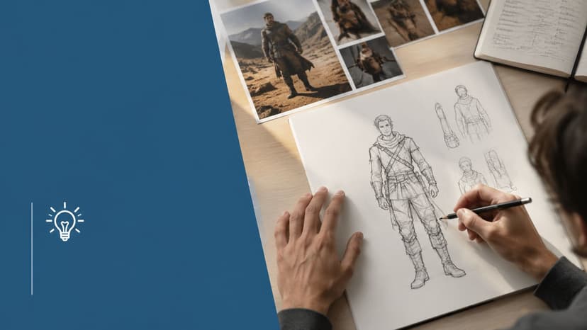
You're probably in one of two places right now. You either have a story with a strong anime-inspired lead in your head and no clear path to turning that person into cover art, or you've already tried. You opened a drawing app, hired an artist, or tested an AI image tool, and the results looked attractive but generic.
That gap matters on a book cover. A character can be beautifully rendered and still fail the job if readers can't read the genre, the mood, or the protagonist's role at thumbnail size. For indie authors publishing through Amazon KDP, creating anime characters isn't just an art exercise. It's packaging. The character has to carry story, branding, and sales appeal at the same time.
Professional anime production solved a version of this problem long ago. The pipeline depends on planning and character design documents before animation starts, and that discipline goes back to the earliest Japanese animations in 1917, including the often-cited milestone The Dull Sword released on June 30, 1917 (production overview and historical context). For book covers, you can borrow that same mindset without running a studio. Build the character as a repeatable design first. Then turn it into a cover asset.
Laying the Foundation of a Character Concept
You approve a character sketch that looks good in isolation. Then the cover draft arrives, and the problems show up fast. The lead reads as the wrong age, the genre signal is muddy, and the pose says “action series” when the book is selling slow-burn romance or dark fantasy. By that stage, revisions cost time and money because the core problem started in the concept brief.
A cover-ready anime character begins as a sales tool with a story attached, not a pile of attractive traits. “Brave, mysterious, powerful” gives an artist almost nothing usable. Those ideas have to become visible direction. Brave can show up in squared shoulders and steady eye contact. Mysterious can mean hidden hands, controlled expression, or layered clothing that withholds information. Powerful often reads better through restraint than aggression, especially on a book cover where one still image has to carry authority.
Build a brief before you build a face
For cover work, the brief should fit on one page. If it runs long, the concept usually is not decided yet.
A useful brief includes:
- Story role: protagonist, rival, love interest, antihero, guide, villain
- Immediate goal: what the character wants during the part of the story the cover is selling
- First-glance impression: how a stranger should read them in one second
- Hidden tension: the contradiction that keeps the design from feeling flat
- Visual anchors: a small set of fixed features such as hair shape, signature garment, emblem, weapon, or color cue
- Cover job: the emotion or promise the image must sell, such as danger, longing, melancholy, status, or intensity
That last point decides a lot of downstream choices. A character made for chapter illustrations can carry more nuance and small detail. A character made for Amazon KDP has to read at thumbnail size, support title placement, and attract the right reader in a crowded category.
I usually ask authors one blunt question early: what should a shopper feel before they read the title? If the answer is vague, the concept is still too soft for production.
Turn personality into visible choices
This step separates a usable design from a generic one. Traits have to affect posture, wardrobe logic, and expression. That applies whether you sketch by hand, paint in Clip Studio, brief a freelancer, or generate first-pass options with AI.
Here is a practical translation table:
| Trait | Body language | Costume cue | Facial cue |
|---|---|---|---|
| Guarded | Closed posture, angled torso | High collar, layered clothing | Eyes averted or narrowed |
| Optimistic | Open chest, lifted posture | Cleaner shapes, lighter trim | Relaxed brows, brighter eyes |
| Disciplined | Controlled stance | Repeated shapes, uniform elements | Minimal expression shifts |
| Chaotic | Asymmetry, restless pose | Mixed accessories, irregular edges | Sharp smile, uneven gaze |
This is the kind of direction an illustrator can act on immediately. It also improves AI output because prompts work better when they describe observable design choices instead of abstract adjectives.
If you need a cleaner way to organize recurring story facts, motives, and contradictions, Novelium's essential definitions for fiction writers helps separate a real character bible from scattered notes. On the visual side, build references with purpose. Use a board that collects shape language, clothing logic, palette cues, and atmosphere. This guide on how to make a moodboard is a useful place to start.
What to approve in the first round
The first round is for alignment, not polish.
Review the concept against a short checklist:
- Can the character be described in one clear sentence
- Do the visual anchors support the book's genre and audience
- Could a reader mistake this character for the wrong trope, age bracket, or tone
- Would the design still work if the final cover only shows the head and shoulders
- Can the design survive simplification for a thumbnail
That last test matters more than authors expect. A character can look impressive in a full illustration and still fail on a retail cover because the idea depends on tiny detail instead of a clear concept. Strong cover characters survive reduction. Weak ones need constant explaining.
Defining the Visual Blueprint Anatomy and Silhouette
An author approves a character sketch that looks great at full size. Then the cover goes onto Amazon, shrinks to thumbnail scale, and the figure turns into hair, fabric, and effects with no clear read. Anatomy and silhouette decide whether that character still sells the book when the image is small.
For cover work, the outside shape has to communicate before the viewer notices linework or rendering. If the outline is weak, extra detail only hides the problem.
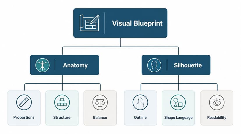
Read the outline first
Start with the fastest professional test. Fill the character in black, remove interior lines, and check the result at thumbnail size. The silhouette should still suggest age range, energy, role, and genre.
On a KDP cover, I look for readability in three passes:
-
Primary shape
The overall body impression. Tall and narrow, compact and youthful, broad and heavy, tapered and elegant. -
Secondary identifiers
Hair mass, sleeve shape, coat length, shoulder line, weapon outline, bag, hat, or other large forms. -
Tertiary detail
Seams, buckles, jewelry, trim, small props, and surface texture.
A lot of weak anime-inspired covers are designed in reverse. The artist starts with ornaments and costume trivia, then tries to force a clear character out of it. Readers never see that effort at retail size. They see clutter.
Build the body as a structure you can revise
Good anime anatomy for cover art is stylized, but it still needs construction. If the figure is not built on clear masses and angles, every revision becomes expensive. That matters because covers rarely stay in one format. You may need an ebook crop, a paperback wrap, a hardcover variant, or ad graphics that only show part of the pose.
A simple scaffold solves that. The head establishes proportion and style. The spine sets attitude. The shoulder and hip angles control tension, confidence, softness, or instability. Limbs can stay as cylinders or tapered blocks until the pose works. Clothing comes later.
One practical beginner method at Instructables' anime drawing scaffold guide uses a center line, basic torso geometry, and simplified body proportions to keep the figure stable before detail is added. That principle holds up in professional workflows too. Traditional artists do it in pencil. Digital artists do it on rough layers. AI-assisted workflows still need it, whether you sketch over generations or use pose references to control the result.
A polished costume on top of a stiff figure still reads as stiff.
Proportion choices change the market signal
Anime gives you wide freedom with proportion, but commercial covers still need internal logic. A small head on a long body pushes the design toward fashion, older teen, or action aesthetics. A larger head with shorter limbs reads younger, softer, or more comedic. Longer legs can add elegance, but they also reduce stability if the torso and hands are not handled carefully.
Authors often need firmer direction from the art side. The question is not whether the anatomy looks "anime enough." The question is whether the proportion supports the book's shelf category and promise.
For example:
- A romantasy heroine can carry a slimmer frame and graceful neck if the pose still leaves room for title type and series branding.
- A YA battle lead often benefits from a larger head-to-body ratio and cleaner limb rhythm because that reads faster and feels more character-driven.
- A dark fantasy antihero can use asymmetry, compression, and uneven balance to create unease before the face does any acting.
Those are design choices, not decoration.
Common silhouette failures on book covers
These problems show up often in self-published anime cover art, whether the piece was drawn by hand, painted digitally, or assembled from AI outputs and then corrected.
-
Equal visual weight everywhere
Hair, torso, sleeves, and legs all compete. Nothing leads the eye. -
Default front view
Straight-on standing poses flatten personality and waste the body's ability to show intent. -
Head scale decided too late
The style starts to drift because the body was built first and the head was added to fit. -
Pose buried under costume design
Coats, ribbons, belts, armor plates, and effects hide the action line. -
Tangents at the edges
Hair touching shoulders, weapons glued to the torso, or hands merging into clothing make the outline harder to read.
That last problem matters more than many authors expect. A tangent can make a professionally rendered cover feel amateur because the silhouette loses separation.
Choose posture for the genre and for the layout
Body language should match the book's commercial job. A fantasy adventure lead usually benefits from forward momentum, a visible action hand, and a stance that suggests movement. Romance often works better with angled shoulders, softer hands, and a pose that leaves emotional space in the frame. Dark fantasy can hold tension with compressed posture and imbalance. Sci-fi action usually reads better with cleaner geometry and less draped clutter.
Use the cover layout as a design constraint from the start. Hair spikes, capes, staffs, wings, and long props can look impressive in a concept sheet and become a typesetting problem on the final cover. If the silhouette fills every corner, the title has nowhere to sit and the thumbnail becomes noise.
That trade-off is part of professional character design for books. Full illustration goals and cover sales goals are not always the same. For a KDP-ready asset, the silhouette has to support both character appeal and typography.
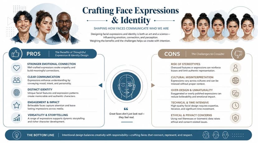
Crafting the Face Expressions and Identity
A reader scrolling Amazon usually meets the character's face before they read the subtitle. At thumbnail size, the face has one job. It must signal genre, mood, and lead-character appeal fast enough to earn the click.
For cover work, identity starts with controlled simplification. Anime design relies on selectivity, not omission by accident. Eyes, brow shape, mouth corners, and the spacing of the features carry far more value than extra rendering. Astropad's notes on facial simplification principles are useful here because they frame simplification as a design choice, not a shortcut.
Eyes do the selling
In anime, the eyes carry the acting load and much of the brand signal. A small change in upper-lid angle can shift a character from kind to guarded. A larger pupil can read as open, young, or emotionally exposed. Tighter highlights can make the same face feel colder or more focused.
This matters on KDP covers because the face is often cropped. If the eyes do not communicate clearly at a small size, the cover loses force even if the full illustration is technically strong.
Use the eye area intentionally:
- Upper lid angle sets tension, confidence, and alertness
- Pupil size changes softness, intensity, and age read
- Highlight placement affects warmth and emotional clarity
- Space between the eyes shifts stylization and perceived maturity
- Lower lid treatment adds fragility, fatigue, or drama
The common failure point is misplaced realism. Detailed lips, nostrils, and teeth can fight the rest of the style and pull attention away from the expression. On a cover, that usually hurts more than it helps.
Hair frames the identity
Hair is not decoration. It is part of the face design system.
A good anime hairstyle supports recognition, controls value grouping, and gives the head a memorable outer shape. It also needs to survive reduction. If the style only reads when zoomed in, it is too dependent on detail for cover use.
Build hair in masses first, then break those masses into secondary clumps. That approach works in pencil, Procreate, Clip Studio Paint, Photoshop, and AI paint-over workflows because it keeps the read stable through revisions. It also prevents a common production problem where strand-heavy hair muddies the forehead, eyes, and cheek silhouette.
Use hair to solve the cover brief:
- Authority needs cleaner masses and more control
- Volatility benefits from directional breaks and asymmetry
- Elegance reads through longer rhythms and restrained flyaways
- Youth often works better with softer bounce and simpler edges
For authors developing a cover with an artist, references from fashion drawing can help more than anime references alone. Display Guru on fashion sketching is useful for studying shape hierarchy, flow, and how a design reads before surface detail is added.
Expression sheets prevent identity drift
One polished face is not enough, especially if the character may return across a series. The design has to hold together when the mouth opens, the brows compress, or the eyes narrow. If it only works in one calm three-quarter view, the identity is fragile.
I usually test five expressions before approving a lead for cover production. Neutral confirms the base model. Warmth checks reader connection. Tension tests stakes. Defiance checks intensity. Vulnerability reveals whether the design can carry emotion without falling off-model.
That review catches problems early. A weak design often hides behind rendering. An expression sheet strips that protection away and shows whether the character is recognizable.
A practical set includes:
- Neutral for baseline identity
- Warm or inviting for connection
- Tense or focused for conflict
- Defiant or angry for power
- Shaken, sad, or exposed for range
Match the expression to the market pitch
Cover expression should support the book's promise, not compete with it. Subtle mixed emotions can work inside the book. On the front cover, indecision often reads as weak direction.
Use a clear target:
| Cover intention | Face strategy |
|---|---|
| Romantic fantasy | Softer mouth, engaged eyes, low aggression in the brows |
| Action series opener | Narrower focus, firmer brow shape, stronger intent |
| Dark psychological story | Restrained mouth, watchful gaze, limited smile cues |
| Cozy fantasy | Open expression, approachable eyes, relaxed brow tension |
AI can help at the concept stage, but prompt for intent, not generic beauty. “Exhausted but stubborn heroine, direct gaze, controlled expression” is more useful than “pretty anime girl.” Then refine manually. Fix eye alignment, clean the mouth shape, simplify the hair masses, and check the thumbnail. Traditional sketching, digital painting, and AI generation all produce better cover art when the facial brief is specific from the start.
Designing Costumes Props and Context
A strong anime character doesn't wear random cool things. Costume explains role. Props explain behavior. Context explains why either one matters.
That's especially important for book covers because readers infer genre from clothing almost instantly. A military coat, shrine-inspired robe, school uniform variant, cybernetic harness, or travel-worn cloak doesn't just decorate the body. It tells the reader what kind of world they're entering.
Costume should answer story questions
When I review character concepts for covers, I ask whether the wardrobe answers these practical questions:
- What kind of world does this person live in
- What's their social position
- Do they move, fight, hide, perform, command, heal, investigate
- What would they wear while doing that
- What can be simplified without losing identity
A lot of first-pass costume design fails because it copies genre signs without role logic. A fantasy mage covered in belts, buckles, gems, chains, and embroidered symbols may look ornate, but if none of those details support movement, status, or ritual, they're just noise.
For authors who want a clearer eye for garment structure, proportion, and how clothing communicates through line and fold, Display Guru's piece on Display Guru on fashion sketching is worth a look. It isn't anime-specific, which is exactly why it helps. It forces you to think about clothing as design, not fandom shorthand.
Props should feel lived with
Props work best when they extend the character rather than compete with them.
A few reliable categories:
-
Professional props
Weapons, tools, instruments, books, devices, medical kits. These tell readers what the character does. -
Personal props
Pendants, letters, charms, heirlooms, worn bags, coded notebooks. These suggest attachment and history. -
World props
Masks, badges, relics, tech interfaces, creature companions. These anchor setting.
The best prop usually creates one extra question without requiring explanation. A cracked ceremonial blade says more than a generic perfect sword. A school satchel with military patches suggests a broader world. A sealed envelope can imply romance, conspiracy, inheritance, or exile depending on context.
The prop should deepen the pitch, not hijack it.
Context changes how the same outfit reads
The same costume can read noble, tragic, or threatening depending on what surrounds it. That's why costume design and cover composition can't be separated.
Consider these shifts:
| Visual context | Costume effect |
|---|---|
| Soft dusk with floral shapes | Becomes romantic or wistful |
| Hard rim light with smoke | Becomes combative or severe |
| Library, scrolls, and warm interiors | Feels scholarly or magical |
| Ruins, debris, and angled framing | Feels battle-tested or post-collapse |
For commercial cover work, simplify before you embellish. Readers need one dominant read. If the design is trying to sell warrior, prince, student, assassin, saint, and chosen one all at once, it usually sells none of them clearly.
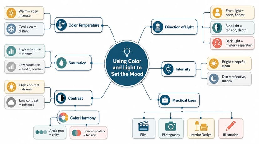
Using Color and Light to Set the Mood
An author approves a character sketch, the linework looks strong, and the cover still underperforms. The usual cause is not anatomy. It is color and light. If the palette signals the wrong genre, or the lighting buries the face at thumbnail size, readers scroll past.
For cover work, mood has a job. It must attract the right reader fast, support the book's promise, and keep the character readable in a small storefront image.
Pick a palette with a job
Good anime-inspired color design starts with hierarchy. The viewer should know where to look first, what emotional signal they are getting, and what details matter from six feet away or from a phone screen.
Build the palette in four parts:
-
Identity color
The color tied to the character at a glance. Hair, eyes, scarf, jacket trim, or a repeated accent. -
Support colors
Hues that reinforce genre and setting. Cold blues and violets can push fantasy or melancholy. Warm creams, reds, and golds can push romance, nobility, or adventure. -
Contrast color
A small accent that directs attention. It often works best on the face, a focal prop, or the title interaction area. -
Neutral control
Blacks, grays, off-whites, muted browns, and desaturated fabric tones keep the design from turning into visual noise.
Many self-directed covers frequently miss the mark regarding color. Authors often choose favorite colors, not selling colors. A palette can be attractive and still be wrong for the book. Bright candy tones on a revenge fantasy, or murky desaturated tones on a playful school romance, create friction before a reader has read a word.
For a wider marketing view, color psychology for branding in visual positioning helps explain why the same color choices that shape brand recall also affect cover click appeal.
Light controls the emotional read
The same character can read trustworthy, dangerous, lonely, or triumphant with no change to the drawing. Light does that work faster than costume detail or rendering polish.
| Lighting choice | Common emotional read |
|---|---|
| Soft front light | Open, sincere, romantic, reflective |
| Side light | Tension, secrecy, inner conflict |
| Rim light | Power, scale, dramatic entrance |
| Underlight or hard low light | Instability, menace, horror tone |
Commercially, readability comes first. I often test a cover at thumbnail size before refining effects, because dramatic lighting that looks impressive full-screen can destroy the eyes, mouth, and silhouette on Amazon. If the expression disappears, the values need to be separated more clearly.
A simple rule helps. Keep the face readable, then stylize the light around it.
Keep the core palette stable across deliverables
Character color logic needs to survive beyond one illustration. A KDP-ready cover usually leads to an ebook thumbnail, a paperback wrap, ads, social graphics, and sometimes later books in a series. If the hair shifts from ash blue to teal to black depending on the asset, recognition gets weaker.
A stable system usually includes:
- One anchor hue that stays with the character across covers
- One mood shift driven by the scene or book tone
- Consistent eye and hair decisions unless the plot explains a change
- Repeatable highlight handling so skin, metal, magic effects, or fabric sheen feel like the same visual world
Traditional principles and newer workflows should converge. Whether the art is painted by hand, finished digitally, or developed with AI-assisted ideation, the color script still needs human control. AI can generate options quickly. It does not reliably protect series consistency, title legibility, or sales-facing hierarchy without direction.
For authors commissioning cover art, ask for two or three small color keys before final rendering. That step saves time, avoids expensive repainting, and makes sure the mood supports the market before production moves forward.
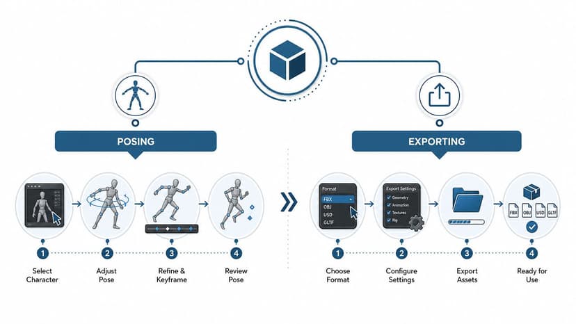
The Production Workflow Tools Posing and Exporting
The concept either becomes a usable cover asset or collapses into endless revisions. The problem usually isn't talent. It's workflow.
A major gap in beginner tutorials is that they teach how to draw a face or head angle but not how to keep the design on-model across poses, expressions, and deliverables. Professional pipelines solve that with model sheets and turnaround views so the same character remains consistent from the cover to marketing assets (on-model workflow problem).
Comparing the main workflows
Different tools solve different problems. Authors often ask which method is best, but that's the wrong question. Ask which method fits the stage you're in.
| Workflow | Best use | Strength | Limitation |
|---|---|---|---|
| Traditional drawing | Early ideation, loose concepting | Fast shape thinking, expressive lines | Harder to revise and repurpose |
| Digital painting | Final cover art, layered revisions | Flexible editing, clean production | Can encourage over-rendering |
| 3D base workflow | Pose development, angle consistency | Repeatable camera control | Can feel stiff if stylization is weak |
| AI-assisted generation | Rapid concept exploration | Fast variation, useful for briefing | Needs curation and cleanup |
Traditional media still works well for ideation. Pencil thumbnails force you to solve silhouette and pose before polish. For final cover work, digital tools such as Clip Studio Paint, Procreate, and Photoshop are far more practical because you can separate line, flats, effects, and typography-safe areas.
A 3D pass can also help, especially if you struggle with body rotation or camera angle. Even a rough mannequin in Blender can save time on cover composition. But for anime-style work, 3D is only useful if you control the stylization later. A correct mesh is not the same thing as an appealing anime image.
How to use AI without letting it drive the design
AI is strongest at exploration and weakest at judgment. That makes it useful early, risky late.
Use it for:
- Thumbnail concepts
- Costume variation
- Mood and lighting tests
- Pose alternatives
- Reference generation for nonfinal details
Don't use it blindly for final cover delivery unless you're prepared to correct anatomy, hands, costume consistency, and text-safe composition.
A practical prompt structure for anime cover concepting looks like this:
-
Character role and emotion
“anime heroine, reserved but determined” -
Visual anchors
“short silver hair, dark academy uniform, ceremonial sword with worn scabbard” -
Pose and framing
“three-quarter view, upper body focus, facing viewer, space for title at top” -
Lighting and mood
“cool twilight lighting, subtle rim light, melancholic fantasy atmosphere” -
Output intent
“book cover concept, commercial composition, clean silhouette”
That's much stronger than listing style terms alone.
If you want to test early directions quickly, a free AI cover maker can help generate broad cover concepts from brief information before you commit to custom illustration. That's useful for narrowing composition and mood, not for skipping art direction.
Posing for cover appeal
The pose has one job. Direct attention and communicate the book fast.
For covers, the strongest poses usually do one of these:
-
Confront
The character faces the viewer or nearly does. Good for confidence, rivalry, danger. -
Reach or move across frame
Good for action, urgency, pursuit. -
Turn away with visible face
Good for mystery, longing, emotional distance. -
Interact with an object or another figure
Good for romance, intrigue, vocation, ritual.
What doesn't work often enough:
- neutral standing poses with arms hanging
- heavily cropped poses that hide the character's signature features
- action poses so extreme they become unreadable at thumbnail size
- “cool” weapon poses where the weapon dominates the frame and the face becomes secondary
A cover pose isn't judged like a portfolio illustration. It's judged by whether a buyer understands the promise of the book in a glance.
Exporting for real publishing use
The final artwork has to survive production. That means keeping your files organized and export-ready before you worry about filters and effects.
Minimum practical deliverables for an author or publisher:
-
Layered master file
Keep character, background, effects, and text area separable. -
Clean art without typography
This helps if you later change title treatment or make ads. -
Front cover crop
-
Print wrap version
-
Web preview version
-
Series branding notes
Hair color, eye treatment, costume rules, palette anchors
For KDP use, confirm the current trim size, bleed needs, and export settings at the point of production rather than assuming one template fits all projects. Covers need to be prepared differently for ebook front-only use and full paperback wraps.
What a professional handoff looks like
If you're hiring, handing off to a designer, or moving from AI concepts into finished art, this package prevents confusion:
- Character brief
- Moodboard
- Silhouette thumbnails
- Face sheet or expression references
- Costume callouts
- Color notes
- Pose options
- Final selected composition
- Export requirements for ebook and print
That may sound like extra work, but it saves you from the most expensive mistake in cover production. Rebuilding a character after everyone already liked the first pretty image.
Creating anime characters for book covers works best when you treat the character as a repeatable product asset, not a one-off illustration. Start with a clear brief. Solve silhouette before detail. Make the face carry identity. Use costume and props to clarify genre. Control color and light so the character stays recognizable. Then choose a workflow that supports revisions, marketing, and KDP delivery instead of fighting them.
If the character can hold attention at full size and still read at thumbnail size, you're on the right track. That's the standard that matters.
Ready to Create Your Own Book Cover?
Turn your story into a visual masterpiece. Fill in the details below to start generating professional covers instantly.