A Practical Guide to Book Cover Illustration
Learn to create a professional book cover illustration from start to finish. This guide covers everything from concept and style to final file prep.
Posted by
Related reading
How to Write an Ebook in 2026: A Step-by-Step Guide
Learn how to write an ebook that sells. Our practical guide covers topic validation, drafting, editing, formatting, cover design, and launching on KDP.
Children Book Illustration: From Concept to KDP
Learn the essentials of children book illustration in our complete guide for indie authors. Covers styles, hiring illustrators, budgets, and KDP print specs.
The Bright Pink Color Code for KDP Book Covers
Find the right bright pink color code for your book cover. This guide covers hex, RGB, and CMYK values, plus KDP print settings and design tips for authors.
Ready to design your cover?
Use our AI book cover generator to create tailored book cover concepts in minutes.


A book cover illustration is more than just a pretty picture; it's a bespoke piece of art crafted to be the face of a story. Its job is to grab a potential reader, visually whisper the book's genre and mood, and make them need to know what's inside. It's the book's first and most important sales pitch.
Translating the Brief into a Powerful Vision
Before a single line is drawn, every great book cover illustration starts with a deep dive into the story itself. This is where you put on your detective hat and translate the author's written brief into a tangible visual concept. It’s less about raw artistic talent at this stage and more about careful investigation—reading between the lines to find the soul of the book.
Your first job is to pull apart that creative brief and zero in on three non-negotiables: genre, mood, and target audience. Are you working on a gritty noir thriller that demands a dark, high-contrast style? Or is it a whimsical middle-grade fantasy that calls for vibrant colors and soft, inviting textures? Figuring out who the book is for is critical. The last thing you want is a beautiful illustration that completely misses its intended market.
Conducting Smart Visual Research
Once you have a solid grasp of the core message, it's time for some smart visual research. This isn't just about scrolling through Pinterest for inspiration. It's a calculated analysis of what’s already working in the book's specific genre. Spend time browsing online booksellers and wandering through physical bookstores. Look for common color palettes, recurring typographic styles, and compositional trends. The idea is to understand what readers in that category are trained to look for, which allows you to meet their expectations while still carving out a unique space.
This is also your chance to identify the tired clichés you need to sidestep. That hooded figure for a mystery novel or the dragon silhouette for a fantasy epic? They've been done to death. The real magic happens when you find a fresh perspective that still feels comfortably familiar.
The idea of the cover as a powerful marketing tool really took off in the 20th century. A huge moment was when Penguin Books invented the mass-market paperback in 1935, turning covers into essential sales drivers. Their legendary artistic director, Jan Tschichold, even standardized the use of Gill Sans font to boost legibility, proving how seriously design was being taken. You can find more fascinating insights into the history of cover design and how it shaped the publishing world.
Key Takeaway: The goal of research isn't to copy. It's to learn the visual language of a genre so your design feels like it belongs on the shelf, yet is distinct enough to catch a reader's eye from across the room.
This whole process—from brief to research to sketching—is about building a solid, intentional foundation for the final artwork.
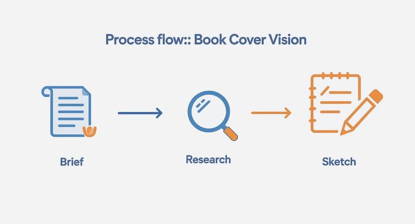
Following these steps ensures that every creative choice is deliberate and tied directly to the book's core identity before you get lost in the details of the illustration itself.
Exploring Ideas with Mood Boards and Thumbnails
Okay, now it’s time to get those ideas out of your head and into the world. Start by creating a mood board—a digital or physical collage of images, colors, textures, and fonts that bottle up the feeling you're aiming for. Think of it as your visual North Star for the entire project.
With your mood board as a guide, start cranking out thumbnail sketches. These are tiny, rough drawings, often no bigger than a postage stamp, that let you explore dozens of compositional ideas in minutes. Don't get hung up on details. Just focus on the big shapes, where the title might go, and the overall energy of the layout. This is a low-pressure way to fail fast and find the strongest concepts before you commit hours to a polished drawing.
A well-defined brief is the bedrock of this entire process. For authors and publishers, providing clear and comprehensive information is the single best way to ensure the final illustration aligns with your vision. Here’s a checklist of what every illustrator needs to know.
Essential Briefing Checklist for Illustrators
This table breaks down the critical information an illustrator needs from you before they can start bringing your book cover to life. Getting this right from the start saves time, reduces revisions, and leads to a much stronger final product.
| Information Category | Key Questions to Ask | Why It Matters |
|---|---|---|
| Book & Story Details | What is the title and author's name? Can you provide a plot summary, key themes, and character descriptions? | This is the core material. The illustration must accurately reflect the story's content, tone, and central conflict. |
| Genre & Audience | What is the primary genre and sub-genre (e.g., Epic Fantasy, Cozy Mystery)? Who is the target reader? | Genre conventions dictate visual style. A cover for a Young Adult audience looks very different from one for adult literary fiction. |
| Mood & Tone | What are 3-5 keywords that describe the book's feeling (e.g., ominous, hopeful, romantic, tense)? | This guides the color palette, lighting, and overall atmosphere of the illustration to evoke the right emotion in the reader. |
| Key Visuals | Are there specific symbols, objects, characters, or scenes that are essential to the story? | Helps the illustrator focus on elements that are meaningful to the plot, avoiding generic or irrelevant imagery. |
| Art Style & Examples | Are there existing book covers or art styles you admire? Are there any you absolutely want to avoid? | Providing visual references (a "mood board") gives the illustrator a concrete starting point and helps manage expectations. |
| Technical Specs | What are the final trim size, format (ebook, print), and any text/logo placement requirements? | These practical details ensure the final artwork is created at the correct resolution and composition for production. |
Taking the time to fill out these details thoughtfully is an investment. It empowers the illustrator to act as a true creative partner, not just a hired hand, and sets the stage for a cover that doesn't just look good, but also sells books.
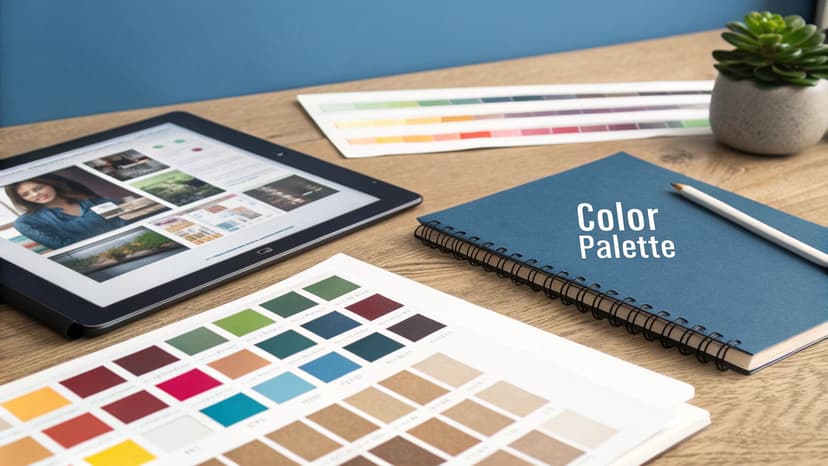
Finding the Right Artistic Style and Palette
Once you've nailed down a strong concept, it's time to give your book its visual soul. This is where you decide on an artistic style and color scheme that truly clicks with your story's genre and mood, turning that abstract idea into something a reader can see and feel.
Think of the style as a powerful, instant signal to your ideal reader. A loose, painterly illustration with visible brushstrokes might immediately scream "epic fantasy" or "sweeping historical drama." On the other hand, clean lines and bold, graphic shapes are a perfect match for modern non-fiction or a sharp, contemporary thriller.
The real trick is finding that sweet spot between your own artistic voice and what readers have come to expect from a genre. You want your work to feel fresh and stand out, but it still needs to fit comfortably on the same shelf as its peers. If you're looking for ideas, check out our gallery of book cover design inspiration to see how different styles are used across the board. Browsing a range of illustrated book cover examples is a fast way to calibrate that balance for your own genre.
Mastering Color to Set the Mood
Color is, without a doubt, your most powerful tool for sparking emotion. It operates on a subconscious level, setting the entire tone before a reader even deciphers the title. The right palette can make a cover feel mysterious, joyful, tense, or serene in a split second.
This idea of using color and art to lure in buyers isn't new. Back in the mid-19th century, new printing tech allowed for more creative covers. Cheap formats like "Yellowbacks" used vibrant illustrations to grab attention. By the 1870s, the shift to paper jackets solidified the cover's dual role: protection and graphic appeal. It's a fascinating evolution that shows just how long we've understood the power of a good cover.
Building a winning color palette is more than just picking your favorite shades; it's about strategic storytelling. You can see how different genres use color to convey mood in these fantasy book cover examples.
- Thrillers and Mysteries: These genres often lean on dark, desaturated palettes with high contrast. Think deep blues, blacks, and grays punched up with a single, jarring accent of red or yellow to create an instant feeling of danger.
- Contemporary Romance: Here, you'll typically find bright, warm, and optimistic colors. Pinks, light blues, and sunny yellows are used to evoke happiness, connection, and lighthearted fun.
- Science Fiction: Cool palettes are king, with blues, purples, and silvers suggesting futuristic tech and the vastness of space. A pop of neon can add an energetic, cyberpunk vibe.
Pro Tip: Don't be afraid to break the genre rules, but always do it with a clear purpose. Using a surprisingly bright, cheerful palette for a horror novel could create a deeply unsettling and unforgettable cover, but the execution has to be perfect, or you'll just confuse readers.
Ultimately, your style and color choices have to work together to pitch your book visually. They tell the reader not just what the story is about, but how reading it will make them feel. A well-chosen palette makes sure your cover pops off the shelf—even as a tiny thumbnail online.
Crafting a Balanced Composition with Typography
A breathtaking illustration can completely fall flat if the composition is a mess or the text looks like it was slapped on at the last minute. The real goal here is to create a visual hierarchy that pulls the reader's eye exactly where you want it to go, blending your art and the words into one cohesive, powerful statement.
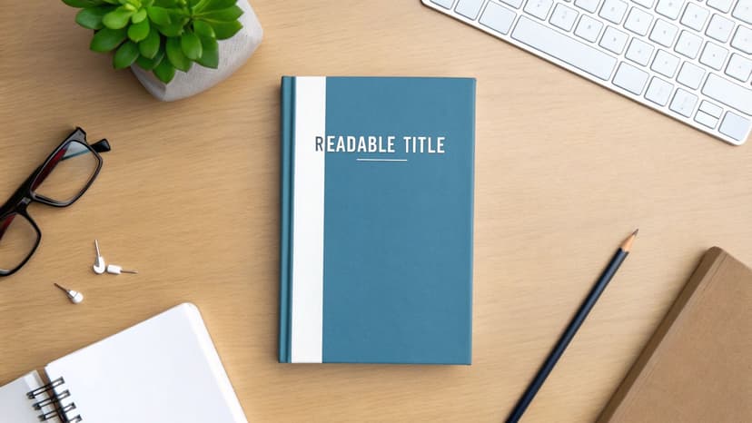
This all starts with a clear focal point. It doesn’t matter if it’s a character’s intense gaze, a glowing magical artifact, or a stark silhouette against a sunset—one element has to own the space. Everything else in the composition should exist to support that focal point, not fight it for attention.
Your best friends in this process are the classic design principles you probably already know. The rule of thirds, for instance, is a lifesaver for creating dynamic, engaging images simply by placing key elements along invisible grid lines instead of dead-center. In the same way, using leading lines—like a winding path, a pointed sword, or even the direction of a character's gaze—can cleverly draw the reader’s eye straight to the title.
Making Typography a Part of the Art
Typography isn't just there to convey information; it's a critical piece of the design puzzle. The font you pick has its own personality, and if that personality clashes with your artwork, the whole cover will feel off. A delicate, sweeping serif font might be perfect for a historical romance but would look completely ridiculous on a gritty, cyberpunk thriller.
The typography should feel like it grew out of the illustration itself.
- Hand-painted illustrations tend to pair beautifully with more organic, script-like fonts or classic serifs that echo that handmade feel.
- Bold, graphic vector art is a natural fit for clean, modern sans-serif fonts that feel just as sharp and intentional.
- Intricate fantasy scenes can often support more ornate or even custom-designed lettering that feels like it was pulled right out of that world.
Think of the title and author name not as text, but as shapes you need to place within your composition. I’ve seen so many covers where the text is just dropped over the busiest part of the illustration, making it impossible to read. You have to actively hunt for those pockets of "negative space" or areas of lower contrast in your artwork where the text can sit comfortably and breathe.
A cover has to work just as hard as a tiny thumbnail on an online store as it does on a physical bookshelf. If the title is illegible when shrunk down, you've lost a potential reader before they even click.
Selecting the right font is a huge part of this. To give you a head start, here’s a quick guide to pairing typography with common book genres.
Typography Choices by Book Genre
| Genre | Recommended Font Styles | Characteristics |
|---|---|---|
| Fantasy | Ornate Serifs, Uncial, Gothic, Custom Lettering | Evokes a sense of history, magic, and epic scale. Think Lord of the Rings or classic fantasy scrolls. |
| Sci-Fi | Modern Sans-Serifs, Geometric, Slab Serifs | Clean, futuristic, and often technical. Can range from sleek and minimalist to bold and industrial. |
| Thriller/Horror | Distressed Sans-Serifs, Condensed Fonts, Grungy Scripts | Creates tension and unease. Often feels sharp, urgent, or deliberately unsettling. |
| Romance | Elegant Scripts, Classic Serifs, Soft Sans-Serifs | Conveys emotion, intimacy, and connection. Fonts are typically flowing, delicate, or warmly inviting. |
| Historical Fiction | Traditional Serifs (Garamond, Caslon), Blackletter | Reflects the time period. Aims for authenticity and a classic, literary feel. |
| Non-Fiction | Clean Sans-Serifs (Helvetica, Futura), Authoritative Serifs | Prioritizes clarity, credibility, and readability. The goal is to feel trustworthy and professional. |
Of course, these are just starting points. The best typography choices often come from breaking the rules intelligently, but you need to know the rules first to break them effectively.
Avoiding Common Text and Image Pitfalls
Getting text and art to play nicely together is all about careful planning. One of the biggest hurdles is ensuring the title is perfectly legible without neutering the impact of your beautiful illustration. If you have a visually complex background, you must create contrast.
This doesn't have to be complicated. You can place a subtle gradient behind the text, add a faint drop shadow, or even frame the title within a simple shape that feels like an intentional part of the design.
For example, a brilliant white title might completely vanish into the clouds of a sky background. By just slightly darkening the area of the sky directly behind the letters, you can make the title pop without it looking tacked on. The key is subtlety. You want the text to feel effortlessly readable, not like it's been aggressively stamped on top of your art. Nail this balance, and you'll have a book cover that is both stunning and commercially effective.
Weaving AI into Your Creative Workflow
Let's be honest, artificial intelligence has gone from a sci-fi concept to a very real tool on our desktops. Instead of seeing it as a threat that will replace artists, it's far more practical to think of it as a creative co-pilot.
Think of it this way: AI can handle the grunt work and help you blast through creative blocks. This frees you up to focus on what really matters—the final human touch, the storytelling, and the emotional connection that makes an illustration truly great.
When it comes to book cover illustration, AI shines brightest in the early, messy stages. I used to spend hours sketching dozens of tiny thumbnails, trying to find the perfect composition. Now, you can generate a whole universe of compositional ideas in minutes. This lets you and your client explore different character poses, settings, and visual metaphors at lightning speed, helping you lock in a solid direction faster than ever before.
Supercharging Idea Generation and Iteration
Imagine a brainstorming partner who never gets tired and never runs out of ideas. That's AI. You can feed it a simple prompt—like "a lone astronaut on a red desert planet, style of a vintage sci-fi poster"—and instantly get back multiple interpretations.
Will they be perfect? Probably not. But they're fantastic starting points that can spark a better, human-led design.
AI is also an absolute beast at iteration. Found a concept you like? Just ask for variations.
- Color Exploration: See the same composition in a dozen different color palettes to find the one that nails the story's tone.
- Texture Overlays: Generate unique textures—distressed paper, cosmic dust, metallic sheens—to add a layer of depth to your art.
- Background Concepts: Quickly mock up different environments behind your main character to see which one tells the most compelling story.
This kind of rapid-fire experimentation makes for a much more dynamic and fluid workflow. For a much deeper dive, we have a full book cover generator to experiment with.
Find the Right Balance: The trick is to play to each other's strengths. Use AI for what it's good at—generating a massive volume of ideas and variations—while you provide the curation, artistic direction, and emotional nuance that only a human can.
The Ethical Side of Things and Best Practices
Of course, with great power comes great responsibility. Using AI in your work means you have to be smart about it. It is absolutely crucial to understand the terms of service for any tool you use, especially regarding commercial rights.
Transparency with your clients is also key. The goal isn't to pass off a raw AI image as your own final piece. It's about using it as one of many powerful tools in your arsenal to get to a better result, faster.
For illustrators looking to get started, this guide to AI content creation tools is a great resource for finding the right software to streamline your process. By being smart and ethical, you can maintain your artistic integrity while delivering stunning book covers more efficiently than ever.
Preparing Your Final Files for Print and Digital
You’ve done the hard creative work. The illustration is signed off, the typography is perfect, and your cover looks incredible on screen. But hold on—the job isn't quite done. The last lap is a technical one: getting your files prepped for both the physical and digital worlds.
This final step is all about precision. Get it wrong, and you could face rejected files from your printer, costly mistakes, or a cover that just doesn't pop the way it should. The needs of a paperback are completely different from an ebook, and you have to nail both.
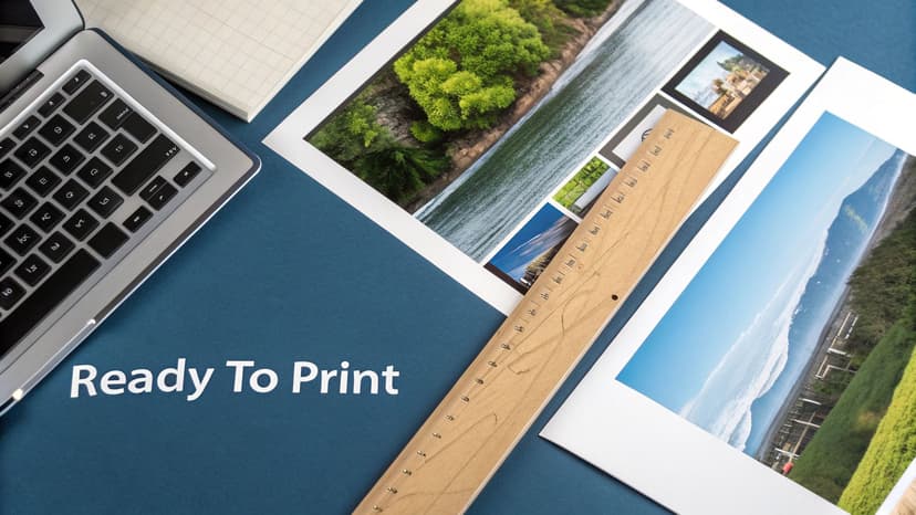
Setting Up Your Print Cover File
For a physical book, you're not just designing a front cover; you're creating a full wraparound jacket that includes the front, spine, and back. This has to be built to exact specifications, and platforms like Amazon KDP are notoriously strict.
First up is the bleed. Think of this as a safety margin. You need to extend your illustration an extra 0.125 inches (or 3mm) beyond the final trim line on all sides. Why? Because industrial paper cutters aren't always perfect down to the micrometer. Without that bleed, a tiny shift during trimming could leave an ugly white sliver along the edge of your beautiful cover.
Next, you have to calculate the spine width. This isn't a guess—it's determined by your final page count and the specific paper stock you choose. KDP and other printers have online calculators for this. Use them. Getting this measurement wrong means your spine text will be off-center and the whole cover will wrap incorrectly.
Crucial Technical Specs for Print: Your final print file needs to be a flattened PDF saved in CMYK color mode. This color space is for ink on paper, not screens. The resolution is non-negotiable: it must be 300 DPI (dots per inch) to guarantee a sharp, professional-looking image that isn't blurry or pixelated.
Optimizing for Digital Ebook Covers
Ebook covers are much simpler, but they play by their own rules. You can forget about bleed, spines, and CMYK. Here, it’s all about making an impact on a screen.
The goal for your digital cover is maximum visual punch in the RGB color space.
- Color Mode: Stick to RGB. It's the native color language of digital screens and offers a much wider and more vibrant range of colors than CMYK. If you just convert your print file, the colors will likely look flat and dull. Always create a separate RGB version.
- Resolution and File Type: While the old web standard was 72 DPI, modern e-readers have high-definition screens. KDP actually recommends a higher resolution to keep your cover looking crisp. I always aim for at least 150 DPI and save the file as a high-quality JPEG.
- Dimensions: The sweet spot for KDP is 2,560 x 1,600 pixels. This 1.6:1 aspect ratio looks great on most devices, from phones to dedicated e-readers.
When you're getting files ready for your sales pages, remember that load times matter. A little knowledge about optimizing images for web performance can make a huge difference.
And if you’re an author handling this part of the process yourself, our guide on how to create a book cover for free has some great tools and tips to help you through it. Sweating these small technical details is what separates an amateur cover from a professional one.
Burning Questions About Book Cover Illustration
Whether you're an author commissioning your first cover or an illustrator trying to break into publishing, you've probably got questions. Getting straight answers is the best way to sidestep common headaches and make sure everyone walks away happy.
Let's tackle the big ones.
How Much Does a Book Cover Illustration Actually Cost?
This is usually the first question on everyone's mind, and the answer is... it depends. A lot. An artist who is just starting out and building their portfolio might charge a few hundred dollars. On the other end of the spectrum, an in-demand illustrator with a string of bestsellers to their name could easily command several thousand.
The final price tag really boils down to a few key things: the complexity of the artwork, the artist's experience level, and the specific usage rights you need.
What's a Reasonable Number of Revisions?
Authors often worry about how many chances they'll get to ask for changes. A professional contract should spell this out clearly, but the industry standard is usually two to three rounds of revisions.
Think of it this way: the first round (the initial sketches) is for making big, foundational changes. Later rounds are for fine-tuning things like color saturation or small details. It’s not a buffet for endless tweaks.
What Illustration Style is Right for My Book?
This is a huge one, and it ties directly into your genre and who you're trying to sell your book to. You have to think like a reader. For example, there's a reason children's book illustrations look the way they do. Their style has a rich history, kicked off by the "Golden Age" of color lithography in the early 20th century. That innovation created the vibrant, classic look we still associate with kids' stories today. If you want to dive deeper, this is a great read on the evolution of children’s book illustrations.
Here are a few rules of thumb:
- For young readers, you can't go wrong with quirky animals and bright, expressive characters — the look you'll spot across these children's book cover ideas.
- For romance novels, stylized vector art showing the main couple is practically a genre uniform at this point.
- For epic fantasy, a detailed, painterly style is the universal signal for a grand, sweeping story.
The Bottom Line: The "right" style isn't about your personal taste. It’s a marketing tool. It’s the one that sends the clearest, quickest signal to your ideal reader, telling them, "This book is for you."
How Long is This Whole Process Going to Take?
Patience is a virtue here. A realistic timeline for a custom book cover illustration is anywhere from four to eight weeks, from the first email to getting the final files.
This gives the illustrator enough time for research, concepting, sketching, getting your feedback, making revisions, and creating the final polished art. Trying to rush it is the fastest way to get a generic cover that misses the mark. Plan ahead.
Who Actually Owns the Artwork When It's Done?
This is one of the most critical—and most often misunderstood—parts of the deal. Who owns the rights? This absolutely must be defined in a written contract.
Typically, an illustrator grants you, the author, the exclusive rights to use the image for your book cover and related marketing. However, the illustrator usually keeps the copyright, which lets them use the art in their own portfolio.
If you want to own the art outright—say, to print on t-shirts or other merchandise—you'll need to buy out the full copyright. Expect to pay a much higher fee for that privilege. Get this sorted out from the very beginning to avoid any nasty legal surprises later.
Ready to Create Your Own Book Cover?
Turn your story into a visual masterpiece. Fill in the details below to start generating professional covers instantly.