How Color Theory in Marketing Can Sell Your Book
Unlock the power of color theory in marketing. This guide helps indie authors use color psychology to design book covers that sell and stand out on KDP.
Posted by
Related reading
Master Dark Teal Hex Code for Stunning Covers
Find the official dark teal hex code (#014D4E) for book covers. Learn color psychology, palettes, and KDP print tips to perfect your design.
Your Guide to the Burgundy Color Code for Book Covers
Discover how to use the burgundy color code for your book cover. Get HEX, RGB, and CMYK values to create a cover that sells on Amazon KDP.
How to Increase Book Sales on Amazon: An Author's Practical Guide
Learn how to increase book sales on Amazon with actionable strategies for metadata, pricing, ads, and cover design to amplify your KDP success.
Ready to design your cover?
Use our AI book cover generator to create tailored book cover concepts in minutes.


When marketing your book, color isn't just decoration. It's a strategic tool to make your book sell. For authors publishing on services like Amazon KDP, this means choosing colors that instantly signal your genre and make your cover stand out in a sea of tiny thumbnails.
This isn't about your personal favorite color. It’s about making an informed decision that transforms your cover into your hardest-working sales asset.
Your Cover Is Your Silent Salesperson

Picture a reader scrolling through Amazon. Hundreds of books fly by. What makes them stop? It’s not your blurb. It’s not your reviews. It’s your cover. In that split second, your cover has one job: make them pause. Color is its most powerful language.
For indie authors, that first visual hook is everything. Readers make lightning-fast judgments based entirely on what they see. They don't consciously think, "Ah, this specific shade of blue implies trustworthiness," but they feel it. The right colors create an immediate, subconscious connection, signaling that your book is exactly what they’ve been looking for.
From Art Concept to Sales Driver
Thinking about color theory isn't some lofty art school exercise; it's a core marketing skill. The colors you choose are what turn a pretty picture into a sales-driver.
Here’s why it matters:
- Signal Genre Instantly: A dark, moody palette with a splash of crimson screams thriller. Soft pastels whisper sweet romance. These are visual shortcuts that readers have learned over time. Using the wrong colors is like shelving your sci-fi novel in the cookbook section—it confuses readers, and they move on.
- Establish Tone and Mood: Color is the fastest way to set an emotional stage. Bright, saturated hues create a sense of energy and fun, perfect for an action-packed adventure. On the other hand, muted, desaturated tones can evoke nostalgia or melancholy, ideal for literary fiction or a heavy memoir.
- Create a Professional Impression: A well-balanced, intentional color palette signals professionalism. It tells the reader you cared enough to get it right, which makes them trust that the writing inside is just as polished. Clashing, amateurish colors can unfortunately make your book look homemade.
Your cover is a critical piece of your author platform and a key part of your content strategy. It’s an ad, a promise, and a first impression all rolled into one.
Your book cover is not just packaging; it's the single most important piece of marketing you'll create. It promises a specific experience, and color is the foundation of that promise.
You don't need a fine arts degree to get this right. By learning a few core principles, you can make informed choices that turn casual scrollers into paying readers and give your book the best possible shot at success.
The Building Blocks of Color: Hue, Saturation, and Value
To use color effectively in your marketing, you have to speak its language. Forget intimidating jargon—the only three terms you really need to understand are Hue, Saturation, and Value.
Think of them like controls on a sound mixer, but for visuals. Once you grasp them, you can stop guessing and start making strategic choices to help sell your book.
Hue: The Pure Color
Hue is the simplest concept. It’s what most people just call “color.” It's the pure pigment you'd find on a classic color wheel.
- Primary Hues: Red, Yellow, Blue
- Secondary Hues: Orange, Green, Purple
- Tertiary Hues: Blends like Blue-Green or Red-Violet
Think of hue as a color's basic identity—the difference between a pure red and a pure blue. When picking a main color for your cover, you're choosing a hue. For example, the deep blues common on thriller book covers are a deliberate hue choice, meant to instantly signal mystery and suspense.
Saturation: The Color’s Intensity
If hue is the color, saturation is its intensity. It’s the "volume" knob for your color. High saturation gives you a vibrant, punchy color, while low saturation creates something more muted, dull, or grayish.
Analogy: Imagine a glass of water. A highly saturated color is like squeezing in a lot of food coloring—it's rich and bold. A desaturated color is like adding a single drop, leaving you with a pale, subtle tint.
A fiery, high-saturation red can scream passion or danger, making it a great fit for a dramatic romance. A muted, low-saturation blue, on the other hand, can whisper melancholy or peace, perfect for a quiet literary novel. This single control is key to setting your book's emotional tone at a glance.
Value: The Lightness or Darkness
Finally, there’s value. This is simply how light or dark a color is, on a scale from pure white to pure black. You tweak a hue’s value by adding white (creating a tint) or adding black (creating a shade).
This element is absolutely critical for creating contrast and ensuring your title is readable, especially as a tiny thumbnail on a screen. A light-value yellow title will vanish on a white background, but it will leap off the screen against a dark-value purple.
Getting these three elements right is crucial. Research shows that 85% of shoppers say color is a primary reason they buy a product. When a reader is scrolling through an online store, their first impression of your cover—a snap judgment made in under 90 seconds—is up to 90% based on color alone.
You can read the full research on how colors influence marketing to dig deeper. By consciously adjusting hue, saturation, and value, you take control of that split-second impression. Generating a few concepts with an AI tool can be a practical way to see how tiny shifts in these three areas completely change a cover's impact.
How to Harness Emotions with Color Psychology
This is where color theory becomes a powerful marketing tool. Beyond the technical side, you can tap into color psychology.
Colors are a direct line to your reader’s emotions and subconscious. Knowing how to use them is like learning a silent language that starts selling your book before anyone reads the blurb.
Of course, it’s not as simple as “blue equals sad.” The emotional impact of a color is almost entirely dependent on context and genre. The same fiery red that signals passion on a romance novel can evoke terror on a horror cover. Both use red to get the heart pounding, but the surrounding design tells the reader which intense emotion to feel.
This is where you combine the building blocks of color to create those emotional triggers.
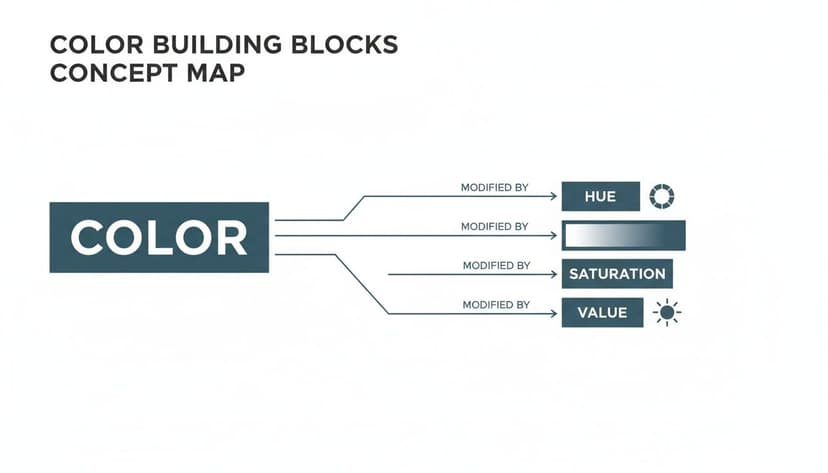
As the map shows, these three levers—hue, saturation, and value—are what you'll pull to fine-tune the specific mood your story demands.
Tying Color Choices to Reader Feelings
Your first job is to pick a dominant color that matches the core emotion of your book. Think like a reader browsing your genre. What feeling are they really shopping for?
- Trust and Expertise: For a non-fiction guide or a serious business book, you need to project authority and reliability.
- Passion and Conflict: For a steamy romance, your goal is to signal intense desire and high-stakes drama.
- Mystery and Suspense: For a thriller, you have to create a sense of unease, dread, and intrigue that promises a page-turner.
- Joy and Lightheartedness: For a cozy mystery or a rom-com, the vibe should be uplifting, fun, and safe.
When you nail this, you create an instant mental shortcut for shoppers. You're telling them, "This book has the experience you're looking for." That’s the direct line between a simple color choice and its impact on your sales.
For a deeper look into how these powerful associations are built, you can explore the fundamentals of color psychology for branding.
Why Blue is a Powerful Choice
Some colors carry an almost universal weight. Take blue. It’s often considered the king of consumer trust.
Blue consistently tops charts as one of the world’s most popular colors, making it a go-to for any brand trying to communicate security and competence. Studies have found that 46% of consumers link blue with trust. A 2003 survey revealed that a staggering 57% of men and 35% of women named blue as their favorite color.
For authors, a blue-dominant cover on a self-help book or business guide can instantly boost its perceived credibility. It’s a global psychological shortcut.
Color Psychology Quick Guide for Authors
While context always rules, you don't have to start from scratch. Certain colors carry common psychological associations in Western cultures that give you a powerful head start.
Use this table as a quick-reference guide to help you match your cover's color palette with reader expectations for your genre.
| Color | Common Psychological Associations | Typical Book Genre Applications |
|---|---|---|
| Red | Passion, Energy, Danger, Urgency | Romance, Thriller, Action |
| Blue | Trust, Calm, Stability, Professionalism | Non-Fiction, Sci-Fi, Thriller, Corporate |
| Green | Growth, Nature, Health, Peace | Fantasy, Self-Help, Environmental Topics |
| Yellow | Optimism, Happiness, Warning, Youth | Children's Books, Comedy, Lighthearted Reads |
| Orange | Enthusiasm, Creativity, Friendliness | YA, Adventure, How-To Guides |
| Purple | Royalty, Luxury, Mystery, Magic | Fantasy, Paranormal Romance, Historical |
| Black | Power, Sophistication, Death, Elegance | Thriller, Horror, Luxury/High-Concept |
| White | Purity, Simplicity, Minimalism, Sterility | Minimalist Non-Fiction, Sci-Fi, Literary |
Remember, this isn't a rigid rulebook, but a solid foundation for making informed design choices that resonate with your target audience.
Key Takeaway: Your cover's colors should never be an afterthought. They are your primary tool for managing a potential reader's emotional expectations and signaling that your book belongs on their shelf.
The best way to see this in action is to experiment. You could use an AI tool to generate a few cover concepts for your book. Now, change the dominant color. See how flipping the palette from blue to red completely transforms the cover’s message from "trustworthy guide" to "passionate affair." This simple exercise is the fastest way to move from theory to making practical, sales-driven decisions for your book.
How to Build an Effective Color Palette
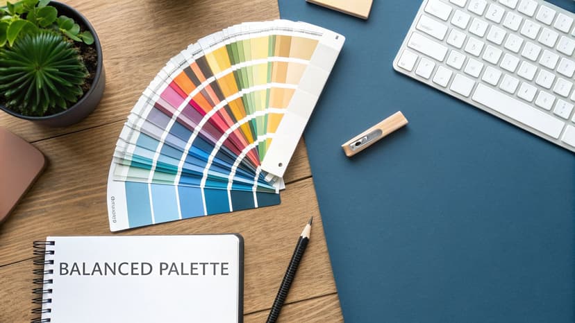
A single color can set a mood, but a full color palette is what gives your cover a professional, polished look. This is where you combine hues to create something cohesive, not chaotic.
Instead of guessing what works, you can lean on established color harmonies. Think of these as time-tested recipes for pairing colors in a way that’s both visually appealing and strategically smart.
Creating Harmony with Proven Color Schemes
Understanding a few basic color schemes is like having a map for navigating color relationships. Each one creates a distinct feel, making them useful for different genres and marketing goals.
-
Analogous: This scheme uses colors that are right next to each other on the color wheel—think blue, blue-green, and green. The result is a smooth, low-contrast look that feels calm and unified. It’s an excellent choice for a memoir or a gentle self-help book where you want a serene, approachable tone.
-
Complementary: This scheme pairs colors from directly across the wheel, like blue and orange or red and green. This creates the highest possible contrast, making elements pop. For authors, that’s gold for making a thriller or action novel jump off the virtual shelf, even as a tiny thumbnail.
-
Triadic: A triadic scheme forms a triangle on the color wheel, using three evenly spaced colors like red, yellow, and blue. This approach is vibrant and dynamic, offering strong visual contrast while feeling more balanced than a simple complementary pairing. It’s a fantastic choice for a fantasy series or any story that needs to feel energetic.
While professional graphic design services can help nail the execution, mastering these schemes gives you a huge advantage and a solid foundation for any design discussion.
Applying the 60-30-10 Rule for Balance
Once you’ve picked a scheme, how do you prevent the colors from clashing? The 60-30-10 rule is an interior design principle that works just as brilliantly for book covers, giving you a simple ratio to keep your palette balanced.
It’s a straightforward formula:
- 60% Dominant Color: This is your main hue, the workhorse of your palette. It sets the overall tone and covers the most visual real estate, usually in the background.
- 30% Secondary Color: This color supports the dominant hue and creates visual interest. Use it for secondary elements like subtitles or important graphical shapes.
- 10% Accent Color: This is your secret weapon. It’s a pop of contrast used sparingly to draw the eye exactly where you want it to go—your title, author name, or a critical story icon.
This rule isn't about mathematical precision. It's about creating a clear visual hierarchy. It forces you to assign a job to each color, which helps you avoid the classic amateur mistake of giving every color equal weight and ending up with a cluttered, confusing design.
For example, a romance cover might use a soft pink for 60% of the design, a deeper magenta for 30%, and a striking white or gold for the 10% accent on the title. The structure guides the reader's eye right to the most important information.
This approach is also fundamental to creating designs that work for everyone. You can dive deeper into this topic by learning about creating accessible color palettes.
How to Design for Genre and Visibility
Everything we've discussed comes together on the Amazon store page. This is where your cover must perform a difficult balancing act: it needs to fit in and stand out, all at the same time.
Success on KDP isn't just about artistic flair. It’s about understanding that your cover is being judged in a fast, crowded, and almost entirely digital space. Your color choices are a critical marketing tool for discoverability and sales.
Speaking the Language of Genre
Every book genre has its own visual shorthand, and color is the main dialect. Readers develop subconscious expectations for how a book in their favorite category should look. Nail this, and you’ve got their attention.
Think of it as a secret handshake with your ideal reader.
- Thrillers & Mysteries: These live on dark, high-contrast palettes. Oppressive blacks, deep blues, and shadowy grays build tension. A sudden splash of acid yellow or blood-red signals danger or a crucial clue.
- Romance: The colors here depend entirely on the heat level. Steamy romances embrace passionate reds, blacks, and rich purples. But a sweet, cozy romance will use soft pastels—pinks, lavenders, and baby blues—to promise a heartwarming story.
- Science Fiction: The vastness of space is often represented by a foundation of black or deep navy. Bright, electric accents like cyan, magenta, or lime green then pop in to signify futuristic tech, alien worlds, or laser-fire action.
- Fantasy: This genre often draws from a rich, earthy palette of deep greens, browns, and golds to evoke ancient forests and lost lore. High fantasy might lean into regal purples and shimmering silvers to hint at magic and royalty.
Ignoring these unwritten rules is a massive marketing risk. A bright yellow thriller cover will stand out, but it might also make readers think it’s a self-help book and scroll right by. Your goal is to work within the genre’s visual framework so readers instantly know your book is for them.
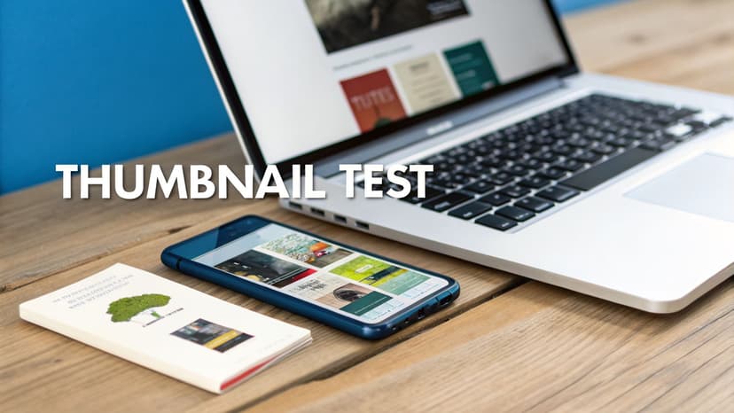
Winning the Thumbnail Test
On Amazon, most shoppers will see your cover for the first time as a tiny thumbnail, often no bigger than a postage stamp. This is the ultimate trial by fire for your color choices. A gorgeous design can easily turn into an unreadable mess when shrunk down.
The thumbnail test is non-negotiable. Before you finalize anything, shrink your cover design down to that tiny size.
At a glance, is the title still readable? Is the main imagery clear? Most importantly, does the cover’s core emotion and genre signal survive? If not, your colors aren't doing their job.
This is where contrast becomes your most valuable player. A cover with low contrast, like a light gray title on a pale blue background, will wash out completely. But a high-contrast combo—like bold white text on a dark, saturated background—stays punchy and legible even at a tiny scale. Exploring the power of an aqua blue color, for example, can show how a vibrant hue maintains its impact.
Finding the Sweet Spot: Convention vs. Distinction
The real challenge is to follow genre rules while still creating a cover that feels fresh and stops the scroll. You need to signal "I'm the thriller you're looking for" without looking identical to the ten other thrillers on the results page.
This is where your secondary and accent colors come in. You can use a conventional dark blue background for your thriller but pick a unique, electric green for the title's accent color. That one small choice can make your cover feel both familiar and distinct.
Experimenting is key. This is a good place to use an AI tool, which can generate dozens of genre-appropriate concepts in minutes. You can test different palettes and see how a subtle shift from a standard red to a burnt orange gives your cover a whole new personality without breaking genre rules. It's all about finding that perfect sweet spot where your cover respects reader expectations but is memorable enough to earn that crucial click.
Common Color Mistakes Authors Should Avoid
Knowing the rules of color theory is one thing; applying them without falling into common traps is another. It’s easy to grasp the basics of color psychology and still end up with a cover that looks amateurish and hurts your book's chances on a crowded digital shelf.
Avoiding these common pitfalls will put you ahead of the pack.
Pitfall 1: The "More is More" Palette
This is a frequent offender. In a bid to get attention, authors cram five, six, or more clashing colors onto their cover. The result isn't eye-catching—it's visual chaos. When every color is screaming for attention, readers don't know where to look, and the design feels unprofessional.
- The Fix: Stick to a simple, powerful palette using the 60-30-10 rule. A dominant color (60%), a secondary color (30%), and a high-contrast accent color (10%) for critical elements like the title. This creates a clear visual hierarchy and guides the reader's eye.
Pitfall 2: Ignoring Genre Conventions
Your favorite color might be a lovely shade of lavender, but if you splash it all over your gritty procedural thriller, you're sending the wrong signals. Readers are trained to recognize genres by color. Breaking those conventions is a recipe for confusing your ideal audience.
- The Fix: Before choosing a palette, browse the bestseller list for your specific subgenre on Amazon. What colors dominate the top-selling romance book covers? What about hard sci-fi? You'll see patterns immediately. Your job is to work within those established color languages while still finding a way to look fresh.
Your cover's first job is to signal its genre. When you ignore the established visual language, you risk becoming invisible to your target audience, no matter how beautiful the design is.
Pitfall 3: Failing the Thumbnail Test
A beautiful color scheme is worthless if nobody can read your title. This mistake becomes painfully obvious when you shrink your cover down to the size of a postage stamp—the infamous "thumbnail test." Low-contrast text, like gray letters on a light blue background, will simply vanish.
- The Fix: Always test for contrast. A simple trick is to view your cover in grayscale; if the title blends into the background, you have a problem. Ensure your title and author name have a strong light-dark difference from whatever is behind them. If needed, a subtle dark outer glow or a clean drop shadow can make your text pop.
Making smart color decisions has never been easier. With an AI cover creation tool, you can rapidly generate and compare different palettes. This lets you see firsthand what works for your genre and what doesn't, helping you sidestep these common mistakes and ensure your cover works as the powerful marketing asset it’s meant to be.
Frequently Asked Questions About Book Cover Colors
It's one thing to talk about color theory, but it's another to actually apply it. Authors run into the same practical questions all the time when trying to finalize their cover design. Here are some straightforward answers to the most common ones.
How Can I Stand Out Without Breaking Genre Color Rules?
This is the tightrope every author has to walk. You want to fit in just enough to be recognized, but stand out enough to get noticed. The trick is to nail the balance between convention and distinction.
Start by embracing your genre’s main color palette. If you’re writing a thriller, you’re probably working with dark, moody blues or blacks. Don't fight it. Instead, make your mark with your accent color. While every other thriller on the shelf might use a splash of red or yellow, you could use an arresting electric lime or a chilling ice blue for your title.
That one strategic choice makes your cover feel both familiar and fresh. It respects what readers are looking for while giving them something memorable to grab onto.
What Colors Work Best for a Book That Blends Genres?
When your book is a sci-fi romance or a historical fantasy, your colors have to pull double duty. The key is to signal both genres to the right readers. First, figure out the core color palettes for each genre. Sci-fi often leans on dark, deep space backgrounds with glowing neon accents. Romance might use passionate reds, soft pastels, or warm, inviting tones.
A simple, effective strategy is to let one genre dictate your dominant color and the other inspire your accent colors. For that sci-fi romance, you could go with a deep navy background (the sci-fi) and a hot magenta title (the romance). This creates a visual mashup that tells readers exactly what they're getting. Playing around with a few mockups, perhaps with an AI cover tool, can quickly show you which combinations work.
Key Takeaway: For a hybrid-genre book, your color palette should be a direct reflection of its blended themes. Use color to promise readers they're getting the best of both worlds.
Should My Website Branding Match My Book Cover Colors?
Yes, but think "cohesive," not "identical." Your author brand needs a consistent visual identity, but it shouldn't be a carbon copy of one book's cover, or you'll box yourself in. A much smarter approach is to establish a core brand palette—maybe two or three main colors that define your overall author persona.
Then, for each new book or series, you create a sub-palette that works for that specific story. This palette should feel like it belongs to your main brand but is tailored to the book's unique tone. For instance, a thriller author whose brand uses black and gray might introduce a deep crimson for a series about a gritty detective, reinforcing the link between their brand and their thriller book covers.
Ready to Create Your Own Book Cover?
Turn your story into a visual masterpiece. Fill in the details below to start generating professional covers instantly.