Using Aqua Blue Color in Your Book Cover Design
Discover how the aqua blue color can elevate your book cover. Learn its psychology, color codes, and practical design strategies to attract more readers.
Posted by
Related reading
Master Dark Teal Hex Code for Stunning Covers
Find the official dark teal hex code (#014D4E) for book covers. Learn color psychology, palettes, and KDP print tips to perfect your design.
Your Guide to the Burgundy Color Code for Book Covers
Discover how to use the burgundy color code for your book cover. Get HEX, RGB, and CMYK values to create a cover that sells on Amazon KDP.
The Cobalt Blue Color Code: A Guide for Book Cover Design
Discover the exact cobalt blue color code (Hex, RGB, CMYK) and learn how to use it for book covers that stand out on Amazon KDP and beyond.
Ready to design your cover?
Use our AI book cover generator to create tailored book cover concepts in minutes.


The aqua blue color is a vibrant, captivating hue that blends blue and green, immediately calling to mind tropical waters and clear summer skies. For authors, it's a powerful tool—a shortcut to communicating feelings of calm, clarity, and escapism that makes it an incredibly effective choice for book covers across many genres.
Why Aqua Blue Is a Powerful Choice for Book Covers
Choosing your book cover color isn't just an artistic decision; it's a critical marketing move. In the endless digital scroll of Amazon KDP, your cover has just a few seconds to grab a potential reader's eye and make a promise. Aqua blue is a standout choice because it hits a psychological sweet spot, blending the deep tranquility of blue with the refreshing, lively energy of green.
This unique combination makes it exceptionally versatile. While primary colors can sometimes feel one-dimensional, aqua has a chameleon-like ability to shift its meaning depending on the story it’s telling. Here’s a quick decision-making guide for using it:
- For Fantasy: It can suggest magical springs, otherworldly skies, or serene, mythical lands untouched by time.
- For Sci-Fi: A bright, electric aqua often signals advanced technology, alien worlds, or futuristic energy sources.
- For Romance: It perfectly captures the sun-drenched vibe of a beach read or a heartfelt, tranquil love story.
- For Self-Help: The color implies mental clarity, peace, and trustworthiness, building an instant connection with readers seeking guidance.
This adaptability gives it a real edge in a competitive market. We know from data that blue tones perform exceptionally well online. For instance, a 2023 analysis of top Amazon bestsellers revealed that shades of blue, including many aqua variants, appeared on an impressive 28% of covers, helping to boost click-through rates in genres like fantasy and mystery.
The real power of aqua blue lies in its ability to set a professional, genre-appropriate tone in a heartbeat. It connects with readers emotionally before they even read your blurb, creating an instant promise of the experience your story offers. You can dive deeper into these principles in our guide to color psychology for branding.
As you design your cover, remember you can play with different shades of aqua to dial in your book's specific mood. A darker teal-aqua might feel more serious and introspective, while a light, bright cyan-aqua feels energetic and fun. Don't be afraid to experiment—it’s often in those subtle variations that you find the perfect hue to make your book irresistible to your ideal reader.
Choosing the Right Shade of Aqua Blue
Not all aqua is created equal. The difference between a vibrant, tropical aqua and a muted, sophisticated teal can completely transform the feeling of your book cover. To nail your design, you need to be able to communicate your specific vision, whether you’re briefing a designer or experimenting with a cover design tool.
This is where color codes come in. Think of them as the universal language of design, ensuring the exact shade you pick on your screen looks just right everywhere else. It's like having a recipe for a color—by specifying the exact ingredients, you get a consistent result every time.
For authors publishing through platforms like Amazon KDP, you’ll really only need to know two formats for your cover files.
Decoding the Color Codes
Each format serves a different purpose, and knowing the difference is key to avoiding frustrating color mishaps—like when your stunning, vibrant ebook cover turns into a dull, muddy paperback.
- RGB (Red, Green, Blue): This is your go-to for anything digital. The format mixes red, green, and blue light to create millions of colors on a screen. You’ll use it for your ebook cover, website graphics, and social media posts. The values range from 0 to 255 for each color.
- CMYK (Cyan, Magenta, Yellow, Black): This is the one that matters for print. It uses percentages of cyan, magenta, yellow, and black ink to reproduce colors on paper. You’ll need this for your print-on-demand paperback cover.
- HEX (Hexadecimal): This is a shorthand for RGB used in web design. A six-digit code preceded by a hashtag (e.g., #00FFFF), HEX is useful for branding but less critical for the cover files themselves.
Crucial Pitfall: A common mistake is using an RGB file for your print cover. An RGB color that looks brilliant on your screen can appear flat or dirty when printed. This happens because the range of possible colors—the "gamut"—is much smaller for ink (CMYK) than it is for light (RGB).
Key Aqua Blue Color Codes for Digital and Print
To help you get started, here are a few popular shades of aqua blue. You can hand these exact codes to a designer or plug them into a tool like an AI cover generator to see how they look. Using precise codes is a simple step that gives you professional-level control over your cover’s final appearance.
| Shade Name | HEX Code | RGB Value | CMYK Value |
|---|---|---|---|
| Bright Aqua | #00FFFF | 0, 255, 255 | 100, 0, 0, 0 |
| Aquamarine | #7FFFD4 | 127, 255, 212 | 50, 0, 17, 0 |
| Medium Turquoise | #48D1CC | 72, 209, 204 | 66, 0, 2, 18 |
| Light Sea Green | #20B2AA | 32, 178, 170 | 82, 0, 4, 30 |
Having these specific codes in your back pocket makes the design process smoother and ensures your vision comes to life exactly as you imagined, both on-screen and in your reader’s hands.
This quick map shows just how powerfully aqua connects with readers on an emotional level.
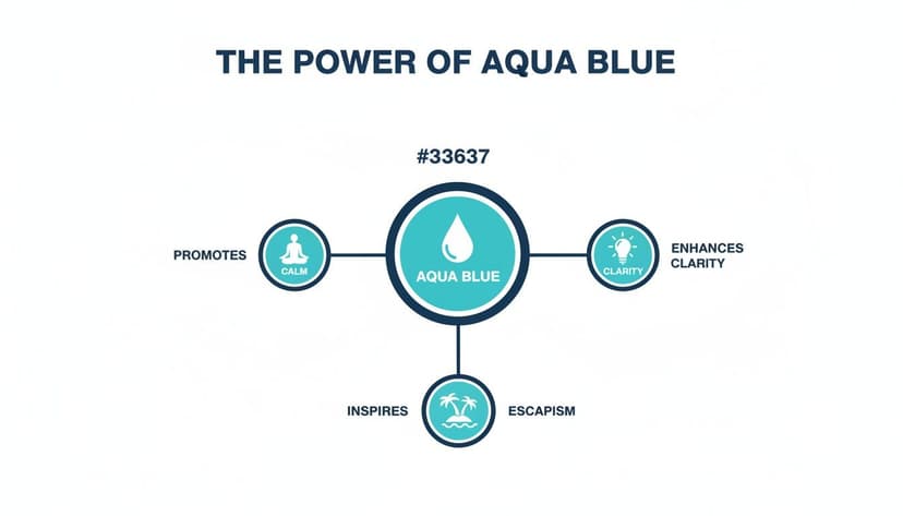
It highlights how a single color can signal calm, clarity, and escapism—making it a valuable shortcut for setting the tone of your story. These associations are powerful tools for connecting with a reader's expectations instantly, which is especially useful for genres like fantasy book covers where world-building and atmosphere are everything.
Connecting with Readers Through Color Psychology

Think of color as a silent conversation. Before a reader even deciphers your title, the aqua blue color on your cover is already whispering to their subconscious, setting the stage and stirring up emotions. This is the heart of color psychology—using specific hues to make a potential reader feel the soul of your story.
Aqua blue is a master of this silent dialogue. It taps into deeply rooted human associations, blending the tranquility of blue with the vitality of green. For a reader scrolling through a seemingly endless grid of books, an aqua cover is a psychological shortcut. It instantly signals certain themes, helping them decide "this is for me" in a fraction of a second.
Aligning Aqua Blue with Genre Expectations
The key is to sync the color's psychological pull with the promise of your genre. Your job as an author is to make sure the cover’s feeling is a perfect handshake with the story inside. A mismatch is jarring; it creates confusion and causes readers to scroll right on by.
Here’s how aqua blue sends the right signals across different genres:
- Romance: It often whispers escapism, tranquility, and dreaminess. Think of a tropical beach getaway or the serene calm that comes with finding “the one.”
- Sci-Fi & Fantasy: Here, aqua can suggest futuristic tech, otherworldly magic, or the vast, unexplored oceans of a distant world. It feels both natural and alien at the same time.
- Non-Fiction & Self-Help: This color radiates clarity, trust, and mental peace. For a reader seeking answers, aqua creates an immediate impression of credible, calm authority.
Understanding these connections lets you choose a shade of aqua that doubles as a powerful marketing tool. A deeper, more serious teal might suit a philosophical sci-fi epic, while a bright, energetic aqua is perfect for a lighthearted beach read. If you want to go deeper into how different hues influence readers, check out our recommended books on color psychology.
Using Modern Tools to Apply Color Psychology
In the past, testing these psychological principles was a long, expensive process. Today, indie authors can explore different design concepts using AI tools. This provides a practical way to experiment with various shades of aqua and see firsthand how a subtle shift in color can completely change a cover's mood and genre appeal.
This approach lets you make smart, data-backed decisions. Instead of just guessing what might resonate, you can test concepts built on the very foundation of what makes readers click. Ultimately, using color psychology isn't just about making your cover look good—it's about making a strategic choice that ensures it sells.
Building Compelling Color Palettes with Aqua Blue

An amazing cover isn't just about one color; it’s about the team of colors working together. When you anchor your design with aqua blue, you can build a palette that steers a reader’s emotions and makes your title pop. The mission is to create a deliberate, balanced scheme that truly serves the story inside.
Think of it like casting a movie. Aqua blue is your star, but it needs a strong supporting cast to bring the story to life. These "supporting" colors will either create harmony or introduce tension, all depending on the specific mood you want to set.
Decision Criteria: High-Contrast vs. Harmonious Palettes
The choice between a high-contrast and a harmonious palette should be driven by your genre and story's core conflict.
High-Contrast Palettes (for Tension & Action) Complementary colors sit directly across from each other on the color wheel. For aqua blue, that means its complements are in the orange and red family. This pairing creates a powerful visual clash that your eyes can't ignore, ideal for genres that need to signal action, tension, or high stakes.
- Aqua and Burnt Orange: This is a strong combination for a thriller or suspense novel. The warmth of the orange fights with the cool aqua, creating an unsettling friction that communicates conflict.
- Aqua and Vivid Red: For a high-energy sci-fi or action story, pairing a bright aqua with a sharp red accent creates an immediate sense of urgency.
Choosing the right palette isn't just an artistic decision—it directly impacts whether someone can actually read your title. High-contrast pairings are crucial for legibility, especially on a tiny book thumbnail. To dive deeper, check out our guide on creating accessible color palettes.
Harmonious Palettes (for Immersion & Calm) Analogous colors are neighbors on the color wheel, which results in a smooth, cohesive visual experience. For aqua, this means teaming it up with other blues and greens. This approach is perfect for genres that lean into wonder, introspection, or calm, creating a rich mood that pulls the reader into your world.
- Aqua, Royal Blue, and Sea Green: This palette is a natural fit for fantasy epics set near water. It suggests vast oceans, magical forests, and deep, ancient lore, just like the ones you see on popular fantasy book covers.
- Aqua, Periwinkle, and Soft Mint: A lighter, more pastel take on this scheme works wonders for contemporary romance, self-help, or literary fiction. It feels gentle, thoughtful, and immediately calming.
Whether you're aiming for nail-biting tension or serene beauty, building a palette around aqua blue gives you strategic control over your cover's first impression. A smart move is to use an AI tool to spin up different palette options for your cover. This lets you test how different schemes affect your book’s mood and marketability before you commit.
Practical Design Tips for Your Aqua Blue Cover
Knowing the what and why of aqua blue is great, but applying it to your book cover effectively is what matters. A winning cover is a balance of genre savvy, technical skill, and artistic instinct.
Here are some hands-on tips to make sure your aqua blue cover looks professional and connects with the right readers.
Checklist for Using Aqua Blue Effectively:
- Let Your Genre Be Your Guide: The specific shade of aqua you pick sends an immediate signal. Don't just pick one you like; pick the one your genre demands.
- Bright, electric aqua for YA, high-energy sci-fi, or a breezy beach read.
- Muted, desaturated aqua/teal for literary fiction, historical novels, or introspective memoir.
- Deep, rich aqua for epic fantasy or a high-stakes thriller hinting at hidden danger.
- Nail Your Readability: Your title and author name must be instantly readable, even as a tiny thumbnail. Contrast is your best friend here.
- Light aqua background? Use a strong, dark font (deep navy, charcoal, black).
- Dark aqua background? Use a crisp white or pale, creamy yellow font.
- Guide the Reader's Eye: Use color to create a clear visual flow. The principles of visual hierarchy in design are key here. Use your brightest aqua or a high-contrast accent to draw attention to the most important element on the cover—a key symbol, the protagonist's face, or the title itself.
- Balance Aqua with Other Elements: The color should support your cover's main elements, not overpower them.
- If you have a powerful central image, use aqua as an accent in the sky, a body of water, or the typography.
- If your cover is more minimalist and type-driven, a textured aqua background can add depth and emotion.
You can play around with how different aqua shades interact with your typography and images by generating a few options with an AI tool. Testing concepts helps you find that sweet spot that captures your book’s mood without locking you into a single direction too early.
The goal is to create a single, cohesive unit where color, imagery, and text all work together to tell one story. It’s this careful balance that separates a polished, professional cover from one that looks amateurish—and it’s what ultimately gets you the clicks and sells the books.
Common Questions About Using Aqua in Cover Design
Working out the final details of your book cover can bring up a lot of last-minute questions. To help you move forward with confidence, here are some practical answers to the most common queries we see from indie authors about using the aqua blue color.
What Genres Work Best with an Aqua Blue Color Scheme?
Aqua blue is surprisingly versatile. It can shift its emotional tone to fit a wide range of genres, making it a real workhorse in a designer’s palette.
- Fantasy and Sci-Fi: It's a natural fit here. Aqua is perfect for signaling otherworldly oceans, glowing magical energy, or sleek futuristic tech.
- Romance: It’s a go-to for beach reads or stories about deep, serene love. Think lighthearted summer flings or heartfelt, emotional journeys.
- Self-Help and Wellness: The color’s inherent calm projects clarity and trustworthiness—two qualities that are absolutely invaluable for non-fiction authors in this space.
- Thrillers: Believe it or not, it works for thrillers too. When you pair aqua with a high-contrast color like a fiery orange or a stark red, it creates a powerful visual tension that feels immediately unsettling.
How Do I Make My Title Readable on an Aqua Background?
Readability is non-negotiable. Your title must pop, especially when it’s shrunk down to a tiny thumbnail on a crowded digital shelf.
If you’re working with a light or bright aqua background, a dark, bold font is your best friend. Think black, deep navy, or charcoal gray. On the flip side, for a dark aqua or teal background, a crisp white or pale yellow font will create the sharp contrast you need for your title to stand out.
Common Pitfall: Avoid thin, overly decorative, or script-like fonts for your main title. They often become a blurry mess when scaled down. When in doubt, always choose clarity over complexity.
If you're new to publishing, getting a handle on what makes an effective book cover is job number one. A crucial step is to test your design at thumbnail size to make sure the title stays perfectly clear.
Is Aqua Blue a Good Choice for Historical Fiction?
Yes, but you have to be selective. A bright, modern aqua would feel totally out of place and anachronistic for a historical story. The secret is to use more muted, desaturated shades of teal and darker aqua.
These more sophisticated tones are fantastic for evoking historical seaside settings, whether it's a moody Victorian coastal town or an ancient Mediterranean port. They can even hint at the luxury of historical pigments like Egyptian blue. Just be sure to pair the color with era-appropriate typography and imagery to nail the authentic feel.
Can I Use Aqua for a Young Adult Fantasy Cover?
Definitely. Bright, vibrant aqua tones are a perfect match for the high-energy, high-stakes feel of most YA fantasy novels. The color can signal everything from elemental magic and mystical creatures to far-future societies.
To make it really connect with the YA market, try pairing a bright aqua with another bold color. A glowing magenta can scream "magic," while a metallic gold for the typography adds a touch of regal importance. A great way to explore options is to use an AI tool to generate cover variations, letting you quickly test which palettes best capture the spirit of your story.
Will Aqua Blue Print Well on a KDP Paperback?
It absolutely will, but only if you get your color profiles right. This is a common stumbling block for new authors.
Your screen displays colors in RGB (Red, Green, Blue), which is based on light. Printers, however, use CMYK (Cyan, Magenta, Yellow, Black), which is based on ink. That gorgeous, vibrant aqua on your monitor can look disappointingly dull or muddy in print if the file isn't converted to CMYK properly.
Always ensure your final print cover file is set to the CMYK color mode. Many professional design tools and services will handle this for you, providing KDP-ready downloads that are already optimized for print. This ensures your cover looks just as brilliant on paper as it does online.
Ready to Create Your Own Book Cover?
Turn your story into a visual masterpiece. Fill in the details below to start generating professional covers instantly.