The Bright Pink Color Code for KDP Book Covers
Find the right bright pink color code for your book cover. This guide covers hex, RGB, and CMYK values, plus KDP print settings and design tips for authors.
Posted by
 Pablo Yáñez
Related reading
Hiring a Book Cover Illustrator: A Practical Guide for 2026
Learn how to find, hire, and manage a professional book cover illustrator. Our step-by-step guide helps indie authors navigate briefs, pricing, and rights.
Photos for Book Covers: A Complete Guide for Authors
Learn how to choose effective photos for book covers. This guide covers composition, sourcing, licensing, and technical specs for KDP-ready designs.
Create the Perfect Book Review Form: A Guide for Authors
Learn to design a book review form that delivers actionable feedback. This guide covers question design, distribution tactics, and using reviews for marketing.
Ready to design your cover?
Use our AI book cover generator to create tailored book cover concepts in minutes.


Bright pink is one of the easiest cover colors to choose badly.
Authors often assume the label points to one reliable value. In practice, "bright pink" covers a range of pinks that shift in saturation, undertone, and brightness enough to change how a book feels at thumbnail size and how it reproduces through KDP. A pink that looks crisp and energetic on a backlit screen can print duller, warmer, or heavier once ink hits paper.
That gap affects sales potential on Amazon. Color is one of the first signals a shopper processes, well before they read a subtitle or compare blurbs. If the pink reads too candy-like, a thriller or sharp contemporary romance can look amateur. If it drifts too far toward red or purple, a cover meant to feel commercial and modern can miss the genre cue entirely.
I treat bright pink as a production choice, not a decorative one. The right code has to survive three tests: it must signal the right market, hold contrast for the title, and stay close enough across ebook and print versions that the book still looks professionally published. That is the standard that matters for indie authors using KDP, because a color that fails in any one of those places weakens the cover before the book gets a fair chance.
Why Your Bright Pink Might Not Be So Bright
A bright pink cover can lose sales before a reader reads the title.
The problem is not pink itself. The problem is treating “bright pink” like a fixed production spec when it is only a loose label. Two shades that both get called bright pink can behave very differently once they hit an Amazon thumbnail, a Kindle preview, or a KDP paperback proof. One may read sharp and contemporary. Another may skew sweet, flat, or slightly purple, which changes the promise your cover makes.
That matters because shoppers make fast judgments. Color is one of the earliest signals on the page, and pink carries strong genre baggage. On a romance cover, the wrong pink can push the design toward cartoonish or self-published. On suspense, memoir, or women's fiction, it can send the book into the wrong visual neighborhood entirely. If you want a useful comparison, a burgundy color code guide for book covers shows how quickly reader perception changes when a hue moves darker, cooler, or redder.
Why the label creates business risk
I see the same mistake often with indie covers. An author approves a pink based on the name in Canva, Procreate, or a stock template, then assumes that choice will hold across every format. It usually does not. The pink on a bright phone screen is emitted light. The pink on a KDP paperback is ink on paper with a smaller printable gamut. Those are different conditions, and bright pink is one of the colors that exposes the gap fast.
For Amazon, that creates three practical risks at once. The cover may signal the wrong genre. The title may lose contrast at thumbnail size. The print edition may come back duller or warmer than the ebook version, which makes the book line look inconsistent.
Practical rule: Approve the exact color value, not the color name.
What usually goes wrong
These are the failures that show up most often on pink-led covers:
- Screen-only approval: The pink looks vivid on a backlit display, then prints flatter through KDP.
- Genre miscues: A pink chosen for energy reads playful or juvenile instead of commercial and targeted.
- Thumbnail collapse: The background has impact at full size, but the title and author name lose clarity in search results.
Bright pink can work hard for a cover, but only if it survives real production conditions. The right choice is the pink that still reads correctly after export, compression, and print, while keeping the book in the visual lane readers expect.
The Official Bright Pink Color Codes Explained
Bright pink is not one color. For a book cover, that matters more than the name. Two files can both be labeled "bright pink" and still produce different genre signals, different thumbnail contrast, and different print results through KDP.
Use each color model for the job it does. Hex and RGB control what readers see on screens. CMYK controls how close that color can get in print. HSL is the adjustment tool I use when a pink has the right energy but the wrong temperature or lightness.
The common disagreement sits between #FF007F and #FE01B1. Both read as bright pink to a non-designer. On a cover, they behave differently. #FF007F sits closer to a classic hot pink. #FE01B1 shifts further toward magenta-purple, which can push the cover toward playful, glamorous, or younger-looking territory depending on typography and imagery.
What each color model actually does
- Hex: The fastest way to lock one exact screen color across Canva, Photoshop, Figma, and your ebook assets.
- RGB: The screen build behind that hex value. It matters when you compare retailer thumbnails, phone previews, and ad creatives.
- CMYK: The print conversion. This is the model that decides whether your paperback pink stays lively or comes back flatter and warmer.
- HSL: The editing view. It helps adjust hue, saturation, and lightness without guessing.
For comparison with a darker red-purple family, this burgundy color code guide is useful because small hue shifts change the sales message of a cover fast.
Bright Pink Color Code Conversions
| Variant Name | Hex | RGB | CMYK | HSL | Nearest Pantone |
|---|---|---|---|---|---|
| Bright Pink variant 1 | #FF007F | 255, 0, 127 | C:0 M:100 Y:50 K:0 | 330°, 100%, 50% | No single authoritative match |
| Bright Pink variant 2 | #FE01B1 | 254, 1, 177 | Not verified in provided data | Not verified in provided data | No single authoritative match |
Which code should an author choose
For most indie authors, #FF007F is the safer working anchor because it already has a documented CMYK conversion. That gives your designer a defined print target instead of a screen-only pink that has to be interpreted later. On Amazon, that usually means fewer surprises between the Kindle cover, the paperback proof, and the A+ content graphics built from the same palette.
#FE01B1 can still be the right choice. I use pinks in this range when a cover needs more pop, more glam, or a stronger contemporary edge. The trade-off is production control. Without a verified CMYK build, you need proofing discipline or you risk a paperback that prints duller than the ebook version.
A cover rarely fails because the pink is ugly. It fails because the color sends the wrong signal by a small margin. On Amazon, a small mismatch can cut against the genre promise that gets a click.
A practical selection rule
Choose your pink in this order:
- Pick the hue family that fits the book's market position
- Lock the exact hex code
- Check whether the print conversion is known
- Test the title and author name at thumbnail size
- Keep that same color reference across ebook, paperback, hardcover, and ads
If you want a broader reference on how color choices shape perception beyond publishing, DesignStack's branding guide is a useful read.
Matching Your Pink to Reader Expectations
Color psychology isn't abstract on Amazon. Readers use it as a sorting shortcut. They don't think, “This hue sits in a particular emotional range.” They think, “This looks like a book for me,” or they move on.
For pink-led covers, the question isn't whether pink works. It's which pink tells the truth about your book. A hot, glossy pink can feel contemporary and bold. A softened pink can feel romantic. A dusty rose can feel literary or mature. If you choose the wrong family, your cover starts a conversation your book can't finish.
Four pink signals authors should know
- Hot pink: Best when the book needs energy, confidence, or a strong commercial pulse. Common for sharp contemporary romance and some bold nonfiction packaging.
- Soft pinks: Better for warmth, emotional intimacy, and gentler romance signals.
- Bubblegum pink: Works when the tone is playful, youthful, or intentionally light.
- Muted or dusty rose: Useful when the book needs sophistication, restraint, or a more upscale feel.
If you want to study how color meaning changes in branding more broadly, DesignStack's branding guide is a solid reference because it shows how small shifts in tone change audience perception.
How to choose by market position
A practical way to decide is to compare your book to the emotional promise it makes:
| Book promise | Pink direction | Risk if you go wrong |
|---|---|---|
| Fast, flirty, modern | Hotter and cleaner pink | Can look generic if typography is weak |
| Tender, emotional, romantic | Softer pink family | Can become too quiet at thumbnail size |
| Stylish, upscale, mature | Dusty or muted pink | Can lose urgency if over-muted |
| Edgy, twisty, feminine with tension | Pink paired with darker accents | Can confuse readers if it reads too playful |
One useful benchmark is to scan a category page and note whether the bestselling covers use pink as the dominant field, an accent, or a contrast device. If most successful covers use pink in controlled accents and yours is wall-to-wall neon, you may be working against the category.
For broader inspiration on how pink functions across publishing categories, this look at pink book covers helps frame the range without forcing you into showcase-style copying.
A strong cover doesn't just “use pink.” It uses the right pink for the promise your title and blurb are making.
Ensuring High Contrast and Readability
A bright background can carry attention, but it can also destroy legibility. That's why many pink covers fail at the last moment. The color is memorable. The title isn't.
On Amazon, shoppers usually meet your cover as a thumbnail first. If the text can't survive that reduction, the design loses commercial value no matter how polished it looks full size. With bright pink, contrast has to be planned from the beginning, not patched later.
What usually works
The safest pairings are straightforward:
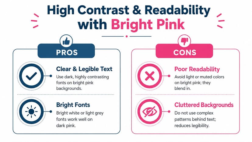
- Black or near-black type: Strong, dependable contrast for many bright pink backgrounds.
- White type: Often effective when the pink is deep enough and the font weight is substantial.
- Dark navy: A good alternative when black feels too harsh but you still need authority.
- Minimal texture behind text: Flat or gently controlled backgrounds keep the title readable.
What usually fails
- Thin serif lettering: Fine strokes disappear fast on saturated color.
- Pale gray or yellow text: These combinations often look stylish in a mockup and weak in a thumbnail.
- Busy photo composites: Bright pink plus image noise behind the type usually lowers clarity.
- Too many text treatments: Outline, glow, shadow, bevel, and texture together make the title feel amateur.
A thumbnail audit checklist
Run this quick check before approving a cover:
- Shrink it down: View the cover at very small size. If the title breaks apart, revise now.
- Squint test: If your eyes have to work to separate text from background, readers will skip it.
- Check hierarchy: The title should read first, then author name, then subtitle or series line.
- Simplify effects: One clean contrast move beats several decorative ones.
- Test on mobile: A lot of Amazon browsing happens on phones, where weak contrast shows up fast.
Good readability feels obvious. Bad readability usually gets noticed only after the cover stops converting.
Typography trade-offs on pink
Bold sans serifs often perform well because saturated backgrounds need stable letterforms. Serif fonts can still work, especially for romance or historical crossover, but they need enough weight and spacing. Script fonts are the highest-risk option. They can look elegant at full size and collapse completely when reduced.
If you're using bright pink as the main field, let the typography do less. Fewer words, stronger weight, cleaner spacing. Pink already provides energy. The title doesn't need extra theatrics.
Building a Professional Book Cover Palette
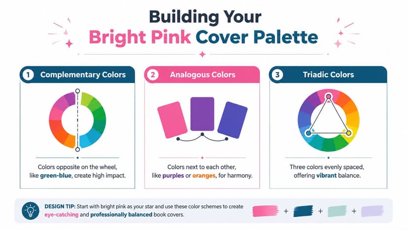
A single bright pink rarely carries a whole cover well on its own. Professional covers usually balance it with supporting colors that control mood, depth, and hierarchy. That's where many DIY covers start to look more deliberate. The pink stays energetic, but the surrounding palette tells readers how to interpret it.
Color theory helps, but you don't need an art-school approach. For cover design, the useful question is simpler. What secondary colors make your chosen pink feel commercial instead of chaotic?
Palette formula one for bold commercial fiction
Use a bright pink anchor, then pair it with dark navy and clean white.
This setup gives you energy plus control. Navy keeps the design from feeling juvenile, and white preserves legibility. It's often a smart direction when the book needs a modern, polished, mainstream look.
Palette formula two for romantic softness
Use pink as the main emotional color, then add cream and a muted plum or mauve.
This pulls the cover away from loud retail brightness and toward warmth. It works well when the story is emotional, intimate, or character-led. The danger is going too pale and losing impact, so keep one deeper supporting tone in the mix.
Palette formula three for edge and tension
Pair bright pink with charcoal and a cool green-blue accent.
This is the most useful formula when the book sits near thriller, dark romance, or women's fiction with a sharper emotional edge. The cool opposing accent creates friction, which can make the pink feel less sweet and more deliberate.
Decision criteria for authors
Ask these three questions before locking the palette:
- Does the secondary color sharpen the pink or soften it? Either can work, but the choice should match the story.
- Does the title still dominate? A palette that competes with your text is the wrong palette.
- Does the mood match the blurb? If the color says playful but the copy says grief, obsession, or danger, revise.
A professional palette also stays disciplined. Most covers don't need a rainbow. One lead color, one structural dark or light neutral, and one accent is often enough.
If your cover feels “busy,” the issue usually isn't the pink. It's that too many supporting colors are competing for attention.
How to Test Your Bright Pink Cover Design
A bright pink cover can gain clicks fast or lose them just as fast. The difference usually shows up in testing, not in the first design file.
Pink is unusually sensitive to context. A hue that looks sharp in your editor can turn juvenile at thumbnail size, muddy on a paperback proof, or too aggressive beside competing covers on Amazon. Authors who skip this step often approve the version they are most used to seeing, not the version readers are most likely to trust.
Compare concepts, not isolated swatches
Single color chips are poor predictors of sales performance. Bright pink changes character based on typography, image contrast, subtitle weight, and how much white or black sits around it. Test full cover systems side by side, not just hex values.
AI can help at this stage if you use it for speed rather than judgment. Generate several directions with meaningfully different pink families, then shrink them to Amazon thumbnail size and compare them in one view. That process exposes a common problem early. The pink that feels freshest at full size often loses title clarity or genre accuracy once it is reduced.
A practical test sequence
Use a repeatable sequence:
- Build three distinct cover versions with different pink temperatures, not minor variations of the same file.
- View each one at thumbnail size on desktop and mobile.
- Check the cover in context on a mock paperback so you can judge wrap, spine visibility, and overall realism.
- Print a physical proof before approving the final KDP file.
- Ask targeted questions about fit and trust, not personal taste.
For the mockup stage, BeYourCover's free book cover mockup tool is useful because a flat front cover often hides issues that become obvious once the design wraps onto a book.
What to test specifically
Focus on four things.
- Genre signal: Does the pink place the book in the right commercial category at a glance?
- Title legibility: Can a shopper read the title in less than a second on a search results page?
- Print behavior: Will the design still work if the printed pink comes back slightly duller than the screen version?
- Promise alignment: Does the color mood match the blurb, title, and overall reading experience?
I usually tell authors to replace “Which one do you like?” with “Which one would you click, and what kind of book do you expect?” That question gets closer to buyer behavior.
If you want a broader production workflow, Skup outlines useful methods for successful design testing that align well with how cover designers check product-facing work before release.
Why testing saves money and time
Late fixes are expensive in all the ways that matter. You spend time updating files, waiting on new proofs, and correcting a product page that may already be underperforming. On Amazon, even a small mismatch between color signal and genre expectation can reduce clicks before readers ever sample the book.
Keep the test simple, but make it disciplined. Compare strong alternatives, inspect them at retail size, and verify them in print. Before you export the final files, run through BeYourCover's cover export documentation for KDP-ready settings so the version you tested is the version readers and buyers will see.
Export Settings for Flawless KDP Print and Ebooks
Export settings decide whether your bright pink sells like a signal color or prints like a mistake.
A cover can look sharp in Photoshop or Canva and still fail at the last step. On Amazon, that failure shows up fast. The thumbnail loses punch, the paperback arrives duller than expected, and the color cue you chose for romance, manga, YA, or bold non-fiction starts drifting out of category. Bright pink is especially unforgiving because the most vivid screen pinks sit near the edge of what print can reproduce cleanly.
Separate your ebook and print files
Use two exports.
Ebook covers should stay in RGB, because shoppers first see your book on phones, tablets, and desktop screens. That version needs the brightest, cleanest on-screen pink you can hold without hurting title contrast.
Print covers need a CMYK export, and they need to be checked after conversion, not before. A bright pink such as #FF007F often shifts in print because fluorescent-looking RGB color exceeds what standard CMYK ink can match. In practice, that means your paperback pink may come back softer, warmer, or slightly muddier. If pink is carrying your genre signal, proof that version before you publish at scale.
For full wraps, inspect the front, spine, and back together. A pink that looks consistent on the front can change across panels if effects, transparency, or rich blacks are handled inconsistently.
The BeYourCover's export cover documentation gives a solid KDP-ready checklist if you want a cleaner handoff from design to final upload.
A clean final checklist
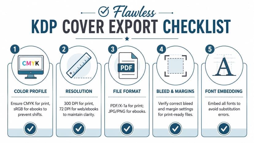
Before uploading to KDP, check these points:
- Color profile: RGB for ebook covers. CMYK for print covers.
- Pink conversion: If your design uses #FF007F, review the CMYK result in your design software and compare it against a proof, not just the screen preview.
- Resolution: Export print files at 300 dpi so edges, serif details, and small subtitle text stay crisp.
- Fonts: Embed fonts or flatten text elements correctly so KDP does not substitute type and change your hierarchy.
- Bleed and margins: Confirm trim safety on the full wrap, especially if pink blocks run to the edge.
- PDF quality: Export a high-quality print PDF for paperbacks, with layers and transparency handled cleanly.
What authors often overlook
Authors usually spend their energy on color choice and typography, then rush export as if it were clerical work. It is production work, and production choices affect sales.
I treat export as the final design pass because Amazon shoppers do not judge your source file. They judge a tiny retail image and, if they buy, the printed object that arrives in the mail. If your pink loses saturation, your black text fills in, or your spine shifts off-center, the cover stops looking intentional. On a crowded category page, that can cost clicks before your blurb gets a chance to work.
Proofing matters even more if bright pink is central to your author brand. For a broader discussion of print quality and material fidelity in visual products, Printano's article on what's essential for confident art buying is a useful companion read.
Strong cover concepts still need disciplined exports. Reliable KDP color comes from controlled files, proof checks, and format-specific outputs.
Ready to Create Your Own Book Cover?
Turn your story into a visual masterpiece. Fill in the details below to start generating professional covers instantly.
