7 Essential Book Cover Design Tips for Authors in 2025
Discover 7 powerful book cover design tips for indie authors. Learn typography, color, and layout secrets to create a cover that sells more books.
Posted by
Related reading
How to Write an Ebook in 2026: A Step-by-Step Guide
Learn how to write an ebook that sells. Our practical guide covers topic validation, drafting, editing, formatting, cover design, and launching on KDP.
Children Book Illustration: From Concept to KDP
Learn the essentials of children book illustration in our complete guide for indie authors. Covers styles, hiring illustrators, budgets, and KDP print specs.
The Bright Pink Color Code for KDP Book Covers
Find the right bright pink color code for your book cover. This guide covers hex, RGB, and CMYK values, plus KDP print settings and design tips for authors.
Ready to design your cover?
Use our AI book cover generator to create tailored book cover concepts in minutes.


In a crowded digital marketplace, your book cover is the single most important marketing tool you have. It’s not just packaging; it's a silent salesperson, working 24/7 to capture a reader's attention in under three seconds. A professional, genre-appropriate cover communicates quality, promises a compelling story, and is often the deciding factor between a click and a scroll. For indie authors, mastering the fundamentals of cover design is no longer a luxury, it's essential for visibility and sales.
This guide breaks down seven critical, actionable book cover design tips that move beyond generic advice. We'll explore the specific principles of typography, color psychology, and strategic composition that professional designers use to command attention. You'll learn not only what makes a cover effective but how to implement these techniques yourself. From establishing a clear typographic hierarchy to ensuring your design works across multiple formats, these insights are designed for immediate application. Our goal is to equip you with the knowledge to create a cover that not only looks great but also converts potential readers into loyal buyers.
1. Master Typographic Hierarchy for Thumbnail Clarity
The single most important rule in modern book cover design is thumbnail clarity. Before a reader ever sees your cover on a physical shelf, they will see it as a tiny, one-inch square on a digital storefront like Amazon, KDP, or Goodreads. If your title and author name are illegible at that size, you’ve lost a potential sale. Mastering typographic hierarchy is the key to ensuring your cover is not only professional but, more importantly, scannable.
Hierarchy isn't just about choosing a "big font." It's the strategic arrangement of text elements using size, weight (bold, regular, light), and placement to create a clear path for the reader's eye. A successful hierarchy ensures the most critical information is absorbed instantly. The title should be the undeniable focal point, followed by the author's name, and then any secondary elements like subtitles or taglines.
Why It Works
A strong typographic hierarchy communicates professionalism and confidence. It tells the reader, "this book is well-produced and worth your time." Covers with muddled, unclear text often appear amateurish and can be skipped over in a split second. By prioritizing clarity, you respect the reader's time and make it effortless for them to identify your book in a crowded marketplace. This is one of the most fundamental book cover design tips because it directly impacts discovery and sales.
Actionable Steps for Implementation
- Test at Thumbnail Size: Before finalizing your design, shrink it down to 150-200 pixels wide. Can you still read the title and author name without squinting? If not, increase the size or weight.
- Establish a Visual Order: The title should be the largest and/or boldest element. The author's name should be secondary, and any subtitle or tagline should be the smallest.
- Maximize Contrast: Ensure your text has high contrast against the background image or color. A simple test is to convert the cover to grayscale; the text should still stand out clearly.
- Use Spacing Strategically: Ample "white space" or negative space around your text prevents it from feeling cramped and improves readability.
With a tool like BeYourCover, you can easily test different typographic layouts and see real-time previews of how your cover will appear as a thumbnail, ensuring your design is effective where it matters most.
2. Color Psychology and Strategic Color Palettes
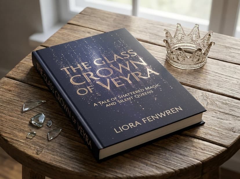
Color is a silent narrator. Long before a reader processes the title or author, the colors on your cover have already communicated a wealth of information about its genre, mood, and tone. Strategic color palettes trigger subconscious emotional responses, instantly guiding a reader's expectations. Red can scream passion or danger, while deep blues suggest mystery or melancholy, and stark black and white often signals a thriller or serious literary fiction.
Harnessing color psychology is not just an artistic choice; it’s a powerful marketing tool. The right combination can set your book apart and create an immediate connection with your ideal reader. A well-chosen palette acts as a visual shortcut, telling a potential buyer, "if you like this kind of story, this book is for you." This is why understanding color theory is one of the most impactful book cover design tips an author can learn.
Why It Works
A strategic color palette communicates genre conventions at a glance and evokes a specific emotional response that aligns with the story's core themes. For example, the muted grays and stark red accent on The Girl with the Dragon Tattoo immediately signal a dark, intense thriller. Conversely, the rich jewel tones often found on fantasy covers promise epic worlds and high stakes; browse fantasy novel cover examples to see that palette in action. By using colors that readers already associate with their favorite genres, you lower the barrier to entry and make their purchasing decision easier.
Actionable Steps for Implementation
- Research Genre Palettes: Browse the bestseller lists in your specific genre. Note the dominant color combinations. Are thrillers using dark, desaturated colors? Are romances using warm, vibrant tones? Use these conventions as your starting point.
- Apply the 60-30-10 Rule: For a balanced and professional look, use a dominant color for 60% of your cover, a secondary color for 30%, and a contrasting accent color for the final 10%. This creates visual interest without overwhelming the design.
- Test for Contrast and Readability: Ensure your text color stands out sharply against your background colors. This is crucial for both thumbnail clarity and accessibility.
- Consider Emotional Impact: Think about the primary emotion you want your cover to evoke. Do you want to create a sense of unease, romance, or adventure? Choose colors that align with that feeling.
With a tool like BeYourCover, you can experiment with pre-designed, genre-specific color palettes or create your own, ensuring your cover’s colors are not only beautiful but also strategically effective.
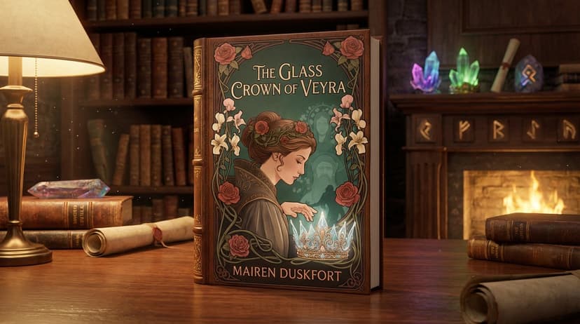
3. Compelling Imagery and Visual Storytelling
The image on your book cover is a silent promise to the reader. It’s the single fastest way to communicate genre, mood, and theme before a single word of the title is read. Compelling imagery acts as a visual hook, creating an emotional connection that draws the reader in. Whether it’s a striking photograph, a bespoke illustration, or an abstract design, the visual should tell a story, or at least hint at the compelling narrative waiting inside.
This visual storytelling is what makes a reader stop scrolling. It’s the difference between a cover that merely describes and one that evokes genuine curiosity. Think of the minimalist nature imagery on Where the Crawdads Sing, which perfectly captures the novel's tone of isolation and natural beauty, or the symbolic items on the cover of The Book Thief. These images aren't just decorative; they are integral to the book's identity.
Why It Works
A powerful image creates an immediate emotional response, bypassing the logical part of the brain that might be weighing a purchase. It connects with the reader on a subconscious level, making your book feel more familiar and intriguing. This is one of the most crucial book cover design tips because it transforms your cover from a simple label into an engaging piece of art that promises an experience. High-quality, thoughtful imagery signals a high-quality, thoughtful story.
Actionable Steps for Implementation
- Invest in Quality: Use high-resolution, professional stock photography or hire an illustrator. Avoid generic, overused stock photos that make your book look like a dozen others.
- Tell a Story: Choose an image that hints at the central conflict, theme, or a pivotal moment without giving everything away. Ask yourself: does this image raise a question in the reader’s mind?
- Maintain a Clear Focal Point: The image must work in tandem with your typography, not compete with it. Ensure there is a clear area for your title and that the overall composition is balanced, especially at thumbnail size.
- Ensure Genre Consistency: Research top-selling books in your genre. A thriller might use a dark, moody photograph, while a contemporary romance might feature a bright, warm illustration.
Finding the right visual balance is key. You can explore how professional designers use imagery in our gallery, like with the food photography seen in The Vibrant Plate, to see how powerful visuals elevate a design.
4. Understanding Target Audience and Genre Conventions
Before a single pixel is placed, the most crucial step is to understand who you are designing for and what they expect. Successful book cover design is a conversation with the reader, and genre conventions are the shared language. Readers have been trained to associate specific visual cues with certain types of stories. A thriller cover looks nothing like a romance cover, and a Young Adult fantasy has a different feel from literary fiction. Meeting these visual expectations is how you signal that your book belongs on their shelf.
This doesn't mean your cover must be a clone of others. It means you must first learn the rules before you can creatively bend or break them. The goal is to build instant trust with your target audience, showing them at a glance that your book will deliver the experience they are looking for. Ignoring these conventions is like showing up to a formal event in beachwear; you might stand out, but you also risk alienating the very people you want to connect with. For a practical benchmark while researching, compare a few live genre pages like romance book covers and thriller book covers.
Why It Works
A genre-appropriate cover acts as a powerful sorting mechanism in a crowded digital marketplace. It allows potential readers to quickly identify your book as something they might enjoy, significantly increasing its click-through rate. Think of iconic examples like the consistent, minimalist design of Penguin Classics or the bold, high-contrast typography of Stephen King thrillers. These designs communicate genre and quality instantly. Adhering to conventions tells readers your book is professionally produced and understands their tastes, making it one of the most effective book cover design tips for driving targeted sales.
Actionable Steps for Implementation
- Create a Genre Mood Board: Go to Amazon or Goodreads and screenshot the top 30-50 bestselling covers in your specific sub-genre. Analyze them for patterns in color, typography, imagery, and layout.
- Identify Core Visual Tropes: Does your genre favor illustrated characters (Romance), stark typography (Thrillers), or epic landscapes (Fantasy)? Note these recurring elements.
- Balance Familiarity and Uniqueness: Aim for your cover to feel like it belongs in the genre but stands out just enough to be memorable. Use a familiar layout but with a unique color palette, for instance.
- Research Your Target Demographic: Go beyond genre and consider your ideal reader's age, interests, and even what other media they consume. A cover for a 19-year-old sci-fi reader will differ from one for a 60-year-old.
If you are unsure how to translate these genre conventions into a compelling design, it may be time to consult an expert. You can find professional designers who specialize in your specific genre and learn more about hiring a book cover designer at BeYourCover.
5. Embrace White Space for Sophisticated Composition
In book cover design, what you don’t include is often as powerful as what you do. White space, also known as negative space, isn't empty or wasted real estate; it is an active design element that guides the viewer's eye, enhances readability, and creates a sense of sophistication and focus. A well-composed layout uses white space to give every element room to breathe, preventing a cluttered, amateurish appearance.
Composition is the artful arrangement of these elements, and principles like the rule of thirds are your guide. Imagine your cover divided by a 3x3 grid; placing key elements like your title or a central image along these lines or at their intersections creates a more dynamic and visually pleasing result than simply centering everything. This thoughtful placement ensures your title, author name, and imagery work in harmony, making the cover feel balanced and intentional.
Why It Works
A cluttered cover overwhelms the potential reader, causing visual fatigue and making it difficult to process key information. By leveraging white space, you reduce this cognitive load and create an immediate focal point. This technique communicates confidence and is particularly effective for literary fiction, nonfiction, and thrillers where a single, powerful concept needs to stand out. Mastering composition is one of the most impactful book cover design tips for elevating your work from homemade to professionally published.
Actionable Steps for Implementation
- Apply the Rule of Thirds: Activate a grid overlay in your design tool. Position your title or the most critical part of your image on one of the intersecting points for a more compelling layout.
- Give Text Breathing Room: Ensure there is significant empty space around your title, author name, and tagline. This separation makes each element distinct and easier to read, especially at thumbnail size.
- Create a Focal Point: Use negative space to isolate and draw attention to one key element, whether it's a powerful symbol or the book's title. Let it be the hero of the cover.
- Aim for Asymmetry: Resist the urge to center every single element. An asymmetrical layout, where elements are balanced across the cover, often feels more modern and engaging.
Using a tool like BeYourCover can help you visualize these principles with built-in guides and templates that encourage balanced composition, making it simple to create clean, uncluttered, and professional layouts.
6. Strategic Placement of Author Name and Endorsements
Beyond the title and imagery, your name and any accolades are powerful marketing tools. Strategic placement isn't about just finding an empty spot; it's about leveraging your brand recognition and social proof to attract readers. How you size and position the author name, endorsements, awards, or bestseller status directly signals your standing in the market and influences a reader's decision to buy.
The core principle is a calculated balance between promoting the story and promoting the author. For a household name like James Patterson or Stephen King, their name is the primary selling point and often dominates the cover. For a debut author, the title and concept must do the heavy lifting, so the author's name is smaller and positioned to not distract from the main hook. This thoughtful arrangement is one of the most commercially aware book cover design tips you can implement.
Why It Works
Proper placement of these elements builds instant credibility and manages reader expectations. A large, prominent author name conveys authority and tells fans, "here is another book you'll love." A powerful blurb from a respected author or a prestigious award seal tells new readers, "this book has been vetted and is a safe bet." Failing to correctly balance these elements can result in a cover that either undersells your authority or appears cluttered and confusing, diluting your core marketing message.
Actionable Steps for Implementation
- Scale Your Name to Your Fame: Be honest about your market recognition. If you are a new author, keep your name clean, legible, and subordinate to the title. If you have an established following, make your name a more prominent feature.
- Leverage Endorsements Selectively: Choose only one or two of the most impactful quotes or blurbs. Placing "A thrilling ride!" from a famous author is far more effective than listing three generic five-star reviews.
- Position for Hierarchy: The most common and effective placement for an author's name is in the bottom third of the cover, keeping the top two-thirds free for the title and imagery. Endorsements often work best at the very top, above the title.
- Use Badges and Seals with Care: Award seals or "Bestseller" banners should be placed where they draw attention without disrupting the cover's primary design. Ensure they are high-resolution and don't obscure key text or imagery.
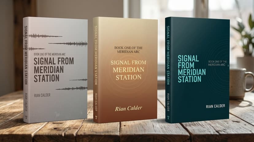
7. Test, Iterate, and Ensure Multi-Format Compatibility
Your cover design isn't finished until it’s proven to work in every context a reader might encounter it. The final, critical step is rigorous testing and iteration across multiple formats. A modern book exists as a physical paperback or hardcover, an ebook on a Kindle, an audiobook square on Audible, and a marketing asset on social media. Each format has unique requirements, and a design that looks stunning on a large monitor can fail completely as a tiny thumbnail or a printed object.
Testing is the process of validating your design choices against real-world conditions. This involves more than a quick glance; it requires checking the cover's performance at different sizes, on various devices, and in both digital and print mockups. Iteration means using the feedback from these tests to make small, targeted improvements, ensuring the cover is effective, legible, and professional everywhere it appears. This prevents costly reprints and lost sales due to unforeseen compatibility issues.
Why It Works
A thoroughly tested cover guarantees a consistent and professional brand experience for your book. It ensures that the design’s impact, clarity, and genre signals are not lost in translation between formats. For indie authors, this step mimics the quality assurance process of major publishing houses, closing the gap between self-published and traditionally published work. Embracing this as one of your core book cover design tips builds reader trust and demonstrates a commitment to quality that extends to the story inside.
Actionable Steps for Implementation
- Simulate All Key Formats: View your design as a 1-inch thumbnail, an ebook on a black-and-white e-reader screen, an audiobook square, and a full-size print PDF. Note any loss of detail or legibility.
- Check Print and Screen Colors: Screen colors (RGB) often appear brighter than printed colors (CMYK). If printing, always convert your file to CMYK and get a physical proof copy to check for color shifts.
- Gather Unbiased Feedback: Show your cover to a small group of 5-10 people who fit your target reader profile. Ask them specific questions like, "What genre do you think this is?" and "What is the title?" instead of a generic "Do you like it?"
- Verify on Actual Store Pages: Take a screenshot of your cover and place it on a screenshot of an Amazon or Goodreads search results page. Does it stand out, or does it blend in and get lost among the competition?
Platforms like the BeYourCover book cover maker help streamline this process by providing previews and templates that are already optimized for major platforms like Amazon KDP, making multi-format compatibility easier to achieve.
7-Point Book Cover Design Comparison
| Element | 🔄 Implementation complexity | ⚡ Resource requirements | ⭐ Expected outcomes | 📊 Ideal use cases | 💡 Key tip |
|---|---|---|---|---|---|
| Typographic Hierarchy and Legibility | Medium — requires typographic skill and iteration | Low–Medium — fonts, designer time, licensing | High — clear readability and professional appearance | Title-focused covers; thumbnails; author-driven marketing | Test at thumbnail size; limit fonts to 2–3; ensure strong contrast |
| Color Psychology and Strategic Color Palettes | Medium — research cultural/genre associations | Low–Medium — color tools, proofs, designer direction | High — instantly communicates mood/genre and improves shelf appeal | Genre signaling, mood-driven covers, branding across a series | Use 60‑30‑10 rule; test for colorblind accessibility; consider cultural meanings |
| Compelling Imagery and Visual Storytelling | High — art direction or commissioning original work | High — professional photography/illustration budget | Very high — strong emotional impact and differentiation | Literary, fantasy, commercial singles that need standout visuals | Invest 30–50% of design budget in imagery; ensure clear focal point at thumbnail |
| Understanding Target Audience & Genre Conventions | Medium — research and pattern analysis | Low–Medium — market research, focus groups | High — improves discoverability and conversion | Debut authors, niche genres, series consistency | Study 30–50 successful covers; balance conventions with originality |
| Effective Use of White Space & Layout Composition | Medium — requires composition skill and restraint | Low — designer time and layout testing | High — clarity, elegance, improved perceived quality | Minimalist/literary covers; information-light designs | Leave ~1/3 of cover as white space; apply rule of thirds/golden ratio |
| Strategic Placement of Author Name & Endorsements | Low–Medium — marketing/design coordination | Low–Medium — layout work; outreach for blurbs | Medium–High — boosts credibility when used appropriately | Established authors, award-winning titles, debut books with blurbs | Make author prominence reflect platform; limit blurbs to 1–2; keep title dominant |
| Testing, Iteration & Multi-Format Compatibility | High — iterative testing across formats and platforms | Medium–High — testing, proofs, user feedback rounds | Very high — ensures functionality, reduces production issues | Multi-format releases (ebook/print/audiobook); high‑stakes launches | Test at 1–2" thumbnail and 300 DPI print proofs; iterate with target readers |
Bringing Your Vision to Life: Your Next Steps
The journey from a blank canvas to a compelling, market-ready book cover can seem daunting, but it is a process you can master. Throughout this guide, we've broken down the essential components that separate a forgettable cover from one that captivates and sells. By moving beyond generic advice, you now have a strategic framework built on actionable book cover design tips that empower you to take control of your book's first impression.
The principles we've covered are not just isolated rules; they are interconnected elements of a single, powerful marketing tool. Your typography must be legible at a thumbnail size, your color palette must align with genre expectations, and your imagery needs to pose a compelling question that only your story can answer. Each decision, from the placement of your author name to the effective use of white space, contributes to a cohesive and professional final product.
From Theory to Actionable Design
Remember, the goal is not just to create something aesthetically pleasing but to craft a cover that performs its job effectively. A successful cover achieves three critical objectives:
- It attracts the right readers. Your design should act as a visual beacon, signaling to your ideal audience that this book is for them.
- It communicates genre and tone instantly. A reader should understand whether they're looking at a thriller, a romance, or a fantasy novel within seconds.
- It converts interest into a click and a sale. The cover is the final nudge that convinces a browsing reader to take the next step.
Mastering these concepts transforms your cover from a simple placeholder into your most dedicated salesperson. It works for you 24/7 in online marketplaces, grabbing attention in a sea of thumbnails and conveying the quality of the story within. This isn't an expense; it's a critical investment in your author career. By applying these detailed book cover design tips, you are building a stronger author brand and giving your manuscript the best possible chance to succeed.
The great news is that you don't have to be a professional graphic designer to implement these strategies. The key is to approach the process with intention and a clear understanding of the principles that drive reader behavior. Start by analyzing the top-selling books in your specific sub-genre. You can find many great romance book covers to study for inspiration. Then, test different concepts, gather feedback, and iterate until you have a cover that not only you love but that also resonates with your target audience. Your story is worth the effort, and a powerful cover is the first step toward getting it into the hands of eager readers.
Ready to Create Your Own Book Cover?
Turn your story into a visual masterpiece. Fill in the details below to start generating professional covers instantly.