A Practical Guide to Book Design and Layout for Indie Authors
Master professional book design and layout. Our guide covers everything indie authors need, from interior typography to KDP-ready cover design that sells.
Posted by
Related reading
Photos for Book Covers: A Complete Guide for Authors
Learn how to choose effective photos for book covers. This guide covers composition, sourcing, licensing, and technical specs for KDP-ready designs.
Create the Perfect Book Review Form: A Guide for Authors
Learn to design a book review form that delivers actionable feedback. This guide covers question design, distribution tactics, and using reviews for marketing.
Effective Backgrounds for Covers: KDP Guide 2026
Choose effective backgrounds for covers to grab attention on Amazon KDP. Our 2026 guide covers types, genre matching, composition, & technical specs.
Ready to design your cover?
Use our AI book cover generator to create tailored book cover concepts in minutes.


Every indie author eventually learns a hard truth: readers absolutely judge a book by its cover and its interior. Professional book design and layout isn't just a final box to tick before publishing. It's a strategic investment that directly shapes your sales, credibility, and reader reviews on platforms like Amazon KDP.
This entire process—from the cover that grabs attention to the pages that keep a reader engaged—forms a reader's first impression and lasting memory of your book.
Why Book Design Is Your Most Powerful Sales Tool
 For an indie author on Amazon KDP, your book isn't sitting on a physical shelf; it's a thumbnail competing in a vast, crowded digital marketplace. Before anyone reads a single word of your story, they see its packaging. That visual first impression, comprised of your cover and the "Look Inside" preview, is your single most powerful sales tool.
A professional design does more than look appealing. It sends an instant, unspoken signal to potential readers, telling them you're a serious author who has invested in creating a quality product worth their time and money.
The Cover Makes The Promise
Your book cover is your first—and often only—chance to connect with a potential buyer. In the split second a reader scrolls past, that image must communicate three crucial things:
- Genre: Does it signal a heart-pounding thriller or a sweeping historical romance? The colors, fonts, and imagery must align with reader expectations for that category.
- Tone: Is the story dark and gritty, light and humorous, or epic and adventurous? The design sets the entire mood before the blurb is even read.
- Professionalism: Does it look like it belongs alongside bestsellers in its genre? An amateurish cover immediately suggests an amateur story.
This initial promise is everything. A fantastic cover, like those found among top-selling fantasy book covers, acts as a visual shortcut, telling the right audience, "This book is for you."
The Interior Delivers The Experience
If the cover makes the promise, the interior layout is how you fulfill it. A clean, readable, and thoughtfully designed interior creates a seamless reading experience, allowing your story to shine without distractions.
Poor interior formatting is like trying to watch a great movie with constant audio glitches—it rips the audience out of the experience and leaves them frustrated. A reader who has to squint at tiny fonts or navigate awkward spacing is a reader more likely to leave a negative review.
Conversely, a polished layout builds subconscious trust. It reinforces the quality promised by the cover and keeps the reader happily turning pages, completely absorbed in the world you’ve built. This combination of a compelling cover and a flawless interior is what truly sets a book up for success.
Crafting A Seamless Reading Experience Inside Your Book
 A great cover gets a reader to open your book, but the interior has to deliver on that promise. Your book design and layout is the invisible architecture holding the entire reading experience together.
When done right, readers don't notice it; they just get lost in your words. When done poorly, it becomes a constant, frustrating distraction that pulls them out of the story. Turning a raw manuscript into a polished book comes down to several key decisions focused on readability and professionalism.
The Power of Typography
Think of your font as the narrator's voice. It sets a subconscious tone before a single word is processed. The two primary font families are serif and sans-serif, and the choice matters.
- Serif Fonts: These are the classic fonts with small "feet" (serifs) on the letters, like Times New Roman or Garamond. For print books, serifs are the standard for body text because the serifs create a subtle line for the eye to follow, reducing reading fatigue over many pages.
- Sans-Serif Fonts: Lacking the decorative feet, fonts like Arial and Helvetica have a modern, clean feel. They are excellent for headlines, chapter titles, and cover text but can be tiring to read in long, printed blocks.
The key is matching the font to your genre’s conventions. A gritty sci-fi novel might use a crisp, modern serif, while a historical romance may call for something more elegant. To maintain consistency, many authors find value in creating a style guide from the start.
Essential Interior Layout Choices for KDP Authors
This table provides practical guidance for the most important layout decisions for both paperback and Kindle editions on KDP.
| Layout Element | Recommendation for Print (Paperback) | Recommendation for Ebook (Kindle) | Why It Matters |
|---|---|---|---|
| Font (Body Text) | Serif (e.g., Garamond, Caslon) | Let the reader choose (set a clean default like Bookerly) | Serif fonts guide the eye in print. Ereaders allow user preference, so don't force it. |
| Trim Size | Genre-standard (e.g., 5.5" x 8.5", 6" x 9") | Not applicable (reflowable text) | A standard size feels professional and manages print costs and page count. |
| Margins | Wider inside margin (gutter) to avoid text in the spine | Standard/Default (handled by the device) | Prevents words from getting swallowed by the binding, making it comfortable to hold and read. |
| Line Spacing | 1.15 to 1.5 (single spacing looks cramped in print) | Default (let the device/user control it) | Gives the text "breathing room," making dense pages feel less intimidating. |
| Paragraphs | First-line indent (0.3"-0.5"), no extra space between | First-line indent (set in your file), no extra space | This is the universal standard for published fiction and most non-fiction. It signals a professionally formatted book. |
Getting these basics right is what separates a book that feels self-published from one that is simply well-published.
Margins, Spacing, and Other Details
Beyond the font, several small but critical details create a page that is a pleasure to read.
A well-formatted book respects the reader's eyes. Ample white space from proper margins and line spacing isn't wasted—it’s breathing room that makes the text less intimidating and more immersive.
Here’s a breakdown of what to control, especially for your print version:
- Trim Size: The physical size of your book. Research the top books in your genre on Amazon to see their dimensions. Common sizes like 5" x 8" or 6" x 9" are safe bets.
- Margins: The blank space around your text. The most important is the inside margin, or gutter, which needs to be wider so text doesn’t disappear into the spine. A good starting point is 0.75" for the top, bottom, and outside margins, with 0.85" or more for the gutter.
- Line Spacing (Leading): The vertical gap between lines. In Word or Google Docs, a setting of 1.15 is a common minimum for print.
- Paragraph Formatting: Use your software’s ruler or paragraph settings to create a first-line indent (around 0.3" to 0.5" is standard). Never use the tab key. Do not put a full blank line between paragraphs in a novel; the indent handles the separation.
These aren’t arbitrary rules; they are conventions developed over centuries to make reading as comfortable as possible.
Front and Back Matter: The Professional Polish
The front and back matter are the bookends of your manuscript. Skipping these pages is a clear sign of an amateur production. They provide structure and information that readers expect.
Front Matter Checklist:
- Title Page: Book title, subtitle (if any), and your name.
- Copyright Page: Includes the copyright notice (© Year Your Name), ISBN, and any disclaimers.
- Dedication (Optional): A short, personal note.
- Table of Contents (Optional for Fiction): Essential for non-fiction, but most novels can omit it.
Back Matter Checklist:
- Acknowledgments (Optional): A place to thank your editor, family, and beta readers.
- About the Author: A brief bio, a link to your website, and a professional author photo.
- Also By (Optional): A list of your other books to encourage further sales.
Getting these interior elements right is a major step. To see how this fits into the broader process, review our guide on how to self-publish a book on your own.
Getting Cover Design Right: The Core Principles
Your book cover is your single most important marketing asset. In the endless scroll of Amazon, your cover is a tiny digital billboard fighting for a split-second of attention. A great cover must instantly communicate genre, tone, and quality.
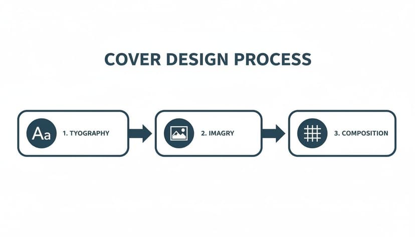
To achieve this, you must master three core pillars of cover design: powerful typography, evocative imagery, and balanced composition. When these elements work in harmony, they create a visual promise that grabs your ideal reader.
Typography Isn't Just a Font, It's a Feeling
Typography is far more than choosing a font; it's using text as a primary design element. The font style immediately sets the mood. A sharp, bold sans-serif might signal "techno-thriller," while an elegant script whispers "historical romance." The goal is for your title to feel like the story inside.
This is so critical in the online marketplace that many designers make titles occupy 70-80% of the cover's real estate. The text is the main visual. This is a direct response to the reality of online bookstores, where only covers that "stop the scroll" as thumbnails have a chance. A bold, type-led cover can significantly boost click-through rates because it prizes clarity and impact over complex, hard-to-read illustration.
Choosing Imagery That Sparks a Connection
The image on your cover is the hook. It needs to forge an immediate emotional connection and signal the genre without relying on tired clichés. Instead of the default silhouette of a man in a trench coat for a thriller, consider a fresher angle.
- Symbolic: Use a single, potent object instead of a literal scene. A cracked pocket watch for a time-travel story can be more intriguing than a full illustration.
- Atmospheric: Focus on mood and setting. A misty forest, a rain-slicked city street, or a sterile sci-fi corridor can set the tone instantly.
- Abstract: Use colors, textures, and shapes to create a feeling. This works well for literary fiction or psychological thrillers where the internal journey is the real story.
The key is to pick an image that piques curiosity, not one that explains the entire plot. You want the reader to pause and ask, "What's this about?"
Composition: Guiding the Reader's Eye
Composition is the arrangement of text and imagery to guide the reader’s eye. A well-composed cover has a clear visual hierarchy, ensuring the most important information—your title and author name—is seen first.
Professional designers use time-tested principles to create balance:
- The Rule of Thirds: Imagine your cover divided by a 3x3 grid. Placing key elements along those lines or at their intersections creates a more dynamic layout.
- Leading Lines: Use elements within your image—like a road or the angle of a building—to draw the eye toward your title.
- Contrast and Color: High contrast between text and background is non-negotiable for a thumbnail. A bold, genre-appropriate color palette makes your cover pop off the screen.
While creating a compelling cover can feel daunting, modern tools can help. You can explore options like using an AI tool to generate unique design concepts and experiment with layouts without needing a design background. This is a practical way to test different compositions and font styles to see what best captures your story's essence.
To dive deeper into the core elements of a winning design, check out our guide on what makes a good book cover.
Your Step-By-Step Book Design and Layout Workflow
Transforming a finished manuscript into a market-ready book can feel overwhelming. The secret is to break the process down into a clear, sequential workflow. By tackling each stage of your book design and layout in order, you can avoid costly mistakes and ensure every piece fits together perfectly. This is your roadmap from a text file to a polished book ready for Amazon KDP.
Step 1: Finalize Your Manuscript First
This is the single most important and most commonly skipped step. Before you think about trim sizes or cover art, your manuscript must be 100% complete. That means it has been through developmental edits, copy edits, and a final proofread.
Why is this rule unbreakable? Any change to the text after the interior is laid out can trigger a domino effect of formatting problems. Deleting a single paragraph can shift every subsequent page, creating awkward page breaks and orphaned lines that require a complete re-format. Lock down your text first.
Step 2: Choose Your Trim Size and Design The Interior
With your final manuscript ready, it’s time to build its home. Your first decision is the trim size—the physical height and width of your printed book. The best way to choose is to study top-selling books in your genre. Common sizes like 5.5" x 8.5" or 6" x 9" are industry standards for a reason.
Once your trim size is set, you or your designer can format the pages. This involves:
- Setting Margins: Ensure an adequate gutter (the inside margin) so words don’t get lost in the book’s spine.
- Selecting Typography: Choose a clean, readable serif font for your body text.
- Formatting Chapters: Create a consistent, professional look for chapter headings and paragraph indentations.
- Adding Front & Back Matter: Slot in your title page, copyright page, author bio, and other essential pages.
This stage is all about crafting an invisible, immersive reading experience.
Step 3: Create A Compelling Book Cover
You can work on the cover while the interior is being formatted. The cover has its own creative workflow, focused on blending typography, imagery, and composition to meet genre expectations.
This flowchart breaks down the core stages of crafting a cover that gets clicks.
A great cover is a deliberate fusion of smart font choices, powerful visuals, and a balanced layout. For instance, in genres like romance book covers, the typography itself carries a specific emotional weight, which is then paired with imagery that taps into a familiar trope.
This is a great point to experiment with an AI tool for cover creation. It allows you to rapidly generate and test different concepts, helping you find a direction that captures your story’s essence before committing to a final design.
Step 4: Conduct The Final Proofing and Review
Once your interior layout and cover are complete, you have a final book file. Now comes the last crucial step: ordering a physical proof copy from your KDP dashboard. Do not skip this step.
Reading your words on a screen is entirely different from holding a physical book. A printed proof will reveal formatting errors, typos, and awkward layouts that are nearly invisible in a digital file.
Go through the proof copy from cover to cover. Look for margin issues, weird spacing, and any typos that slipped through. This is your final chance to catch mistakes before they reach a paying reader. Once you approve the proof, you’re ready to publish with confidence.
Common Design Mistakes That Can Sabotage Your Book
 After months or years of work, a few simple design mistakes can stop your book from succeeding. Certain errors in your book design and layout are like warning signs, telling potential readers that the content might be as amateurish as the packaging. Understanding these pitfalls is your final quality check before you publish.
The Blurry Cover and Pixelated Images
Nothing signals "self-published afterthought" faster than a blurry, low-resolution cover. Your cover is the first thing readers see on Amazon, usually as a thumbnail. If it isn't crisp at that size, it will look even worse on the product page or in print.
This usually happens when the image file doesn't have enough pixels. For a KDP paperback, Amazon requires a file that is at least 300 DPI (dots per inch) to ensure a clean print. Anything less looks fuzzy and immediately erodes reader trust.
A low-resolution cover implies a low-effort book. It’s a visual cue that you might have cut corners on important things like editing.
Unreadable or Inappropriate Typography
Your typography is your book's visual voice. Choosing the wrong fonts is like telling your story while mumbling. Common mistakes include using a font that's too small, too decorative for body text, or one that clashes with the genre. All of these lead to reader fatigue.
For the interior, a classic, readable serif font is almost always a safe choice for print. For the cover, typography must be bold, high-contrast, and legible in a split second as a tiny thumbnail. If a reader has to squint to read your title, you've lost the sale. For some excellent examples of genre-specific typography, look at these professional thriller book covers.
Ignoring Genre Conventions
Every genre has its own visual language. Fantasy readers expect certain fonts and imagery, just as romance readers look for specific color palettes and photo styles. One of the biggest mistakes an author can make is designing a cover that ignores these unwritten rules.
A cover that looks out of place confuses your ideal readers. This doesn't mean your design can't be original, but it must signal its genre from a distance. A practical way to explore concepts is by using an AI tool for cover generation, which can produce ideas aligned with your genre's specific trends.
Interior Formatting Flaws
Even with a masterpiece cover, a poorly formatted interior can kill the reading experience. These flaws are often subtle but powerful enough to make a reader abandon your book.
- Improper Margins: Text crammed too close to the edge of the page or disappearing into the spine (the "gutter") is frustrating to read.
- Awkward Paragraphing: Using the Tab key for indents or adding extra line breaks between paragraphs in fiction creates an amateur look.
- Widows and Orphans: A "widow" is a single line from the end of a paragraph stranded at the top of a new page. An "orphan" is the first line of a paragraph left alone at the bottom of a page. Both disrupt reading flow.
This checklist can help you spot and fix these common issues.
Design Pitfall Prevention Checklist
| Common Mistake | Why It Hurts Your Book | How to Fix It |
|---|---|---|
| Blurry Cover Image | Signals low quality and lack of professionalism. | Export your cover file at a minimum of 300 DPI. For ebooks, use a high-resolution JPEG (at least 2560 pixels tall). |
| Illegible Title Font | If readers can't read it, they won't buy it. | Choose a font with high contrast against the background. Test its readability by shrinking it down to thumbnail size. |
| Genre-Mismatching Design | Confuses your target audience and attracts the wrong readers. | Research the top 20 bestsellers in your specific sub-genre. Note common colors, fonts, and imagery, and aim for a similar feel. |
| Bad Interior Margins | Makes the text physically difficult and frustrating to read. | Use a professional template or software like Vellum or Atticus that sets industry-standard margins automatically. Ensure your gutter margin is wide enough. |
| Widows & Orphans | Disrupts the flow of reading and looks unprofessional. | Manually adjust line breaks or paragraph settings in your formatting software to keep at least two lines together at the top or bottom of a page. |
| Inconsistent Spacing | Creates a visually jarring and confusing reader experience. | Use style settings instead of manual formatting (like hitting Enter twice). Ensure consistent spacing before/after chapter headings and scene breaks. |
Catching these problems before you publish ensures your book looks as compelling as the story you've worked so hard to tell.
Choosing The Right Tools For Your Book Design
You don’t need a massive budget or a design degree to produce a professional-looking book. The secret is matching the right tool to your needs, skills, and budget. For an indie author preparing a book for KDP, the software you choose will define your production workflow. The goal is to find a tool that gives you enough control without being overwhelming.
Professional-Grade Software
For authors with a design background or a willingness to learn, the industry standard is Adobe InDesign. It offers unparalleled control over every element of interior and cover design. However, this power comes with significant complexity and a subscription fee. It's the right choice for intricate layouts like cookbooks or the image-heavy pages you see in children's book layout examples, but is often overkill for a standard novel.
User-Friendly Alternatives
Most indie authors need tools that prioritize simplicity and efficiency.
- For Cover Design: A platform like Canva is a popular starting point for DIY cover creation. Its drag-and-drop interface and numerous templates make it easy to experiment with visual styles without technical expertise.
- For Interior Formatting: Software like Vellum (for Mac) or Atticus (for PC and Mac) are game-changers for interior formatting. These tools were built to turn a Word document into a perfectly formatted ebook and print-ready PDF in minutes, automatically handling everything from chapter headings to front matter.
The right software is about finding a balance between creative control and your available time. A simple tool that helps you publish a beautiful book is always better than a complex one that leaves you stuck.
The Rise of AI-Powered Tools
A modern solution gaining traction is using AI tools for cover creation. Instead of starting from a blank canvas, you can generate multiple high-quality, genre-specific concepts in seconds.
This allows you to test different visual directions—from minimalist typography to epic fantasy illustrations—without investing hours in manual design. It's an affordable and efficient way to arrive at a professional-looking cover that meets market expectations. To learn more about software options, see our breakdown in the article about the best book cover design software.
Answering Your Top Book Design Questions
When diving into book design and layout, several practical questions arise. Here are clear, straightforward answers to the most common queries from indie authors publishing on Amazon KDP.
How Much Should I Budget For Book Design and Layout?
Costs vary widely depending on your approach. Hiring a professional freelance designer for a complete package (cover and interior) can range from $500 to over $2,000. A professionally designed cover alone typically costs between $300 and $800.
For authors on a tight budget, modern tools offer a more affordable route. By pairing an AI cover generator with user-friendly formatting software like Vellum or Atticus, you can achieve professional results for under $100-$300. This path requires more of your own time and a willingness to learn the tools.
What Is The Difference Between An Ebook and Print Layout?
The simplest way to understand this is that print layouts are static. Once designed, the page sizes, margins, and page numbers are locked in place and never change.
Ebooks, however, use a reflowable layout. The text automatically rearranges itself to fit any screen size, orientation, or reader's font settings. This is why ebooks don’t have fixed page numbers and rely on a special format like EPUB to function correctly on devices like a Kindle.
Can I Design My Own Book Cover?
You can, but proceed with caution. Your cover is your most important marketing tool, and a design that looks amateurish will actively deter readers. It's a significant risk.
If you choose the DIY route, you must become a student of your genre. Spend hours studying the best-selling covers. Analyze trends in typography, color palettes, and imagery that readers in your niche expect.
Before publishing, get honest feedback from other authors. A good middle ground is to use tools that bridge the gap between DIY and professional design. An AI tool for covers, for instance, can generate professional-grade concepts that you can then customize without needing a graphic design degree.
What Are The Most Important Elements Of Interior Design?
For your book's interior, the most important goal is readability. Every design choice should serve that purpose. The most critical elements are:
- A clean, legible font: For fiction in print, a classic serif font is almost always the right choice, as it's what readers are accustomed to.
- Adequate line spacing: Don't cram your text. A line spacing setting between 1.15x and 1.5x provides sufficient white space.
- Consistent formatting: This is non-negotiable. Your margins, paragraph indents, and chapter headings must be uniform from the first page to the last.
Mastering these fundamentals creates an immersive reading experience that lets the reader forget about the design and fall completely into your story.
Ready to Create Your Own Book Cover?
Turn your story into a visual masterpiece. Fill in the details below to start generating professional covers instantly.