Amber Color Meaning in Book Cover Design
Discover the amber color meaning in book cover design. Learn its psychology, how it fits specific genres, and how to use it to attract readers and boost sales.
Posted by
Related reading
Master Dark Teal Hex Code for Stunning Covers
Find the official dark teal hex code (#014D4E) for book covers. Learn color psychology, palettes, and KDP print tips to perfect your design.
Your Guide to the Burgundy Color Code for Book Covers
Discover how to use the burgundy color code for your book cover. Get HEX, RGB, and CMYK values to create a cover that sells on Amazon KDP.
The Cobalt Blue Color Code: A Guide for Book Cover Design
Discover the exact cobalt blue color code (Hex, RGB, CMYK) and learn how to use it for book covers that stand out on Amazon KDP and beyond.
Ready to design your cover?
Use our AI book cover generator to create tailored book cover concepts in minutes.


What's the first thing a reader feels when they see an amber book cover? Before we dive deep, let's clarify one thing. For an author publishing on platforms like Amazon KDP, amber is more than just a color—it’s a powerful tool for signaling genre and emotion on a crowded digital shelf.
It’s the perfect middle ground between the cheerfulness of yellow and the energy of orange. This unique blend creates an immediate sense of warmth, wisdom, and invitation. When used correctly, it tells a potential reader exactly what kind of journey they're in for.
What Does the Color Amber Truly Mean for a Book Cover

Amber doesn’t just catch a reader's eye; it hints at a story brimming with energy, ancient history, or profound enlightenment. Its deep connection to fossilized tree resin—a natural substance that literally preserves pieces of the past—gives it a weight and depth few other colors can match.
Choosing amber can make your cover feel both timeless and thrillingly alive. You're promising a rewarding experience before the reader even clicks "Buy Now." For authors on Amazon KDP, understanding this emotional shortcut is non-negotiable. After all, your cover is your single most important piece of marketing collateral.
Amber Color at a Glance
To make it simple, here’s a quick breakdown of what amber communicates to your readers at a single glance.
| Attribute | Meaning & Symbolism |
|---|---|
| Primary Emotion | Warmth, Comfort, Security |
| Intellectual Cue | Wisdom, Knowledge, History |
| Energy Level | Dynamic, Positive, Energetic |
| Core Symbolism | Preservation, Timelessness, Value |
| Negative Traits | Caution (when used like traffic lights), Sickness (if too yellow-green) |
This table serves as a helpful starting point, but the real impact comes from applying these concepts to your specific genre and story.
Communicating Warmth and Wisdom
Amber's primary function is to create a feeling of warmth. Think of a crackling fireplace, a golden-hour sunset, or a jar of rich, aged honey. This warmth immediately translates into comfort, safety, and a sense of approachability. A cover with strong amber elements tells a reader that the story inside is welcoming, not intimidating. It’s an open invitation.
But amber isn’t just about coziness. It carries a strong sense of wisdom and age. Because it's named after a substance that preserves ancient life, the color itself implies history and knowledge. This makes it a fantastic choice for historical fiction, epic sagas, or non-fiction books focused on sharing timeless insights. For example, using amber on a design for our /fantasy-book-covers page could instantly signal a story rooted in ancient lore or long-forgotten magic.
A Strategic Choice for Visibility
Let's be practical. The digital bookshelf is an endless scroll of tiny thumbnails. Your cover has seconds to stand out. Amber’s natural vibrancy, sitting perfectly between yellow and orange, helps it pop without being as aggressive or alarming as a pure, screaming red.
Research highlights color's massive impact, showing an 80% increase in brand recognition when using psychologically tuned palettes. In an Amazon thumbnail scroll, this can make a cover with amber accents far more noticeable. You can explore more about using color psychology for branding.
When you're finalizing your design, it's smart to test how different shades of amber look next to the current bestsellers in your genre. You can mock this up by creating different versions of your cover. Using an AI tool to generate these variations can show you exactly how your cover might perform in the wild, letting you tweak it for maximum impact before you hit publish.
The Psychology Behind Using Amber on Your Cover
Color is never just decoration. It’s a direct line to a reader's subconscious, and the psychology behind the amber color meaning makes it an incredibly powerful tool for any author. Amber’s specific wavelength triggers feelings of confidence, discovery, and warmth, making it a compelling choice for a book cover that needs to connect instantly.
Unlike aggressive reds that can signal danger or over-the-top passion, amber is an active color that invites readers in. It doesn't shout; it beckons. It has the warm, alluring glow of a campfire on a cool night or the gentle light of a perfect sunset—that's the comforting, engaging feeling amber brings to your design. This psychological pull is a huge advantage on a crowded digital bookshelf, where your cover is a tiny thumbnail fighting for a click.
Evoking Curiosity and Optimism
Amber has a unique knack for sparking curiosity. Its deep ties to ancient resin and preserved history suggest that there’s something valuable to be uncovered within the book's pages. This makes it a perfect fit for authors who want to signal a gateway to an exciting adventure, an enlightening journey, or a story rich with historical secrets.
This color taps into some of our most fundamental human motivations:
- Discovery: Amber’s link to fossils and hidden artifacts makes it a natural for stories about exploration—whether in a fantasy world or through dusty historical archives.
- Optimism: Its bright, golden energy radiates positivity and hope. This is ideal for self-help, motivational non-fiction, or any uplifting fictional tale.
- Security: The inherent warmth of amber creates a sense of safety and comfort, reassuring the reader that they're in for a rewarding, not stressful, experience.
By understanding these emotional triggers, you can use amber to shape a reader's expectations long before they even get to your blurb.
A Signal of Energy and Approachability
Amber is energetic without being pushy. It finds that perfect sweet spot between the high-octane punch of orange and the sunny, cheerful accessibility of yellow. For an author, this balance is critical when you want to convey excitement but still feel trustworthy and inviting.
It means you can promise an energetic plot or life-changing advice without the risk of appearing too intense or frivolous. Amber suggests a story that is both exciting and substantive.
You can learn more about how different colors build a strong author brand in our complete guide on color psychology for effective branding at beyourcover.com.
As you design your cover, think about how different shades of amber can tell your story. A bright, golden amber might suit a lighthearted adventure novel, while a deeper, burnt amber could signal a complex historical saga. Playing with these variations is key to finding the exact shade that connects with your target audience.
Matching Amber to Your Book Genre
Choosing a cover color isn't just about what looks good; it's a strategic marketing move. The power of amber isn't a silver bullet for every book.
As an indie author, your job is to match amber’s unique psychological fingerprint to your specific genre to hook the right readers. Its natural warmth and historic vibe make it a fantastic tool, but you have to know how and when to use it. When used correctly, it’s a visual shortcut, telling a reader scrolling through an endless sea of thumbnails exactly what kind of story you’re promising.
Where Amber Shines Brightest
Some genres are a perfect match for amber’s emotional palette. Using it here is like speaking a language your readers already understand, making your cover instantly click.
-
Fantasy: Amber is practically made for signaling ancient magic, a dragon’s golden treasure, or forgotten secrets written on aging parchment. A glowing amber amulet on one of our fantasy book covers is an immediate cue that your reader is in for an epic adventure steeped in myth.
-
Historical Fiction: This is amber’s home turf. The color effortlessly calls up feelings of heritage, nostalgia, and lost golden ages—the same aged warmth you'll find across vintage book cover examples. It can make a cover feel like a precious artifact, promising a story rich with historical texture and heart.
-
Adventure: For stories of daring exploration and discovery, amber screams energy, warmth, and the promise of a journey to sun-drenched, far-off lands. It’s the color of a quest with a rewarding payoff.
-
Motivational Non-Fiction: Amber’s blend of yellow’s optimism and orange’s energy makes it a go-to for self-help. It signals hope, new opportunities, and the warmth of positive change without being too loud or aggressive.
Strategic Use in Other Genres
While amber is a clear winner for the genres above, you have to be more calculated when using it elsewhere. A light touch can add intriguing layers, but going too far can send the wrong signal entirely.
For instance, a thriller might use a single, sharp point of amber light—a lone window in a dark house—to create a disturbing focal point of false safety. In contrast, a Young Adult adventure could drench the cover in amber to build an overwhelming sense of wonder and excitement. It all comes down to matching the amount of amber to the specific feeling you want your reader to have. While a bright, energetic amber fits YA, a cool and serene palette might serve another audience better; check out our guide on the aqua blue color for more ideas.
One analysis found that 62% of top-selling adventure novels on Amazon used warm amber-orange tones, which helped boost conversions by 35% over cooler palettes. You can find more insights on the hidden psychology of color on ineedabookcover.com.
At the end of the day, it's all about context. The best way forward is to experiment. Consider using an AI tool to generate a few different versions of your cover. Testing how a small splash of amber feels compared to a full amber background lets you make a smart, data-backed decision before you lock in your final design.
Practical Design Tips for Using Amber Effectively
Knowing what amber means is one thing. Actually using it on a book cover that sells? That’s a completely different game. It’s easy to get lost in the theory, but for your cover to work, it all comes down to contrast, readability, and the right emotional punch.
A gorgeous amber design is a total failure if your title disappears into the background. This is especially true when it’s shrunk down to a tiny thumbnail on an Amazon search page. You have to think of amber as a strategic tool, not just a pretty color.
Balancing Contrast and Readability
Your cover’s first and most important job is to be seen and understood in a split second. If you’re using amber as a background or for a large part of your design, text readability needs to be your top priority.
A classic, powerful pairing is amber with deep blues or blacks. The high contrast makes your title leap off the screen. It’s a go-to choice for genres like fantasy or thrillers, where you want to signal warmth and magic (amber) but also mystery and danger (dark tones).
For a completely different feel, try pairing amber with earthy browns and deep greens. This creates a natural, historical vibe that works beautifully for epic sagas or period adventures.
A critical test for any cover is the "thumbnail test." Shrink your design down to the size of a postage stamp—about how it will look on a digital storefront. Is the title still readable? Do the colors turn to mud? If so, you have a readability problem that will absolutely kill your clicks and sales.
To really nail this for all your readers, it's worth checking out our guide on creating accessible color palettes for book covers.
Choosing the Right Shade and Combination
Not all ambers are created equal. The specific shade you pick can completely change the mood of your cover. A bright, golden amber like #FFBF00 feels energetic and optimistic, a perfect fit for a YA adventure or a hopeful self-help book.
On the other hand, a deeper, burnt amber around #D4A017 feels more serious, weighty, and historical. This is the shade you'd lean toward for literary fiction or a historical drama.
This decision tree gives you a clear path for how to think about applying amber to your specific genre to get the most impact.
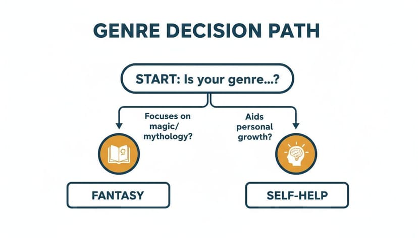
As you can see, whether your story is rooted in magic or personal growth directly influences how amber can be used to meet reader expectations.
To help you visualize these combinations, we’ve put together a quick-reference table of color pairings that work well with amber.
Effective Amber Color Pairings for Book Covers
This table highlights some effective complementary and contrasting palettes to pair with amber, helping you create maximum visual impact for different genres.
| Paired Color | Best For Genres | Psychological Effect |
|---|---|---|
| Deep Navy or Black | Fantasy, Thriller, Sci-Fi | High contrast, mystery, drama, seriousness |
| Earthy Browns & Greens | Historical Fiction, Adventure | Natural, grounded, historical, organic |
| Cream or Off-White | Non-Fiction, Literary, Memoir | Warm, sophisticated, gentle, approachable |
| Deep Red or Burgundy | Historical Romance, Epic Fantasy | Passionate, regal, luxurious, intense |
| Teal or Turquoise | Self-Help, Travel, YA Adventure | Vibrant, energetic, optimistic, modern |
Choosing the right partner for amber is just as important as choosing amber itself. Use this table as a starting point to make sure your color palette is sending the right signals to your ideal reader.
A great way to test these ideas without committing is to play around with an AI cover generator. Simply describe your book and ask for mockups using different amber pairings—for example, "a fantasy book cover with glowing amber runes on a dark blue background." This lets you see what works for your specific title before you lock in a final design.
Common Mistakes to Avoid When Designing with Amber
Knowing what amber means is one thing; using it effectively is another. Here are common pitfalls for authors to avoid.
- Choosing a Muddy Shade: A dull, brownish amber doesn't communicate "vibrant energy." It signals "stale and forgotten," which is the last thing you want your book to feel like, especially as a tiny thumbnail. Always opt for a clear, luminous shade.
- Overuse and Poor Contrast: A cover completely drenched in a single shade of amber looks flat and amateurish. Without contrast or other colors to create depth, the design falls apart. Think of amber like a powerful spice—use it strategically as a glowing focal point, a rich gradient, or a sharp accent to catch the eye.
- Mismatching Tone and Genre: This is the most critical error. Forcing amber onto a story where it doesn’t belong sends the wrong signals. A cheerful, golden-hour amber on a grimdark novel is a recipe for reader confusion and disappointment. Always ensure your color choice aligns with your story's emotional core.
A quick way to check your work is to use an AI tool to generate a few cover variations. Seeing different shades and layouts in context can instantly tell you which one best captures your book's unique feel before you commit.
Putting Your Knowledge into Action
You now understand what amber signifies—the warmth, the history, the hint of caution. The next step is to translate that knowledge into a cover that stops scrollers in their tracks.
This is where you move from abstract ideas to a tangible, market-ready design. The key is to be specific. Instead of making generic requests, you need to act as the art director, providing clear, meaning-driven instructions. This is especially effective when using an AI tool to brainstorm or finalize your cover.
From Concept to Cover Prompt
Vague requests lead to generic results. To get a cover that feels intentional, feed your design process (or AI tool) specific, meaningful instructions.
- For Fantasy: Try a prompt like, “a fantasy book cover with glowing amber magical runes on a dark, gritty background” to instantly signal ancient, forgotten power.
- For Self-Help: Go for something like, “a self-help cover with a hopeful amber gradient behind a strong, clean title” to create a sense of optimism and transformation.
- For Historical Fiction: You could ask for “a historical fiction design featuring a sepia photo tinted with a rich amber wash” to immediately evoke a feeling of preserved memory and nostalgia.
The amber color powerfully conveys preservation, mystery, and golden opportunity on book covers. 75% of motivational bestsellers from 2020-2025 used amber-gold accents, correlating to a 22% higher sales velocity on major platforms. You can discover more about color's impact on book design at rachaelritchey.com.
By providing this level of detail, you ensure your final cover isn't just a pretty picture. It becomes a finely tuned marketing tool, designed from the ground up to connect with the right readers.
Common Questions About Using Amber on Your Cover
Working with a color as rich as amber often brings up a few questions. Let's tackle some of the most common ones authors face when deciding how to use it for their own cover design.
Can Amber Really Work for a Thriller or Horror Cover?
Absolutely, but you have to use it subversively. While amber’s default setting is warmth and comfort, you can twist that expectation to create a deep sense of unease.
Think of a single amber light glowing from a window in an otherwise pitch-black, chilling scene. That spot of color immediately snags the reader's eye, but it doesn't feel safe. Instead, it feels like a trap, a dangerous lure, or a pocket of false hope in a world of darkness. The trick is to use it as a sharp, deliberate accent—not to drench the cover in a warm glow. That stark contrast makes the surrounding darkness feel even more menacing.
What’s the Best Amber Hex Code for Digital Displays?
There’s no single “best” hex code, because amber is really a whole family of colors. However, for grabbing attention on digital storefronts like Amazon KDP, you need something vibrant that won't get lost as a thumbnail. For that, #FFBF00 is a fantastic choice—it’s bright, clear, and holds its own.
If your story has a more historical, ancient, or mystical feel, a deeper, richer shade like #D4A017 will serve you better. It carries more weight and history. Your best bet is always to test a couple of shades against the bestsellers in your genre to see which one pops the most.
Using amber as a deliberate accent is not just a creative choice; it’s a psychological one. Its inherent warmth makes it a powerful tool for contrast. It tells the reader where to look, creating a focal point that can either promise safety or hint at a trap.
How Is Amber Different From Gold on a Book Cover?
They might seem similar, but amber and gold send completely different signals to a potential reader. It all comes down to the feeling they evoke.
- Gold feels manufactured and opulent. It screams luxury, high status, immense wealth, and royalty. It has a cold, metallic sheen that communicates prestige.
- Amber feels organic and accessible. It’s connected to the earth, preserved history, ancient energy, and the spirit of discovery. It feels natural and warm.
So, if your story is about a royal court, a billionaire’s life, or untouchable power, gold is your color. But if your book—even a fantasy book cover—is about ancient magic, a personal journey of growth, or a forgotten secret, amber will feel far more emotionally resonant. It feels like something earned, not just owned.
Ready to Create Your Own Book Cover?
Turn your story into a visual masterpiece. Fill in the details below to start generating professional covers instantly.