Book Cover Ideas: 200+ Real Examples by Genre
Steal the design thinking behind covers that sell. Below are 200+ real cover examples organized into numbered idea sections by genre, a two-minute primer on what makes a cover work, the design principles that hold across every shelf, and answers to the questions authors ask most.
What Makes a Book Cover Work
A book cover is a marketing asset with three jobs: signal your genre at a glance, promise a specific emotional experience, and stay legible at thumbnail size. Browsers give it a second or two — the ideas that survive that glance are the ones that sell. The fastest way to find yours isn't staring at a blank canvas;it's this:
- Read the shelf you'll sit on. Pull up the top 20–30 bestsellers in your exact subgenre — not just "thriller" but domestic thriller, not just "fantasy" but romantasy. The typography, palettes, and imagery that repeat across them are the conventions readers use to find their next book.
- Name the emotional promise. Fear, wonder, heat, hope, authority — your cover sells the feeling of the book, not the plot. Write the feeling down before you look at a single font.
- Pick one focal idea. An object, a figure, a scene, or the title itself. Covers fail when they try to show everything; every strong example on this page is built on a single dominant element.
- Test small before you commit. Shrink any idea to 100 pixels wide. If the title disappears or the image loses its shape, simplify — that's the size most readers will meet your cover at.
The numbered sections below apply this thinking genre by genre: a short read on which ideas are working right now, with real examples generated for each shelf. Click through to any genre'sfull gallery for deeper comps and prompts tuned to that audience.
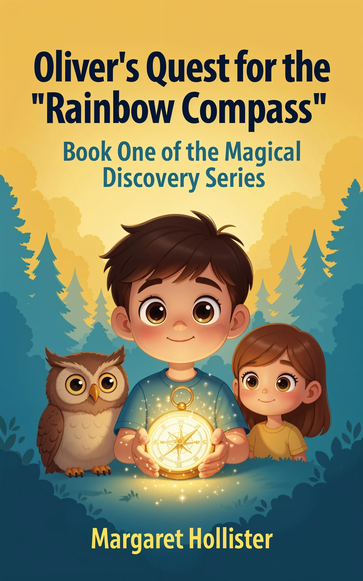
Children's cover ideas start with a character a kid would want to befriend: bright, friendly illustration, a face mid-action, and a hand-lettered title with bounce. Keep the palette saturated and the background simple so the hero pops at thumbnail size — parents shop small screens too.
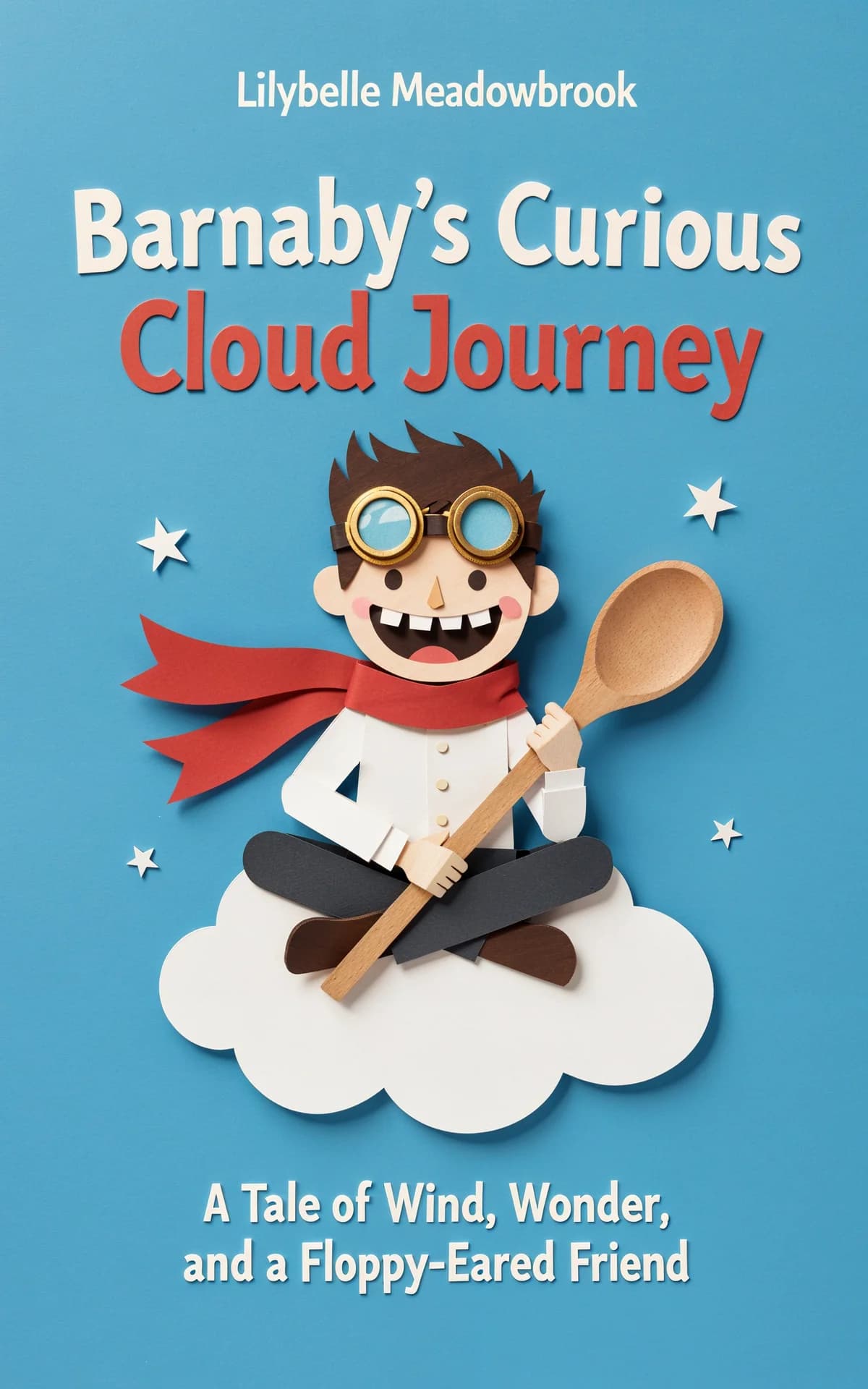
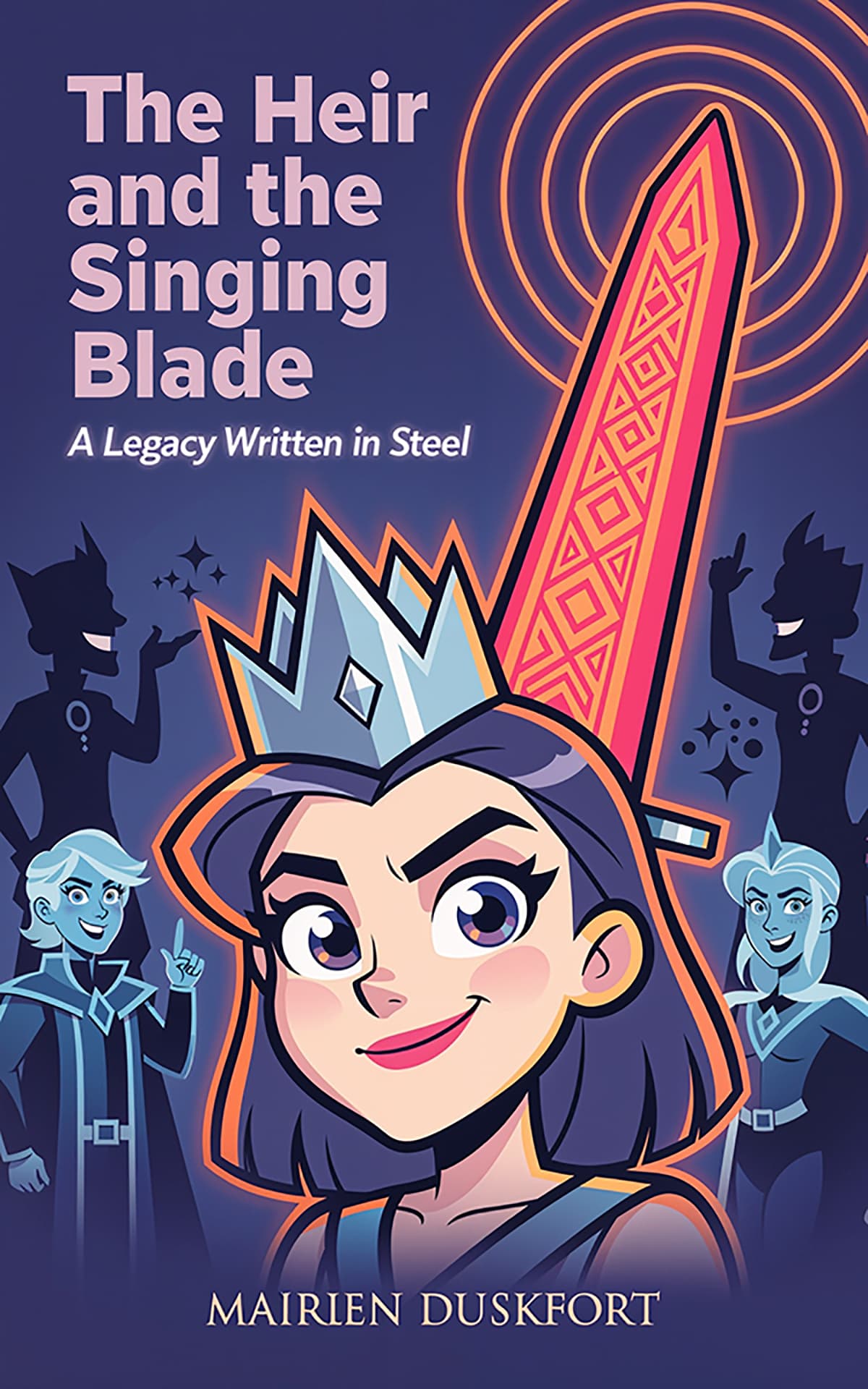
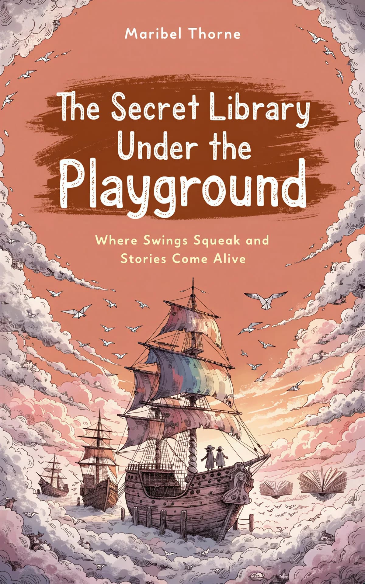
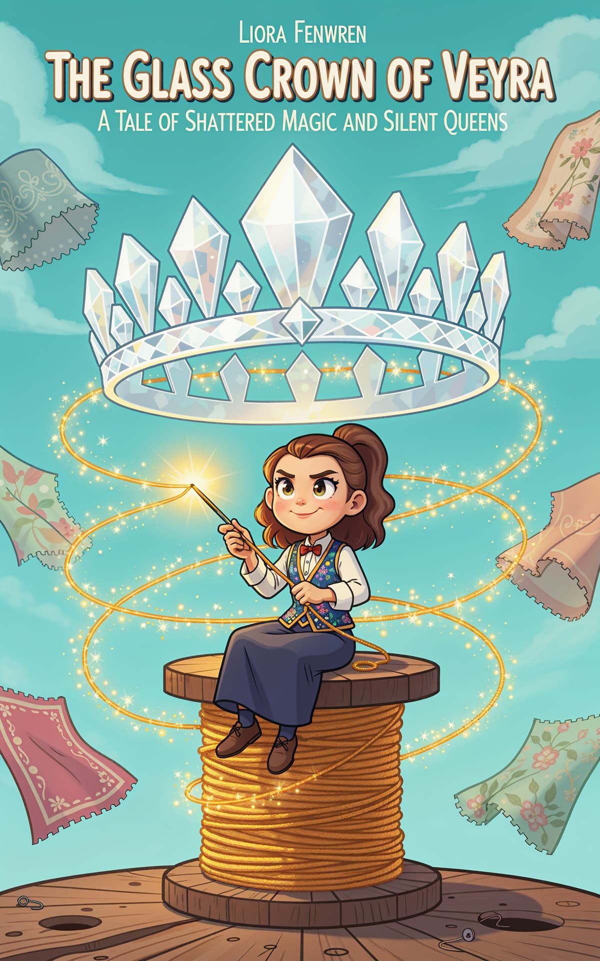
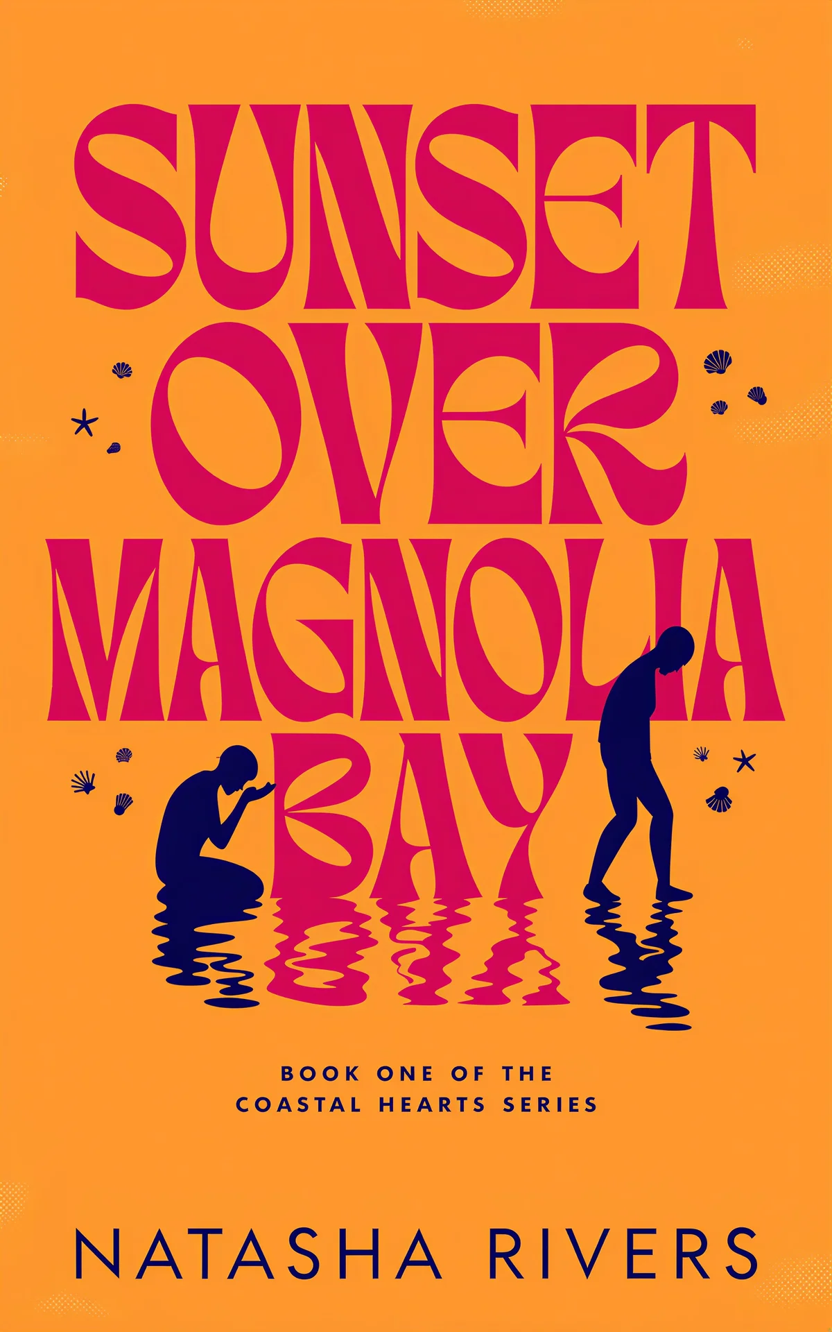
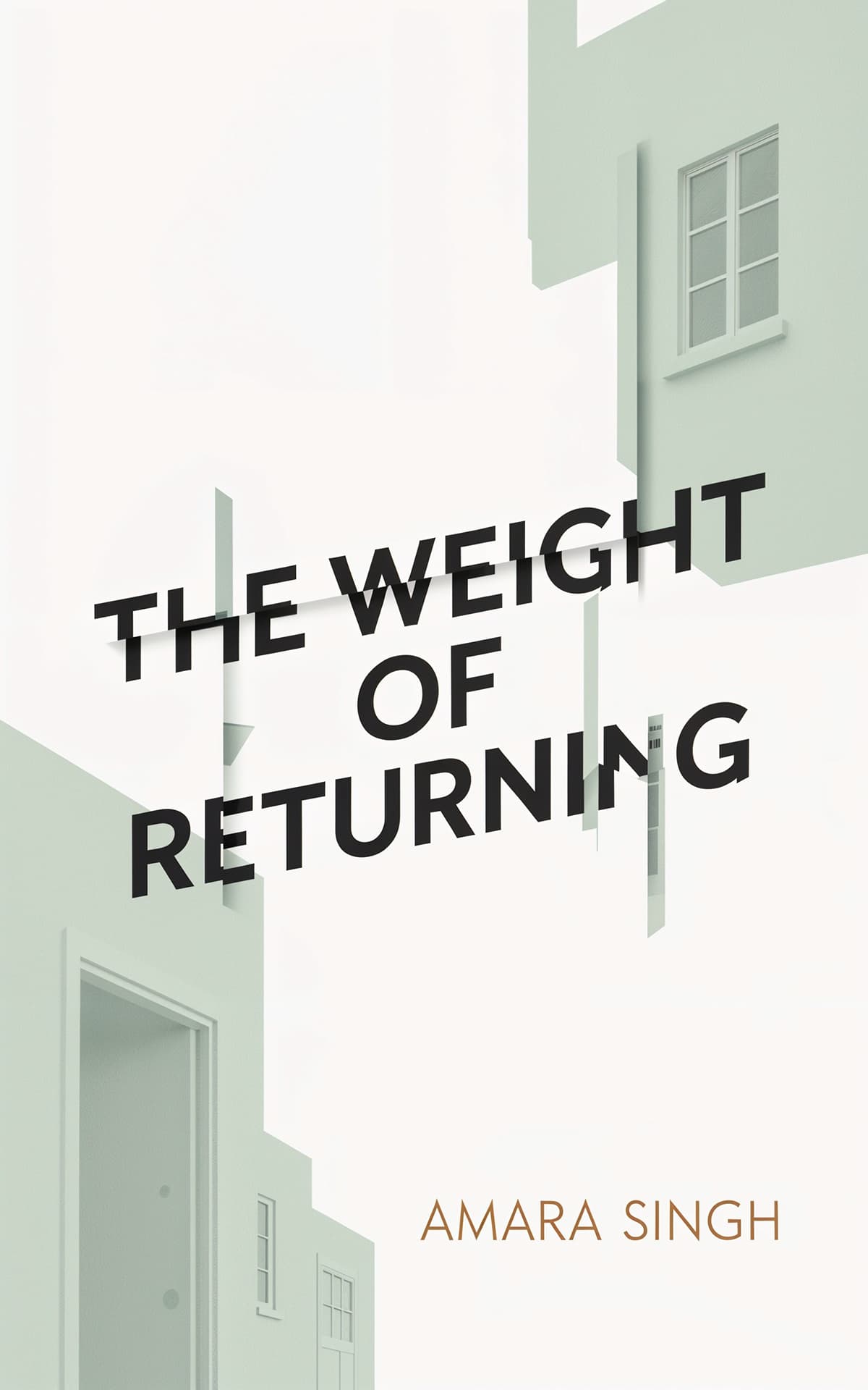
General and literary fiction rewards one conceptual image executed with wit: an everyday object made strange, a figure walking out of frame, bold color blocking with typographic play. Aim for intrigue over explanation — make the browser ask a question only the book answers.
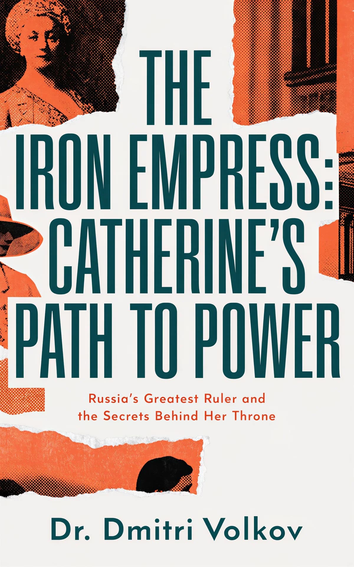
Biography ideas center the person: a strong portrait, photographic or painted, with era-appropriate typography and the subject's name given nearly title billing. Duotone treatments and archival textures signal seriousness, while a bold color field can modernize a historical face.


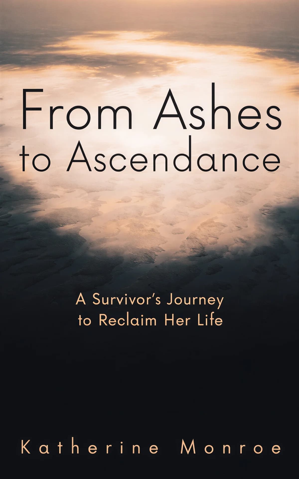
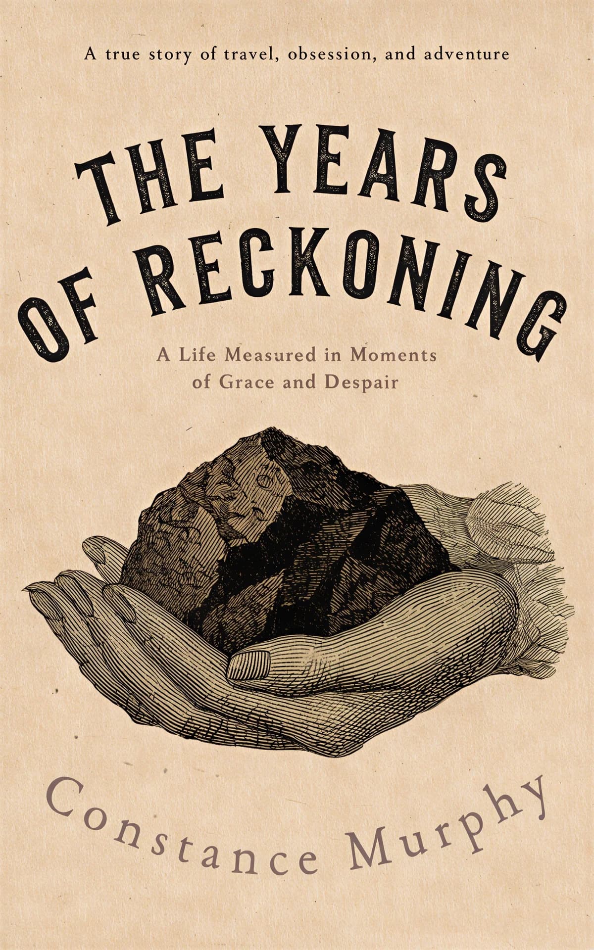
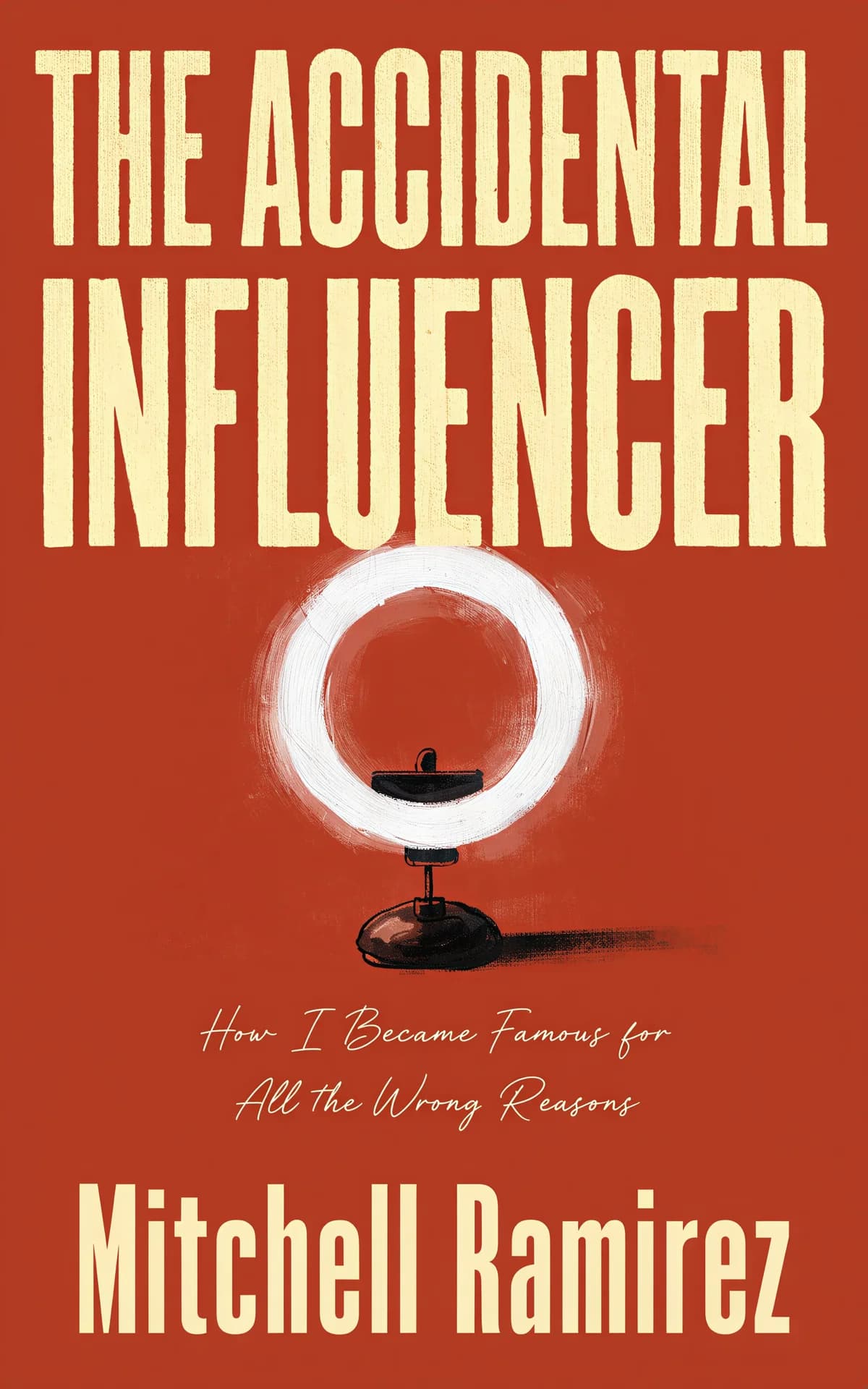
Memoir covers work best built around one true artifact: a photograph, a place, or an object that carries the story — a suitcase, a dress, a kitchen table. Understated type and honest imagery beat drama; the idea is intimacy, not spectacle.

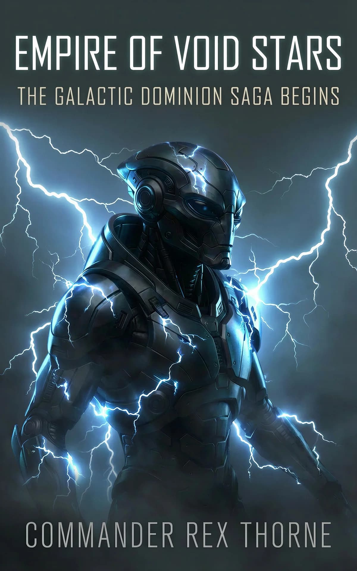
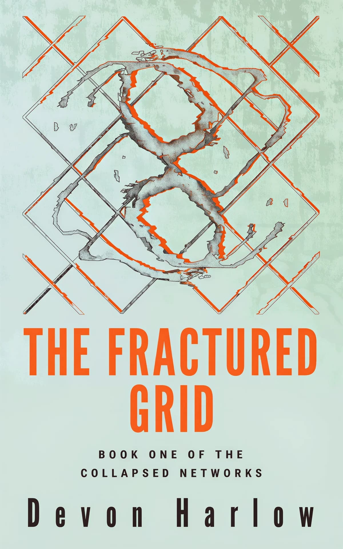
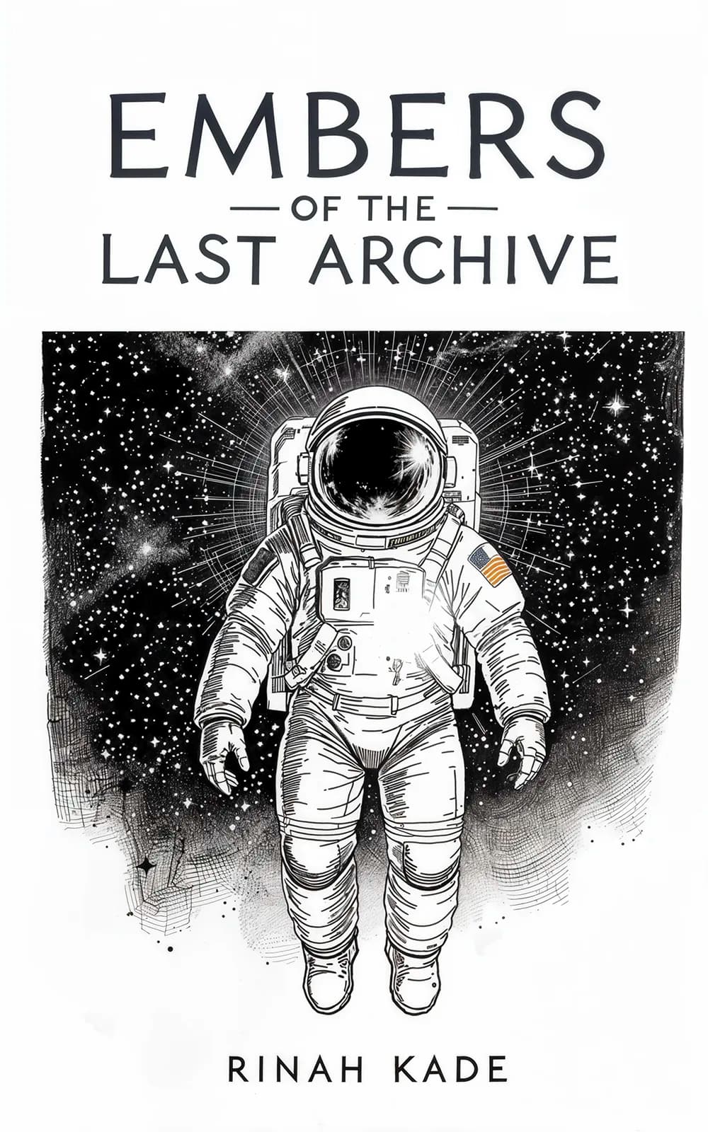
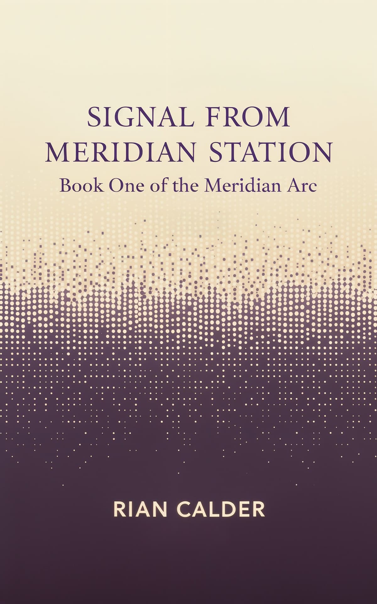
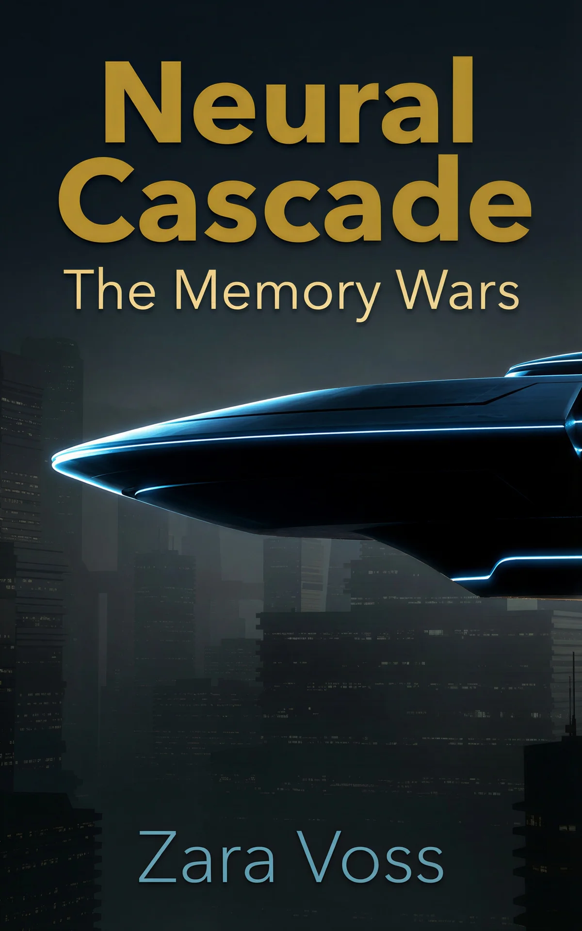
Sci-fi ideas cluster around geometry and light: neon gradients, starfields, monoliths, a silhouetted figure against a megastructure. Wide-tracked geometric sans-serif titles do the genre signaling, and retro-futurist palettes — chrome, sunset orange, grid lines — are a strong way to stand out right now.
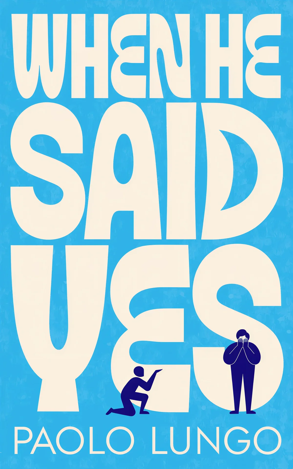
Romance ideas run from bright illustrated meet-cutes to moody photographic embraces — decide the heat level first, then match the art style to it. Flat vector art with hand-lettered script signals rom-com, soft-focus couples in warm light signal contemporary heat, and serif type over florals signals small-town sweet.

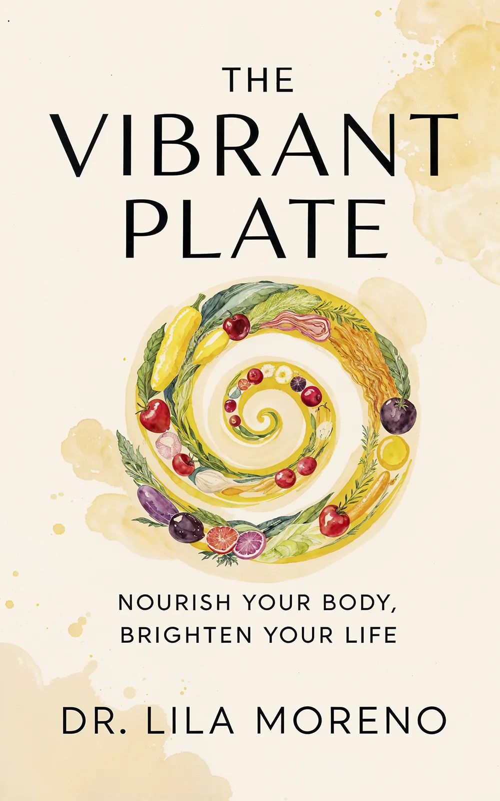
Health and fitness ideas split between energy and calm: dynamic figure photography with bold condensed type for training books, or clean fields, fresh greens, and airy sans-serifs for nutrition and wellness. Either way, one clear promise in the title and zero clutter.




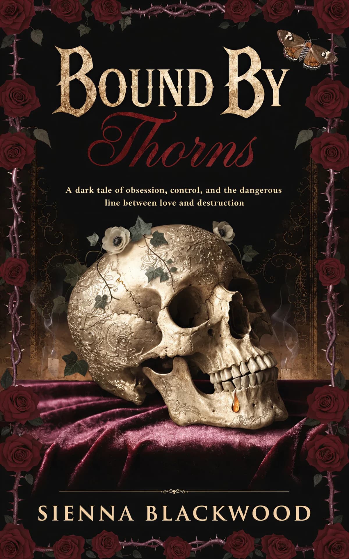
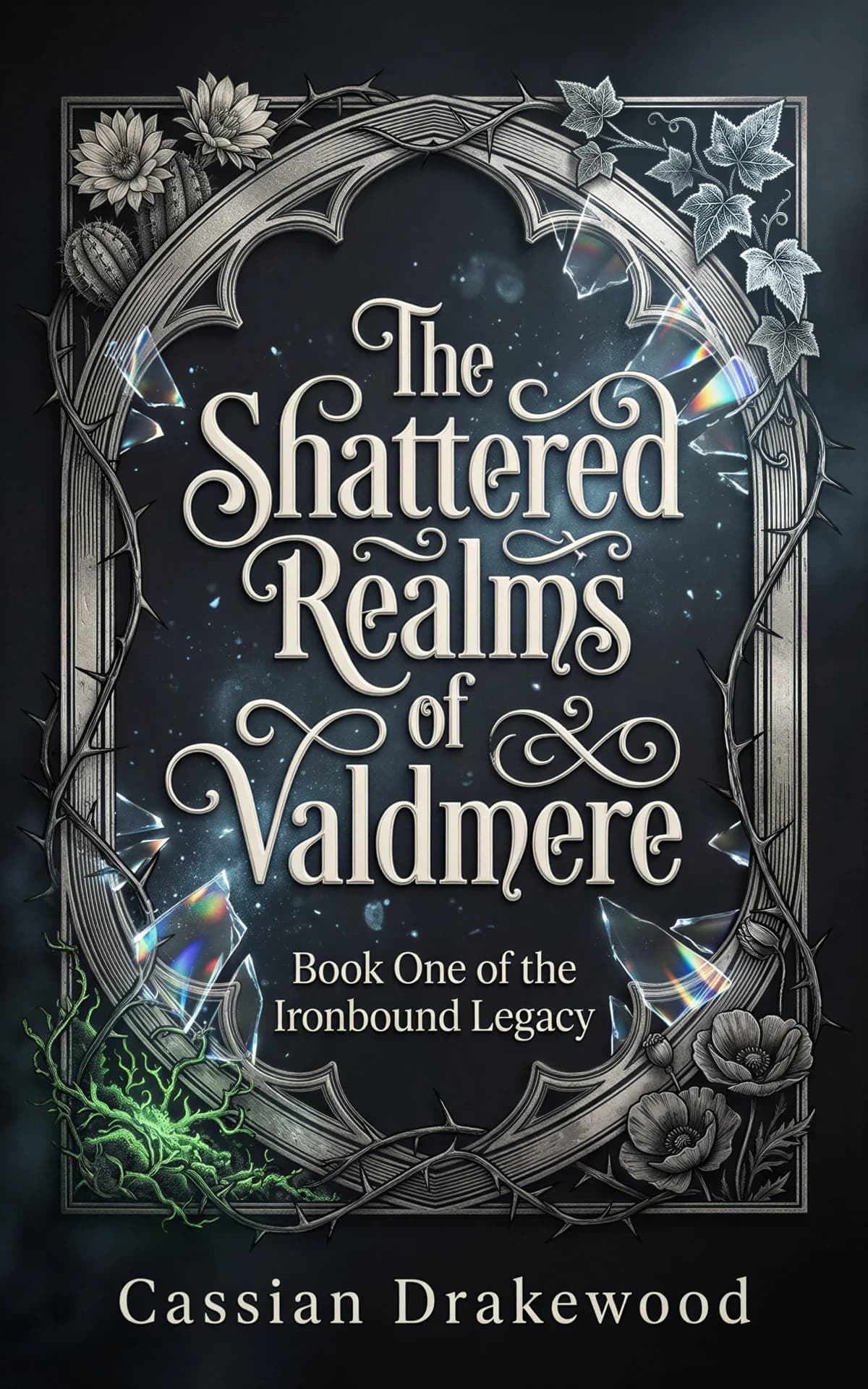
Dark romance pairs gothic ornament with obsession cues: black backgrounds, one saturated accent like crimson or violet, thorned florals, snakes, daggers, and a delicate serif title. The idea is elegance with a threat in it — beautiful objects that look like they could cut.
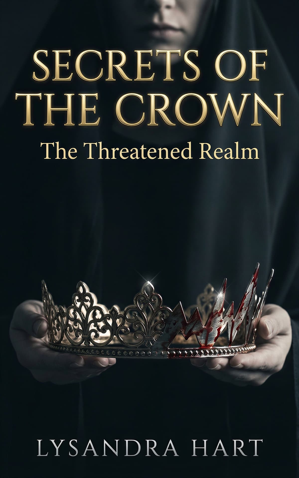
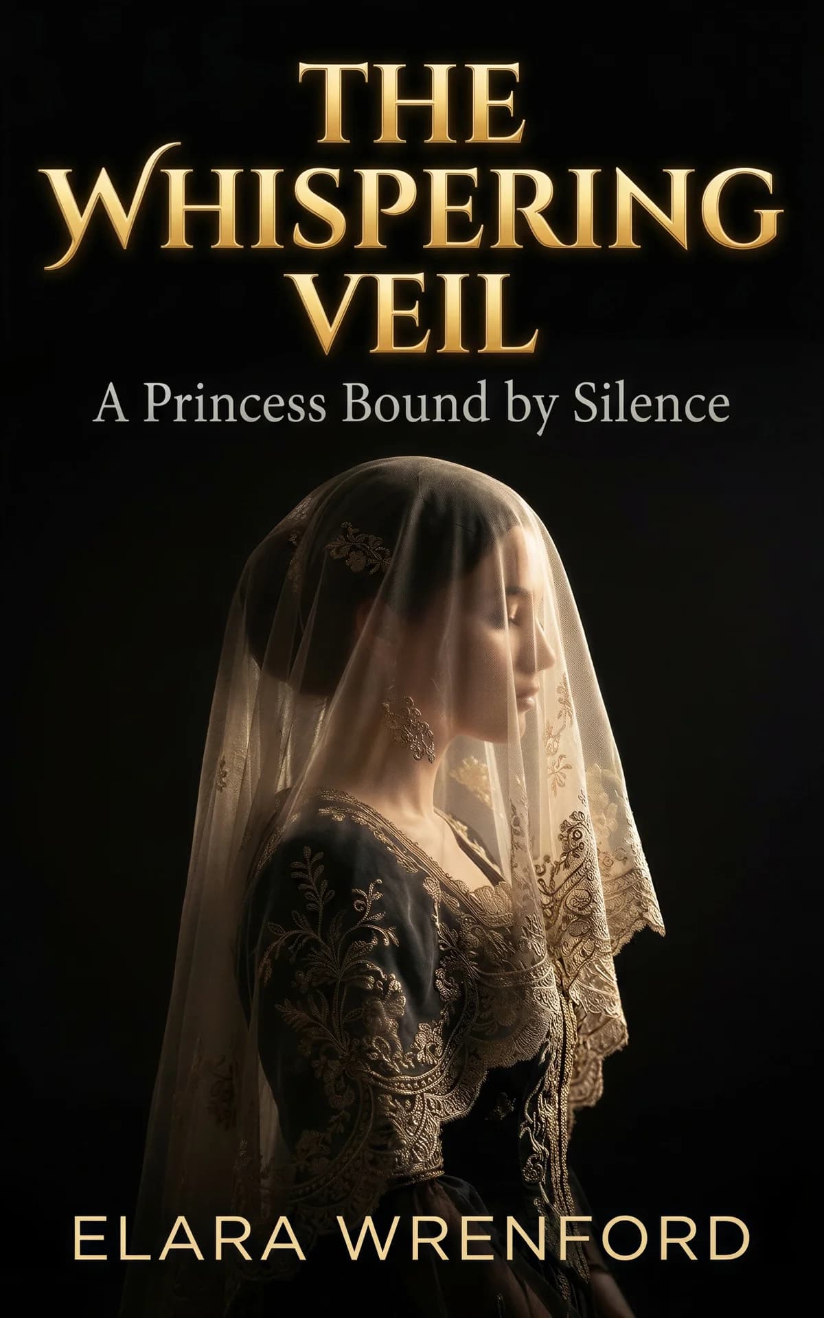
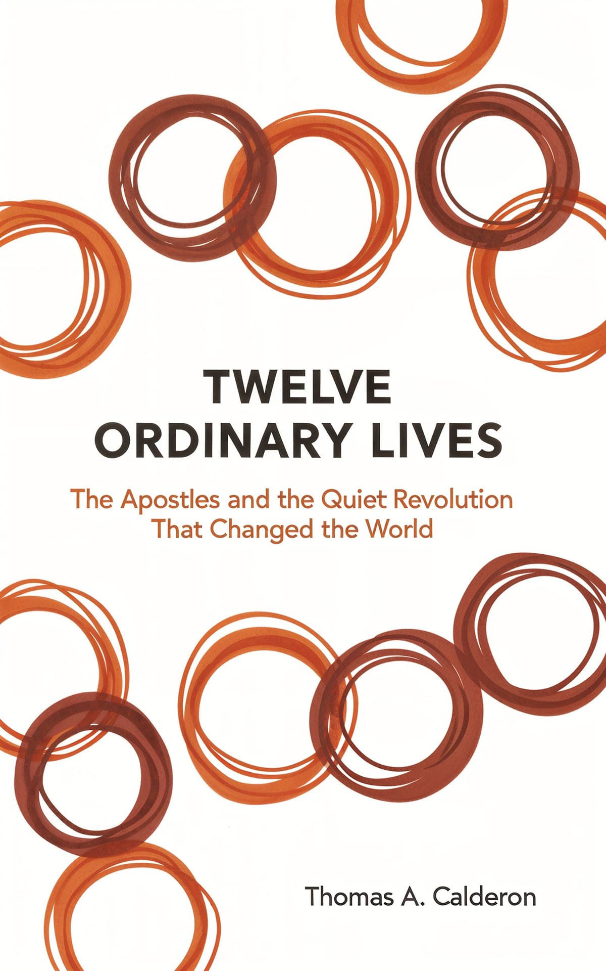
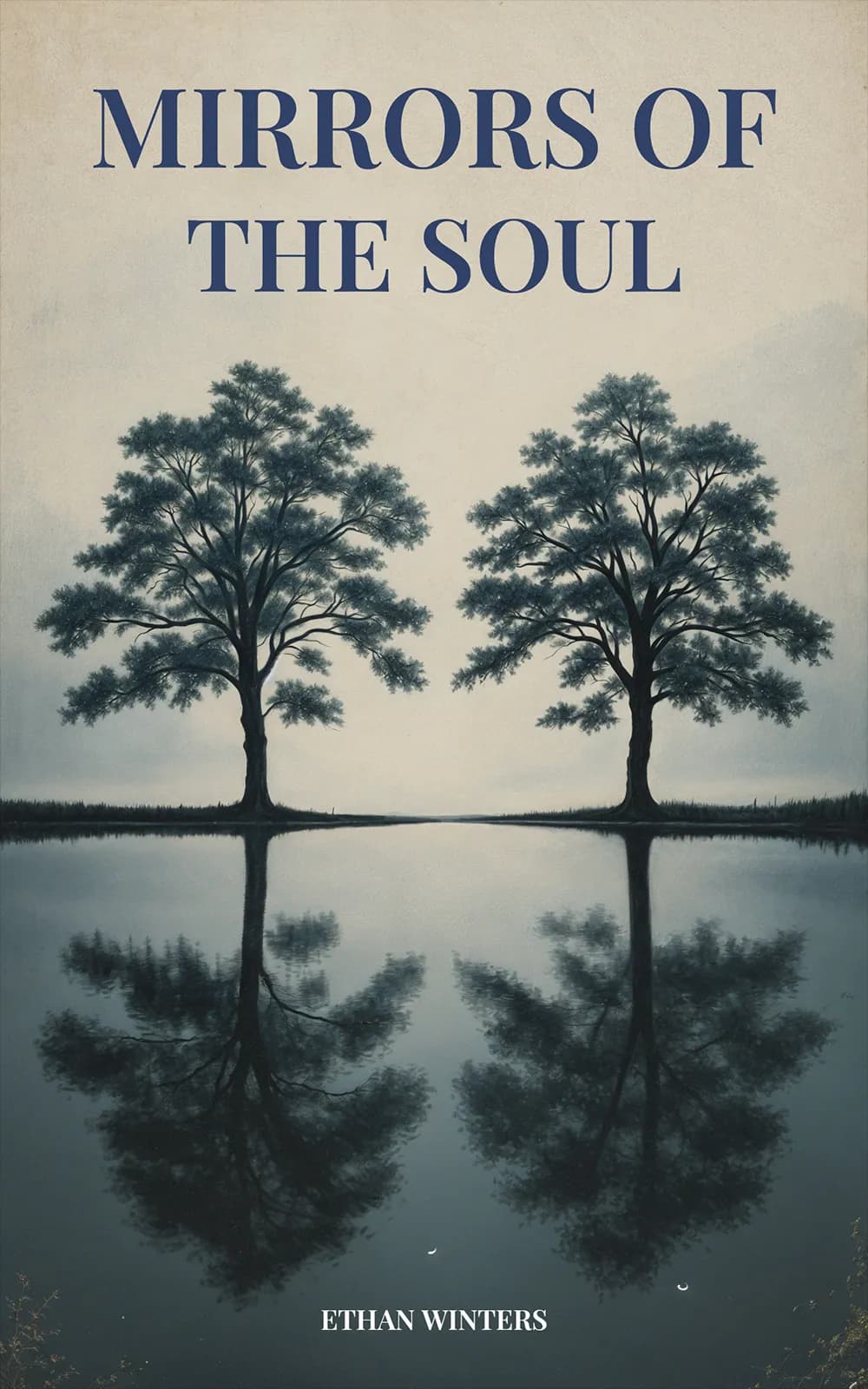
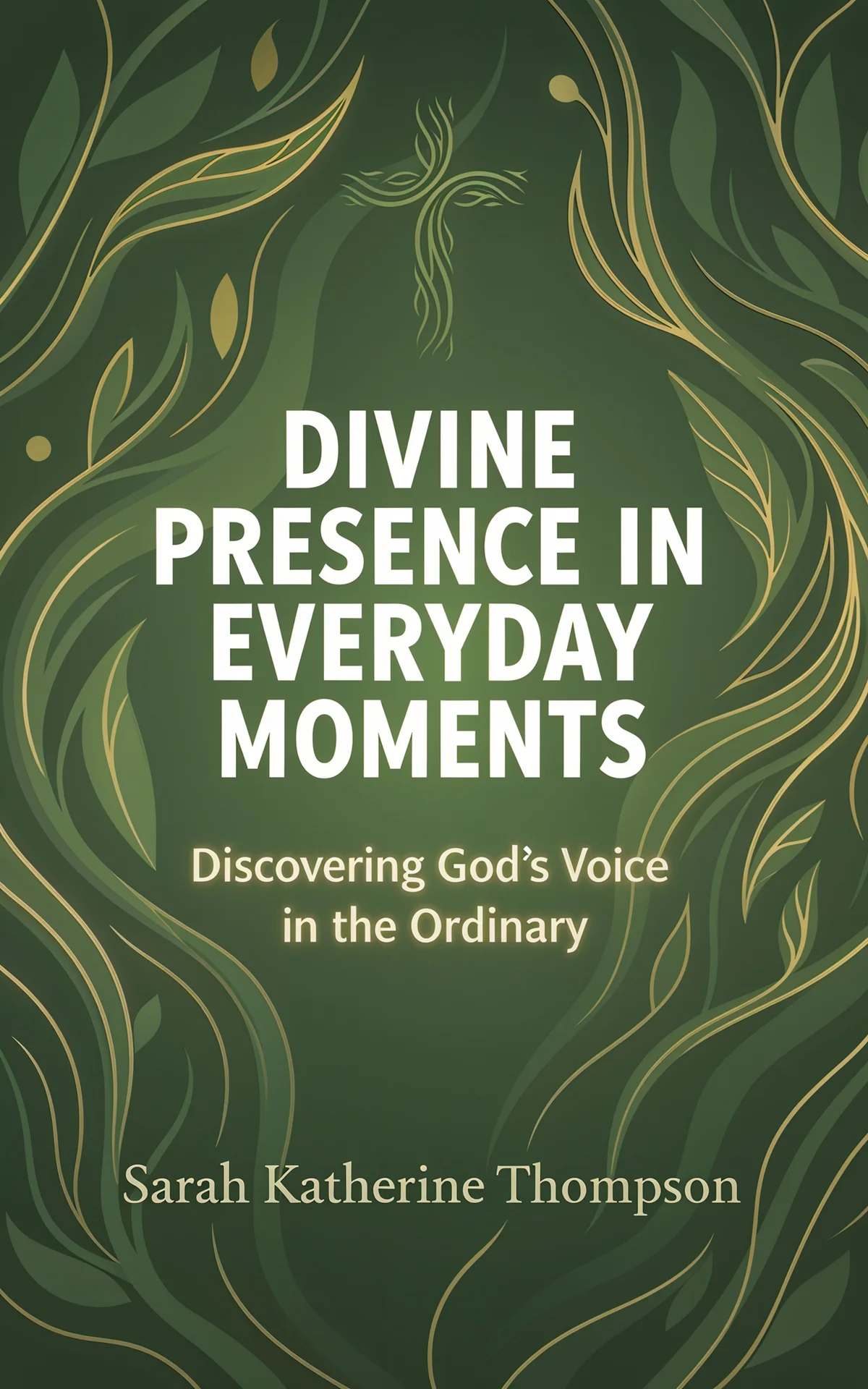
Spiritual covers trade in light and symbol: rays through clouds, a dove, a lotus, a candle flame, an engraved cross — rendered quietly on a serene field. Classic serif titles with generous spacing read as trustworthy, and gold-foil-style accents add reverence without kitsch.


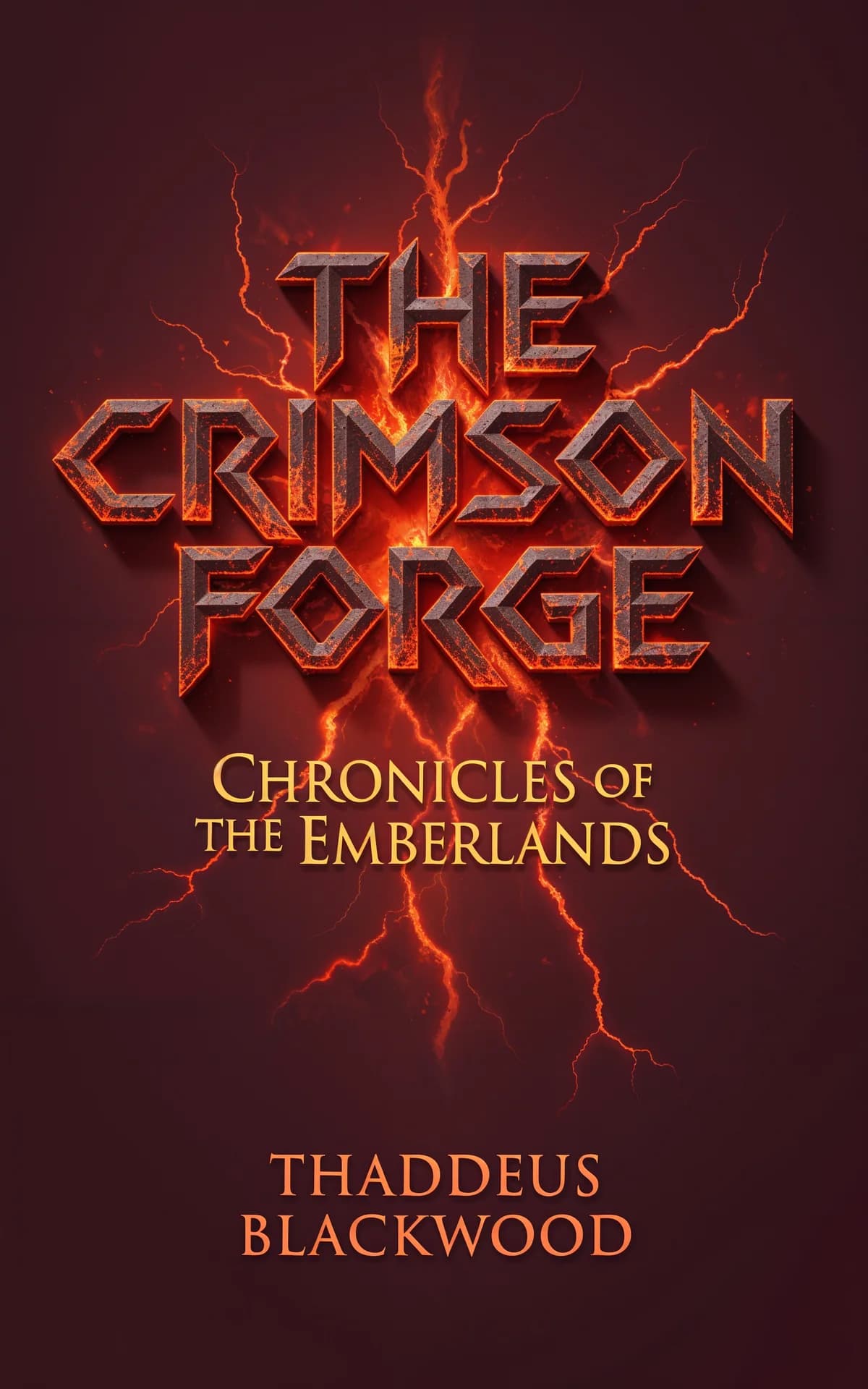
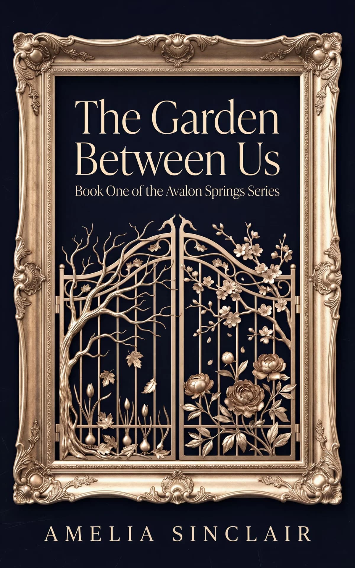
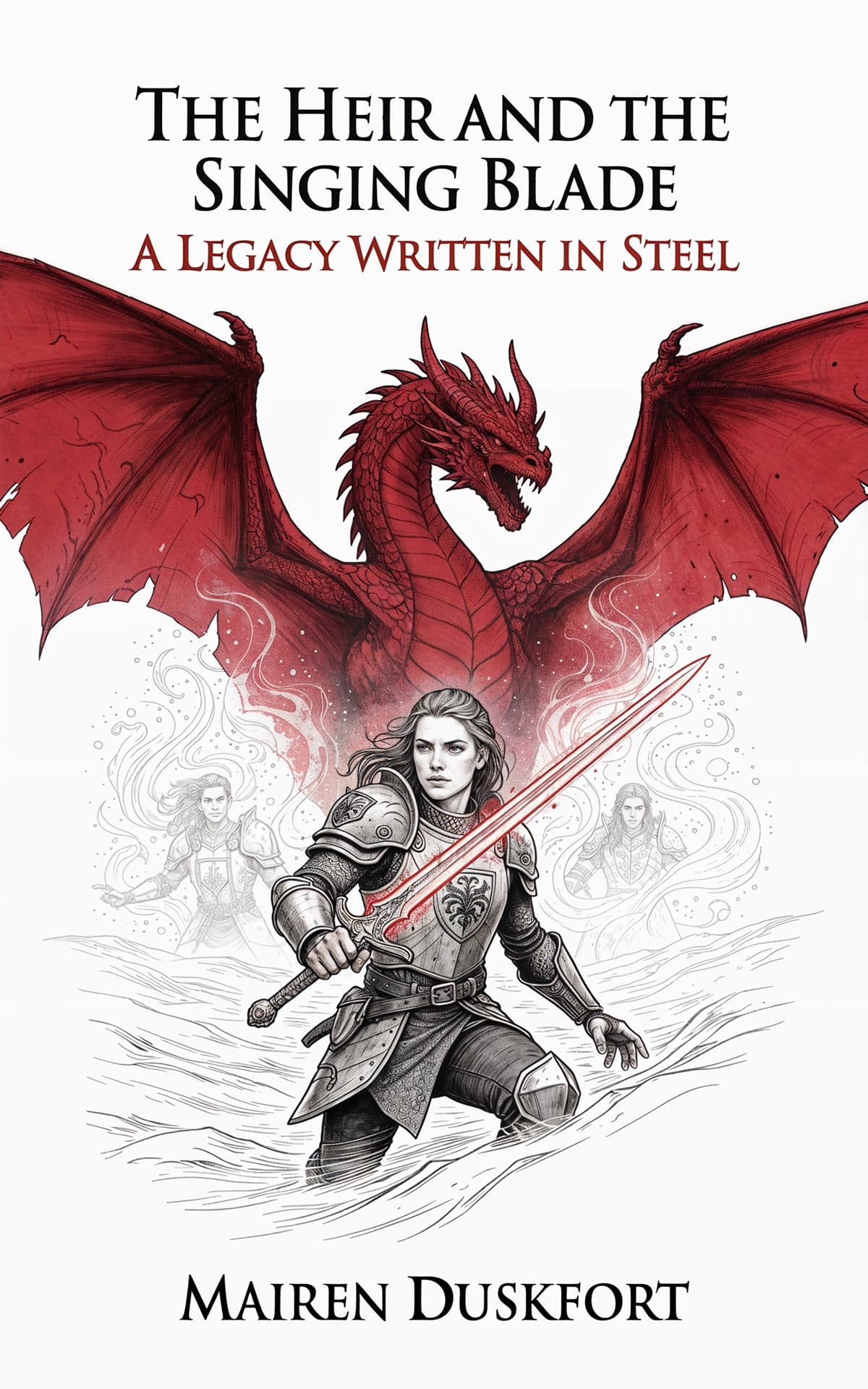
Fantasy covers sell scale and magic. Ideas that keep working: a single glowing artifact — sword, crown, sigil — on a dark field, ornate serif or blackletter titles inside border ornament, or a painterly landscape that dwarfs a lone figure. Epic fantasy leans metallic texture and symmetry; romantasy leans botanical frames and jewel tones.
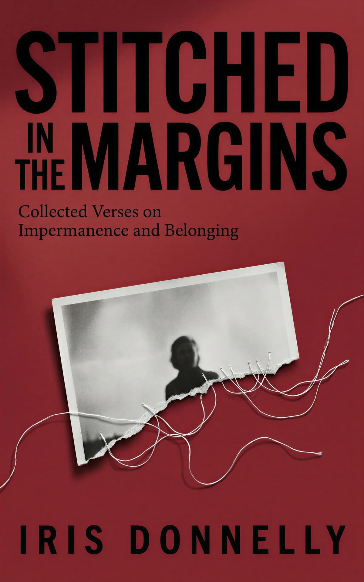
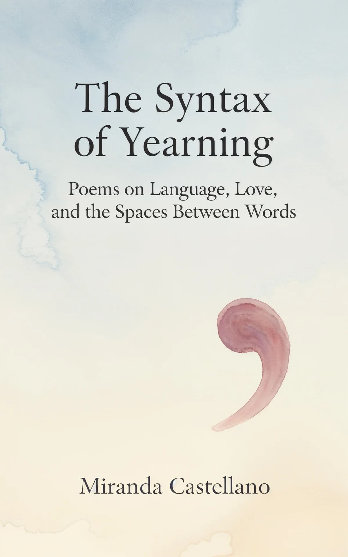
Poetry covers can take risks novels can't: abstract art, botanical line work, collage, expressive brush texture. Keep the type small, elegant, and off-center — the idea is an art object that promises the collection's mood rather than its subject.


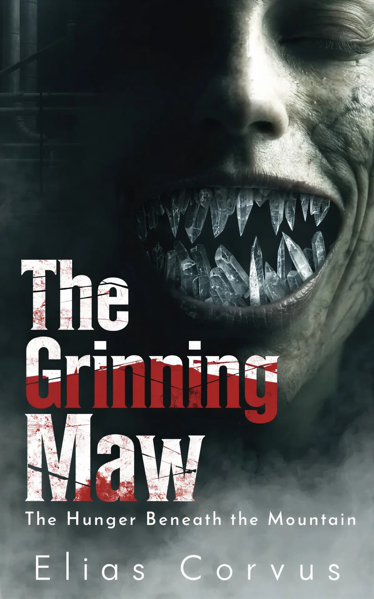
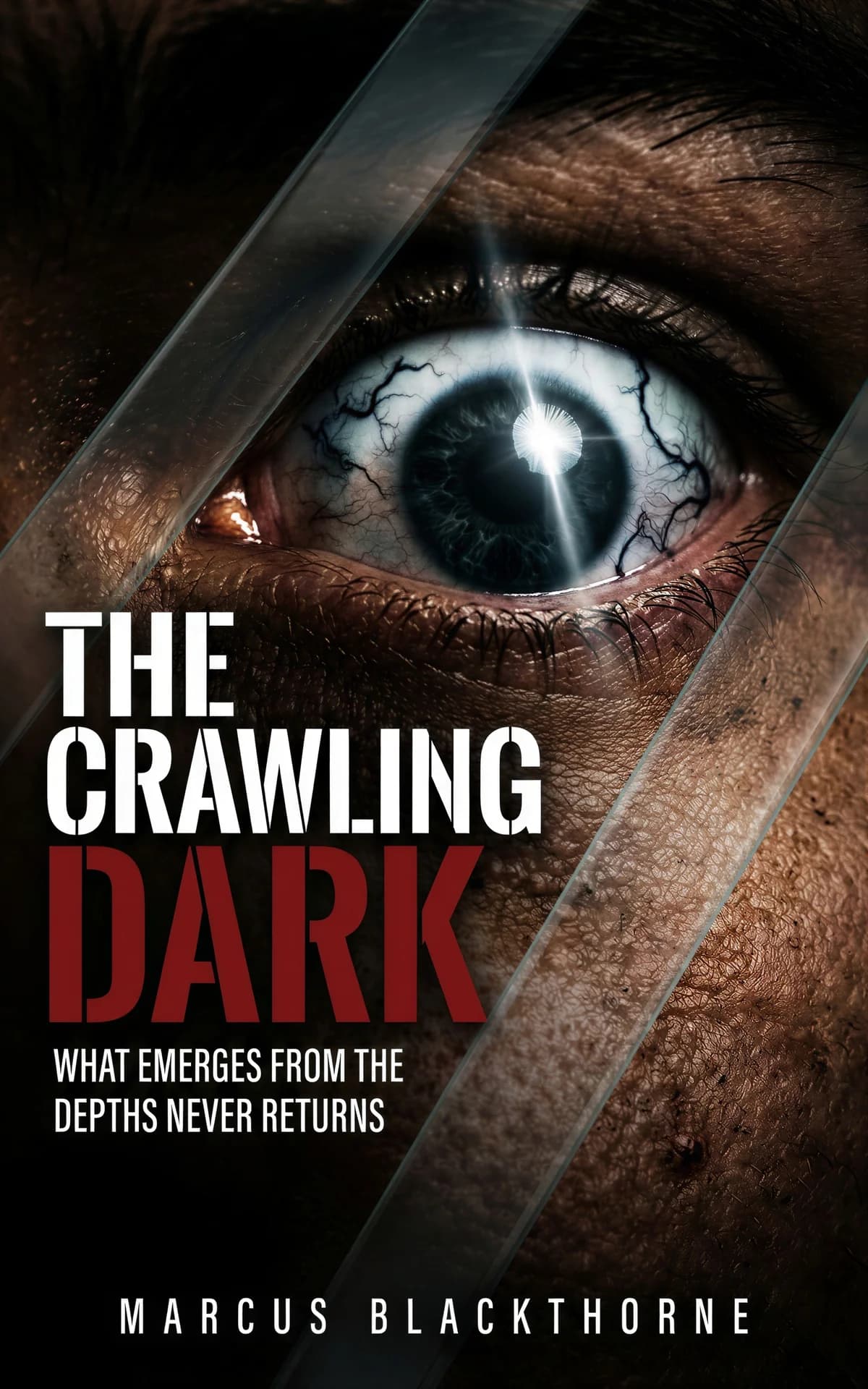
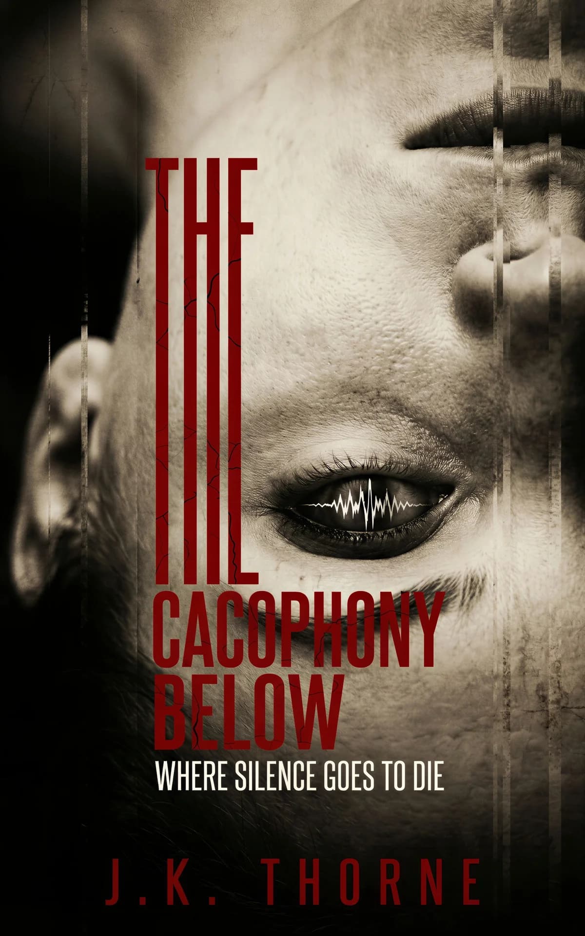
Horror sells dread through restraint: one unsettling image isolated in negative space — a doll, a doorway, antlers, a stain — usually on black or bone white. Distressed serif or scratchy hand-lettering adds wrongness, and a single red element gives the eye nowhere safe to land.
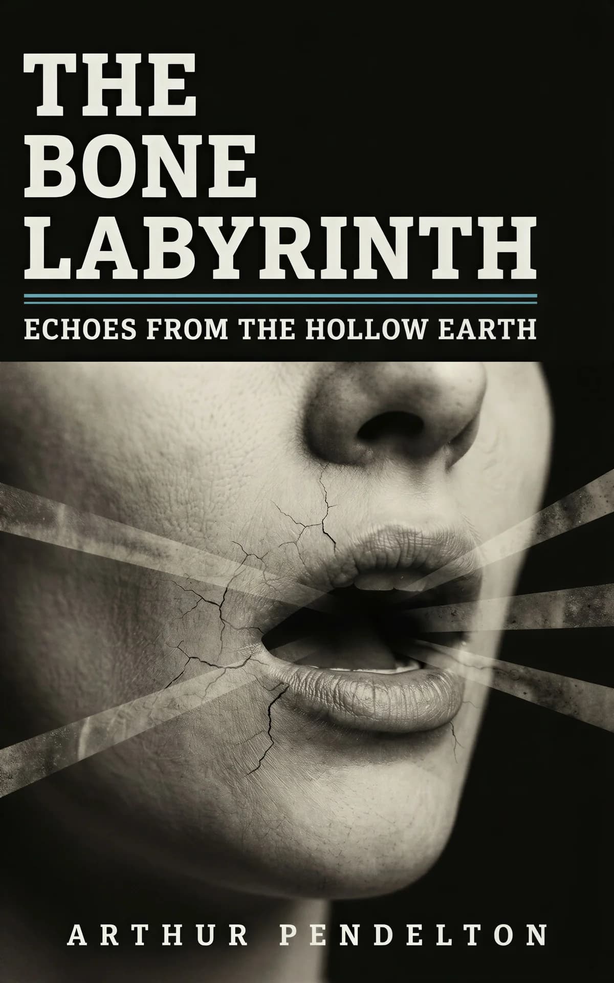
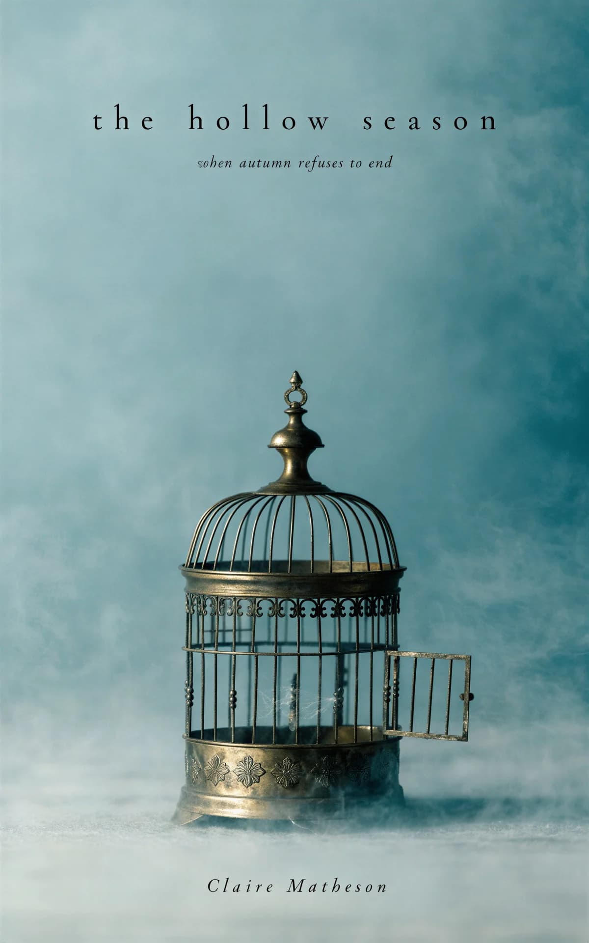
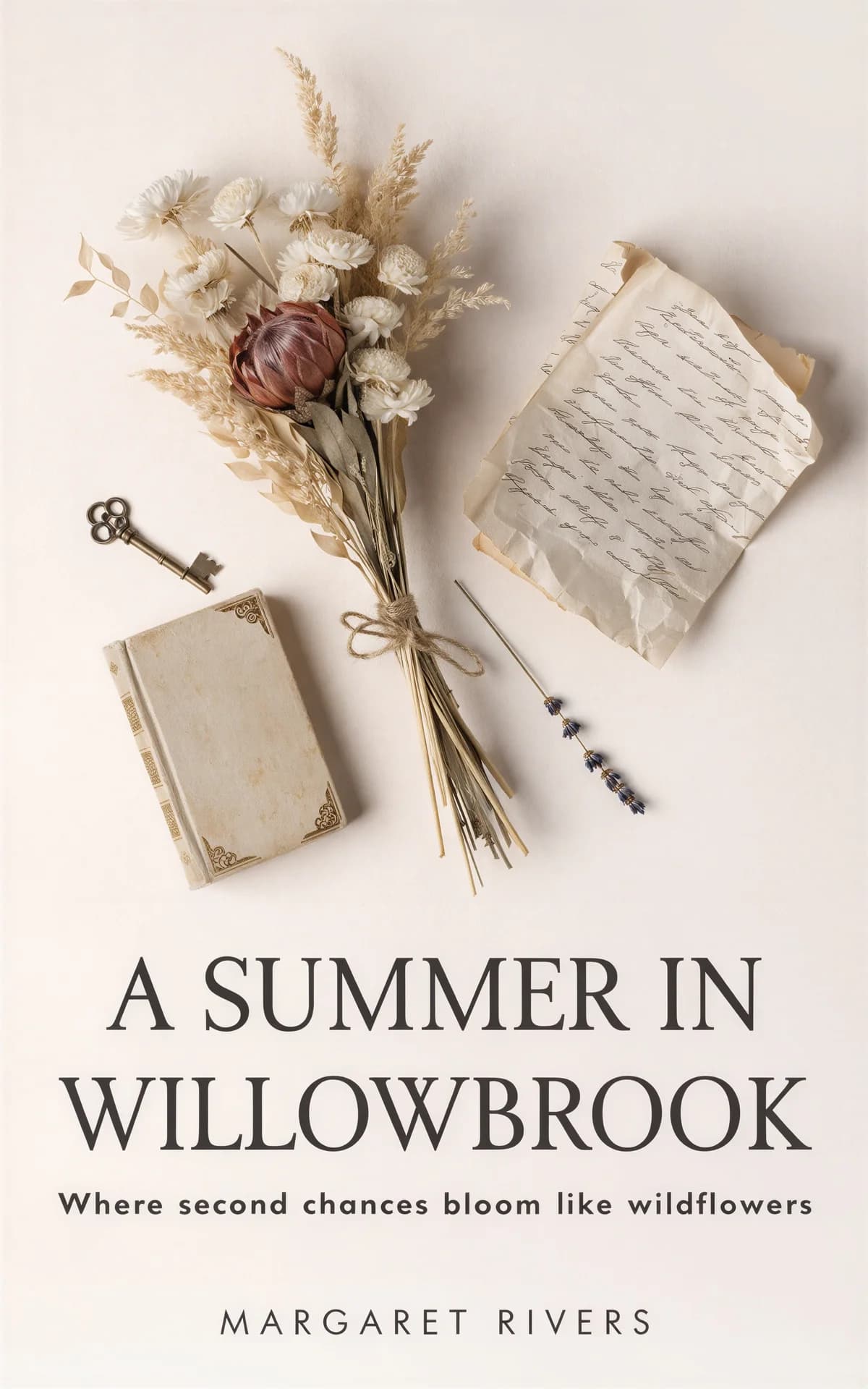
Mystery covers work by withholding: fog, silhouettes, and a clue-object — a key, a letter, a locket — rendered large under vintage or engraved-style type. Cozy mysteries flip the palette to bright flat illustration with a playful script title while keeping the same clue-object idea.


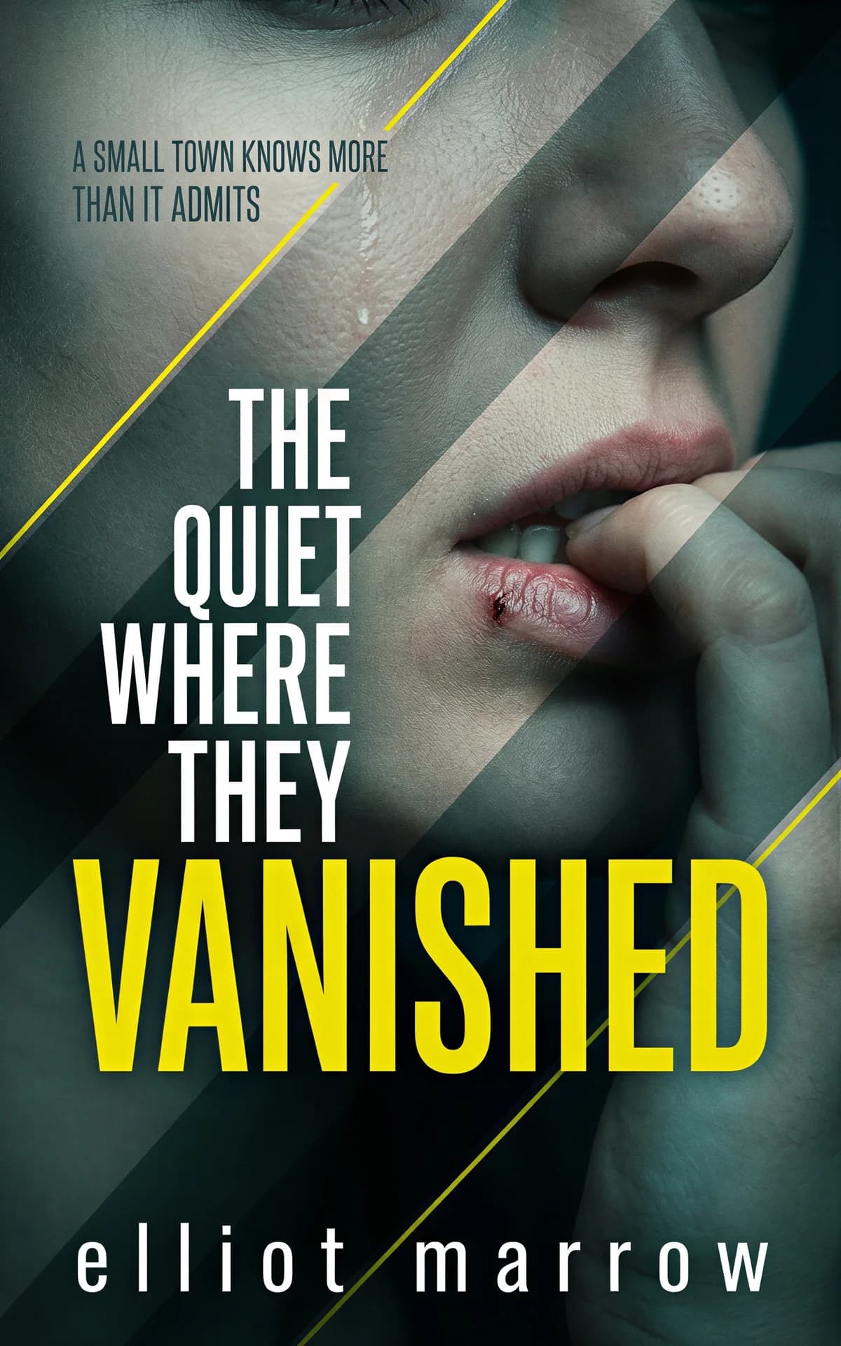
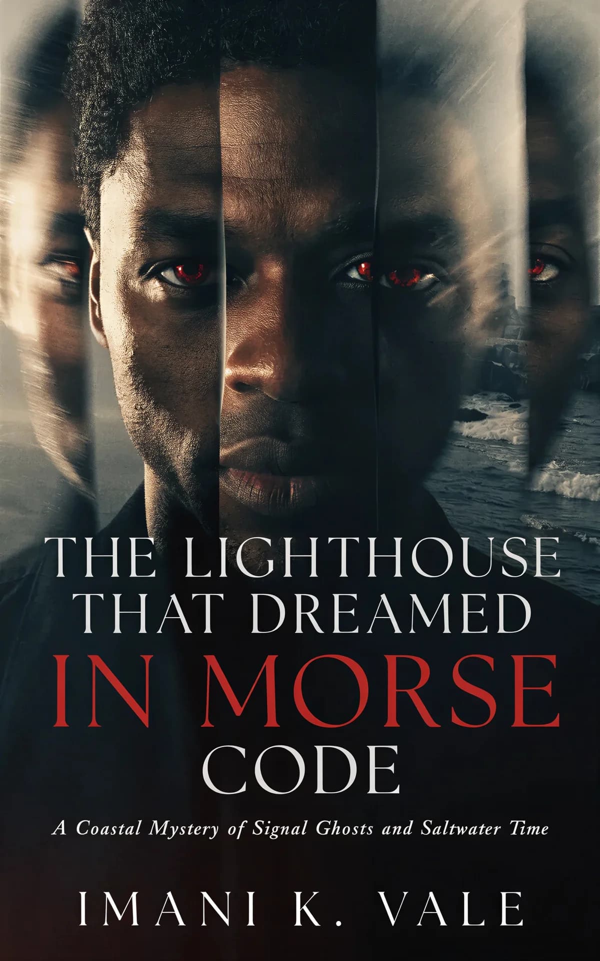
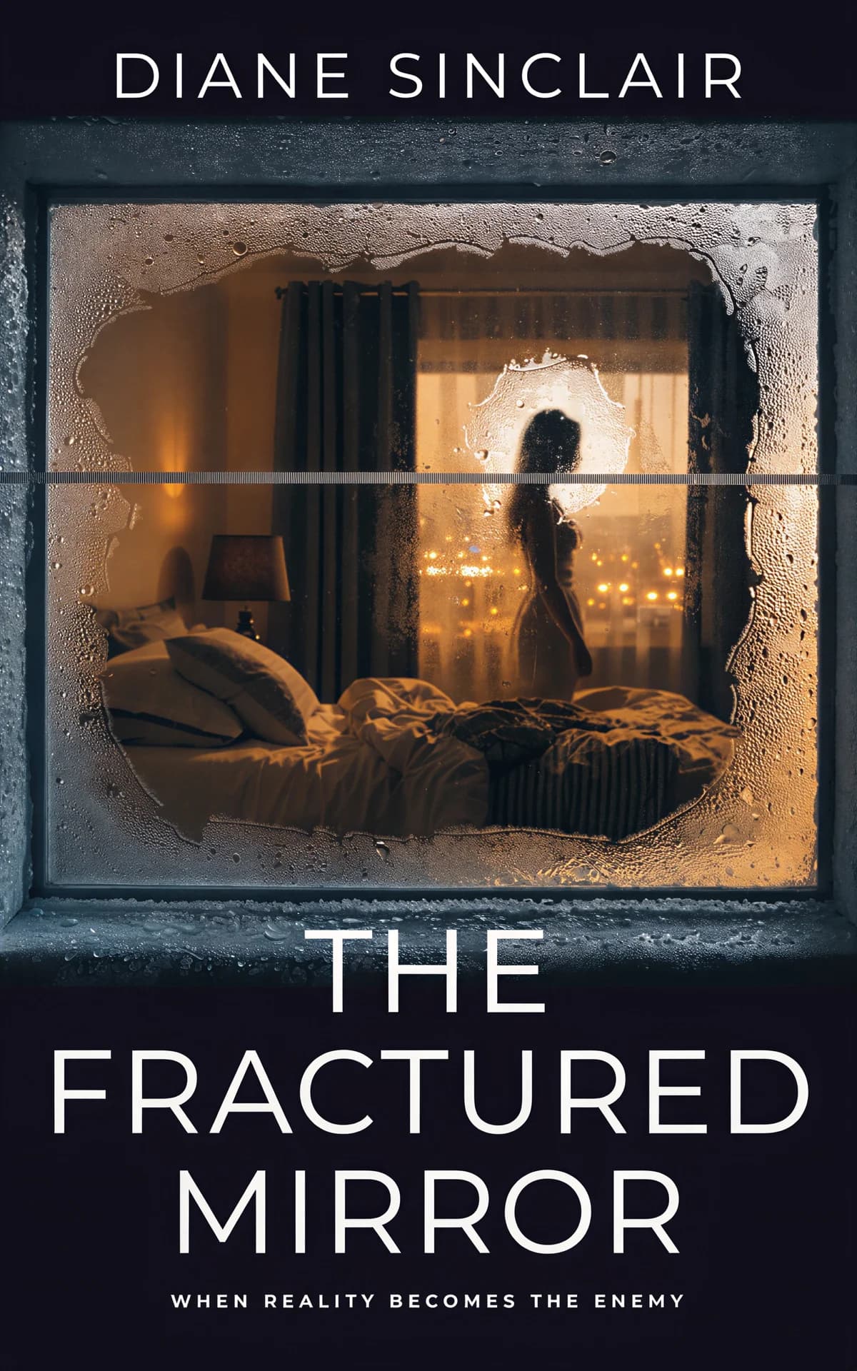
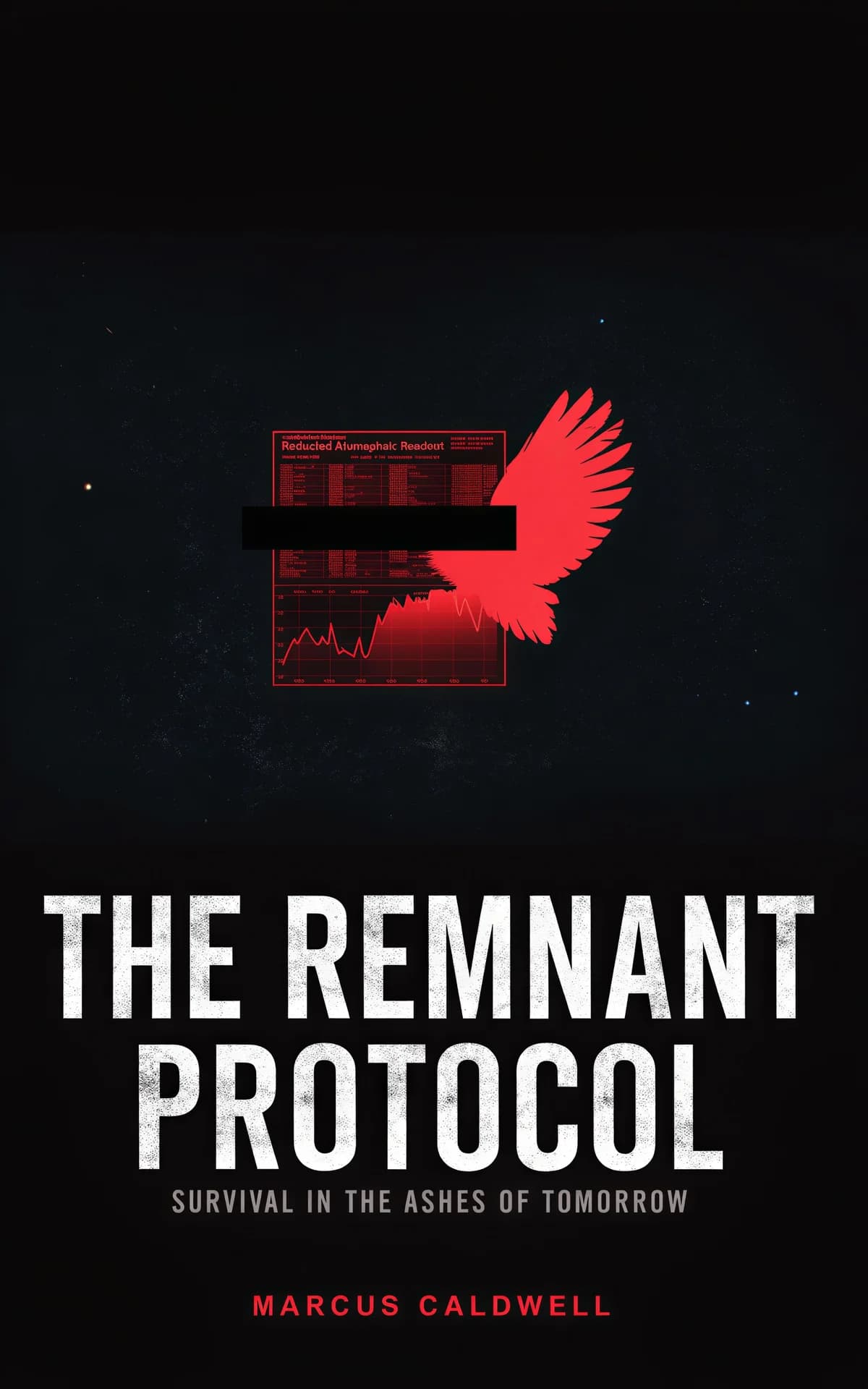
The most reliable thriller idea: huge condensed type over one ominous image — a house at dusk, an empty road, a figure walking away — in a dark palette with a single hot accent. Add unease with tilted horizons, grain, or one detail that's slightly wrong, like a lit window where nobody should be home.
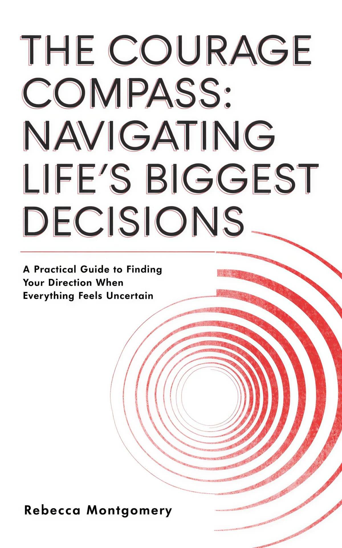
Non-fiction covers are won with typography: a big, blunt title, generous white space, and at most one visual metaphor — a single object, an arrow, a torn edge. Let the subtitle do the explaining so the title can stay short and loud.




The business-cover idea kit: a bold sans-serif title, one clever object metaphor — chess piece, ladder, domino — a restrained two-color palette, and clean grid alignment. Authority comes from restraint; the more it reads like a brand, the more credible it feels.



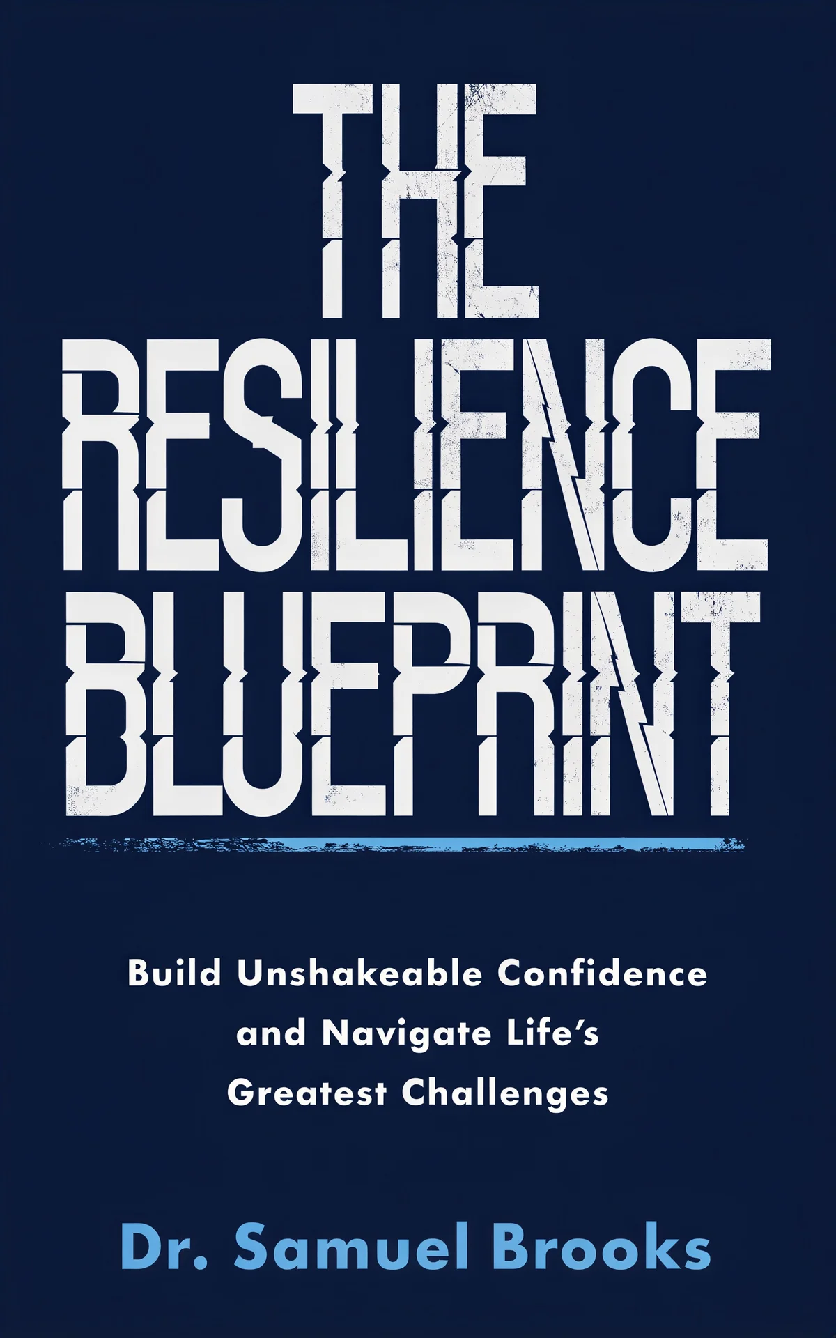
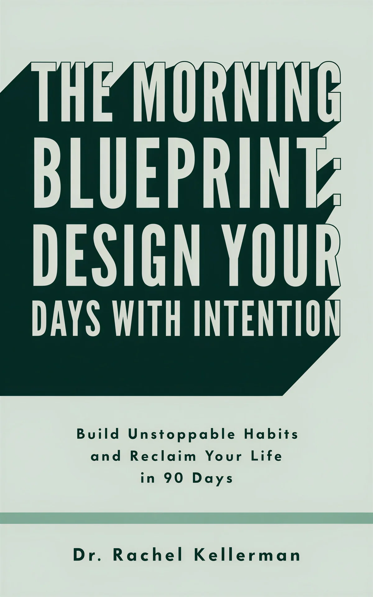
Self-help ideas lead with optimism and clarity: warm or pastel fields, type-first layouts, and a single uplifting motif like a sunrise, an open door, or a spark. Keep the design calm enough that the promise on the cover feels achievable.


More Book Cover Ideas by Subgenre
Niches have sharper visual codes than their parent genres. Browse these galleries when you know exactly which shelf you're aiming for.
Book Cover Ideas by Style and Color
Sometimes the starting idea isn't a genre — it's a look. Explore covers grouped by visual treatment and palette.
Book Cover Design Principles That Hold in Every Genre
Whatever direction you pick above, these five rules decide whether the idea survives contact with a real storefront.
Typography is half the cover
Your title has to work at two sizes: full-size on the product page and about 100 pixels wide in search results. Font style is also a genre signal — elegant serifs read literary or historical, condensed sans-serifs read thriller, scripts read romance. If the title and author name look good alone on a plain field, you have a cover; if not, no image will save it.
Color signals genre before imagery does
Readers decode palettes faster than pictures: dark with neon says sci-fi, black with red says horror or dark romance, pastels say rom-com or self-help, earth tones say literary and historical. Borrow the palette range from your subgenre's bestseller shelf, then push one variable to stay distinctive.
Win the thumbnail test
Most buyers first meet your cover as a thumbnail in a crowded search grid. Shrink your design to 100 pixels wide: if the title dies or the image turns to mud, simplify. High contrast and a single focal point survive shrinking; fine detail never does.
One idea per cover
Covers fail when they try to summarize the plot. Pick a single focal element — an object, a figure, a landscape, or the type itself — and give it the whole frame. Everything else on the cover should support that one idea or be deleted.
Convention first, twist second
Genre conventions exist because they work — they tell readers where your book belongs in a glance. Match your subgenre's typography, palette, and imagery first, then differentiate with exactly one deliberate deviation so you stand out on the shelf without confusing anyone.
Mistakes that sink good ideas
- Chasing "cool" over "clear." A striking image that doesn't signal genre loses to a plain one that does.
- Mixing subgenre conventions. A cozy mystery dressed like a domestic thriller alienates both audiences.
- Designing for yourself instead of your reader. What you find beautiful may not say "buy me" to your audience — the conventions exist because they work.
- Leaning on stock-art clichés. Generic covers vanish in the search grid. Root the idea in your story's actual hook.
Prefer to start from a proven layout instead of a blank page? Browse our book cover templates — genre-tested designs you can apply to your own title and edit down to every detail.
Frequently Asked Questions
Start from your genre's bestseller shelf, not a blank canvas. Study the top 20–30 covers in your subgenre and note what repeats — typography weight, palette, imagery — because those conventions are the signals readers shop by. Then pick one focal idea from your own book (an object, a setting, a figure, or a type-only treatment) and rough out three versions of it. The genre sections on this page give you working starting points for each shelf.
A good cover does three jobs: it signals its genre at a glance, it promises the emotional experience of the story, and it stays readable as a thumbnail. In practice that means genre-appropriate typography and palette, one strong focal idea, and enough contrast that the title survives at 100 pixels wide.
Both, in that order. Conventions tell readers where your book belongs, so match your subgenre's typography, palette, and imagery first. Then change exactly one variable — an unexpected color, texture, or motif — to stand out on the shelf without confusing anyone about what you wrote.
Yes — AI is most useful at the idea stage, when you want many distinct directions cheaply before committing to one. Describe your book in the BeYourCover generator and it produces genre-aware concepts you can compare side by side. Your first two covers are free, and every element stays editable afterwards.
Shrink it to thumbnail size and drop it into a screenshot of an Amazon search grid next to real comps — it should blend in genre-wise while still drawing the eye. Then show it to readers of your genre (not friends and family) and ask one question: what kind of story does this look like? Wrong answers mean the idea is signaling the wrong shelf.
Borrowing conventions — palettes, typography styles, compositional patterns — is how genre signaling works, and it's expected. What you can't do is copy a specific cover's artwork, photography, or distinctive trade dress. Take the idea, like a glowing artifact or a split composition, never the execution.
Ready to Try One of These Ideas?
Describe your book, pick a direction from this page, and the AI generator applies your genre's conventions in about a minute. Your first two covers are free.
Create Your Cover Free