Thriller Book Cover Examples
Study thriller covers that successfully create tension and intrigue at first glance. See how bestselling psychological thrillers, crime fiction, and suspense novels use design to promise readers the high-stakes, page-turning experience they're searching for.
Understanding Thriller Cover Design
Thriller covers must create immediate tension and intrigue to grip a browser's attention and promise a high-stakes, page-turning experience. The best thriller covers use stark imagery, dramatic lighting, and bold typography to signal danger, mystery, and psychological depth. Whether you're writing a twisty psychological thriller, a gritty crime procedural, or a high-stakes conspiracy, your cover needs to promise readers that adrenaline rush they're seeking. Common sub-styles in this genre include three highly effective approaches: minimalist designs that use one haunting focal point to create unease, photorealistic covers with high-contrast shadows for grounded realism, and typography-driven layouts that emphasize a sense of ticking-clock urgency. Dark palettes, unsettling compositions, and strategic use of negative space all contribute to that sense of danger lurking just out of sight. By analyzing these examples, you'll see how successful thriller covers use color—often stark blood reds, deep blacks, and cold, clinical blues—to create an atmosphere of suspense that makes your book impossible to ignore. Study how these designs maintain clarity and impact at thumbnail size, ensuring your mystery is seen and felt by potential readers immediately.
What Makes Great Thriller Covers
Successful thriller covers share common visual strategies that attract readers and communicate genre expectations. Study these patterns in the examples below:
- Dark, moody color palettes that create tension and unease
- High-contrast lighting with dramatic shadows for psychological impact
- Stark imagery focused on eyes, silhouettes, or symbolic objects
- Bold, readable typography that commands attention
- Compositions that create suspense through what's hidden or suggested
- Strategic use of negative space to increase tension and focus
Common Mistakes to Avoid
Even professional authors make these mistakes. Avoid them to ensure your cover performs well:
- Too much visual information that reduces psychological impact
- Colors that are too bright or cheerful for the thriller genre
- Clichéd imagery like generic shadows or overused symbolism
- Typography that's too decorative and reduces the sense of urgency
- Compositions that reveal too much instead of creating mystery
Thriller Cover Examples

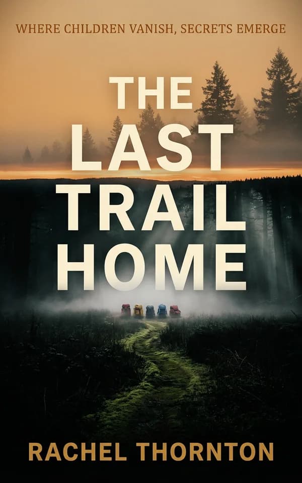
The composition masterfully uses atmospheric perspective and silhouette to create psychological tension—the isolated vehicles in fog suggest mystery and abandonment, while the golden sunset contrasts ominously with the dark forest. This visual storytelling immediately signals a thriller about disappearance and hidden secrets, drawing readers seeking suspenseful narratives with environmental or wilderness horror elements.

The fragmented diagonal composition with striking yellow accent lines creates visual tension and psychological unease, perfectly capturing the mystery genre's intrigue. The intimate facial close-up combined with the geometric split design suggests secrets, hidden truths, and fractured narratives—drawing readers into a dark, compelling mystery about disappearance.

Japanese aesthetic with samurai and Mount Fuji creates cultural authenticity and contemplative tension.

The close-up noir portrait and stark lighting instantly communicate danger, power, and psychological tension.

The stark, half-lit portrait creates immediate psychological tension and a sense of urgency.

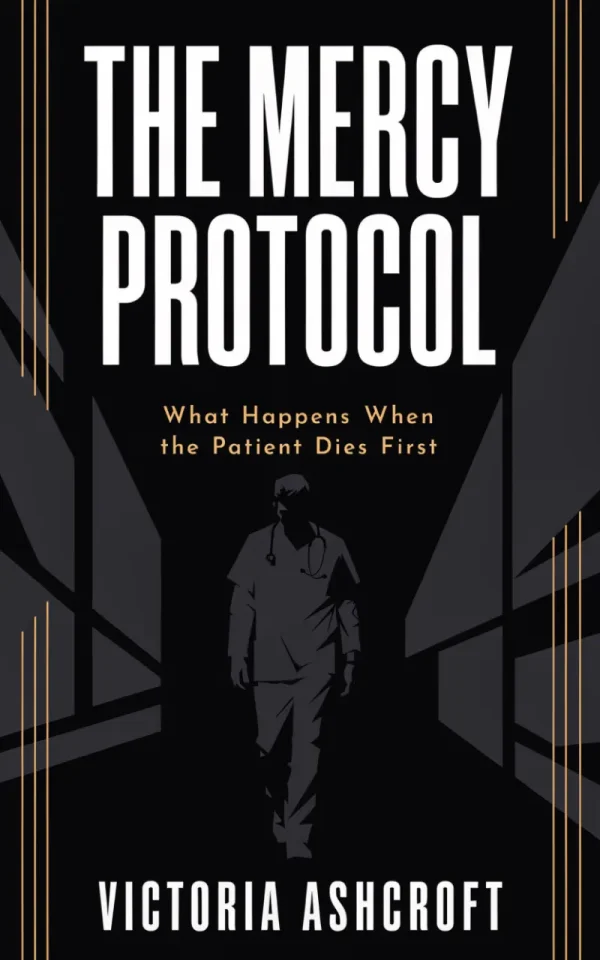
The unsettling contrast between a sterile environment and violent imagery heightens psychological horror.

The striking geometric shadow bisecting the protagonist's face creates psychological tension and visual intrigue, while the bold red typography commands attention against the dark background. This high-contrast composition perfectly captures the thriller genre's sense of mystery and danger, immediately signaling to readers that this is a suspenseful, time-sensitive narrative.

The stark contrast between crisp white typography and shadowy classical architecture creates immediate tension and gravitas, while the red horizontal lines inject urgency and danger. This composition perfectly captures the thriller genre's themes of hidden power structures and institutional corruption, drawing readers interested in political intrigue and exposé narratives.

The stark contrast between pristine white feathers and deep black creates immediate visual tension and intrigue, while the deliberate cross arrangement serves as a powerful symbolic anchor that reinforces the title and suggests both spiritual mystery and criminal investigation. This minimalist approach leverages typography and symbolic imagery to convey psychological thriller elements that appeal to mystery and crime fiction audiences.

The stark monochromatic Capitol dome paired with bold red redaction bars creates immediate visual tension and intrigue, perfectly conveying political corruption and classified secrets. The typography-forward design with the 'CLASSIFIED' stamp establishes authority and urgency, immediately signaling this is a political thriller that will appeal to readers of espionage and government conspiracy narratives.

The stark vertical composition of a single blood-stained dagger against a weathered, dark background creates immediate tension and intrigue. This minimalist approach strips away distraction, forcing focus on the weapon as a symbol of violence and corruption, making it deeply effective for a political thriller about power and moral compromise.

Minimal composition and stark imagery focus attention on identity and concealment, heightening psychological intrigue.

The striking contrast between vibrant orange typography and deep navy background creates immediate visual tension and urgency, perfectly capturing the thriller genre's high-stakes atmosphere. The minimalist feather motifs subtly suggest investigation and clues, while the bold, clean typeface conveys authority and precision—exactly what appeals to mystery/thriller readers seeking intelligent, fast-paced narratives.

Low-key lighting and partial facial visibility create unease and reinforce themes of disappearance and secrecy.

The ordinary school setting contrasted with unsettling body language creates subtle suspense and narrative tension.

The decaying wall and restrained typography convey history, secrecy, and a slow-burning sense of unease.
Showing all 16 thriller cover examples
Thriller Cover Design Checklist
Before finalizing your thriller cover, ask yourself these critical questions:
- Does it create an immediate sense of tension or unease?
- Is the color palette appropriately dark and moody?
- Does the composition suggest mystery without revealing too much?
- Is the typography bold and impactful enough for the genre?
- Would thriller readers immediately understand the subgenre?
- Does it stand out in the crowded thriller marketplace?
Explore by Style
Different visual styles work better for different thriller stories. Explore these curated style collections to find the perfect aesthetic for your book.
Photoreal Thriller
Realistic, photographic covers with detailed imagery and lifelike scenes that create immediate visual impact and authenticity.
Minimal Thriller
Clean, simple designs with focused typography and strategic use of white space for elegant, modern appeal.
Typography Thriller
Text-driven covers that rely on creative font choices, layout, and typographic hierarchy to make a bold statement.
Want to explore more covers?
Browse all 16+ thriller covers in our visual gallery to find inspiration for your next cover design.
Create Your Thriller Cover
Design a cover that grips readers from the first glance and promises the suspense they crave.
Start Designing