Master Your Album Cover Template for Visual Consistency
Create a professional album cover template. Learn dimensions, typography, and layout tips for Spotify, Apple Music, and Amazon KDP to ensure you stand out.
Posted by
Related reading
Photos for Book Covers: A Complete Guide for Authors
Learn how to choose effective photos for book covers. This guide covers composition, sourcing, licensing, and technical specs for KDP-ready designs.
Create the Perfect Book Review Form: A Guide for Authors
Learn to design a book review form that delivers actionable feedback. This guide covers question design, distribution tactics, and using reviews for marketing.
Effective Backgrounds for Covers: KDP Guide 2026
Choose effective backgrounds for covers to grab attention on Amazon KDP. Our 2026 guide covers types, genre matching, composition, & technical specs.
Ready to design your cover?
Use our AI book cover generator to create tailored book cover concepts in minutes.


In today's digital marketplace, your album cover template is more than just a design file—it's your repeatable system for visual branding. For independent authors and artists, this system is what enables you to produce professional, consistent visuals for every release. A solid template saves critical time and money, all while ensuring every cover meets industry standards.
Why a Repeatable Cover System is Essential
If you're an indie creator publishing on a platform like Amazon KDP or Spotify, your cover is your most important marketing tool. With thousands of new titles and tracks released daily, you have only a fraction of a second to capture attention before a potential fan scrolls past.
An album cover template is not a restrictive, cookie-cutter design. It’s a strategic framework. When you stop treating cover design as a one-off task and start approaching it as a system, you begin to build a cohesive visual identity that your audience will recognize instantly.
This system is a set of brand guidelines you define for your work. It typically includes:
- Consistent Typography: Using the same font families (or complementary ones) for your name and the title.
- A Defined Color Palette: Sticking to a core set of colors that align with your genre and brand.
- Structural Layout: Having a go-to placement for key elements like your name, the title, and the main image.
Before building your template, you must define its core components. The following table breaks down what every creator should have in place to ensure consistency and professionalism across their catalog.
Key Elements of an Effective Album Cover Template
| Component | Purpose | Practical Application |
|---|---|---|
| Grid & Safe Zones | Ensures key elements are visible on all devices and avoids cropping issues. | A 3x3 grid with a 50px margin for text and logos. |
| Typography Hierarchy | Creates a clear visual order for the artist name, title, and other text. | Author/Artist Name: Bold Sans-Serif, 32pt. Title: Script Font, 64pt. |
| Color Palette | Builds brand recognition and evokes a specific mood or genre. | Primary: #0A1D37 (Dark Blue), Secondary: #E5E5E5 (Light Gray), Accent: #F0A500 (Gold). |
| Image/Art Style | Defines the aesthetic (e.g., photo, illustration, abstract) for brand consistency. | Using high-contrast, black-and-white photography for all covers. |
| Logo/Name Placement | Makes your name instantly recognizable across your entire catalog. | Always placing the author/artist name locked to the top-right corner. |
Having these elements defined and ready to implement is the difference between an amateur release and a polished, professional one.
Building Recognizable Branding
A strong visual identity turns a one-time reader or listener into a loyal fan. When someone enjoys your first release, a consistent cover style makes your next one instantly stand out. That familiarity builds trust and encourages them to engage without a second thought.
For example, this is a common practice with series, such as those with fantasy book covers. Successful authors often use recurring design elements—like a specific font treatment or color wash—to create a powerful brand that jumps off the digital shelf.
Your repeatable design system is what keeps your brand looking sharp and professional. It turns your cover from just another image into a powerful magnet for your audience.
Saving Time and Money
Designing a cover from scratch for every single song or book is highly inefficient. A well-designed template system eliminates guesswork. You are no longer staring at a blank canvas but working within a framework you already know is effective. This structured approach allows you to create new covers much faster, whether you are doing it yourself or providing a brief to a designer. This is also where an AI cover creation tool can be beneficial, letting you quickly generate variations while staying on-brand.
Setting Up Your Canvas for Digital and Print
Think of your master album cover template as the foundational blueprint for your art. Getting the technical specifications right from the start is non-negotiable. It prevents pixelated uploads, frustrating platform rejections, and costly printing errors.
The goal is to create a single, high-quality file that you can easily adapt for any purpose, whether it's for an ebook, a streaming service, or a physical CD case.
For digital storefronts and streaming services like Spotify and Apple Music, the standard is a perfectly square image to ensure correct display on everything from a large desktop monitor to a small smartphone screen.
The process below shows how a systematic approach is the bedrock of building a recognizable brand.
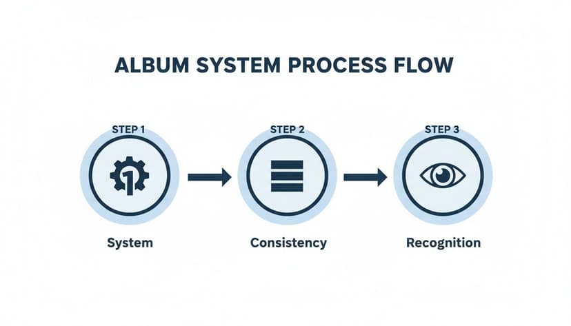
As you can see, a solid system breeds consistency, and that consistency is what ultimately leads to brand recognition. Your technical setup is the very first step in that system.
Digital Album and Ebook Cover Specifications
When you open your design program—whether it's Photoshop, Affinity, or Canva—use these exact settings for your primary template. This guarantees maximum quality and compatibility across all major digital platforms.
- Dimensions: 3000 x 3000 pixels. This large, square format is the gold standard. It ensures your artwork looks crisp and professional, even on high-resolution displays.
- Resolution: 300 DPI (Dots Per Inch). While some may say 72 DPI is sufficient for screens, starting with 300 DPI provides a master file that is instantly print-ready without extra work.
- Color Mode: RGB (Red, Green, Blue). This is the universal color model for all digital screens. Designing in RGB ensures the vibrant colors you see on your monitor are what your audience will see on their devices.
In a fiercely competitive market, your cover art is your first handshake. A technically perfect template is the pre-flight check that ensures you don’t get disqualified before you even launch.
If you need to quickly resize your artwork for different platforms, a dedicated tool can streamline your workflow. For instance, a SoundCloud artwork resizer tool can help maintain quality across various formats.
Adapting for Print on Demand
If you plan to release a physical CD or a print book through a service like Amazon KDP, you’ll need to adjust your file. While the core design remains the same, the technical requirements for print are different.
We explore this topic in depth in our guide on printable book covers, but here is a brief overview.
The most significant change is the color mode. Print projects must use CMYK (Cyan, Magenta, Yellow, Key/Black), the four-color model used by physical printers. You will also need to account for bleed, a small extra margin added to your design that gets trimmed off during production to ensure a clean, edge-to-edge finish.
On a crowded platform, professionally designed covers can increase click-through rates significantly compared to amateur efforts, turning casual browsers into dedicated fans.
Mastering Typography for Thumbnail Impact
 Your font choice is one of the most critical decisions for your cover template. When your art is a tiny square on a crowded screen, typography is no longer just decoration; it becomes a functional tool. An elegant, delicate font that looks incredible on a large physical product will likely become an unreadable blur on a smartphone.
This is why it is crucial to design for the smallest size first. Your top priority is readability above all else. The goal is simple: make your name and title instantly legible at a glance.
Choosing Fonts That Command Attention
On digital platforms, bold is often better. The key is to select typefaces that are clean, clear, and impactful.
- Weight Matters: Opt for fonts with bold or heavy weights. These thicker letterforms hold up well when scaled down.
- Simplicity Wins: Avoid overly decorative or complex script fonts. They may look beautiful up close but often become illegible at thumbnail size. Stick with strong serifs and clean sans-serifs.
- Genre Alignment: Your font must still signal your genre. A heavy, geometric sans-serif might suit electronic music or sci-fi, while a classic, bold serif could be appropriate for a literary novel or singer-songwriter. We discuss this in our guide on fonts for book covers, and the same principles apply here.
This trend toward clarity is a response to the "thumbnail problem." Creators are using bold, oversized fonts to cut through the noise on digital stores. This style, often limited to one to three colors with ample white space, makes designs scalable from a full-size cover down to a tiny icon.
Creating a Clear Type Hierarchy
A common mistake is making all text on a cover the same size. A professional look requires a clear type hierarchy—a visual structure that tells the viewer's eye what to read first.
For your cover template, keep the hierarchy simple:
- Primary Text: The title. This should be the largest, most prominent text on the cover.
- Secondary Text: Your name. Make it smaller than the title but still perfectly readable.
By locking these sizes and styles into your template, you create a consistent, professional look for every release. An AI cover design tool can help you test font pairings and layouts quickly, saving you from manually resizing and repositioning elements.
When a potential fan is scrolling, your typography is doing the heavy lifting. Make sure it's strong enough to carry your message from a distance.
Ultimately, your text must be so clear that someone can understand it in a fraction of a second. That is what separates a cover that gets skipped from one that earns a click.
Composing Your Layout with Genre in Mind
Once your technical canvas is set, the next step is composition. This is where you arrange your imagery and typography within your template. Think of it as visual storytelling—the way you place each element instantly signals your genre and promises an experience.
A simple grid can be a helpful starting point. The rule of thirds is a classic principle for a reason. Imagine your canvas divided into nine equal squares by two horizontal and two vertical lines. Placing your most important elements—like your name or the focal point of a photo—along these lines or at their intersections often creates a more compelling layout than centering everything. It feels more dynamic and professional.
Sourcing and Creating Genre-Specific Imagery
The main visual on your cover is its strongest emotional hook. It is the first thing people see and must act as a clear signpost for your genre. Just as specific art styles instantly identify fantasy book covers on a digital shelf, your cover art should do the same for your work.
- For Singer-Songwriters or Memoirs: An authentic, high-contrast portrait or a minimalist, evocative illustration can be very effective. The goal is to feel personal and direct.
- For Electronic Music or Sci-Fi: Consider abstract geometric patterns, glitch art, or futuristic cityscapes. These visuals communicate a modern, synthetic, or technological vibe.
- For Metal/Rock or Thrillers: Bold, dark imagery often works best. Strong textures and powerful symbolism can match the intensity of the content.
The key is to build a system. Your cover template should have a designated space for this core visual. This creates a predictable framework that builds brand recognition across multiple releases while allowing for creative freedom with each new project.
Using AI for Rapid Visual Exploration
Finding the perfect image can be a significant investment of time and money. Modern creative tools can provide a major advantage here. Using an AI tool to generate visual concepts allows you to test dozens of ideas in minutes.
Instead of endlessly scrolling through stock photo sites, you can describe the mood, style, and subject matter you envision. An AI can return several unique options almost instantly. This is not about replacing creativity but accelerating it. It provides a much wider palette of visual directions to explore without committing significant time or budget upfront. You can quickly see what works and what doesn't, refining your prompts until you land on a concept that truly captures the essence of your work.
Composition is the silent narrator of your cover. A well-composed layout guides the viewer's eye, communicates what your content feels like, and makes a promise about the experience within—all before they click play or 'look inside'.
By blending classic design principles with the speed of modern tools, you can build a layout that’s not just visually appealing but also a strategic asset. Your final composition should feel deliberate, reinforcing your genre and making your work instantly recognizable in a crowded field.
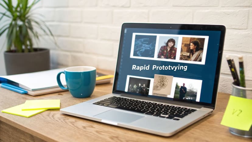
Using AI for Rapid Prototyping and Iteration
Let's clarify the role of AI in design. It’s not here to replace your creativity. Think of it as a tireless brainstorming partner—one that can take you from a blank template to a dozen solid concepts quickly.
For an indie creator, this is a massive advantage. The primary benefit of AI is its speed. You provide a genre, a title, and a few words about your project's mood, and it generates a range of visual ideas. This transforms the traditional design workflow. Instead of spending hours searching for stock photos or sketching layouts, you start with multiple, often surprising, options right away.
A Practical Workflow for AI Prototypes
The goal is not to simply accept the first image an AI generates. The skill lies in iteration. Learning to create AI generated album covers effectively is about guiding the tool, refining your prompts, and steering it toward your vision.
Here’s a practical workflow:
- Your First Prompt: Start with something direct. For example: "cover for a lo-fi electronic track, moody cityscape at night, neon reflections on wet streets, minimalist typography."
- Analyze and Refine: The AI provides four concepts. One has the right color palette, but the mood is wrong. Your next prompt might be: "Make it more melancholic and less futuristic. Remove the flying cars. Add more purple and blue tones."
- Swap Elements: From there, you can ask the AI to change the composition or swap specific details without starting from scratch. It's a conversational process.
AI isn’t about surrendering creative control; it’s about accelerating your creative process. It lets you test a dozen “what ifs” in the time it used to take to build a single mockup, helping you land on the strongest concept faster.
This approach is also very cost-effective. AI adoption is growing because it can reduce design timelines from weeks to minutes—a significant benefit for indie creators on a tight budget. We're seeing more AI-generated art for covers as creators realize they can produce brand-aligned visuals without hiring an expensive designer.
Ultimately, AI is a powerful tool for A/B testing. You can quickly generate a handful of strong concepts, show them to your audience on social media, and see which one connects most before you commit. We explore this strategy in our guide to choosing the best AI book cover generator for 2025, where the core principles are identical. This data-driven method removes guesswork, giving you a cover that has already been market-tested.
Common Questions About Cover Templates
Diving into design can feel overwhelming, especially when you're an indie creator focused on your craft. Let’s address some common questions about creating and using cover templates, with practical advice to help you achieve professional results.
What Is the Best Software for Creating a Cover Template?
For professional designers, the industry standards remain Adobe Photoshop or Affinity Designer. They provide complete, pixel-perfect control over every element.
However, most creators need something faster and more intuitive. Free web-based tools like Canva are popular for this reason. The trade-off is that they often lack the fine-tuned optimization controls needed for a flawless final file.
A more modern approach is an AI-powered platform that combines template creation with instant design generation. These tools are often built to ensure your final export is already optimized for KDP and streaming services, removing technical guesswork.
How Do I Ensure My Cover Looks Good on Both Large and Small Screens?
This is a critical concern. The most effective strategy is to design for the smallest size first. While working on your high-resolution 3000 x 3000 pixel template, you should constantly zoom out to view it at about one or two inches on your screen. This is the “thumbnail test.”
As you glance at the tiny version, ask yourself these questions:
- Is the main visual element still obvious and recognizable?
- Can I read the title in a split second?
- Does the cover have a single, strong focal point?
If the answer to any of these is no, it’s time to simplify. Make key elements bigger and bolder. Increase the contrast. Remove any busy background details that become visual noise at a small size. A single, dominant focal point is the most important rule for success in a digital storefront.
Think of your cover like a tiny billboard on a busy digital highway. If the message isn’t crystal clear in a fraction of a second, it gets ignored. The thumbnail test is how you make sure your message cuts through the noise.
Can I Use the Same Template for an Album and a Book Cover?
Yes, you can, but with a few critical adjustments. The core principles are the same: strong typography, a clear focal image, and visuals that signal the correct genre. The visual cues for a thriller book cover, for example, are not so different from what you might expect on a dark rock album.
A standard square template is a perfect starting point for an ebook cover. However, if you're publishing a print book through a service like Amazon KDP, you must use their specific template generator. It will provide the exact dimensions for the full wraparound cover—front, spine, and back—based on your final page count. You can then adapt your front cover design to fit into that new, larger layout.
How Much Does a Professional Cover Cost?
The cost of a great cover can vary widely depending on the path you choose.
- Freelance Designer: Hiring a professional can cost anywhere from $500 to over $5,000, depending on their experience and the complexity of your vision.
- Pre-made Templates: A cheaper option is to buy a pre-made design, which usually costs between $50 and $150. The downside is that it will not be unique to your brand.
- DIY Methods: Doing it yourself is technically "free" but comes at the cost of your time and a potentially steep learning curve to achieve a professional result.
AI design tools have changed this equation. They provide a way to generate unique, professional-grade concepts for a fraction of what a freelancer would charge. This allows you to explore dozens of ideas before committing a single dollar, making professional design more accessible than ever.
Ready to Create Your Own Book Cover?
Turn your story into a visual masterpiece. Fill in the details below to start generating professional covers instantly.