Children Book Illustration: From Concept to KDP
Learn the essentials of children book illustration in our complete guide for indie authors. Covers styles, hiring illustrators, budgets, and KDP print specs.
Posted by
 Pablo Yáñez
Related reading
The Bright Pink Color Code for KDP Book Covers
Find the right bright pink color code for your book cover. This guide covers hex, RGB, and CMYK values, plus KDP print settings and design tips for authors.
Hiring a Book Cover Illustrator: A Practical Guide for 2026
Learn how to find, hire, and manage a professional book cover illustrator. Our step-by-step guide helps indie authors navigate briefs, pricing, and rights.
Photos for Book Covers: A Complete Guide for Authors
Learn how to choose effective photos for book covers. This guide covers composition, sourcing, licensing, and technical specs for KDP-ready designs.
Ready to design your cover?
Use our AI book cover generator to create tailored book cover concepts in minutes.

You've written the manuscript. You know the story works. Then the hard question lands: what kind of art does this book need, how much should you spend, and how do you get from a loose visual idea to files that won't break when you upload to KDP?
That's where most indie authors get stuck. Children book illustration sits at the intersection of storytelling, production, and sales. A charming style that misses the target age can weaken the reading experience. A talented illustrator with a vague brief can burn through your budget in revisions. Beautiful art exported incorrectly can print badly.
The strongest projects treat illustration as both a creative system and a publishing asset. The decisions you make about style, workflow, file prep, and cover integration all affect whether the book feels professional when a parent sees it online and when a child opens it for the first time.
The Growing World of Children Book Illustration
Children book illustration isn't a decorative add-on. It's a product decision with commercial weight. The category is large enough, competitive enough, and visually driven enough that weak art will usually show up long before a reader reaches page two.

The scale of the market makes that clear. The global children's illustration book market reached a valuation of approximately USD 13.8 billion in 2024, with projections indicating it will nearly double to USD 28.9 billion by 2033, driven by a compound annual growth rate of 7.8%, according to market reporting on the children's illustration book segment. For an indie author, that doesn't mean easy sales. It means readers and buyers already have strong visual expectations.
What this means for an indie author
If you're publishing on Amazon KDP, your illustrator's work has to do several jobs at once:
- Carry the story visually so early readers can follow emotion, action, and pacing
- Signal age category fast through color, line quality, and character design
- Support the cover so your interior and front-facing product feel like the same book
- Hold up in print without muddy color, soft detail, or bad edge handling
A weak manuscript can't be fixed by pretty pictures. But a good manuscript can absolutely be undermined by generic, inconsistent, or technically sloppy art.
Practical rule: In picture books, readers don't separate writing quality from visual quality. They experience them as one thing.
The real trade-off
Indie authors often frame the choice as budget versus beauty. In practice, the sharper trade-off is clarity versus confusion. Good illustration helps a child understand the scene, anticipate the page turn, and connect with character emotion. Poor illustration makes the book feel distant, even if the art looks polished in isolation.
That's why the illustration process needs to be managed like a publishing workflow, not a one-time art purchase. Style comes first. Then collaboration. Then technical prep. Then cover integration. If one stage goes off track, the later stages get more expensive.
Choosing the Right Illustration Style for Your Story
Style selection starts with audience, not personal taste. Many indie authors collect reference images they love, then hire toward that mood. That usually creates friction later because the style they admire isn't always the style their story needs.

A better approach is to ask three questions first. Who is the reader. What emotional temperature does the story need. What kind of visual complexity helps rather than distracts?
Four common style directions
Here's a practical way to think about the most common approaches.
| Style direction | Usually works best for | Strength | Risk |
|---|---|---|---|
| Whimsical and bright | Preschool and read-aloud books | Fast emotional readability, friendly shapes, strong shelf appeal | Can feel disposable if every scene uses the same energy |
| Realistic and detailed | Older children, nonfiction, adventure | Strong sense of world, useful for informational scenes | Can overwhelm younger readers or slow page reading |
| Expressive and stylized | Character-led stories, fantasy, emotional arcs | Gives a book a distinct voice | Needs disciplined consistency to avoid visual drift |
| Classic and gentle | Bedtime stories, early readers, timeless themes | Soft trust-building tone | Can disappear online if cover contrast is too low |
If you need broader visual references before briefing an artist, it helps to browse diverse comic art styles and notice how line weight, color handling, and exaggeration affect tone. You're not looking for a comic look specifically. You're training your eye to describe visual decisions more clearly.
Match style to page function
The best children book illustration style doesn't just match the premise. It matches how the pages need to behave.
- Dialogue-heavy scenes benefit from clean compositions and readable expressions.
- Action scenes need silhouettes that read instantly.
- Quiet emotional beats often need space, restraint, and controlled color.
- Educational passages usually work better when detail supports comprehension rather than showing off technique.
Many first-time projects often stumble on this point. The author hires an illustrator for one beautiful portfolio image, but the book requires repeatable character acting across many spreads.
Child-centric perspective matters more than most style guides admit
One of the most useful filters for picture books is perspective. Illustrations that place the horizon line at a child's actual eye level, often 3–4 feet, increase emotional engagement by making scenes feel “lived-in” rather than observed from above, a critical factor for picture books targeting readers ages 3–6, as discussed in this perspective guide for children's illustration.
That matters because adult default drawing habits often place the viewer too high. The result is technically fine art that feels emotionally off.
If the child reader feels like they're standing inside the scene, the book gains warmth. If they feel like they're watching from an adult viewpoint, the page loses intimacy.
A quick style decision checklist
- Choose for the reader first: Don't pick a style just because it looks expensive or fashionable.
- Review full-sequence work: One strong image doesn't prove an illustrator can sustain a whole book.
- Check emotional range: Can the characters act, react, and stay recognizable?
- Watch perspective habits: Especially for ages 3–6, eye-level choices affect connection.
- Think ahead to the cover: A style that works inside the book also needs to sell at thumbnail size.
The Illustrator's Workflow From Brief to Final Art
Most illustration problems begin before the first sketch. They start when the author sends a manuscript and says, “I'm open to anything.” That sounds collaborative. In practice, it forces the illustrator to guess at audience, pacing, character tone, and production scope.

A professional workflow works because each stage answers a different question. You don't want to be debating final color before you've agreed on composition. You don't want to approve character details before you know the page turns work.
Start with a brief that reduces ambiguity
Your brief should tell the illustrator what the book is trying to do, not just what happens in it.
Include:
- Audience and age range: This affects shape language, detail level, and emotional framing.
- Trim size and format: A square picture book behaves differently than a tall vertical layout.
- Art scope: Full spreads, spot illustrations, vignettes, cover, endpapers, title page.
- Visual references: Not to copy, but to define mood, texture, and energy.
- Non-negotiables: Character traits, setting details, objects that matter to the plot.
The brief is also where you define what success looks like. If the story depends on humor, say that. If you want a quieter bedtime feel, say that too.
Thumbnails solve expensive problems early
Thumbnail sketches are small and rough by design. They're not there to impress you. They're there to test pacing, page balance, camera angle, and page-turn rhythm while changes are still cheap.
This stage should answer questions like:
- Does each spread have a clear focal point?
- Are the page turns earning curiosity?
- Is text space being preserved where needed?
- Are repeated scenes starting to look visually flat?
One issue indie authors often miss is repetition. If every spread sits at the same distance with the same viewpoint, the book starts to feel static. Variation in close-ups, side angles, and wider scenes keeps momentum alive.
Approve composition before detail. Revisions after rendering are the costliest revisions in the whole project.
Character sheets and rough sketches protect consistency
Before the illustrator moves into polished pages, get agreement on character construction. That doesn't require endless model sheets. It does require enough reference for the artist to keep faces, proportions, clothing, and body language stable across the manuscript.
Then come rough sketches. This is the stage for checking:
- Expression accuracy
- Body language
- Scene readability
- Prop continuity
- Visual fit with the manuscript text
If something feels wrong emotionally, this is the moment to fix it.
Final art is production, not just polish
By the time final rendering begins, the creative questions should be mostly resolved. Final art is where the illustrator applies line quality, palette, texture, and finish in a way that stays coherent across the book.
When authors rush this stage, they usually create one of two problems. Either they ask for late structural changes that should have happened in thumbnails, or they approve final pages one by one without checking whether the whole book still feels unified.
A useful habit is to review pages as a sequence. Spread-to-spread consistency matters as much as individual page beauty.
A Guide to Illustration Tools and Software
Tool choice shapes workflow, revision speed, and file delivery. It also affects how much flexibility you have when KDP requirements or cover needs change late in the process. That's why it helps to understand the production implications of traditional, digital, and AI-assisted approaches before you hire.
Traditional media brings texture and constraints
Watercolor, ink, gouache, colored pencil, and collage can give a children's book a tactile quality that digital brushes often imitate rather than fully reproduce. That physical texture can become a genuine strength when the story wants warmth, softness, or handcrafted charm.
The trade-off is revision friction. If a facial expression needs to change, or a character's shirt color conflicts with another spread, physical art is less forgiving. Scanning quality matters too. If you're working with an illustrator who paints traditionally, a solid guide on scanners for creative professionals can help you understand what's required to capture artwork cleanly before layout and print prep.
Digital tools are usually the most practical for indie production
For KDP-focused publishing, digital workflows are often easier to manage. Tools like Procreate, Adobe Photoshop, Adobe Illustrator, and Clip Studio Paint let illustrators work in layers, preserve alternate versions, and adapt art for both interior pages and covers.
That doesn't mean digital art automatically looks better. It means it's easier to revise without damaging the whole piece. It's also easier to hand off files to a designer who needs to handle typography, crop adjustments, or wrap layout.
If you're comparing setup options for the cover side of the project, this overview of book cover design software gives a practical sense of how different tools handle layout and production tasks.
AI-assisted tools can help, but they need boundaries
AI tools fit best at the ideation edge of the workflow, not as a substitute for clear authorship. They can help explore mood directions, draft rough visual references, or test compositional possibilities before you commit to a final cover concept.
Used carelessly, they create other problems. Consistency suffers. Character identity drifts. Rights and originality questions become harder to manage if the process is vague.
A sensible standard is simple:
- Use AI for exploration
- Use a human illustrator or designer for controlled execution
- Keep source files and approvals organized
- Don't assume generated art is production-ready
That approach gives you speed where speed helps, and accountability where accountability matters.
How to Commission an Illustrator for Your Book
Hiring an illustrator is part creative matchmaking, part vendor selection. If you treat it only as an art search, you can end up with attractive samples and a broken process. If you treat it only as procurement, you can flatten the project into a transaction and miss the importance of voice.
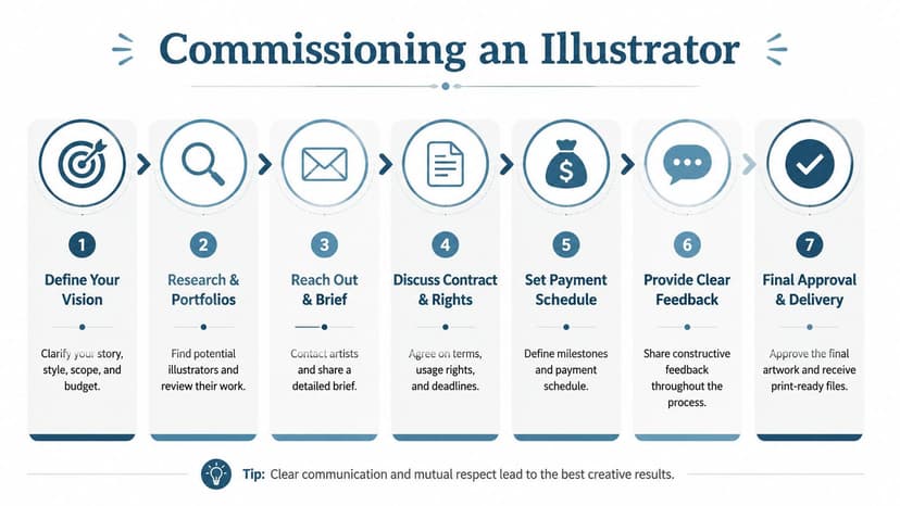
The strongest commissioning decisions come from balancing style fit, reliability, and rights clarity.
Budget with the full scope in mind
Many indie authors underestimate illustration because they price the book as a manuscript plus “some art.” In reality, illustration often becomes the largest visible line item in the project.
For self-published children's books, illustrator fees typically range from $3,000 to $15,000 per book, while traditional publishing advances range from $5,000 to $20,000 plus 3.5%–6% royalties of the retail price, according to this breakdown of illustrator compensation.
That range reflects scope more than prestige alone. A short book with simple spot art is a different project from a full-bleed picture book with recurring characters, cover work, and multiple revision rounds.
What to look for before you ask for a quote
A portfolio should answer practical questions, not just aesthetic ones.
Look for:
- Sequence strength: Can the illustrator sustain character consistency across multiple scenes?
- Age fit: Does the work feel right for your readership?
- Emotional clarity: Are expressions readable without being exaggerated past usefulness?
- Environment control: Can the artist stage backgrounds that support, rather than swallow, the action?
- Professional process: Do they talk clearly about revisions, timelines, and deliverables?
If you want a more focused overview of the role itself, this guide to choosing a book cover illustrator helps clarify what to evaluate when illustration also needs to perform in a sales context.
A strong illustrator isn't only someone who draws well. It's someone who can repeat quality, take direction, and deliver files you can actually publish.
Contract points that matter
This is the part indie authors skip when they're eager to get started. Don't skip it.
Your agreement should define:
- Scope of work including number of illustrations, cover elements, and any extras
- Revision rounds so feedback stays structured
- Payment schedule tied to milestones
- Timeline with approval checkpoints
- Rights and usage including whether you have exclusive publishing rights and cover use
- Delivery format so final files arrive in publishable form
A commissioning checklist
- Write a real brief: Don't send only the manuscript.
- Request a quote after scope is clear: Broad questions produce broad pricing.
- Ask how revisions are handled: This reveals whether the process is mature.
- Confirm file delivery expectations: Especially if the art will be used on both interior pages and cover.
- Get rights in writing: Verbal assumptions cause expensive disputes later.
Technical Specs for KDP Print and Ebook Files
Even attractive artwork can still fail. KDP doesn't care how moving your illustrations are if the files are soft, cropped badly, or built in the wrong color mode. The production side has to be right.

The essential baseline is clear. High-fidelity illustrations for print-on-demand must be rendered at a minimum resolution of 300 DPI at the final trim size in CMYK color space, with a 0.125-inch bleed on all sides where artwork extends to the page edge, as outlined in this print specification reference for children's picture book illustrations.
The print checklist that prevents common KDP issues
Use this when preparing files with your illustrator or designer:
- Set final trim size early: Don't design first and choose dimensions later.
- Build art at final size: Avoid enlarging low-resolution raster files.
- Use CMYK for print interiors and covers: This reduces color surprises at print stage.
- Add bleed where art touches the edge: Without it, you risk visible white slivers.
- Export print-ready PDFs carefully: Your production file should preserve image quality and page integrity.
If you're still working through the broader publishing workflow, this practical article on how to self publish a book is useful for seeing where file preparation fits into the full release process.
Ebook and print are not the same file problem
A common mistake is assuming one export works for every edition. It usually doesn't. Print files need to satisfy press requirements. Ebook files need to display well on screens and adapt to different device behaviors.
That means your illustrator and layout designer should know, before final delivery, whether the project includes:
- Paperback
- Hardcover
- Fixed-layout ebook
- Standard ebook adaptation
- Marketing graphics derived from interior art
If your art is also feeding into the cover workflow, it helps to understand how printable book covers are prepared so your front cover, spine, and back cover remain aligned with the interior design choices.
Files that look fine on a laptop can still print badly. Always review with production specs in mind, not just screen appearance.
What usually goes wrong
The most common technical failures are predictable:
| Problem | Usually caused by |
|---|---|
| Soft or blurry art | Low-resolution source files or enlarging raster images |
| Unexpected white edges | Missing bleed |
| Color shift in print | Building for screen instead of print |
| Cropping surprises | Safe areas not considered during layout |
None of these problems are creative. All of them can damage the reader's impression of the book.
Integrating Illustrations with a Market-Ready Cover
Interior illustration and cover design should feel related, but they shouldn't do the same job. Inside the book, art supports pacing and comprehension. On the cover, art has to stop a scroll, signal genre, and stay readable at a small size.
That's why the best covers don't rely on lifting an interior spread and dropping the title on top. They translate the book's visual language into a sales asset.
Keep the visual DNA, change the composition
A market-ready children's cover usually works best when it carries over:
- The same character design
- The same color logic
- The same emotional tone
- The same world-building cues
But it often needs a different composition than any interior page. Covers need hierarchy. The focal character or scene should read immediately. Typography needs space. Background detail should support the hook, not compete with it.
What usually works better than authors expect
For children book illustration projects, the cover tends to improve when you simplify. One strong character moment is usually more effective than trying to summarize the full plot visually.
Good cover integration often comes down to a few decisions:
- Feature the clearest emotional hook: curiosity, comfort, wonder, mischief
- Protect the title area: don't force text over busy detail
- Preserve recognizable character acting: the face has to carry at thumbnail size
- Use interior style cues selectively: texture and palette matter more than copying a full spread
Testing concepts before finalizing
This is one place where AI tools can be useful. Not for replacing your illustrator, but for testing alternate cover compositions, typography directions, or focal arrangements before you lock the final version.
An author might use an AI cover tool to prototype several layouts based on the established illustration style, then bring the strongest direction back to the illustrator or designer for refinement. That can reduce indecision and make feedback more concrete.
If you want to experiment with early concepts before commissioning final cover work, try the free tool from BeYourCover to test visual directions and compare what reads best for your category.
The important point is control. Prototype broadly. Finalize deliberately. The strongest children's covers feel consistent with the interior art, but they're designed for discovery first.
Ready to Create Your Own Book Cover?
Turn your story into a visual masterpiece. Fill in the details below to start generating professional covers instantly.
