Your Guide to the Perfect Book Cover Design Format
Master the book cover design format for KDP ebooks and print. Learn file types, dimensions, and color modes to publish your book with confidence.
Posted by
Related reading
Photos for Book Covers: A Complete Guide for Authors
Learn how to choose effective photos for book covers. This guide covers composition, sourcing, licensing, and technical specs for KDP-ready designs.
Create the Perfect Book Review Form: A Guide for Authors
Learn to design a book review form that delivers actionable feedback. This guide covers question design, distribution tactics, and using reviews for marketing.
Effective Backgrounds for Covers: KDP Guide 2026
Choose effective backgrounds for covers to grab attention on Amazon KDP. Our 2026 guide covers types, genre matching, composition, & technical specs.
Ready to design your cover?
Use our AI book cover generator to create tailored book cover concepts in minutes.


Diving into the world of book cover design formats can feel like a technical minefield for an indie author. However, it all boils down to two distinct deliverables: a digital-first ebook cover and a full-wrap print cover.
Each format serves a unique purpose and comes with its own set of non-negotiable technical specs. Understanding these differences is the first practical step toward publishing a book that looks professional on Amazon KDP and in a reader's hands.
Why Your Book Cover Format Matters
Your book cover isn't a single image; it's a set of files, each formatted for a specific platform. The primary challenge for an author is creating a design that stops the scroll as a tiny thumbnail on a digital store and looks compelling on a physical bookshelf. Attempting to use a one-size-fits-all file is a recipe for disaster, leading to file rejections from services like KDP and giving potential readers a sloppy, amateur first impression.
The goals for each format are fundamentally different, which is why their specifications are so rigid:
- Ebook covers are digital billboards. Their primary job is to be compelling and legible at a small size to capture attention in crowded online marketplaces.
- Print covers are physical objects. The design must wrap around the front, back, and spine, and requires technical extras like bleed to ensure it looks sharp after being printed and trimmed.
The Cost of Getting It Right
The need for multiple, correctly formatted files is a significant reason why professional design can feel like a steep investment, especially for indie authors. In the competitive self-publishing landscape, these costs have been rising. As of 2026, industry analysis from SpineMagazine.co indicates that the average price for a professional book cover design has reached a substantial $920.
This price can range from around $300 for a basic ebook-only design to over $2,000 for a complex print cover with custom illustration.
For an author, mastering the book cover design format isn't just a technical hurdle—it's a strategic necessity. A properly formatted cover ensures your book looks professional everywhere it appears, from a fleeting glance online to the moment it’s held in a reader’s hands.
Quick Guide to Cover Formats
Understanding the fundamental differences is the first step. For example, a professional-looking thriller book cover must convey suspense both as a thumbnail and on a bookstore shelf, requiring two distinct file setups. Newer approaches, like using an AI tool to generate cover concepts, can help authors quickly visualize how their design works in different formats before committing to a final direction.
Here’s a quick-glance comparison of the essential requirements for the two main types of book cover formats you will need.
Quick Guide to Ebook vs. Print Cover Formats
This table breaks down the core differences between what you need for a digital release versus a physical one. Think of it as your cheat sheet for talking to a designer or setting up your own files.
| Specification | Ebook Cover (Digital) | Print Cover (Paperback/Hardcover) |
|---|---|---|
| Components | Front Cover Only | Full Wrap (Front, Spine, & Back) |
| Color Mode | RGB (for screens) | CMYK (for ink) |
| Resolution | 72-96 DPI | 300 DPI (High Resolution) |
| File Type | JPEG or PNG | Print-Ready PDF |
Getting these four specs right—Components, Color Mode, Resolution, and File Type—is the foundation of a professional-looking book launch. We'll dive deeper into what each of these means in the next sections.
The Digital-First Ebook Cover Format
For most indie authors publishing on platforms like Amazon KDP, the ebook cover is the number one sales asset. Unlike a print book, an ebook cover is a "front cover only" file. Its sole purpose is to grab a reader's attention and stop their thumb from scrolling past your book on a crowded digital storefront.
This means your cover must look incredible, even as a tiny thumbnail. This digital-first reality comes with its own set of rules. Getting the technical specs wrong is a classic mistake that can lead to a pixelated, blurry, or rejected file. Let's make sure that doesn't happen.
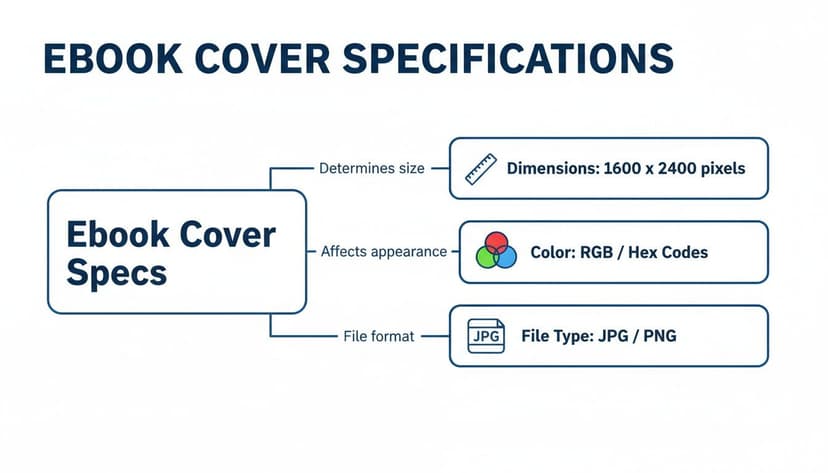
Ebook Cover Dimensions and Resolution
Before you or a designer begins, the digital canvas must be set up correctly. While various stores have slightly different preferences, designing for KDP's standards will ensure your cover is accepted almost everywhere.
- Ideal Dimensions: The gold standard is 2,560 x 1,600 pixels. This creates a 1.6:1 aspect ratio, which looks excellent on modern e-reader screens and scales down perfectly for store listings.
- Resolution (DPI): A resolution of 72 to 96 DPI (Dots Per Inch) is all that's needed for screens. Unlike print, where high DPI is critical, anything higher for a digital file just makes it unnecessarily large without any visual benefit.
Think of it as a digital photograph. The file should be large enough to look sharp on a high-definition tablet but not so massive that it slows down loading times for a potential customer.
Understanding Color Mode: RGB vs. CMYK
Here’s a technical detail that often trips up new authors: color mode. Your ebook cover file must be saved in RGB (Red, Green, Blue).
The easiest way to remember the difference is that RGB is for screens (light) and CMYK is for print (ink). Your monitor, phone, and e-reader create color by mixing red, green, and blue light. A physical printer, on the other hand, mixes Cyan, Magenta, Yellow, and Black inks on paper.
If you upload a file saved in CMYK, the online platform will have to convert it back to RGB. That automated process often results in dull, muddy colors that don't match the vibrant design you approved. Always start your design in RGB and export it in RGB to keep your colors looking bright and exactly as intended. For a deeper dive into these requirements, you can read our detailed guide on the essential specs for a book cover for an ebook.
The Right File Types for Ebooks
Finally, you need to save your finished cover in a format that every online marketplace can read. Stick with these two, and you can't go wrong.
- JPEG (or JPG): This is the king of ebook covers. It delivers a fantastic balance of high image quality and small file size, which is critical for fast loading times on store pages. Your designer will almost always send you a high-quality JPEG as the final file.
- PNG: PNGs are also accepted, but they usually create larger files than JPEGs. Their main advantage is supporting transparency, which is not needed for a standard ebook cover. Unless a specific platform demands it, JPEG is the best choice.
A valuable design practice is "dual-scale design"—making a cover that works both as a tiny thumbnail and as a beautiful piece of art when viewed full-size. With 85% of book sales now originating in an online marketplace, this is more important than ever. Designers achieve this by using bold, scroll-stopping shapes for the thumbnail view while reserving finer details for the full-size version. You can see how this plays out in current trends over at Damonza.com.
This is where experimenting with an AI cover creation tool can be helpful. You can generate multiple concepts and immediately assess how each one performs as a small thumbnail. It's an effective way to test for visibility and impact before finalizing a design, ensuring your cover is optimized to sell from day one.
Mastering the Print Book Cover Format
You've perfected your ebook cover. Can you just send that same file to your printer for the paperback? This common assumption is a guaranteed way to get your file rejected.
Moving from a digital screen to a physical book introduces a whole new set of rules. An ebook cover is a simple, single image, but a print cover is a different beast entirely. It’s what’s known as a full wrap—a single, continuous file that includes the front cover, back cover, and the all-important spine.
Think of it as one cohesive canvas that wraps around your book block. Getting this right is non-negotiable for a professional-looking paperback.
Decoding the Full Wrap Components
Imagine taking the dust jacket off a hardcover and laying it flat. That’s exactly what a print cover file is: one large, continuous image with three distinct zones. To build one correctly, you must master four critical components.
- Trim Size: This is the final, cut dimension of your book. A standard trade paperback, for example, often has a trim size of 6 x 9 inches.
- Bleed: This is a small, extra margin of 0.125 inches of your cover art that extends beyond the trim lines. Why? Printers aren't perfect. This tiny buffer ensures that if the cutting blade is off by a hair, you won't get ugly white slivers along the edges of your finished book.
- Safe Zone: This is the area inside the trim lines where every critical element—your title, author name, blurb, and key images—must live. Anything outside this zone risks getting sliced off during production.
- Spine Width: Here’s the tricky part. The width of your spine depends entirely on your final page count and the paper type (cream paper is often thicker than white paper). This dimension changes for every book.
While a print cover has all these moving parts, an ebook cover is much simpler. It’s a straightforward, single-panel image built for screens.
The key takeaway is that print adds a layer of physical complexity. You're no longer just designing a thumbnail; you're engineering a physical product.
Nailing the Technical Print Specs
Beyond the physical layout, two technical specs will make or break your print cover: resolution and color mode. Get these wrong, and all your hard design work will result in a blurry, discolored mess. For a deeper dive, check out our guide to printable book covers.
For a print book, your file must be 300 DPI and in CMYK color mode. This is the absolute, unbreakable rule. Sending a low-res or RGB file is the number one reason authors end up with fuzzy images and dull, disappointing colors.
Resolution: 300 DPI DPI stands for Dots Per Inch. It measures how many tiny dots of ink a printer will place on a square inch of paper. While 72 DPI looks perfectly fine on a screen, it will look like a pixelated disaster in print. The industry standard of 300 DPI ensures your images and text come out looking sharp, crisp, and professional.
Color Mode: CMYK Your computer screen creates color with light using the RGB (Red, Green, Blue) model. Printers, on the other hand, create color by mixing physical ink using the CMYK (Cyan, Magenta, Yellow, Black) model.
If you design in RGB and send that file to a printer, the colors will be automatically converted to CMYK—and the results can be shocking. The vibrant, glowing blue on your monitor might turn into a flat, muddy navy on paper because CMYK inks simply cannot reproduce those light-based tones.
Always set your design software to CMYK from the very beginning. This gives you an accurate preview of how your colors will actually look on the printed page, saving you from a costly and disappointing surprise.
The Nitty-Gritty: File Types, DPI, and Color Modes
Let's get into the technical details. Getting these specs right is what separates a crisp, professional-looking book from a file that gets instantly rejected by Amazon KDP. Think of this as your pre-flight checklist.
Nailing your file types, resolution, and color modes gives you the power to work confidently with a designer or to correctly set up the files yourself. It’s the final, crucial step.
Choosing the Correct File Type
Using the right file type is like using the right tool for the job. You wouldn't use a screwdriver to hammer a nail, and the file you need for an ebook is completely different from what you need for a paperback.
Here’s a simple breakdown of the three you absolutely need to know:
- JPEG (or JPG): This is the undisputed king for ebook covers. JPEGs give you fantastic visual quality without a huge file size, which means your book’s product page loads in a snap. You’ll almost always submit your final ebook cover as a high-quality JPEG.
- PNG: You can use PNGs for ebooks, but they often create larger files than JPEGs. Their main trick is supporting transparency, which you don't need for a standard cover. Unless a specific retailer asks for it, stick with JPEG.
- Print-Ready PDF: This is the gold standard for print books, and it's non-negotiable. A PDF bundles everything—your high-res images, fonts, and the full-wrap layout—into one locked file. This guarantees that nothing moves or breaks when it goes to the printer.
A classic rookie mistake is trying to upload a JPEG for a print cover or a PDF for an ebook. The platforms will just reject them. Always, always double-check you're uploading the right file for the right format.
Demystifying DPI and PPI
Resolution is easily one of the most critical specs and a major stumbling block for new authors. You'll often hear DPI and PPI thrown around. While they're technically different, they both boil down to one thing: image clarity.
- PPI (Pixels Per Inch): This is for screens. It’s the density of pixels in a digital image. For ebooks, a resolution of 72 to 96 PPI is the standard.
- DPI (Dots Per Inch): This is for print. It measures how many dots of ink a physical printer lays down on paper. For a sharp, non-blurry print cover, 300 DPI is the absolute minimum.
Think of it like this: a low-resolution image is a mosaic made of big, chunky tiles. The picture looks blocky and blurry. A high-resolution image is a mosaic made of tiny, intricate tiles, creating a smooth, detailed picture. If you send a 72 DPI image to a printer, your cover will look like a pixelated mess.
To get a better feel for how visual specs impact display quality, it's also helpful to understand concepts like video aspect ratio, which governs how images fit on different screens.
RGB vs. CMYK: The Real-World Consequences
We’ve touched on this before, but the fallout from getting this wrong is so massive it’s worth repeating. Your choice of color mode directly controls how your cover actually looks when a customer holds it in their hands.
RGB (Red, Green, Blue) is for screens. It’s an "additive" color model that creates colors by mixing light. This is why screens can produce such a wide, vibrant range of glowing colors. It's the required mode for all digital files, especially your ebook cover.
CMYK (Cyan, Magenta, Yellow, Black) is for printing. It’s a "subtractive" color model that creates colors by mixing physical inks on paper, which absorb light. The range of colors CMYK can produce is much smaller than RGB.
Here’s the danger: if you send an RGB file for your print book, the printer’s software will automatically convert it to CMYK, and the results can be shocking. That gorgeous, electric blue on your monitor might print as a dull, lifeless navy. Why? Because the vibrant RGB color was "out-of-gamut," meaning it’s physically impossible for CMYK inks to reproduce.
To avoid this disaster, your print cover file must be designed and exported in CMYK mode from the very beginning.
You can get hands-on experience with these settings when you create a book cover online with a tool that handles the technical details for you.
Technical Specification Cheat Sheet
Feeling overwhelmed? Don't be. Most of these specs are a "set it and forget it" affair once you know what to look for. This cheat sheet boils it all down to the essentials.
| Attribute | Ebook Requirement | Print Requirement | Why It Matters |
|---|---|---|---|
| File Type | JPEG | Print-Ready PDF | Ensures the file is accepted and optimized for its platform (digital vs. physical). |
| Resolution | 72-96 PPI | 300 DPI | Guarantees your cover looks sharp and professional, not blurry or pixelated. |
| Color Mode | RGB | CMYK | Prevents unexpected and dramatic color shifts between your screen and the final printed book. |
| Cover Layout | Front Cover Only | Full Wrap (Front, Spine, Back) | The ebook is just a thumbnail, while the print book is a physical object that wraps around. |
Keep this table handy, and you'll sidestep the most common technical headaches that trip up authors. Getting these four things right is 90% of the battle.
Common Format Mistakes to Avoid

For an indie author, navigating book cover formats can be frustrating. One wrong setting can lead to file rejections from KDP, costly printing mistakes, or a cover that looks amateurish. It's a significant headache.
The good news is that these pitfalls are almost entirely avoidable. By learning to spot the common traps, you can ensure your book makes a strong, professional first impression.
Pitfall 1: Ignoring Bleed and Trim Lines
Forgetting about bleed is arguably the most common and damaging mistake for print books. In simple terms, bleed is an extra 0.125-inch border you add to your design, extending it beyond the final trim size of the book.
- The Consequence: Commercial printing equipment can have slight variations in cutting. If your artwork stops precisely at the edge, a tiny shift can leave an unsightly white sliver along the side of your finished cover, immediately signaling a lack of professional polish.
- The Solution: Always design your print cover with the required bleed. Equally important, keep all critical text and design elements (like the title and author name) inside the "safe zone" defined by your printer's template. This prevents anything important from being trimmed off.
This is especially critical for genres that depend on atmosphere. A poorly formatted thriller book cover with the title crammed against the edge can undermine the suspense you worked so hard to build.
Pitfall 2: Using Low-Resolution Images
This is the primary cause of blurry, pixelated print covers. An author might find a great image online, but it's a small file intended for a website. When stretched to fit a 6 x 9-inch book, the result is a low-quality mess.
Golden Rule for Print: Your cover file must be 300 DPI (Dots Per Inch). An image that looks sharp on a 72 DPI screen will appear fuzzy and blocky in print because there isn't enough data in the file for the printer to create a sharp image.
The Consequence: Your cover art looks muddy and out of focus. This immediately suggests a low-quality product to readers and can damage your author brand.
The Solution: Only use high-resolution images for your print design. When purchasing stock photos, always select the largest file size available. A professional designer will handle this, but if you're creating the cover yourself, this is non-negotiable.
Pitfall 3: Miscalculating Spine Width
Your book's spine width is not a fixed number; it depends on your final page count and the paper type selected for printing. Guessing or using an old calculation is a sure way to have your file rejected.
The Consequence: If your spine calculation is too narrow, the text will wrap awkwardly onto the front or back cover. If it's too wide, the front and back cover art will creep onto the spine. Both outcomes look unprofessional and will be automatically rejected by platforms like KDP's file-checking system.
The Solution: Finalize your manuscript before you finalize the print cover. Once it's complete, use the official spine calculator from your printer (both KDP and IngramSpark provide one) with your exact page count and paper choice to get the precise width. A good designer will require this final number before completing the full-wrap cover. It is one of the most critical details in the entire book cover design format.
Your Pre-Launch Cover Format Checklist
You’ve poured your heart into the design, and your cover is finally looking perfect. But before you race to hit that “upload” button on Amazon KDP, it’s time for one last, crucial step. This is where a single overlooked setting can cause file rejections, ugly printing errors, or a cover that just looks off.
Think of this as your pre-flight check. Running through this list will give you the confidence that your book is ready for a clean, professional debut.
For Your Ebook Cover
Your ebook cover is your digital storefront window. Its entire job is to look sharp and irresistible on a store page, especially as a tiny thumbnail.
- File Format: Is your file a high-quality JPEG? This is the universal standard that keeps your cover looking crisp while loading quickly for shoppers.
- Dimensions: Have you sized it to KDP’s preferred 2,560 x 1,600 pixels? This ratio ensures it looks fantastic on large screens and scales down perfectly without distortion.
- Color Mode: Is the file saved in RGB? This is non-negotiable for digital screens and ensures your colors appear as intended.
- Resolution: Is the resolution set to 72 or 96 DPI? Anything more is unnecessary for screens and inflates your file size.
- Content: Does the file contain only the front cover? Ebooks don’t have spines or back covers.
Final Check: Open the JPEG on your phone. If the title is hard to read or the design doesn't immediately grab you at that small size, it might need refinement. This is also a great opportunity to test variations, perhaps using an AI tool to see if a different concept has more thumbnail power.
For Your Print Book Cover
A print cover is a physical product that demands manufacturing precision. Getting these details wrong can be a costly, frustrating mistake.
- File Format: Is your final file a print-ready PDF? This industry-standard format locks your design—fonts, images, and layout—in place for the printer.
- Layout: Is the PDF a full wrap—a single, continuous image including the front, spine, and back?
- Resolution: Is everything set to a crisp 300 DPI? This is the gold standard for print quality.
- Color Mode: Did you export the file in CMYK color mode? This is your best defense against disappointing color shifts between screen and print. A professional romance book cover, for example, relies on accurate skin tones and rich colors, which CMYK helps preserve.
- Bleed: Did you add the required 0.125-inch bleed on all four outer edges? This safety margin prevents white slivers from appearing after trimming.
- Safe Zone: Is all essential text and imagery (title, author name, blurb) tucked safely inside the safe zone, away from the trim lines?
Frequently Asked Questions About Cover Formats
Once your design is locked in, you’re on the home stretch. But this is often where a new wave of technical questions pops up. Let's clear up some of the most common final-step hurdles authors run into with their cover formats.
Do I Need a Different ISBN for Ebook and Print Formats?
Yes, absolutely. Each format of your book—ebook, paperback, hardcover—is considered a distinct product and requires its own unique ISBN.
Think of them as different items in a store; they cannot share the same barcode. If you plan to release a paperback and a hardcover, they will each need a separate ISBN, and your ebook will require its own as well.
Can I Easily Convert a Print Cover to an Ebook Cover?
Not with a single click, but it's a straightforward task for a designer. The print cover is a "full wrap" file that includes the front, back, and spine. An ebook cover is only the front.
A designer will take the full print PDF, crop out the front cover art, and re-format it for digital. This involves resizing it to the correct dimensions (e.g., 2,560 x 1,600 pixels for KDP), changing the color mode from CMYK to RGB, and saving it as a JPEG. You cannot simply upload the print PDF for your ebook; it will be rejected.
How Should I Approach Covers for Multiple Platforms?
The best practice is to create one master file for your ebook and one for your paperback that will work across all major retailers like Amazon KDP, IngramSpark, and Apple Books.
The key is to design your files to meet the strictest standards, which are typically KDP's. If your files are built for KDP, they will almost certainly be accepted elsewhere.
- Ebook: A high-resolution JPEG (ideally 2,560 x 1,600 pixels) in RGB color mode is the universal standard.
- Print: A 300 DPI, CMYK, print-ready PDF with the correct bleed and spine width will work for any major print-on-demand service.
The only detail that might change is the spine width if you use different printers with different paper types, but the front cover art itself remains the same. A great romance book cover, for example, will look just as professional on Barnes & Noble as it does on Amazon.
What if My Page Count Changes After the Cover Is Designed?
This is a common issue and highlights why you should always finalize your manuscript before the print cover is designed.
If your page count changes, even by a few pages, the thickness of your book changes. This means your spine width is now incorrect, and your existing print cover file is unusable.
You will need to provide your designer with the final, locked-in page count. They will then adjust the spine width on the print PDF and shift the back cover elements accordingly. It's usually a quick fix for a professional but is absolutely necessary to avoid a file rejection or a misprinted book.
Ready to Create Your Own Book Cover?
Turn your story into a visual masterpiece. Fill in the details below to start generating professional covers instantly.