A Guide to Designing a Book Cover for Ebook Publishing
Learn how to design a high-converting book cover for ebook platforms. This guide covers technical specs, design principles, and a modern AI workflow.
Posted by
Related reading
Photos for Book Covers: A Complete Guide for Authors
Learn how to choose effective photos for book covers. This guide covers composition, sourcing, licensing, and technical specs for KDP-ready designs.
Create the Perfect Book Review Form: A Guide for Authors
Learn to design a book review form that delivers actionable feedback. This guide covers question design, distribution tactics, and using reviews for marketing.
Effective Backgrounds for Covers: KDP Guide 2026
Choose effective backgrounds for covers to grab attention on Amazon KDP. Our 2026 guide covers types, genre matching, composition, & technical specs.
Ready to design your cover?
Use our AI book cover generator to create tailored book cover concepts in minutes.


On the endless digital shelves of Amazon, your ebook cover is the only sales tool that matters in the first three seconds. Before a reader ever gets to your killer blurb, your glowing reviews, or the "look inside" feature, they’ve already made a snap judgment based on one thing: a tiny thumbnail image.
A great cover isn't just art. It's a calculated marketing asset designed to signal genre, quality, and promise to your ideal reader—instantly.
Why Your Ebook Cover Is Your Most Important Sales Tool

Think of your cover as your digital storefront. It’s your first and best chance to stop a reader from scrolling past your book into the abyss of other titles. A professional, genre-appropriate design does more than just catch the eye; it builds immediate trust and tells the reader exactly what to expect.
The Psychology of the Click
Book buyers are masters of visual shorthand. They have been trained for years to associate specific colors, fonts, and imagery with the genres they love. A dark, moody cover with a stark, sans-serif font practically screams "thriller." A soft-focus illustration paired with an elegant script font whispers "cozy fantasy."
In the blink of an eye, your cover has to answer a few critical, subconscious questions for the reader:
- What kind of story is this? The visual language must align perfectly with genre conventions. Getting this wrong is the fastest way to confuse readers and lose a sale.
- Does this look professional? An amateur cover hints at an amateur story. Right or wrong, readers equate a high-quality design with a well-written and properly edited book.
- Is this a book for me? The cover's entire mood—whether it’s tense, romantic, adventurous, or inspiring—has to connect with what your target audience is looking for.
Your ebook cover isn't just a wrapper for your manuscript. It’s a precision-engineered piece of marketing built to attract a very specific type of reader. Its only job is to earn the click so your blurb and sample pages can do the rest.
Communicating Value Instantly
In a saturated market, your cover becomes a direct reflection of your author brand. A polished, compelling design signals you’re a serious author who has invested in their craft. It shows you respect the reader's time and money.
A killer cover can put a brand-new indie author on the same visual footing as a multi-platinum bestseller from a major publishing house. It levels the playing field. When a reader is browsing, they don't see your marketing budget or your publisher's logo—they just see the cover. Nail this one element, and you’ve already won half the battle for their attention.
Getting the Technical Specs Right for Your Ebook Cover
There's nothing more deflating than hitting "publish," only to be met with an upload error. Getting your beautifully designed book cover for ebook rejected over a technicality is a common—and completely avoidable—headache for indie authors.
These specs aren't just arbitrary rules. They exist to make sure your cover looks sharp and professional on every single device, from a tiny smartphone screen to a big, high-resolution tablet. Think of them as the foundation. Without a solid foundation, even the most incredible artwork won't connect with readers the way it should.
The KDP Gold Standard Dimensions
For anyone publishing through Amazon's Kindle Direct Publishing (KDP), there’s a magic number that has become the de facto industry standard: 2,560 x 1,600 pixels.
Why this size? It’s all about clarity. This dimension ensures your cover is crisp and clean on the high-definition displays that are now common on modern tablets and e-readers. A smaller image might look okay as a thumbnail, but it can appear fuzzy or pixelated when a reader taps to see it full-size, which immediately screams "amateur."
- Height: 2,560 pixels
- Width: 1,600 pixels
- Ratio: This gives you the ideal height/width ratio of 1.6:1.
KDP’s absolute minimum is 1,000 pixels on the longest side, but aiming for the 2,560 x 1,600 standard is a smart move. It future-proofs your design, guaranteeing it looks great as screen technology continues to improve. And while you're mastering these details, it's always a good idea to stay current on general Amazon image requirements and best practices to avoid any surprises.
Key Takeaway: Always design your ebook cover at the highest recommended resolution. You can easily scale a large, high-quality image down without losing an ounce of clarity, but you can never scale a small, low-quality image up without it looking like a mess.
Must-Knows: File Format and Color Profile
Beyond the pixel count, two other critical details can make or break your upload: the file format and the color profile. If you get these wrong, your vibrant, eye-catching cover could end up looking dull and muddy, or just get rejected by the platform.
File Format: Stick with JPEG KDP accepts two file types for ebook covers: JPEG (or JPG) and TIFF.
- JPEG: This is the recommended choice. It offers a fantastic balance between high image quality and a manageable file size. This means your cover looks great without slowing down loading times for potential buyers.
- TIFF: This is a "lossless" format, meaning it's uncompressed. While that sounds good in theory (and is great for print), the files are massive and provide no real visual benefit for a cover viewed on a screen.
For 99% of authors, a high-quality JPEG is the way to go. When you're exporting your file, just make sure to choose a quality setting of at least 90% (often labeled "Maximum" or "High") to preserve all the important details.
Color Profile: RGB is Non-Negotiable This one is an absolute must. Your cover’s color profile must be RGB (Red, Green, Blue).
RGB is the color language of digital screens—every monitor, phone, and tablet uses it. The alternative, CMYK (Cyan, Magenta, Yellow, Black), is strictly for printing physical books. If you accidentally upload a CMYK file to KDP, the platform will try to convert it, and the colors will likely end up looking muted, off, or just plain wrong.
This is a common mistake, especially for authors designing their print and ebook covers at the same time. Always double-check that your final book cover for ebook file is saved in the RGB color space. For a broader view of the entire publishing journey, our guide to self-publishing on Amazon ties all these pieces together.
Ebook Cover Specifications for Major Platforms
While KDP is the giant in the room, you might also be publishing on Apple Books, Kobo, or other platforms. The good news? Their requirements are very similar, and a KDP-optimized cover will almost always work perfectly everywhere else.
Here's a quick reference table.
| Specification | Amazon KDP | Apple Books | Kobo |
|---|---|---|---|
| Recommended Dimensions | 2,560 x 1,600 pixels | At least 1,400 pixels wide | At least 1,600 pixels wide |
| Ideal Ratio | 1.6:1 | Any (1.5:1 common) | Any (1.5:1 common) |
| File Format | JPEG, TIFF | JPEG, PNG | JPEG, PNG |
| Color Profile | RGB | RGB | RGB |
| Minimum Resolution | 72 DPI (300 DPI recommended) | 72 DPI | 72 DPI |
By sticking to that KDP gold standard—a 2,560 x 1,600 pixel JPEG in the RGB color space—you're creating a universal file. It will meet the specs for virtually any digital bookstore, saving you time and ensuring your book has a consistent, professional look everywhere it’s sold.
Key Design Principles for a High-Converting Ebook Cover
Once you’ve nailed the technical specs, the real work begins. A perfect file gets you in the door, but a smart design is what actually sells your book. The goal isn't just to look professional. It's to create a cover that actively grabs the right readers and gives them an undeniable reason to click.
Think Thumbnail-First, Always
On Amazon, the first time most readers see your cover, it's a tiny image, maybe just 150 pixels tall, buried in a long list of search results. That gorgeous, detailed design that looks amazing on your 27-inch monitor can easily become an unrecognizable smudge.
This is why a thumbnail-first mindset isn't optional; it's essential for survival.
Every single design choice has to be judged by how well it works at a tiny scale.
- Clarity Over Complexity: Forget subtle textures and intricate details. They vanish. Go for bold, clean images with strong silhouettes that pop.
- Instantly Readable Title: Your title has to be legible at a glance. This usually means choosing thicker, cleaner fonts. Those delicate, swirly scripts might look pretty up close, but they turn into a blurry mess when shrunk down.
- One Powerful Focal Point: Don't crowd the canvas. A single, striking element—a face, a silhouette, a key object—is infinitely more effective than a busy scene where everything is competing for attention.
Pro Tip: Before you finalize a design, shrink it down to the size of a postage stamp on your screen. Can you still read the title? Is the main image clear? If not, the design is failing its most important test. This simple check can save you from a very expensive mistake.
Speak Your Genre's Visual Language
Readers are incredibly savvy. They scan covers using a kind of visual shorthand to find books they'll love. They expect a thriller to look like a thriller, and a romance to look like a romance. Your cover's font and color palette are the most powerful signals you have to meet those expectations instantly.
Getting this wrong is one of the fastest ways to kill a sale. A cover that screams "sci-fi" for a historical romance won't just repel the right readers; it will attract the wrong ones who are guaranteed to leave you bad reviews.
Fonts That Signal Genre
The font you choose does more than spell out words—it sets the entire tone for the story within.
- Thrillers & Suspense: These almost always use stark, bold, sans-serif fonts like Helvetica Neue or Bebas Neue. The sharp, clean lines create an immediate sense of modern danger and tension.
- Fantasy & Sci-Fi: There's more room to play here. Epic fantasy often leans into classic, decorative serif fonts, while sci-fi goes for something more futuristic or digital-looking.
- Romance: This genre lives and dies by its typography. Elegant script fonts or clean, modern serifs are the go-to. A steamy contemporary romance will use a very different font than a sweet historical one—a subtle cue that helps readers find their perfect story.
- Non-Fiction: The vibe here is authority and clarity. Clean, professional sans-serif or serif fonts are the standard, signaling that the content is trustworthy and easy to digest.
If you're struggling to find the right feel, a deep dive into fonts for book covers can be a huge help in narrowing down the options.
Color Palettes That Sell
Color psychology is a massive part of cover design. Your color choices trigger instant emotional responses and genre associations in a reader's brain.
- Dark & Contrasting: Deep blues, blacks, and blood reds punched up with bright white or yellow are classic thriller, horror, and suspense. High contrast equals high tension.
- Warm & Soft: Pinks, peaches, and light blues are the bread and butter of romance and women's fiction. They create a feeling of warmth, intimacy, and connection.
- Earthy & Muted: Think greens, browns, and grays. These palettes often signal historical fiction, serious literary fiction, or non-fiction about nature or history.
- Vibrant & Bold: Bright, saturated colors are perfect for grabbing attention in sci-fi, fantasy, and comedy. They promise an energetic, fast-paced read.
Create a Clear Visual Hierarchy
Visual hierarchy is simply arranging elements on your cover so the reader's eye is guided exactly where you want it to go. A cover with a strong hierarchy feels clean and professional. A cover without one feels chaotic and amateurish.
Here’s the typical path a reader’s eye takes:
- Main Image: This is the hook. It's the first thing that grabs their attention.
- Book Title: Their eye should move straight from the image to the title. This needs to be the biggest, boldest text on the cover.
- Author Name: After they know what the book is called, they look for who wrote it. It should be prominent but shouldn't overshadow the title (unless you're Stephen King).
- Tagline/Subtitle: This is the final piece of info, offering a little extra flavor or context.
You create this path using simple design tools:
- Size: Bigger things feel more important. Make your title the largest text element.
- Color & Contrast: Our eyes are drawn to bright, high-contrast areas. Use this to make your title or a key image pop.
- Placement: We naturally see things at the top or in the center of a design as being more important.
When you put these principles to work, your cover stops being just a pretty picture. It becomes a strategic asset, fine-tuned to do one job incredibly well: sell your book.
A Practical Workflow for Creating Your Ebook Cover
Designing a book cover that sells can feel overwhelming. You don't need a massive budget or a degree in graphic design, though. With the right process, any author can go from a vague idea to a polished, KDP-ready cover file.
This workflow breaks it down into three practical phases: defining your core concept, brainstorming variations, and adding the final professional polish. It turns a technical chore into a creative and exciting part of bringing your book to life.
Start with a Solid Creative Brief
Before you even think about fonts or images, you have to translate your story's soul into a visual language. This is what a creative brief is for. It’s a strategic North Star for every design decision that follows. This is where you distill your novel's core themes, mood, and characters into concrete visual cues.
To start, just answer these three questions:
- What’s the core conflict? Boil down the central struggle. (e.g., A detective must find a killer before they strike again.)
- What’s the primary mood? If you had to describe the book's vibe in three words, what are they? (e.g., Tense, atmospheric, gritty.)
- Are there key symbols or objects? Think about recurring items that hold real weight in the story. (e.g., A single raven feather, a broken pocket watch, a specific city skyline.)
These answers are the raw materials for your design. They give you the ammo you need to find imagery and typography that perfectly match what readers in your genre are looking for.
This flow chart breaks down the core principles of the design process.
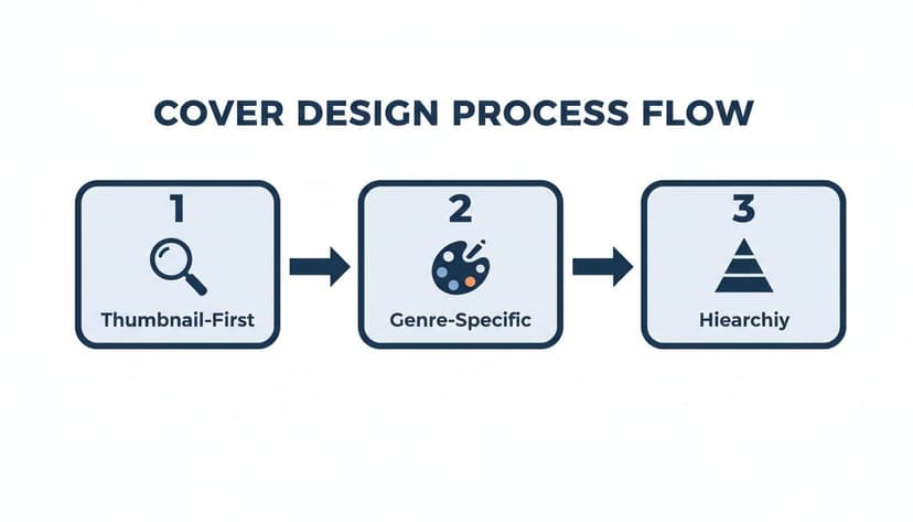
As you can see, every great cover starts by being clear even when tiny (thumbnail-first), respects the visual rules of its genre, and uses a strong visual hierarchy to tell the reader what’s important.
Generate and Iterate on Concepts
Once your brief is locked in, it's time to explore visual directions. In the past, this meant rough sketches or paying a designer for a few pricey mockups. Today, you have more direct tools for this exploratory phase.
This is where generating concepts with an AI tool can be useful. You can feed it the keywords and themes from your creative brief and get back multiple, distinct concepts in minutes. Instead of trying to guess what a "gritty urban fantasy with a lone detective" might look like, you can see several versions almost instantly.
The goal here isn't to hit a home run on the first try. It's about rapid iteration. Generate a concept, see what works and what doesn't, tweak your prompt, and go again. This is how you can discover visual ideas you might not have thought of on your own.
For example, your first prompt might be too vague. After seeing the initial results, you might refine it to something much more specific: "A dark, rain-slicked city street at night, with a lone figure in a trench coat silhouetted under a single streetlamp." This back-and-forth process gets you closer and closer to a concept that truly nails your story's feel.
Refine and Polish Your Final Design
When you've landed on a base image that gets you excited, it's time for the final phase: refinement. This is where you add the professional touches that make a cover look polished instead of homemade. This includes typography, layout, and making sure every element has a job to do.
You don't need to be a design guru for this part. There are plenty of user-friendly tools that give you all the control you need. For a deep dive, check out our guide on the best book cover design software, which reviews options for every skill level and budget.
Your Final Refinement Checklist:
- Typography Placement: Play with the size and position of your title and author name. Does the title grab your attention immediately? Is your name legible but not screaming for attention?
- Font Selection and Effects: Make sure the font style fits your genre. Test subtle effects like a drop shadow or a soft outer glow to make the text pop against the background.
- Color Adjustments: Make tiny tweaks to the image's brightness, contrast, or saturation. Sometimes, pulling a little color out of the background is all it takes to make your title stand out.
- The Thumbnail Test: Before you export, zoom way out and look at the cover as a tiny thumbnail. Can you still read the title? Is the main image still clear? This is the most critical final check.
This modern workflow—brief, generate, refine—demystifies the entire process. It puts you, the author, in the driver's seat, giving you the power to create a high-quality, market-ready book cover for ebook that does justice to your story.
Preparing and Exporting Your Final Cover Files
You’ve wrestled with the creative process, nailed down a powerful concept, and obsessed over every last typographic detail. Now you’re at the finish line—the final, critical step of exporting your cover file before you can finally hit "publish."
Don’t rush this part. Getting the export settings wrong can lead to frustrating upload rejections from platforms like KDP. Even worse, it can result in a cover that looks blurry, pixelated, and unprofessional on retail sites, undermining all your hard work. This is all about technical precision.
Choosing the Right Export Settings
When you hit "Save As" or "Export," you'll see a few technical-looking options. Making the right choices is straightforward and will ensure your cover sails through KDP’s validation process every single time.
Your main focus is on two things: the file format and the compression level. These settings have a direct impact on both the visual sharpness and the size of your final file.
-
File Format: Always choose JPEG (or .jpg). Some platforms might accept other formats like TIFF, but JPEG hits the sweet spot between high image quality and a small, web-friendly file size. It's the undisputed industry standard for a reason.
-
Compression/Quality: When you export as a JPEG, you’ll see a quality slider, usually from 0-100 or 1-12. Keep the quality high to maintain crisp text and sharp imagery. A good rule of thumb is to set it to 90% or higher (or a setting of 10-12). This prevents ugly compression artifacts, like blurriness around your title, while still keeping the file size reasonable.
-
Color Profile: Just give this a final check. Make sure your file is still in the RGB color space. As we covered earlier, this is the native language of digital screens and an absolute must for ebook covers.
Your Pre-Upload Final Checklist
Before you drag and drop that file into KDP, run through this quick sanity check. This is the final proofread for your cover’s technical health.
- Dimensions: Is the file exactly 2,560 x 1,600 pixels? This is the gold standard that guarantees your cover looks fantastic on everything from a tiny phone screen to a large tablet.
- File Type: Did you save it as a JPEG?
- File Size: Is the file under KDP’s generous 50 MB limit? A properly exported JPEG at the right dimensions will almost always be well under this cap, usually just a few megabytes.
- Final Proofread: Seriously, read every single word on the cover one last time. Squint at the author name, the title, and any tagline. You’d be amazed how often a typo slips through.
- File Naming: Use a clean and professional file name. Something like
StephenKing_TheShining_EbookCover.jpgis infinitely better thanfinal_cover_v3_final_final.jpg. You’ll thank yourself later.
Pro Tip: Consider creating two or three slight variations of your final cover. Maybe one version has a different color for the subtitle, or you test a punchier tagline. Having these test-ready files handy makes it incredibly easy to run ads later and let the data tell you which design actually converts more readers into buyers.
By methodically checking these final details, you’re not just saving yourself a potential headache—you're ensuring your book shows up looking polished, professional, and ready to sell.
Common Ebook Cover Questions
Even with a clear plan, a few nagging questions always seem to pop up, especially when you're creating your first book cover for ebook release. Let's tackle some of the most common ones I hear from authors.
What Are the Biggest Cover Design Mistakes to Avoid?
Almost every major blunder comes down to one thing: forgetting that most readers will see your cover as a tiny thumbnail first. If it doesn't work at that size, it doesn't work at all.
One of the most frequent slip-ups is using low-res images. They look blurry and pixelated on retail sites, which screams amateur and scares potential buyers away.
Typography is another huge minefield. Authors fall in love with beautiful, ornate fonts that become an illegible smudge when shrunk down. Other common mistakes include:
- Genre Mismatch: Your cover screams gritty sci-fi, but your book is a lighthearted rom-com. This is a surefire way to attract the wrong readers and get bad reviews.
- Visual Overload: Trying to cram every plot point onto the cover creates a chaotic mess. You need a single, powerful image that grabs the eye, not a crowded scene.
- Zero Hierarchy: The reader’s eye darts around, unsure where to land. Your title should be the star of the show, followed by your author name. Everything else is secondary.
Do I Really Need a Separate Cover for My Ebook and Paperback?
Yes, you absolutely do. While the front cover artwork can stay the same, the actual files you need are completely different.
Your ebook cover is a simple, single JPEG file of just the front.
A paperback cover, however, is a full "wraparound" file, usually a PDF. It includes the front, the back blurb, and the spine. The tricky part is the spine width—it’s calculated based on your final page count and the paper you choose. That means you literally can't create the final print-ready file until your manuscript is 100% formatted and finalized.
How Can I Figure Out Which Cover Will Actually Sell?
The gold standard here is A/B testing. No more guessing or asking your mom what she thinks.
This means creating two different cover concepts and running them against each other with real-world ads on a platform like Facebook or Amazon Ads. You show each version to a similar audience and let the data tell you what works. The cover with the higher click-through rate (CTR) is your winner—it's the one that makes actual buyers stop scrolling.
Polling your friends is nice for a confidence boost, but live market data is what puts money in your pocket. AI tools can be helpful here, allowing you to generate several slight variations of a winning concept in minutes to really dial in what connects with readers.
Is It Worth Paying for Stock Photos?
Without a shadow of a doubt. High-quality, properly licensed stock photos are non-negotiable for two critical reasons: professionalism and legal protection.
"Free" image sites often come with murky licensing terms that can land you in hot water if you use their images for commercial purposes (like selling a book).
Investing a few dollars in a reputable stock photo site like Depositphotos or Adobe Stock buys you peace of mind and access to millions of professional images. It instantly levels the playing field, making your book look just as polished as one from a major publisher. You can see how quality imagery elevates a design by looking at these fantasy book cover examples. It’s a tiny investment with a massive payoff in perceived value.
Ready to Create Your Own Book Cover?
Turn your story into a visual masterpiece. Fill in the details below to start generating professional covers instantly.