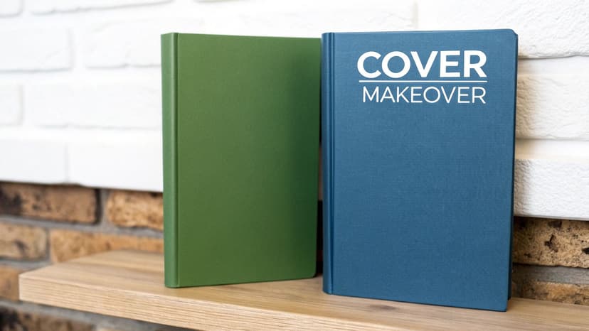
Mastering the Principles of Design Repetition
Discover the principles of design repetition to create unified and memorable designs. Learn the core benefits, types, and common mistakes with clear examples.
Posted by
Related reading
How to Write an Ebook in 2026: A Step-by-Step Guide
Learn how to write an ebook that sells. Our practical guide covers topic validation, drafting, editing, formatting, cover design, and launching on KDP.
Children Book Illustration: From Concept to KDP
Learn the essentials of children book illustration in our complete guide for indie authors. Covers styles, hiring illustrators, budgets, and KDP print specs.
The Bright Pink Color Code for KDP Book Covers
Find the right bright pink color code for your book cover. This guide covers hex, RGB, and CMYK values, plus KDP print settings and design tips for authors.
Ready to design your cover?
Use our AI book cover generator to create tailored book cover concepts in minutes.


Think about your favorite song. What's the part you can't help but sing along to? It’s almost always the chorus—that one repeated section that anchors the entire piece and makes it unforgettable. The principles of design repetition work in the exact same way.
The Hidden Rhythm in Great Design
Repetition is so much more than just copying and pasting. It’s the strategic reuse of certain visual elements—like colors, shapes, fonts, or textures—to create a unified, memorable experience for the viewer.
This principle is the invisible thread that ties a design together. It builds a sense of unity, reinforces your brand identity, and tells the viewer’s eye exactly where to go. It’s what turns a random collection of parts into a polished, professional whole.

This idea is the secret to leveling up your designs, especially for something like a book cover where that first impression is everything. For a book cover, repetition might be as simple as using the same bold font for both the title and the author’s name. Or it could mean pulling a specific color from the main image and using it for the text. These small, deliberate choices create a visual rhythm that pulls the reader in.
A Legacy of Cohesion
Using repetition to create harmony isn't some new-age design trend. Its roots in the visual arts go back to at least the early 20th century, really taking off during the Bauhaus movement that started in 1919. This legendary school is responsible for shaping about 90% of the minimalist design principles we see today, and they preached repetition as the key to simplicity. Its importance hasn't faded one bit; roughly 92% of first-year design students are still taught repetition as a foundational concept. You can see more design statistics that prove its lasting impact on Linearity.io.
Repetition is the glue that holds a design together. It provides the consistency that makes a visual composition feel like a single, cohesive unit rather than a random assortment of elements. Without it, a design can feel chaotic and confusing.
Ultimately, mastering repetition gives you control over how your design is perceived. It lets you:
- Establish a strong visual hierarchy, telling viewers what to look at first.
- Build a memorable brand identity through consistent visual cues.
- Create a pleasing sense of movement and flow that guides the eye naturally.
When you understand how and when to repeat certain elements, you can create designs that aren't just beautiful, but also incredibly clear and effective.
Why Repetition Is Your Most Powerful Design Tool
It’s easy to think of repetition as boring or uncreative, but in design, it’s one of the most powerful tools in your arsenal. Repetition isn’t about endlessly copying the same thing; it’s about being intentional. When you use it right, repetition brings a sense of clarity, strength, and purpose to your book cover.
It works because it taps directly into how our brains naturally find patterns and make sense of the world. By mastering it, you gain control over how a reader experiences your cover, turning a simple design into something cohesive and memorable.
Forge Unforgettable Unity and Cohesion
Think of repetition as the visual glue that holds your entire design together. When elements like colors, fonts, or shapes are repeated, they create a family resemblance across the cover. This simple act turns a jumble of separate parts into a single, unified whole.
A cover without any repetition can feel chaotic—the title, author name, and imagery all seem to be shouting over each other. But repeat a font style or a specific color, and suddenly those elements feel connected, signaling to the reader that they’re all part of the same story. Our guide on how to use fonts for book covers dives deeper into creating this kind of typographic harmony. You can see these principles of repetition applied in many fantasy book covers to create a sense of magic and scale.
By repeating key elements, you create a predictable and satisfying journey for the viewer, ensuring your message is seen and understood exactly as you intended. This predictability builds trust and makes the design feel professional and deliberate.
Build Powerful Brand Recognition
Consistency is everything when it comes to building a memorable brand. Repetition ensures that every time someone sees your work, they are reminded of your unique identity. The process of creating impactful brand guidelines is built entirely on this idea—codifying the repetitive use of logos, colors, and typography to build an instantly recognizable presence.
This consistency is what makes a brand feel familiar in a crowded market. When a reader spots that same distinctive font or color palette across an entire series of books, they immediately connect it to an author or publisher. Over time, that recognition builds a loyal following.
This isn't just a design trick; it’s rooted in cognitive science. Spaced repetition is a learning technique that uses carefully timed recurrence to cement information in our memory. Experiments going all the way back to 1985 showed that optimized intervals could help people maintain around 80% retention. In the same way, repeating design elements reinforces your brand in a reader's mind, making your work unforgettable. You can explore the fascinating history of this learning method in more detail on SuperMemo.com.
Create a Satisfying Visual Rhythm
Finally, repetition creates a visual rhythm that guides the eye across your layout. It’s like a trail of breadcrumbs, leading the viewer from one piece of information to the next in a natural, logical sequence. This flow is critical for making sure your message is absorbed in the right order.
- Creates Flow: Repetition establishes a predictable path, making the design easy and intuitive to navigate.
- Directs Attention: It subtly tells the viewer where to look next, preventing their gaze from wandering aimlessly.
- Adds Energy: A well-paced rhythm can make a design feel dynamic and engaging, not flat and static.
By repeating certain elements, you create an effortless journey for the eye, ensuring your most important messages aren't just seen, but truly understood.
Exploring the Five Types of Design Repetition
Repetition isn’t a single, blunt instrument. Think of it more like a versatile toolkit, with different tools for different jobs. Getting a handle on the specific types of design repetition lets you control the exact feeling your book cover conveys, whether you’re aiming for calm consistency or dynamic energy.
It's a bit like a musician choosing between a steady, hypnotic drumbeat and a complex, evolving melody. Both lean on repetition, but they create wildly different emotional responses in the listener. Let's break down the five core types you can use to bring your cover to life.
Simple and Alternating Repetition
The most straightforward approach is simple repetition, where you reuse the same element without any changes. This is your go-to for creating a strong sense of unity and consistency. For example, using the exact same font style and size for every chapter heading in a book creates a predictable, easy-to-follow structure that readers appreciate, even subconsciously.
Taking it up a notch, we have alternating repetition. This type follows a predictable A-B-A-B sequence, creating a rhythm that's simple yet engaging. On a book cover, this could be a pattern of alternating thick and thin stripes in the background or switching between two specific colors in a series of graphic elements. It adds a touch of visual interest without getting too busy.
This simple concept map shows how the core benefits of repetition—Unity, Brand Recognition, and Rhythm—are all connected.

As you can see, each benefit stems from that central idea, showing how a single principle can hit multiple design goals at once.
Progressive and Rhythmic Repetition
When you want to show movement or growth, progressive repetition is the perfect tool. Here, an element is repeated, but it changes slightly with each instance—it might get progressively larger, shift in color, or fade into the background. Imagine a series of birds flying across a cover, with each one getting smaller to suggest distance. That’s progressive repetition telling a visual story.
Repetition, in its many forms, is the key to creating a design that feels both unified and alive. It provides the structure that allows creativity to flourish without descending into chaos.
Then there is rhythmic repetition, which is all about the spacing between elements. Instead of a uniform pattern, the gaps between repeated items vary, creating a more dynamic and organic flow. Think of the difference between a metronome's rigid tick-tock and a natural heartbeat. This technique can make a design feel less mechanical and more human.
Pattern-Based Repetition
Finally, pattern-based repetition is the most structured form. Elements are repeated in a grid-like or highly organized way to create a distinct texture or surface. This could be a repeating geometric shape that forms a background or a tiled motif that adds a touch of decorative flair. This type is brilliant for establishing a strong, cohesive visual theme across a large area of your design—it's exactly why romantasy cover design ideas lean so heavily on repeated botanical and filigree motifs.
To help you figure out which type fits your project, here’s a quick rundown of their strengths.
Comparing the Five Main Types of Repetition
This table breaks down the different types of design repetition, their core characteristics, and their most effective use cases in visual design, particularly for book covers.
| Type of Repetition | Core Characteristic | Best Used For |
|---|---|---|
| Simple | Identical elements are reused consistently. | Creating strong unity and brand consistency. |
| Alternating | A predictable A-B-A-B sequence. | Building a simple, pleasing rhythm. |
| Progressive | Elements change slightly with each instance. | Showing movement, growth, or a sequence. |
| Rhythmic | Spacing between elements is varied. | Creating a dynamic, natural flow. |
| Pattern-Based | Elements form a structured, grid-like design. | Building textures and cohesive backgrounds. |
Each of these types offers a different way to guide the viewer's eye and build a cohesive experience. Choosing the right one is all about matching the technique to the story you want your cover to tell.
See How Repetition Transforms Book Cover Designs
It's one thing to talk about design theory, but the real magic happens when you see the principles of design repetition in action. A book cover without cohesion just feels… off. It’s disjointed, confusing, and screams amateur. It can’t grab a reader’s attention because there’s no clear visual story to follow.
This is where we get our hands dirty. We'll walk through some practical before-and-after examples, starting with messy, ineffective mockups and showing how simple, strategic repetition turns them into polished, professional covers that practically leap off the shelf.
From Disjointed to Unified
Picture this "before" cover for a sci-fi novel. It’s got everything but the kitchen sink: a sprawling space battle, a futuristic city, and a close-up of the hero. To make it worse, the title is in a slick, modern font, but the author's name is in a classic serif. The color palette is a free-for-all. It's pure chaos.
A reader’s eye doesn’t know where to land first. Is this book about the battle, the city, or the character? The clashing fonts create a jarring disconnect, shattering the cover's unity.
Now, let's fix it with repetition.
- Typographic Harmony: First, we make the author's name font the same as the title font, just in a smaller size or a lighter weight. This one simple change creates an immediate visual link. It establishes a clear hierarchy and unifies all the text.
- Color Cohesion: Next, we pull just two or three dominant colors from the artwork itself—maybe the orange from an engine flare and the deep blue of space. We then apply this limited palette to the typography. Suddenly, the text feels like it belongs with the image, not just slapped on top.
These small, intentional acts of repetition pull all the scattered pieces together into one powerful composition. The cover now confidently communicates its genre and focus. If you want to see more examples of this in the wild, check out some top-tier book cover design inspiration to see how the pros do it.
Creating Rhythm with Shapes and Patterns
Another common misstep is a flat, static background. Let's take a non-fiction business book as our second "before" example. The cover is plain white with a title, an author name, and a tiny, generic icon like a lightbulb. It’s clean, sure, but it’s also incredibly boring. There's no energy to draw the eye.
To breathe some life into this design, we can use pattern-based repetition.
By repeating a single, simple element, you can create a background texture that adds depth, communicates a theme, and guides the eye without overwhelming the primary information.
Here’s how the transformation plays out:
- Before: A stark, empty background that makes the cover feel uninspired and forgettable.
- After: We take a simple geometric shape—like a small arrow pointing upward to symbolize growth—and repeat it in a subtle, rhythmic pattern across the background in a light gray.
This single change accomplishes several things at once. It adds visual texture, reinforces the book's theme of progress, and creates a gentle movement that guides the eye right to the title. The repetition of that arrow gives the entire design a sense of purpose and a professional polish, turning a bland cover into a compelling one.
Common Repetition Mistakes and How to Fix Them
Knowing about the repetition principle is one thing; actually using it well is what separates a professional cover from an amateur one. It’s surprisingly easy to fall into a few common traps that can leave your design feeling flat, chaotic, or just plain confusing.
But once you can spot these pitfalls, you can avoid them. Let's break down the most frequent mistakes designers make with repetition and, more importantly, how to fix them.
Overcoming Monotony from Over-Repetition
The single biggest mistake is over-repetition. This is when you use an element so much that the design just becomes… boring. Think of a song that plays the same four notes over and over with zero change. You tune it out. A cover with the exact same font, color, or shape repeated endlessly makes the reader’s eyes glaze over because nothing stands out.
The fix is surprisingly simple: introduce controlled variation. Break up the pattern by making just one instance of the repeated element different.
- Change the Size: Make one of the repeated circles or lines significantly larger to create an instant focal point.
- Switch the Color: Use a single pop of a contrasting color to draw the eye exactly where you want it.
- Adjust the Weight: Repeating a font for different text blocks? Make a key phrase bold or italic to give it visual punch.
This little bit of intentional contrast creates a clear hierarchy while keeping the design unified.
Fixing Inconsistent and Meaningless Repetition
On the other end of the spectrum is inconsistent repetition. This is what makes a design look accidental and sloppy. It happens when repeated elements have tiny, unintentional differences—a shape is a few pixels off, a color is a slightly different hex code, or the spacing isn't uniform. These small errors kill the visual rhythm.
The solution here is to be deliberate. Use grids, alignment tools, and precise color codes (#FFFFFF, not just "white") to make sure every repeated element is identical. If you find this tedious, using a tool that incorporates book cover design tool can be a huge help, as it automates this kind of pixel-perfect consistency.
Finally, watch out for meaningless repetition—placing elements on the cover just for the sake of it. This doesn't create unity; it just adds noise. In the art world, artists like Donald Judd used repetition to explore powerful ideas about form and balance. Every repeated box had a purpose. The same should be true for your cover. Before you duplicate an element, ask yourself: What job is this doing? If it isn't guiding the eye or reinforcing the theme, get rid of it.
Of course. Here is the rewritten section, crafted to sound like it was written by an experienced human expert, following all your specified requirements.
Common Questions I Hear About Repetition in Design
Even when you get the theory, putting a design principle like repetition into practice can feel a little tricky. Over the years, I've seen a few questions pop up again and again from designers trying to get it just right. Let's tackle them.
"How Do I Know If I've Gone Overboard With Repetition?"
This is the big one. You know you've used too much repetition when your design just feels… flat. Boring, even. It’s that feeling you get when every single element is shouting with the same volume—nothing stands out, so the viewer's eye just glazes over without knowing where to land. It's a monotonous visual landscape with no focal point.
The fix is surprisingly simple: inject a little controlled variety. Take one of those repeated elements and make it different. Make it bigger, splash a new color on it, or shift its position. That single change is enough to break the pattern, create a point of interest, and give the design a clear sense of hierarchy again. The sweet spot is always a balance between repetition for unity and contrast for emphasis.
"Is It Okay to Mix Different Kinds of Repetition?"
Absolutely, and you definitely should. Layering different types of repetition is how you create designs with real depth and sophistication. Think about it: you could use simple repetition for your body font to keep things readable, while a more subtle progressive repetition—like shapes that slowly shrink—adds texture to your background.
The trick is to make sure your combined patterns have a clear purpose and aren't fighting for attention. A good rule of thumb is to pick one dominant type of repetition to be the star of the show and use another as a subtle, supporting accent.
"What's the Single Most Important Thing to Repeat?"
If you're focused on building a memorable brand, the holy trinity is your logo, color palette, and typography. Repeating these three elements consistently across everything you create is the fastest way to build a strong, recognizable identity that sticks in your readers' minds.
But if I had to pick just one? I’d say a consistent color palette is probably the most powerful. Color hits us on an emotional level and is often the most immediate visual cue for brand recognition. Get that right, and you're already halfway there.
Ready to Create Your Own Book Cover?
Turn your story into a visual masterpiece. Fill in the details below to start generating professional covers instantly.