A Practical Guide to DIY Book Cover Design for Indie Authors
Discover diy book cover design essentials for indie authors: typography, genre cues, and file prep to craft compelling, shop-ready covers.
Posted by
Related reading
Photos for Book Covers: A Complete Guide for Authors
Learn how to choose effective photos for book covers. This guide covers composition, sourcing, licensing, and technical specs for KDP-ready designs.
Create the Perfect Book Review Form: A Guide for Authors
Learn to design a book review form that delivers actionable feedback. This guide covers question design, distribution tactics, and using reviews for marketing.
Effective Backgrounds for Covers: KDP Guide 2026
Choose effective backgrounds for covers to grab attention on Amazon KDP. Our 2026 guide covers types, genre matching, composition, & technical specs.
Ready to design your cover?
Use our AI book cover generator to create tailored book cover concepts in minutes.


Deciding to design your own book cover puts you in control of your book's most powerful marketing tool. It’s a mix of strategic thinking and creative execution, where you’ll learn genre conventions, source compelling visuals, and master typography. The goal is to create a professional-grade cover that stops readers from scrolling and converts them into buyers on Amazon KDP.
Your Book Cover Is Your #1 Marketing Asset
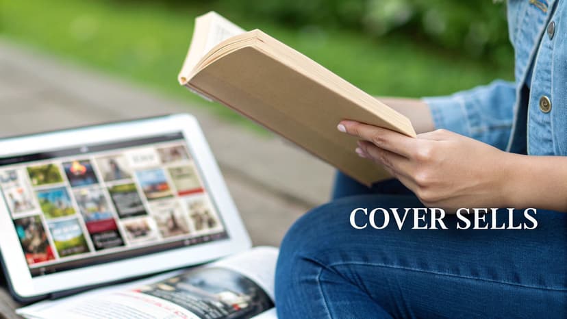
Before opening any design software, it's essential to adopt a critical mindset. A book cover isn't just decoration; it's your silent, tireless salesperson, working 24/7. In the crowded digital marketplace of Amazon, your cover has about three seconds to accomplish several critical tasks.
It must:
- Instantly signal the genre so the right readers take notice.
- Convey professional quality, assuring readers the story inside is worth their time and money.
- Establish the tone and mood—is this a terrifying thriller or a lighthearted romance?
- Remain clear and legible as a tiny thumbnail on a smartphone screen.
If your cover fails on any of these points, a potential reader will scroll past, regardless of your story's quality. This is why the design process must be treated as a crucial business decision.
The Financial Impact of a Professional Cover
Investing time or money into a high-quality cover isn't an expense—it's an investment with a measurable return. Indie authors consistently find that a professional-grade cover can significantly increase sales. For visually driven genres like romance and thrillers, a well-executed cover can deliver a 200% to 400% return on investment compared to a substandard one.
Your cover acts as the advertisement, and your blurb is the sales pitch. Understanding the principles of persuasive copywriting ensures that once the cover hooks a reader, your description can effectively close the sale.
Your cover is a promise to the reader. It sets expectations for the world, characters, and emotional journey you’ve crafted. A successful DIY cover doesn't just look good; it keeps that promise accurately and compellingly.
Ultimately, every choice—from the color palette to the font—must be deliberate and aimed at capturing your ideal reader’s attention. The specific elements of what makes a good book cover are subtle but learnable. By mastering these core principles, you can create a cover that not only you love but also effectively sells your book.
Step 1: Decode Your Genre's Visual Language
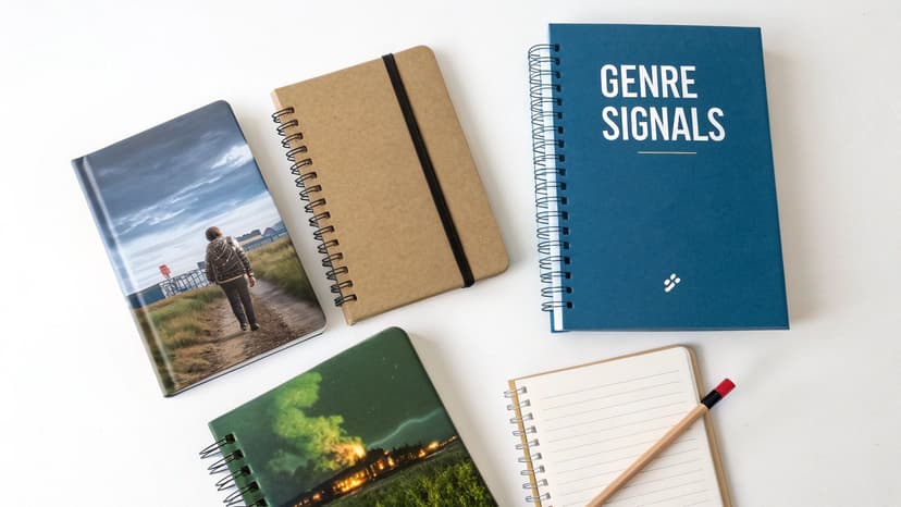
Before you begin designing, the foundational work is research. Your objective isn't merely to create something aesthetically pleasing; it's to create a cover that fluently speaks the visual language your target readers already understand and expect.
Every genre has its own set of visual conventions—a shorthand using colors, fonts, and imagery to signal the type of story within. Readers rely on these cues, often subconsciously, to find their next book. Your first task is to become an expert in decoding these signals.
Analyze the Bestsellers in Your Niche
Your primary research should be conducted on the Amazon KDP store. Go directly to the bestseller list for your specific sub-genre. A quick glance at the top 10 is not sufficient; you need to analyze at least the top 50 to gain a comprehensive understanding of current market trends.
As you browse, train your eye to identify patterns. Move beyond a simple "I like that cover" and conduct a more surgical analysis. Ask yourself:
- Typography: Are the fonts clean, sharp sans-serifs (common in thrillers and sci-fi)? Or are they elegant, flowing scripts typical of historical romance?
- Color Palette: Is there a dominant color scheme? Are covers dark and moody, bright and vibrant, or soft and atmospheric?
- Imagery: What is being shown? Are there character faces, symbolic objects, or abstract graphics? Is the imagery primarily photographic or illustrated?
- Composition: How are the elements arranged? Is the layout clean and centered, or dynamic and asymmetrical? Where is the title typically placed relative to the main image?
This is not casual browsing; you are building a visual blueprint. Consider using a mood board (Pinterest is excellent for this) or a simple document to save screenshots and note your observations.
Identify Key Genre Signifiers
After analyzing several dozen covers, the key signifiers will become apparent. For instance, if you study current romance cover trends, you'll observe a significant trend toward illustrated characters over the dated photo-stock couples of the past. A modern thriller often features a lone figure dwarfed by a stark landscape, while a cozy mystery might use quirky illustrations and playful, handwritten fonts.
This research isn't about finding a popular cover to copy. It's about understanding reader expectations so you can meet them, and then innovate just enough to stand out. Your cover should feel familiar at a glance but fresh upon closer inspection.
These trends have a direct impact on sales. There has been a broad shift toward bold, high-contrast typography and minimalist layouts across many genres, largely because they are more effective as small thumbnails on mobile devices. For a deeper analysis, research from industry experts on how cover trends impact sales can provide valuable insights.
Using an AI tool can be an effective way to test your understanding of these tropes. Generating a few concepts can help you visualize how different genre signals might apply to your story, providing a low-risk method to explore visual directions before committing to a final design.
Step 2: Develop a Strong Concept and Source Visuals
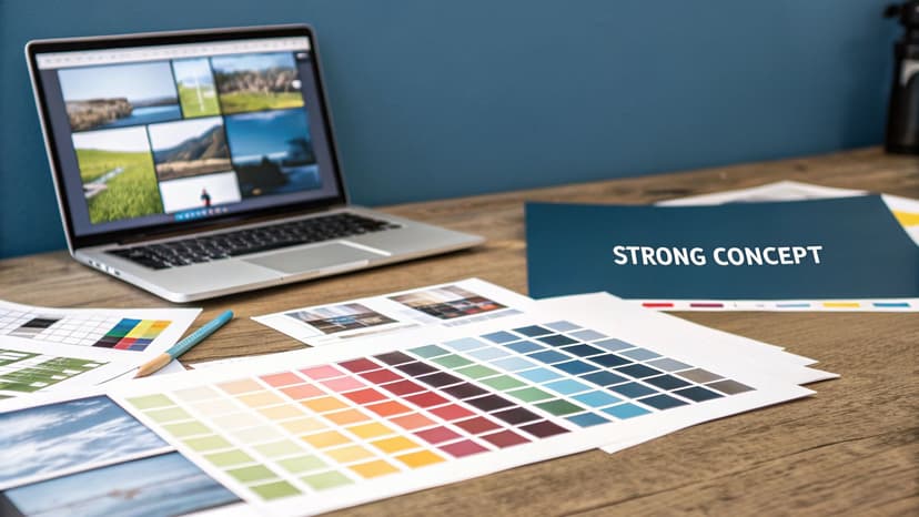
With your research complete, you can now translate your story’s core emotion into a single, compelling visual. This is the heart of the diy book cover design process. The goal is not to depict your entire plot but to capture an emotional promise. What will the reader feel when they engage with your book?
A powerful cover concept is built around a single focal point—the element that grabs the reader's attention and instantly communicates the book's essence.
Your focal point could be:
- A Character: Featuring your protagonist (or their silhouette) can build an immediate connection, which is highly effective in character-driven genres like fantasy or thrillers.
- A Symbolic Object: An object central to your story—a mysterious key, a blood-stained glove, a forgotten locket—can spark immediate curiosity.
- A Key Scene or Setting: A sweeping, dramatic landscape or an atmospheric room can establish the tone and world of your story before the first page is read.
The key is to select one strong idea and allow it to dominate the design. Attempting to include multiple characters, scenes, and symbols results in a confusing and ineffective cover that will be easily overlooked as a thumbnail.
Sourcing High-Quality, Legally Compliant Images
Once you have a concept, you need the right visual assets. This is a critical stage where many DIY designs falter. Your primary options are stock photos and illustrations, each with distinct advantages and disadvantages.
Stock Photos are widely used by authors due to their accessibility and professional appearance. The main risk is that the best images are popular, and you may find the same photo used on other book covers, which can make your book look generic.
Illustrations are gaining popularity, particularly in romance and fantasy, as you'll see across current fantasy genre cover examples. They offer a unique, custom feel and can capture a specific mood or fantastical element in a way photography often cannot.
Licensing is non-negotiable. Using an image from a Google search can lead to serious legal issues. Always use reputable stock image websites and carefully read the license agreement to ensure you have the rights for commercial use on a book cover.
To avoid the generic stock photo trap, refine your search terms. Instead of "woman in forest," try more specific phrases like "woman with red cloak in misty pine forest at dusk." For more guidance, our article on sourcing book cover photos provides practical tips.
Using AI to Accelerate Concept Development
Modern AI tools can be invaluable at this stage. Instead of spending hours searching for a suitable image, you can generate numerous unique, genre-specific concepts in minutes.
This allows you to rapidly test different focal points—a character, an object, or a scene—to see which best captures your story's essence. It's a low-risk method for visualizing multiple possibilities and refining your concept before committing to a final image.
Step 3: Master Typography and Composition
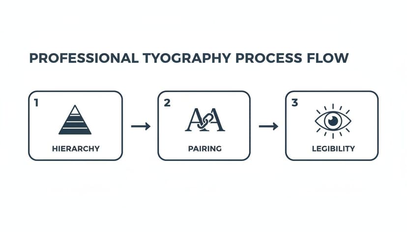
A stunning image may capture attention, but poor typography will cause a reader to scroll past. The text on your cover is not just information; it's a critical design element that guides the eye, signals professionalism, and sets the tone. For any diy book cover design, mastering composition and typography is essential, especially since your cover will primarily be viewed as a small thumbnail.
The most important principle is visual hierarchy. This is the art of arranging text to instantly communicate what is most important. Your title should be the primary element, followed by your author name, and then any tagline or series information. This order is created using font size, weight (boldness), and style. The title receives the largest, boldest treatment, drawing the eye first.
Balancing Legibility with Style
Choosing the right fonts requires balancing genre aesthetic with readability. A common and effective technique is font pairing—combining two distinct but complementary fonts to create visual interest. A classic approach is to pair a decorative or bold serif font (with "feet" on the letters) for the title with a clean, simple sans-serif font (without feet) for the author name and tagline. This creates instant contrast and clarity.
Here are common typography mistakes to avoid:
- Too Many Fonts: Stick to two, or at most three, fonts. More than that creates a chaotic, unprofessional look.
- Poor Contrast: Text must be clearly visible against the background. Place dark text over light areas of your image and light text over dark areas. Ensure your design meets basic WCAG contrast ratios for thumbnail text for maximum impact.
- Illegible Scripts: A beautiful script font may look good at full size but can become an unreadable smudge when shrunk down. Always test your font choices by zooming out to thumbnail size.
Effective book cover typography supports the story. The fonts for a gritty sci-fi thriller should feel completely different from those on a lighthearted contemporary romance, as any gallery of romance genre cover examples makes clear. The text itself is part of the visual promise you make to the reader.
For a deeper dive into selecting typefaces, our complete guide on fonts for book covers offers specific, genre-tested recommendations.
Composition Checklist
Before finalizing your design, shrink it to the size of a postage stamp and evaluate it with this checklist:
- Is the title instantly readable? Can you decipher it in under three seconds?
- Is the visual hierarchy clear? Does your eye naturally move from the title to the author's name?
- Is the layout balanced? Does the text feel anchored and intentional?
- Does it look professional? Place your cover next to the top 10 bestsellers in your genre. Does it look like it belongs?
Getting these elements right is what separates a cover that sells from one that is ignored.
Step 4: Prepare and Export Final Files for KDP
Once your design is complete, the final step is exporting your files correctly for Amazon KDP. This technical stage is where many DIY designers encounter problems. Incorrect settings, such as the wrong file format or low resolution, can result in a blurry, pixelated cover or an outright file rejection from KDP, halting your launch.
Ebook vs. Print: Two Different Files
The most critical takeaway is that your ebook and print book require completely different files. They have unique specifications for color mode, file type, and dimensions. You cannot use the same file for both formats.
- Ebook: A digital file for screens. You only need the front cover.
- Print Book: A physical object. You need a full wraparound cover (front, back, and spine) as a single, continuous image.
KDP Export Settings Checklist
When you export from your design software, use these precise settings to avoid upload errors.
For Your Ebook Cover:
- File Format: JPEG is the standard.
- Color Mode: RGB (Red, Green, Blue) for digital screens.
- Resolution: 300 DPI to ensure sharpness on high-resolution displays.
- Dimensions: KDP recommends a 1.6:1 aspect ratio (height is 1.6 times the width). The ideal size is 1600 x 2560 pixels.
For Your Print Cover (Paperback):
- File Format: Print-Ready PDF only.
- Color Mode: CMYK (Cyan, Magenta, Yellow, Black) for professional printing. Using RGB will result in inaccurate colors in the printed book.
- Resolution: A mandatory 300 DPI.
- Bleed: You must include a 0.125-inch (3.2 mm) bleed on all outside edges. Bleed is an extra margin of the image that gets trimmed off during production to prevent white borders.
Pro Tip: Before starting your print cover design, use KDP’s cover calculator. Input your trim size, paper type, and final page count to get a precise template with the exact dimensions you need, including the spine width. Designing on this template will prevent significant formatting issues later.
Common DIY Book Cover Design Questions
Diving into DIY book cover design can be daunting. Here are answers to some of the most common questions from indie authors.
Can I Just Use AI To Make My Whole Cover?
While you can, it's generally not recommended. Think of AI as an incredibly fast concept artist, not a finished designer. AI tools are excellent for generating initial genre-aware concepts and core visuals, saving significant time in the creative process. However, they often fall short on the finer details, such as professional typography, precise text placement, and creating technically correct print-ready files.
A more effective workflow is a hybrid approach: use AI to generate the main visual, then import that high-resolution image into a program like Canva or Affinity Photo to handle the text, perfect the layout, and export the files to KDP’s exact specifications. This combines the speed of AI with the control needed for a professional product.
What Are The Biggest Mistakes Authors Make With DIY Covers?
Most first-time designers encounter the same few pitfalls. Being aware of them is the first step to avoidance.
The most common mistakes include:
- Poor Typography: Using fonts that are illegible at thumbnail size or combining too many different font styles.
- Low Contrast: Placing light text over a light background (or dark on dark), making the title disappear.
- Ignoring Genre Conventions: Creating a beautiful cover that misrepresents the genre. A cover that looks like literary fiction for a gritty thriller will fail to attract its target audience, such as dedicated thriller book readers.
- Overly Complex Design: Trying to include every plot point, character, and symbol, resulting in a chaotic and confusing mess.
- Using Illegal Images: Taking an image from a Google search can lead to legal trouble. You must use images for which you have the proper commercial license.
Remember, your cover’s primary job is instant communication. If a potential reader has to struggle to read the title or guess the genre, they will move on.
How Do I Know If My Cover Is Effective?
The ultimate test of a cover is not whether you like it, but whether your target readers respond to it. Objective feedback is essential.
Share your design in author groups on social media and ask for honest critiques. Be open to feedback. You can also run A/B polls to see which of two versions performs better.
The most critical evaluation is the "lineup test." Take a screenshot of the top 10 bestsellers in your specific Amazon category. Shrink your cover to a thumbnail and place it among them. Does it look like it belongs? Does it stand out in a good way, or does it look amateurish? If your cover can hold its own visually against the top performers while clearly signaling its genre, you are on the right track.
Ready to Create Your Own Book Cover?
Turn your story into a visual masterpiece. Fill in the details below to start generating professional covers instantly.