Find the Best Book Cover Design Software
Discover the best book cover design software for any budget. Our guide compares features, AI tools, pricing, and usability for indie authors.
Posted by
Related reading
15 AI Tools for Graphic Designers: A Practical Guide for Authors
Speed up your workflow with the best AI tools for graphic designers. Explore top solutions for image generation, layout, and typography in our 2026 guide.
A Guide to Digital Collage Art for Book Covers
Learn to create stunning book covers with digital collage art. Our guide covers tools, techniques, and AI-assisted workflows for indie authors.
Your Guide to the Burgundy Color Code for Book Covers
Discover how to use the burgundy color code for your book cover. Get HEX, RGB, and CMYK values to create a cover that sells on Amazon KDP.
Ready to design your cover?
Use our AI book cover generator to create tailored book cover concepts in minutes.


When you're trying to find the best book cover design software, it's easy to get overwhelmed. The truth is, the "best" tool depends entirely on you. For the designer who wants total creative control, nothing beats Adobe Photoshop. For the author who needs something fast and easy, Canva is king. But for most of us, the ideal solution is somewhere in the middle—and that’s where AI-powered tools like BeYourCover are changing the game by offering genre-specific concepts you can tweak in minutes.
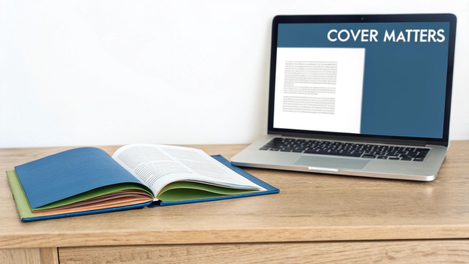
Why Your Book Cover Software Matters
Let's be blunt: your book cover is your most critical marketing tool. In the endless scroll of Amazon and social media, it's the first—and sometimes only—thing that can stop a potential reader in their tracks. The right software gives you the power to create a cover that not only looks professional but screams your book's genre and vibe from a mile away. It becomes your silent, tireless salesperson.
Picking the right software isn't just a technical choice; it's about finding the perfect fit for your needs. The biggest hurdle for most authors is squaring a tight budget with the need for a cover that looks like it cost a fortune. This guide isn't another generic list. It’s a practical roadmap to help you find your way.
We'll break down the main categories:
- Professional Suites: For authors who need every pixel to be perfect and have complete creative freedom.
- User-Friendly Tools: For those who value speed and simplicity above all else.
- AI-Powered Platforms: For writers looking for that sweet spot between automated ideas and personal customization.
My goal is to help you pick a tool that genuinely matches your skills, budget, and publishing ambitions.
The Impact of Visuals in a Fast-Paced Market
The modern reader moves at lightning speed. On platforms like TikTok's 'BookTok,' a cover might get less than three seconds of screen time. Instant recognition isn't just a bonus; it's a requirement. This is where Artificial Intelligence (AI) has become a huge asset, generating concepts that tap into current trends and reader psychology almost instantly. It’s all about "cognitive efficiency"—how quickly your cover gets its message across.
This simple idea—that color, font, and imagery all work together to signal genre—is the foundation of great design. Understanding what makes a good book cover is the first real step toward creating your own.
Your cover has to work its magic everywhere, from a tiny thumbnail on a phone screen to a full-sized paperback. The software you choose is what determines whether you can create a design that’s both beautiful and technically perfect for every single format.
And it doesn't stop at the digital file. Getting that design to look just right in print is a whole other challenge. Finding quality book printing services is crucial, but your design software must be able to export files with the right color profiles and resolutions to make it all work. A great tool handles the technical stuff so you can focus on the creative.
How We Judge Book Cover Design Software
To figure out which book cover design software is genuinely the best, you need a solid game plan. We’re not just making a list of features; we're judging each tool against five core pillars that directly affect whether an author’s cover will sink or swim in a crowded market. This framework keeps our comparisons grounded, fair, and focused on what actually helps you create a professional, market-ready book cover.
Think of these criteria as your personal checklist. They’ll help you cut through the marketing noise and see which software truly fits your budget, skill level, and creative vision. Every pillar represents a crucial step in turning a blank canvas into a polished, high-resolution file you can confidently upload to KDP.
Usability and Learning Curve
First things first: how fast can you get in and start making something that looks good? We look at whether the interface feels natural for a total beginner or if it’s a complicated beast built for a seasoned graphic designer. This includes checking for helpful tutorials, built-in guides, and just the overall vibe of using the tool.
A steep learning curve isn't always a deal-breaker. Professional-grade tools like Adobe InDesign demand your time but pay you back with immense power. But for an author staring down a launch deadline, a tool that simplifies the work without sacrificing quality is pure gold.
Template Quality and Typographic Control
A great template should be a launchpad, not a cage. We dig into whether a platform’s templates are the same tired designs you’ve seen a dozen times or if they’re professional, genre-specific, and easy to make your own. A huge part of this is typographic control—the one thing that screams "DIY cover" from a mile away.
We’re looking for the ability to tweak kerning (the space between letters), leading (the space between lines), and access to a solid library of licensed fonts. Getting the text just right isn’t a nice-to-have; it's essential for a cover that looks polished and is readable, even as a tiny thumbnail on Amazon.
Honestly, the difference between an amateur and a professional cover often boils down to the typography. If a tool won't let you fine-tune your text, it can sabotage an otherwise great design and make it look instantly cheap.
Technical Output and Pricing Models
Finally, we get down to the brass tacks—the technical and financial side. Can the software export files at 300 DPI in the right CMYK color profile needed for print-on-demand services like KDP and IngramSpark? Does it help you create full wrap-around covers with a proper spine and back?
We also pull apart the pricing. Is it a monthly subscription that nibbles at your budget, a one-time purchase, or a "free" tool full of hidden costs? This practical look ensures you know the total investment you’re making. After all, the global publishing software market is booming, which shows just how vital these high-end features have become. You can learn more about the growth in publishing software at Data Insights Market.
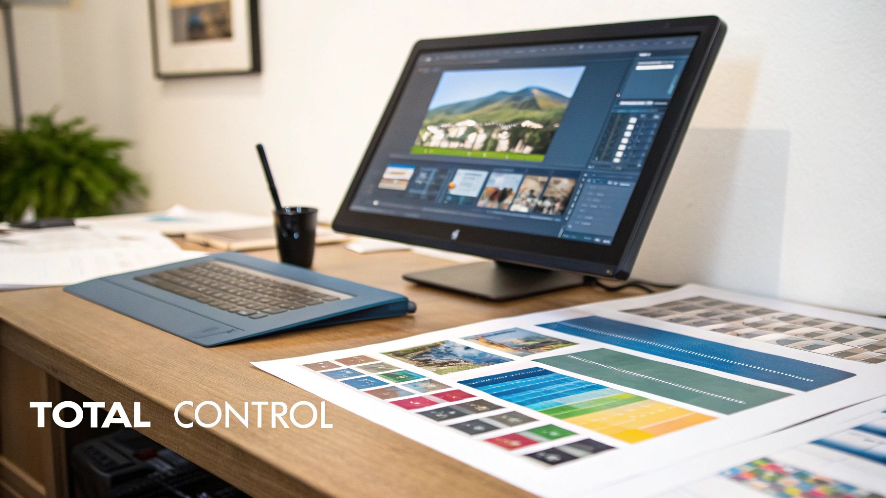
Professional Grade Tools for Total Creative Control
For authors who see their book cover as a central piece of art, not just packaging, dipping into professional-grade software is the only way to get total creative freedom. These are the tools career designers live and breathe in, giving you granular control over every single pixel, layer, and typographic choice. But be warned: this power comes with a serious investment in both time and money.
This tier of software isn't for the faint of heart. It’s for the serious author-preneur who plans to publish a whole series, build a recognizable brand from the ground up, and needs their vision executed without any compromise. Let's break down the titans of the industry: Adobe Photoshop, Adobe InDesign, and Affinity Designer.
Adobe Photoshop: The Image Manipulation Powerhouse
There's a reason "Photoshopped" is a verb. It's the undisputed king of raster graphics, which means it’s built for editing pixel-based images like photos and digital paintings. If your book cover relies on stunning, composite imagery—think epic fantasy landscapes cobbled together from multiple photos or a haunting thriller portrait—Photoshop has no equal. Its powerful layering system lets you experiment with effects and adjustments without permanently destroying your original image.
But Photoshop’s greatest strength is also its biggest weakness for cover design. The text handling tools just aren't as sophisticated as what you'd find in a layout program. You can create a beautiful title, sure, but getting perfect, print-ready typography with fine-tuned control over kerning and ligatures is a lot more work.
- Best For: Authors in genres that live and die by photo manipulation. Thrillers, sci-fi, and romance covers often require blending multiple stock images into one seamless, compelling piece of art.
- Key Consideration: You absolutely must set up your document correctly from the start. That means a resolution of 300 DPI and the CMYK color profile to ensure your printed book looks sharp and the colors don't come out muddy.
Adobe InDesign: The Master of Typography and Layout
Where Photoshop is all about the image, Adobe InDesign is the master of arranging everything—text, images, graphics—into a cohesive final product. It is the industry standard for professional typesetting and layout for very good reasons. InDesign gives you unparalleled typographic control, making it a breeze to manage the complex hierarchy of a title, author name, tagline, and the back cover blurb.
Creating a full, print-ready wraparound cover is where InDesign truly flexes its muscles. It's built to handle the precise calculations for spine width based on your final page count and paper stock, and its export options are designed specifically for professional printers like KDP and IngramSpark.
The core difference is simple: Photoshop creates the art, while InDesign assembles the product. Many professional designers use both, creating visual assets in Photoshop or Illustrator and then importing them into InDesign for final layout and text treatment.
As these tools advance, designers are also mastering AI image creation prompts for text integration, which can be a game-changer for getting specific text elements woven directly into AI-generated art.
Affinity Designer: The Budget-Friendly Contender
If Adobe's subscription model makes you wince, the Affinity suite is a powerful and refreshingly affordable alternative. Affinity Designer is a fascinating hybrid tool, combining robust vector and raster editing tools inside a single program. This means you can create scalable logos and crisp text (vectors) and edit detailed photos (rasters) without having to switch applications.
Its one-time purchase price makes it an incredibly appealing choice for authors who want professional-level tools without a recurring monthly bill. While it might lack some of the super-advanced, niche features found in the Adobe suite, it has more than enough horsepower to create gorgeous, professional-grade book covers. For many indie authors, Affinity Designer hits that perfect sweet spot between cost, power, and usability—representing the best long-term value for anyone willing to tackle the learning curve.
User-Friendly Online Platforms for Fast Results
If the thought of wrestling with complex software makes you break out in a cold sweat, you're in luck. For authors who need a professional-looking cover without the brutal learning curve, browser-based platforms are the answer. These tools are built for speed and simplicity, usually leaning on templates and drag-and-drop editors to get the job done. They are the perfect solution when your goal is a fast, effective cover, not granular creative control.
This move toward accessible, cloud-based tools is a big deal in publishing. In fact, by 2025, the whole bookstore software market has been reshaped by the demand for tools you can access from anywhere, a trend noted by Fortune Business Insights. That same user-friendly philosophy is now at the heart of the best author-facing design platforms.
Let's break down three of the biggest names in the space: Canva, Book Brush, and BeYourCover. We won't just list features; we'll look at how they actually work for an indie author in the real world.
Canva The All-Purpose Design Giant
Canva is practically a household name in online design, and for good reason. It’s packed with a mind-boggling number of templates, the interface is a breeze to learn, and the free plan is incredibly generous. If you need a quick ebook cover, you can jump in, find a template, swap the text, change the image, and walk away with a decent design in less than an hour.
Here’s a peek at the Canva interface, which really highlights its template-first approach.
That clean layout and endless library of starting points is Canva's greatest strength. But for authors, it’s also its biggest weakness.
Because Canva is so popular, its book cover templates have been used—and overused—to death. If you just make a few minor tweaks, you risk ending up with a cover that looks painfully generic and disappears on a crowded digital shelf like Amazon's. To create something that truly stands out, you have to be ready to tear that template apart and rebuild it, which takes a good design eye.
- Best For: Authors on a shoestring budget who just need a simple ebook cover and feel confident they can customize a template heavily to make it their own.
- Key Consideration: Pay close attention to the licensing for any images or graphics you use, especially on the free plan. You need to be 100% sure they are cleared for commercial use on a book cover.
Book Brush The Author Marketing Specialist
While Canva tries to be everything to everyone, Book Brush is laser-focused on one thing: author marketing. This platform was built from the ground up by people who understand what writers actually need. Its real magic isn’t just in helping you design a cover, but in creating the entire suite of promotional graphics to go with it.
This is where Book Brush absolutely kills it. Once your cover is done, a few clicks can instantly generate gorgeous 3D mockups, social media banners, and ad graphics all featuring your book. It’s all about creating a cohesive, professional brand that looks amazing across every marketing channel.
If your main goal is building a consistent author brand and making your book promotion workflow easier, Book Brush has a specialized set of tools that a general design platform just can't compete with. It gets that the cover is just the first step in your marketing journey.
The platform is also packed with author-specific goodies, like a box set creator and dedicated tools for audiobook covers. The whole point isn't endless design freedom; it's about giving you practical, marketing-ready assets that save a massive amount of time.
BeYourCover The AI-Powered Concept Generator
BeYourCover swoops in to fill the huge gap between overly simple templates and intimidatingly complex pro software. It tackles the single biggest hurdle for most authors: coming up with a powerful, genre-appropriate concept in the first place. Instead of making you scroll through a library of static templates, it uses AI to generate completely unique cover concepts based on your book's title, genre, and blurb.
This AI-first workflow gives you a much stronger starting point. The designs it generates are already tuned into the visual language and reader expectations for your specific genre, whether you're writing a gritty thriller or a sweet contemporary romance. You can see a ton of examples of these AI-generated concepts in our guide to the best AI book cover generators.
Once the AI hands you a concept you love, BeYourCover provides simple but powerful editing tools to make it yours. You get advanced control over typography, color palettes, and layout, letting you polish the final design without needing a lick of technical skill. It solves the "blank page" problem and completely sidesteps the generic look of overused templates, offering a fantastic middle ground for authors who want both speed and quality—you can see how these elements come together in these thriller book covers.
Comparing Top Online Book Cover Design Tools
To make sense of it all, here’s a quick side-by-side look at how these three platforms stack up on the features that matter most to authors.
| Feature | Canva | BeYourCover | Book Brush |
|---|---|---|---|
| Primary Use Case | General design, quick template edits | AI concept generation, unique covers | Author marketing graphics, 3D mockups |
| Starting Point | Static templates | AI-generated concepts from your summary | Templates or build-from-scratch |
| Ease of Use | Very easy | Very easy | Easy, with a slight learning curve |
| "Uniqueness" Factor | Low (unless heavily customized) | High (AI generates unique art) | Medium (template-based) |
| Author-Specific Tools | ✗ No | Yes (genre analysis, typography engine) | Yes (3D mockups, box sets, ad templates) |
| Best For | Budget-conscious, simple ebook covers | Authors wanting speed and a unique design | Authors focused on marketing and branding |
This table isn't about finding a single "best" tool, but about finding the right tool for your specific needs at this moment in your author journey. Each one excels in a different area.
So, How Do You Choose the Right Software for You?
Picking the right book cover design software can feel overwhelming, but it really boils down to an honest look at your own needs. There's no single "best" tool—only the right tool for your specific situation. The goal here is to match your skills, budget, and author goals with the options we've just walked through.
Forget the one-size-fits-all approach. Think about where you are on your author journey. Are you a debut author who just needs one fantastic ebook cover on a shoestring budget? Or are you a seasoned writer planning a multi-book series and building a brand? Each scenario points to a different—and equally valid—tool.
A Decision Framework for Authors
Let's break this down into a simple framework. The key is to be realistic about your resources, and that doesn't just mean money. It also means time. How fast do you need a cover, and how many hours are you willing to sink into learning a new program? Answering these questions honestly will point you down the right path.
This flowchart visualizes the decision process, starting with your budget and then branching out based on your need for speed versus your desire for creative control.
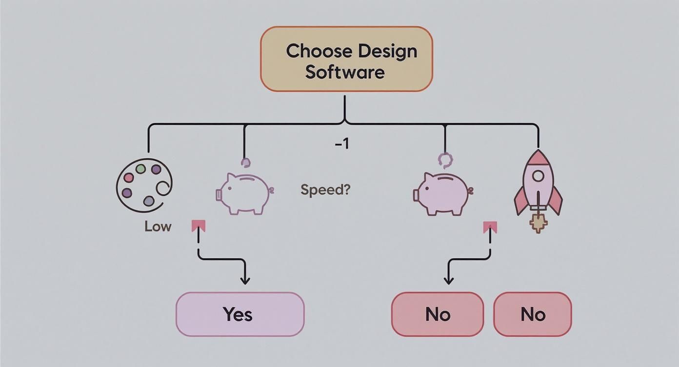
As you can see, different priorities lead to different software categories. It’s all about aligning your choice with what matters most to you right now.
For instance, if your budget is tight and speed is everything, an AI-powered tool or a simple template editor is your best friend. On the other hand, if you have a bit more to spend and want total command over every pixel, you're naturally leaning toward professional-grade software like Affinity Designer or Adobe Photoshop. The learning curve is steep, but that's part of the investment.
The most common mistake I see authors make is picking a tool that doesn’t fit their reality. An author with zero design experience trying to master Photoshop for a single cover is just as inefficient as a pro designer trying to create a complex, branded series using only basic templates.
Situational Recommendations
Let's make this even more practical by looking at a few common author scenarios.
- The Debut Author on a Budget: You need one great ebook cover and funds are tight. Your smartest move is to start with a specialized, user-friendly tool. If you want to play around with ideas before spending a dime, you can learn how to create a book cover for free using platforms designed to walk you through the process.
- The Prolific Series Author: You're in this for the long game. You're planning a series that needs a consistent, branded look across multiple books. For you, investing the time to learn Affinity Designer offers the best long-term value. Its one-time cost and professional features give you complete creative freedom for your entire backlist and future releases.
- The Time-Strapped Author-preneur: You need a unique, professional cover yesterday, but you don't have time to wrestle with a complex program. This is where an AI-powered platform like BeYourCover shines. It generates genre-specific concepts that you can quickly customize, giving you a high-quality, original cover in a fraction of the time.
Final Checks Before You Commit
Once you've zeroed in on the right category of software, there are a few final, crucial things to do before you hit publish.
- Verify Image Licensing: Always, always double-check the license for any stock photos or graphics. Make sure they are cleared for commercial use on a book cover. Getting this wrong can lead to serious legal headaches down the road.
- Gather Reader Feedback: Don't design in a bubble. Show your final design to beta readers, your street team, or other authors in your genre. A fresh pair of eyes can spot issues with typography or genre cues that you've become blind to.
- Confirm Technical Specs: Before you export that final file, confirm the exact resolution, dimensions, and color profile needed for your platforms (KDP, IngramSpark, etc.). A beautiful design is worthless if it's rejected for technical reasons.
By taking this personalized approach, you can move forward confidently, knowing you’ve chosen the perfect tool to bring your book’s cover to life.
A Few Common Questions
Diving into cover design always brings up a few key questions. Let's tackle the most common ones authors run into, so you can move forward with confidence.
Can I Design Print and Ebook Covers with the Same Software?
Yes, you absolutely can. Most capable design tools, both professional-grade and online, can handle ebook and print formats. But here's the catch: the requirements for each are completely different, and you need to know what you’re doing.
An ebook cover is just a single, flat JPEG. A print cover, on the other hand, is a full wraparound design that includes the front, back, and that all-important spine.
The biggest technical hurdle is resolution. Ebook covers only need to be 72 DPI (dots per inch) because they're viewed on screens. Print covers demand a much higher resolution—300 DPI is the non-negotiable industry standard—to keep them from looking fuzzy or pixelated in a reader's hands.
And then there's the spine. Its width isn't a random number; it's determined by your final page count and the paper stock your printer uses.
- Professional Software: Tools like Adobe InDesign and Affinity Publisher were literally built for this. They let you create pixel-perfect templates for wraparound covers, making sure your spine text is dead center and your back cover copy lines up just right.
- Online Platforms: Author-focused platforms like Book Brush get it. They often build spine calculations right into their templates. You can use a general-purpose tool like Canva, but you'll have to manually calculate and input the exact custom dimensions from your print-on-demand service (like KDP or IngramSpark), which can be a real headache.
What Is the Biggest Mistake Authors Make with DIY Covers?
Without a doubt, the most common mistake—and the one that screams "amateur" from a mile away—is bad typography. It’s not about finding a cool font. It's a whole collection of small details that, when done wrong, instantly cheapen a cover and signal a low-quality book to potential readers.
Typography blunders usually fall into a few camps:
- Using Too Many Fonts: A professional designer almost never uses more than two, maybe three, typefaces. Piling on more just creates visual noise.
- Choosing Genre-Inappropriate Fonts: A delicate, swirly script has no business on a gritty military sci-fi novel. Your font choice is one of the most powerful genre cues you have.
- Poor Readability: This is a huge one. If a potential reader can't easily read your title at thumbnail size because of a busy background, low contrast, or funky spacing (kerning), you've lost them before they even click.
The runner-up for the biggest mistake is a close cousin: using low-quality, generic, or painfully obvious "stock" photos. A cover that looks like it came from the first page of a free stock site tells a reader the story inside is probably just as unoriginal.
Spending a few bucks on a premium stock photo or using a tool that generates something truly unique can be the difference between a cover that blends in and one that pops.
Do I Need to Understand Color Theory?
You don't need a degree in color theory, but a basic grasp of the fundamentals will give you a massive advantage. Color isn't just decoration; it’s a powerful tool for triggering emotion and meeting reader expectations for a specific genre.
Just think about the last time you browsed the thriller section online. You probably saw a lot of dark blues, blacks, and splashes of high-contrast red. Those colors subconsciously scream suspense, danger, and tension. Head over to the romance category, and you’ll find bright pastels or warm, rich hues that signal passion, warmth, and hope.
A great way to start is by doing your own informal market research. Just go to Amazon, pull up the bestseller list for your specific sub-genre, and look at the dominant color palettes.
You're not looking to copy them, but to understand the visual language your readers are already fluent in. Many modern tools, including Canva and BeYourCover, also provide professionally designed color palettes that take the guesswork out of it. Starting with one of those is a smart shortcut to making sure your colors are sending all the right signals.
Ready to Create Your Own Book Cover?
Turn your story into a visual masterpiece. Fill in the details below to start generating professional covers instantly.