6 Best AI Book Cover Generators in 2026 (Free Options Included)
We tested 6 AI book cover generators on real projects. See which ones actually produce professional covers, pricing from free to $49/mo, and one is the best.
Posted by
Ready to design your cover?
Use our AI book cover generator to create tailored book cover concepts in minutes.


Last updated: March 27, 2026
Finding the best AI book cover generator is essential for modern authors who want to stand out in a crowded digital marketplace. While traditional design services typically cost $300-$800 per cover (see our breakdown of book cover design costs), AI tools have revolutionized the process, offering professional results in minutes.
In this guide, we compare the top 6 AI book cover makers based on real-world testing using standardized benchmark prompts. Whether you're looking for a free AI book cover generator or a professional-grade suite, we've analyzed the pros, cons, and output quality of each.
Quick Comparison: Best AI Book Cover Generators
| Feature | BeYourCover | NightCafe | Canva | Ideogram | Venngage | DIY Book Covers |
|---|---|---|---|---|---|---|
| Genre-Specific AI | ✓ Yes | ✗ No | ✗ No | ✗ No | ✗ No | ✓ Yes |
| Input Workflow | Brief + prompt | Prompt | Template + prompt | Prompt | Template + prompt | Template |
| Editing Workflow | Transform, style conversion, remove text, typography restyle | External | Good manual editor | ~ Limited | Good manual editor | Basic |
| Full Wrap Print Covers | ✓ Yes | ✗ No | Manual setup | ✗ No | ✗ No | ~ Limited |
| Audiobook Covers | ✓ Yes | ✗ No | Manual resize | ✗ No | ✗ No | ✗ No |
| Marketing Assets | ✓ Yes | ~ Limited | ✓ Yes | ~ Limited | ~ Limited | ✗ No |
| AI Quality | ★★★★★ | ★★★★☆ | ★★★☆☆ | ★★★★☆ | ★★☆☆☆ | ★☆☆☆☆ |
| Commercial License | ✓ Included | ✓ Included | ⚠ Pro only | ✓ Included | ✓ Included | ✓ Included |
| Price | Free / $19 one-time | Free / $12.49/mo | Free / $12/mo | Free / $20/mo | Free / $49/mo | Free / $19 one-time |
| Best For | All-in-one author workflow | Artistic covers | General design | Style experiments | Beginners | Quick templates |
Our Testing Methodology: The Benchmark Prompts
To ensure a fair comparison, we tested every tool using the exact same four prompts across different genres.
How We Tested:
- Standardization: Every AI received the identical prompt text.
- No Cherry-Picking: We display the first or second generation to show realistic "out of the box" performance.
- Typography Check: We specifically tested how each tool handles title and author placement.
- Genre Adherence: We evaluated if the AI understands the visual tropes of Horror, Romance, Non-Fiction, and Children's books.
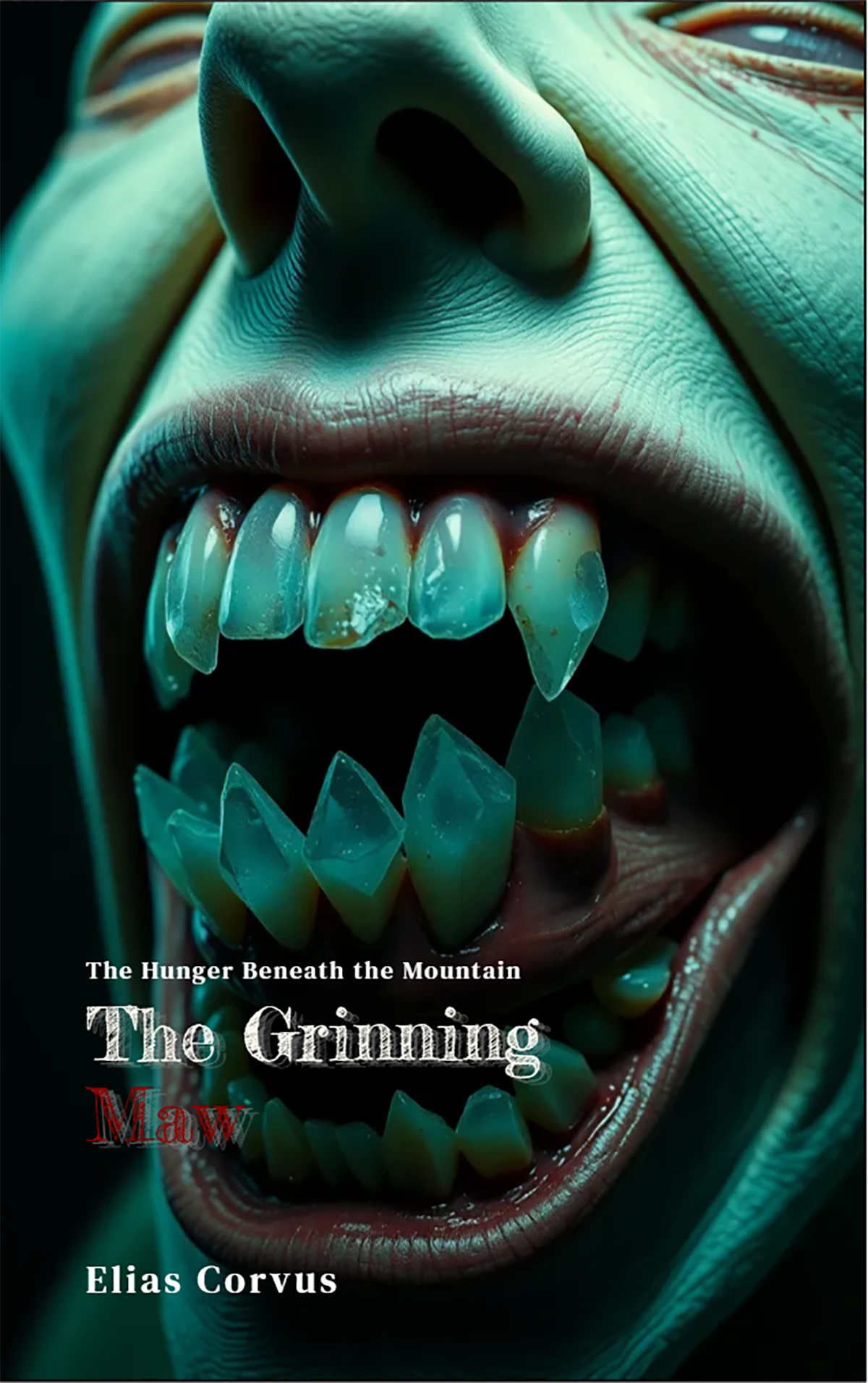
1. Horror Prompt ("The Grinning Maw")
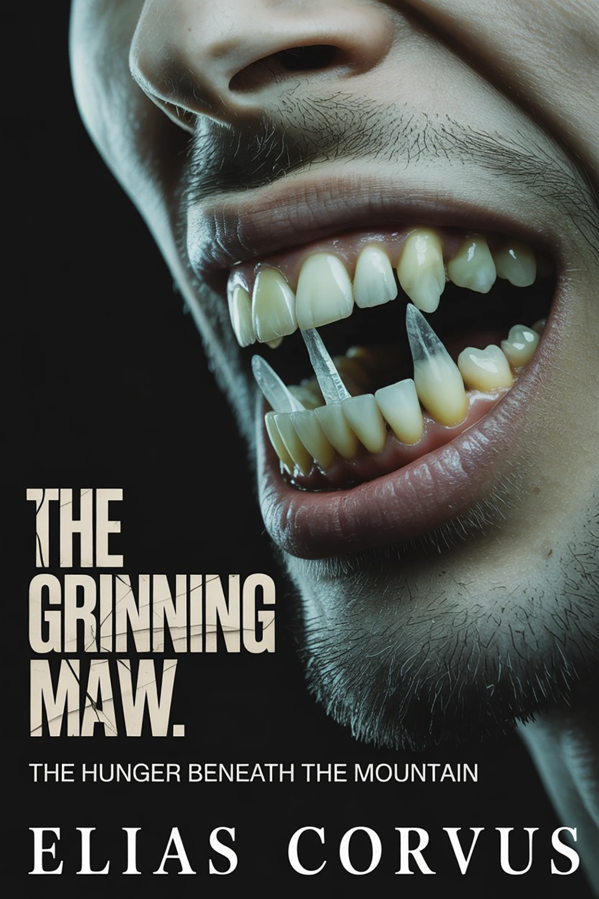
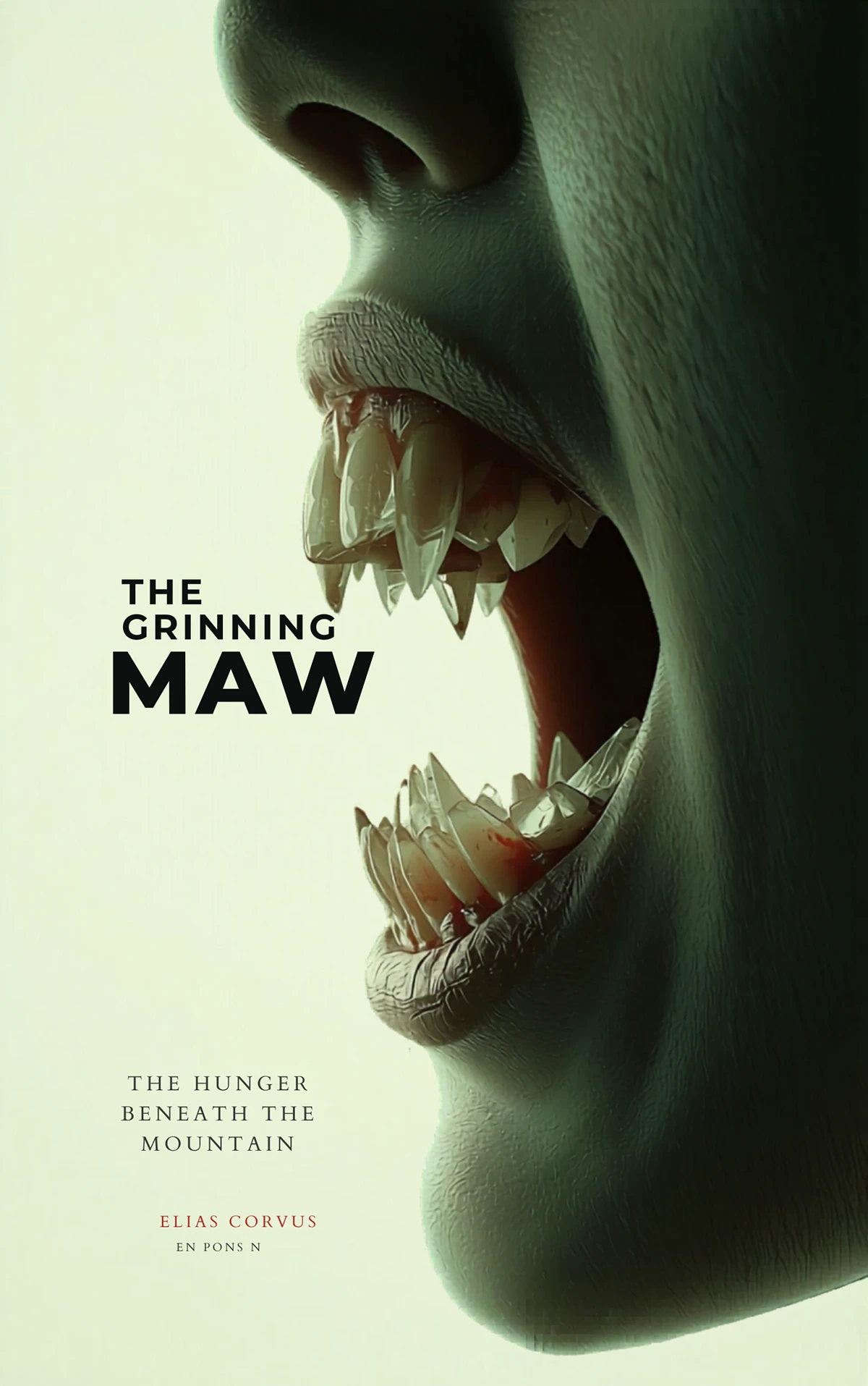
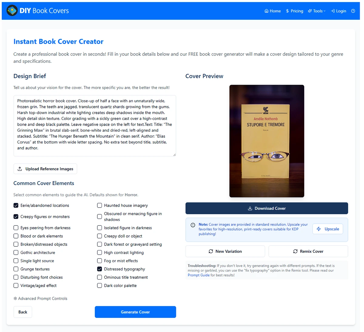
"Photorealistic horror book cover. Close-up of half a face with an unnaturally wide, frozen grin. The teeth are jagged, translucent quartz shards growing from the gums. Harsh top-down industrial white lighting creates deep shadows inside the mouth. High detail skin texture. Color grading with a sickly green cast over a high-contrast bone and deep black palette. Leave negative space on the left for text. Text: Title: 'The Grinning Maw' in brutal slab-serif, bone-white and dried-red, left-aligned and stacked. Subtitle: 'The Hunger Beneath the Mountain' in clean serif. Author: 'Elias Corvus' at the bottom with wide letter spacing."
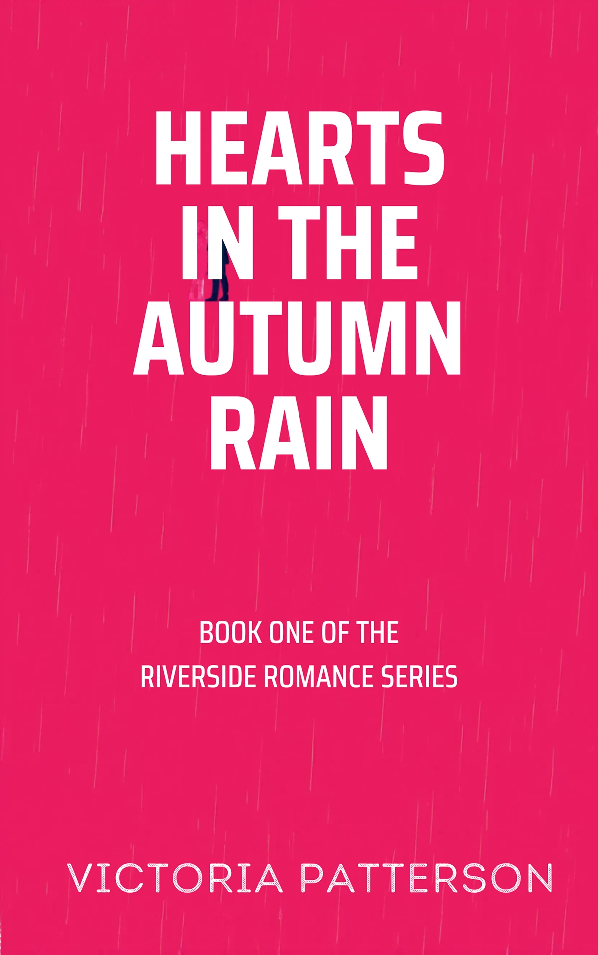
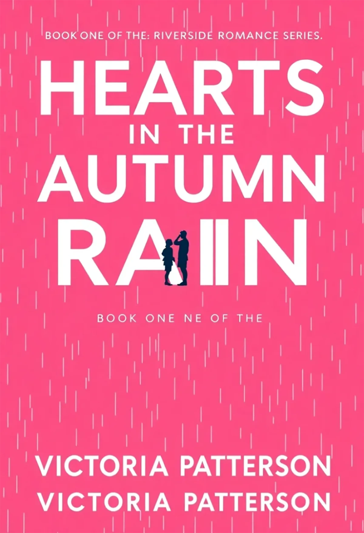
2. Romance Prompt ("Hearts in the Autumn Rain")
"Typography-first mass-market bestseller cover with a solid hot pink (#FF2D8F) background and subtle halftone rain texture. The title 'HEARTS IN THE AUTUMN RAIN' dominates about 70% of the cover in tall bold condensed white sans-serif, left-aligned with little margin and stacked across four lines: HEARTS / IN THE / AUTUMN / RAIN, occupying roughly the top 55-60%. Between 'AUTUMN' and 'RAIN,' two tiny flat navy (#1A1A2E) silhouette figures (man and woman) face each other across the letter 'U,' together no more than 12% of cover height and never overlapping text. Subtitle 'BOOK ONE OF THE' and 'RIVERSIDE ROMANCE SERIES' appears in small flat navy (#1A1A2E) sans-serif with wide tracking, left-aligned. Author name 'VICTORIA PATTERSON' is set in wide-tracked white capitals near the bottom."
3. Non-Fiction Prompt ("Sustainable Architecture")
"Photorealistic nonfiction book cover with a seamless warm cream background filling the entire cover. Centered is a pristine cylindrical concrete pillar floating against the backdrop, split perfectly down the middle: the left half industrial gray with subtle texture, the right half overtaken by vibrant emerald moss and delicate ferns emerging from fine cracks, divided by a razor-sharp vertical line. Soft studio lighting from the upper left creates a gentle shadow beneath the cylinder. Minimal, high-fashion editorial aesthetic. Title: 'THE RISE OF SUSTAINABLE ARCHITECTURE: DESIGNING BUILDINGS FOR TOMORROW' in bold condensed uppercase sans-serif, black, tightly tracked, stacked across three lines at the top. Subtitle: 'Environmental Innovation, Material Science, and the Future of Urban Design' in elegant black serif. Author: 'DR. HELENA WHITMORE' anchored at the bottom."
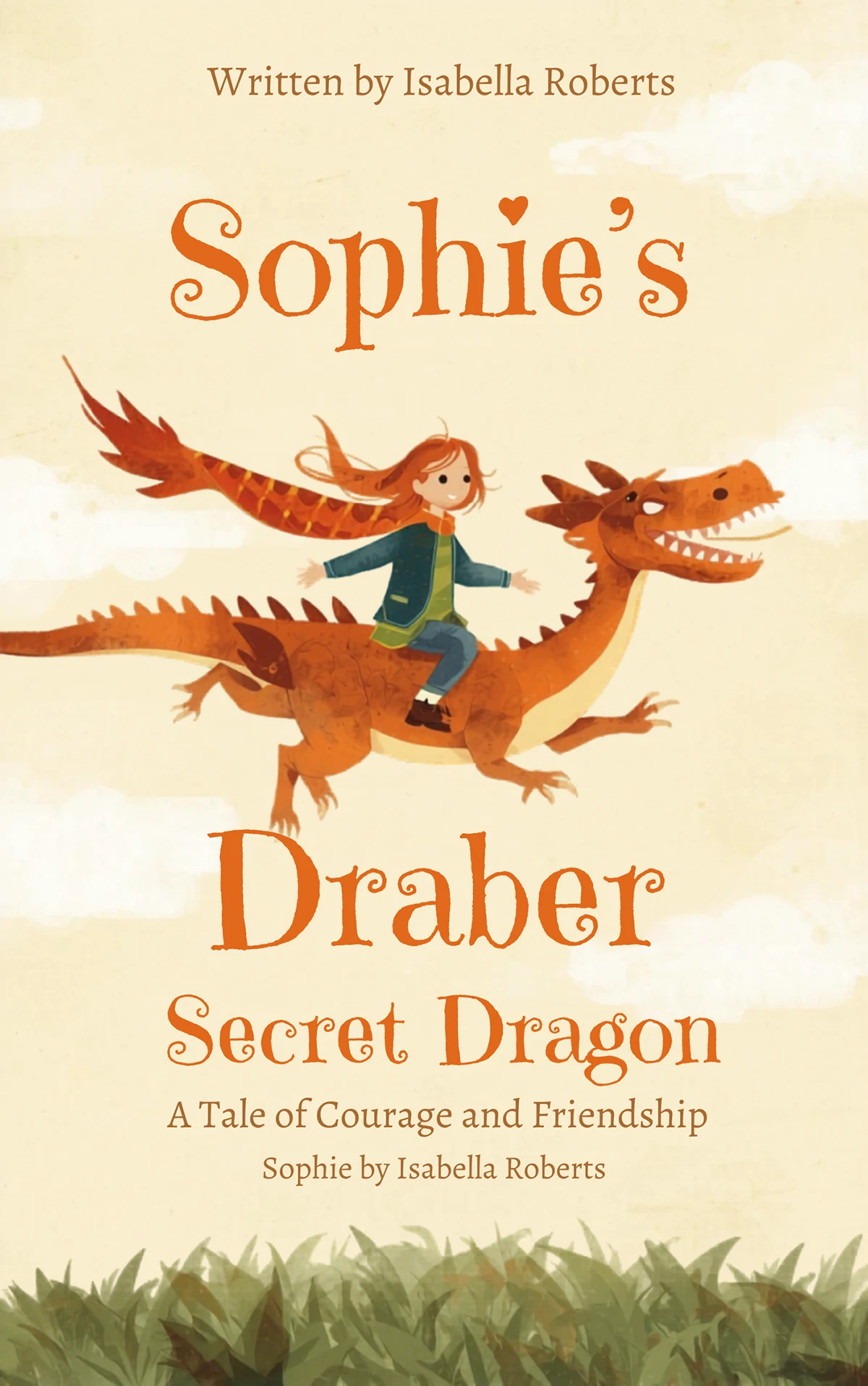
4. Children's Prompt ("Sophie's Secret Dragon")
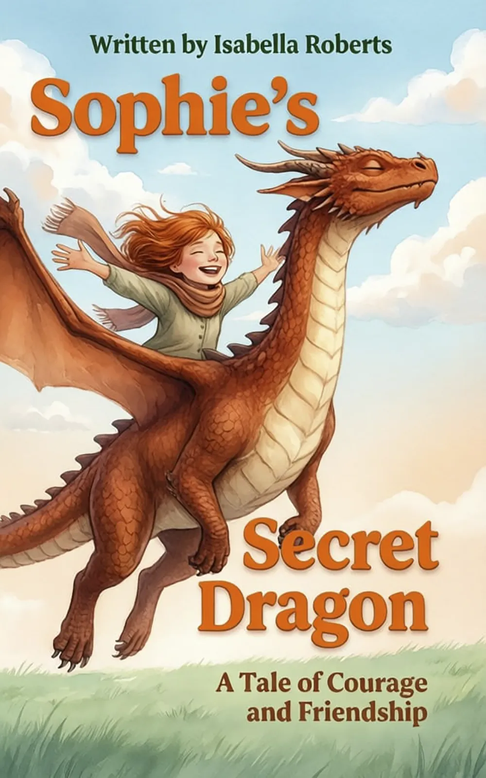
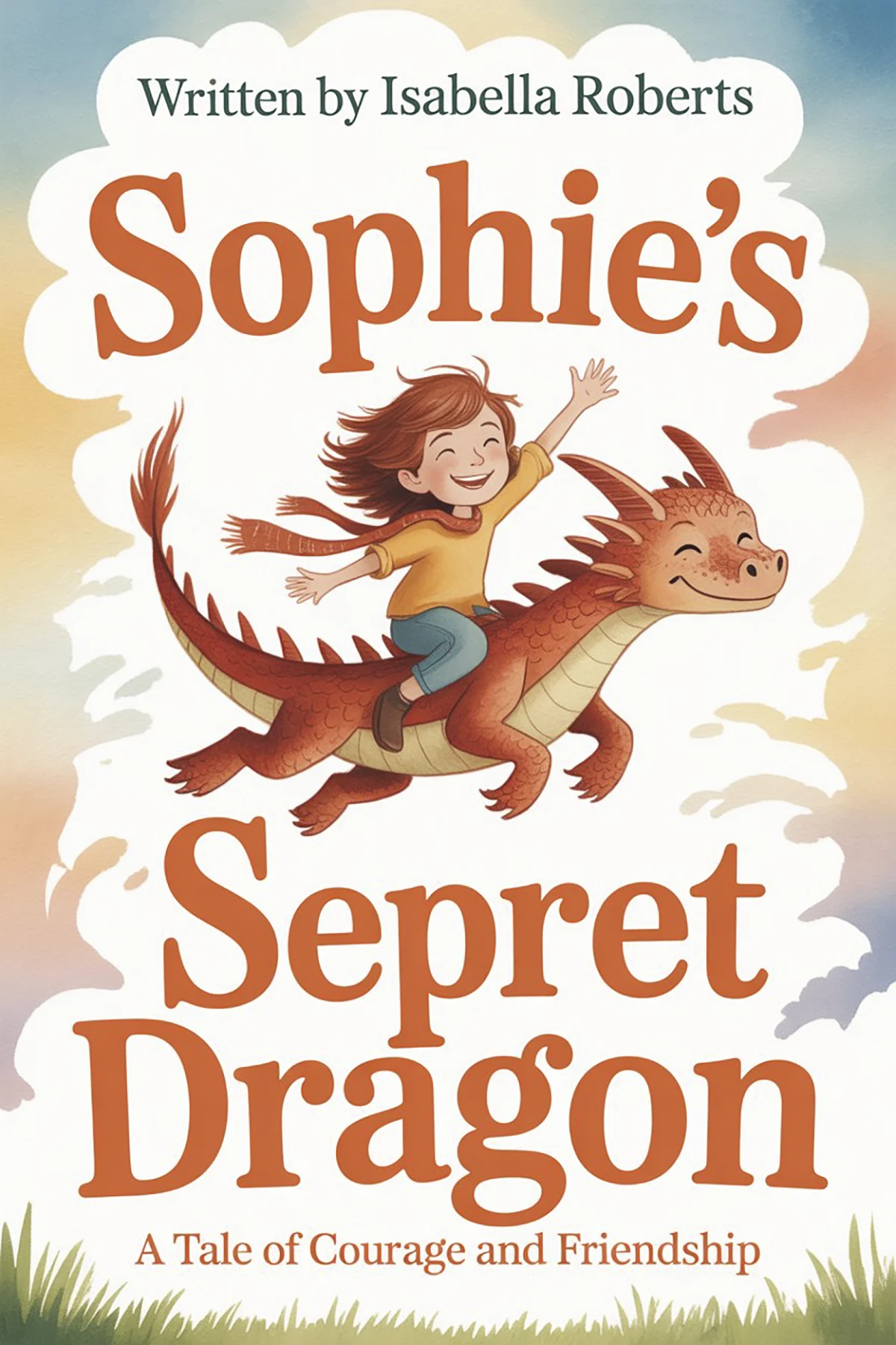
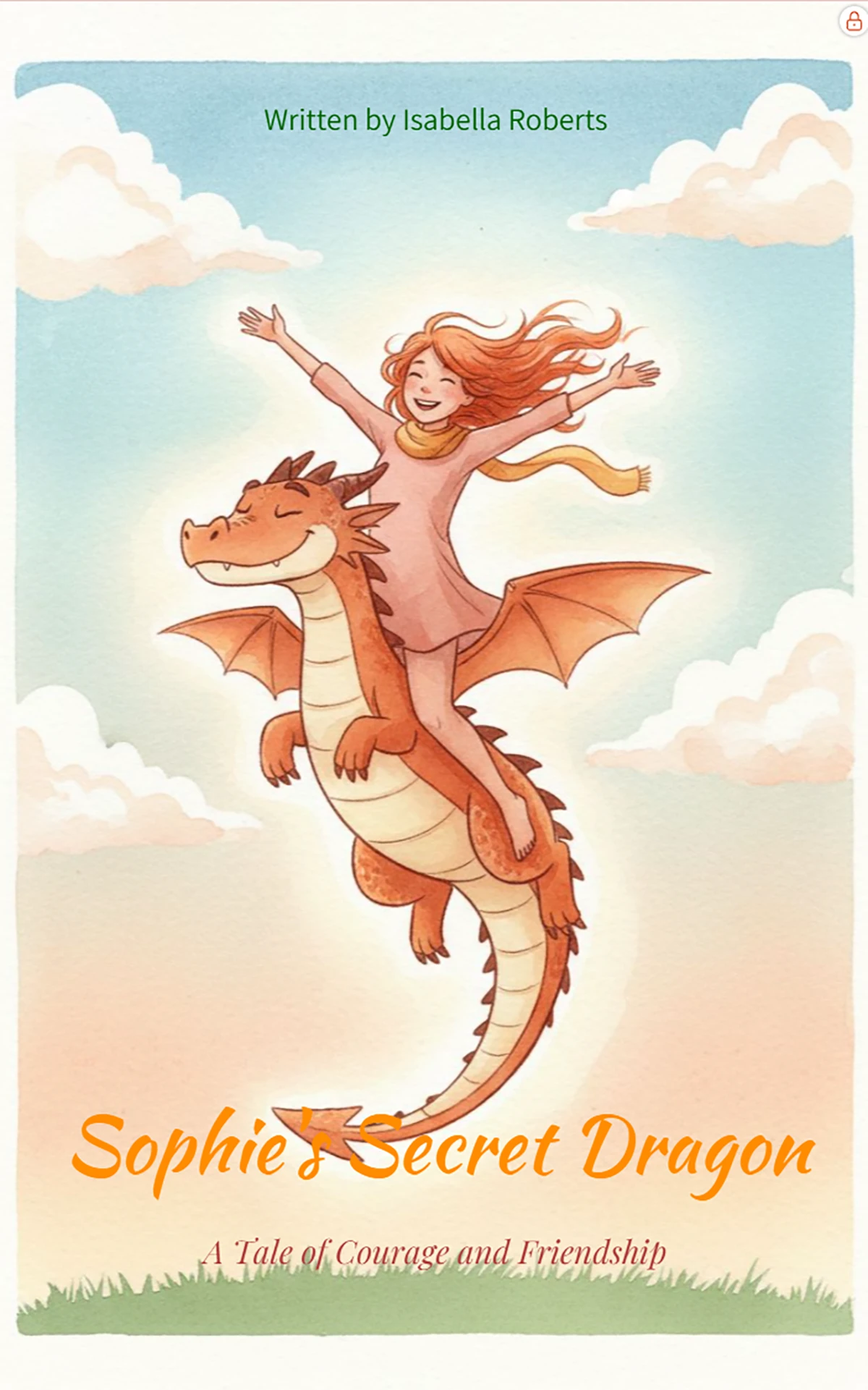
"Typography-first mass-market bestseller cover in a storybook-classic watercolor style with soft brush strokes and gentle texture. Background sky with puffy white clouds over a warm gradient that shifts from peachy cream at the horizon to soft robin's egg blue at the top, with a minimal sage green grass line along the bottom edge. At the center, Sophie rides on Ember the dragon, soaring upward as one joyful silhouette. Sophie stretches her arms wide, copper-red hair streaming behind, scarf flowing. Ember grins playfully with eyes closed, warm terracotta scales and a cream belly. Title split in two parts: 'Sophie's' at the top left and 'Secret Dragon' at the bottom right, set in a chunky playful serif in bright cheerful orange. Author lines 'Written by Isabella Roberts' appear at the top in clean deep green sans-serif."
Detailed Comparison of AI Book Cover Generators
1. BeYourCover - Purpose-Built AI Book Cover Generator
Rating: 4.8/5
Best for: Authors who want one workflow for ebook, print, audiobook, and promo assets
Pricing: Free trial available, then $19-$39 one-time per book
Website: beyourcover.com
What Sets BeYourCover Apart
BeYourCover is a purpose-built platform designed exclusively for book cover creation. Unlike generic AI image generators, it understands the specific visual language of book covers - composition, typography hierarchy, and genre-specific color palettes - and it now covers far more of the publishing workflow than just front-cover generation.
You can start with either a book brief or a direct prompt, generate multiple directions, iterate with "More like this," then move into editing tools like Transform, Style Conversion, Remove Text, and guided typography restyles. From the same cover, Pro users can also create audiobook versions, full wrap print covers with spine and back, and marketing assets like ad images, social mockups, and promo video.
Real-World Generations with BeYourCover
We tested BeYourCover using our benchmark prompts. The results demonstrate its superior ability to handle complex layouts and professional typography.
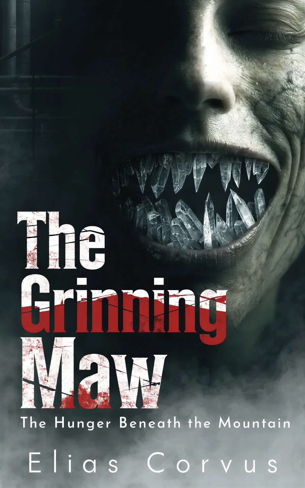
Horror Benchmark Result
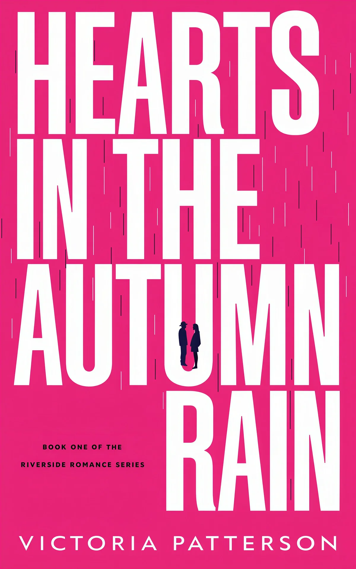
Romance Benchmark Result

Non-Fiction Benchmark Result
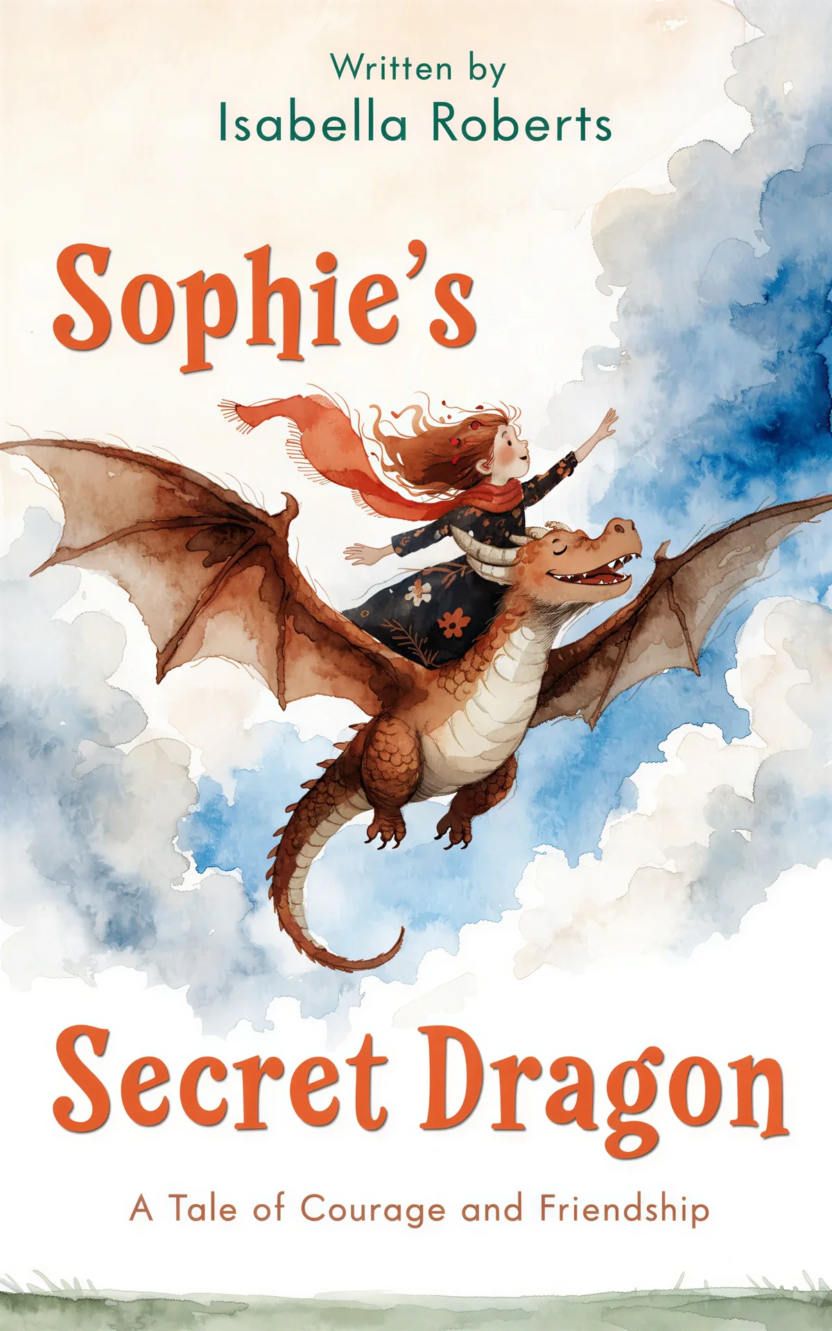
Children's Benchmark Result
Pros:
- Specialized training on real book covers ensures genre-appropriate designs.
- Supports both brief-based and prompt-based generation, plus "More like this" iterations.
- Includes Transform, Style Conversion, Remove Text, and guided typography restyles.
- Full Wrap workflow creates front, spine, and back covers for print, plus audiobook and marketing asset exports from the same project.
- One-time payment model is much cheaper than monthly subscriptions for single-book authors.
Cons:
- Limited External Assets: Unlike Canva, you cannot currently upload your own images to use as base examples for the AI generation.
- Smaller Font Library: While the fonts are curated for books, the total number is smaller than general design platforms.
The BeYourCover Workflow Advantage:
- Start with a brief or prompt: Use the AI book cover generator with your story summary or a direct visual prompt.
- Choose a direction: Generate genre-aware covers, then use templates and "More like this" to explore better fits.
- Refine the cover: Edit artwork with Transform, Style Conversion, and Remove Text, then improve title treatment with typography tools.
- Build format variants: Create the ebook version you want, then adapt it into a square audiobook cover or a full wrap print cover with back and spine.
- Create launch assets: Generate high-res exports plus marketing resources like 4:5 ad images, 9:16 or 4:5 mockups, and a short promo video.
Try it Free: Start with the free AI book cover generator - no credit card required.
2. NightCafe - Creative AI Art Generator for Book Covers
Rating: 4.5/5
Best for: Authors wanting unique, artistic covers with maximum creative freedom
Pricing: Free limited plan, paid plans from $12.49/month
Website: creator.nightcafe.studio
NightCafe is the winner for pure artistic creativity. It uses advanced generative AI models including DALL-E 3 and Flux to create truly original artwork.
NightCafe Test Results
NightCafe produces high-quality artistic images with good text rendering, though prompt adherence is in the middle - not perfect, but not bad.
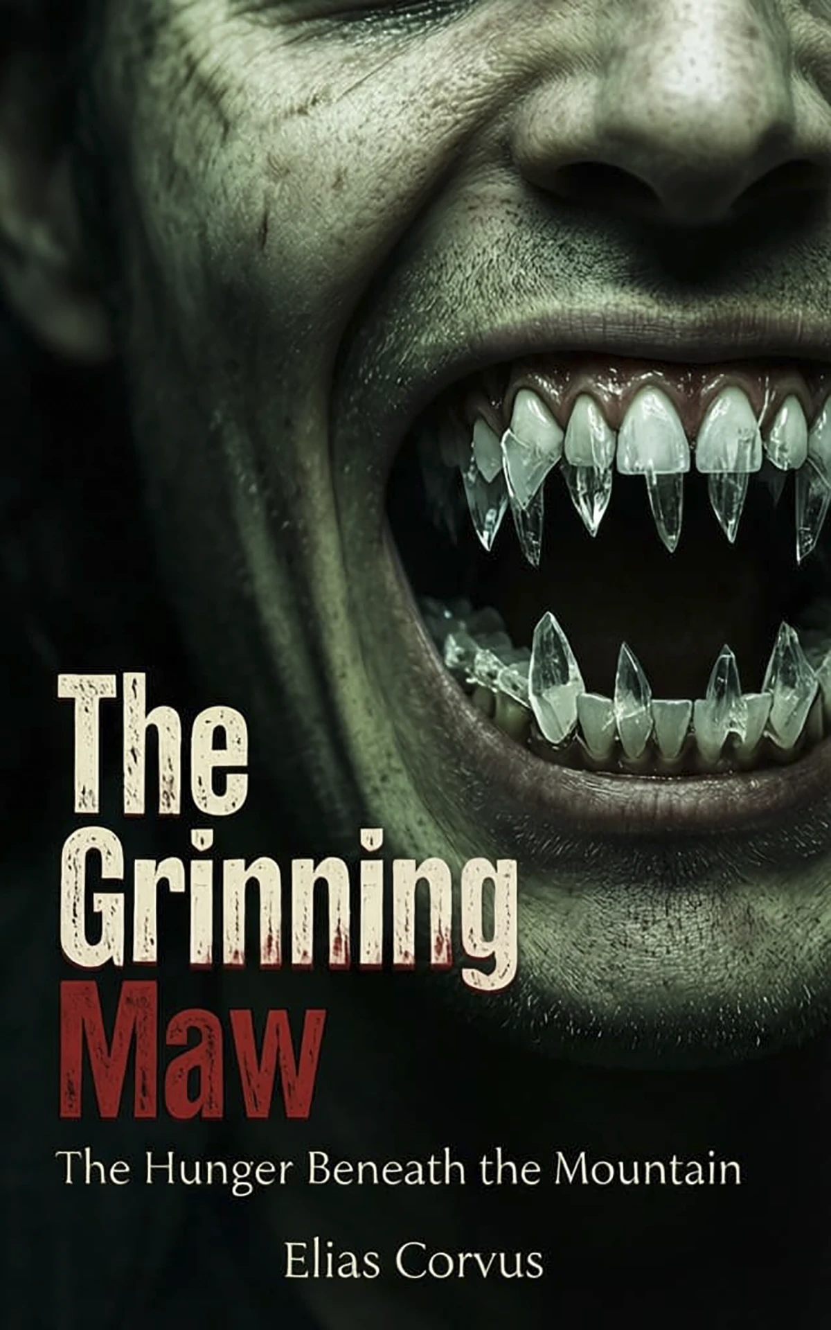


Pros:
- Unmatched variety of AI models. If you are an expert in AI image generation, you can take advantage of that.
- Very active community and daily free credits.
- Good prompt adherence.
Cons:
- No built-in book cover templates or safe-zone guides.
- Font looks unprofessional: fonts lack creativity for some genres.
Verdict: If you are an author who wants absolute control over the image model used and you're comfortable using a second tool for typography, NightCafe is arguably better than BeYourCover for creative flexibility.
3. Ideogram - Best for Experimenting with Styles
Rating: 4.0/5
Best for: Experimental covers with embedded text
Pricing: Free limited plan, paid plans from $20/month
Website: ideogram.ai
Ideogram offers numerous Styles you can use for experimenting, but they are not focused on genre conventions.
Ideogram Test Results
Ideogram shows good prompt adherence and produces high-quality images, but human skin can look unnatural. While it handles text better than most, it still isn't perfect.


Pros:
- Good at text rendering; it can often "bake" the title directly into the art.
- Fast generation and great for social media teasers.
Cons:
- "Uncanny Valley" Faces: Human skin and eyes often look plastic or unnatural compared to BeYourCover's photorealistic models.
- Limited post-generation editing.
Verdict: For authors who want to experiment with different pre-built styles, Ideogram is the go-to tool.
4. Canva with AI Image Generation
Rating: 3.5/5
Best for: DIY authors comfortable with design tools
Pricing: Free plan available, Pro from $12/month
Website: canva.com
Canva's Magic Media feature brings AI image generation to their platform, but it's not optimized for book covers specifically. Authors using Canva for AI-generated book covers often struggle with text rendering and genre-specific layouts.
Canva Test Results
Canva produces good images and follows instructions well, but frequently struggles with accurate text rendering, requiring manual correction.

Pros:
- Familiar interface for existing Canva users
- Massive asset library (photos, graphics, fonts)
- Collaboration features for team projects
- Print-on-demand integration
Cons:
- AI lacks book cover training - produces generic images
- Manual text placement required
- Time-consuming compared to specialized tools
- Results often look "homemade" rather than professional
- No understanding of genre conventions
Verdict: Canva remains the king of general marketing. Use it to finish a cover you generated elsewhere, but its native AI is still too generic for professional book covers.
5. Venngage - AI-Assisted Book Cover Generator
Rating: 3.2/5
Best for: Beginners who want AI-assisted templates
Pricing: Free limited plan, $49/month for Venngage AI
Website: venngage.com
Venngage combines AI-powered suggestions with a drag-and-drop editor for book cover AI design. While user-friendly, it's more about AI-assisted templates than true AI generation.
Venngage Test Results
Venngage generally produces lower-quality images and struggles to follow detailed instructions. It also has a significant barrier to entry: you need a company email domain to register (Gmail, Outlook, etc. are not accepted).

Pros:
- AI suggests layouts, fonts, and color palettes
- Commercial usage rights included
- Free plan available for basic use
- Good customer support
Cons:
- Requires a company email to register (Gmail, Outlook, etc. are blocked)
- AI sometimes ignores detailed prompts
- Template-based rather than generative
- Limited artistic originality
- Free plan has export restrictions
- Not specialized for book publishing
Verdict: Suitable for authors new to design who want AI guidance, but for truly professional AI book cover generation, BeYourCover's specialized approach delivers superior results.
6. DIY Book Covers - CoverMaker
Rating: 2.5/5
Best for: Quick, traditional-style covers on zero budget
Pricing: Free basic plan, paid plans from $19 one-time
Website: diybookcovers.com
DIY Book Covers offers a CoverMaker tool that's free but extremely basic. It's template-driven with no actual AI image generation.
DIY Book Covers Test Results
In our testing, DIY Book Covers failed to produce usable results for most prompts. It only showed generic images, ignored instructions, and never displayed any text.

Pros:
- Completely free for basic use
- Genre-specific templates
- 3D mockup generation
- Very fast (under 10 seconds)
Cons:
- No AI image generation at all
- Purely template-based
- Non-existent customization
- Generic, recognizable designs
- Basic typography options only
Verdict: Only for authors with zero budget who need something immediately.
Why AI Book Cover Generators Are Essential for Modern Authors
The self-publishing landscape is more competitive than ever. With millions of books published annually on platforms like Amazon KDP, your cover is your #1 marketing asset.
Traditional design services are excellent but often out of reach for debut authors. AI tools bridge this gap by:
- Reducing Costs: Saving $500+ per book allows you to spend more on actual ads.
- Speed to Market: You can iterate on a cover concept in 20 minutes instead of waiting 2 weeks for a designer's first draft.
- A/B Testing: You can generate 5 different styles and let your newsletter subscribers vote on the winner.
Frequently Asked Questions About AI Book Cover Generators
Q: Can AI-generated book covers really compete with professional designers?
A: Yes, especially specialized tools. While generic AI can look "off," a purpose-built AI book cover generator understands the composition and resolution requirements (like the Kindle ebook cover size) needed to look professional on a digital shelf.
Q: Are AI book covers legal to use commercially?
A: Yes. Most reputable platforms provide full commercial licenses. However, always check the specific terms - for example, Canva requires a Pro subscription for certain AI-generated commercial rights.
Q: How much does an AI book cover generator cost compared to hiring a designer?
A: Professional designers charge $300-$800. Most AI tools range from free limited plans to $49/month, with some offering one-time payments starting at $19. For more details, see our book cover design cost guide.
Q: Can I use BeYourCover for print books, audiobooks, and marketing assets too?
A: Yes. BeYourCover now supports full wrap print covers with front, spine, and back editing, plus square audiobook versions and marketing resources like ad images, social mockups, and promo video. For print exports, you should still proof the final PDF before uploading to KDP or IngramSpark.
Final Thoughts: Choosing Your Tool
The landscape of AI book cover design is no longer a one-size-fits-all.
- Choose BeYourCover if you want an all-in-one workflow that takes you from initial concept to ebook, print, audiobook, and launch-ready marketing assets.
- Choose NightCafe if you want to be an "AI artist" and create something completely unique.
- Choose Ideogram if you need complex text effects integrated into the artwork.
Regardless of your choice, the barrier to professional self-publishing has never been lower.
Ready to Create Your Own Book Cover?
Turn your story into a visual masterpiece. Fill in the details below to start generating professional covers instantly.