7 Top Sources for Book Cover Inspiration in 2026
Struggling with your cover? Discover the 7 best sources for book cover inspiration to find winning design concepts for your next KDP novel.
Posted by
Related reading
Photos for Book Covers: A Complete Guide for Authors
Learn how to choose effective photos for book covers. This guide covers composition, sourcing, licensing, and technical specs for KDP-ready designs.
Create the Perfect Book Review Form: A Guide for Authors
Learn to design a book review form that delivers actionable feedback. This guide covers question design, distribution tactics, and using reviews for marketing.
Effective Backgrounds for Covers: KDP Guide 2026
Choose effective backgrounds for covers to grab attention on Amazon KDP. Our 2026 guide covers types, genre matching, composition, & technical specs.
Ready to design your cover?
Use our AI book cover generator to create tailored book cover concepts in minutes.


A great book cover is your single most important marketing tool, especially on crowded platforms like Amazon KDP. It must instantly communicate genre, hint at the story's tone, and capture a reader's attention in a fraction of a second. But navigating the path from a blank page to a compelling final design can feel overwhelming for many authors. Where do you even begin your search for effective book cover inspiration?
This guide cuts through the noise. We'll explore seven essential platforms and marketplaces where you can find professional, market-tested cover concepts. We move beyond simple galleries to show you how to analyze designs, identify genre trends, and translate those insights into a cover that works for your specific book.
Each entry includes a direct link and a breakdown of what makes the platform useful, helping you make an informed decision for your project. Whether you're looking to hire a professional, find a premade cover, or test ideas using an AI tool, this is your strategic roadmap to a cover that connects with readers and drives sales. We'll analyze specific design principles, such as what makes for effective standout thriller covers, and show you how to apply those principles to your own work.
1. BeYourCover
As a standout resource for authors seeking immediate and actionable book cover inspiration, BeYourCover occupies a unique position. It moves beyond static galleries by functioning as an active, AI-powered design partner. This platform is engineered specifically for indie authors and small presses who need to translate a story concept into a market-ready visual, quickly and affordably.
Instead of just browsing existing designs, users can generate multiple, fully-realized cover concepts in under a minute. By entering a title, genre, and a brief summary, the AI delivers a range of professional-grade options that are aligned with current market trends and genre expectations. This transforms the inspiration process from passive observation to active creation, allowing authors to see how their specific title, themes, and tones could be visualized.
Why BeYourCover Stands Out for Inspiration
BeYourCover excels by combining rapid ideation with powerful, yet accessible, customization tools. This makes it an ideal starting point for anyone looking to brainstorm, test, and refine their cover direction without committing to a designer or purchasing stock assets upfront.
- Speed and Efficiency: Generate dozens of unique visual ideas in minutes, not days. This rapid iteration is invaluable for testing different taglines, compositions, and color palettes to see what resonates.
- Genre-Specific Intelligence: The platform is trained on genre conventions, ensuring the inspiration it provides is commercially viable. A thriller concept will look like a thriller, not a miscategorized romance.
- Cost-Effective Exploration: With a free trial (2 cover generations) and one-time pricing plans, authors can explore visual possibilities without a significant financial investment. This lowers the barrier to professional-level experimentation.
Key Features and Practical Applications
The platform's strength lies in its blend of automated generation and granular user control. Authors can use its features to move seamlessly from an initial idea to a polished, publishable file.
| Feature | Practical Application |
|---|---|
| Instant Generation | Quickly visualize multiple directions for your book. Ideal for authors who are "stuck" and need fresh book cover inspiration to break a creative block. |
| Advanced Text Editor | Test different fonts, colors, and layouts for your title and author name directly on a generated cover. See how typography choices impact the overall mood. |
| Transform & Style Conversion | Take a concept you like and instantly restyle it. Change the art style, color scheme, or character elements to refine the initial inspiration. |
| High-Resolution Exports | Any concept you develop can be exported as a KDP-ready file, turning your inspiration into a tangible, ready-to-upload asset. |
Pricing and Access
BeYourCover operates on a user-friendly, non-subscription model. New users can try the service for free to generate two covers. For those ready to move forward, two one-time payment options are available:
- Basic Plan ($19, limited launch pricing): Ideal for authors working on a single book who need to test a few concepts.
- Pro Plan ($39, limited launch pricing): Offers the best value for prolific authors or those requiring extensive iteration. It includes unlimited books, 50 versions per project, access to all premium styles, and full-resolution exports.
Pros and Cons
- Pros: The one-time pricing model is a significant advantage over subscription services. The combination of speed, powerful editing tools, and market-aware AI provides an exceptional toolset for authors who want creative control and professional results. The platform's proven track record with over 3,500 authors adds a layer of trust.
- Cons: The most powerful features, like unlimited books and the full range of premium styles, are exclusive to the Pro plan. While the AI is highly advanced, projects requiring intricate, bespoke illustration or complex series branding might still benefit from collaboration with a human designer.
Website: https://beyourcover.com
2. Reedsy Marketplace + Book Cover Gallery
For authors seeking to hire a top-tier professional, Reedsy is a premier curated marketplace. It's more than just a gallery; it's a platform connecting you with vetted designers, many of whom have experience working with major publishing houses. This focus on quality control is what sets Reedsy apart from more open, unvetted freelance sites.
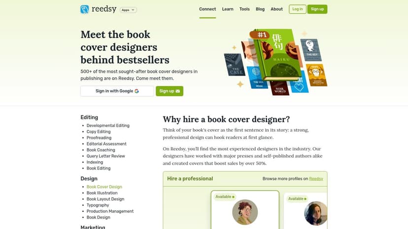
The platform provides two primary functions for authors looking for book cover inspiration. First, their public Book Cover Gallery is an excellent resource, allowing you to browse hundreds of professionally designed covers, filterable by genre. This helps you identify current trends and find designers whose style aligns with your vision. Second, the marketplace itself allows you to dive deep into individual designer portfolios, see their specific work, and read reviews from other authors.
Key Features and Workflow
Reedsy’s structured process simplifies hiring. You can browse over 200 designers, filtering by genre, specialization, and even location (for US-based authors). The platform allows you to request quotes from up to five designers simultaneously, streamlining the comparison process. All communication, contracts, and payments are managed within the Reedsy ecosystem, adding a layer of security and convenience.
- Pros: Strong vetting process ensures high-quality talent. Transparent portfolios and reviews build trust. The multi-quote system is efficient for comparing options.
- Cons: Pricing varies significantly between designers, as there are no fixed rates. Top-tier designers often have limited availability, so you may need to book them well in advance.
How to Use Reedsy for Inspiration
A smart strategy is to use Reedsy’s gallery to create a "mood board" of covers you admire. Pay attention to the designers behind your favorite examples. When you're ready to get quotes, you'll have a pre-vetted list of professionals whose style already resonates with your project. This approach transforms your search for book cover design inspiration from passive browsing into an actionable step toward hiring the right partner.
3. 99designs by Vista (Book Cover Contests or Direct Hire)
For authors who thrive on variety and want to explore multiple creative directions at once, 99designs by Vista offers a unique contest-based model. Instead of vetting and hiring a single designer, you write a creative brief and launch a contest. Designers from around the world then submit concepts based on your brief, giving you a wide pool of initial ideas to choose from. This approach is ideal for authors who aren't yet settled on a specific visual style and want to see how different creatives interpret their story.
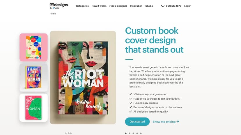
The platform’s core strength is its ability to generate a high volume of diverse concepts quickly. You can also bypass the contest model and hire individual designers directly, similar to other marketplaces. However, the contest feature is what truly sets it apart, turning the search for book cover inspiration into an interactive and collaborative process where you guide multiple designers toward a final, polished product. This makes it a powerful tool for discovering what you didn't know you wanted.
Key Features and Workflow
99designs simplifies the budgeting process with tiered, fixed-price contest packages (Bronze, Silver, Gold, and Platinum). Each tier promises a certain number of design concepts, allowing you to control costs while scaling the experience level of participating designers. The platform guides you through creating a detailed brief, running feedback rounds, and selecting a winner. Once a design is chosen, the handover process is managed by the platform, and you receive production-ready files for both print and digital formats.
- Pros: Generates a large volume of concepts, which is great for visual brainstorming. Fixed-price contests provide predictable budgeting. The platform manages file handovers and offers money-back guarantees on contests.
- Cons: Actively managing a contest and providing feedback to numerous designers can be time-consuming. The quality of submissions can vary widely, especially in lower-priced tiers.
How to Use 99designs for Inspiration
A highly effective strategy is to use a 99designs contest as a large-scale A/B test for your cover concept. Write a very clear brief outlining your genre, target audience, and key themes. As concepts roll in, you'll quickly see which visual approaches resonate most. This process does more than just find you a designer; it helps you understand what makes a good book cover for your specific project. Use the initial submissions to refine your vision, then provide targeted feedback in the final rounds to get a cover that is not only beautiful but also market-tested.
4. Etsy – Premade Covers and Editable Templates
Etsy offers a vast, sprawling marketplace for independent designers selling premade book covers and editable templates. Unlike curated platforms, Etsy is an open market, providing authors on a budget with thousands of affordable and often genre-specific options. This makes it a go-to resource for quick inspiration, rapid turnaround, and finding designs for niche sub-genres that might be harder to source elsewhere.
The platform's value lies in its sheer volume and variety. Authors can find everything from one-of-a-kind, sold-once premade covers to highly affordable Canva or Photoshop templates they can customize themselves. This direct-to-creator model provides a different kind of access to design talent, focusing on speed and affordability.
Key Features and Workflow
Etsy’s marketplace functions like a massive digital art fair for authors. You can search for "premade book cover" and filter by genre, price, and digital download availability. Many designers offer add-on services like typography customization, paperback wrap creation, and audiobook cover formatting. Communication is handled directly with the individual shop owner, allowing for a more personal transaction.
- Pros: Extremely wide price range to fit any budget and a massive variety of styles. Digital delivery is often instantaneous for templates. Excellent for discovering visual trends in niche sub-genres, from cozy mystery cover design ideas to clean romance cover inspiration ideas.
- Cons: Quality and licensing terms vary significantly between shops, so you must read listings carefully. Many premade covers are not exclusive unless the seller specifically states it is a "sold-once" design, risking cover overlap with other books.
How to Use Etsy for Inspiration
Etsy is an excellent tool for gathering book cover inspiration without a large financial commitment. You can browse popular shops in your genre to see what visual styles are currently selling well. Consider purchasing an inexpensive template not to use as your final cover, but as a low-cost way to experiment with typography and layout. This hands-on approach can help you clarify your vision before you commit to a final design or hire a professional, ensuring you understand the core elements that make a cover effective.
5. SelfPubBookCovers
For authors needing a professional-quality cover quickly and without the back-and-forth of custom design, SelfPubBookCovers offers a unique solution. It is a vast marketplace dedicated exclusively to premade book covers, each guaranteed to be sold only once. This exclusivity is a major draw for indie authors on crowded platforms like Amazon, as it prevents the embarrassing scenario of having a cover identical to another book in your genre.
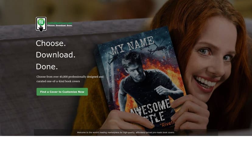
The platform is designed for speed and ease of use. Authors can browse over 40,000 unique covers, filtering by genre, keywords, and even dominant colors to find the perfect match. Once a design is chosen, the true magic lies in its built-in editor. You can instantly add your title, author name, and tagline and experiment with unlimited typography changes in-browser before committing to a purchase. This provides a powerful way to visualize the final product with your own details.
Key Features and Workflow
SelfPubBookCovers streamlines the process from discovery to download. After finding a cover, you use the simple editor to customize the text. Upon purchase, the design is immediately removed from the marketplace to ensure its exclusivity. You then receive instant access to download both web-ready (72 dpi) and print-ready (300 dpi) files, covering all your needs for ebook and paperback distribution. The platform even offers US-based phone support for any issues.
- Pros: Guaranteed exclusivity means your cover is unique. The in-browser editor allows for fast customization and real-time visualization. Instant file downloads get your book to market faster.
- Cons: Designs are sold as-is; significant changes beyond typography require commissioning the artist separately. The visual style can be inconsistent as it features work from many different artists.
How to Use SelfPubBookCovers for Inspiration
Even if you plan to commission a custom design, this site is an excellent source of book cover inspiration. Use its robust search filters to analyze what’s currently available in your genre, noting common layouts, color palettes, and typographic styles. You can also use their editor to test how your title looks on various concepts, which can inform the brief you give to a custom designer or guide your efforts when using an AI tool to generate initial mockups.
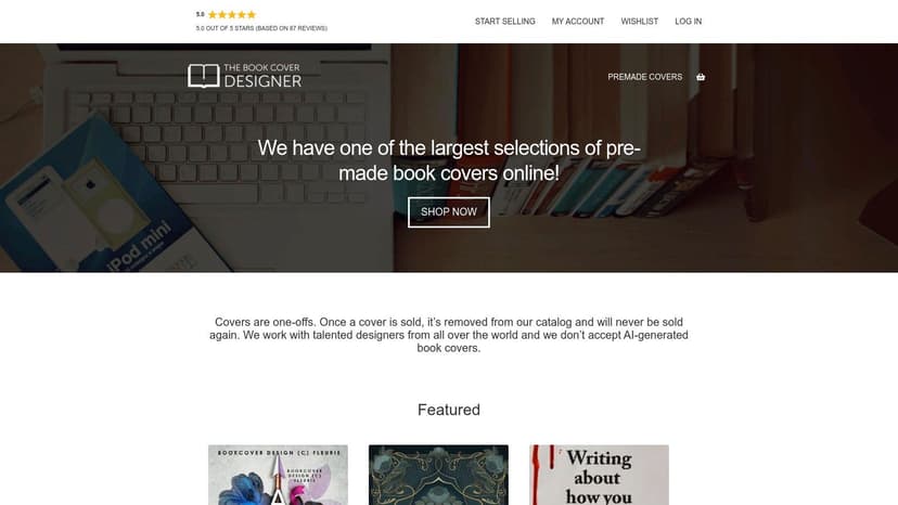
6. The Book Cover Designer (TBCD)
For authors seeking a unique, professionally designed cover without the back-and-forth of a custom project, The Book Cover Designer (TBCD) is a leading marketplace for premade designs. It features a massive catalog of "sold-once" covers from a diverse pool of independent designers, making it a go-to resource for quickly finding a high-quality, genre-appropriate visual for your book.
The primary strength of TBCD is its sheer volume and focus on premade covers. Authors can browse over 10,000 unique designs, filtering extensively by genre, price, and even specific keywords. This makes it an invaluable tool for book cover inspiration, as you can instantly see what's currently available in the market for your genre. The platform’s business model is simple: find a cover you love, purchase it, and the designer will add your title and author name, often at no extra cost.
Key Features and Workflow
TBCD streamlines the process of acquiring a professional cover. Once you find a design, you purchase it directly, and it's removed from the store to ensure exclusivity. Communication happens with the individual designer to finalize your text and any minor included edits. The wide price spectrum caters to various budgets, from entry-level options for novellas to premium designs for flagship novels. A key differentiator is its clear policy against AI-generated art, providing assurance for authors who prefer human-created designs.
- Pros: Huge, easily searchable catalog perfect for trend-spotting and inspiration. Most sellers include text customization and minor edits in the purchase price. Securing a cover is fast and straightforward.
- Cons: Communication and turnaround times vary depending on the individual designer. Buyers should confirm the specifics of the stock image license with the designer, especially if planning to use the art for merchandise.
How to Use TBCD for Inspiration
Use the extensive genre filters on The Book Cover Designer to explore the visual language of your category. Save your favorite designs to a folder to identify recurring color palettes, typography styles, and imagery. This process not only provides excellent book cover inspiration but also helps you understand market expectations. If you find a cover that’s almost perfect, it can serve as a detailed creative brief for a custom project or a prompt for testing similar concepts with an AI tool.
7. BookCovers.com – Premade Marketplace
For authors who need a high-quality cover quickly and affordably, BookCovers.com is a leading marketplace for premade designs. Unlike platforms focused on custom work, this site emphasizes scale and speed, offering a massive catalog of ready-to-go covers that can be customized with your title and author name. It's an ideal solution for authors working on a tight deadline or budget.
The primary appeal of BookCovers.com is its sheer volume. With over 60,000 designs, you can find inspiration for nearly any genre or niche imaginable, from mainstream thrillers to a sprawling fantasy cover design gallery. This vast selection allows you to browse current design trends at different price points, making it a powerful resource for book cover inspiration even if you don't purchase a cover directly. The platform supports both authors as buyers and artists as sellers, creating a dynamic and ever-growing library of options.
Key Features and Workflow
The process on BookCovers.com is incredibly straightforward. You find a design you like, provide your book's details for customization, and purchase it. The designer then updates the text and sends you the final files, usually within a day or two. This simplicity removes the back-and-forth of a custom design project.
- Pros: The high volume provides abundant inspiration and specific matches for niche sub-genres. The checkout process is streamlined, offering fast access to your completed cover files.
- Cons: Quality can be uneven across such a large marketplace, requiring careful vetting. You must review the exclusivity and licensing details for each listing, as they can vary between designers.
How to Use BookCovers.com for Inspiration
Use the site as a real-world trend-spotting tool. Filter by your genre and see what visual elements and typography are common among the best-selling designs. Take note of color palettes and character poses that align with your story. Once you identify a style you like, you can either purchase a premade cover or use your findings as a creative brief when generating concepts with an AI tool, ensuring your final design is commercially viable.
Book Cover Inspiration: 7-Option Comparison
| Option | 🔄 Complexity | ⚡ Speed / Efficiency | ⭐ Expected Quality / Results | 📊 Resource Requirements | 💡 Ideal Use Cases |
|---|---|---|---|---|---|
| BeYourCover | Low — AI + in-browser editor, minimal setup | Very fast — multiple concepts ≈30s | High ⭐⭐⭐⭐ — genre-optimized, KDP-ready exports; may miss bespoke brand nuance | Low‑to‑moderate cost — 2 free covers; one‑time Basic ($19) or Pro ($39) for full features | Quick, publish-ready covers; iterative testing; budget-conscious indie authors |
| Reedsy Marketplace + Gallery | Medium — client–designer workflow, quoting & contracts | Moderate — timeline varies by designer | Very high ⭐⭐⭐⭐ — vetted pros (Big 5 experience) and portfolio/review signals | Higher & variable — professional rates; time for quotes and selection | Hiring vetted professional designers for bespoke covers and publisher work |
| 99designs by Vista | Medium — run contests or direct hire; requires feedback rounds | Fast (for concept volume) — contests generate many options quickly | Variable ⭐⭐⭐ — quality scales with contest tier and price | Moderate–high — fixed contest tiers; time investment for contest management | Sourcing many concepts for inspiration/A‑B testing or finding a designer via contest |
| Etsy – Premade Covers & Templates | Low — buy premade or editable templates from sellers | Very fast — instant digital delivery / quick customization | Variable ⭐⭐–⭐⭐⭐ — quality and terms vary by shop | Wide price range; licensing & exclusivity inconsistent — read listings carefully | Cheap, fast covers for niche subgenres or DIY authors using templates |
| SelfPubBookCovers | Low — premade catalog + in‑browser editor; instant downloads | Very fast — immediate download after purchase | Good ⭐⭐⭐ — exclusive “sold‑once” premades reduce look‑alike risk | One‑time purchase; exclusivity often increases price; instant access | Authors wanting exclusive premade covers with quick, simple customization |
| The Book Cover Designer (TBCD) | Low — browse premades; sellers often handle text edits | Fast — purchase and minor edits are typically quick | Good ⭐⭐⭐ — large catalog; sellers often include minor edits | Varied pricing; turnaround depends on individual seller communication | Trend scouting and securing sold-once premades with minor included edits |
| BookCovers.com – Premade Marketplace | Low — large catalog, pick/customize/purchase workflow | Very fast — instant access to tens of thousands of designs | Variable ⭐⭐–⭐⭐⭐ — high volume leads to uneven quality | Large catalog with varied pricing; check exclusivity/licensing per listing | Rapid inspiration across many genres and quick cover acquisition at scale |
From Inspiration to Publication-Ready Cover
We've explored a powerful array of tools and platforms, from the bespoke designer marketplaces of Reedsy and 99designs to the immediate availability of premade covers on Etsy and SelfPubBookCovers. Each one offers a different path from idea to final asset, but the starting point is always the same: strategic inspiration. The goal isn't just to find covers you like; it's to understand the visual language that sells books in your specific genre.
Finding effective book cover inspiration is about deconstructing what works. It's about recognizing the typographic cues that scream "thriller" or the color palettes that whisper "cozy fantasy." By analyzing the designs available on these platforms, you've started building the critical eye needed to guide your own cover design process, whether you're writing a detailed brief for a designer or generating concepts yourself.
Key Takeaways for Your Cover Design Journey
To turn this inspiration into a tangible, market-ready cover, keep these core principles at the forefront of your strategy:
- Genre Is Non-Negotiable: Your cover’s primary job is to signal its genre instantly. A reader scrolling through Amazon should know within a second if your book is a gritty procedural or a sweeping historical romance. Deviating too far from established conventions is a risk that rarely pays off.
- Typography Does the Heavy Lifting: The font choice, size, and effects are powerful communicators. A delicate serif can imply literary fiction, while a bold, distressed sans-serif points to action or suspense. Pay close attention to how bestselling authors in your niche use text.
- Color Psychology Sells: Color palettes create an immediate emotional connection. The cool blues of a sci-fi cover evoke technology and distance, while the warm golds of a fantasy epic suggest magic and adventure. Choose your colors with intention.
- Test, Don't Guess: Never assume you know what will resonate with readers. Use tools like an AI cover generator to create multiple variations of a concept. Test different images, font styles, or color schemes to see which one performs best before committing.
Choosing Your Path Forward
Your next step depends on your budget, timeline, and design confidence.
- For maximum control and a bespoke vision, hiring a professional designer through a marketplace like Reedsy or 99designs is the gold standard. It’s an investment in getting a custom, professionally executed asset.
- If you need a quality cover on a tight budget and timeline, browsing premade marketplaces like Etsy, TBCD, or SelfPubBookCovers is an excellent, efficient choice.
- To rapidly brainstorm, iterate, and test concepts, using an AI tool like BeYourCover gives you unparalleled creative speed, helping you validate your ideas before finalizing a design.
Ultimately, your book cover is the single most important marketing tool you have. It’s your book’s first impression, its digital handshake, and its silent salesperson. As you move from inspiration to the final product, understanding the nuances of digital publishing will ensure your hard work translates into a professional and effective final product.
Take the insights you've gathered here, study your genre’s bestsellers, and choose the tool that aligns with your goals. By grounding your creative vision in proven market principles, you can create a cover that not only looks incredible but also connects with the right readers and drives them to click "buy."
Ready to Create Your Own Book Cover?
Turn your story into a visual masterpiece. Fill in the details below to start generating professional covers instantly.