How to use fonts for book covers: Master Genre Pairing & Typography Tips
Learn how fonts for book covers influence genre, legibility, and mood. Get tips on pairing and licensing to design a cover that sells.
Posted by
Related reading
How Color Theory in Marketing Can Sell Your Book
Unlock the power of color theory in marketing. This guide helps indie authors use color psychology to design book covers that sell and stand out on KDP.
Mastering the Blue Green Color Code for Your Book Cover
Discover how to use the blue green color code for your book cover. Learn color psychology and design tips to create covers that captivate readers on KDP.
Create Book Club Flyers That Attract More Readers
Learn to design and distribute effective book club flyers. Get practical tips and strategies to grow your readership and boost book sales.
The best fonts for book covers don't just look good—they instantly tell a potential reader what your book is all about. They act as a powerful signal for your genre and forge an emotional connection before anyone even reads the blurb.
Think about it: elegant serif fonts like Garamond or Cinzel feel right at home on a fantasy or literary fiction novel. On the other hand, a bold sans-serif like Helvetica Neue or Agency FB screams thriller or sci-fi. Your font choice isn't just decoration; it's one of your most powerful marketing tools.
How Typography Shapes Your Book's First Impression
Long before a reader dives into your synopsis, your font has already started telling a story. See your cover's typography less as simple text and more as your book's "voice." It's a visual promise, setting expectations and creating an immediate gut feeling.
This first impression is a critical part of your marketing arsenal. The right font is like a silent salesperson, working in just a few seconds to grab your ideal reader and pull them in. It’s a strategic choice, not just an aesthetic one, that can make the difference between a click and a scroll.
Why Font Selection Is a Strategic Choice
Choosing fonts for your book cover is so much more than picking something you find pretty. It’s a deep dive into visual communication, where every curve and line carries a subconscious message.
A smart font choice can:
- Instantly Signal Genre: A sharp, condensed font shouts "thriller," while a flowing, elegant script whispers "romance." Readers lean on these visual shortcuts to find the books they’ll love.
- Establish Tone and Mood: Is your story dark and gritty? Light and funny? Your typography sets the stage and conveys that atmosphere immediately.
- Create a Professional Image: A well-chosen, professionally applied font signals quality. It suggests the story inside is just as thoughtfully crafted. For more on this, check out our other book cover design tips. You can see how typography defines a genre in these romance book cover examples.
The importance of good typography isn't just a designer's opinion. The global font and typeface market was valued at around $965.44 million in 2021 and is on track to hit $1.21 billion by 2028. This isn't just random growth; it shows how seriously publishers and designers take the power of fonts. You can see more data on the growing typeface market on MarketResearch.com.
Your cover font is the handshake you offer every potential reader. It can be firm and confident, mysterious and intriguing, or warm and inviting—but it absolutely must be intentional.
Building Your Typography Framework
This guide is here to take the guesswork out of the equation. We’re going to dig into the psychology behind different font styles, the art of pairing fonts for a clean visual hierarchy, and the nitty-gritty technical details that make a design look professional, not amateur.
By the end, you'll have a complete framework for making confident, effective typography choices that help your book stand out, connect with readers, and ultimately, sell.
Matching Your Font to Your Book's Genre
Think of your book cover font as a genre-specific handshake. It's the first thing a reader sees, and in that split second, it has to feel right. Slapping an elegant script on a gritty thriller cover is like showing up to a back-alley brawl in a tuxedo—it’s just plain confusing and breaks the unspoken promise you've made to your audience.
The goal isn't just to pick a pretty font. It's about choosing a typeface that readers in your genre are already wired to understand. They have expectations, and your font is the fastest way to signal that you've got what they're looking for. Getting this right is a huge part of what makes a good book cover.
When you pick a font that fits your genre, you’re not being cliché; you’re speaking a shared visual language. It’s a smart move that helps readers find their next favorite book—yours.
To make this easier, here's a quick cheat sheet for matching fonts to the most popular genres.
Genre-Based Font Recommendations
| Genre | Common Font Style | Psychological Impact | Example Fonts |
|---|---|---|---|
| Thrillers & Suspense | Condensed Sans-Serif | Creates urgency, tension, and a sense of danger. | Agency FB, Bebas Neue, Impact |
| Romance | Elegant Scripts, Soft Sans-Serifs | Evokes intimacy, emotion, and personal connection. | Playfair Display, Great Vibes, Lato |
| Fantasy & Adventure | Decorative Serifs | Suggests history, magic, and epic grandeur. | Cinzel Decorative, Garamond, Trajan Pro |
| Science Fiction | Modern Sans-Serifs, Geometric | Feels futuristic, technological, and expansive. | Orbitron, Eurostile, Avenir |
| Non-Fiction & Memoir | Clean Serifs, Classic Sans-Serifs | Conveys authority, clarity, and trustworthiness. | Georgia, Helvetica, Baskerville |
Let's break down the thinking behind these choices.
Thrillers and Suspense Fonts
For a thriller, the typography needs to practically scream tension. You want fonts that are sharp, impactful, and just a little bit unsettling—the visual equivalent of a floorboard creaking in an empty house.
This is exactly why condensed sans-serif fonts are king in this genre. Their tall, narrow letters create an immediate sense of claustrophobia and urgency. They’re clean, modern, and get straight to the point.
- Characteristics to Look For: Think sharp angles, tight letter spacing (kerning), and a bold, imposing presence.
- Psychological Impact: These fonts signal danger, speed, and suspense. They feel serious and clinical, hinting at the high stakes inside.
- Examples: Agency FB, Bebas Neue, Impact.
Romance and Contemporary Fiction Fonts
Romance covers are all about emotion. Whether it’s steamy passion or lighthearted fun, the fonts have to be softer, more personal, and feel like they have a human touch.
Elegant script fonts are the go-to for a reason; their handwritten feel creates a powerful sense of intimacy. For contemporary romance or rom-coms, a clean, friendly sans-serif with rounded edges can feel warm and instantly accessible.
A well-chosen romance font feels like a whispered secret or a heartfelt love letter. It should invite the reader into an emotional journey, making a promise of connection and feeling.
The trick is to match the font to the subgenre. A sweeping historical romance can handle a lavish, flowing script, while a witty rom-com needs something more bubbly and modern.
Fantasy and Epic Adventure Fonts
Fantasy is built on world-building, magic, and a sense of history. Your font choice has to reflect that—it needs to feel timeless, epic, and maybe a little otherworldly. This is where decorative serif fonts truly shine.
Serifs, those small lines attached to the letters, give a font a classic, established feel. They're perfect for stories steeped in ancient lore. Many popular fantasy fonts even include unique flourishes or alternate letters that add a subtle touch of magic.
- Characteristics to Look For: Classic proportions, elegant serifs, and often unique decorative elements.
- Psychological Impact: These fonts practically radiate history, magic, and grandeur. They feel important, lending weight and credibility to the world you've built.
- Examples: Cinzel, Garamond, Trajan Pro.
Science Fiction Fonts
Sci-fi fonts need to look forward, not back. They should feel technological, clean, and sometimes a bit alien. The genre is dominated by modern sans-serif fonts with geometric or minimalist structures.
Picture the typography you’d see on the control panel of a spaceship or a futuristic corporate logo. These fonts are often wide and extended to create a sense of vast, open space. You can also play with distressed or glitched-out effects to hint at a darker, dystopian world.
Non-Fiction and Memoir Fonts
For non-fiction, the mission is simple: convey authority, clarity, and trustworthiness. Your font needs to be professional and incredibly easy to read, never distracting from the valuable information inside.
Both clean serif and sans-serif fonts are excellent choices here. Classic serifs like Baskerville or Georgia lend a sense of academic credibility and are a breeze to read. On the other hand, modern sans-serifs like Helvetica or Lato can give a business or self-help book a more current, accessible vibe.
It all comes down to simplicity and function. The font should project confidence and make the reader feel like they're in capable hands.
The Art of Font Pairing and Visual Hierarchy
A book cover almost never works with just one font. The best designs use a thoughtful mix of typefaces to create a look that feels professional and pulls the reader in. Think of it like casting a movie—each font has a specific role to play, and they all need to work together to tell a clear story.
This is where the idea of font pairing comes in. Your title, author name, and tagline are the main characters on your cover. The goal is to pick fonts that complement each other, creating a design that’s both interesting to look at and easy to understand in a single glance.
The Foundation of Great Font Pairing
The most powerful tool you have for pairing fonts is contrast. When fonts are too similar, they can create a weird, unsettling visual clash. But when they are intentionally different, they create a dynamic and balanced design.
A classic, can't-go-wrong strategy is to combine a serif font with a sans-serif font. The elegance and traditional feel of a serif title can be beautifully offset by the clean, modern look of a sans-serif for the author’s name. It just works.
To get started, here are a few ground rules:
- Create Obvious Contrast: Don't just pair two similar-looking serifs and call it a day. Pair a big, decorative font with a simple, quiet one. The difference should be obvious and look like you did it on purpose.
- Maintain a Consistent Mood: While your fonts should contrast in style, they have to share the same overall vibe. A playful, bubbly font just won't work with a grim, gothic one. That kind of pairing just confuses the reader about your book's tone.
- Limit Your Choices: Seriously, stick to two, or at the absolute most, three fonts. Any more than that almost always leads to a cluttered, amateur-looking design. Simplicity is your best friend.
This diagram shows how different genres—like thriller, romance, and fantasy—lean on specific font styles to signal their core themes to potential readers.
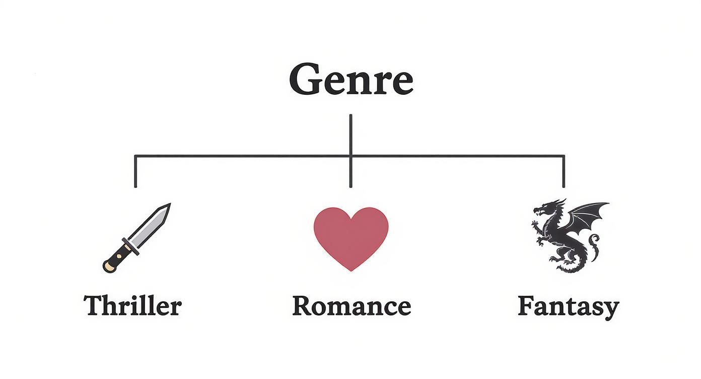
As you can see, each genre has its own typographic language. Sticking to these conventions helps your cover meet reader expectations from the get-go.
Mastering Visual Hierarchy on Your Cover
Once you’ve picked your fonts, the next job is arranging them to guide the reader's eye. This is called visual hierarchy. It’s the art of telling the viewer what to look at first, what's second most important, and so on.
On a book cover, the hierarchy is usually pretty straightforward:
- The Title: This is your hero. It should be the biggest, boldest, most eye-catching piece of text on the cover. No question.
- The Author Name: This is the trusted guide. It needs to be prominent, but it shouldn't be fighting the title for attention.
- Tagline or Subtitle: This is the supporting character. It adds a little extra context and should be the smallest, most subtle text element.
You can create this hierarchy using a few simple tricks of the trade.
Hierarchy is the silent director of your book cover. It tells the reader's eye exactly where to look first, ensuring your most important message—the book's title—is seen and understood in a fraction of a second.
Size is the most obvious tool in your toolbox. A bigger font naturally grabs more attention. Your title should be significantly larger than your author name, which should then be larger than any tagline.
Weight is another key player. This refers to the thickness of the font (think Light, Regular, or Bold). A bold font will pop more than a light one, even if they're the same size. Try using a bold weight for your title and a regular weight for the other text to create a clear separation.
Finally, placement and color matter a lot. Text placed near the top or in the center of the cover feels more important. Likewise, using a bright or high-contrast color for your title will instantly make it the main event.
By combining these elements, you create a clear path for the reader's eye, making your cover easy to scan and giving it a polished, professional finish. This structured approach ensures every word on your cover is doing its job perfectly.
Essential Typography Details That Matter
Choosing the right fonts for your book cover is a massive first step. But the small details—how you actually use those fonts—are what separate a professional-looking cover from a DIY mess. These subtle tweaks might feel tiny, but they have an outsized impact on the balance, readability, and overall polish of your design.
Think of it like getting a suit tailored. Off the rack, it might fit okay. But it’s the precise adjustments—taking in the waist, shortening a sleeve—that make it look sharp and custom. Typography is no different. The tiny details elevate the entire thing.
Fine-Tuning Your Letter Spacing
Have you ever looked at a title and felt like some letters were awkwardly squished together while others were floating in space? That’s a spacing problem, and it can be fixed with two key techniques: kerning and tracking.
- Kerning is all about adjusting the space between specific pairs of letters. Think about the letters ‘A’ and ‘V’. Their slanted shapes create a huge, clunky gap between them. Kerning nudges them closer, creating a more visually balanced word.
- Tracking, on the other hand, adjusts the space across an entire word or line of text. Bumping up the tracking can give a title a more modern, airy vibe. Tightening it can create a tense, urgent feel that’s perfect for a thriller.
Most design software, including the editor in our book cover design tool tool, handles a lot of this automatically. But taking a moment to manually tweak the kerning for your main title is a pro move that makes a world of difference.
These tiny spacing adjustments become absolutely critical for online stores. When your cover gets shrunk down to a thumbnail, poorly spaced text turns into an unreadable blur. Clean, intentional spacing keeps your title crisp at any size.
Mastering the Space Between Lines
Just as crucial as the space between letters is the space between lines of text. In the design world, we call this leading (pronounced "ledding"). If your title or author name takes up two lines, leading controls how much vertical breathing room they have.
Too little leading and the text feels cramped and claustrophobic. Too much, and the lines look disconnected, breaking the visual flow. A good rule of thumb is to set your leading to about 120% to 140% of your font size. It's the sweet spot that gives your text enough room to breathe without falling apart.
Choosing the Right Size and Weight
The last technical details to nail down are font size and weight. These elements are your primary tools for creating that all-important visual hierarchy, making sure your cover communicates the right information at a glance.
Font Size for Impact
Your title has one job: to be seen. It needs to be the most prominent piece of text on the cover, legible even as a tiny thumbnail on a phone screen. There's no one-size-fits-all answer, since it depends on your cover art and how long your title is. The real test? Zoom out on your design until it's about an inch tall. If the title is still crystal clear, you’re good to go.
Font Weight for Clarity
Font weight is simply the thickness of the letters (Light, Regular, Bold, etc.). For your title, a Bold or Black weight is almost always the right call—it helps the words pop against a potentially busy background. For the author's name or a tagline, a Regular or Medium weight often strikes the perfect balance, ensuring it’s readable but doesn’t scream louder than the title.
Beyond these individual tweaks, building a strong author presence relies on brand consistency, and your typography is a huge part of that. By mastering these essentials—kerning, tracking, leading, size, and weight—you take full control over your cover’s professional finish, making sure it looks fantastic both on a digital shelf and in a reader's hands.
Navigating Font Licensing for Your Book Cover
So you’ve found it. The perfect font. It screams your genre, looks amazing with your artwork, and just feels right. But before you hit "save" and call it a day, there's a critical, non-negotiable step you absolutely cannot skip: checking the font license.
This is a big one. Seriously. Ignoring font licensing is one of the most common—and potentially expensive—mistakes an author can make. Just because a font is free to download doesn't automatically mean it's free to use on something you plan to sell. This tiny oversight can spiral into some pretty scary legal and financial headaches down the road.
Think of a font just like a piece of software or a work of art. The designer who poured their time and talent into creating it owns the intellectual property, and they get to decide how it’s used. Using a font without the proper permission is no different than using a copyrighted photograph without paying for it.
Personal vs. Commercial Use: The Golden Rule
The single most important distinction to burn into your memory is the difference between a personal use license and a commercial use license. The concept is simple, but the consequences are huge.
-
Personal Use: This license is for projects that don’t make you a dime. Think school reports, a personal blog you don't monetize, or invitations to a family party. If no money is changing hands, you're likely in the clear.
-
Commercial Use: This is the one you must have for your book cover. Your book is a product for sale, making the cover a commercial asset. This license gives you the legal right to use the font on items intended to generate revenue.
It’s crucial to understand what an Intellectual Property Violation entails. Slapping a "personal use only" font on your cover can lead to takedown notices from retailers like Amazon, invoices for retroactive licensing fees, or even legal action from the font foundry.
My rule of thumb? Always assume a font is for personal use only unless you see the words "Free for Commercial Use" in big, bold letters. When in doubt, play it safe and find a font with a crystal-clear commercial license.
Font Licensing Models Compared
Navigating the world of font licenses can feel a bit like reading the fine print on a legal document—dense and confusing. To simplify things, here’s a quick breakdown of the most common license types you’ll encounter.
| License Type | Typical Use Case | Common Restrictions | Example Sources |
|---|---|---|---|
| Open Source (SIL OFL) | Book covers, websites, apps, logos—nearly anything. | Almost none. Cannot sell the font file itself. | Google Fonts, Font Squirrel |
| Freeware (Commercial) | Same as Open Source, but terms can vary. | Read the license! Some require attribution. | DaFont, 1001 Fonts (check filters) |
| Desktop License (Paid) | Book covers, print materials, logos. | Limited by number of users/computers. | Adobe Fonts, MyFonts, Fontspring |
| Personal Use Only | School projects, personal blogs, non-monetized use. | Absolutely NO commercial use. No sales, no ads. | DaFont, various free font sites |
Understanding this table is your first line of defense. Always double-check the license file (usually a .txt or .pdf) that comes with the font download. It will tell you exactly what you can and can't do.
Where to Find Commercially Safe Fonts
The good news is you don't have to spend a fortune to get incredible, legally-sound typography for your cover. Finding high-quality, commercially safe fonts is easier than ever.
Here are a few of my go-to, reliable sources:
-
Google Fonts: This is a goldmine. It's an amazing collection of hundreds of top-tier, open-source fonts. Every single font in their library is free for commercial use, making it the perfect place to start, especially if you're on a budget.
-
Adobe Fonts: If you have an Adobe Creative Cloud subscription, you’re sitting on a treasure trove. You already have access to a massive library of premium fonts that are all cleared for commercial use.
-
Trusted Marketplaces: Sites like Fontspring, MyFonts, and Creative Market are fantastic for finding unique, premium fonts. They provide very clear licensing information, so you know exactly what rights you're purchasing.
By making licensing a priority from the very beginning of your font search, you protect yourself, your book, and your author business. It ensures your gorgeous cover is built on a solid, legal foundation so you can publish with total peace of mind.
Common Questions About Book Cover Fonts
Jumping into the world of typography can feel like a lot, especially when your book’s first impression is riding on it. To cut through the noise, I’ve pulled together the most common questions I hear from authors and designers about picking the right fonts. Think of these as quick, practical answers to get you unstuck and designing with confidence.
This is your typography troubleshooting guide, built to solve the exact problems that pop up when you’re trying to lock in that final cover design.
How Many Different Fonts Should I Use on a Cover?
Here’s a rule I live by: less is almost always more. Sticking to two fonts is the professional standard. You can sometimes get away with three if one is a very subtle accent, but using more than two is the fastest way to make a cover look cluttered, chaotic, and amateur.
The goal is to create a clear, intentional pairing. This usually breaks down into two roles:
- A "Hero" Font: This is for your title. It needs to be distinctive, eye-catching, and a perfect match for your book's genre and mood.
- A "Supporting" Font: This is for the author's name, taglines, or subtitles. Its main job is to be readable and to complement the title font, not compete with it.
A classic, foolproof strategy is pairing a decorative serif font with a clean sans-serif. This creates a beautiful contrast that immediately tells the reader’s eye what’s most important, making your cover easy to absorb in a single glance.
What Are the Biggest Font Mistakes to Avoid?
There are a few common tripwires that can seriously weaken your cover's impact. Dodging these is key to creating a design that looks polished and actually connects with your ideal readers.
The single biggest mistake is ignoring genre conventions. If you slap a sleek, futuristic font on a historical romance cover, you’re sending a confusing signal. Your font choice is a promise to the reader, and it needs to align with what they expect from that genre.
Another huge error is poor readability. This is non-negotiable, especially when your cover is shrunk down to a tiny thumbnail online. Stay away from overly ornate scripts, fonts that are too thin, or light-colored text on a busy, light-colored background. If a reader has to squint to read your title, they’re already gone.
Perhaps the most critical mistake, though, is a legal one: never, ever use a font licensed "for personal use only" on a book you plan to sell. Ignoring the license can lead to legal trouble and serious financial penalties.
Finally, keep an eye on spacing. Awkward gaps between letters (also known as bad kerning) can make even the most beautiful font look cheap and unprofessional.
Can I Use a Common Font Like Times New Roman?
Technically, yes. But for your main title? I’d strongly advise against it. System fonts like Times New Roman, Arial, or Calibri are so common they’ve become invisible. They carry no unique personality. Using one on your cover can make your book feel generic and instantly forgettable, like it was made from a default template.
Your title font has a heavy-lifting job to do—it needs to capture a specific mood and stand out in a sea of other books. A font that people see in their emails and Word documents every day just doesn't have the muscle to do that.
That said, this doesn’t mean all classic fonts are off-limits. A clean, timeless font like Garamond, Baskerville, or Helvetica can be a fantastic choice for the author's name or a subtitle. In those supporting roles, you want clarity and professionalism more than a loud personality, which makes them a perfect fit.
Where Can I Find Good and Affordable Fonts?
You absolutely do not need a massive budget to find incredible, professional-grade fonts. There are plenty of places to find both high-quality free fonts and unique premium ones. The trick is knowing where to look to make sure you’re getting a font with the right commercial license.
Here are some of my go-to, reliable sources:
- Google Fonts: This should be your first stop for free fonts. Every single font in its massive library is open-source and 100% free for commercial use. It takes all the licensing guesswork completely off the table.
- Adobe Fonts: If you have any kind of Adobe Creative Cloud subscription (even the cheap photography plan), you already have access to a huge library of thousands of premium fonts, all cleared and ready for commercial projects.
- Reputable Marketplaces: When you need something more unique or specialized, paid font marketplaces are the way to go. Sites like MyFonts, Fontspring, and Creative Market offer an unbelievable variety and provide clear, easy-to-understand licensing info with every purchase.
No matter where you find your font, always take a minute to read the license agreement. It’s a simple step that ensures your beautiful cover is built on a solid legal foundation, giving you total peace of mind when you hit publish.
Ready to Create Your Own Book Cover?
Turn your story into a visual masterpiece. Fill in the details below to start generating professional covers instantly.
A brief description helps generate more relevant covers.
0/1000It usually takes about 1-2 minutes to generate your unique covers.
Best for NonFiction

Title Block
Typographic
Modern Minimalist Icon
Illustrated

Editorial Poster
Typographic

Huge Typography Solid
Typographic

Huge Typography Patterned
Typographic

Full-Bleed Photo + Bold Type
Photo

Object on Solid + Clean Type
Photo

Type Top / Photo Bottom
Photo
Leave empty to let AI choose the best styles for your genre
You can use just Title, Author, and Genre and refine later