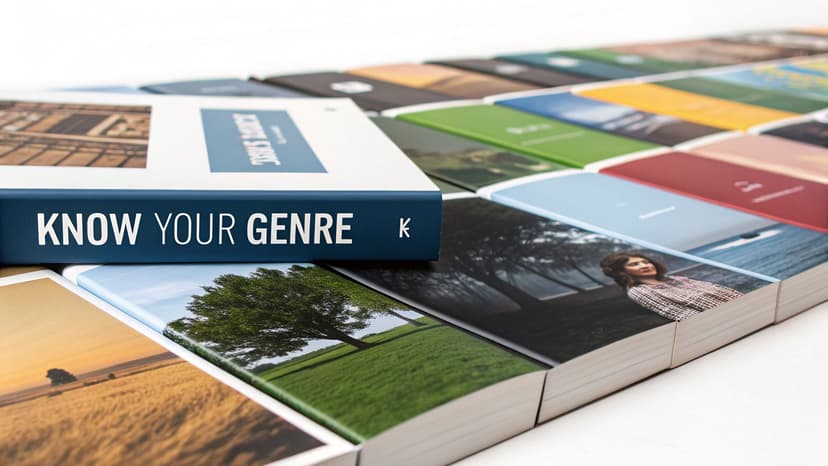
A Guide to Your Self Publishing Book Cover
Learn how to create a self publishing book cover that sells. Get KDP specs, genre insights, and tips to avoid common design mistakes for indie authors.
Posted by
Related reading
Photos for Book Covers: A Complete Guide for Authors
Learn how to choose effective photos for book covers. This guide covers composition, sourcing, licensing, and technical specs for KDP-ready designs.
Create the Perfect Book Review Form: A Guide for Authors
Learn to design a book review form that delivers actionable feedback. This guide covers question design, distribution tactics, and using reviews for marketing.
Effective Backgrounds for Covers: KDP Guide 2026
Choose effective backgrounds for covers to grab attention on Amazon KDP. Our 2026 guide covers types, genre matching, composition, & technical specs.
Ready to design your cover?
Use our AI book cover generator to create tailored book cover concepts in minutes.


In the flood of books on Amazon, yours has about two seconds to make a reader stop scrolling. That’s it. Your cover isn't just a pretty wrapper; it's a sales pitch, and it might be the most important one you’ll ever make for your self-published book.
A strategic self publishing book cover is your single most valuable marketing asset. This guide focuses on the specific requirements and conventions self-published authors need to master, particularly for platforms like Amazon KDP.
Why Your Book Cover Is Your #1 Sales Tool

Think of the last time you browsed for a book online. What made you click? It was the cover. In the digital bookstore, your cover’s job is to stop the scroll and earn that click.
Many indie authors fall into the trap of thinking a great story sells itself. But here's the hard truth: readers can't discover your brilliant plot if they never get past the thumbnail. Your cover is a silent salesperson working 24/7, and it’s the first—and often only—impression you get to make.
The Indie Author Advantage
The stigma against self-publishing is gone. In fact, recent data shows that 51% of readers now actively choose to support self-published authors, while only 17% specifically prefer traditionally published books.
This shift puts the power in your hands. You don't need a huge publishing house to succeed, but you do need a cover that looks just as professional as theirs. The expectation for quality has never been higher, and your cover is the primary signal of that quality.
Your cover doesn't need to be a fine art masterpiece. It needs to be an effective piece of commercial art. Its job is to sell the book by clearly communicating its genre and promise to the right audience.
A Learnable, Market-Driven Skill
Here’s the good news: designing an effective cover isn't a mystical talent. It's a learnable skill centered on understanding what your specific market wants to see.
Every genre has its own visual language—a set of cues that readers instantly recognize. For instance, the design conventions you’ll see on romance book covers look nothing like what you’d find on a thriller.
You can learn this language by studying the bestsellers in your niche. Pay attention to the patterns in:
- Typography: What kind of fonts are used? Are they bold and blocky, or elegant and script-like?
- Imagery: Is it a photo of a person? An abstract illustration? A symbolic object?
- Color Palette: What’s the dominant mood? Dark and gritty, or bright and hopeful?
Modern tools can help you experiment with these conventions. For example, creating concepts with an AI tool allows you to test different layouts and styles that fit market expectations, letting you focus on strategy without needing a graphic design degree.
Ultimately, creating a successful cover is an informed business decision, not just a stroke of artistic luck. It's a key part of learning how to make and sell an ebook that people are excited to buy.
Decoding the Visual Language of Your Genre
Before you fall in love with a cool font or a striking image, understand this: a successful self publishing book cover has nothing to do with your personal taste. Zero.
Its only job is to speak a visual language that your target readers instantly recognize. Think of it as a uniform. It tells a browsing reader, "Hey, you! This is the exact kind of story you love."
These genre conventions aren’t rules meant to stifle your creativity. They’re powerful, battle-tested shortcuts that help readers on a crowded digital shelf find what they’re looking for and set immediate expectations for your book’s tone.
How to Analyze Your Genre's Visual Code
Your research lab is the Amazon bestseller list. But don't just browse the top 100 in a massive category like "Fantasy." You have to get granular.
Drill down to the exact subgenre where your book will live. "Epic Fantasy" and "Urban Fantasy" are two completely different worlds with different visual codes. The same goes for "Cozy Mystery" versus "Hardboiled Detective."
Open an incognito browser window and pull up the top 20-50 bestselling books in your specific niche. Your mission is to spot the patterns. A simple spreadsheet is perfect for this.
Start tracking the common threads in these three areas:
- Imagery: Do the top sellers feature characters? Symbolic objects? Abstract textures? If there are people, are they posed or in action?
- Color Palette: Is the mood dark and gritty, or bright and upbeat? Note the dominant color schemes. A sea of moody blues and fiery oranges in paranormal romance isn't an accident.
- Typography: This is huge. Are the titles in big, bold, in-your-face fonts? Or are they elegant, flowing scripts? How big is the author's name compared to the title?
After analyzing a few dozen covers, a clear visual recipe will emerge. That’s the language your cover needs to speak.
Genre Convention Analysis Checklist
Use this checklist to analyze top-selling books in your genre and identify key design patterns.
| Design Element | Common Patterns to Note | What It Signals to Readers |
|---|---|---|
| Imagery & Subject | Characters (posed vs. action), objects (swords, roses), landscapes, abstract textures. | "This is about heroes," "This is a mystery," "This is high-stakes." |
| Color Palette | Dark & moody, bright & saturated, pastel & soft, high-contrast, monochromatic. | Thriller, romance, light-hearted comedy, epic scale. |
| Title Typography | Serif (classic, literary), Sans-serif (modern, thriller), Script (romance, historical), Decorative (fantasy, sci-fi). | The story's tone: serious, fast-paced, personal, or imaginative. |
| Text Hierarchy | Is the title or the author's name bigger? Is there a tagline? | The book's primary selling point: the concept or the author's brand. |
| Overall Mood | Mysterious, romantic, suspenseful, inspirational, quirky. | The core emotion the reader will experience. |
By breaking down top-performing covers this way, you move from guesswork to a data-informed strategy. You're not copying; you're learning the code.
Typography Is Your Loudest Signal
Of all the elements, typography is the most powerful—and most often botched—genre signal. A font choice alone can scream "Thriller" or whisper "Historical Romance." That blocky, distressed font tells readers to expect a gritty, post-apocalyptic world. A delicate, swooping script promises a Regency-era love story.
The single biggest mistake new indie authors make is choosing a font because it looks "cool." This creates a jarring disconnect that makes readers scroll right past, because the cover is sending the wrong message.
Size and placement are just as critical. In thrillers, a big-name author's name often dwarfs the title. In many fantasy novels, an intricate, stylized title is the main event. These are the unwritten rules of your genre's visual hierarchy. To master this, check out guides on the best fonts for book covers.
Turning Research into a Concept
Once you’ve done your homework, you’ll have a solid creative brief. You're not looking to make a carbon copy of another cover. The goal is to design something that looks like it belongs on the same shelf as the bestsellers but has its own unique spark.
This is the perfect time to start experimenting. Using an AI tool to generate cover concepts can be a fantastic way to quickly brainstorm based on your research. Feed it your genre, themes, and notes on imagery and typography. You can generate a dozen approaches in minutes, seeing how different combinations of these proven elements feel before committing to a final design.
Key Design Principles for a Professional Cover

You've done the market research. Now it's time to apply the design principles that separate a pro cover from an amateur one. A great self publishing book cover isn't just a pretty picture. It's a precisely engineered composition designed to grab eyeballs and convey information in a split second.
The three pillars of effective cover design are visual hierarchy, typography, and color theory. Master these, and you create a cover that’s not just eye-catching but also crystal clear, even as a tiny Amazon thumbnail.
Establish a Clear Visual Hierarchy
Think of your cover as a 3-second sales pitch. Visual hierarchy is how you control what the reader sees first, second, and third. When a potential buyer glances at your cover, their brain should process the title, author name, and imagery without any conscious effort.
You're creating a path for the eye to follow. The most important information—usually the title—needs to hit them first.
Here’s how to build a strong hierarchy using contrast:
- Size: Your title should be significantly larger than any other text.
- Color: Use bright text on a dark background (or vice versa) to make key elements pop.
- Placement: Position your most critical element in a natural focal point, like the top third or dead center of the cover.
A classic indie author mistake is making everything equally important. When every element is screaming for attention, the result is just noise. A solid hierarchy ensures your key selling points are seen and understood instantly.
Master Legible and Evocative Typography
Your font choice does more than spell out the title—it telegraphs genre and sets the mood. But the non-negotiable rule of cover typography is legibility at thumbnail size. If a reader can't make out your title on a crowded search page, you've already lost the sale.
When picking your fonts, keep these rules in mind:
- Ditch Complex Scripts: That beautiful, intricate script might look amazing up close, but it will turn into an unreadable smudge when scaled down.
- Limit Your Fonts: Stick to two fonts, three at the absolute maximum. A popular combo is a decorative font for the title and a clean, simple sans-serif for the author name.
- Create Powerful Contrast: Pair a bold serif with a light sans-serif, or an expressive script with a stark block font. This reinforces your visual hierarchy.
Your typography is a promise to the reader. A blocky, sans-serif font might promise a fast-paced thriller, while an elegant serif suggests a literary narrative. Mismatching your font to your genre is confusing and off-putting.
Use Color to Evoke Emotion
Color is your emotional shortcut. Long before a reader processes your title, the color scheme has already sent a signal. Is this story dark and suspenseful? Bright and optimistic? Passionate and romantic?
As you saw during your genre research, different niches have their own color codes. Thrillers lean into high-contrast palettes with dark blues, blacks, and pops of red or yellow. Contemporary romance often uses bright, saturated colors. For a deep dive on how this works, just look at the conventions of thriller book covers.
Beyond genre tropes, colors carry universal psychological weight:
- Red: Passion, danger, excitement, anger.
- Blue: Calm, trust, sadness, stability.
- Yellow: Happiness, optimism, warning.
- Black: Power, mystery, elegance, death.
Stick to a limited color palette that honors both your genre's expectations and your story's mood. You can use tools for Ai Image Editing to tweak the colors and tones in your imagery, ensuring everything matches your chosen palette.
Modern tools can help you rapidly test different layouts, font pairings, and color schemes based on your genre, helping you nail down a composition that feels professional and instantly connects with readers before committing to a final design.
Getting Your Files Ready for KDP and Print
A gorgeous cover design means nothing if you fumble the technical details. Getting your files right for Amazon KDP isn't just a suggestion—it's the last, crucial hurdle to making sure your book looks as professional in a reader's hands as it does on your screen.
An amateur file setup is the fastest way to get your upload rejected, trigger printing errors, and end up with a book that just looks cheap. Let's walk through the specs every self-published author needs to get right.
Resolution and Color Mode
Two of the most fundamental—and most often confused—concepts are Dots Per Inch (DPI) and color mode.
Think of DPI as image sharpness. For anything you plan to print, the non-negotiable industry standard is 300 DPI. If you use a 72 DPI image (the web standard), your print cover will be blurry and pixelated. Always start your design file in a 300 DPI canvas.
Color mode is just as critical. Your monitor uses RGB (Red, Green, Blue) light. Printers use CMYK (Cyan, Magenta, Yellow, Key/Black) ink.
- Ebook Covers: Stick with RGB. This keeps your colors looking bright on screens.
- Print Covers: You absolutely must submit your file in CMYK. If you upload an RGB file, the printer’s software will automatically convert it, and you'll likely get a dull, muddy-looking cover.
The most common rookie mistake is designing a cover in RGB and being shocked when the printed proof looks lifeless. By designing in CMYK from the start, you get a much more accurate preview of how the final colors will print on paper.
File Formats for Ebook and Print
Amazon KDP has very different needs for digital versus print.
- Ebook: All you need is a simple front cover as a JPEG file.
- Print: You must provide a print-ready PDF. This is a single, flattened file that includes your front cover, back cover, and spine as one continuous image.
This is where many DIY authors get stuck. Creating that full wraparound PDF requires absolute precision.
Calculating Your Wraparound Print Cover
Your print cover is a full wraparound that includes the back cover and a spine of a very specific width. That width is determined by your final page count and the paper type you choose.
Amazon KDP provides its own cover calculator. You plug in your trim size, page count, and paper type, and it gives you the exact dimensions for your full cover PDF, including the all-important spine width. For a detailed guide on using these measurements, check out our breakdown of the official Amazon book cover dimensions.
This brings us to a couple of other critical zones on your print layout.
Bleed and Safe Zones
When a printer trims a stack of book covers, the cuts can shift slightly. To prevent an ugly white sliver from appearing on the edge of your book, your design needs to include bleed. This is an extra 0.125-inch margin of your background that extends beyond the final trim line on all sides.
At the same time, you must keep all your important text and imagery inside the print-safe zone. This ensures nothing critical gets accidentally chopped off during trimming.
Print-on-Demand (PoD) has completely changed the game for indie authors, with the market expected to grow to almost $103 billion by 2034. But the precision PoD requires can be unforgiving. You can read more about what these self-publishing trends mean for authors here.
While these technical details are tedious, they are non-negotiable. One way to simplify this is to use tools built for authors. For instance, some AI cover generators can export files pre-formatted to KDP’s specifications, automating the resolution, color mode, and bleed requirements for a pain-free upload.
Common Cover Design Mistakes and How to Fix Them
Even the most brilliant story can be dead on arrival if the cover screams “amateur.” I’ve seen countless promising books get ignored because of a few rookie mistakes—tiny errors that sabotage all the hard work inside.
The good news? These are all completely avoidable. Once you learn to spot them, you can look at your own self-publishing book cover with a critical eye and make sure it’s ready to compete.
Mistake #1: Your Title Is a Blurry Mess on Amazon
This is the number one killer of self-published books. Your cover's most important job happens when it's just a tiny thumbnail on an Amazon search page. If a reader can't instantly read your title, you've lost the sale. This usually happens with fancy script fonts that dissolve into an illegible smudge when shrunk down.
- The Fix: Test it tiny. Open your design file and zoom out until it’s about one inch tall. Can you still clearly read the title and author name? If not, you need a bolder font, more contrast, or a simpler typeface. No exceptions.
Mistake #2: The "Too Many Fonts" Ransom Note Effect
A cover cluttered with three, four, or even five different fonts is a classic sign of a DIY job. When every bit of text is styled differently, the result is visual chaos that looks busy and cheap. A professional cover guides the reader’s eye with a clear hierarchy.
- The Fix: Stick to a maximum of two fonts. A tried-and-true strategy is pairing one stylized or decorative font for the title with a clean, simple sans-serif for the author's name and tagline. This creates instant visual clarity.
Mistake #3: You've Dressed Your Thriller for a Romance Party
If you've written a gritty spy thriller, but your cover has a soft pastel palette and a delicate script font, readers will think it’s a sweet romance. This genre mismatch is a recipe for disaster—it attracts the wrong audience and leads to bad reviews from confused readers. Your cover is a visual promise that must signal the correct genre and tone.
- The Fix: Go back to the digital bookstore. Open Amazon and study the top 20 bestsellers in your exact subgenre. What do their covers have in common? Your cover needs to speak that same visual language. The dark, gritty feel of most thriller book covers is a universe away from a light-hearted comedy for a reason.
The flowchart below shows the technical side of things, where even a genre-perfect design can fail if the file isn't built correctly for KDP.
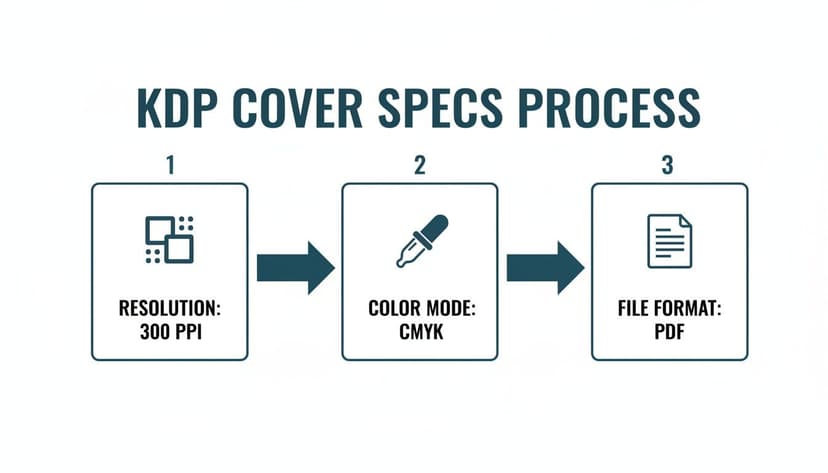
As you can see, critical specs like 300 PPI resolution and the CMYK color mode for print are non-negotiable. Get these wrong, and your design will look muddy and pixelated on paper.
Mistake #4: Your Cover Art Is Cheesy Stock Photo #34B
Stock photography can be a lifesaver, but choosing the wrong image can make your book look cheap in a heartbeat. Readers can spot a generic, overly posed stock photo—it feels fake and disconnected from the story. Your cover image needs to feel unique to your world.
The Fix: Dig deeper for your imagery. Look for photos with natural lighting and unposed subjects. Even better, use symbolic objects, atmospheric landscapes, or high-quality digital illustrations. AI tools can be fantastic here, helping you generate truly unique images that completely avoid that dreaded "stock photo" vibe.
Your Book Cover Questions, Answered
When you're wrestling with your book cover, a million questions pop up. It's one of the most critical—and often most confusing—parts of the self-publishing journey. Let's tackle some of the most common concerns.
How Much Should I Budget for a Book Cover?
There’s no single price tag. Your costs will fall into a few different buckets, depending on the path you choose.
At the top end, a fully custom design from a professional who knows your genre will run anywhere from $500 to $2,000+. You're paying for their market expertise and a unique asset.
A fantastic middle-ground option is a premade cover. These are ready-made designs from pros that you can buy exclusively, typically for $75 to $300. The pure DIY route is the cheapest but also the riskiest if you don't have a designer's eye.
A modern alternative is using an AI-powered tool. These platforms let you generate genre-savvy designs for a low one-time fee, giving you creative control without the high cost of a custom designer.
Can I Design My Own Cover with No Experience?
The short answer? You can, but you probably shouldn't. Using a tool like Canva is technically possible, but a book cover is your single most important marketing tool. An amateurish cover can absolutely kill your sales.
Readers have an almost sixth sense for spotting designs that don't meet professional standards. An awkward font or clunky layout screams "amateur," and they'll assume the writing inside is, too.
If your budget is the main roadblock, don't just jump into a generic design app. A purpose-built AI cover generator is a much safer bet. These tools are trained on genre conventions and design principles, guiding you toward a result that looks like it belongs in the marketplace.
What Is the Difference Between an Ebook and Print Cover?
Getting this wrong is a classic rookie mistake. Ebook and print covers are entirely different files built for different purposes.
-
Ebook Cover: This is just the front cover. It's a single JPEG file saved in RGB color mode. This ensures your colors look bright and vivid on screens.
-
Print Cover: This is a print-ready PDF. It’s a single flat image that includes the front cover, back cover, and the spine. The spine's width has to be calculated perfectly based on your final page count and paper choice. Critically, this file must be in CMYK color mode for printing.
If you upload an RGB file for a print book, your colors will look dull and muddy. If you get the spine width wrong, your upload will be rejected by KDP altogether.
How Do I Know if My Cover Is Effective Before Publishing?
You don't—not until you test it. Your opinion doesn't sell books. Your target reader's opinion is the only one that matters. Never launch a cover without getting feedback from the exact people you hope will buy it.
Here are a few battle-tested ways to see if your cover works:
- Run a Poll: Post your cover in author groups on Facebook or relevant subreddits. Show your cover next to two or three current bestsellers in your micro-niche and ask, "Which of these books would you click on first?"
- Use Feedback Services: A site like PickFu lets you pay a small fee to run polls with a targeted audience (e.g., "female sci-fi romance readers"). This gives you unbiased data on which design grabs the most attention.
- A/B Test with Ads: Set up two small, low-budget ad campaigns on Facebook or Amazon. Run one ad with Cover A and another with Cover B. The one with the higher click-through rate is your winner.
This is where generating multiple concepts with a tool can give you an advantage. You can create a handful of different options in minutes and test them all against each other to find the one that truly resonates with your audience before you commit.
Ready to Create Your Own Book Cover?
Turn your story into a visual masterpiece. Fill in the details below to start generating professional covers instantly.