How to Make Cover Art That Sells Books
Learn how to make cover art that grabs attention and converts readers. This guide covers genre research, typography, AI tools, and KDP-ready exporting.
Posted by
Related reading
Photos for Book Covers: A Complete Guide for Authors
Learn how to choose effective photos for book covers. This guide covers composition, sourcing, licensing, and technical specs for KDP-ready designs.
Create the Perfect Book Review Form: A Guide for Authors
Learn to design a book review form that delivers actionable feedback. This guide covers question design, distribution tactics, and using reviews for marketing.
Effective Backgrounds for Covers: KDP Guide 2026
Choose effective backgrounds for covers to grab attention on Amazon KDP. Our 2026 guide covers types, genre matching, composition, & technical specs.
Ready to design your cover?
Use our AI book cover generator to create tailored book cover concepts in minutes.


Knowing how to make cover art that actually sells books boils down to one simple idea: translate your story's feeling, not just its plot. The best covers use visual shortcuts specific to their genre—think symbols, color palettes, and fonts—to forge an instant emotional connection with the right readers. This isn't just art; it's a strategic move that turns your cover into your hardest-working marketing tool from the second it pops up in a search result.
Translating Your Story Into a Visual Concept
Before you open a design tool or browse for images, you need a plan. A strong book cover doesn’t materialize out of thin air; it’s born from a clear, focused design brief. This document is your North Star. It will guide every single decision, whether you’re hiring a designer, tackling it yourself, or using an AI tool to brainstorm concepts.
The purpose of the brief is to distill your book’s core essence into key visual ingredients. Forget summarizing every plot twist. Instead, you need to identify the primary emotion you want readers to feel. Is it dread? Wonder? Passion? Nail-biting suspense?
Define Your Core Visual Elements
Your first job is to pinpoint the central theme of your story. A common mistake among indie authors is trying to cram every character, subplot, and location onto the cover. The result is always a cluttered, confusing design that looks amateur. Your mission is to select only the most powerful visual hooks that communicate your genre and intrigue your target audience.
Zero in on these three areas:
- Central Symbolism: What single object or icon captures the story's main conflict? For a thriller, it might be a cracked pocket watch. For a high fantasy novel, it could be a glowing, intricate sigil.
- Character Archetype: What kind of hero are we dealing with? A lone detective cloaked in shadow instantly signals a crime novel. A figure in a sweeping gown against a historical backdrop hints at romance.
- Setting and Atmosphere: Where and when does the story take place? A misty, moonlit forest creates a palpable sense of foreboding, ideal for horror or dark fantasy—a hallmark of the best horror cover design ideas. A sun-drenched, bustling cityscape suggests a contemporary drama.
A strong design brief is your best defense against costly redesigns. It forces you to clarify your vision upfront, ensuring that every element on the cover serves a strategic purpose—to attract the right reader.
Aligning With Genre Expectations
Readers have been conditioned to expect certain visual cues from the covers in their favorite genre. They might not consciously recognize these patterns, but they are powerful drivers of purchasing decisions. An author who understands this has a massive advantage. Your cover must look like it belongs on the same digital shelf as the bestsellers in your category.
For instance, the visual language for romance book covers is worlds away from what you’d see in science fiction. Romance often leans into warm color palettes and focuses on the emotional connection between characters. Sci-fi, on the other hand, might use sleek, sharp typography and imagery of advanced technology or vast cosmic scenes.
This isn't about copying other covers. It's about speaking the same visual language as your audience. By building a clear brief around these conventions, you create a solid foundation for any design path you choose—especially if you plan on using an AI tool to generate and refine your ideas.
Using Color and Typography to Signal Your Genre
On a crowded digital bookshelf, you have a split second to make an impression. In that tiny thumbnail, color and typography are your most powerful allies for instantly communicating your book's genre to the right readers. These aren’t just decorative flourishes; they are calculated signals that tap directly into reader psychology and established market trends.
Color is often the first thing a potential reader’s brain registers. It sets the emotional tone before they even process the title. It’s why you see specific palettes appear consistently in certain genres. Dark blues and stark blacks signal a thriller, evoking a sense of mystery and danger. Vibrant pastels and warm tones are common in contemporary romance, promising a lighthearted, feel-good story. These aren't arbitrary rules; they're established visual shortcuts that sell books.
Market data confirms these trends. An analysis of cover trends for bestsellers shows that certain colors dominate specific categories. For example, the use of white on top covers soared from 52% in the early 2000s to 79% by 2022, signaling a major shift toward clean, modern designs, particularly in literary fiction and non-fiction.
Choosing Fonts That Speak Volumes
Just like color, typography has a distinct personality. The font you choose for your title is a critical piece of the genre-signaling puzzle. A mismatch can confuse readers and make your cover look amateurish, undermining the effort you put into the imagery.
Think of fonts as visual dialects:
- Serif Fonts: These fonts, with their small decorative strokes (like Garamond), feel traditional, classic, or literary. They’re a perfect fit for historical fiction, epic fantasy, and serious literary novels.
- Sans-Serif Fonts: Clean, modern fonts without strokes (like Helvetica or Arial) project a current, sleek, and direct vibe. You’ll find them all over science fiction, thrillers, and non-fiction.
- Script Fonts: Mimicking handwriting, these can range from elegant to playful. They’re used heavily in romance to suggest intimacy and a personal connection.
- Decorative Fonts: Use these highly stylized fonts with extreme caution. While they can work for specific fantasy or horror subgenres, they often compromise legibility, especially when shrunk down to a tiny thumbnail.
Your font choice isn’t just about style; it's about legibility. The most beautiful, genre-perfect font is useless if a reader can't decipher your title in a thumbnail. Always test for clarity at a small size.
Mastering Typographic Hierarchy
Beyond choosing the right font, you must arrange the text to create a clear visual flow. Typographic hierarchy is the practice of organizing text elements to show their order of importance. For a book cover, this is straightforward: the title should be the most prominent element, followed by the author's name.
Getting this balance right is crucial for a professional look. A title that’s too small gets lost in the art. An author's name that’s too big can overpower the design. As you experiment with different concepts, perhaps using an AI tool to test various layouts, pay close attention to this balance. The text needs to feel integrated with the art, not just placed on top as an afterthought. For a deeper dive, check out our guide on the principles of color psychology for branding.
Choosing Your Design Path: Designer, DIY, or AI?
As an indie author, one of the biggest decisions you'll face is how to get your cover art made. There are three main paths, each with a different cost, time commitment, and level of creative control. Choosing the right path is about aligning with your budget, skills, and goals.
The traditional route is hiring a professional book cover designer. This provides expert guidance and a collaborative process but is also the most expensive option. On the other end of the spectrum is the DIY approach, which offers total creative freedom for a minimal budget. The catch is the steep learning curve and the high risk of producing a cover that looks amateurish—which can kill sales before a reader even sees your blurb. If you're leaning this way, a good starting point is checking out the best book cover design software.
Weighing the Cost of Professional Design
Hiring a professional is a significant investment, but a great cover often pays for itself many times over in market appeal. An analysis of over 9,600 design projects found the average professional book cover cost hit $880 in 2024, with most projects landing between $625 and $1,250.
The cost also varies by genre. Intricate fantasy book covers with custom illustrations can run from $910–$1,760, while a cleaner non-fiction cover might be closer to $700–$800. For a self-publishing author, that single expense can consume a large part of the launch budget.
The Rise of AI as a Practical Middle Ground
A third path has emerged that strikes a balance between cost, speed, and quality: AI cover generation. Modern AI tools are more than just image makers; many are specifically trained on genre conventions, allowing you to generate multiple strong concepts based on your book's themes. This provides a professional-grade starting point that you can then refine.
It’s an affordable alternative that allows authors to avoid the high costs of a designer while also steering clear of common DIY pitfalls. If you want to explore this route, learning how to prompt AI to create an image is the key skill you'll need to get good results.
Comparing Cover Design Options
To make the decision easier, here's a breakdown of the three main paths. Consider your budget, timeline, and how much creative control you want.
| Method | Typical Cost | Time Investment | Best For |
|---|---|---|---|
| Hire a Pro | $625 - $1,250+ | Low (a few emails/calls) | Authors with a budget who want guaranteed professional quality and a collaborative process. |
| DIY | $50 - $200 (for software/assets) | Very High | Authors with a strong design sense, a tight budget, and a lot of time to learn the craft. |
| Use AI | $0 - $40 | Medium (prompting & refining) | Authors who want a professional look on a budget and enjoy having creative control. |
Ultimately, there's no single "right" answer. A bestselling author launching their tenth book has different needs than a debut author bootstrapping their first release. Use this table as a gut check to see which approach feels most aligned with your specific situation.
Choosing your path isn't just a budget decision—it's a strategic one. The right choice depends on your skills, timeline, and how much creative control you want over the final product that represents your story to the world.
A Practical Workflow for Crafting Your Cover
Great cover art comes from a repeatable process that combines a clear vision with modern tools. The goal is to move from a concept to a polished, market-ready cover without losing creative control.
This journey starts by translating your design brief into prompts that an AI can understand. This is a critical step. Don't just ask for a "fantasy novel cover." Be specific about the mood, character, and key visual elements. A better prompt would be: "Epic fantasy book cover, lone female warrior with a glowing sword, standing on a misty clifftop, dark and foreboding atmosphere, cinematic lighting."
There are three main paths you can take to bring your cover to life.
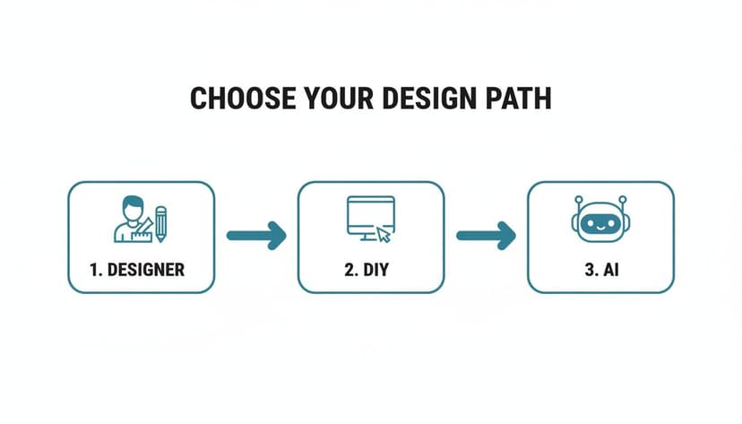
Each route—hiring a designer, doing it yourself, or using AI—is a different mix of cost, time, and creative control.
Refining Your Initial Concepts
Once you have a few visual concepts, the real work begins. Your goal isn't to get the perfect image on the first try but to guide the AI toward your vision. Generate several variations of your favorite ideas to experiment with different compositions, color schemes, and character poses.
This iterative process is where the best results emerge. Perhaps the character looks great, but the background is flat. You can swap out elements, instruct the AI to regenerate just one part of the image, or tweak the lighting to add more drama. It’s an effective way to experiment without needing advanced artistic skills.
The best cover creation process isn't a straight line. It's a cycle: generate, evaluate, and refine. Embrace creating variations and combining the best elements to build a cover that truly fits your story.
Integrating Typography That Sells
With a strong image locked in, it’s time to focus on typography. The right font and placement can make or break a cover, especially when viewed as a thumbnail.
Best-selling covers increasingly feature typography that is more structural than decorative. Some design experts like Damonza predict that text may claim 70-80% of the visual real estate on many top titles. Why? Because bold, high-contrast fonts are legible at small sizes.
As attention spans shrink, the thumbnail's impact is paramount. Large text, a clear hierarchy, and strong contrast are what earn clicks. When you place your title and author name, ensure they feel integrated with the artwork, not just placed on top. This blend of smart image generation and intentional typography is the key to a cover that not only looks professional but gets readers to stop scrolling.
Finalizing Your Cover for KDP and Beyond
You've designed a great cover, but the final step is ensuring your files meet the technical requirements of platforms like Amazon KDP. A single incorrect setting can cause file rejection, printing errors, or a blurry online appearance. This final quality check is non-negotiable. Before you upload, you must verify the resolution, color mode, and file format. These details are as important as the art itself.
Ebook vs. Paperback: Two Different Beasts
A common mistake for new authors is assuming one file works for both ebook and print. It doesn't. While they start from the same front cover design, the final files are different.
- Ebook Cover: This is straightforward. You need a single, high-quality JPEG of your front cover in RGB color mode, the standard for digital screens.
- Paperback Cover: This is more complex. You need a single, flattened PDF that includes the front cover, back cover, and the spine as one continuous image. Critically, this file must be in CMYK color mode for printing.
One of the most common printing mistakes is uploading an RGB file for a paperback cover. The colors will shift during the printing process, often leaving your vibrant design looking muddy or dull. Always convert to CMYK for your print-ready PDF.
Mastering the Print Wrap
Creating the full "print wrap" requires precision. The most important variable is the spine width, which is determined by your final page count and the paper type you select (cream or white). A miscalculation here can cause your spine text to be off-center or creep onto the front or back cover.
Amazon KDP provides a cover calculator and templates to determine the exact dimensions. You input your book's trim size, page count, and paper choice, and it generates a template with the correct measurements. This template will also include the required bleed, an extra margin of 0.125 inches (3.2 mm) around the outer edges. During production, the printer trims the cover to its final size, and this bleed ensures your background art extends to the very edge, preventing any white slivers.
For a complete walkthrough, our guide on Amazon book cover dimensions breaks down the entire process.
Here's a quick checklist summarizing the key technical specs for KDP.
KDP Cover File Specifications Checklist
| Specification | Ebook Requirement | Paperback Requirement |
|---|---|---|
| File Format | JPEG (.jpg) | PDF (.pdf) |
| Color Mode | RGB (for screens) | CMYK (for print) |
| Resolution | 300 DPI (min) | 300 DPI (min) |
| File Components | Front Cover Only | Full Wrap (Front, Spine, Back) |
| Bleed | Not Required | 0.125" on top, bottom, and outer edges |
Getting these technical specs right is the final piece of the puzzle. It ensures your cover not only looks fantastic online but also prints flawlessly, delivering a professional, high-quality book into your readers' hands.
Answering Your Top Cover Design Questions
For an indie author juggling multiple roles, cover design can feel intimidating. Let's address some of the most common questions that arise during the process.
What Are the Biggest Mistakes Indie Authors Make?
By far, the most common pitfall is ignoring genre conventions. Your epic sci-fi adventure shouldn't have the visual style of a summer romance. Sending the wrong signals attracts readers who will be disappointed and repels the audience you wrote the book for.
Other major blunders include:
- Typography that becomes unreadable at thumbnail size.
- Using generic stock photos that look unprofessional.
- Forgetting that 99% of readers first see your book as a tiny thumbnail. The design must be clear and impactful at a small scale.
How Do I Know if My Cover Is Good?
The acid test is to place it in a lineup. Take a screenshot of your cover and view it next to the top 10 bestsellers in your specific Amazon sub-category.
Ask yourself honestly: does it look like it belongs? Does it appear as professional as covers from major publishers while still having something unique that makes it stand out?
A great cover nails three things: it clearly communicates the book's genre and tone, it looks professional enough to compete with bestsellers, and it creates enough curiosity to make a potential reader click.
Beyond your own judgment, get feedback from people who read your genre—not just family and friends. Their opinion is the one that matters for sales.
Can I Use AI for My Final Book Cover?
Yes, and a growing number of authors are doing so successfully. The key is to use a tool designed for this purpose. Modern book cover generators are often trained to analyze genre trends and create high-resolution, KDP-ready concepts based on your book's details.
The best platforms also provide tools to adjust typography, refine the layout, and regenerate imagery until it's perfect. For authors who want a professional result without the high cost of a designer, AI has become a fast, powerful, and budget-friendly alternative.
Do I Need Separate Covers for My Ebook and Paperback?
You need different files derived from the same core design. The front cover art should remain consistent to maintain brand recognition. However, the technical specifications are completely different.
- For your ebook: You only need the front cover art, typically as a high-resolution JPEG file.
- For your paperback: You need a full "wrap" file. This is a single PDF that includes the front cover, back cover, and spine. The spine width is precisely calculated based on your final page count and paper choice.
Any professional designer or quality cover creation tool will provide you with both of these formats, ensuring you're ready to publish across all platforms.
Ready to Create Your Own Book Cover?
Turn your story into a visual masterpiece. Fill in the details below to start generating professional covers instantly.