Formatting for Kindle Direct Publishing: A Guide to KDP Success
Discover formatting for kindle direct publishing tips to format your eBook and print book correctly and avoid common errors.
Posted by
Related reading
Letter of Transmittal Templates: Free Downloads 2026
Find the best letter of transmittal templates for any project. Get free, downloadable Word, PDF, & Google Docs files for business & authors.
Your Guide to the Perfect Book Cover Design Format
Master the book cover design format for KDP ebooks and print. Learn file types, dimensions, and color modes to publish your book with confidence.
How to Increase Book Sales on Amazon: An Author's Practical Guide
Learn how to increase book sales on Amazon with actionable strategies for metadata, pricing, ads, and cover design to amplify your KDP success.
Ready to design your cover?
Use our AI book cover generator to create tailored book cover concepts in minutes.


Formatting your book for Kindle Direct Publishing is the process of preparing your manuscript and cover files to meet Amazon's technical requirements. This isn't just a technical hurdle; it’s a critical step that involves choosing between a reflowable eBook and a fixed-layout print book, setting correct margins, and creating a final file that gives readers a professional, seamless experience.
Proper formatting is your first—and arguably most important—marketing decision.
Why KDP Formatting Is a Critical First Step
Before you begin adjusting fonts or page breaks, understand this: formatting is the silent foundation of your book's success on Amazon. It's an invisible element that, when done right, creates a seamless reading experience that encourages positive reviews and helps your book gain visibility.
When formatting is done well, readers don't notice it. But when it's done poorly, it leads to one-star reviews complaining about "unreadable text," technical rejections from KDP, and a book that fails to find its audience. In a competitive market, you can't afford these preventable mistakes. Sloppy formatting that causes upload errors for incorrect file types or improper margins can stop your launch before it even begins.
The self-publishing landscape is more crowded than ever. With millions of books competing for attention, a professionally formatted interior and cover are non-negotiable.
The Two Critical Paths: Reflowable vs. Fixed-Layout
Your entire formatting journey begins with one fundamental decision: are you creating a reflowable eBook for Kindle devices or a fixed-layout book for print-on-demand? Understanding this distinction from the start will save you significant time and prevent rework.
-
Reflowable eBooks: Designed for Kindle e-readers and the Kindle app, the text in these books "flows" to fit any screen size. The reader controls the experience by adjusting font size, style, and spacing. Your goal is to produce a clean, flexible file (typically an EPUB) that adapts gracefully to user settings.
-
Fixed-Layout Print Books: This is for your paperback. Every element—text, images, margins, and page numbers—is locked into a specific position. You have complete control over the visual presentation, from the book's trim size to the gutter margin required for binding.
A common pitfall for new authors is attempting to use a single file for both formats. A Word document formatted for an 8.5" x 5.5" paperback will be unusable as an eBook, and vice versa. Each format has distinct technical rules that require a separate approach.
To help clarify this, here’s a breakdown of the core differences.
eBook vs. Print Formatting Key Differences at a Glance
This table outlines the essential distinctions between formatting for a Kindle eBook and a KDP paperback, helping authors understand the unique requirements for each.
| Attribute | Kindle eBook (Reflowable) | KDP Print (Paperback) |
|---|---|---|
| Primary Goal | Adaptability and readability on any screen. | A precise, fixed visual layout for every page. |
| Page Numbers | Not used. Location is dynamic based on settings. | Essential. Must be set correctly in the final PDF. |
| Margins | Controlled by the e-reader; not set by the author. | You must set specific top, bottom, inside (gutter), and outside margins. |
| Images | Embedded inline with text; resolution should be clear but file size is a concern. | Must be high-resolution (300 DPI) and placed precisely. Bleed settings are critical. |
| Fonts | Reader chooses the font. You can embed, but it's often overridden. | You choose and embed the exact fonts for headings and body text. |
| Final File Type | EPUB is the industry standard (KDP also accepts .docx or .kpf). | Print-ready PDF is the only accepted format. |
Understanding these differences is crucial for an efficient workflow. They represent two fundamentally different design philosophies.
Making the Right Choice Early
Deciding on your primary format is a strategic decision. An author planning a rapid eBook release should focus on creating a clean, simply structured manuscript that converts easily. In contrast, an author creating a photo-heavy coffee table book must consider bleed settings and high-resolution images from the project's inception.
By choosing your format first, you create a smoother workflow and avoid the common traps that hinder new authors. For more on how this fits into the broader publishing journey, see our guide to self-publishing on Amazon.
Preparing Your Manuscript for a Flawless Upload
The key to a stress-free KDP upload isn't expensive software—it's starting with a clean, well-structured manuscript. Many formatting problems can be avoided by establishing good habits in Microsoft Word or Google Docs from the outset.
This initial preparation involves creating a predictable, machine-readable file that Amazon’s conversion tools can interpret without errors. When you prioritize structure over cosmetic tweaks, your text flows correctly, your table of contents generates automatically, and your images appear where intended.
Of course, before formatting, the manuscript must be written. If you're looking to streamline your entire process, it's worth exploring strategies to write faster.
Once your manuscript is complete, you must decide whether you're formatting for an eBook or a print book, as the requirements diverge significantly.
As this illustrates, the formatting journey splits the moment you choose between digital and print.
The Power of Using Styles
If you follow only one piece of advice from this guide, let it be this: use built-in Styles for all text elements. Do not manually bold and increase the font size of your chapter titles. Instead, apply the "Heading 1" style. For your body paragraphs, consistently use the "Normal" or "Body Text" style.
This is critical because KDP's software doesn't "see" your book visually; it reads the underlying code. It uses the "Heading 1" tag to automatically build a clickable table of contents for your eBook—a non-negotiable feature for a good reader experience. Using styles ensures a professional, consistent result without the hidden formatting code that manual adjustments create.
Manuscript Preparation Checklist: Do's and Don'ts
Preparing your document means abandoning bad habits. Manual formatting is the primary cause of conversion errors. A consistent, style-based structure is the solution.
Here’s a checklist to guide you:
- DO use the "Styles" menu for all text (e.g., Heading 1, Normal). This is the foundational rule.
- DO start each new chapter with a page break (Ctrl+Enter or Insert > Page Break). This ensures chapters begin on a new page, regardless of the reader's device or font settings.
- DO set first-line indents using the paragraph settings and save this formatting within your "Normal" style.
- DON'T use the tab key or spacebar to create indents. This leads to inconsistent and unprofessional spacing on different e-readers.
- DON'T press the "Enter" key multiple times to create space between paragraphs or for scene breaks. Use a centered symbol (like an asterisk) for scene breaks or adjust the "Space After" setting in your paragraph styles for a cleaner result.
Treat your manuscript as a structured blueprint, not a visual document. The less manual formatting you apply, the cleaner the final book will be after KDP's conversion process.
Handling Special Elements Correctly
Your manuscript likely contains more than just standard text, such as images or block quotes. Each element must be handled correctly to display properly in both eBook and print formats.
For images, always use the "Insert Picture" command rather than copy-pasting. Ensure they are centered and set the text wrapping to "In Line with Text." This anchors the image to a specific point in the text, preventing it from floating unpredictably.
Block quotes require their own dedicated style. Do not indent them manually. Create a "Blockquote" style that automatically applies a left indent. This systematic approach is more efficient and eliminates the formatting errors that frustrate readers and can lead to negative reviews.
By adopting these practices, you set yourself up for a smooth and successful KDP launch.
Choosing Your eBook Conversion Tool
With your manuscript properly structured, the next step is to convert it into a KDP-ready file. The tool you choose will impact the final quality and your level of control. For most indie authors, the primary options are Amazon's free Kindle Create software and the powerful open-source tool, Calibre.
This decision has financial implications. Proper formatting is directly linked to your potential income. Amazon's KDP offers up to 70% royalties on eBooks priced between $2.99 and $9.99. This model is so effective that it paid out an estimated $272 million to authors via Kindle Unlimited in the first half of 2023 alone.
A formatting mistake can cause your book to be flagged during review or create a poor reader experience, resulting in bad reviews and lost sales. You can find more eye-opening ebook stats on whop.com.
Kindle Create: For Simplicity and a Direct Path to KDP
If you prefer a straightforward, guided process without a steep technical learning curve, Kindle Create is an excellent choice. It is Amazon’s free, purpose-built software designed to get your book onto its platform as smoothly as possible.
The main advantage of Kindle Create is its seamless integration with the KDP ecosystem. After importing your .docx file, the software automatically detects your chapter headings (if you used "Heading 1" styles) and helps you build a clickable Table of Contents with ease.
Key features include:
- Professional Themes: Apply clean, pre-designed themes for chapter headings and title pages that look professional on any Kindle device.
- Easy Drop Caps: Add an elegant drop cap to the first letter of each chapter with a single click.
- Image Handling: The tool simplifies inserting and resizing images, ensuring they display correctly without disrupting the layout.
Kindle Create offers the path of least resistance. It is engineered to produce a file that KDP will accept without issues, making it a reliable choice for authors who prioritize speed and simplicity.
The trade-off is a lack of granular control. You are limited to the themes and design options provided by Amazon. Furthermore, it exports a proprietary .kpf file that can only be uploaded to KDP, effectively locking your formatted eBook into the Amazon ecosystem.
Calibre: For Ultimate Power and Flexibility
For authors who want complete control or plan to distribute their books on multiple platforms, Calibre is the industry standard. It is a free, open-source eBook management tool that is significantly more powerful than Kindle Create, but it has a steeper learning curve.
Calibre’s key strength is its ability to convert your manuscript into a universal EPUB file. The EPUB format is accepted by all major eBook retailers, including KDP, Apple Books, and Kobo. This is essential for any author pursuing a "wide" distribution strategy.
Using Calibre provides extensive control over the final product:
- Metadata Editing: You can fine-tune all metadata, including the book's title, author, series information, and embed your cover art directly into the file.
- Look & Feel Customization: Calibre allows you to adjust paragraph spacing, remove extra line breaks, or embed specific fonts by directly editing the file's code.
- Structure Detection: You can configure powerful rules to ensure Calibre correctly identifies chapters and builds a flawless Table of Contents.
While a well-formatted interior is crucial, remember that the cover is what compels a reader to open the book. A compelling thriller book cover, for example, signals suspense that the interior formatting must uphold. It can be helpful to use an AI tool to brainstorm cover concepts and test which visuals resonate with your target audience.
The right tool depends on your goals. If you want to publish on Amazon quickly and without technical challenges, Kindle Create is a solid choice. However, if you are building a long-term author career and value professional customization and the freedom to publish anywhere, mastering Calibre is a worthwhile investment.
Formatting Your Paperback for KDP Print
Transitioning from a reflowable eBook to a fixed-layout paperback requires a different mindset. With a physical book, every element is locked in place, including page size, margins, and bleed. This guide will help you create an interior file that looks professional in a reader's hands.
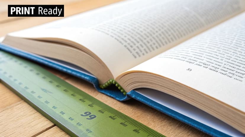
Unlike an eBook where the reader controls the display, you are directing the entire visual experience. This means paying close attention to detail to avoid common mistakes, such as text being obscured by the binding or images being cut off.
Choosing the Right Trim Size
Your first decision is the book's physical dimensions, known as trim size. This choice is often influenced by genre conventions and reader expectations. While KDP offers many options, adhering to standard sizes makes your book feel familiar and professional.
Common trim sizes by genre include:
- Mass-Market Fiction (Thrillers, Romance, Sci-Fi): 5" x 8" or 5.25" x 8" are standard compact sizes.
- Literary Fiction & Memoirs: 5.5" x 8.5" is a popular and versatile size that offers a comfortable reading experience.
- Non-Fiction & How-To Guides: 6" x 9" is the standard, providing ample space for instructional content.
- Children's Books: Often use unique sizes like 8.5" x 8.5" (square) to accommodate large illustrations.
Choosing a standard size also impacts your printing cost and spine width calculation. A larger trim size results in fewer pages, which affects the production cost per unit.
Setting Up Correct Margins and Gutters
Once you have chosen a trim size, setting the margins correctly is the most critical step for your print edition. Incorrect margins can lead to file rejection by KDP or a printed book with text that is difficult to read.
A common pitfall is using identical margins on all sides. For a bound book, the inside margin—the gutter—must be larger to prevent text from disappearing into the book's spine.
KDP has minimum margin requirements that vary based on your book's page count. Thicker books require a larger gutter to ensure readability.
| Page Count | Inside (Gutter) Margin | Outside (Top, Bottom) Margin |
|---|---|---|
| 24 - 150 pages | 0.375" (9.5 mm) | At least 0.25" (6.4 mm) |
| 151 - 300 pages | 0.5" (12.7 mm) | At least 0.25" (6.4 mm) |
| 301 - 500 pages | 0.625" (15.9 mm) | At least 0.25" (6.4 mm) |
| 501 - 700 pages | 0.75" (19.1 mm) | At least 0.25" (6.4 mm) |
It is best practice to set up your document with these margins from the start. KDP offers downloadable Word templates pre-configured with the correct mirrored margins and gutter settings for your chosen trim size.
Understanding Bleed for Full-Page Images
If your book contains images or design elements intended to extend to the edge of the page, you must account for bleed. Bleed is a safety margin—an extra 0.125 inches (3.2 mm) on the top, bottom, and outer edges—that your image must extend into.
This extra area is trimmed off during the printing process. It acts as a failsafe, ensuring that minor variations in cutting do not result in an unprofessional white sliver along the edge of a full-page image.
- No Bleed: If all content is contained within the margins, select "No Bleed" during the KDP setup process. Your PDF's page size should match your exact trim size (e.g., 5.5" x 8.5").
- With Bleed: If you have any edge-to-edge elements, select "Bleed." Your PDF's page size must be slightly larger than your trim size to include this extra area (e.g., 5.75" x 8.75" for a 5.5" x 8.5" book).
Mastering this detail is what separates an amateurish project from a professional-quality book. If you're writing in a visually driven genre, studying professional romance book cover examples can provide inspiration for how full-bleed interior graphics can complement a cover's design.
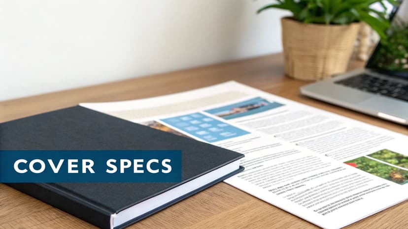
Getting Your KDP Cover Specs Just Right
Your book cover is your single most important marketing asset. It is the first thing a potential reader sees, and Amazon’s Kindle Direct Publishing has specific, non-negotiable rules for how the cover file must be prepared.
Failing to meet these specifications can result in your file being rejected during upload, halting your launch. This is not just about aesthetics; it's about meeting the technical requirements of a global printing and distribution system.
eBook Cover Essentials
The eBook cover is the simpler of the two formats. You only need to provide the front cover, but it must be high-resolution to look sharp on devices ranging from small phone screens to large tablets.
- File Format: KDP accepts JPEG or TIFF. Most designers provide a high-quality JPEG, which is sufficient and keeps the file size manageable.
- Dimensions: The ideal aspect ratio is 1.6:1. For best results, your cover should be 2,560 pixels tall by 1,600 pixels wide.
- Resolution: While 72 DPI (dots per inch) is the standard for screens, saving your file at 300 DPI is a best practice that ensures maximum sharpness.
A blurry, pixelated cover signals an amateur production. For more guidance, see our article on creating a book cover for an eBook that captures reader attention.
The complexities of a Paperback Cover
A paperback cover is more complex. It is a single, continuous file that includes the front cover, back cover, and the spine.
The exact dimensions of this file depend on three factors: your trim size, final page count, and paper choice (cream or white). These variables determine the precise width of your book’s spine.
Crucial Advice: Never guess your paperback cover dimensions. Always use KDP’s official cover calculator or template generator. A miscalculation of even a single millimeter can cause misalignment, resulting in text being cut off or the spine wrapping onto the front cover.
Understanding Bleed and the Safe Zone
When working with print files, two terms are critical: bleed and safe zone.
- Bleed: This is a safety margin. Your cover's background image must extend an extra 0.125 inches (3.2 mm) beyond the final trim lines on the top, bottom, and outside edges. When the book is trimmed, this prevents unprinted white edges from appearing if the cut is slightly off.
- Safe Zone: This is the inner area where all vital information must be placed. Your title, author name, back cover blurb, and other important design elements must be kept within this zone to avoid being trimmed off during production.
Modern design tools often include guides for bleed and safe zones in their templates, which removes the guesswork and helps you produce a compliant file.
For quick reference, here’s a breakdown of the key specs for both formats.
KDP Cover Specification Checklist
| Specification | eBook Cover | Paperback Cover (Full Wrap) |
|---|---|---|
| File Format | JPEG or TIFF | Print-Ready PDF |
| Color Profile | RGB (for screens) | CMYK (for printing) |
| Ideal Dimensions | 1,600 x 2,560 pixels | Varies by trim size & page count |
| Resolution | 300 DPI recommended | 300 DPI (required) |
| Bleed | Not applicable | 0.125 inches on 3 sides |
| Safe Zone | Keep text from edges | Critical for all text & logos |
Keep this table handy when finalizing your files. Meeting these specifications is the first step toward a professional-looking book.
The Final Review: Using KDP's Previewer
You’re almost done. The files are uploaded, and you're ready to publish. However, this final quality check is what distinguishes professional authors from amateurs.
Once your files are in the KDP dashboard, use the Kindle Previewer before publishing. KDP provides both an online version and a downloadable desktop application. I recommend using both, as the desktop tool is more robust.
What to Look for in the KDP Previewer
Be meticulous during this review. Open the previewer and navigate through your book, switching between different device emulators (Kindle Paperwhite, tablet, phone) to check the display on each.
Here is a checklist for your final review:
- Click Every Single Link: Test every link, including each entry in your Table of Contents and any links in your author bio or back matter. A broken link undermines your credibility.
- Scrutinize Your Images: Check how images render on different screen sizes. Ensure they are crisp, centered, and that text wraps correctly without looking distorted.
- Check Your Paperback Margins: For the print version, pay close attention to the inside gutter. Ensure no text is too close to the binding where it might be obscured. Review every page.
- Hunt for Formatting Gremlins: The conversion process can sometimes introduce minor errors, such as odd line breaks, inconsistent spacing, or font glitches that were not in your original file. This is your last chance to catch them.
A thorough final review is non-negotiable. A reader who encounters broken links or text disappearing into the spine is likely to leave a one-star review, which can damage your launch momentum.
Content Originality and Financial Readiness
As part of your final checks, consider two other items. With the increasing use of AI tools, it is wise to be aware of how platforms can effectively detect AI-generated text to ensure your work maintains its originality.
Finally, review the financial details. Double-check that your bank information is entered correctly in your KDP account. It's also a good time to review your total costs of self-publishing so you can accurately track your profits from launch day.
After completing this checklist, you can hit "Publish" with confidence.
Common KDP Formatting Questions, Answered
Even with a detailed guide, specific questions often arise. Here are answers to some of the most common queries from authors.
Do I Really Need an ISBN for My KDP Book?
The answer depends on the format.
For your Kindle eBook, you do not need to purchase your own ISBN. When you upload your manuscript, Amazon assigns it a unique ASIN (Amazon Standard Identification Number), which serves as its identifier in their store.
For print books, the situation is different. KDP offers a free ISBN for your paperback, but using it ties your print edition exclusively to Amazon. If you plan to sell your paperback on other platforms (a "wide" distribution strategy), you must purchase your own ISBN from an official agency like Bowker. Owning your ISBN makes you the official publisher of record, giving you complete control and distribution flexibility.
Can I Update My Book After It's Published?
Yes, this is one of the major advantages of self-publishing on KDP. You can upload a revised manuscript or a new cover file at any time to correct typos or update back matter.
KDP will review the changes, which typically takes up to 72 hours. Once approved, the new version will replace the old one in the Kindle Store.
It is important to note that readers who have already purchased your eBook will not automatically receive the updated version. Amazon only pushes updates to existing libraries if a critical error is identified. New buyers will always receive the most recent version.
What's the Best Font to Use?
For reflowable eBooks, the font choice is straightforward. Since readers can select their own font style and size on their device, your main goal is to ensure a clean conversion. Stick with a classic, universally supported font like Times New Roman or Garamond in your source document.
For print books, your font choice is permanent and directly affects readability. Standard serif fonts are the best choice for body text, as they are easy on the eyes during long reading sessions. Timeless options like Garamond, Caslon, or Baskerville are excellent choices.
For your cover, typography is a key design element that signals genre. The fonts used on fantasy book covers, for instance, often use distinct styles to convey a magical or epic tone. Creative font choices on your cover can help it connect instantly with the right audience.
Ready to Create Your Own Book Cover?
Turn your story into a visual masterpiece. Fill in the details below to start generating professional covers instantly.