A Guide to Designing a Book Cover in Illustrator for KDP
Learn how to design a professional book cover in Illustrator. This guide covers KDP setup, typography, and exporting for print to help you succeed.
Posted by
Related reading
Photos for Book Covers: A Complete Guide for Authors
Learn how to choose effective photos for book covers. This guide covers composition, sourcing, licensing, and technical specs for KDP-ready designs.
Create the Perfect Book Review Form: A Guide for Authors
Learn to design a book review form that delivers actionable feedback. This guide covers question design, distribution tactics, and using reviews for marketing.
Effective Backgrounds for Covers: KDP Guide 2026
Choose effective backgrounds for covers to grab attention on Amazon KDP. Our 2026 guide covers types, genre matching, composition, & technical specs.
Ready to design your cover?
Use our AI book cover generator to create tailored book cover concepts in minutes.


Before you even think about fonts or imagery, getting your document set up correctly in Adobe Illustrator is the most critical step. Mess this up, and you're looking at KDP rejections, printing errors, and a cover that just looks off.
The goal here isn't just to make one file; it's to build a master template that works for both your full-wrap paperback and a separate, screen-optimized ebook. Getting this foundation right from the start ensures your title doesn't get chopped off and your colors look just as good in hand as they do online.
Setting Up a Flawless KDP Cover Document
A tiny mistake in your initial file setup can have a ripple effect, causing frustrating delays and a final product that falls short of professional quality. Let's walk through how to build a rock-solid template that covers all the bases for an indie author using services like Amazon KDP.
Calculating Your Paperback Dimensions
First things first, we need the exact dimensions for your print cover. This isn't a guess—it's a precise calculation based on three things: your book's trim size (e.g., 6" x 9"), your final page count, and the paper type you choose on KDP (cream or white). These numbers determine your spine width, which is the lynchpin of the whole layout.
KDP provides official calculators, but the formula is straightforward:
- White paper: Page count x 0.002252" (or 0.0572 mm)
- Cream paper: Page count x 0.0025" (or 0.0635 mm)
Let's run through a practical example. For a 6" x 9" book with 300 pages on cream paper, your total artboard width would be:
(6" Front Cover + 0.125" Bleed) + (300 pages x 0.0025" Spine) + (6" Back Cover + 0.125" Bleed)
The process always follows the same logical path: get your spine width, build the full artboard, and then set your margins and bleed.
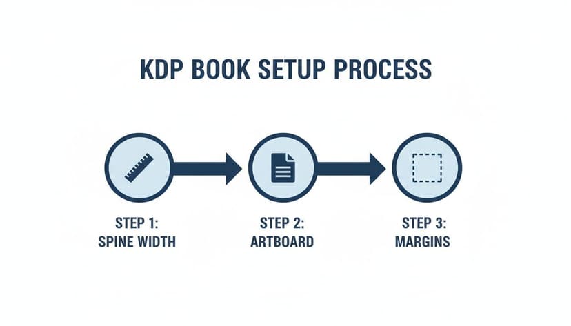
Think of it this way: each step physically builds on the last, creating a structurally sound file that KDP's printers can work with perfectly.
Essential Document Settings
With your math done, it’s time to jump into Illustrator. A practical workflow is to create two artboards in a single file—one for the paperback and another for the ebook. This keeps all your assets organized. If you need a deeper look at different trim sizes, we break them all down in our guide to Amazon book cover dimensions.
Here are the non-negotiable settings for your paperback artboard:
- Color Mode: Set this to CMYK. This is the standard for print, and it prevents unexpected color shifts when your book comes off the press.
- Raster Effects: Use High (300 ppi). This ensures any photographic elements or textures look crisp, not pixelated.
- Bleed: Add 0.125" (or 3mm) to all four sides. This is the safety margin that gets trimmed off, preventing ugly white slivers at the edge of your cover.
Pro Tip: Don't design in RGB and convert to CMYK at the end. You'll watch your vibrant blues and greens turn dull. Always start your print file in CMYK to see an accurate representation of the final printed colors.
KDP Cover Setup Checklist Paperback vs Ebook
Here’s a quick-glance table comparing the essential Illustrator settings for both formats. Use this as a checklist before starting any new project to avoid common pitfalls.
| Setting | Paperback (Print) | Ebook (Digital) |
|---|---|---|
| Color Mode | CMYK (Critical for print accuracy) | RGB (Standard for all screens) |
| Units | Inches or Millimeters | Pixels |
| Resolution (PPI) | 300 PPI (For sharp, high-res printing) | 72 PPI (Sufficient for screens) |
| Bleed | 0.125 inches (Mandatory for printing) | 0 inches (Not required for digital) |
| Artboard Layout | Full Wrap (Back + Spine + Front) | Front Cover Only |
This table highlights the fundamental differences. Forgetting to switch from RGB to CMYK for your print file is one of the most common—and avoidable—mistakes indie authors make.
Applying Layout Principles for Maximum Impact
Your book cover has one job: to stop a reader mid-scroll. It's a split-second sales pitch. A strong layout is what makes that pitch work, guiding a potential reader's eye exactly where you want it to go and making a promise about the story inside. The goal is a design that’s just as clear and compelling as a tiny Amazon thumbnail as it is in someone's hands.

It all starts with a solid visual hierarchy. This principle is about deciding what's most important and making it look that way. When you understand the core principles of visual hierarchy in graphic design, you can control how a reader processes your cover's information.
For most books, the title is the star of the show. It needs to be the most dominant, eye-catching element. The author's name and any key imagery should follow in a clear, logical order of importance.
Using Grids for Stronger Compositions
One of the oldest techniques for achieving a professional layout is the rule of thirds. Imagine your cover divided by a 3x3 grid. By placing your most critical elements—the title, a character’s eyes, a key object—along these lines or where they intersect, you create a far more dynamic and engaging composition than simply centering everything.
Illustrator’s guides are perfect for this. Create a simple grid on a separate layer that you can toggle on and off. This forces you to be intentional with your placement.
Another powerful tool is negative space—the "empty" area around your text and images. Don't be afraid to let your design breathe. A cluttered cover appears amateurish and confuses the reader. Good use of negative space pulls the eye toward what matters and gives the design a clean, confident feel. This is essential for genres like literary fiction or minimalist non-fiction, such as you might find on our literary-fiction-book-covers page.
Designing for the Thumbnail Test
Most readers will first see your book as a tiny digital postage stamp. This is the ultimate test of your layout. If it fails here, you've lost the sale.
Actionable Tip: Before finalizing a design, shrink it down. In Illustrator, zoom out until your artboard is roughly thumbnail size (around 160 x 250 pixels). Can you still read the title? Does the main image still have impact? If not, it's time to simplify.
This test is brutal but effective. It instantly reveals which intricate details get lost and which subtle colors blur together. To pass the thumbnail test, you need:
- High-Contrast Typography: Your title must pop, even when tiny. Bold, clean fonts are your best friend here.
- A Clear Focal Point: There should be one dominant image or graphic element that grabs the eye immediately.
- A Simplified Color Palette: A limited, high-impact color scheme will always stand out more than a busy one.
This is a great stage for rapid iteration. Playing around with different compositions and running them through the thumbnail test will help you find a powerful, effective layout much faster.
Choosing Typography That Speaks to Your Readers
Typography is the voice of your book cover. The right font choice makes a promise to the reader, setting the mood before they even read the blurb. It's the visual shorthand that separates a sweeping historical romance from a high-tech modern thriller.
Your first decision should always be grounded in your genre. An elegant serif font feels right at home on a literary fiction novel, while a clean, bold sans-serif is a perfect fit for a business book. For a deep dive, our complete guide on the best fonts for book covers breaks down top picks by genre to get you started. The goal is to find a font that not only looks good but feels true to your story.
The Art of Font Pairing
Most professional covers use at least two fonts: a primary one for the title and a secondary, more subdued one for the author's name and any subtitles. The secret is to create contrast without creating a visual clash.
A tried-and-true strategy is pairing a decorative or stylistic title font with a simple, clean sans-serif for everything else. This immediately establishes a visual hierarchy, making sure the title grabs the reader's eye first. When you're building a book cover in illustrator, this is incredibly easy to test. Just put your different font options on separate layers so you can toggle them on and off to see what works.
Technical Typography in Illustrator
Once you've picked your fonts, it's time to refine the details. Illustrator gives you granular control over how your text behaves.
- Kerning: This is the space between individual letters. Open the Character panel (Ctrl+T or Cmd+T) to manually nudge letters closer or further apart. This is a must for titles to fix awkward gaps, especially with letter pairs like 'A' and 'V'.
- Leading: This controls the vertical space between lines of text. For a stacked title, adding more leading can give it room to breathe and feel less cramped.
- Tracking: This adjusts the spacing across an entire word or sentence. It's useful for making a subtitle fit perfectly into a specific spot.
Critical Final Step: For any print cover, you must convert your text to outlines. Select your text box, right-click, and hit 'Create Outlines'. This turns your font into a vector shape, completely eliminating any risk of font-related errors at the printer.
Don’t forget that your typography has to work everywhere, from a tiny online thumbnail to the physical book. Legibility at a small size is a non-negotiable sales driver. You can see more on this trend in this breakdown of 2026 book cover design trends on damonza.com.
If you’re having trouble visualizing how your fonts will look, using an AI tool to generate cover mockups can be an effective way to quickly test pairings and see how they hold up at scale.
Integrating Images and Graphics Like a Pro
The right image makes a book cover jump off the digital shelf. It could be a dramatic stock photo, a piece of custom digital art, or even clean vector shapes. The real magic happens in Illustrator when you blend those visuals seamlessly with your typography, creating a unified design that doesn't just look pasted together.

Before you even think about placing an image, take a moment to check image copyright. This small step can save you from major legal headaches and ensures your hard work is built on a solid foundation.
Mastering Essential Illustrator Techniques
Once you have your licensed images, it’s time to pull them into your Illustrator file. First, create a dedicated "Images" layer. This keeps them separated from your text and background, making it easy to lock other layers and avoid accidentally moving something.
One of the most powerful tools in your arsenal is the clipping mask. This is how you place a photo or a texture inside another shape—like fitting a galaxy scene into your title text or confining a portrait to a circular frame. It’s a game-changer for creating unique compositions that feel intentional and professional.
A classic rookie mistake is using low-resolution images for a print cover. Always check your linked files in the Links Panel. Illustrator shows you the "effective PPI" (pixels per inch) for every image. For print, that number must be 300 PPI or higher. Anything less will look blurry.
Understanding Vector vs Raster
Illustrator works with two kinds of graphics, and knowing the difference is non-negotiable for producing a high-quality cover.
-
Raster Graphics (Photos, Textures): These are pixel-based images like photographs. They're fantastic for complex visuals but lose quality when you scale them up. Always start with the largest, highest-resolution file available.
-
Vector Graphics (Logos, Icons, Text): These are built from mathematical points, lines, and curves. Their advantage is that they can be scaled to any size with absolutely zero loss in quality. Your title, author name, and any graphic symbols should always be vector.
A great sci-fi cover might use a high-resolution raster image of a nebula for the background but combine it with razor-sharp vector graphics for the spaceship and title.
To make your design cohesive, play around with the Transparency Panel. By adjusting the opacity and blend modes of your images, you can make them interact with the background. Setting an image layer to "Multiply" or "Overlay," for instance, can help it blend into a textured background instead of just sitting on top. This is the kind of fine-tuning that separates a decent cover from a professional one.
Finalizing and Exporting Your Cover for KDP
You've nailed the design. Now for the final, technical hurdle: getting your cover out of Illustrator and into Amazon KDP's system without a hitch.
This last part isn't about creativity—it's all about precision. One wrong setting can trigger an upload error or a printed proof with muddy colors and fuzzy text. Let's walk through the exact export settings you need.
You’ll be creating two separate files: a print-ready PDF for the paperback and a high-quality JPEG for the ebook. Each one has strict technical specs you must meet perfectly.
Exporting the Print-Ready Paperback PDF
For the full-wrap paperback cover, Amazon KDP requires a PDF/X-1a:2001 file. This standard is non-negotiable because it locks in your CMYK colors and embeds all your fonts, which prevents errors during printing.
To export, go to File > Save As and select Adobe PDF. In the dialog box, focus on a few key areas:
- Adobe PDF Preset: At the top, select [PDF/X-1a:2001]. This handles most of the heavy lifting.
- Marks and Bleeds: Go to this tab and check the box for Use Document Bleed Settings. This is critical. It tells Illustrator to include that extra 0.125-inch bleed you set up earlier. Do not add any other printer marks.
- Output: The PDF/X-1a preset should have already handled the color profile. Just glance here to confirm it's converting colors to the destination CMYK profile you chose.
Final Check: Always open your final PDF and review it before uploading. Zoom in to check for any pixelation in your images and make sure your text looks sharp. This five-minute check can save you hours of frustration.
Creating the Ebook Cover JPEG
Compared to the print version, exporting the ebook cover is simple. This file is for digital screens, so it needs to be in the RGB color space.
The best way to do this is with Illustrator's Export for Screens feature (File > Export > Export for Screens).
Select the artboard with your front cover design. In the settings panel, make sure the format is JPEG and set the Quality to 100. The color space will default to RGB, which is exactly what you need for a vibrant digital file.
This final export step is where many indie authors get stuck. It’s the kind of technical prep that's baked into professional design fees. You can see more on these design cost trends on spinemagazine.co. When you're creating a book cover in Illustrator yourself, mastering these settings gives you control over the final product.
Common Illustrator Pitfalls (And How to Fix Them)
If you're new to Adobe Illustrator, you've probably run into a few confusing moments. Most indie authors hit the same walls when they first start designing their own covers.
Let's walk through the most common tripwires and how to avoid them.
"Why Is My Illustrator File So Large?"
It's a common shock: you've placed a few images and added some text, and suddenly your .ai file is over 500 MB. This is usually a sign you're doing things right.
Here’s why it happens:
- Embedded High-Res Images: When you embed a photo at 300 PPI (which you should for print!), you are saving every single one of those pixels inside your Illustrator file.
- Complex Vector Work: Every intricate swirl, gradient mesh, or detailed vector pattern adds to the data load.
- Multiple Artboards: An all-in-one file with your print wrap and ebook cover is convenient, but it also contains more assets.
Don't worry about the working file size. The final PDF you export for KDP will be highly compressed and much smaller. The goal during design is to preserve maximum quality.
"Why Do My Printed Colors Look Dull?"
This is the most frequent and frustrating problem authors face. On your screen, the cover is electric, but the printed proof from KDP arrives looking flat and dark.
The culprit is almost always your color mode.
Your monitor uses RGB (Red, Green, Blue) light to create brilliant, luminous tones. Commercial printers use CMYK (Cyan, Magenta, Yellow, Black) ink on paper. The world of ink is smaller and less vibrant than the world of light. The CMYK color gamut simply cannot reproduce the most intense on-screen colors. To avoid this disappointment, you must set up your print document in CMYK color mode from the start. This provides a more realistic preview of how your colors will actually look on paper.
"Do I Really Need a Commercial License for My Fonts?"
Yes, absolutely. This isn't a small detail; it's a critical legal requirement.
When you download a font, it comes with a license agreement. Most "free" fonts are for personal use only, which does not include putting it on a product you intend to sell, like your book.
To use a font on your book cover, you need a commercial license (sometimes called a desktop license). Always read the EULA (End-User License Agreement) before using a font. Stick to reputable sources like Google Fonts, Adobe Fonts (which comes with a Creative Cloud subscription), or paid font foundries. They make their licensing terms clear. This is a necessary business expense for any self-publishing author.
Ready to Create Your Own Book Cover?
Turn your story into a visual masterpiece. Fill in the details below to start generating professional covers instantly.