How to Create a Book Cover Online: A Guide for Indie Authors
Learn how to create a book cover online that drives sales on Amazon KDP. Our guide covers design principles, typography, and export settings for indie authors.
Posted by
Related reading
How to Get Book Reviews: A Practical Guide for Indie Authors
Struggling with how to get book reviews? Learn proven strategies for finding reviewers, crafting effective outreach, and leveraging reviews for more sales.
How to Find the Best Book Designers for Your Novel
Discover how to hire the best book designers with expert tips on portfolios, pricing, and when AI tools fit your book project.
The Cobalt Blue Color Code: A Guide for Book Cover Design
Discover the exact cobalt blue color code (Hex, RGB, CMYK) and learn how to use it for book covers that stand out on Amazon KDP and beyond.
Ready to design your cover?
Use our AI book cover generator to create tailored book cover concepts in minutes.


When you set out to create a book cover online, you're not just making a pretty decoration; you're building your most important sales tool. For an indie author publishing on Amazon KDP, a professional cover is the single biggest factor that convinces a reader to click. It’s an investment you must get right before hitting "publish."
Why a Professional Cover Is Your #1 Sales Tool on KDP
On the infinite digital shelves of Amazon, your cover has less than two seconds to grab a potential reader's attention. It's not just art; it's commercial advertising. Before a reader sees your compelling blurb, your five-star reviews, or even your author name, they see the cover. That single image must instantly communicate your book's genre, quality, and tone.
That split-second decision is where most sales are won or lost. In the Kindle Direct Publishing (KDP) marketplace, your cover is reduced to a tiny thumbnail fighting for every click.

Designs that are clear, bold, and adhere to genre conventions pop off the screen. Anything cluttered, confusing, or hard to read simply fades into the background noise, taking your sales potential with it.
The Business Case for a Great Cover
A well-designed cover isn’t an expense; it’s a direct investment in your book's sales performance. Think of it as your silent salesperson, working 24/7 to attract the right readers.
Here's how it directly impacts your success on KDP:
- Boosts Visibility: Amazon's algorithm rewards books with high click-through rates. An effective cover gets more clicks, signaling to Amazon that your book is relevant and should be shown to more shoppers.
- Builds Reader Trust: A high-quality cover signals a high-quality book. It tells readers you are a professional author who has invested in their craft, making them more willing to take a chance on a new name.
- Sets Clear Genre Expectations: Your cover is the fastest way to communicate genre. A dark, moody design with sharp text promises a thriller. A vibrant, illustrated scene sets the stage for a fantasy epic. To learn more about these visual cues, see our guide on what makes a good book cover.
Your primary objective is to stop the scroll. A great cover does exactly that, turning a casual browser into a potential buyer.
Step 1: Create a Pre-Design Blueprint
Before you open any design tool, you need a plan. An effective cover isn't the result of random inspiration; it’s the product of a clear strategy that connects your book to its target audience. This "blueprint" phase is about defining your goals so that every design choice is deliberate and serves a purpose.
Your journey starts with a simple design brief. This is a set of notes for yourself that clarifies three core elements: your target reader, the visual conventions of your genre, and the specific mood of your story. Getting this right is the foundation for a cover that sells.
Modern tools have changed the game for indie authors. It is now possible to create or test genre-specific covers using an AI tool without the high cost of a professional designer. With over a million books published each year through KDP, strategic thinking is what separates bestsellers from books that never find their audience. You can learn more about what's working now by reviewing these book cover trends on spines.com.

Analyze the Bestsellers in Your Genre
The most effective way to understand the "rules" of your genre is to study the top-performing books. Go to Amazon and analyze the top 20 bestsellers in your specific subcategory. Don't just glance at them—break down their common design elements.
Pro Tip: Focus on what the covers communicate. Your goal is to understand how typography, color, and imagery work together to make a specific promise to the reader.
Use this checklist during your research:
- Typography: What types of fonts are used? Are the titles serif or sans-serif? Are they large and bold, or more subtle and elegant?
- Color Palette: Is there a dominant color scheme? Do they use bright, saturated colors, or are they dark and moody?
- Imagery: What is the subject of the cover? Do they feature characters, objects, or abstract concepts? If people are shown, are they facing the viewer or turned away?
- Overall Mood: How does the cover feel? Does it create tension, romance, mystery, or inspiration?
This isn't about copying other authors. It's about understanding the visual language your target readers already recognize and respond to. For a practical look at this, browse our collection of fantasy book cover examples and you'll immediately see how these conventions are applied.
This knowledge is your most valuable asset. It will guide you in creating a marketable, professional cover, whether you're using an AI tool or briefing a human designer.
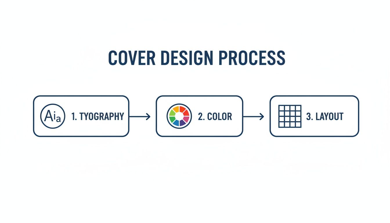
Step 2: Understand the Elements of Effective Cover Design
To create a book cover online that sells, you must understand the fundamentals of good design. You don't need a formal art education, but knowing why certain fonts, colors, and layouts work will give you a significant advantage. These three elements are your tools for sending an instant, powerful message to your ideal reader.
A professional cover is a piece of marketing real estate. Every choice, from signaling your genre to making your title legible on a crowded search page, has a purpose. Nailing these details is what separates a cover that gets scrolled past from one that earns the click.
Think of it as learning the grammar of visual storytelling. Once you understand the rules, you can apply them to any design tool and produce a cover that is not just beautiful, but effective.
Key Design Elements for Online Book Covers
This table outlines the three pillars of cover design, their main function on a platform like Amazon, and a crucial best practice for KDP authors.
| Design Element | Primary Goal on Amazon | KDP Best Practice |
|---|---|---|
| Typography | Instantly signal genre and ensure title legibility at thumbnail size. | Use a clean, bold font for the title that remains readable even when shrunk to 100 pixels wide. |
| Color | Evoke the core emotion of the story and create standout contrast. | Employ a high-contrast palette so the cover doesn't fade into the white/gray background of the search page. |
| Layout | Guide the reader's eye to the most important info (title, then author). | Create a single, clear focal point to avoid visual clutter that makes a thumbnail look messy and confusing. |
Understanding these fundamentals helps you make intentional choices, ensuring every part of your cover is working hard to attract readers.
Typography: The Voice of Your Book
Your font choice is the voice of your story. The right typography instantly tells a reader what to expect. A delicate script whispers romance, while a gritty, sans-serif font screams thriller. It’s your fastest way to communicate genre and tone.
Beyond style, legibility is crucial, especially for the KDP thumbnail. Your title must be crystal clear when it’s the size of a postage stamp. This means choosing fonts with clean lines and ensuring high contrast between the text and the background.
Finally, establish a clear visual hierarchy. Your title should be the largest, boldest text element. Your author name comes next, followed by any tagline or series information. This structure guides the eye naturally and makes the cover easy to process in a split second. For more detail, this guide to the best fonts for book covers shows how specific typefaces align with popular genres.
Color: The Emotion of Your Story
Color provides a direct path to a reader's emotions. Your chosen palette can create an atmosphere of dread, warmth, or wonder before they’ve even read the title. Cool blues and grays are perfect for a thriller, while vibrant yellows and pinks can signal a lighthearted romance.
On a digital storefront, strong contrast is essential. A cover with bold, contrasting elements will always stand out more than one with a muted, washed-out palette. This is critical for capturing a browser's attention as they scroll.
Remember, color psychology is tied to genre expectations. A dark, gritty color scheme on a cozy mystery cover will only confuse readers and hurt sales. Your job is to meet their expectations, not subvert them.
Layout: The Structure of Your Design
Layout is the arrangement of all elements—image, title, author name—into a balanced composition. A well-designed layout draws the reader’s eye to the most important information first, creating a visual flow that feels professional.
One of the most powerful principles is establishing a single focal point. This is the dominant element that grabs attention first, whether it's a character’s gaze, a symbolic object, or a striking title. A cover with too many competing elements creates visual noise and dilutes its impact.
Many designers use the "rule of thirds." Imagine your cover divided by a 3x3 grid. Placing key elements along these lines or at their intersections creates a more dynamic and visually pleasing layout than simply centering everything. A thoughtful structure makes a cover look polished and intentional.
Step 3: Use Modern Tools to Bring Your Vision to Life
With your design blueprint ready, it's time to turn your ideas into a cover. Today, authors have a wide range of options. From DIY editors to powerful AI generators, there are more ways than ever to create a book cover online. The goal is not to find one "perfect" tool, but to choose the one that best fits your skills and objectives.
An AI cover generator can be an excellent creative partner. Instead of starting with a blank canvas, you can input your core themes and receive multiple unique concepts in minutes. This is a powerful way to explore visual possibilities you might not have considered.
How to Write Prompts That Generate Results
The key to getting quality results from an AI tool is writing a detailed prompt. Vague instructions lead to generic images. An effective prompt combines all the elements from your design blueprint into a clear, descriptive instruction.
A strong prompt should always include these key components:
- Genre and Mood: "A dark, atmospheric fantasy book cover..."
- Core Subject: "...featuring a lone sorceress holding a glowing crystal orb..."
- Setting Details: "...in a misty, ancient forest at twilight."
- Artistic Style: "Digital painting style, detailed, with a focus on dramatic lighting."
This level of detail gives the AI a clear roadmap, and the resulting concepts will be much closer to your vision. If you want to source your own unique imagery, exploring resources on finding the best AI photo generator for your creative needs is a great next step.
Iteration and Refinement: The Path to a Final Cover
Once you have a few AI-generated concepts, the real work begins. It’s time to analyze them against your genre research. Which one has the most commercial potential? Which one best communicates your story's promise and will stand out in a crowded marketplace?
This is where you refine a good concept into a great, sales-ready cover. Small adjustments to typography, color, and layout can make a significant difference.
Using an online editor, you can make these critical adjustments. Experiment with different font pairings. Tweak the color saturation to make the image more vibrant. Adjust text placement to create a balanced layout. If you're considering your options, our guide to the best book cover design software can help you find the right fit.
One final tip: show your top two or three versions to trusted readers in your genre. A fresh perspective can provide invaluable feedback before you make your final decision.
Step 4: Complete the Final Technical Checklist for KDP
Achieving the right design is a major accomplishment, but the final technical steps are where many authors encounter problems. One incorrect setting can lead to KDP rejecting your cover. Use this as your pre-flight checklist to ensure a smooth upload.
Resolution: The Non-Negotiable Requirement
The first technical requirement is resolution. For any print cover, your file must be 300 Dots Per Inch (DPI). This is a strict requirement. Uploading a file with the standard web resolution of 72 DPI will result in a blurry, pixelated print cover—a clear sign of an amateur production.
Ebook covers are more forgiving. Since they are only viewed on screens, the goal is a sharp image that doesn't create an unnecessarily large file.
Color Profiles and File Formats
Next is color. Your computer screen uses an RGB (Red, Green, Blue) color profile, which is ideal for digital displays and perfect for your ebook cover.
Printers, however, use ink and operate on a CMYK (Cyan, Magenta, Yellow, Black) profile. While KDP Print can convert an RGB file to CMYK, the results can be unpredictable. A vibrant blue on your screen might become a dull navy in print.
To avoid this, export your print cover file directly in the CMYK profile. This will give you the most accurate preview of how the colors will look on paper.
Key Takeaway: Use RGB for your ebook and CMYK for your print paperback. This ensures the final product closely matches what you see on your screen.
File format is another crucial detail. While KDP accepts JPEGs and PDFs, a high-quality, print-ready PDF is the safest choice for paperbacks. Understanding the nuances is helpful, so it’s worth reading about choosing the right image format like PNG or JPEG if you are unsure.
Dimensions, Spine, and Bleed
You cannot guess the size of your paperback cover. You need the exact dimensions for the front cover, back cover, and spine. The spine width is especially important, as it depends on your final page count and the paper type you choose.
KDP provides a free Cover Calculator tool that you should always use. Enter your trim size, page count, and paper color, and it will generate a perfect template with the precise dimensions you need, including the spine.
Finally, you must account for bleed. Bleed is a small margin (0.125 inches) of your cover image that extends beyond the final trim lines. When the printer cuts the book, this extra margin prevents unprinted white edges from appearing if the cut is slightly off-center. Forgetting to include bleed is a common reason for cover rejection.
Completing these technical steps is the final hurdle. By following this checklist, you can be confident when you create a book cover online and submit it for publication.
Common Questions About Making a Book Cover Online
Navigating online cover design for the first time can raise many questions. Here are answers to some of the most common queries from indie authors.
How Much Does It Cost to Create a Book Cover?
The cost to create a book cover varies widely. Free template tools are available, but often result in generic designs. A more effective option for budget-conscious authors is using an AI tool to generate unique concepts, which typically operate on a subscription or credit basis.
Hiring a professional designer is the premium option. A simple ebook cover design can start around $150, while a fully illustrated print cover can exceed $800. Your choice will depend on your budget, design skills, and the expectations of your genre. To understand the level of quality required in a competitive genre, browsing professional romance book cover examples can provide valuable insight.
What Are the Biggest Mistakes to Avoid?
The most common mistakes are often technical rather than creative. Using a low-resolution image that prints poorly is a frequent error. Another is choosing a font that is unreadable when the cover is viewed as a small thumbnail on Amazon.
Your cover's primary job is to communicate, not just decorate. Common pitfalls include cluttering the design with too many elements, ignoring genre conventions, and failing to verify the commercial license for stock or AI-generated art. These mistakes can confuse potential buyers and create legal issues.
Can I Use AI-Generated Art for My KDP Book Cover?
Yes, you can use AI-generated art, but you must follow Amazon's policies. You are required to disclose the use of AI-generated content when setting up your book in KDP. This is a simple checkbox during the publication process.
Furthermore, you are responsible for ensuring that the AI platform you use grants you the commercial rights to the final image. Always review the terms of service for your chosen tool before publishing. This due diligence ensures your book is fully compliant and ready for the marketplace.
Ready to Create Your Own Book Cover?
Turn your story into a visual masterpiece. Fill in the details below to start generating professional covers instantly.