How to Create a Professional Audiobook Cover
Discover how to design a high-quality audiobook cover that drives sales on Audible and KDP. Get practical tips on design, specs, and using AI tools.
Posted by
Related reading
Photos for Book Covers: A Complete Guide for Authors
Learn how to choose effective photos for book covers. This guide covers composition, sourcing, licensing, and technical specs for KDP-ready designs.
Create the Perfect Book Review Form: A Guide for Authors
Learn to design a book review form that delivers actionable feedback. This guide covers question design, distribution tactics, and using reviews for marketing.
Effective Backgrounds for Covers: KDP Guide 2026
Choose effective backgrounds for covers to grab attention on Amazon KDP. Our 2026 guide covers types, genre matching, composition, & technical specs.
Ready to design your cover?
Use our AI book cover generator to create tailored book cover concepts in minutes.


Your audiobook cover is a square digital image, yes, but thinking of it as just "artwork" is a massive mistake. It’s the visual handshake for your audiobook on giant platforms like Audible, KDP, and even Spotify. It's not just a pretty picture; it's a hard-working sales tool that has seconds to grab a listener's attention, signal your genre, and earn that click in a noisy, mobile-first world.
Why Your Audiobook Cover Is Your Most Important Sales Tool
Let's be blunt: in the self-publishing arena, your audiobook cover isn't just a part of your marketing—it's your most important marketing asset. Period. Picture it as your digital storefront. Potential listeners are endlessly scrolling through grids of tiny thumbnails on their phones, and their decision to tap or keep swiping happens in a blink. A powerful, instantly readable design is what makes them stop.

This isn't like browsing a physical bookstore where someone can pick up a book, feel the paper, and read the back blurb. In the digital world, the first impression is almost entirely visual. That little square has to do all the heavy lifting on its own, instantly telling the listener:
-
Genre: Is this a gritty thriller or a sweet, lighthearted romance? The visuals need to scream the answer.
-
Tone: Does the story promise something dark and mysterious, or is it a bright, high-stakes adventure?
-
Professionalism: Does this look like a high-quality production, or something slapped together? A cheap-looking cover implies a cheap-sounding audiobook.
The Commercial Reality of Digital Bookshelves
The audiobook market lives on mobile phones. For an indie author publishing on Amazon KDP, this means your cover must be optimized for a small screen. The square format—mandated by distributors at 2400x2400 pixels—is a critical design constraint. That tiny canvas is where you win or lose the battle for a listener's attention.
Industry A/B tests often show that properly optimized audiobook covers can boost click-through rates significantly. For an indie author, your audiobook cover is your silent salesperson. It’s out there working for you 24/7 on platforms across the globe. Its performance directly impacts your pre-orders, your launch-day sales, and your long-term visibility. Investing in a great cover isn't an expense; it's an investment in your book's future success.
Once you grasp that your cover is a sales tool, you start to see how art and design can be the key to your success in any creative project. The challenge for authors is balancing strict technical specs with a design that nails genre conventions and stands out. Modern tools, like those that use AI, can provide a significant advantage, allowing you to create and test professional-grade visuals without the high cost of traditional design.
Before we dive into the design process, let's get the critical technical stuff out of the way. Getting these specs wrong means your cover will be rejected during upload, causing frustrating delays right when you're trying to launch.
Audiobook Cover Technical Specifications Checklist
Here’s a practical checklist to keep you on track. This covers the non-negotiable requirements for major platforms like ACX and KDP.
| Specification | Requirement | Why It Matters for Indie Authors |
|---|---|---|
| Dimensions | Exactly 2400 x 2400 pixels (a perfect square) | Ensures clarity on all devices and is the standard for all major platforms. Anything else will be rejected. |
| Resolution | Minimum 72 DPI (dots per inch) | This is the standard for digital screens. Higher is fine, but 72 DPI is the baseline for a crisp image. |
| Color Mode | RGB (Red, Green, Blue) | This is the color profile for digital screens. Using CMYK (for print) will result in dull, incorrect colors online. |
| File Format | JPG or PNG | These are the accepted formats. JPG is generally smaller, while PNG supports transparency (though not needed here). |
| File Size | Under 5MB | Larger files can cause upload errors or slow down the listener's browsing experience. Keep it optimized. |
| Content | No pricing, website URLs, or time-sensitive info | Platforms see this as advertising and will reject covers that contain promotional text outside the title/author name. |
Getting these technical details right from the start saves you a world of headaches later. It’s the foundation upon which you'll build a visually compelling and commercially effective cover.
Mastering Design Principles for the Small Screen
Your audiobook cover has one job: it must be effective on a tiny screen while a listener is scrolling at lightning speed. This isn't about creating a masterpiece for a gallery wall; it's about engineering a tiny, tappable billboard that stops the scroll.
The design lives or dies by a single, powerful focal point. When someone is browsing Audible, their brain has a split second to make a judgment call. A cover cluttered with too many characters, a busy background, or text fighting for attention is just visual noise. Your mission is to find that one striking image or symbol that screams what your book is about and plant it right in the center.
Composition for a Square Canvas
Working with a 1:1 square is a different beast than designing for a rectangular ebook. The square format naturally pulls the eye toward the center, which you can use to your advantage.
Most effective audiobook covers lean on one of these compositional tricks:
-
Centered Subject: This is the most direct and often the most powerful approach. Place your main character or a key object right in the middle. It’s balanced, it’s clear, and it’s impossible to ignore.
-
Rule of Thirds: A classic for a reason. Imagine a tic-tac-toe grid over your cover. Placing your focal point or title along one of those lines, or where they cross, creates a more dynamic, professional feel.
-
Leading Lines: Use elements in the image itself to guide the listener's eye. A winding road, the angle of a shadow, or even a character's gaze can act as an arrow pointing directly to the title.
Getting the hang of arranging elements is key. A lot of these principles apply across different digital formats. If you want to go a bit deeper, understanding the basics of Aspect Ratio for Social Media can be surprisingly helpful, as it’s all about grabbing attention in a crowded feed.
Typography That Shouts Clearly
Your title and author name absolutely must be readable at thumbnail size. This is not the place for delicate, wispy fonts or text that subtly blends into the background. Readability isn't just a suggestion; it’s a requirement for a successful cover.
Your font choice is a critical tool for signaling genre. A thick, bold sans-serif font might scream "Thriller," while a more elegant serif could whisper "Historical Fiction." The goal is to find a font that serves the genre while being crystal clear from a distance.
The easiest way to achieve this is with high contrast. White text on a dark image or black text on a light one is a classic for a reason—it just works. For a much deeper dive into picking the perfect fonts, check out our complete guide on typography for book covers.
The Psychology of Color and Genre
Color is your secret weapon. It’s the fastest way to communicate your book's tone and genre before a single word is read. Listeners have subconscious, learned associations with certain color palettes. Nail the colors, and you build instant trust. For example, the moody blues and jarring reds you see on so many thriller book covers are no accident; they immediately signal danger and suspense.
Think about these common genre-color shortcuts:
-
Romance: Pinks, purples, and warm, sunny palettes.
-
Sci-Fi: Deep space blues and blacks, often punched up with vibrant, futuristic neons.
-
Fantasy: Earthy greens and browns, rich jewel tones, and metallic golds or silvers.
-
Non-Fiction: Often uses clean whites, bold primary colors, and trustworthy blues to convey authority.
Once you get a feel for these core principles—composition, typography, and color—you’ll be able to look at any cover and immediately know what’s working and what isn’t. It’s the key to making smart, confident decisions for your own audiobook.
A Practical Workflow for Crafting Your Cover
Great design principles are one thing, but turning them into a polished, market-ready audiobook cover is another. You need a solid, repeatable process. Having a clear workflow doesn't just save you time; it ensures your final cover is visually striking and actually helps sell your book. It all starts with digging into the core of your story.
Before you even think about images or fonts, nail down the central theme, mood, and the single most important element of your book. Is it a character's gut-wrenching internal conflict? A mysterious artifact that drives the plot? A desolate, high-stakes setting? Whatever it is, that idea becomes the anchor for your entire visual design.
From Concept to Initial Designs
This is where the idea becomes tangible. AI tools are a game-changer here. Instead of scrolling through stock photos hoping to find something that fits, you can generate unique imagery that’s born from your story.
The secret is crafting a detailed prompt that gives the AI clear directions. A great prompt usually includes:
-
Subject: What’s the main focus? "A lone astronaut gazing at a swirling purple nebula."
-
Style: What’s the artistic vibe? "Photorealistic," "dramatic oil painting," or "clean, minimalist vector art."
-
Color Palette: Set the mood with color. "Dominated by deep blues, blacks, and vibrant magenta highlights."
-
Composition: How is it laid out? "Centered subject, symmetrical, looking away from the viewer."
A vague prompt like "fantasy cover" will get you generic results. But a specific prompt like, "Epic fantasy book cover, a lone warrior with a glowing sword standing on a mountain peak, dramatic storm clouds, cinematic lighting, style of Frank Frazetta," gives the AI clear instructions. You'll get a much stronger starting point. It's wise to generate several variations to see different ways the AI interprets your concept.
The infographic below breaks down how you can take an initial idea and refine it into a finished design.
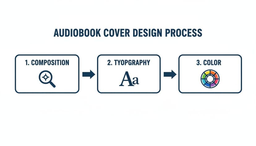
This shows how composition, typography, and color aren't separate tasks. They're all interconnected pieces of the same puzzle, and they have to work together to create a cover that clicks with listeners.
Refining and Finalizing Your Cover
Once you have a few strong base images, it's time to refine them. The goal is to iterate on the AI's output to get it just right. Don't be afraid to experiment. Use features like style conversion to see how your image looks in a different artistic style—perhaps shifting from photorealistic to an illustrated look would better suit your genre.
If there's an element that feels out of place, regenerate that specific part of the image or remove distracting objects. This loop—generate, evaluate, refine—is how you get to a professional result. For authors seeking an even smoother workflow, BeYourCover includes a dedicated audiobook cover generator tool as part of its Pro plan. It automatically sets your canvas to the required 2400x2400 pixel square format, ensuring your design is compliant from the very beginning.
You're not just creating a pretty picture. You're building a functional sales tool. Every decision, from the first word in your prompt to your final font choice, should be made with the listener's split-second decision in mind.
After you've locked in the final artwork, the last major step is adding your text. This means picking a font that’s easy to read, making sure it has high contrast against the background, and arranging your title and author name so they pop, even as a tiny thumbnail.
Once that's done, you’re ready to export the final file, totally confident that it meets every technical and design requirement for platforms like Audible and KDP. And if you're looking for ways to show off your final design in your marketing, our guide on creating a book cover mockup generator can be a huge help.
Current Design Trends and Mistakes to Avoid
Staying on top of design trends isn't about chasing the latest fad. It's about speaking the same visual language as your listeners. A cover that feels current and professional signals that your audiobook is exactly what they're searching for. On the other hand, a dated design can kill a sale before a potential listener even reads your summary.
The name of the game today is clarity and immediate impact. Your cover has to win that split-second decision a user makes while scrolling through a crowded mobile app.
Top Trends Dominating the Charts
If you look at the bestseller charts right now, you'll see a clear pattern. The most successful covers are leaning into simplicity and power. They don’t try to cram the entire plot onto the cover; instead, they pose a single, compelling question that makes someone need to know more.
Three trends are consistently performing well:
-
Minimalist Compositions: These designs are all about a single, strong focal point against a clean backdrop. Think of a lone silhouette, a powerful symbolic object, or a stark, empty landscape. This approach cuts through all the visual noise and makes the cover instantly digestible.
-
Bold, Expressive Typography: The title isn't just information; it's a critical piece of the art. Big, high-contrast fonts that a listener can read in a blink are absolutely non-negotiable. The font itself does a lot of heavy lifting, conveying the mood—from a gritty, textured font for a thriller to an elegant serif for a historical drama.
-
Strategic Use of Negative Space: Don't underestimate the power of empty space. It’s what pulls the eye toward the most important elements—the title and the main image—and gives the whole design room to breathe. A cover that feels open and uncluttered also comes across as more modern and confident.
Listeners consistently gravitate towards designs that spark their imagination. You can discover more about how visual trends impact audiobook sales in this deep-dive video.
Common Pitfalls That Hurt Sales
Knowing what not to do is just as important as knowing what to do. Many indie authors fall into the same visual traps that instantly make their audiobook look amateur, hurting its performance right out of the gate.
Steering clear of these common pitfalls is one of the fastest ways to make your cover more effective:
-
The Overly Cluttered Design: This is the number one mistake. Authors try to stuff too many characters, scenes, or symbols onto one small square, and it just becomes a confusing mess. The fix: Pick one single, powerful idea and let that be the hero of your design.
-
Illegible Fonts: Using a font that is too thin, overly decorative, or has low contrast against the background is a death sentence for a thumbnail. If a listener has to squint to read your title, they’ve already scrolled on. The fix: Readability first, always. Go for bold, clear fonts that pop against the background.
-
Genre Mismatch: Putting a cover with classic romance tropes on your hard sci-fi novel is a recipe for disaster. You’ll attract the wrong audience and instantly disappoint them. The fix: Do your homework. Spend time studying the bestsellers in your specific sub-genre. For instance, if you write fantasy, browse through top-performing fantasy book covers to get a feel for the expected color palettes, imagery, and typography.
-
Poor Image Quality: Nothing screams "amateur" louder than a low-resolution, pixelated image. The fix: Always, always start with a high-resolution base image. If you're using an AI tool to generate your art, make sure you export the final file at the highest quality setting available.
Getting Your Final Cover File Ready for Upload
You’ve tweaked, polished, and perfected your design. Now for the final, crucial step: getting it ready for the world. This is where the technical details matter. A single wrong setting can get your cover rejected by platforms like ACX or KDP, causing frustrating delays right when you’re ready to launch. The goal here is a smooth, one-and-done upload.
Before you even think about hitting that "export" button, run through a quick pre-flight check. It only takes a minute and can save you a world of headaches.
First, is your canvas exactly 2400 x 2400 pixels? Not 2401, not 2399. A perfect square is non-negotiable.
Next, confirm the color mode is RGB. This is the standard for all digital screens, from phones to desktops, ensuring your colors look vibrant and correct.
Finally, check the resolution. It needs to be at least 72 DPI (Dots Per Inch), though going higher is totally fine and won't hurt anything.
Exporting and Naming Your File
When it comes time to save the final file, you'll usually choose between a JPG or a PNG. For an audiobook cover, a high-quality JPG is almost always the right call. It strikes the perfect balance between crisp image quality and a manageable file size, which helps you stay under the common 5MB upload limit.
File naming might seem trivial, but it’s a lifesaver, especially when you're juggling multiple projects. A clear, consistent format keeps everything organized.
-
Do this:
TheLastStarship_Audiobook_Cover_Final.jpg -
Not this:
cover_1.jpg
This simple habit prevents you from grabbing the wrong file in a rush to upload.
Pro Tip: Before uploading, zoom out on your final image until it's about the size of a postage stamp on your screen. Can you still read the title? Does the main image still pop? This is your best simulation of how listeners will see it in a crowded store, and it's your last chance to catch any legibility problems.
How to Fix Common Upload Errors
Even the most careful author can run into an upload error. Don't panic; most of them are simple to fix.
-
"Incorrect Dimensions" Error: This is the big one. It simply means your file isn't a perfect 2400x2400 square. Just pop back into your design software, correct the canvas size without stretching the image, and export it again. Problem solved.
-
"File Size Too Large" Error: Your file has gone over the platform's limit (usually around 5MB). The fix is easy. When you export your JPG, just dial back the quality setting a tiny bit—from 100% down to 90%, for instance. The visual difference is almost impossible to spot, but it can shrink the file size dramatically.
-
"Invalid Color Space" Error: This technical-sounding error just means you saved it in CMYK (for print) instead of RGB (for screens). Open the file, switch the color mode to RGB in your software's settings, and re-export.
Nailing these technical specs is just as important as the creative design itself. If you want to dive deeper into the nuances between different formats, our guide on creating a book cover for ebook platforms has some great insights that are also relevant here.
Your Audiobook Cover Questions, Answered
Let's cut through the noise and tackle some of the most common questions indie authors have about making a killer audiobook cover. These are the practical, real-world issues you'll hit when getting your book ready for listeners.
Does My Audiobook Cover Need to Be Different From My Ebook?
Different? Yes. Unrecognizable? No. Think of it as an adaptation, not a total rewrite. Your core branding—the imagery and vibe that readers already associate with your book—absolutely needs to stay consistent.
The big change is the format. Audiobook covers live in a 1:1 square aspect ratio. Just cropping your rectangular ebook cover almost never works—it usually lops off something important or messes up the whole composition. You'll need to rearrange text and shift your focal point to make sure it pops in that square frame.
This is where a tool designed for the job is a lifesaver. For example, the audiobook generator in BeYourCover's Pro plan helps adapt your existing brand to the square format without you having to start from scratch.
How Much Is This Going to Cost Me?
If you go the traditional route and hire a designer, you can expect to pay anywhere from $300 to $800 for a custom audiobook cover. Often, this is an add-on service to your main ebook cover package, but it's a significant expense, especially for new authors.
This is exactly why AI-powered platforms have become so popular. They give you the power to create and fine-tune a high-resolution, genre-perfect square cover for a tiny fraction of that cost. It makes professional design accessible when you're on a budget.
What's the Single Most Important Thing on the Cover?
Clarity. Full stop. When your cover is a tiny thumbnail on a phone screen, clarity is the only thing that matters.
The winning combination is a simple, powerful focal image and a title that’s instantly readable. A potential listener scrolling through Audible has to "get" your genre and read your title in a fraction of a second.
Busy scenes, fussy decorative fonts, and low-contrast color schemes are guaranteed to fail this test. Always choose immediate impact over complex artistic flair.
To get a feel for what's working now, check out these top book cover design trends.
Can I Really Just Use AI to Make the Whole Thing?
You can, but the best results come from a partnership between you and the AI. AI is brilliant at generating stunning, genre-aware visuals in seconds. It can give you a dozen incredible starting points quickly.
Your role is to be the director. You guide the AI with sharp prompts, pick the strongest concepts it returns, and then use editing tools to nail the typography and final layout. The best platforms don't just spit out an image; they combine powerful generation with a robust text editor, giving you the control to make it truly professional.
Ready to Create Your Own Book Cover?
Turn your story into a visual masterpiece. Fill in the details below to start generating professional covers instantly.